


Nano Banana AI produces impressive infographic images. So why does the output still feel unusable for real professional work?
If you have ever stared at a blank slide wondering how to turn dense content into something that looks professionally designed, Nano Banana AI will impress you. The layouts are well structured, the typography is clearer than what earlier AI tools could manage, and for a moment it feels like the gap between having content and having a finished design has finally closed.
That feeling holds right up until you try to use the generated image in an actual client-ready deliverable, where on-brand consistency is expected.
If you are a marketer, brand owner, consultant, founder, or educator who needs design work done without a dedicated designer, this review is for you. After 25 tests across real professional use cases, the gap between a beautiful AI image infographic and a usable, brand-compliant deliverable became impossible to ignore.
Why Nano Banana AI is worth taking seriously
Nano Banana Pro brought two capabilities earlier AI image generation tools could not consistently deliver: 1. clean text rendering inside images and 2.more reliable style control across multiple generations. For anyone who watched earlier models turn in-image text into unreadable squiggles, that is a significant advance.
Being able to drop in raw data, a blog post, or a research paper and receive a structured visual in under a minute is a significant advantage, especially for content creators looking to repurpose long-form content into shareable assets without touching a design tool.
What the best results actually require, though, is more skill than it appears. The strongest results come from building a master brand prompt before you generate anything: a single reusable prompt capturing your exact color codes, font styles, design rules, and layout approach. Without that discipline, brand consistency becomes a matter of luck rather than process. And that quietly raises the question of who this tool actually serves well at a professional scale.
Meet Pulseon: the brand I built to stress-test brand consistency
To run a fair test, I needed a brand that Nano Banana had never encountered before, with specifications precise enough that any inconsistency in the output would be immediately visible. So I opened ChatGPT and asked it to generate brand name ideas for a fitness app, along with matching visual themes. It returned ten options.
I chose Pulseon: sleek, tech-forward, and built around the idea of smart fitness tracking and performance. I asked ChatGPT to develop it into a full brand identity, and it produced a complete specification and brand style guide.
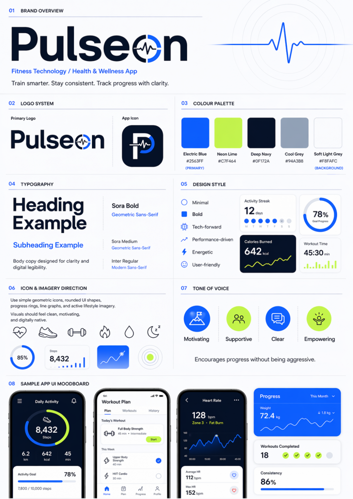
The whole process took about ten minutes. What I had at the end was a specific brand identity with the same level of detail a professional brand designer would hand off to a marketing team and expect to see applied consistently across every asset in a campaign. That became the brief I handed to Nano Banana.
What I tested across 25 infographics
With the Pulseon brand defined, I put it to work across 25 infographic tests spanning five categories, each with a different success criteria. Knowing that casual prompting would not produce brand-compliant outputs, I also used ChatGPT to generate the test prompts, feeding it the full Pulseon specification and asking it to build comprehensive, brand-specific prompts for each asset type.
The goal was to give Nano Banana every possible advantage so that any inconsistency in the output could not be blamed on a vague brief.
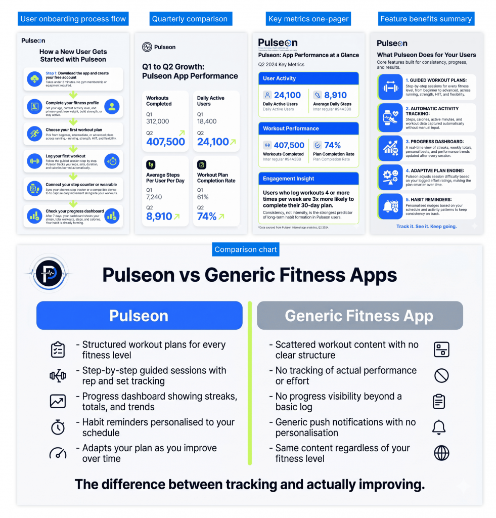
Professional documents: A user onboarding process flow, a side-by-side comparison of Pulseon against generic fitness apps, a quarterly performance statistical infographic using a supplied dataset, a key metrics one-pager for executive reporting, and a feature benefits summary.
Social and content marketing assets: A LinkedIn thought leadership post on why fitness routines fail, a newsletter visual summary header covering three fitness industry shifts, a blog header explainer showing how Pulseon tracks progress, a stat infographic built around consistency data, and a tips infographic covering the first week on the app.
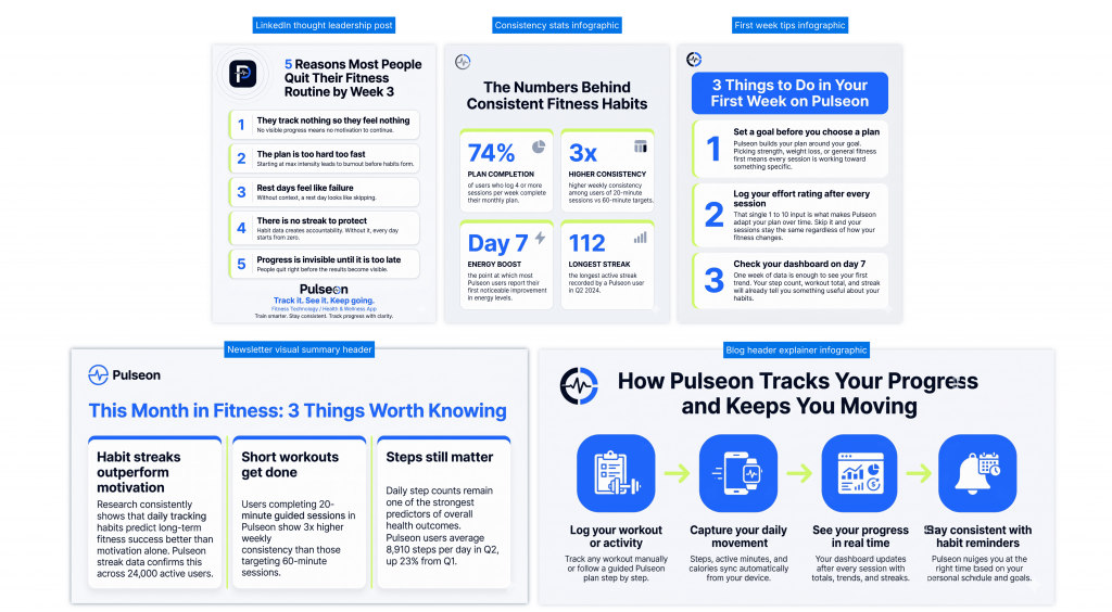
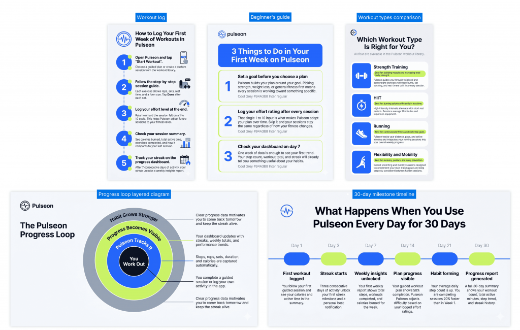
Educational and training materials: A step-by-step guide to logging the first week of workouts, a circular layered diagram showing the Pulseon progress loop, a 30-day milestone timeline, a beginner’s guide covering the first seven days, and a workout types comparison explaining the four training categories available in the app.
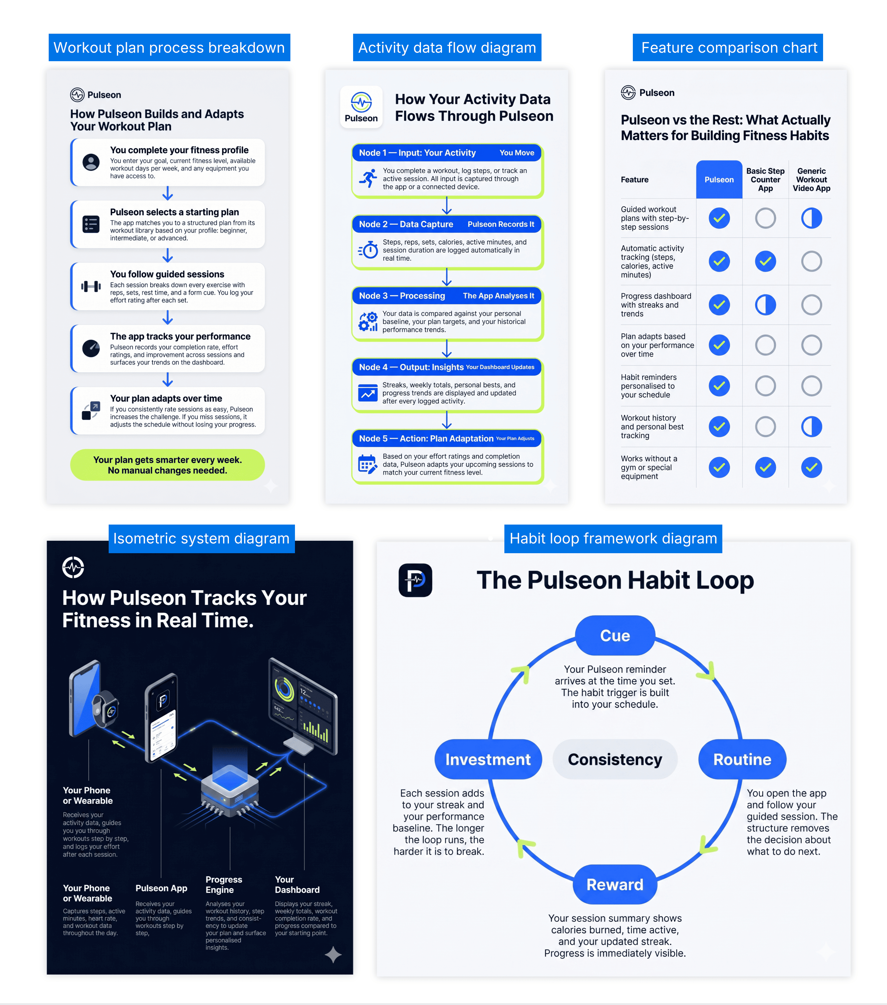
Technical and conceptual visuals: An isometric system diagram showing how activity data moves through the Pulseon platform, a technical process breakdown of how the app builds and adapts a workout plan, a feature comparison chart, a data flow diagram showing how user activity is captured and processed, and a habit loop framework diagram.
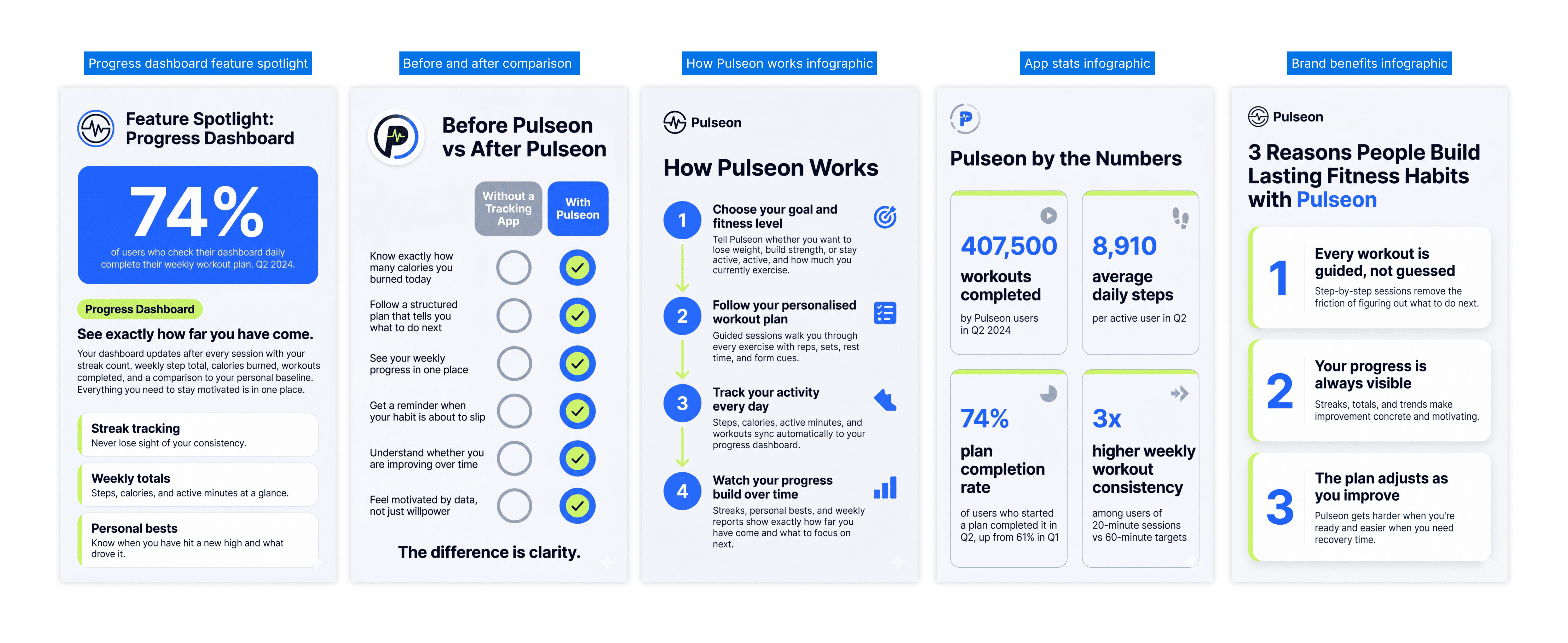
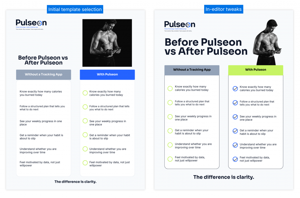
Branded campaign series: Infographics designed to run as a connected campaign for Pulseon, each covering a different topic but sharing the same visual identity across colors, typography, layout style, and icon style. Topics covered: brand benefits, app stats, how the product works, a before and after comparison, and a feature spotlight on the progress dashboard.
What worked well
Having the ChatGPT-generated prompts ready before starting made a significant difference to the workflow. Because each prompt already contained the full Pulseon brand specification, there was no need to re-explain the brand from scratch with each new asset. Once the setup work was done, every generation that followed moved quickly.
Within that workflow, Nano Banana was able to capture the right hex codes, interpret the font direction, and automatically lay out clean infographics that followed the Pulseon brand style. Each new design came back within minutes, and across the full experiment, 25 infographics were completed well within a day. For anyone who needs a volume of visual assets turned around quickly, that speed is a real advantage.
The tool also handled format variety well. Donut charts, isometric infographics, quarterly performance comparisons with supplied datasets, step-by-step how-to layouts, and timeline infographics all came back as recognizable, structured outputs.
For ideation and concept work, that combination of speed and format flexibility is where Nano Banana earns its place.
Where brand consistency started to break down
The findings below are specific to what happened across the Pulseon tests and most relevant for anyone responsible for maintaining a consistent brand identity across multiple design assets.
How sessions affected consistency
In earlier sessions, every prompt included the full Pulseon brand specification, logo reference, and icon. Over time, Gemini began retaining the brand in its memory within a conversation, meaning later generations in the same session no longer needed the full reference to produce recognizably Pulseon-styled outputs.
What became clear, though, is that session structure itself introduced a consistency problem. New chat sessions produced cleaner, more consistent brand outputs because each generation started fresh from the brief alone. Continuing in the same chat meant each new infographic was subtly shaped by previous generations, with design decisions from earlier assets bleeding into new ones in ways that were difficult to predict or control. Better individual results came from new chats, but that also meant re-establishing context every time.
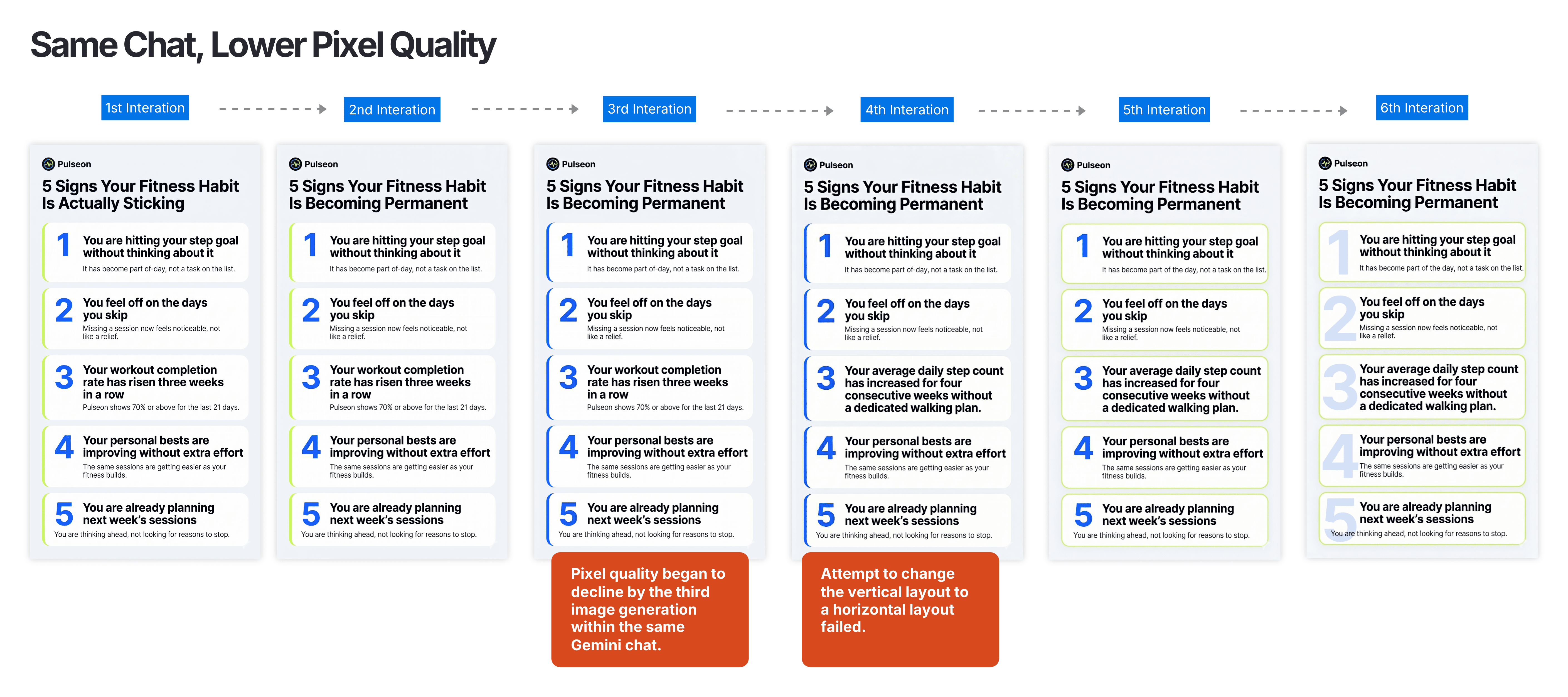
Pixel quality also declined with each successive regeneration within the same session. By the fourth iteration, when the prompt asked for a different layout format, the model stopped producing anything new and returned a version of the previous design. The creative range narrowed with each generation, and the outputs became less responsive to instruction the further into the session they went.
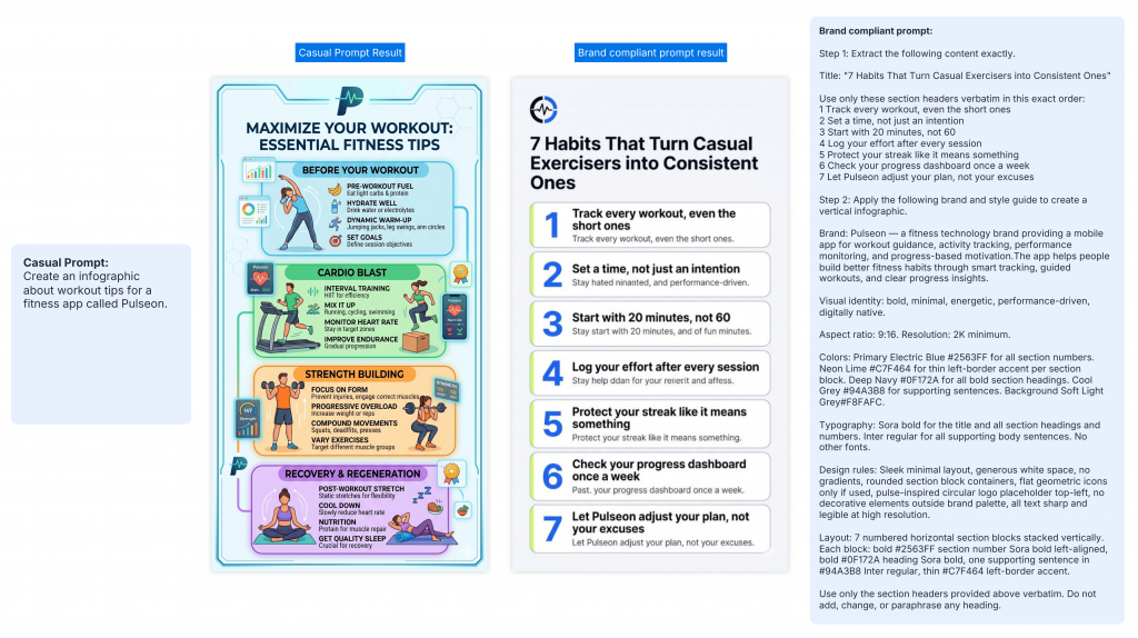
The logo was barely accurate
Of all the brand elements tested, the logo was the most consistently problematic. Even when the full Pulseon logo and icon were supplied as references in the prompt, the rendered output regularly distorted or misrepresented the mark. Occasionally an iteration would get it right, but there was no reliable way to reproduce that result. New chats, repeated references, and multiple regeneration attempts did not resolve it. The only workable solution every time was to manually drop the correct logo back into the exported image, meaning every single output required post-production intervention just to carry the most basic brand identifier.
Icons and images are out of your control
Icons and images presented their own consistency problem. Adding a new visual, swapping an existing one, or adjusting the style of an icon or image all required going back to the prompt and accepting whatever the next generation produced. There was no way to target a single icon for replacement without regenerating the entire image, and the result was never guaranteed.
The editing wall
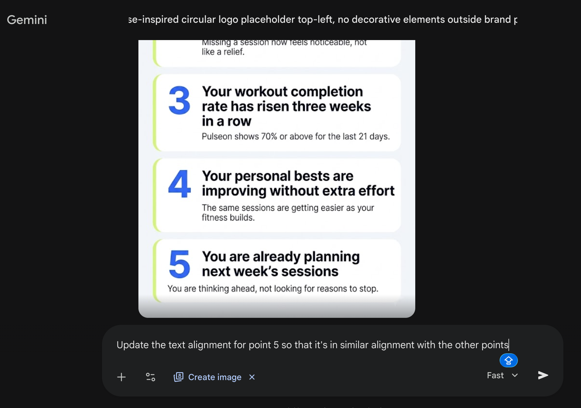
Every output is a flat image file with no editable layers. There is no freedom to move an element, adjust a color, or fix the position of a line of text directly. Every correction goes back through the prompt, and every regeneration is a risk.
Text alignment was a specific version of this problem. When text sat slightly off or broke across lines in a way that looked unprofessional, re-prompting to fix it did not work. Across multiple attempts with explicit correction instructions, the alignment did not change. The only option was to regenerate the entire image and accept whatever came back.
The biggest misconception about AI infographic tools
There is an assumption that is easy to fall into after seeing Nano Banana’s outputs, and the findings above make it even easier: if the tool captured the right hex codes, laid out a clean structure, and produced 25 assets in half a day, surely the brand consistency problem is solved. Newsflash – it isn’t solved. And the closer the output gets to looking right, the harder that distinction is to see until it matters.
The distinction worth understanding is the difference between an image that approximates your brand and a design asset that precisely applies it. An approximation gets the color in the right direction and the font roughly right. An applied brand kit means your exact hex codes, your precise fonts, your actual logo, and an asset you can update, resize, and reproduce with the same accuracy next quarter. One exists as a single image file. The other lives in a system.
AI image generation tools, even the most capable ones, produce approximations. The visual closeness is real and often impressive. But closeness is not consistency, and for anyone managing brand output at scale, that difference is where the workflow either holds or falls apart.
For a one-off social post, the approximation is good enough. For a campaign series, a content program, or any body of work that needs to look like it came from the same brand, it is the gap that costs you the most time.
Why I switched to a different AI design tool
After 25 infographics and a campaign series that produced only a few usable on-brand pieces, the gaps became specific enough to define exactly what a better workflow needed to do.
I needed to load the brand style guide once and have it show up correctly every time, without re-engineering a prompt or checking logos and fonts between sessions. I needed text and charts I could actually edit and I also needed the same asset to work across formats without starting over. That is what led me to test Venngage’s AI Infographic Generator.
How the Venngage workflow handled the same brand
I ran the same Pulseon brief through Venngage to see how a template-based AI design tool handled the same brand consistency challenge.
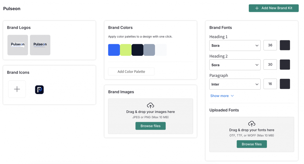
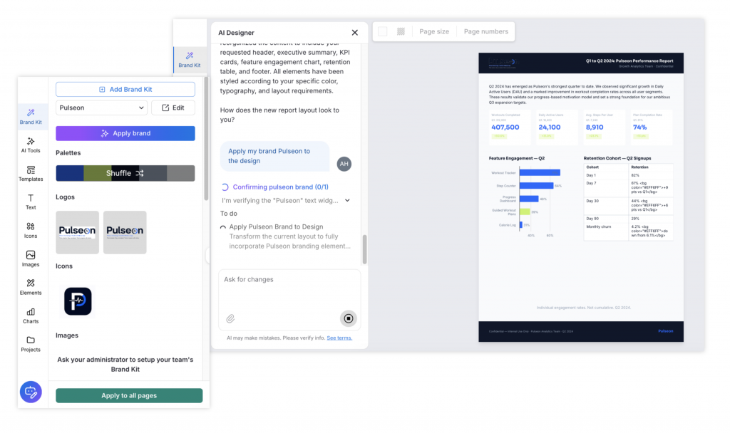
Step 1: Set up the Pulseon brand kit once. Before generating a single infographic, I loaded the Pulseon brand into Venngage’s brand kit: the exact hex codes for Electric Blue, Neon Lime, Deep Navy, Cool Grey, and the Soft Light Grey background, the Sora and Inter font pairing, and the Pulseon logo. This took around 10 minutes. From that point forward, every infographic generated in Venngage applies those exact elements automatically. There is no prompting, approximation, or design drifts between sessions.
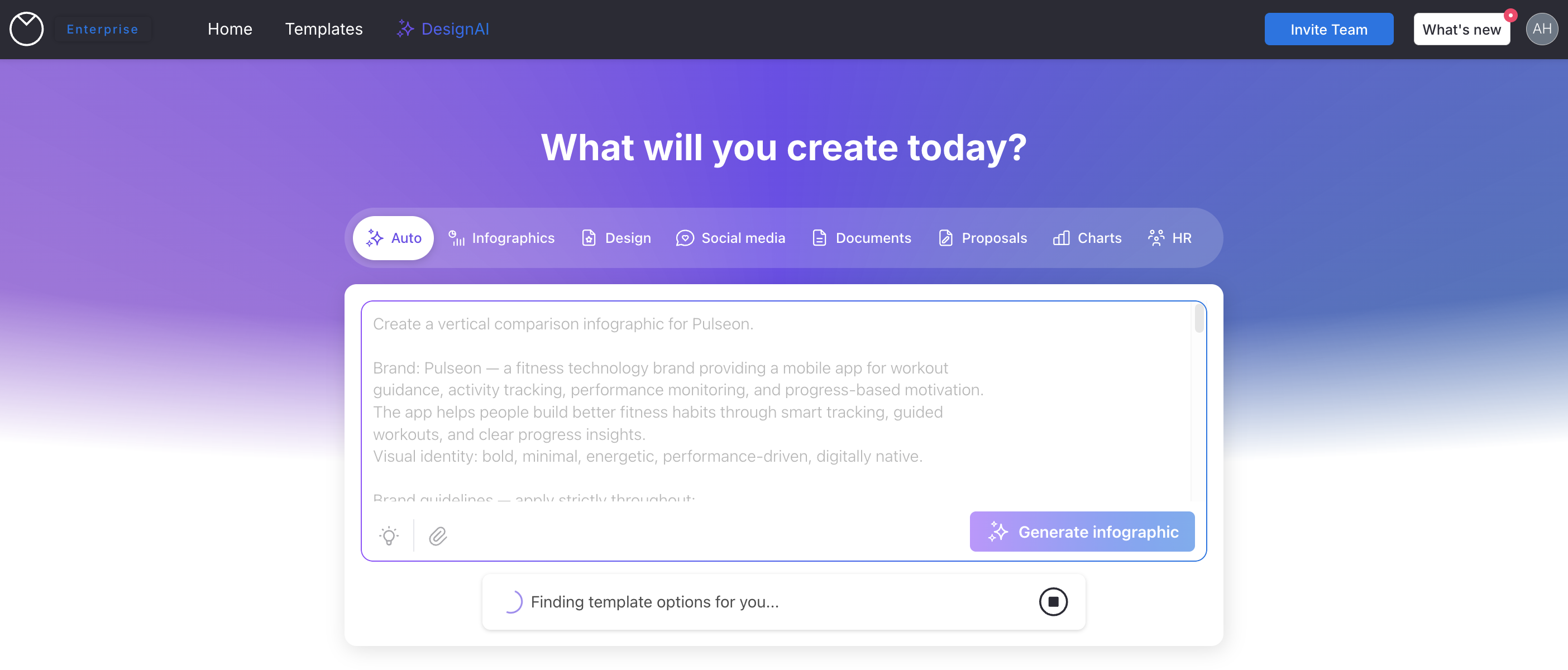
Step 2: Generate with the goal, not the topic alone. Rather than crafting a prompt around a visual style and hoping the brand follows, you describe the output you need through the prompt widget: a comparison infographic for a marketing deck, a process flow for an onboarding SOP, a stats infographic for a quarterly review. Venngage’s AI selects a suitable template from that context, and for the Pulseon use cases the suggestions were on target without any manual library browsing
Step 3: Edit what needs editing. Every element in the Venngage output is editable. Click on any text and it is live, in the correct font, ready to change in seconds.The Electric Blue tone is precisely #2563FF because that is what the brand kit contains. When a section heading needs revision, I am able to change with just a few clicks.
Subsequent instructions go through the built-in AI Designer inside the editor, so you can continue refining layout sections and updating content without leaving the design. When a section heading needs revision, a few clicks is all it takes. The editorial work of finishing each piece is still yours, but you are working on a brand-accurate starting point rather than rebuilding from scratch.
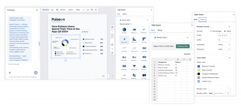
For icons and images, you can pull directly from Venngage’s library or use the built-in AI icon and image generator to create your own. From there, the modify button lets you generate new icons in a similar style to the one selected, keeping the visual language consistent across the design.
Step 4: Adapt the same asset across formats. The Pulseon comparison infographic built in Venngage was adapted into a report page, a presentation slide, and a one-pager in the same session. The brand elements remained identical across all three. The Nano Banana version of the same infographic would have required separate regeneration runs for each format, with no guarantee the brand would hold across them.
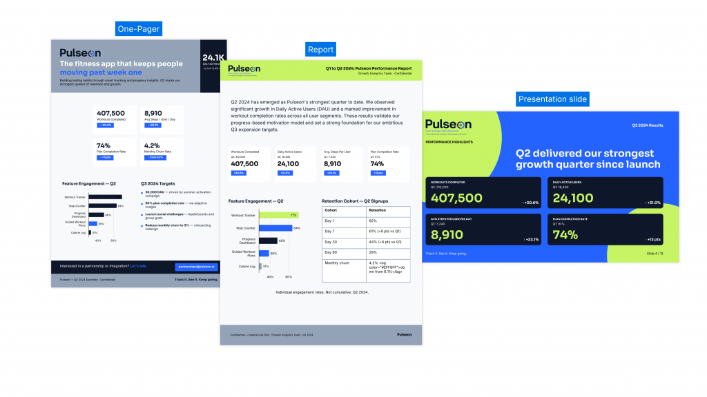
The result across equivalent assets: Every Venngage output applied the Pulseon brand correctly. The hex codes matched, the font pairing held, and the rounded UI elements were consistent. The shuffle function on the brand kit cycles through color combinations within your palette, and for Pulseon every variation stays accurately within the defined color system.
What Venngage does not do well
Here is where the Venngage workflow requires more from you.
Data accuracy needs a manual check. When I fed raw data directly into the AI Designer, the output was not always accurate. For any infographic where the numbers matter, make sure to verify every data point against your source and correct as needed. Build this into your workflow time.
Switching formats takes 3 to 5 minutes and wipes your current design. When I used the AI Designer to switch from a report layout to a presentation slide format, generation took 3 to 5 minutes. The tool replaces your existing design with the newly generated one so before you regenerate, make sure to create a copy. If you forget, the undo button recovers the original and redo retrieves the new version, but relying on that under time pressure is not ideal.
The brand kit requires manual reselection and is never predetermined. At both the prompt widget stage and inside the editor, the brand kit does not carry over automatically. If you are managing multiple brand kits across clients or projects, you will need to re-select the correct one each time you start a new generation.
Pricing requires a paid plan for the full workflow. Venngage offers a free plan, though access to the full template library, AI design tools, and exports requires a paid subscription. The workflow described in this article requires a paid subscription.
The recommendation here is scoped to one goal: producing editable, accurately branded infographics and business documents at scale without a dedicated designer. For that job, Venngage is the stronger workflow. If you need a single visual today with no brand system behind it, a prompt-based image generator like Nano Banana will be faster.
The Infographic readiness test
Before choosing a tool for your next infographic project, answer three questions to discover which workflow fits you.
1. Will this infographic need to be edited after the first version? If yes, you need editable elements. A flat image file cannot be changed without regenerating the whole thing.
2. Does this infographic need to carry accurate data or match a specific brand identity? If yes, you need charts connected to real data and a brand kit applied at the system level, not prompt-engineered each time.
3. Will this content need to work in more than one format? If yes, you need a design asset you can adapt, not an image you regenerate for each new size.
If you answered yes to any of these three, a purpose-built AI infographic generator is the right tool. If you answered no to all three, meaning this is a one-off social visual where speed matters more than brand precision, Nano Banana AI handles it well.
Most brand owners, marketers, and content teams producing infographics for real business use answer yes to at least one. That is where the workflow gap matters.
Who this is actually for
Use Nano Banana AI when you need a fast visual reference, a one-off social asset where brand precision is flexible, a technically impressive isometric or system diagram, or a concept sketch to share before a brief is locked.
Use Venngage when you are a brand owner, marketer, content strategist, or brand manager who needs multiple infographics to look like they belong to the same brand, with editable text, accurate data, and the same asset adapted across multiple formats.
Use both when ideation and production are distinct stages. Nano Banana AI helps you quickly explore whether a concept works visually before the brand is applied. Venngage builds the actual deliverable with the brand locked in from the start.
Final verdict
Across visual styles and format types, Nano Banana generated impressively varied results. Isometric layouts, donut charts, and comparison structures all came back well-formed, and the quality held consistently across the full test. Because the tool interprets a prompt and decides on a visual style itself, the output can take a direction you would not have chosen from a menu. For concept work and one-off content where brand precision is not the priority, that creative freedom is an advantage.
For brand owners and marketing teams, the results told a different story. Logo accuracy was never guaranteed even with references supplied. Fonts were interpreted rather than applied precisely. Icon changes were unpredictable with every re-prompt. Text alignment issues persisted despite multiple correction attempts. Output quality degraded noticeably across successive iterations in the same session.
Brand consistency at a professional scale requires a workflow that holds the brand at the system level, not one that relies on re-describing it from scratch with every new prompt. After 25 tests, one purpose-built brand, and two very different workflows, Venngage proved to be the stronger tool for the job.
If your goal is a set of branded infographics that actually look like they belong to your brand, Venngage’s AI Infographic Generator is where to start.
Frequently asked questions
What is Nano Banana AI and why is everyone talking about it?
Nano Banana AI refers to Google’s Nano Banana Pro image generation model, built on the Gemini 3 Pro architecture. It gained attention among designers, marketers, and content creators for its ability to generate structured, visually coherent infographics from a text prompt in under a minute, with cleaner text rendering than any previous AI image tool.
Can Nano Banana AI maintain brand consistency across multiple infographics?
Inconsistently. A single infographic can look close to a brand brief with a detailed prompt. Across sessions, colors may drift from specified hex codes, fonts interpreted rather than applied, and layout decisions shift with each generation. For a one-off visual it can work. For a set of assets that need to look like they came from the same brand, the inconsistency becomes a challenge.
What is the difference between AI image generation and an AI infographic generator for brand work?
AI image generation approximates your brand from a prompt. An AI infographic generator like Venngage applies your brand from a saved brand kit, meaning your exact hex codes, fonts, and logo every time without re-prompting. For one-off work the difference is manageable. For a campaign series or content program, it is the difference between a brand that looks consistent and one that does not.
What is a Gemini Infographic and how does it relate to Nano Banana?
A Gemini Infographic is an infographic-style visual created through Google Gemini using the Nano Banana Pro image model. Gemini is the interface; Nano Banana Pro is the underlying generation model.
What is the best AI design tool for brand owners and marketers who need consistent infographics?
For teams who need multiple infographics to maintain accurate brand identity, a purpose-built AI infographic generator with a brand kit system like Venngage is the stronger choice. Use the Infographic Readiness Test in this article to decide which tool fits your specific project.
How does AI content repurposing work for branded infographic creation?
It means taking existing content, such as a blog post, data report, or campaign brief, and converting it into a branded visual infographic. The workflow works best when the tool applies your brand automatically from a saved kit. Venngage handles this end-to-end. With Nano Banana AI, it typically requires detailed brand prompting each time.
Can Venngage handle brand consistency across different document types?
Yes. Once a brand kit is set up, the same brand applies correctly across infographics, report pages, presentation slides, and one-pagers within the same session, without re-prompting or manual adjustments between formats.
Does Venngage have a free plan?
Yes. The free plan includes limited access to templates and exports with Venngage branding. Access to the full template library, AI tools, brand kit features, and clean high-resolution export requires a paid plan.


