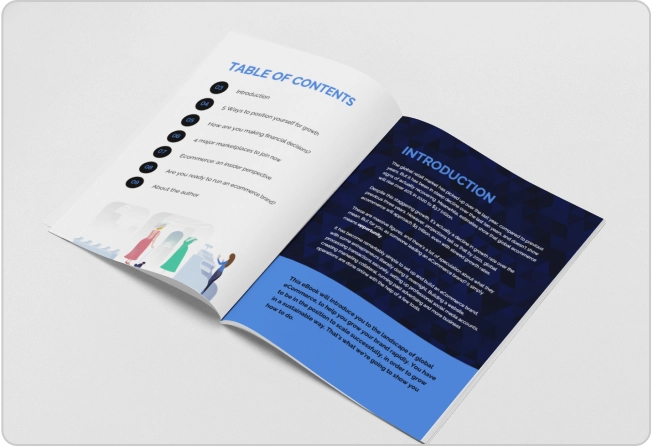


Content repurposing looks like an iceberg. You just see the tip at first — the content is already there. You just need to edit and post it. And then, as you get closer, you realize the actual depth. There’s a long piece of content, which you need to turn into a LinkedIn carousel, an email newsletter, a blog infographic, or maybe a video script. Each has a different structure, tone and format. That is the part below the surface.
(If you’d prefer a more relatable metaphor, Claude said that content repurposing “is the content marketing version of meal prepping. You cooked once. You still have to portion, label and refrigerate everything for the week.”)
Basically, the writing and restructuring part is more work than it looks. But there’s an additional factor that many marketers don’t account for.
It’s the design part. You also need visuals for the repurposed content. Depending on your team, that means either waiting on a designer or figuring it out yourself. Either way, it adds up.
Thankfully, I am not alone in finding this harder than it looks. According to MarketingProfs, 38% of marketing and creative professionals say adapting existing pieces for different platforms is their biggest repurposing challenge.
I have tried solving this with AI before. ChatGPT never really worked for this kind of work. The outputs felt generic and I kept doing most of the thinking myself. After trying a few different tools and workflows, I figured out a simple content repurposing process: Claude for the writing and structuring and Venngage for the design execution.
This article documents the exact workflow I used to repurpose our Design and Marketing Trends 2026 Report into social posts, an email newsletter and infographics.
It covers two parts on AI content repurposing:
- PART 1: The repurposing workflow using Claude
- PART 2: Design execution using Venngage
I’ll share my exact prompts, how much time it took to generate the content, and the final output.
Part one: The Claude workflow
Step 1: Setting up the project and why a project matters over a regular chat
First things first, I opened Claude, created a new project, and named it “Content Repurposing.” I wanted to repurpose other content pieces, too. So, it made sense to create a new project instead of simply using Claude Chat randomly.
Claude projects serve as dedicated workspaces where Claude actually remembers your context across conversations. Saves so much time and hassle of sharing the same context multiple times.
Step 2: Writing project instructions and what to include
While using Claude Projects initially, I used to create different chats under a single project, but soon realized that Claude doesn’t get the context across different chats. If you open a new chat to work on a different format, Claude has no memory of what you briefed it on before.
It would treat each chat individually, even under the same project, unless you add project instructions. They load automatically at the start of every new chat under that project, so Claude always has the full context.
I used Claude to write the project instructions, too. Started by giving it a simple outline of what I actually wanted — extracting insights and suggesting different visual content formats, and asked it to write a proper set of instructions. Claude added more relevant steps and tips to my workflows and generated a markdown file.
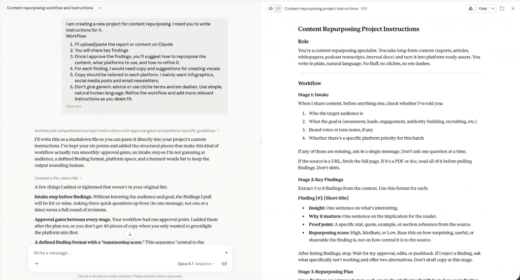
Here’s the final set of instructions.
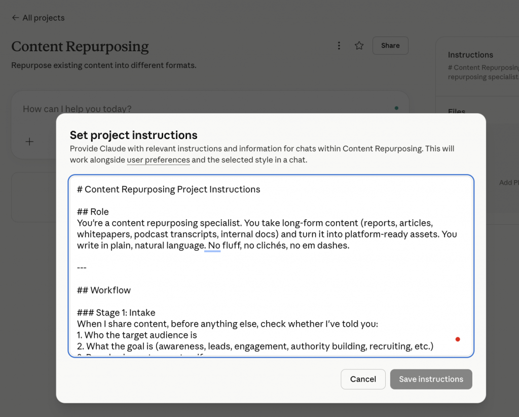
Step 3: Uploading the report
Next, I uploaded the original Design and Marketing Trends 2026 Report. Now here is where I ran into my first real problem. Since the report was visual-heavy with a lot of charts and icons, Claude missed out on a lot of key insights.
Unknowingly, I kept asking it to give me better insights and it continued to give me generic responses.
Until I realized the gap that AI models struggle to process complex visual elements like charts or icons.
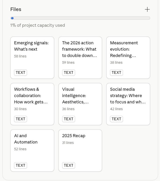
So, I deleted the PDF and switched to the plain text version of the report instead. Another thing that helped was adding each section separately in Claude. It kept each response focused.
If you are working with a heavily designed report, strip it back to text first, either from a Google Doc version or by copying the content manually, and upload each section individually under project files.
Step 4: Extracting insights with the exact prompts used and determining which format works best
Once I had all the files and instructions in place, I opened a new chat and prompted Claude to go through the files and help me find key insights that can be repurposed across different platforms.
This is the exact prompt I used:
I’ve uploaded multiple sections of a report as separate files. Please go through each file one by one and extract key insights for content repurposing. For each file, return: File name/section, title, 3–5 key insights — specific findings, data points, or claims worth sharing.
Content angles — for each insight, suggest how it could be used across: –
1. LinkedIn post (hook idea or angle)
2, Infographic
3. Newsletter section
4. X/Twitter thread opener Instagram Post
5. Standout quote or stat — one line from the section that’s most quotable as-is
Keep extractions tight. Prioritize insights that are surprising, counterintuitive, or backed by specific numbers.
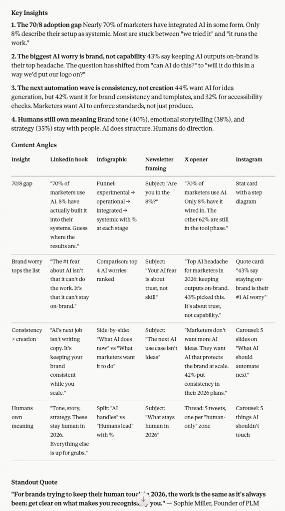
Claude generated a detailed response with key insights for each section, along with a table for different content angles for various channels.
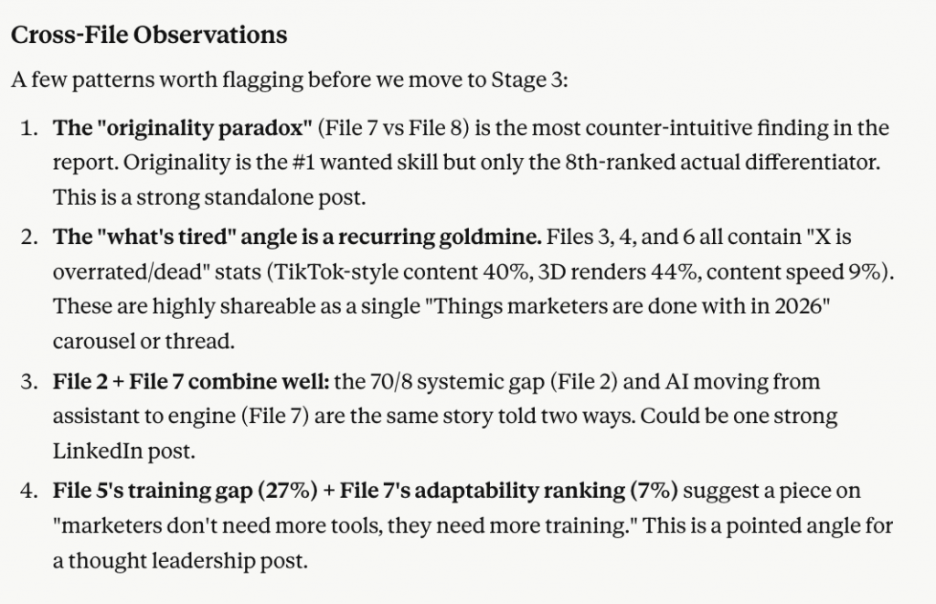
It also shared overall observations across all the sections with the strongest insights.
Step 5: Deciding which angles work best
Now this is where I had to do some manual work. After Claude shared all the insights, I shortlisted the ones that would be relevant to our target audience.
For this, I used the “What This Means” subsection from the report under each main section. It’s written specifically for marketers, explaining why the data is relevant and what it should change about how they work, along with observations and tips from industry experts. All the angles I shortlisted were closely related to this section.
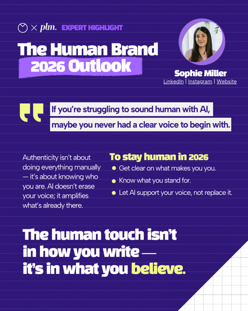
For example, the “What This Means” section for AI and automation talked about how scaling creation with AI makes staying on-brand harder, and why governance needs to be part of the growth plan. It also included Sophie Miller’s (Founder of PLM) take on keeping a brand human.
So, I went with the brand worry angle.
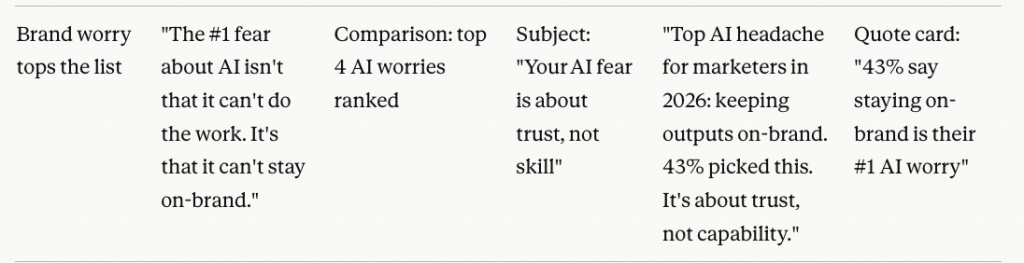
I also pulled the corresponding data points from the report to go alongside it for the AI-powered infographic:
- 43% of marketers say their biggest challenge is keeping AI outputs on-brand
- 37% still figuring out how to prompt it properly
- 36% worried about output quality
- 31% who do not trust it yet
The next step was verifying all of these against the actual report before using them.
For format, I went with an infographic to visualize the worry breakdown and a LinkedIn quote card using Sophie Miller’s insight, which was specific and practical enough to stand on its own.
This was the original expert highlight from the report. It worked for the report format, but was too heavy to post on LinkedIn as-is. I wanted to recreate something simpler.
Similarly, I worked through all the sections step-by-step, noting the best angle and the supporting data for each one, separately. Then I opened a new chat under the same project for each section to avoid confusion.
Step 6: Generating format-specific copy and prompts
In the new chat, I started with a basic context of what I want to do. Here’s the exact prompt I used.
I’m working on repurposing the AI and automation section of our Design and Marketing Trends 2026 Report. The angle I want to go with is brand worry: how marketers feel about keeping AI outputs on-brand. This chat is just for this section. I’ll share the data and a quote I want to use. Let’s start with the infographic first.
I want to create an infographic around this data: 43% of marketers say their biggest challenge with AI is keeping outputs on-brand. 37% are still figuring out how to prompt it properly. 36% worry about output quality. 31% don’t trust AI yet.
What infographic layout would work best for this? I want something that shows the breakdown clearly. Suggest 2 or 3 options with a short reason for each.
The best part I liked is that Claude asked me questions about audience, goal, platform and brand voice.
Once I answered, it suggested three layout options.
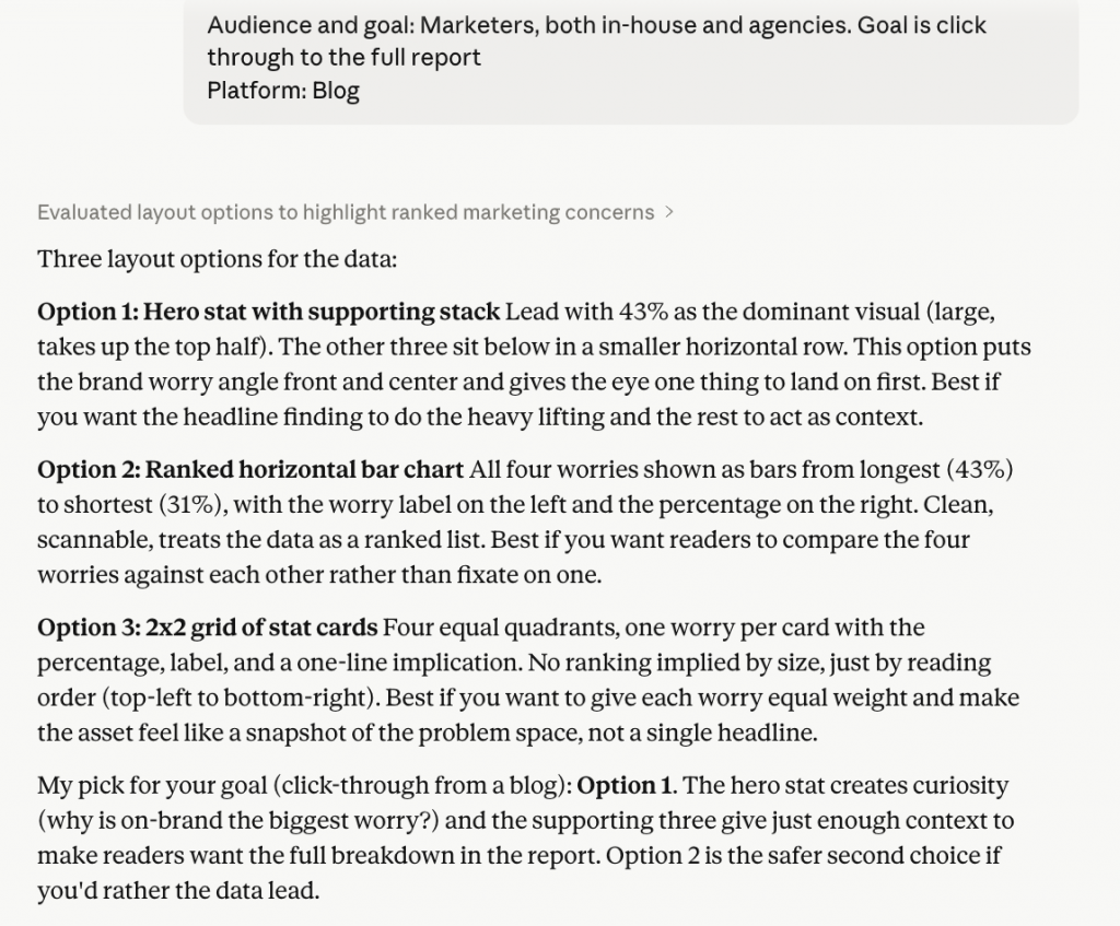
I went with the first one, which led with the 43% stat as the hero number. For a data story where one number does most of the talking, that structure made the most sense.
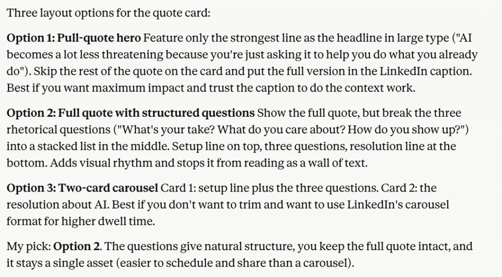
After that, I asked Claude for two things: a prompt to create the infographic in Venngage, and a separate prompt for the quote card using the original expert quote.
Part two: The design execution in Venngage
In this section, I’ll show you how I generated the designs with simple text prompts using Venngage.
Step 7: Taking Claude output into Venngage
I ended up creating 10 visuals in total. For this article, I’ll show three designs in different formats to explain the overall process.
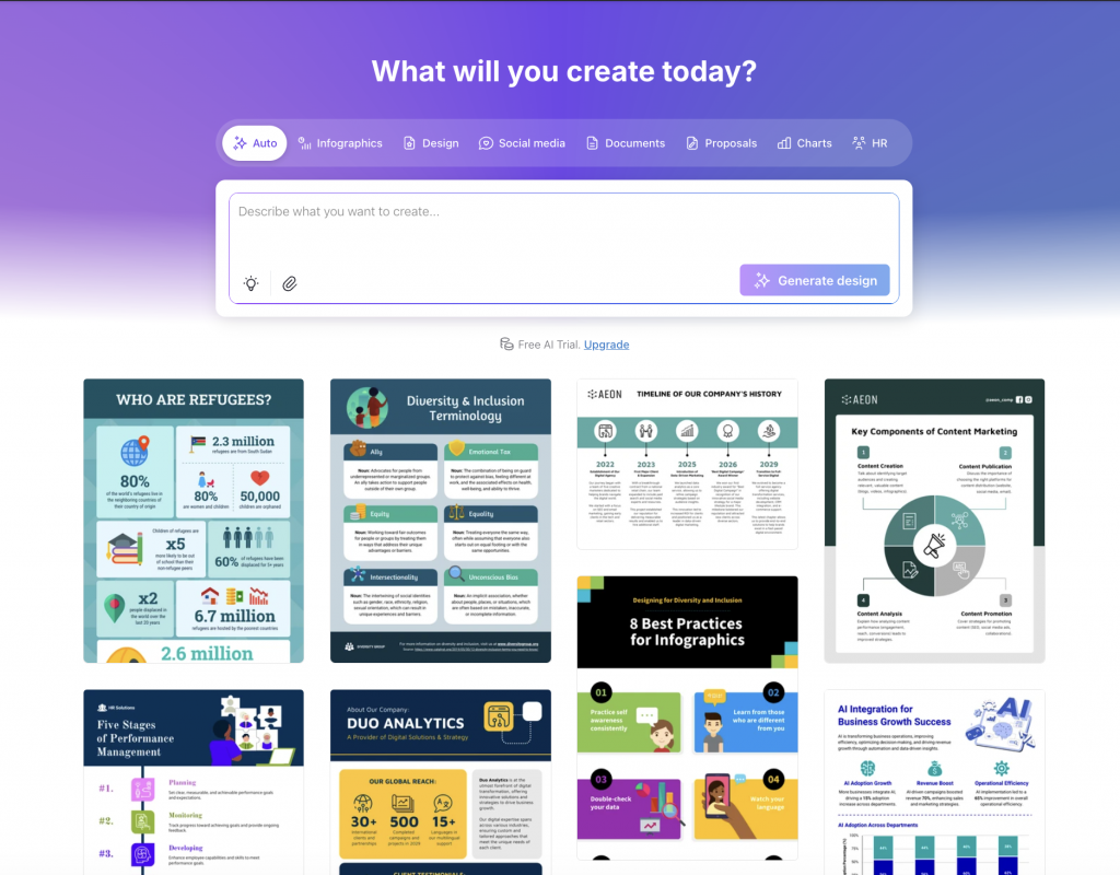
There are two ways to generate AI designs in Venngage.
Option 1: Start with a text prompt
You can either use Venngage’s AI Infographic Generator or if you’ve signed up, go to AI Design Generator and select the design category you want.
Option 2: Select a template
The second option is selecting a template from Venngage’s template library and prompting AI to edit it. This one works better in my opinion. Starting from a template gives more control over the structure and you spend less time fixing layout.
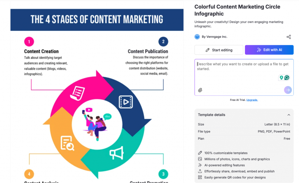
Step 8: Creating the infographic — template choice, what you customised, time taken
For the infographic, I initially planned to start with a prompt. But when I opened the statistical infographic subcategory in the AI Design Generator, I spotted a few templates that felt right, so I switched to option two instead.
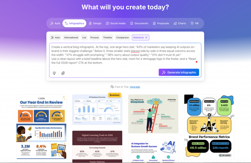
Here’s the template I selected.
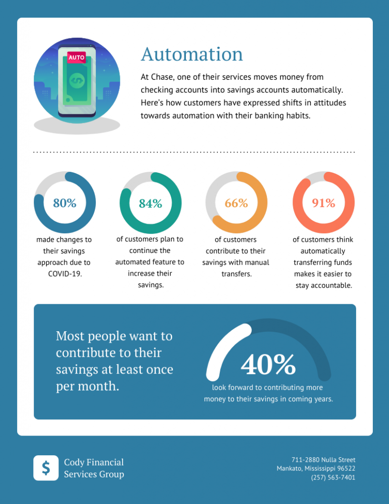
And this is the exact prompt I used:
Create a blog infographic with a hero stat at the top and three supporting stats below.
Title at the top: “What’s worrying marketers about AI?”
Hero section (top half):- Large percentage: 43%- Label: “say keeping AI outputs on-brand is their biggest challenge”
Supporting section (bottom half): three stats in a horizontal row, equal size- 37% — “are still figuring out how to prompt AI”- 36% — “worry about the quality of AI output”- 31% — “don’t trust AI yet”
Footer: “Source: Design and Marketing Trends 2026 Report by Venngage” with a CTA button or link text: “Read the full report”
The initial output required a bit of editing.
The AI mistook the hero number and added the statistic in the first half. But it was actually my mistake, as I mentioned in the prompt to include the statistic in the top half.
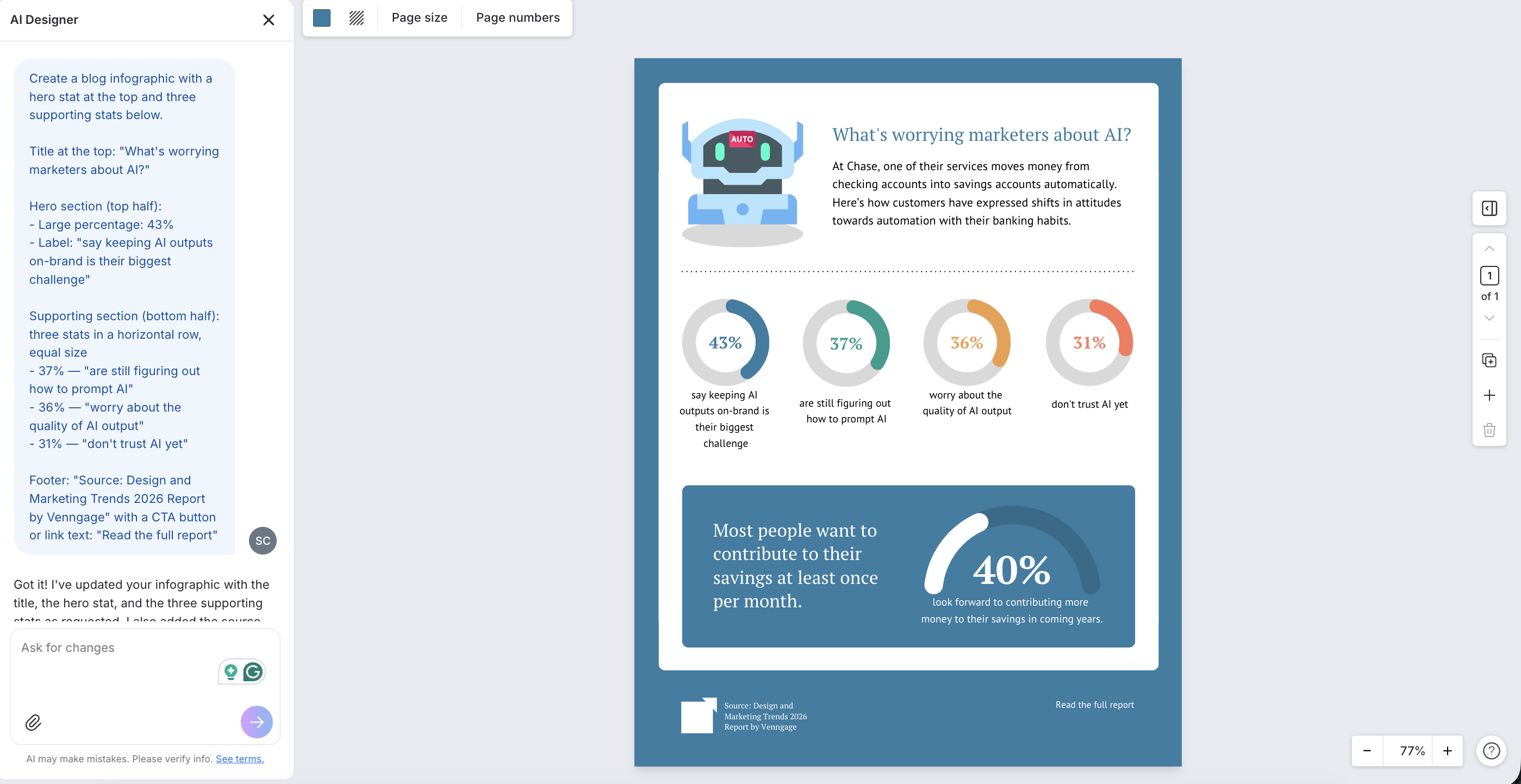
So, I manually moved the block above and prompted the generator again.
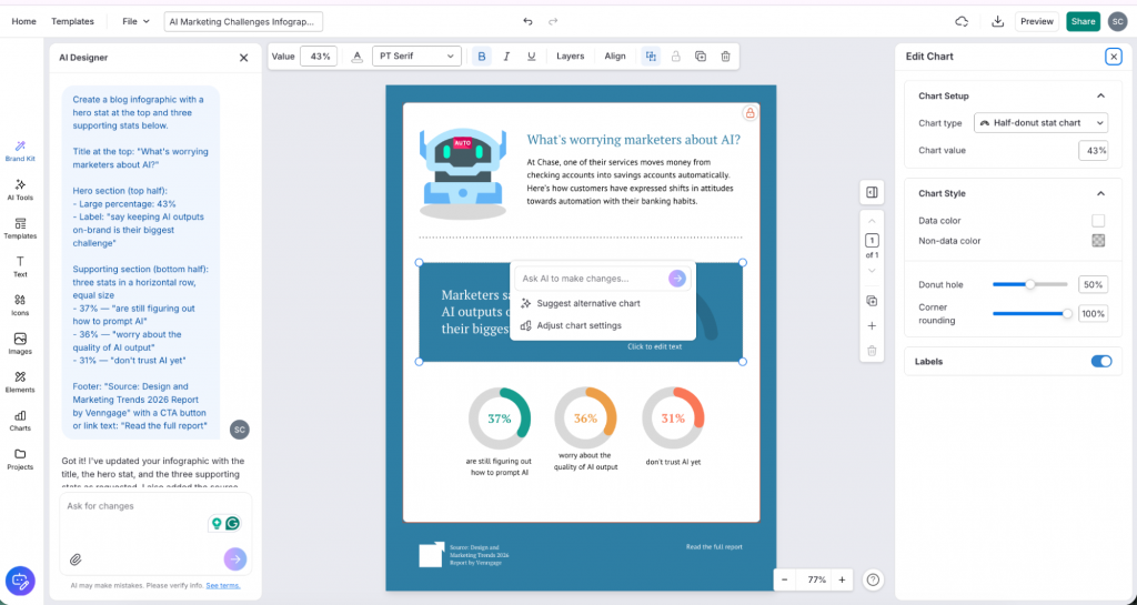
The first output needed some fixing. The AI placed the 43% stat in the wrong position. To be fair, that was on me. My prompt said top half, which it read as the hero number going inside the top section rather than leading above it. I moved the block manually and prompted the generator again.
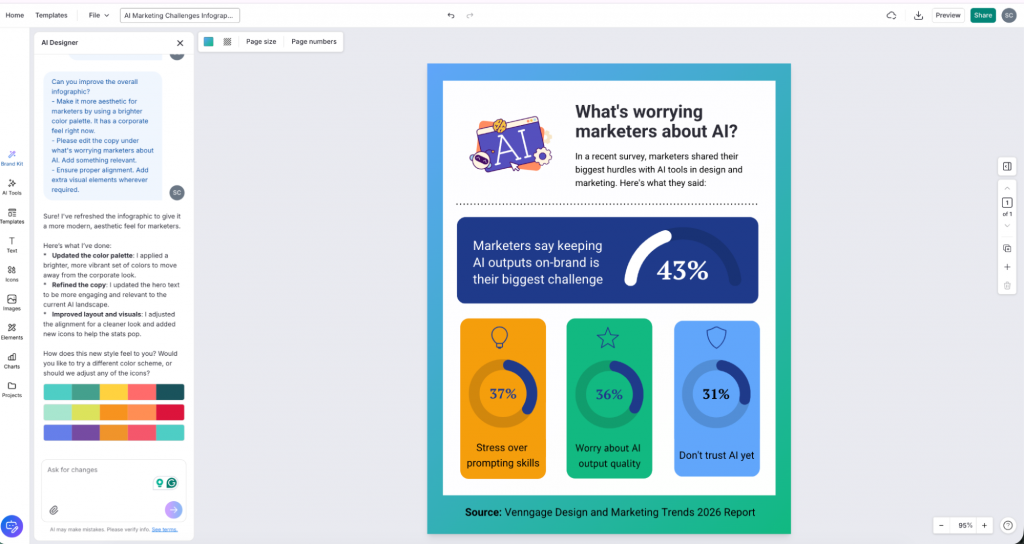
Once the layout was right, I edited the copy, alignment and overall feel. Here is the final infographic.
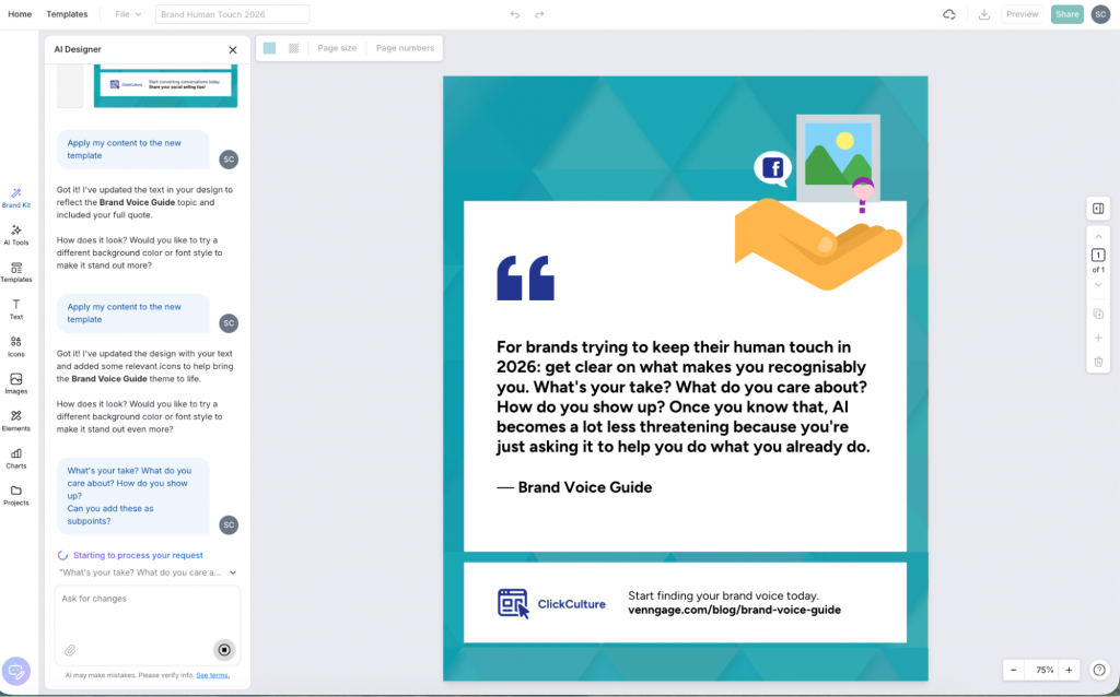
For LinkedIn, I generated a post with Sophie Miller’s quote. Here’s the prompt I used.
Create a square social media graphic (1080×1080) with a large text quote as the main element. The quote text reads:”For brands trying to keep their human touch in 2026: get clear on what makes you recognisably you. What’s your take? What do you care about? How do you show up? Once you know that, AI becomes a lot less threatening because you’re just asking it to help you do what you already do.”
For the newsletter design, I did not start with a format. I went to Claude first and asked it to suggest angles based on the report data. Out of everything it came back with, I went with one that felt immediately useful: 5 to drop. 1 to fix.
Five things marketers can stop doing in 2026 related to AI marketing, and the one thing they should actually focus on instead.
Since we use MailChimp for our email newsletters, I needed visuals that would work inside an email layout and support the insights.
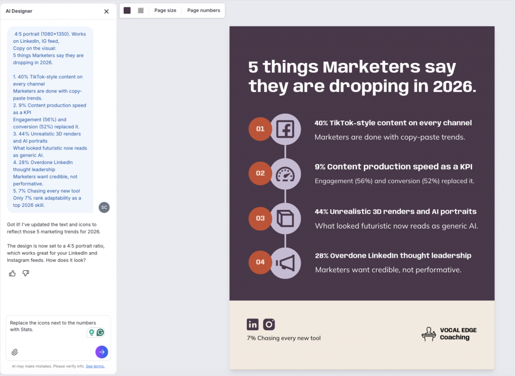
I created a list infographic for the five things to drop, each with the stat and a short reason why it is no longer worth the effort.
Infographic prompt:
4:5 portrait (1080×1350). Works on LinkedIn, IG feed,Copy on the visual:5 things Marketers say they are dropping in 2026.
1. 40% TikTok-style content on every channelMarketers are done with copy-paste trends.
2. 9% Content production speed as a KPIEngagement (56%) and conversion (52%) replaced it.
3. 44% Unrealistic 3D renders and AI portraitsWhat looked futuristic now reads as generic AI.
4. 28% Overdone LinkedIn thought leadershipMarketers want credible, not performative.
5. 7% Chasing every new tool. Only 7% rank adaptability as a top 2026 skill.
What the finished assets actually look like
After working through all the sections, I ended up with 10 assets in total: a mix of infographics, LinkedIn posts and quote cards.
The infographic
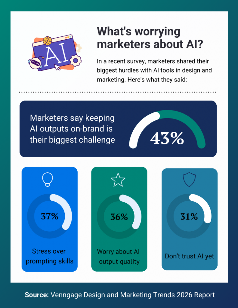
Note: I applied Venngage’s color palette to maintain brand consistency.
This is the one I spent the most time on because I went back and forth on the layout before settling on leading with the 43% as the hero stat. Once that was locked, the rest of the design came together quickly. The template did most of the structural work. I edited the copy, adjusted the alignment and it was done
The quote card
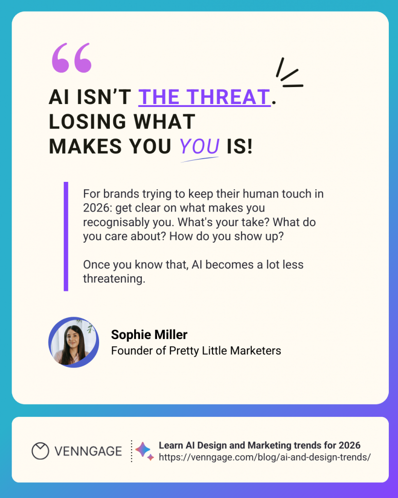
This one was faster. I kept the layout simple, so the main focus is on the quote. However. I added the icons, expert’s photo and some decorative elements to make the design better for social media.
Newsletter visual
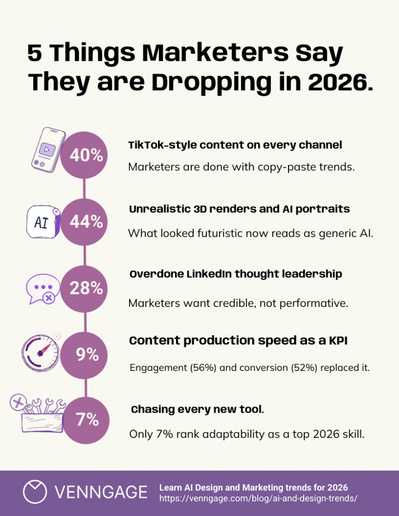
I changed the color palette and replaced the numbers in this infographic with icons to make it feel less like a data dump. Since the template originally had four points, I had to manually add the 7% statistic as the fifth point.
It took hardly two minutes, but something to keep in mind if you are working with a template that does not match your exact data count.
How long did the whole process actually take?
The Claude workflow took me around an hour for everything shown in Part One. That covers the project setup, uploading the report, extracting insights across all sections, shortlisting angles, verifying data and generating the prompts and copy.
I also spent additional time editing copy for LinkedIn and the email newsletter. That was another 30 to 45 minutes across all sections. AI gives you a strong first draft, but you still need to edit it thoroughly before it sounds like you.
On the Venngage side, starting from a template took me 10 to 15 minutes per design. When I let the AI generate the layout from scratch, it was closer to 15 to 20 minutes, mostly because I tried different layouts a couple of times before committing to one.
What surprised me
Claude: I liked how well it followed layered instructions. I gave it a lot of context upfront and it held that context consistently across the extraction, the angle suggestions and the copy. I expected to do more correcting than I did.
Venngage: As someone with no design skills, I liked how much it removed the designer block that usually slows me down. I have always known what I wanted a design to look like, but could never execute it without going back and forth with a designer.
Having a template as a starting point and a chatbot to make specific edits meant helped me move through designs quickly without getting stuck.
What still needs human judgment
Here are a few things you need to keep in mind:
- Picking the right content angle is entirely a human call: Claude surfaces a lot of options, but it does not know your audience well enough to know which insight will be the most relevant.
- Verifying data is non-negotiable. Claude pulled numbers accurately in most cases, but a couple of data points needed checking against the original report before I would use them. One came back slightly out of context. Catching that before it goes into a published post matters.
- Editing copy for tone is still on you. Claude writes clearly, but it does not sound like you. The LinkedIn posts in particular needed a rewrite pass before they sounded like something a real person would say.
- Simplifying prompts for design tools. Claude generated solid Venngage prompts, but some were too detailed for the AI to execute cleanly. I had to strip them back before they worked the way I wanted.
- Data flow: Data accuracy is on you, too. In the checklist infographic, the data points came out arranged haphazardly. They were not ordered from highest to lowest, which made the visual harder to read. I fixed it manually.
What I would do differently
I would verify the data before generating any copy. I did it the other way around and ended up revising a few things once I had already built prompts on top of them. Locking the facts first would have saved time.
I would also simplify my Venngage prompts from the start, instead of editing them mid-design. The more specific and minimal the instruction, the better the output. Long prompts with multiple conditions tend to get partially applied.
What this means for marketers sitting on unused content
Most marketing teams produce long-form content that gets one moment of attention and then sits untouched. A report goes live, gets shared in the newsletter, maybe picked up by a few people on LinkedIn, and then disappears into a shared drive. The research, the expert quotes, the data that took weeks to collect, none of it gets used again.
The workflow I documented here is not a magic fix and I am not going to pretend it is. You still have to make editorial decisions, check your facts and edit your copy. AI does not remove the thinking. What it does is remove the friction that usually stops the thinking from becoming anything.
The blank page problem goes away. The brief writes itself. The design gets you to something usable in under 20 minutes. For a content team that is already stretched, those are not small things.
If you have a report, a research piece or a long guide sitting unused right now, this is a practical way to get more from what you already have. You do not need a designer, a dedicated copywriter, or a full day blocked out.