

TL;DR
- Good AI design starts with specific prompts, not vague instructions. The more clearly you define what the design needs to accomplish, the less AI has to guess.
- Effective prompts define the purpose, format, style, brand cues, and constraints. These details give AI clearer direction and help avoid generic-looking results.
- Different design jobs call for different approaches. Data-rich infographics, social graphics, and presentation decks each need different instructions for structure, hierarchy, and visual storytelling.
- AI-generated designs still need human direction. Review the output, check facts and data, and refine the design rather than treating the first result as final.
- The Generate → Refine → Remix approach helps improve AI designs. Start with a strong first prompt, adjust one variable at a time, then reuse what works for future designs.
If your AI design process looks like prompt, generate, dislike, regenerate, the problem may not be the tool. You may just need to give it better direction.
A vague prompt can produce a decent first draft, but it also leaves the AI to make decisions about the layout, visual style, hierarchy and overall look. That’s when you end up regenerating the same idea in slightly different versions instead of getting closer to what you actually want.
In this article, I’ll share 15 graphic design AI prompts for social posts, infographics and presentations, plus a simple framework you can use to write better prompts for your own designs.
What is a graphic design AI prompt?
A graphic design AI prompt is a written instruction that tells an AI design tool what visual asset to create, how it should look, what it should include and what it should avoid. You can specify the format, audience, layout, colors, typography, content and brand style in the same prompt.
But a graphic design prompt differs from an AI art prompt. While an art prompt mainly describes an image, such as a subject, setting, style or composition, a graphic design prompt describes a functional asset, such as an infographic, social post or presentation, with instructions for text, hierarchy, layout and brand context.
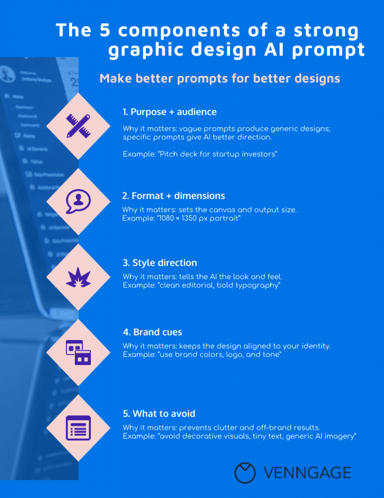
The 5 components of a strong graphic design AI prompt
Graphic design AI follows the classic GIGO rule: garbage in, garbage out. Give it a vague prompt and you’ll likely get a generic design. Give it specific direction and you’ll give it a much better starting point.
Here are the five things to include if you want a better starting point.
1. Purpose and audience
Always start with the job your design needs to do and the person it’s aimed at.
For instance, “Create an infographic about remote work” leaves a lot to the imagination. But “Create a one-page infographic for HR leaders that summarizes five remote-work trends for an internal leadership meeting” gives the AI a clear purpose and audience.
Defining your audience also affects the visual choices. Instagram graphics aimed at college goers need a wildly different approach from sales decks designed for CFOs.
2. Format and dimensions
Tell the AI exactly what you’re making and the channel or medium people will see it. Specify the type of asset, orientation, dimensions and platform when relevant.
For example: “Create a 1080 x 1350 px LinkedIn post” or “Create a 16:9 presentation for a 30-minute sales pitch.” This prevents the AI from making a design that needs a complete redesign before you can use it.
3. Style direction
AI doesn’t know what you mean by “modern,” or it can misinterpret it broadly. Give it specifics like cream backgrounds, serif headings, bold numbers and generous white space and you’ve given it something it can actually design from.
4. Brand cues
Your prompt should tell the AI what makes the design feel like your brand. Include your brand colors, fonts, logo treatment, imagery style, tone and recurring visual elements. You can even mention what to avoid.
Strong brand cues also help your designs feel distinctive instead of blending into the wider wave of AI slop in design.
5. What to avoid
“Constraints breed creativity” applies to AI design prompts, too. Think of it as giving the AI guardrails, not just directions. Along with what you want, mention what to leave out, whether that’s stock-photo clichés, gradients, decorative icons, tiny text or too many colors.
You can also define content rules, like avoiding jargon or statistics. If something would make the design feel wrong for your brand, say so in the prompt.
Here’s a simple template prompt that brings all five elements together. Try it the next time you ask an AI to design something:
[Asset type] for [audience] about [topic]. Format: [dimensions]. Style: [style]. Brand: [brand cues]. Avoid: [avoid list].
What this looks like in practice?
I tested this with Venngage’s AI Infographic Generator using two versions of the same idea: one vague prompt, another one much more specific. Here’s how differently they turned out:
The first prompt was simple:
Create an infographic about burnout at work.
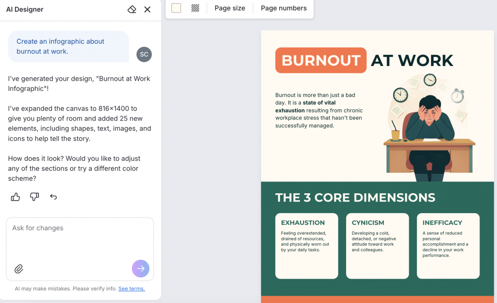
The result was good, but broad. Venngage AI created a general explainer with a definition of burnout and its three core dimensions.
Then I gave it a more specific prompt:
Create a one-page infographic on Burnout at Work: 5 Warning Signs to Watch For, aimed at employees, managers and HR teams. The purpose is to help people recognize burnout early and understand what they can do before it gets worse. Cover constant exhaustion, loss of motivation, irritability and detachment, declining focus and performance, and physical stress signals. Use a clean professional layout with strong numbering, a central workplace illustration, soft blue and peach shapes and clear visual separation between each warning sign. Keep the copy concise and easy to scan.
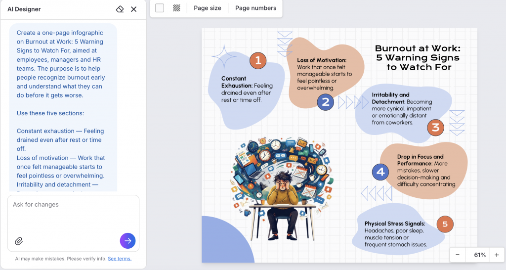
This time, the design followed a much clearer structure. It focused on the five warning signs I wanted, used strong numbering to guide the reader and created a more intentional visual hierarchy around the content.
Which AI tool is right for each design job?
A good prompt can only take you so far. The right tool matters, too: some are built for editable designs, while others are better for images or content.
Here’s which tool to use for each type of design prompt:
5 AI prompts for infographics
Like we always say at Venngage, a good infographic does more than just look nice. So when prompting AI, tell it how to handle the data density, visual hierarchy, icons and chart types, not just what the infographic should be about.
Here are a few examples:
1. Data storytelling infographic
Prompt:
Create a [vertical/landscape] data storytelling infographic for [audience] based on the following [survey/report/research]: [paste source content or key findings].Purpose: Help [audience] understand the three to five most important findings and the main takeaway.
Structure: A strong headline that summarizes the central finding A short introduction explaining the context Three to five key statistics, with the most important statistic receiving the strongest visual emphasis A supporting chart for each major data point where appropriate A short takeaway or conclusion
Use [bar charts/line charts/donut charts/pictograms] based on the type of data being presented. Use simple icons to support the content without distracting from the numbers.
Format: [dimensions].
Style: [editorial/corporate/minimalist/bold].
Brand: [brand colors, fonts, logo treatment].
Use clear visual hierarchy, short text blocks, generous spacing and high-contrast text.
Avoid: decorative charts, unnecessary statistics, tiny text, 3D charts, visual clutter and invented data.
Best for: Turning survey results, annual reports, research or campaign data into a visual summary.
What you’ll get: A structured infographic that leads with the key finding and supports it with relevant stats. AI may suggest chart types, but review them to ensure they accurately show the data.
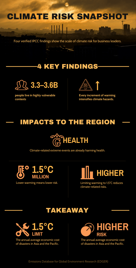
Tweak it: You can also tell AI which finding matters most so it gives that statistic the strongest visual emphasis.
2. Myth vs reality infographic
Prompt:
Create a myth vs reality infographic about [topic] for [audience].Create [5] concise myth-and-reality pairs using only the verified information below: [insert claims, statistics or source content].
Structure: MYTH: [short claim] REALITY: [clear correction] EVIDENCE: [one supporting fact or statistic]
Make MYTH and REALITY visually distinct within one consistent design system. Lead with the strongest myth and use a simple vertical flow for quick scanning.
Format: [dimensions].
Style: [modern/editorial/bold/minimal].
Brand: [colors, fonts, logo treatment].
Use large headings, short copy, simple supporting visuals, strong contrast and generous spacing. Keep the infographic concise and image-led rather than text-heavy.
Avoid: exaggerated claims, invented statistics, fear-based imagery, decorative visuals, dense paragraphs and unsupported conclusions.
Best for: Debunking misconceptions about your industry, product category, process or research topic.
What you’ll get: A repeatable visual pattern for every myth and its correction. That makes the infographic easy to scan and gives each claim enough space to make its point.
Here’s a cybersecurity example built from the prompt below.
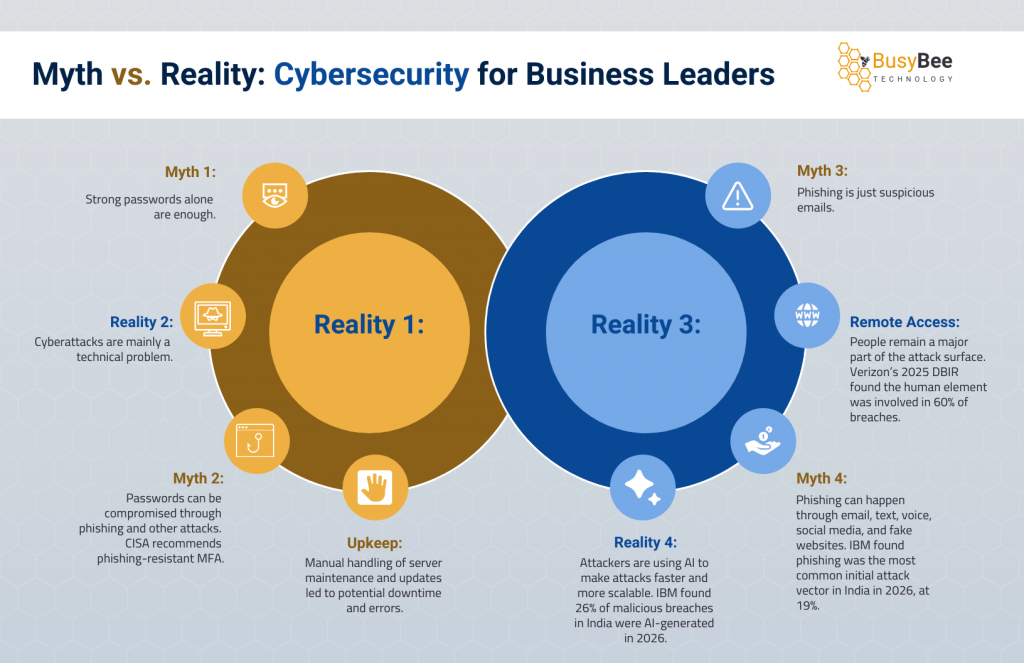
Tweak it: Replace “Reality” with “What the data says” for a more research-led tone.
3. Anatomy-of infographic
Prompt:
Create an anatomy-of infographic explaining [object/system/concept] for [audience].Show the complete subject as the central visual, with [5-8] key parts clearly labeled.
Structure: A strong title and one-line introduction A large central visual Short labels with precise callout lines pointing to each part A one-sentence takeaway
Keep the central subject dominant and labels short. Use clear visual hierarchy, balanced spacing and accurate proportions so the diagram is easy to understand at a glance.
Format: [dimensions].
Style: [technical/editorial/illustrated/minimal].
Brand: [colors, fonts, logo treatment].
Avoid: overlapping callouts, inaccurate labels, tiny text, unnecessary decoration and visual clutter.
Best for: Explaining products, processes, systems, concepts, tools or physical objects.
What you’ll get: An infographic around one dominant visual instead of dividing the page into unrelated content blocks.
I used the prompt in Venngage AI to create an Earth anatomy infographic and it did a great job of grounding the findings in real research.
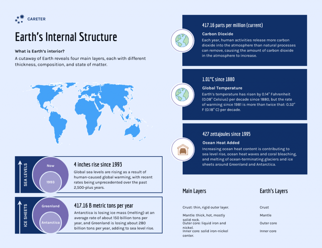
Tweak it: Ask for numbered callouts instead of text labels if you need a cleaner, more editorial layout.
4. Decision tree or flowchart infographic
Prompt:
Create a decision tree infographic that helps [audience] decide [decision/problem].Start with: [insert starting question].
Decision path: Question 1: [question] → YES: [next step] / NO: [next step] Question 2: [question] → YES: [next step] / NO: [next step] Question 3: [question] → YES: [outcome] / NO: [outcome]
Use a clear top-to-bottom flow with arrows, distinct decision nodes and clear endpoint shapes. Keep questions and outcomes short so the logic is easy to follow at a glance.
Format: [dimensions].
Style: [clean/corporate/editorial].
Brand: [colors, fonts, logo treatment].
Avoid: crossing lines, dead ends, ambiguous arrows, excessive text, decorative elements and more than [X] decision points.
Best for: Helping readers choose a product, process, strategy, service or next step.
What you’ll get: A visual path instead of a list of instructions. The important part is the logic in the prompt. AI can format the decision tree, but you still need to give it accurate questions, branches and outcomes.
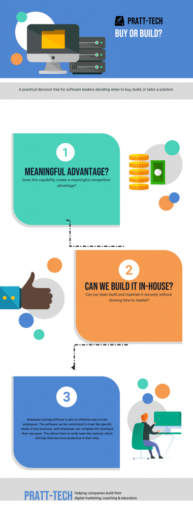
Tweak it: As a best practice, keep the number of decision points low so the flowchart stays easy to follow and doesn’t become a maze.
5. Before-and-after or transformation infographic
Prompt:
Create a before-and-after transformation infographic about [topic] for [audience].BEFORE: [starting state]
Key issues: * [issue 1] * [issue 2] * [issue 3]
AFTER: [improved state]
Key improvements: * [improvement 1] * [improvement 2] * [improvement 3]
Structure: A strong headline describing the transformation A clear BEFORE section A central transition element A clear AFTER section A short takeaway explaining what changed
Use a side-by-side or split layout so the contrast is immediately obvious. Connect each improvement to the corresponding problem with simple arrows or numbered markers.
Format: [dimensions].
Style: [modern/editorial/minimal/bold].
Brand: [colors, fonts, logo treatment].
Keep copy short, visuals prominent and both sides equally weighted. Avoid exaggerated results, invented metrics, misleading comparisons, excessive decoration and vague labels.
I used the prompt to create a daily-running before-and-after infographic highlighting its key benefits.
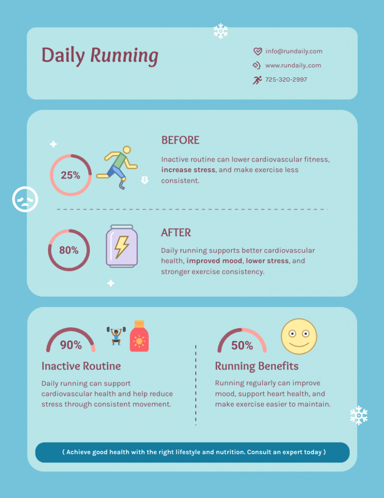
Tweak it: Specify exactly what should change between the “before” and “after” so AI can make the contrast clear, not just visually different.
1. LinkedIn thought-leadership carousel
Prompt:
Create a [6-8]-slide LinkedIn thought-leadership carousel for [target audience] about [topic].Core argument: [insert your main point or opinion].
Structure: Slide 1: A strong hook challenging a common assumption Slide 2: The problem or misconception Slide 3: The key insight Slide 4: Supporting evidence: [statistic/example/data point] Slide 5: What this means for [audience] Slide 6: [3] practical takeaways Final slide: A concise takeaway and CTA: [CTA]
Use one main idea per slide. Keep headlines short, bold and easy to read on mobile. Use large type, strong hierarchy, generous spacing and simple supporting visuals.
Format: 1080 × 1350 px, portrait LinkedIn carousel.
Style: [editorial/bold/minimal/corporate].
Brand: [brand colors, fonts, logo treatment].
Tone: [authoritative/conversational/contrarian/educational].
Avoid: dense paragraphs, generic stock imagery, tiny text, irrelevant decoration and more than [X] words per slide.
Best for: Sharing an opinion, framework, lesson or industry insight that needs more room than a single social graphic.
What you’ll get: A narrative to build around instead of asking it to fill eight slides with disconnected tips. Each slide gets one job, which makes the carousel easier to scan on a phone.
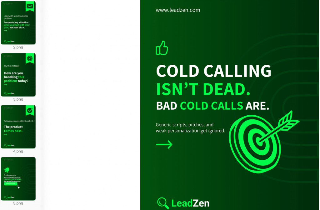
Tweak it: Replace the generic hook with a contrarian statement so that it gives your audience something to debate in the comments.
2. Instagram or LinkedIn stat card series
Prompt:
Create a [5]-card social media series for [Instagram/LinkedIn] about [topic].Statistics: 1. [statistic + source] 2. [statistic + source] 3. [statistic + source] 4. [statistic + source] 5. [statistic + source]
For each card: Make the statistic the largest element Add a short headline explaining why it matters Add one brief supporting sentence Show the source in small but readable text Use one simple icon, illustration or chart
Keep all cards visually consistent and give the most important statistic the strongest treatment.
Format: [1080 × 1350 px / other platform dimensions].
Style: [bold/editorial/minimal].
Brand: [brand colors, fonts, logo treatment].
Avoid: invented statistics, distorted charts, unnecessary decimals, unreadable sources, stock-photo clichés and cluttered backgrounds.
Best for: Turning research, survey findings or industry statistics into a series people can quickly scan and share.
What you’ll get: A series of cards that feels like one campaign instead of five unrelated graphics. The prompt also tells AI to give the number visual priority, which matters when the statistic is the reason someone stopped scrolling.
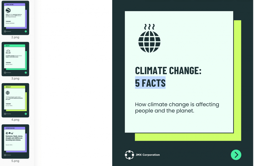
Tweak it: Add the source URL for every statistic directly in the prompt so you can verify the claims before publishing.
3. Product launch or feature announcement graphic
Prompt:
Create a social media graphic announcing [product/feature] for [target audience].Main announcement: [what is launching]
Customer problem: [problem this solves]
Key benefit: [primary benefit]
Supporting benefits: * [benefit 1] * [benefit 2] * [benefit 3]
Structure: Headline: [short announcement] Supporting copy: [one sentence] Hero visual: [product screenshot/product illustration/feature visualization] Benefit highlights: [2-3 short points] CTA: [Try it / Learn more / Sign up / Book a demo]
Make the announcement immediately clear at a glance. Lead with the customer outcome and make the product visual the main supporting element.
Format: [1080 × 1350 px / 1200 × 628 px / platform-specific dimensions].
Style: [brand style].
Brand: [colors, fonts, logo treatment, imagery style].
Avoid: excessive feature lists, vague claims, oversized logos, fake UI elements, dense copy and generic “Introducing…” headlines.
Best for: Announcing a new product, feature, integration, template collection or major update.
What you’ll get: A graphic that leads with the announcement and customer benefit, with the product visual making the message easier to understand.
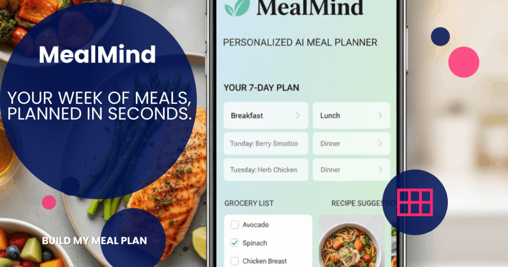
Tweak it: Lead with the customer outcome, not the product or feature name.
4. Customer story or testimonial graphic
Prompt:
Create a social media testimonial graphic featuring [customer name/company] and their experience with [product/service].Customer quote: “[insert exact approved quote]”
Context: * Customer: [name/company] * Role: [job title] * Challenge: [problem] * Solution: [how they used the product] * Result: [verified result or metric]
Structure: Lead with the strongest part of the quote Highlight one verified result or outcome Show the customer’s name, role and company Add a subtle product or brand reference End with CTA: [CTA]
Make the customer’s words the visual focus. Use large quotation text, clear hierarchy and a subtle supporting image or customer photo.
Format: 1080 × 1350 px.
Style: [editorial/trustworthy/minimal].
Brand: [colors, fonts, logo treatment].
Avoid: rewriting the quote, invented results, exaggerated claims, excessive product promotion, generic praise and dense text.
Best for: Turning customer feedback, case-study results or approved testimonials into social proof.
What you’ll get: A graphic that puts the customer’s experience first and clearly separates verified results from marketing claims.
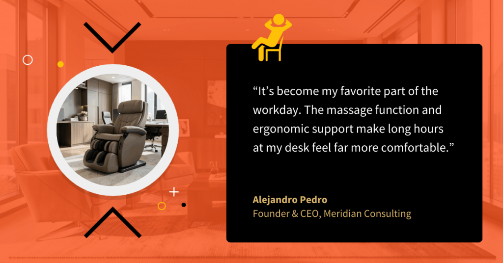
Tweak it: Ask AI to create three versions using different sections of the same approved quote, then choose the strongest one.
5. Webinar or event promo graphic
Prompt:
Create a social media event promotion graphic for [webinar/event name].Event details: * Topic: [topic] * Date: [date] * Time: [time + timezone] * Speakers: [names and roles] * Audience: [target audience] * Key takeaway: [what attendees will learn] * CTA: [Register now / Save your seat / Join us]
Structure: Headline focused on the attendee’s benefit Date and time Speaker names and roles [2-3] short takeaways One clear CTA
Make the event, date, time and benefit immediately clear at mobile size. Use speaker photos only if provided and create a strong visual hierarchy.
Format: [1080 × 1350 px / platform-specific dimensions].
Style: [professional/editorial/bold].
Brand: [brand colors, fonts, logo treatment].
Avoid: oversized speaker bios, excessive details, tiny text, generic calendar imagery, competing headlines and more than one primary CTA.
Best for: Promoting webinars, workshops, conferences, AMAs, product demos and other events.
What you’ll get: A mobile-friendly graphic that puts the event details people need to register front and center.
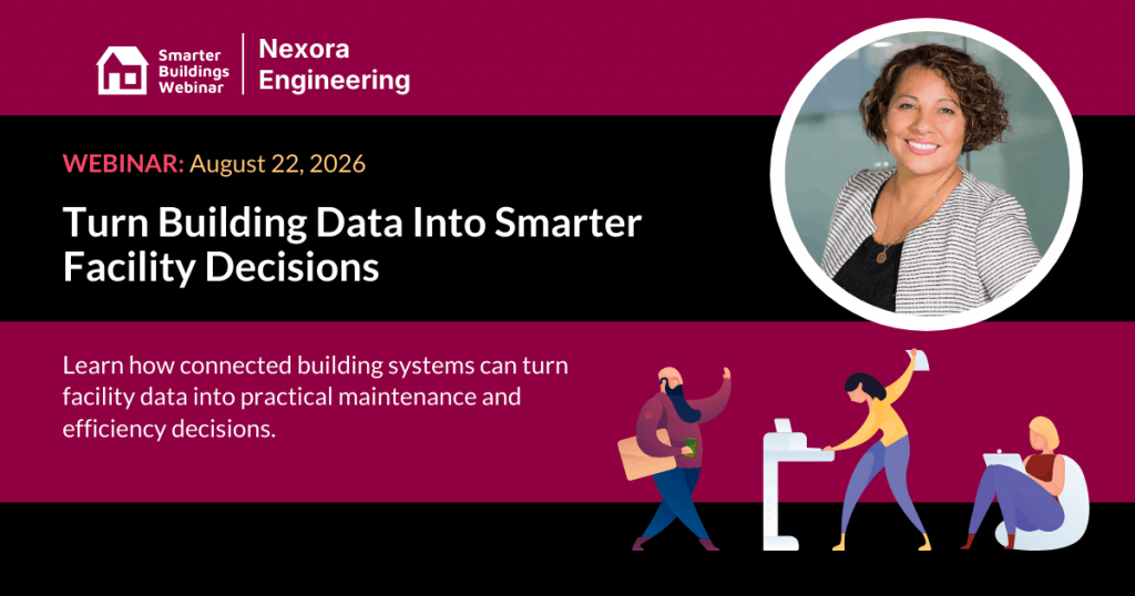
Tweak it: Lead with the audience’s desired outcome, not the event name. Example: “Build a workout routine you’ll actually stick to.”
5 AI prompts for presentations
1. Sales pitch deck
Prompt:
Create a [10-12]-slide sales presentation for [target company/audience] about [product/service].Primary goal: [book a demo/close a deal/start a pilot/etc.]
Audience: [job titles and industry]
Customer problem: [specific problem]
Solution: [how your product/service solves it]
Key benefits: [benefit 1] [benefit 2] [benefit 3]
Supporting proof: – [customer result/case study] – [statistic] – [testimonial] – [other evidence]
Structure: A title and compelling customer-focused hook The problem and its business impact Why the problem matters now The proposed solution How the solution works Key benefits or differentiators Proof or customer results A relevant use case Pricing or commercial model Implementation or next steps Objection handling or FAQ A clear CTA
Create a logical narrative from problem to solution to proof to action. Give each slide one main idea.
Format: 16:9 widescreen.
Style: [professional/editorial/bold/minimal].
Brand: [brand colors, fonts, logo treatment, imagery style].
Avoid: feature dumps, dense paragraphs, generic stock photography, unsupported claims, competing headlines and repeating the same message across multiple slides.
Best for: Product demos, sales meetings, proposals and business development presentations.
What you’ll get: The prompt gives AI the ingredients for a sales argument instead of asking it to create a collection of product slides. The sequence moves from the buyer’s problem to your solution and then to evidence, which gives the deck a reason to keep moving.
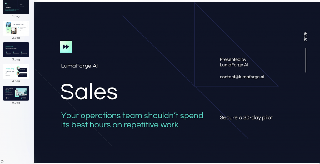
Tweak it: Add the three objections you hear most often from prospects and ask AI to address each one in the deck.
2. Webinar or workshop deck
Prompt:
Create a [30/45/60]-minute webinar or workshop presentation for [audience] about [topic].Learning objective: By the end of the session, attendees should be able to [specific outcome].
Audience knowledge level: [beginner/intermediate/advanced].
Structure: A title slide with a clear promise What attendees will learn Why the topic matters The current problem or common misconception Key concept #1 An example or case study Key concept #2 An interactive exercise or discussion Key concept #3 A practical framework or process An action checklist A summary and Q&A
Keep one core teaching point per slide. Use diagrams, examples, charts and short text blocks where they improve understanding.
Format: 16:9 widescreen.
Style: [educational/editorial/professional].
Brand: [brand colors, fonts, logo treatment].
Avoid: text-heavy slides, unexplained jargon, excessive animations, decorative visuals, more than [X] ideas per slide and slides that simply repeat the speaker’s script.
Best for: Webinars, workshops, training sessions, masterclasses and educational presentations.
What you’ll get: The deck should follow the rhythm of a real session: introduce the problem, teach the concepts, give people a chance to apply them, then leave them with something practical. That makes the slides useful during the presentation without forcing you to read them word for word.
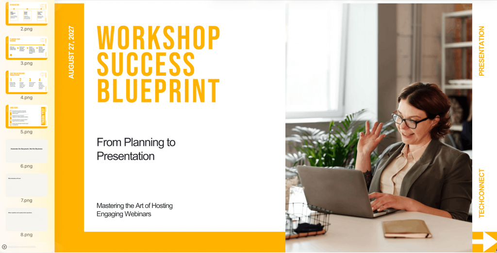
Tweak it: Add the questions you expect attendees to ask and turn the strongest ones into dedicated slides.
3. Investor or fundraising pitch deck
Prompt:
Create a [10-12]-slide investor pitch deck for [company] seeking [funding amount] to [business goal].Company: [company description]
Target market: [market]
Customer problem: [problem]
Solution: [product/service]
Business model: [how the company makes money]
Traction: * [revenue/customer/user metric] * [growth metric] * [other verified result]
Competitive position: [key differentiator]
Go-to-market strategy: [strategy]
Financial highlights: [verified figures]
Funding use: [how the funding will be used]
Team: [founders/key team members]
Structure: Company and opportunity Problem Solution Market opportunity Product or how it works Business model Traction Go-to-market strategy Competitive landscape Team Financial outlook Funding ask and use of funds
Make the strongest evidence visually prominent. Use charts for financial and growth data. Keep assumptions and projections clearly labeled.
Format: 16:9 widescreen.
Style: [confident/editorial/minimal].
Brand: [brand colors, fonts, logo treatment].
Avoid: inflated claims, unsupported market figures, decorative charts, excessive text, vague competitive claims and invented financial data.
Best for: Fundraising meetings, investor updates, accelerator presentations and pitch competitions.
What you’ll get: You’ll get a deck structured around the information an investor needs to evaluate the opportunity. The prompt also separates verified traction from projections, so the design has less room to blur evidence with assumptions.
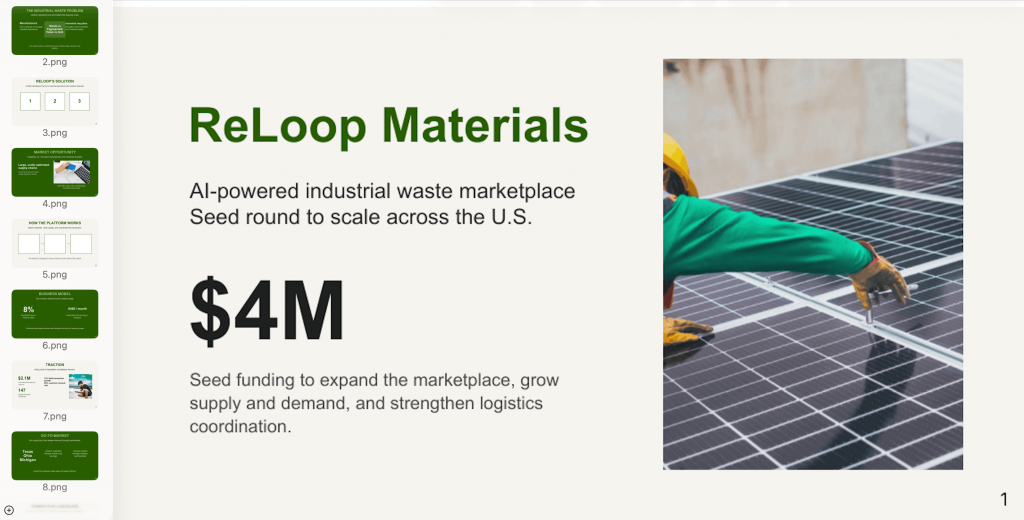
Tweak it: Add your actual revenue, customer or growth figures to the prompt instead of asking AI to generate placeholder metrics.
4. Report-to-deck conversion
Prompt:
Convert the following [report/white paper/survey/annual report] into a [10-15]-slide presentation for [audience].Source content: [paste report content or provide source document]
Presentation goal: [inform leadership/summarize findings/recommend an action/etc.]
Prioritize: * [key finding 1] * [key finding 2] * [key finding 3] * [key recommendation]
Structure: Title and report context Executive summary Key finding #1 Supporting evidence Key finding #2 Supporting evidence Key finding #3 Trend or comparison Key implications Recommendations Action plan Final takeaway
Turn long passages into concise slide headlines and supporting points. Convert suitable data into charts or diagrams. Preserve the meaning and figures from the source.
Format: 16:9 widescreen.
Style: [editorial/corporate/data-led].
Brand: [brand colors, fonts, logo treatment].
Avoid: copying paragraphs from the report, adding unsupported conclusions, inventing statistics, using a chart when a simple number would work and overcrowding slides with source material.
Best for: Turning research reports, annual reports, survey results and long-form documents into presentation decks.
What you’ll get: The result should feel like a presentation of the report rather than a PDF pasted onto slides. The prompt also tells AI to preserve the source data, which is important when the deck will inform business decisions.
Tweak it: Tell AI which three findings matter most to your audience before generating the deck. This gives it a clearer editorial hierarchy.
5. Internal all-hands or QBR deck
Prompt:
Create a [10-15]-slide internal [all-hands/QBR] presentation for [company/team] covering [quarter/time period].Audience: [employees/executives/department leaders]
Primary goal: [share company performance/align teams/review the quarter/etc.]
Key information: * Business performance: [metrics] * Major wins: [wins] * Challenges: [challenges] * Key projects: [projects + status] * Customer highlights: [examples] * Risks: [risks] * Priorities for next period: [priorities] * Decisions needed: [decisions]
Structure: Opening and period overview Executive summary Performance highlights Key metrics Major wins Customer or project highlights What didn’t go as planned Key risks or blockers Lessons learned Next-period priorities Team or department actions Decisions and next steps
Use charts and concise metric cards for performance data. Use consistent status indicators for projects. Make risks, priorities and decisions visually distinct.
Format: 16:9 widescreen.
Style: [professional/editorial/brand-led].
Brand: [brand colors, fonts, logo treatment].
Avoid: corporate clichés, excessive celebration of minor wins, dense tables, unexplained acronyms, decorative charts and burying important risks or decisions.
Best for: Quarterly business reviews, all-hands meetings, leadership updates and internal strategy presentations.
What you’ll get: The deck should make the quarter easier to scan and discuss. Performance, risks, priorities and decisions get distinct visual treatment, so your audience can quickly see what happened and what needs attention next.
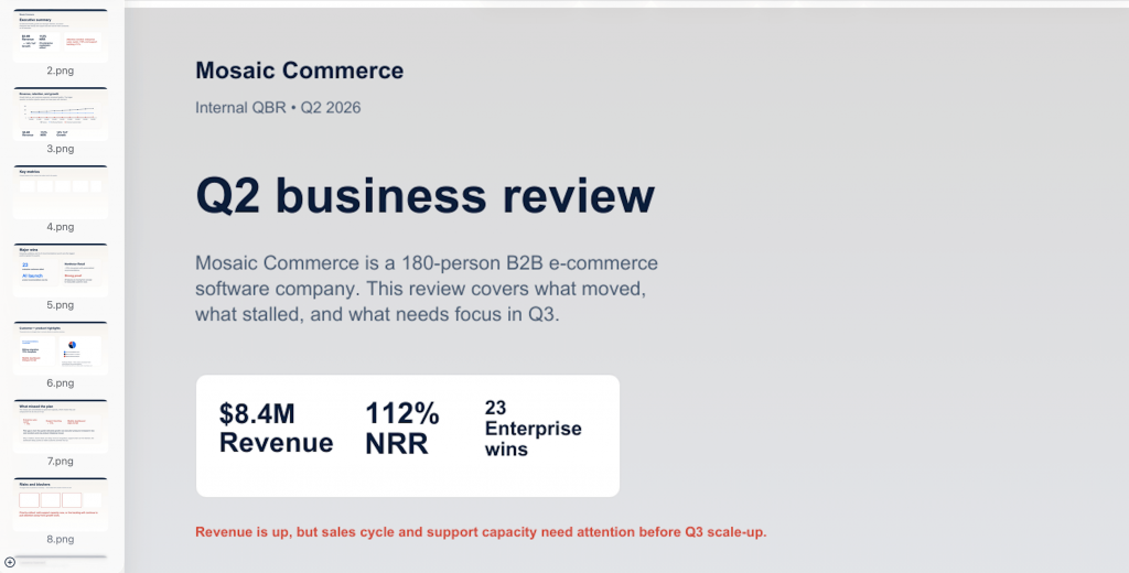
Tweak it: Tell AI what needs discussion or a decision, not just what happened.
Why your AI design prompts keep failing
Even strong prompts can fall flat. The backlash around AI slop in design is a good reminder that polished AI output isn’t necessarily good design.
Here are six areas to check before blaming the AI.
Fix: Replace broad adjectives with concrete visual instructions for color, typography, composition, imagery and spacing.
Too vague:
Make a clean and modern infographic about remote work.Better:
Use a white background, dark navy headings, bold sans-serif typography, simple line icons, generous spacing and a two-column editorial layout.2. Missing dimensions can lead to the wrong format
Fix: Specify the exact dimensions or orientation and the platform when relevant.
Too vague:
Create an Instagram post about our new product.Better:
Create a 1080 × 1350 px portrait Instagram post about our new product.3. AI image generators struggle with text-heavy designs
Fix: Use image generators for standalone visuals, then use a design tool for assets that depend on accurate text, charts, layouts or editable elements.
Too vague:
Create a professional event flyer for our upcoming webinar.Better:
Create a photorealistic image of a speaker presenting on stage, with a diverse audience in the foreground. Leave clear space at the top for a headline and at the bottom for event details.4. Missing brand cues produce inconsistent designs
Fix: Give the AI your brand colors, fonts, logo treatment, imagery style and other recognizable visual cues to maintain brand consistency.
Too vague:
Create a professional LinkedIn carousel for our company.Better:
Use our navy and coral brand colors, bold sans-serif headings, candid photography, rounded cards and a small logo in the bottom-right corner.5. Missing negative prompts add unwanted elements
Fix: Tell the AI what to leave out, especially elements you know tend to make the design look generic or cluttered.
Too vague:
Create a bold presentation about AI trends.Better:
Avoid gradients, 3D icons, stock-photo clichés, decorative shapes, dense paragraphs and tiny text.6. Describing the solution can solve the wrong problem
Fix: Explain what the audience needs to understand or do, then describe the asset that should help them do it.
Problem-focused:
Create a bold presentation about AI trends.Solution-focused:
Create a 10-slide presentation for marketing leaders that explains three ways AI is changing content workflows and ends with five practical steps teams can take.How to iterate on an AI design prompt
Good AI design rarely comes out perfect on the first try. Instead of rewriting the whole prompt every time, use a simple Generate > Refine > Remix loop. Here’s how:
1. Generate
Run your first prompt and treat the result as a starting point, not a final design. Aim for roughly 70% right. You’re only looking for the right direction, not perfection.
2. Refine
Once you have a workable direction, change one variable at a time. Tweak the style, color, layout, imagery or typography so you can see what each change actually improves.
3. Remix
When one version lands, don’t start from scratch for the next asset. Reuse the prompt and adapt the topic, format or content while keeping the visual system consistent across the series.
FAQs
1. What is the best AI tool for graphic design prompts?
The best tool depends on what you’re creating. For AI prompts for graphic design, look for a tool that gives you control over layout, branding, text and visual style, not just image generation.
2. How do you write a good AI design prompt?
Start with the purpose, audience, asset type, format, style and brand cues. Then add specific details about layout, typography, colors, imagery and anything the AI should avoid.
3. Can AI generate infographics from a text prompt?
Yes. Some AI design tools can turn a copy brief into infographic layouts, charts, icons and supporting visuals. For text-heavy designs, review the output carefully and use a design tool to polish text, data and layout.
4. Why do AI-generated designs look generic?
Vague prompts leave too many design decisions to the AI. Specific instructions about your audience, visual style, brand cues, layout and constraints give it less room to default to generic choices.
5. Can I use AI-generated graphics commercially?
It depends on the AI tool and its terms. Some tools allow commercial use under specific conditions, so check the tool’s current licensing terms before using an AI-generated graphic commercially.
6. What is the difference between prompts for ChatGPT and prompts for image generators?
ChatGPT can handle broader design briefs, strategy, copy and iterative feedback. Image generators are primarily optimized for creating visual imagery, while design-oriented AI tools are generally better suited to structured layouts, editable text and multi-element assets.
Start with a better prompt, then keep editing
A more specific prompt gives you a better first draft because the AI has clearer direction on the audience, format, content and visual style.
But you don’t need to squeeze every possible instruction into that first prompt. Generate the design, see what works and then refine the parts that don’t. Change the layout, make the hierarchy stronger, simplify the copy or push the visual direction further.
With Venngage, you can keep working on the same design instead of starting from scratch every time. Generate your first draft and then use the AI Designer to ask for changes until the design feels right.