


![A Total Guide to Accessible Colors [Including Palettes & Templates]](https://venngage-wordpress.s3.amazonaws.com/uploads/2022/11/BLOG-HEADER-Guide-to-Accessible-Colors.png)
Color is important. Like, really important. So important, that 93% of people report it being the number one factor influencing their purchasing decisions.
But remember: not everyone experiences color in the same way. With over 2.2 billion people affected by a visual impairment, failing to design with accessible colors in mind is one costly, exclusionary mistake to make.
So to help you appeal to your whole audience, I’ve done a deep dive into all aspects of accessible colors.
Keep reading for an infographic overview of what they are, why they matter and how you can easily create be-hue-tifully inclusive color pairings — along with tons of tips, examples and accessible templates too.
Click to jump ahead:
- Accessible colors 101 [infographic]
- What are accessible colors?
- Color accessibility guidelines
- How do you choose accessible colors?
- 10 Examples of accessible color palettes and templates
- Why are accessible colors important?
- 3 Types of color blindness
- 3 quick tips to improve color accessibility
- Accessible colors FAQ
Accessible colors 101 [Infographic]

What are accessible colors?
Accessible colors are color combinations that have enough contrast to make layered elements (such as text or icons on a background) clearly distinguishable to those visually impaired or deficient in color vision.
A key component of accessible design, accessible colors pay consideration to how people with disabilities understand information, in order to ensure all components of a page are accessible, legible and inclusive.
Wondering what makes a color accessible? For folks who are “colorblind”, the ability to differentiate certain hues depends on the color contrast ratio — or the degree of contrast between two layered objects (i.e. foreground and background colors).
Established by the World Wide Web Consortium (W3), these contrast ratios are laid out in the Web Content Accessibility Guidelines (WCAG) — a continuously-updated document that defines accessibility standards and provides instructions on how to make digital content accessible to people with sensory impairments.
I’ll discuss the specifics of those color contrast ratios in a moment. But first, let’s review the types of impairments that require accessible design choices.
Related: Image Alt Text: Definition and Best Practices for Accessible Designs
Color accessibility guidelines
The WCAG 2.1 provides clear recommendations on how to make content accessible for everyone, regardless of disability or device. They’re based on three levels of compliance — A, AA and AAA — that stem from the color contrast ratio of layered components.
A – Minimal accessibility
Color combinations with a contrast ratio below 4.5:1 for normal text (and 3:1 for large text and graphics) will cause difficulties for many people with disabilities and impairments.
AA – Strong accessibility
Color pairings with a contrast ratio of 4.5:1 and above provide sufficient accessibility for use in normal text, large text and graphics.
AAA – Enhanced accessibility
Color combinations with a contrast ratio of 7:1 for normal text and 4.5:1 for large text and graphics provide enhanced accessibility. Government sites typically follow these standards.
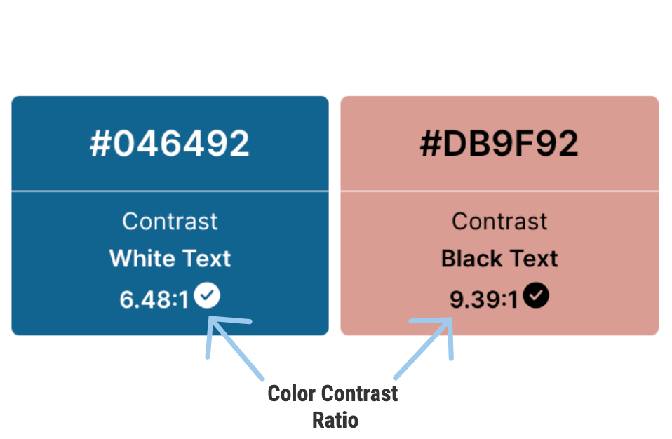
TLDR: a minimum color contrast ratio of 4.5:1 is best practice for text and interactive elements to meet the needs of colorblind or visually impaired users.
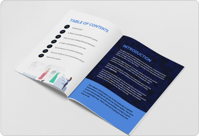
Here’s an example of an accessible infographic that follows a contrast ratio of 4.5:1.

FYI (yenno, because this blog doesn’t have enough abbreviations), you can customize this template, or any other accessible template, to suit your needs by swapping out the text components within.
WCAG exceptions
There are three exceptions to the 4.5:1 contrast requirement for text:
- Large text: for 18 pt text and larger, or 14 pt bold text and larger, a color contrast ratio of 3.1 is acceptable.
- Incidental text: text that’s inactive, decorative or unimportant to an image.
- Logotypes
Wondering if these guidelines are legally enforceable? The answer depends on where you live and who you work for. Check out the FAQ section for more information.
And if accessibility guidelines still sound confusing, you can always use an accessibility tool to check your designs and ensure their color contrast and design compliance.
How do you choose accessible colors?
In a typical design process, you’d choose a color palette, put together a visual and then manually check it for accessibility using a contrast checker or color blindness simulator.
This means you have to mix, match, test and retest, until you’ve found something that works.
Translation: there’s a ton of trial, error and time involved… so save yourself extra time and effort by flipping this process around!
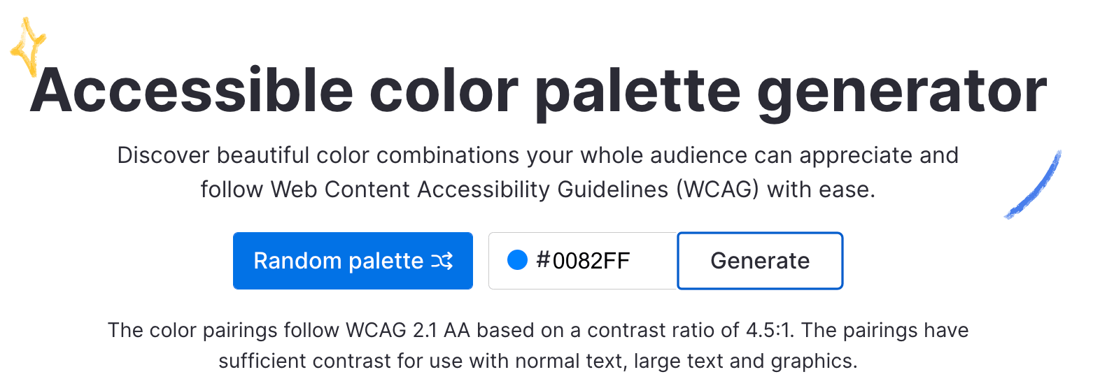
With Venngage’s 100% free Accessible Color Palette Generator, you can generate a range of beautiful, WCAG-compliant color palettes in one of two ways — no design experience or accessibility knowledge required.
Here’s how it works:
1. Generate an accessible color palette based on a predetermined color
Have a color in mind (such as a brand color?). All you need to do is input your predetermined HEX color code in the box at the top of the page, and the Accessible Color Palette Generator will do the work for you.
I’ll use Venngage’s very own blue as an example…
After inputting a HEX code, a swatch dot will appear on the left hand side to confirm you haven’t made one of those classic copy paste mistakes.
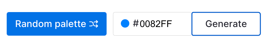
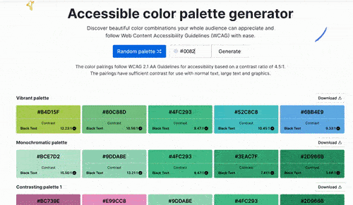
Then, all that’s left is to hit ‘Generate’, and the tool will produce different palettes with guaranteed accessible color and text pairings.
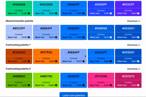
This includes:
- Vibrant color palettes
- Monochromatic color palettes
- Contrasting color palettes
- Pastel color palettes
- Contrasting pastel color palettes
- Dark to light / light to dark color palettes, oh my!
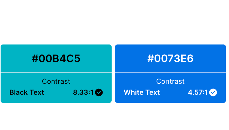
You’ll also find either black or white text on each shade that confirms the layered combo passes the 4.5:1 contrast ratio required for accessible color design.
Once you’ve found your perfect match (or matches, rather), select the download button on the right side to get a copy of the HEX codes as a text file. And there you have it — brand consistency, meet accessibility, meet quickly.
Or, if you’re a free agent…
2. Generate randomized accessible color palettes
In search of inspiration? Shuffle through endless palette options by clicking the ‘Random palette’ button at the top of the Accessible Color Palette Generator.

The tool will then choose a HEX color code at random, and use it to generate a range of themed shades. Because who doesn’t love to roll the dice every once in a while?
Again, you’ll see a swatch of the randomly selected color pop up in the HEX code field, so you’ll know exactly what you’re in for. You’ll also see white or black text layered on top of the different color options to confirm accessibility.
Found a palette most pleasing? Hit the download button and you’re all set.
This tool is truly simple and completely free to use no matter which method you choose, so you can pass those accessibility tests with flying colors.
Did you know? Venngage provides a free PDF accessibility checker that helps you ensure your documents meet the essential accessibility standards? It lets you quickly identify and fix potential accessibility barriers to make sure your PDFs are inclusive for all users!
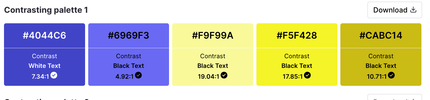
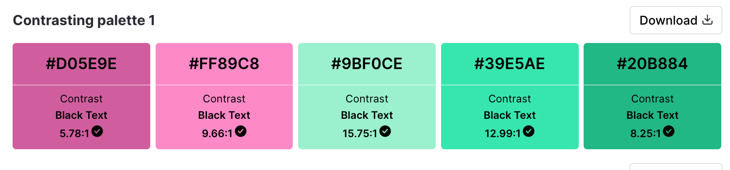
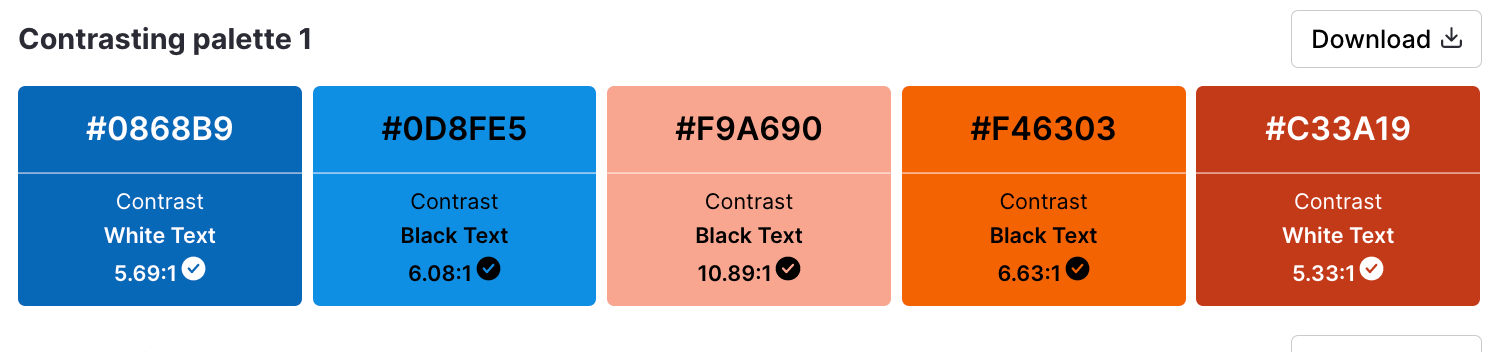
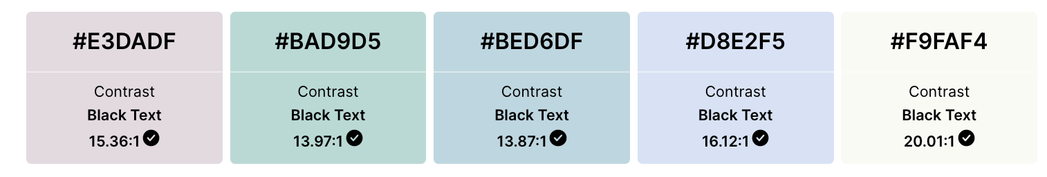
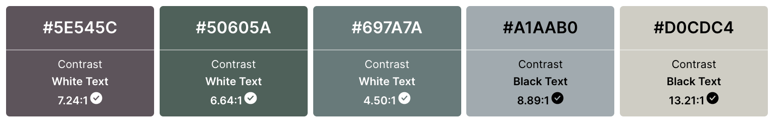
10 Examples of accessible color palettes and templates
With this color palette generator, you have a whole spectrum of amazing, accessible palettes available to you in moments. To show off this range, I’ve generated some accessible palettes at random for easy reference.
Below, find examples of accessible color palettes arranged according to color scheme. For good measure, I’ve included a few templates you can easily edit to create beautiful, engaging, inclusive visual communications in the same vein too.
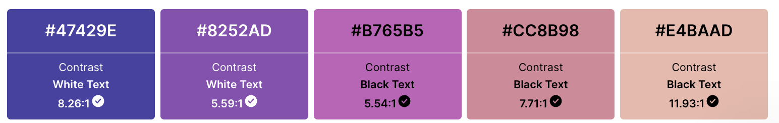
Vibrant accessible color palettes
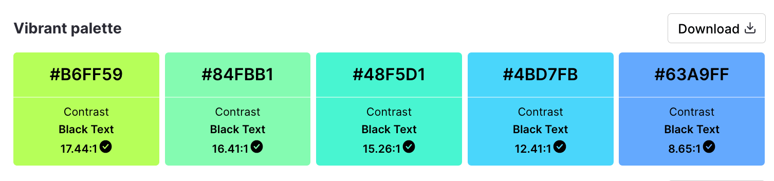
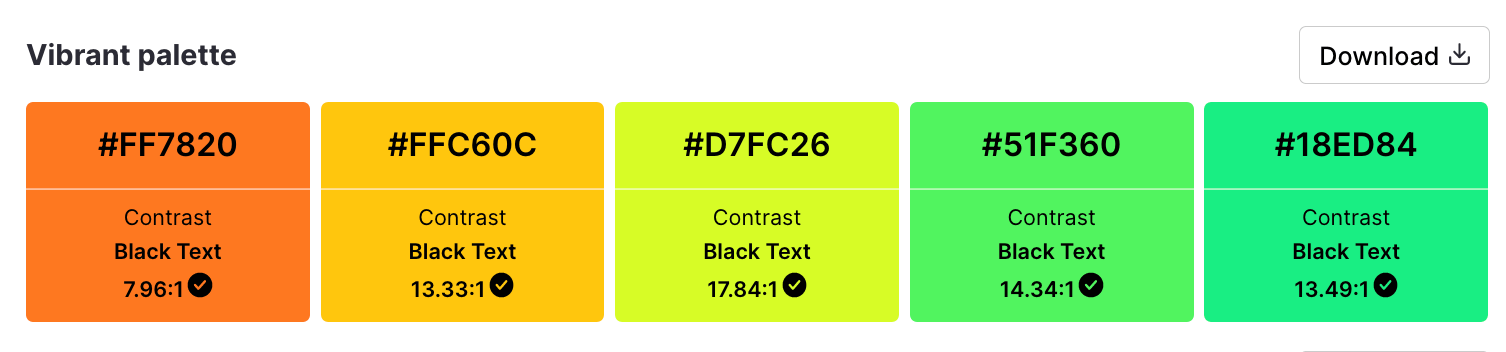
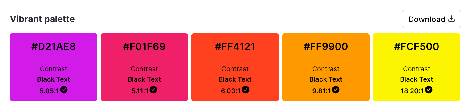
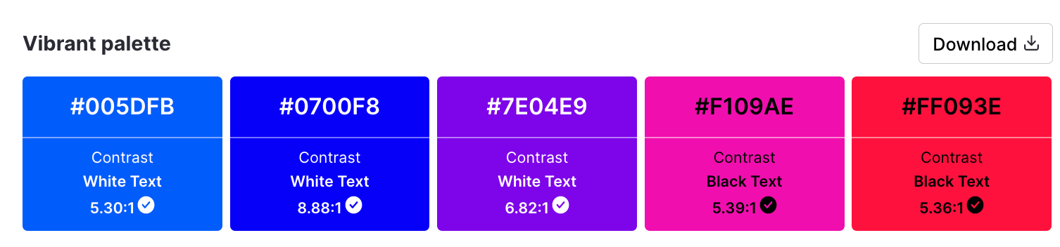
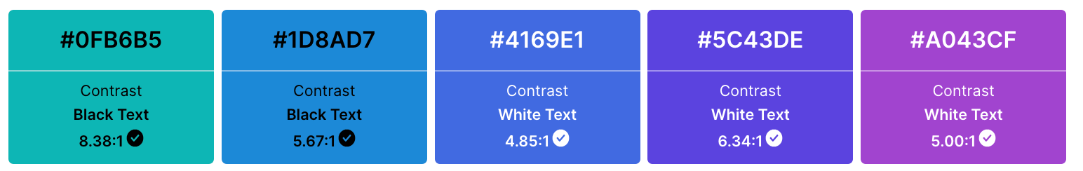
Feeling punchy? Vivacious? Full of life? These bright, intense color palettes have got you covered.
Vibrant accessible color templates

Here’s an accessible process infographic template that employs a vivid color scheme.
What’s great is that you can 100% customize its content to suit your needs. If you’re not a fan of these vibrant colors in particular, just use the accessible colors generator and choose a shade with an acceptable contrast ratio for white.
(Note that this only applies to templates that have white text, or white sections backing the text!)
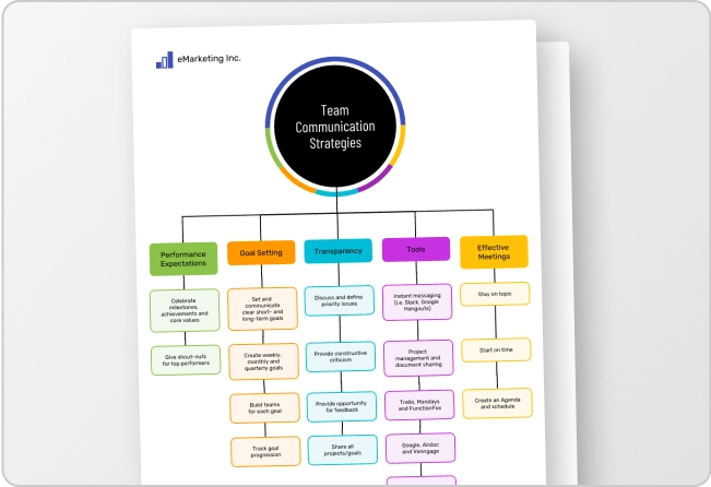
Alternatively, this kaleidoscopic presentation packs a colorful, accessible punch.

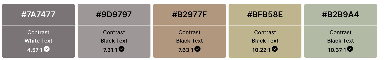
Monochromatic accessible color palettes
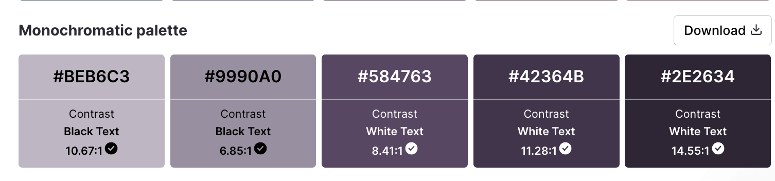
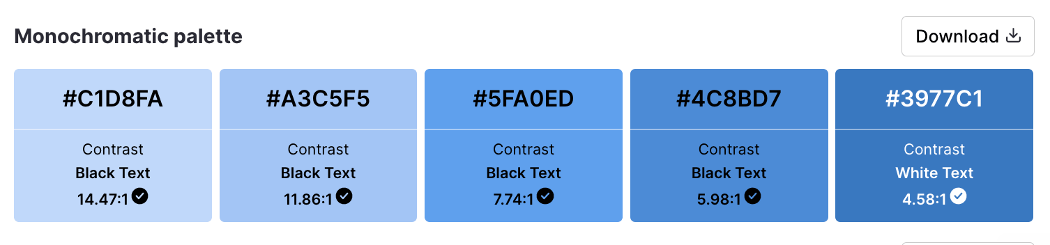
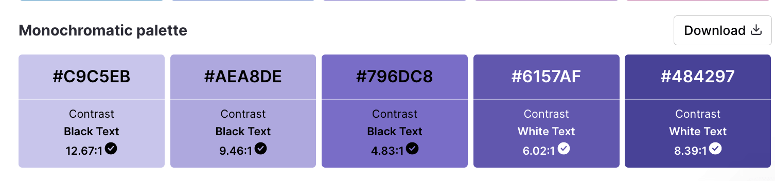
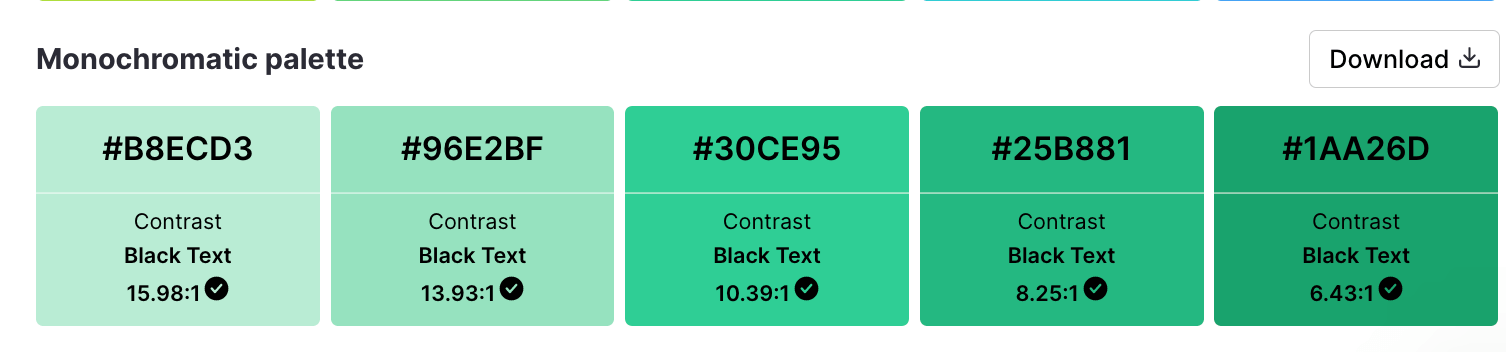
Sometimes, you just need more consistency in your life. (Okay, that was deep. Anyway…)
These monochromatic palettes let you stay true to one hue through-and-through.
Monochromatic accessible templates

Layering monochromatic colors on their own is an accessibility faux-pas. To get around it, use white space to break up sections and provide clarity like this presentation template does.
Otherwise, opt for a high contrast combo by layering your lightest and darkest tones.

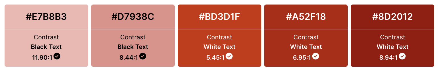
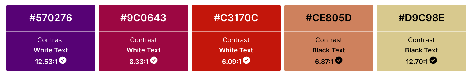
Contrasting accessible color palettes
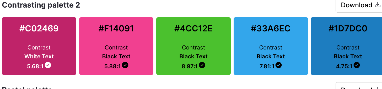
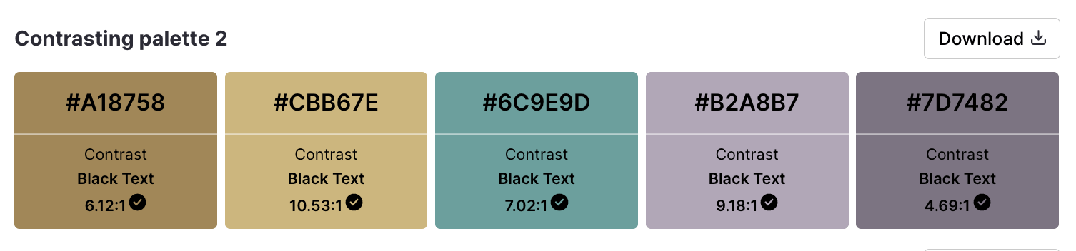
By splitting the palette into groups of highly contrasting hues, these shades are sure to stand out when used together in a design.
Contrasting accessible templates
Want your project proposal to speak volumes while still looking sophisticated?

Look no further than the contrasting teal, tone and charcoal tones layered in this template.
On the other hand, here’s an infographic that juxtaposes a moody background color with striking pale turquoise accents and white text.

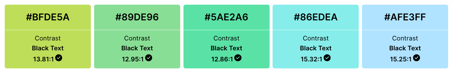
Pastel accessible color palettes
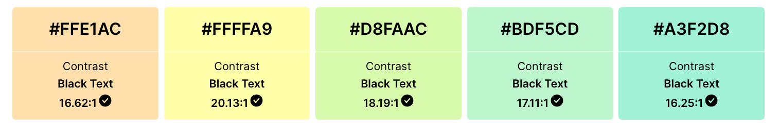
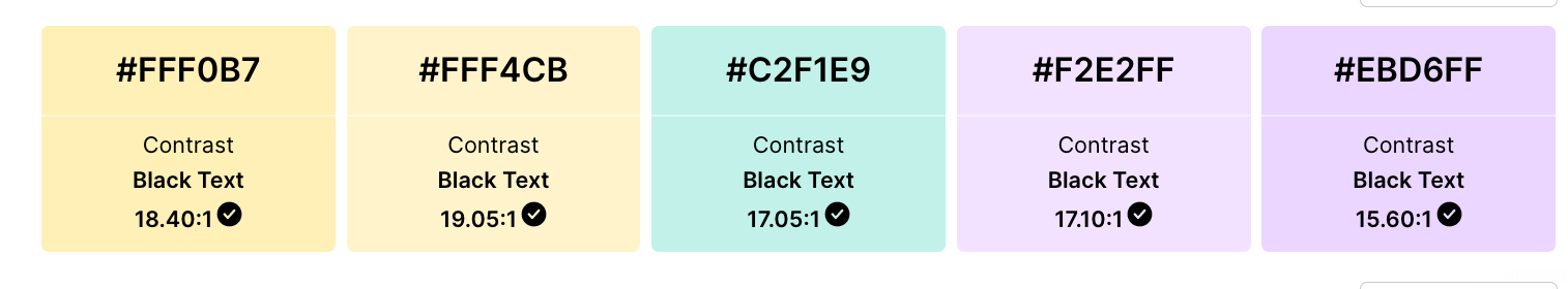
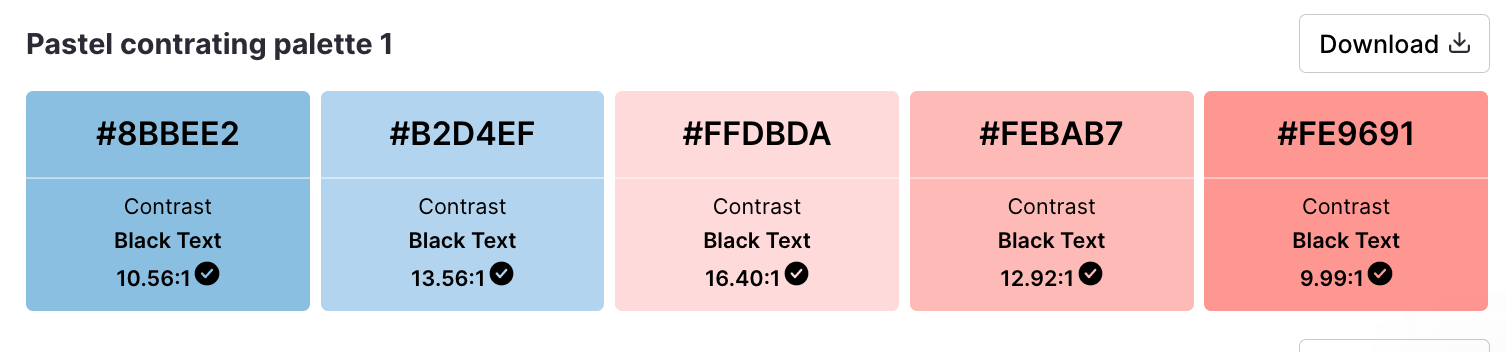
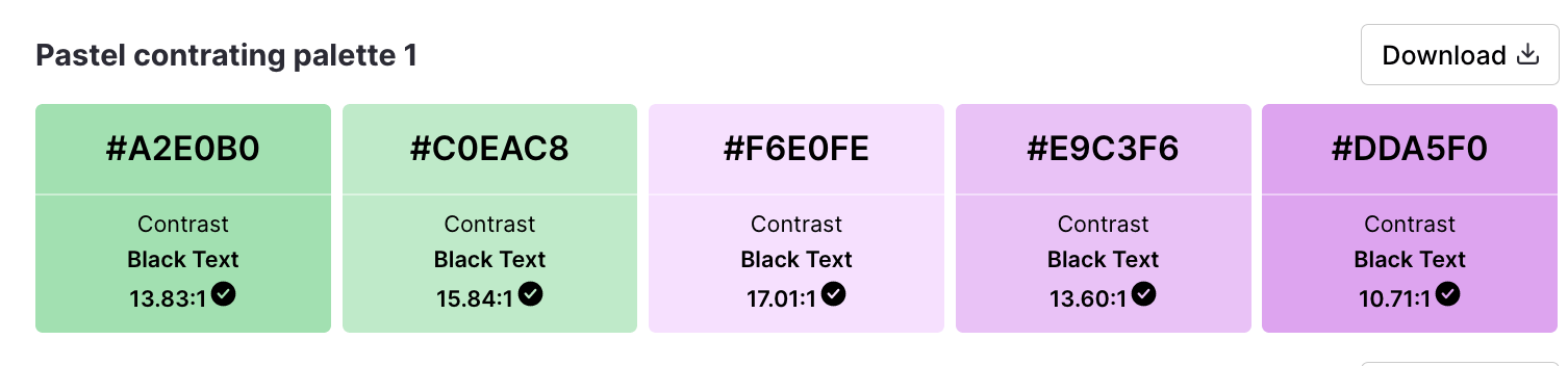
Color psychology explains why pastels are so calming and uplifting: with their high brightness and low saturation, these tones are soft, soothing and pleasing for the eyes.
Pastel accessible templates
Wondering why this template forgoes pastels for its pie charts and graphs?

Because pastels have low saturation, it’s difficult to achieve a 4.5:1 ratio when layering. Adjusting the level and adding labels ensures your data visualizations are color blind-friendly.

Okay, so this one is a bit of a stretch. But with a few customizations using Venngage’s intuitive drag and drop editor, it’s easy to tweak this infographic so it follows a pastel theme while remaining accessible. Here’s how:
- Decrease the saturation of the colors housing the bullet points.
- Change the white lines separating each section to dark lines.
- Add a black outline to the icon bubbles.
Three steps, and you’re done.
Dark to light accessible color palettes
Last but not least, these palettes contain analogous shades (in color theory: neighboring hues on the color wheel) that transition from dark to light tones.
Dark to light accessible templates
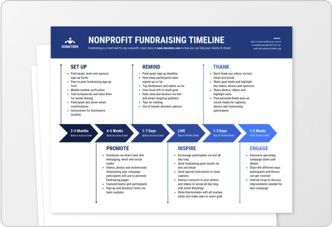
This timeline infographic employs color in a particularly clever way, conveying the progression of time via tone.

Meanwhile, this informational infographic keeps things clean with two crowd-pleasing hues: navy blue and periwinkle.

Why is choosing accessible colors important?
At this point, we’ve covered a few reasons why using accessible colors is important. But for posterity, I’ll review…
First and foremost, accessible colors make your designs usable and legible to those with visual impairments. By empowering these groups to interact with visual environments the same way non-impacted folks do, accessible design choices show your entire audience they’re seen and supported by your organization.
(Why anyone would want to alienate 360 million people — and counting! — is beyond me.)

What’s more, using accessible colors is a wholesale way to prioritize equity and inclusion. Folks with low vision, and even those without any impairments, will benefit from more clear, distinguishable UX designs.
With inclusive visuals top-of-mind for consumers in 2023, you have every reason to prioritize accessibility.
And while WCAG compliance isn’t mandatory for private businesses yet, legal troubles for those who don’t follow these guidelines abound.
In 2021, more web accessibility lawsuits than ever were filed against businesses for violating the American Disabilities Act (see FAQ for more info). If these cases are anything to go by, today’s best practices could become tomorrow’s requirements.
So, clear ethical choice. Smart business decision. No matter what you call it, using accessible colors is the right thing to do.
Convinced? Cool. Now, let’s discuss how you can pick inclusive pairings.
Related: ADA Standards for Accessible Design
3 Quick tips to improve color accessibility
1. Avoid problematic color combinations
Because of the way color blindness affects vision, the following low-contrast color combinations tend to present an accessibility issue when layered:
- Red and green
- Green and brown
- Green and blue
- Blue and gray
- Blue and purple
- Green and gray
- Green and black
That said, if you’re set on a certain combination for your designs, it’s not the end of the world. You can always…
2. Break up low contrast colors with white space or dark space
A simple way to get around issues pairing low contrast colors is to clearly define each section by separating them using white space or dark space. (Many of the templates listed above do exactly that).
To figure out which to use, simply input the color’s HEX value into the free accessible color palette generator, and reference the matching hue on the page.
3. Apply icons, underlining, labels and patterns to distinguish elements
When in doubt, don’t rely on color as your only indicator alone. It’s best practice to add another layer of visual differentiation to the mix — particularly for interactive elements, data visualizations and error states.
For example, writing out links in blue font isn’t enough. Underlining hyperlinks ensures everyone will understand where to click.
Icons or text labels should highlight error states or system warnings that would otherwise go unnoticed.

And patterns can up the visual distinction for those with monochromatic vision, like in this example from Trello.

For more tips on designing for people with color vision deficiency, check out this post: Color Blind Design Guidelines: How to Convey Meaning to Everyone [With Examples & Templates]
3 Types of color blindness
Despite the name, over 99% of “colorblind” individuals can actually see color — just not in the same way as those who aren’t impacted.

Red-green color blindness
The most common form of red-green colorblindness is deuteronomaly. Affecting 5% of males, this deficiency makes it difficult to distinguish red and green colors, or separate blue pigments from purple.
Blue-yellow color blindness
Vision deficiencies affecting the ability to differentiate blue and yellow tones are much more rare, but they impact men and women equally. With blue-yellow color blindness, blue will look more like green, yellow will look more like gray or violet, and pink will be hard to distinguish.
Complete color blindness
Though extremely rare, there are some people who have monochromacy — the inability to distinguish between any colors at all.
With over 360 million “colorblind” people in the world (and counting!), the importance of using accessible colors in your communication designs cannot be overstated.

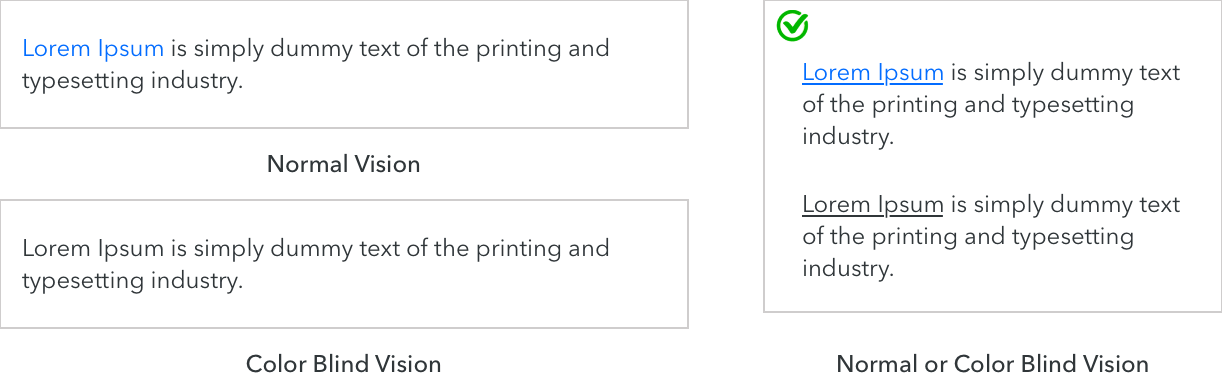
This comparison shows why differentiating interactive components, system warnings and success/error states through high contrast colors is vital. You can imagine how frustrating it would be to read a page with incomprehensible text, or to try and figure out what property to adjust on a form when an error is only indicated via red outline.
In other words, making your communications usable and legible to those visually impaired helps ensure all the time and energy spent designing really counts.
Let’s take a look at those color contrast ratios in more detail.
Accessible colors FAQ
What is a WCAG color?
A WCAG color is shorthand for a color combination that’s accessible and usable to most folks with color vision deficiencies. These colors must be paired with elements or text that adheres to the acceptable level of contrast for web color accessibility as defined by the Web Content Accesiblity Guidelines (WCAG): 4.5:1.
What is AA and AAA in color contrast?
In color contrast, AA and AAA describe the level that color schemes (or palettes) conforms to the accessibility standards set by the WCAG.
Level AA is the middle level of compliance that works with most assistive technologies, and requires a (color) contrast ratio of 4.5:1 for normal text and 3.1 for large text in order to be distinguishable for those who are colorblind.
Level AAA is the gold standard level for accessibility compliance used by government sites and requires a contrast ratio of 7:1 for normal text and 4.5:1 for large text.
Are the WCAG guidelines legally enforceable?
While the WCAG guidelines are not a legal document, section 508 is a law that requires American federal agencies and their contractors to comply with WCAG 2.0 AA standards.
For private companies, it’s even more complicated.
The American Disability Act (ADA) — which organizations with more than 15 employees are subject to — requires places of public accommodation be accessible, and many regions now consider businesses’ websites an extension of that.
In 2019, more than 10,000 lawsuits were filed for violating the ADA, and 20% of those involved website and mobile app design. None of those would have occurred had they followed WCAG AA guidelines.
Is purple accessible?
The color purple is accessible so long as the contrast ratio of the colors, texts and elements are 4.5:1 and higher. Typically, this means a lilac shade would need to be paired with darker text/elements in order to be accessible, while a darker purple would need to be paired with lighter text/elements.
The best designs keep accessibility in mind
Rejoice! You’re now armed with the knowledge and tools you need to create beautiful, inclusive designs that empower all audiences to engage and participate.
Now I’d call that a hue-ge win!
Remember to check out the Accessible Color Palette Generator tool, and take our accessible templates for a spin by signing up for free. Because at Venngage, we’ve made prioritizing accessibility our prerogative, and you should too. Stay tuned for more exciting news on the accessible design front soon…