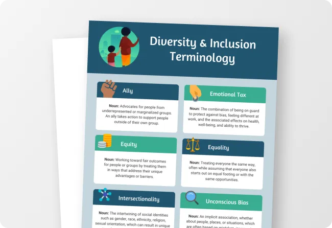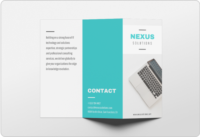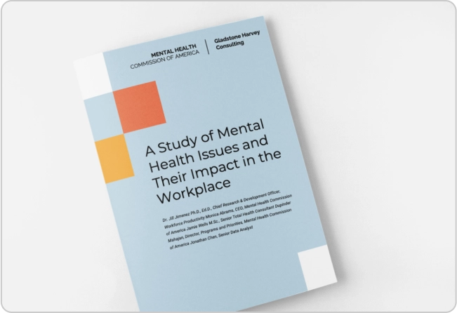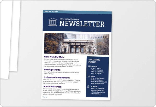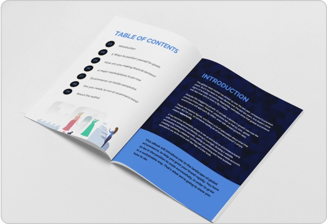
One popular format for sharing information today is using brochures.
Companies use brochures for a variety of marketing purposes, from providing information about themselves, their products, or services and causes.
Everyone loves a pamphlet. A well-designed brochure that is visually appealing can make your business stand out.
But that’s not enough; you also need to make sure brochures are accessible
Ask yourself: Can people living with disabilities engage and understand your brochure?
If the answer is no, don’t worry. In this post, I’ll show you how to make accessible brochures and how you can use our Accessible Design Tool to create WCAG-compliant brochures.
Some of our accessible templates are free and some require a small monthly fee. Sign-up is always free, as is access to Venngage’s drag-and-drop editor.
Click to jump ahead:
- What is an accessible brochure?
- 6 steps to make accessible brochures
- Accessible brochure mistakes
- How to make accessible brochures with Venngage
- Frequently asked questions
- Bottom line
What is an accessible brochure?
An accessible brochure is a physical or digital document that can be easily read, understood, and navigated by a wide range of individuals, including those with disabilities.
The goal of an accessible brochure is to provide information and content in a way that is inclusive and barrier-free.
Why accessible brochures are important
Accessible brochures ensure information is available to and usable by everyone.
Also, depending on your country, there are legal requirements requiring you to make digital content, including brochures, accessible.
Related: ADA Standards for Accessible Design: How to Be Compliant
Failing to do so can cost you big in remediation costs and even litigation.
In 2022, there was a 12% year-over-year increase in web accessibility lawsuits in the US alone.
Besides the law, creating accessible brochures is simply the right thing to do. Inclusive design also increases your visibility, builds brand reputation and increases your bottom line.
6 steps to create accessible brochures
Structure and organization
Organize the content in your pamphlet logically. There should be a clear information hierarchy so that all readers can navigate through the content easily.
When content is organized logically, assistive technology like screen readers can interpret and present the information in a coherent manner.
Note: Screen readers are commonly used by people with visual impairments and it requires structured content to provide a meaningful reading experience.
An easy way to structure your content is to use headings, subheadings, and lists.
But sometimes this is not enough as a screen reader might still get the reading order incorrect and require you to do manual remediation work.
But Venngage’s Accessible Design Tool shows you the reading order and manually edit it in a simple drag-and-drop format.
Here are some examples of accessible brochures that get the structure correct:
Fonts
For accessibility, not all fonts are created equal.
Font style matters for accessibility because it impacts how easily individuals can read and comprehend text, especially people living with visual and cognitive disabilities.
Some font styles are more legible than others, but the general rule is to avoid decorative fonts that are harder to read for people living with dyslexia or visual impairments.
Sans-serif fonts like Arial are often more accessible than serif variants like Georgia.
Also, maintain a consistent font style throughout your brochure to enhance comprehension and reduce cognitive load.
Changing font styles frequently can disrupt the flow of reading and make it more challenging to follow the content.
Last but not least, make sure your fonts are big enough for people with different vision abilities to see. A good rule of thumb to follow is a minimum body text size of 16px.
Here are some examples of accessible brochures that get fonts right:

Alt text
Adding descriptive alt text to images, graphics, and illustrations in your designs is a crucial aspect of creating accessible brochures.
The best way to think of alt text is a description of visual content.
This ensures individuals living with visual disabilities using screen readers can still understand the meaning and context of visual content in brochures.
Alt text should be concise and descriptive and convey what the image or graphic communicates visually.
Here are some key points to keep in mind when writing alt text:
- Be concise
- Be descriptive
- Provide context
- Avoid repetition
- Format correctly
Again, Venngage’s Accessible Design Tool lets you add alt text to visual content in your brochure or mark it as decorative so screen readers know to ignore it.

Similarly, using a PDF checker tool can help ensure your documents meet accessibility standards across color contrast, text size, and layout. Want to see how it works? Try Venngage’s PDF accessibility checker for free.
Here are some examples of brochures where alt text makes them accessible:
Color contrast
Color contrast refers to the difference in visual perception between two colors adjacent to each other.
Maintaining appropriate color contrast between text and background is fundamental to accessible brochures.
It ensures that text and other visual elements stand out clearly, making content easier to read.
It also affects how legible and readable text and images are, especially for individuals with visual impairments.
Also, be careful with how you use colors as it should never be the sole means of conveying information.
Some individuals may not perceive colors or at all, so always include text-based alternatives for color-coded content to make accessible brochures.
Here are some examples of accessible brochures with great color contrast:
Links and navigation
It’s not uncommon for brochures to include CTAs or clickable links for users.
When adding these types of links to your brochure, use descriptive and meaningful anchor text that conveys the purpose or destination of the link.
Avoid generic phrases like “Click Here” or “Read More.” Instead, provide context within the link text, making it clear where the link leads.
For example, instead of “Click here for more information,” use “Read our comprehensive guide on accessible design.”
From an accessibility standpoint, the second link text is beneficial for individuals using screen readers as its purpose is clear.
Besides meaningful anchor links, accessible brochures should also be keyboard navigation-friendly.
This is vital for individuals who rely on the keyboard to navigate due to mobility impairments preventing them from using screen readers.
Just as an FYI, designs created in Venngage, including accessible brochures support keyboard navigation.
Common accessible brochure mistakes
Small text size
To make brochures helpful, designers sometimes reduce text size to fit in as much content as possible.
However, this can create accessibility barriers for people with visual impairments as this will cause them to struggle to read tiny text, even with assistive technology.
For example, for people with low vision who rely on screen magnifiers, small text sizes can become pixelated when magnified. This defeats the purpose of assistive tools meant to enhance readability.
For people with severe vision impairment, when the text size is too small, screen readers might skip it entirely.
The result? An inaccessible brochure.
Small text size also affects older people with bad eyesight.
Considering that brochures are often used to provide important information such as healthcare instructions or event details, inaccessible text size can impact this group negatively.
Getting colors wrong
Brochures are often colorful to draw attention…and they should be!
First impressions matter, but going over the top with bright contrasts or using color to convey meaning goes against inclusive design and excludes people, such as those living with color blindness or low vision.
To avoid accessibility challenges in your brochures, here’s what you need to do:
Colors
Maintain a strong contrast between text and background colors to enhance readability.
Success Criterion 1.4.3 of WCAG 2.2 suggests that regular text should have a minimum contrast ratio of 4.5:1 , while larger text should have a minimum ratio of 3:1 to make accessible documents.
The same principle applies to brochures.
One easy method to check whether your brochure meets WCAG requirements is to use Venngage’s WCAG Color Contrast Checker to check the contrast ratio of text/image and background colors in a few clicks.

Besides contrast, also make sure your brochure uses accessible colors that are distinguishable by individuals with color blindness.
If you’re having a hard time selecting the right palette, tools like our Accessible Color Palette Generator can help you pick beautiful color combinations that everyone can appreciate and understand.
You can either enter a Hex code and let the tool pick a suitable combination or get a random palette. The choice is yours!

Note: Even if you have an accessible color palette, you should provide text alternatives in areas where color is used to convey meaning.
Not sure how your design looks to people living with color blindness?
Our Color Blind Simulator lets you test designs to see how they look to people with visual impairments.

Generally, testing brochures for accessibility and remediating designs to ensure compliance is costly and time-consuming.
But if you use Venngage’s Accessible Design Tool from the start, you can avoid this headache. Sign-up is always free as our accessible templates, but some require a small monthly fee.
Use of complicated language
In an effort to convey information effectively, many brochure designers often fall into the trap of using complicated language.
This is an accessibility barrier for people living with cognitive disabilities or for people who speak English as a second language.
Here’s an example of what I mean by complex language:
“The convoluted and multifaceted intricacies of the financial market, juxtaposed with the intricate dynamics of international trade agreements, are critical factors contributing to the overall economic landscape.”
Did you catch that?
If you didn’t, would you continue reading a brochure? Probably not.
Stick to using plain language and simplifying content to make your brochure accessible. The trick is to use simple words, clear sentence structures, and visual aids when appropriate.
For example, taking the same sentence from above, you could rewrite it as:
“The way the financial market works and international trade agreements affect the economy.”
Much better.
Other points to keep in mind include to ensure accessible copy include:
- Sentence structure: Opt for shorter sentences and paragraphs, which facilitate comprehension and readability.
- Visual aids: Incorporate visual aids, such as images or icons, to supplement textual information, aiding understanding for individuals who may struggle with written content.
How to make accessible brochures with Venngage
Step 1 – Sign up for a free Venngage account
Start by signing up for a Venngage account using your email, Gmail or Facebook account.
Remember, it’s completely free!

Step 2 – Select an accessible template from our library
Besides the examples in this post, you’ll find many types of accessible brochures and other accessible templates in our library. Just pick one you like to start editing.

Step 3 – Use our editor to edit and test your design
Our accessible templates let you replace filler data with your own to make the process of creating accessible brochures painless and fast.
Remember, our editor has in-built accessibility tools so you can test changes for color contrast compliance or alter the look and feel by selecting WCAG-friendly color palettes. No remediation is needed!

Other accessible features include the ability to set alt text, edit the reading order, and more.
Step 4 – Bring your accessible brochure to life with accessible icons, illustrations
Venngage offers diverse icons and illustrations to ensure your brochures are inclusive and accessible.

If you upgrade to a Business account, you also get My Brand Kit — the one-click branding kit that lets you upload your logo and apply brand colors and fonts to any design.
And that’s all there is to it. Creating an accessible brochure has never been easier!
Frequently asked questions
How do I make my pamphlet accessible?
To make your pamphlet accessible, follow these steps: 1) Organize content logically, 2) Use legible fonts, 3) provide alt text for images, 4) ensure appropriate color contrast, and 5) test your design on Venngage.
Bottom line
Nowadays, information is abundant but not everyone can access it.
Brochures are a powerful way for businesses and organizations to meet marketing goals, but if they’re not accessible, you exclude a big chunk of the population that could become brand champions.
Don’t let your efforts go to waste. Start creating accessible brochures with Venngage’s Accessible Design Tool today to unlock the full potential of your business.


