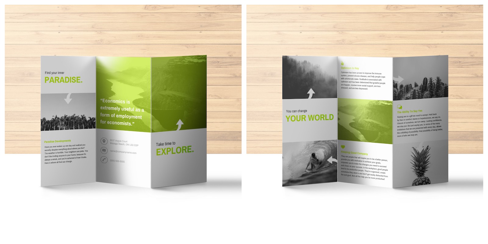
Trifold brochures have been helping businesses get their messages out for decades.
They have been used for this long because they are a very effective form of visual communication. Plus, they can be shared online, or printed out and given to potential customers.
In this article, I’ll be sharing some design tips on how to create a trifold brochure along with trifold brochure templates that you can jump into right away!
What is a trifold brochure?
A trifold brochure is folded twice over the middle section, offering six panels for your information. This gives you plenty of space to talk about your product, business or brand.
Now, you may be thinking, “All of this sounds great, but I don’t know how to design a brochure that actually looks good.”
In this guide, I’ll show you that you don’t need an in-house design team to create your own trifold brochure. So let’s get into it!
1. Use a helpful icon to draw attention to your brochure sections
Let’s start this article by talking about one of my favorite little design helpers: icons. These simple graphics can be used a ton of different ways across all of your design projects.
Plus icons can help a novice designer create something that looks amazing. It doesn’t matter if you are an accountant, consultant or business owner, a well-designed icon can help upgrade any brochure.
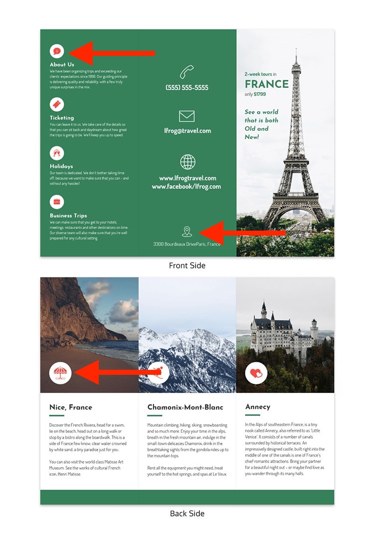
Take a look at this trifold brochure template, each section uses a related icon above the written information. These icons can not only be used to catch the reader’s eye, but also to give some visual context about the information below them.
For example the:
- About Us section uses an information icon
- Nice, France section uses a beach umbrella icon
- Address section uses a map pin icon
These are all very simple examples, but they illustrate how helpful a simple icon on your trifold brochure can be.
2. Use a gradient for an eye-catching brochure background
Simple gradients have been one of the biggest graphic design trends over the past few years. Their resurgence in popularity can be traced back to the need to stand out from the competition and noise on the internet. Also, gradients look futuristic on the HD screens that we carry in our pocket every day.
A great way to stand above this noise is with bold colors and unique backgrounds. As you can see in this example, gradients check both of those boxes!
You can match gradients to the color palette of your trifold brochure template very easily. Plus no other brand will be using the same gradient in their design.
With Venngage you can easily add a gradient with a single click to any brochure, poster, infographic and more!
3. Select a color scheme that fits your trifold brochure topic
When picking a color scheme for your small business brochure it’s important to remember to not pick colors just because they look good together.
Instead, strive to use colors that fit the topic of your brochure.
For example, if you’re creating an informational brochure about your travel agency, use your brand colors. But if you want to create one about your brand’s eco-friendly initiatives, use a more natural color palette.
This beautiful travel brochure uses a color palette that compliments the destination. From the crystal clear Greek water to the blue houses of Santorini, this shade of blue fits their topic perfectly.
Additionally, because they used a palette that matches their destination, they can easily find stock photos that match that color. Find out more about our travel brochure templates.
4. Use image frames for a consistent image shape

It’s pretty easy to keep a consistent color palette or font throughout each page of your brochure. However, once you add images to the design, things can get a little complicated.
There are a ton of different photo styles, color palettes, and sizes that you may be working with.
Now if you were to add them to your brochure, they would look incredibly out of place. But with an image frame, you can quickly make them all the same size and shape with a single click.
In this trifold brochure template, the designer used an image frame to make all three location photos look almost identical.
5. Always include a section with your contact information

If you’re planning to print your trifold brochure out and distribute it, make sure your contact info is included. There’s nothing worse than an interested potential client not being able to learn more about your business.
This trifold brochure example devotes an entire page to their contact info:
You can follow their lead and list out your entire mailing address if you think it’s relevant. Or only include a website where the reader can find that info.
If you’re a one-person team, you might want to put your personal number on the brochure as well.
Just be sure there is some way that a customer can find or contact your business!
6. Include one main section on each brochure page
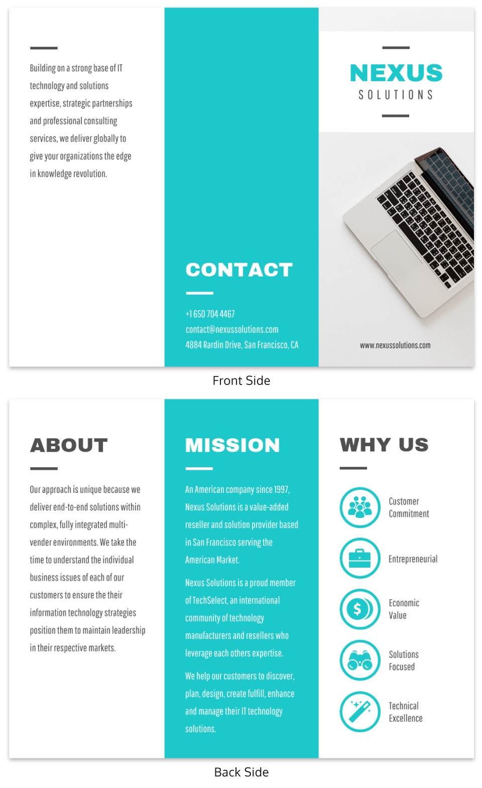
Trifold brochures are already physically broken into different sections. You can use this layout to your advantage by featuring only a single section on each page.
Not sure what I’m talking about? Check out the trifold brochure template below:
Instead of using borders, colors or shapes to break up their sections, the designer used the folds! This approach is great for people wanting a minimalist or modern brochure as well.
Plus it will help you keep from overwhelming the reader with too much information.
I would recommend using bold headers, like they did above, for each of your sections. This will quickly show that the reader is moving from one piece of information to the next.
7. Only use images that share a similar theme or color palette
Using photos with a consistent style and color palette will make your brochure design look a lot more professional.
The photos that you use shouldn’t only have a similar palette but also feel the same. Almost like they all came from the same kind of photographer or a single photo shoot.
I would recommend outlining your photo style in a brand or style guide. That will make it easy for every designer to have a consistent voice.
For example, take a look at the trifold brochure example below:
The designers used a collection of dark moody photos that all work exceptionally well together. Plus each image differs greatly from the light colored background producing a ton of interesting variation.
8. Embrace futuristic colors and patterns this year

Futuristic colors and patterns are another popular graphic design trend this year. I think their rise can be attributed, like gradients, to the overwhelming amount of content out in the world.
These futuristic palettes can help your business brochure stand out from the crowd.
Take a look at the brochure example below to see some futuristic colors in action:
As you can see these color palettes are usually bold, bright and extremely eye-catching. You can also take it to the next level by mixing those colors palettes with some duotones, futuristic patterns and gradients.
This trifold brochure is another good example of using consistent images as well! Even though each of the images are pretty different, they all feel futuristic.
9. Include a timeline to help tell a story

If you plan to tell a story about your company or topic, use a timeline graphic! They can help break down even the most complex business idea, process or topic.
With the limited space of a brochure, a timeline can help you include a lot of information without taking up too much space on the page.
In the business brochure above, Bloomberg used a timeline exceptionally well! Starting with their founding, the designer took readers through the entire history of the company up to this point.
If you were just to list all the information above in a few paragraphs, no one would want to read it. But by adding interesting icons and illustrations, the designer made the content very engaging.
10. Include a compelling CTA on your brochure cover

The most important info is usually contained INSIDE your trifold brochure. But if someone doesn’t open your brochure, they will never read the secrets of your success. Or whatever you want to promote.
So if you want someone to actually read your brochure, you’re going to need a pretty good call to action (CTA) on the cover.
If you’re not familiar with calls to action, they are basically phrases that help guide the reader into taking action. Here are some really simple examples:
- Click Here
- Sign Up Today
- Call Now For Pricing
The trifold brochure example above uses a really specific CTA to get people excited to read their content. This made me want to learn more, and I know others will as well. I mean who doesn’t want to live a happier life?
You could also include a QR code to engage your customers. A QR code generator like Uniqode makes adding one to your brochure easy.
11. Try a non-traditional trifold brochure layout


Sometimes you need to think outside of the box to set your brand apart from the competition. Especially in an already crowded space, like travel brochures, for example.
As you can clearly see, the designers chopped they cut a large section out of each brochure page. This ensured that they could only include the most essential information about the park.
Each page then folded to create a very interesting cover that is begging to be opened!
12. Visualize processes in your trifold brochure
Like I said above, icons can help any designer upgrade their trifold brochure with a few clicks.
They also can be used to help visualize a business process or idea in seconds. At Venngage we have thousands of icons you can use to create your own visualizations in seconds.
Plus no matter the topic, you’re going to be able to find some interesting icons or illustrations. Take a look at the trifold brochure to see a great example:
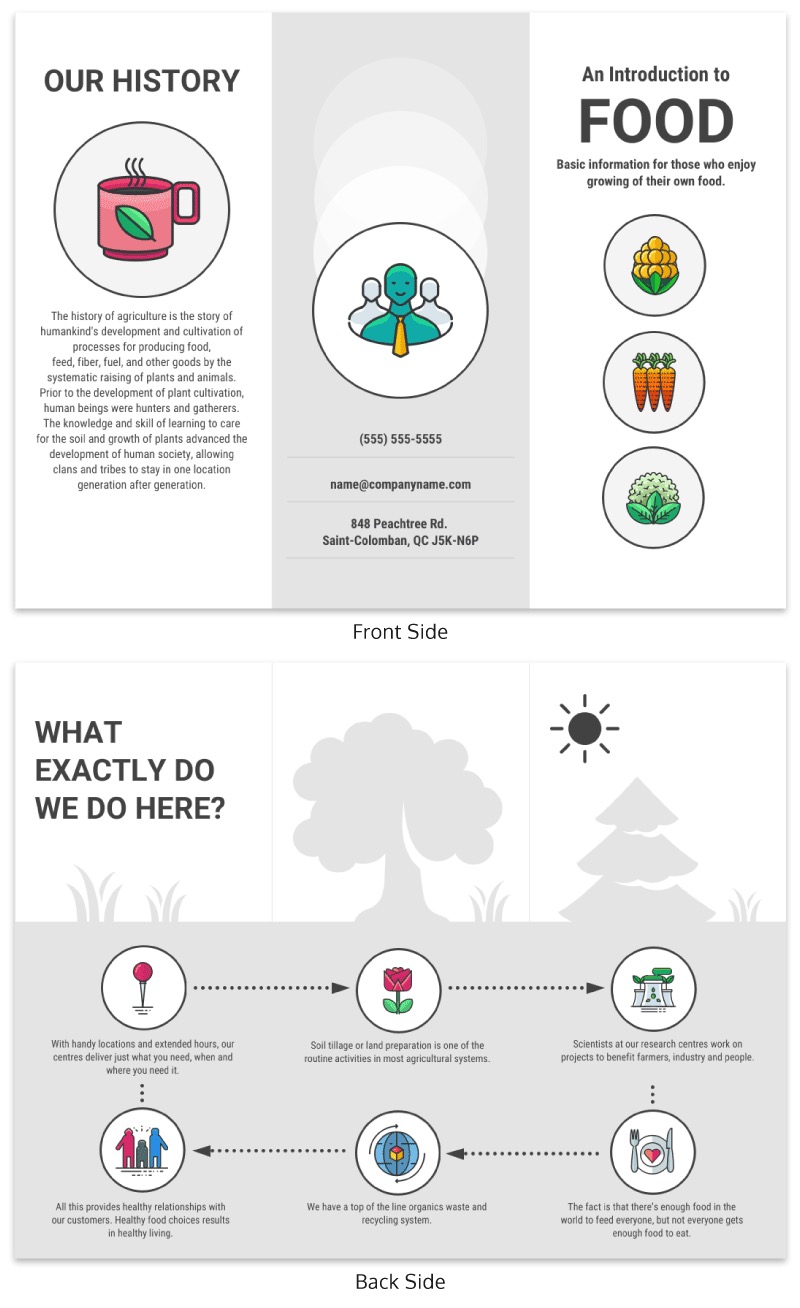
Each of the main points uses an icon to help you visualize the topic, and give you some context about the section. And with the helpful arrows, the process becomes extremely clear.
This approach can help you explain the most complex process to almost any reader. Like explaining a business process, outlining a marketing plan or highlighting your hiring process.
13. Add a color filter to make your images less distracting
Color filters are one of the most useful techniques that any designer can learn. From novice designers, to true artists, a color filter can almost instantly help their design projects.
When you want your background images to fade into the background, use a color filter! A color filter will make the image a lot more muted, and less distracting.
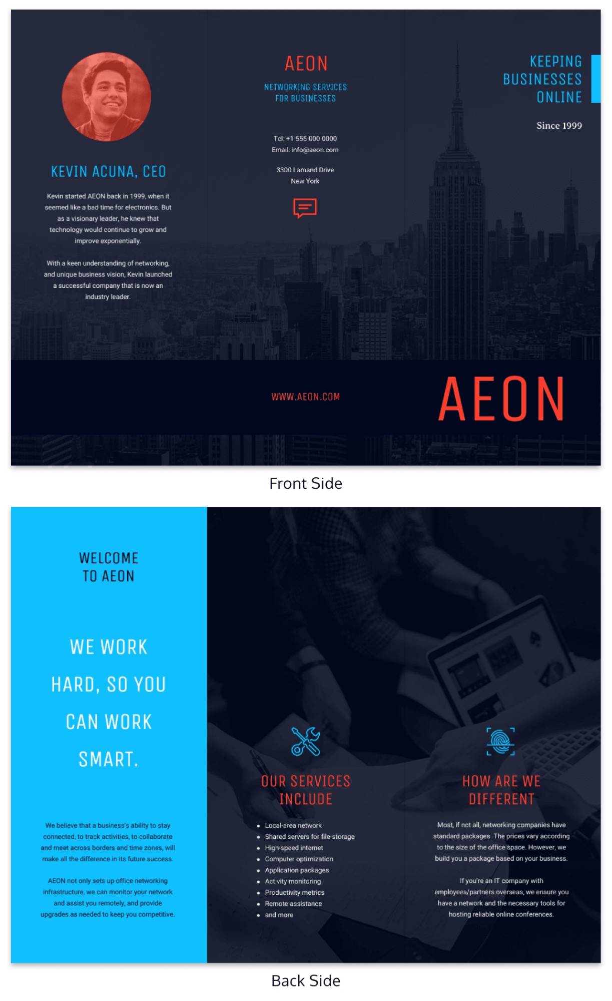
A color filter can make your images match the rest of your brochure in seconds. As you can see above, the designers used a dark blue color filter to match the rest of their brochure color.
To create your own color filter, you only need a square icon! Then change the opacity to your liking, and you’re set.
I would recommend using a color filter to help your agency or business keep a consistent brand message as well.
14. Create a square trifold brochure

Most of the other examples in this article have been very traditional trifold brochures. I think this is because they fit a standard piece of paper.
But if you want to be a little untraditional, you can also create a square trifold brochure like the example above!
The square pages make it a lot easier to include a ton of written information. In this case, the brochure listed all the daily events for each month of the year.
With a traditional trifold brochure, the information would have felt cramped. And the reader probably wouldn’t have enjoyed reading.
Plus, by using a nontraditional shape or size it will stand out from the other brochures instantly.
15. Use content blocks to layout your trifold brochure
Creating a content-heavy brochure can be tricky. There’s a limited amount of space for all your content.
If you plan to include a lot of images and content in your trifold brochure, then take a look at the example below.
This designer was able to include a ton of images on the inside pages of this brochure template without it feeling cramped. With images and written content alternating almost like a tic-tac-toe board. Each of the images gives the written content some space to breathe as well.
An approach like this makes it easy for a reader to consume the information in your brochure. Plus the arrows will draw the reader deeper into the content.
16. Always use high-quality images on your business brochures

Using low-quality images is one of the worst design mistakes you can make, no matter the graphic.
This is the one thing that can sink your business credibility the fastest, trust me.
The images may look great on your tiny computer screen, but once you print it out they look like a blurry mess. Trust me, it has happened to me a ton of times and it’s not fun to have wasted all that time!

Take a look at how great the photos that they used in the trifold brochure example above. They are crisp, clear and make the whole thing look very professional.
Remember that your brochure might be the first time someone hears about your brand, be sure it makes an outstanding impression.
So take the time to find some great images, and if you can’t check out our collection of stock images for some inspiration.
17. Make sure your trifold brochure has ample white space
Filling up your brochure with as much content as possible should never be your goal. Instead, it should have some white space so people can navigate the page easily.
White space is the open space around text, in between columns, and in between images on a page. Leaving enough white space makes a page look better, and makes it easier to read.
Keeping some white space around your content is essential, or your brochure will start to look like a term paper. Or a jumbled mess of text of images.
And no one will want to read that.
I actually outlined some different types of white space in this example below:
You can also use white space to make sure people are drawn to your written content like they did above.
This approach can help you highlight your pricing table, or testimonials from happy customers.
18. Outline a process with visuals or infographics

Some things are just easier to explain a process with a visual. As you can see in this example they outline a complex idea with a simple infographic:
A process infographic like this example is a great way to break down any process into smaller parts. And you can add some icons or illustrations to make it a little more captivating.

In fact, people will actually want to read your information if it’s presented in an interesting way.
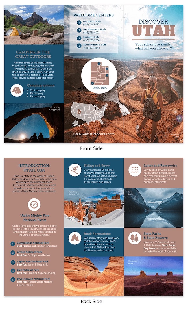
19. Select a photo that will cover the front & back cover
Let’s be honest, your trifold brochure isn’t going to be presented perfectly to a reader each time. Sometimes it will be upside down or have the back cover on top.
To combat this very real possibility, I would recommend making your back cover as attractive as you front.
One way simple way to do this is by using an image or graphic that stretches from the front to back cover. Because you can now take up more space, your potential cover image choices are almost limitless as well.
This trifold brochure example uses a beautiful landscape photo to advertise a trip to Utah:
No matter where you look on the brochure that image still will grab your attention and not let go!
20. Make consistent font choices throughout your trifold brochure
Using consistent fonts will make your trifold brochure design cohesive and readable.
Don’t make the headers use one font on the inside page and another on the next page. This will only confuse the reader, and in some cases make them put down your business brochure.

How to design a trifold brochure
You can create an eye-catching and convincing brochure yourself by:
- Starting with a trifold brochure template (this guide will give you a bunch of examples)
- Customizing your brochure template and adding your branding using our online drag-and-drop brochure maker tool (I’ll show you some ways to do this)
- Following a few trifold brochure design best practices (which I have included above)
That’s all the trifold brochure tips we have for you this time!
Remember these trifold brochure design tips:
- Select a color scheme that fits your trifold brochure topic
- Include a compelling CTA on your cover
- Add a color filter to make your images less distracting
- Outline any process with visuals or infographics
- Make consistent font choices throughout your trifold brochure
And if you want to learn more about creating trifold brochures, check out these guides:


