Symbols are a powerful way to communicate ideas and emotions quickly and clearly.
In design, using the right symbols can make your work more engaging and effective. Whether they are universally understood or specific to a culture, symbols can add depth and meaning to your designs.
This article explores common symbols, their meanings, and how to use them to enhance your design projects.
This guide to common symbols and meanings in design will cover:
- Why are symbols used in graphic design?
- Universal symbols and meanings: shapes and lines
- How to use shapes and lines in design
- Useful symbols and meanings for infographics, presentations, and reports
- How to use symbols and icons in infographics and creative designs
- How to use symbols and icons in professional documents
- How to use symbols and icons in web design
- Where to get symbols, icons, and illustrations for your designs

Designers use symbols and icons to:
- Add a touch of creativity to infographics
- Make presentations more memorable and engaging
- Break up text content in dense reports
- Help users navigate websites
You are probably familiar with many of these symbols already.
Some of the most popular symbols are:
- Heart symbol: this represents love, compassion and health.
- Dove symbol: this represents peace, love, and calm.
- Raven symbol: this represents death and doom.
- Tree symbol: this represents growth, nature, stability, and eternal life.
- Owl symbol: this represents wisdom and intelligence.
- Dragon symbol: this represents power, wisdom, strength, and mysticism.
- Butterfly symbol: this represents rebirth, beauty, and transformation.
- Dog symbol: this represents loyalty, protection, and companionship.
- Lion symbol: this represents courage, leadership, and royalty.
- Fox symbol: this represents slyness and cleverness.
But let’s face it: while we all know that a heart represents love, and a dove represents peace, we often need to visualize more practical concepts like “business growth”, “meeting agenda”, or “status update”.
This in-depth guide dives deep into symbols and meanings that are actually useful (for all of your graphic design needs).
First, let’s talk about why symbols are so central to graphic design.
Why are symbols used in graphic design?
It’s always better to show than tell.
Symbols, used in combination with text and images, can make messages more meaningful and memorable than text alone and have been used throughout the history of marketing and design.
Understanding their symbolism and spiritual meanings enhances their impact in design and communication.
They have the power to cross language barriers, and can help you engage with your audience on a deeper level than is possible with just words.
Symbols can even be combined like words in a phrase to tell a powerful story, as seen in this creative flyer design:
Common symbols used in graphic design (and the real world) are:
- Arrow symbols: used to represent directions
- Cloud, rain, snow and sun symbols: used to represent weather
- Power, disk, wifi and bluetooth symbols: used to represent tech
- Wheelchair, information, bathroom and no-smoking symbols: used on different signs found in public places
Universal symbols like these are so commonplace that they’ve become so second-nature to us. We understand them immediately and intuitively…there’s simply no need for explanation!

Design Pro Tip: Find these symbols in the Venngage icon library under the following categories: “Arrows & Directions”, “Weather”, “Technology”, and “Signs”.
When used in graphic design, symbols and icons can help break up dense passages of text, making it easier to digest.
But symbols and icons are not just communication tools. Designers use stylized, illustrated icons to add flair to things like infographics and presentations for a custom-made feel.
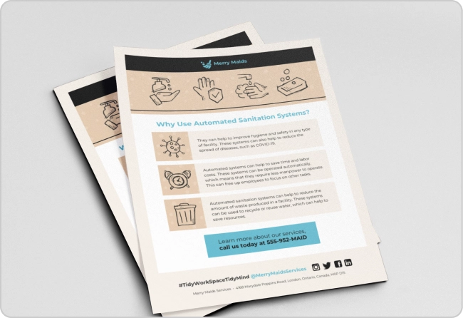
For example, the icon-focused presentation template shown below is a pretty creative presentation idea, with illustration-style icons dominating each slide:
Whether you’re creating an infographic, a presentation, a logo, or a website, visual symbolism can take your design to the next level.
Universal symbols and meanings: shapes and lines
Geometric shapes are the most basic symbols that carry meaning.
While designers typically combine basic geometric shapes to create more complex, meaningful symbols, geometric shapes still hold meaning on their own.
Understanding the meaning of basic shapes is foundational to logo design and other forms of graphic design.
Related Reading: Logo Design Tips to Take Your Brand to the Next Level
Here the 10 basic shapes and lines and their meanings:
- Circle: Completeness, cycles, continuation, playfulness
- Square: Stability, tradition, security, straightforward
- Triangle: Transformation, movement, balance
- Intersecting lines: Relationships, connectedness
- Spiral: Growth, evolution, transformation
- Five-pointed star: Excellence
- Arrow: Direction, movement, force
- Curved lines: Movement, connection, fluidity
- Diagonal lines: Tension, excitement
- Zigzag: Path, confusion

Curved lines and shapes tend to provide a sense of movement, fluidity, continuity, and informality.
Shapes with hard corners and straight lines, in contrast, typically suggest stability and groundedness.
How to use shapes and lines in design
Graphic designers use basic shapes and lines to:
- Organize information through grouping and separation
- Highlight important information
- Add texture and depth
- Create structure
Like in the infographic template below, the symmetry of geometric shapes is perfect for creating a sense of order and structure in a design.
Large structural background shapes (like the circle above) add subtle complexity. Background shapes can also convey something about the relationships within the content of the design–creating groups or suggesting separation between topics.
Shapes like circles and squares can also be added behind other icons and symbols, emphasizing important information and creating a sense of repetition and depth in a design.
In the list infographic below, layered borders and ovals make the icons a focal point. They feel like they’re popping out of the page, demanding your attention:
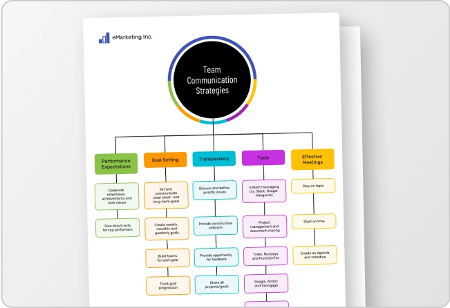
The type of shape used impacts the overall feel of the design. Comparing the mind map examples below, curved circles and lines create a playful, creative feel, while the stability of squares and rectangles make the design feel more traditional and professional.
Geometric shapes and lines are particularly critical in logo design, where basic shapes often form the essence of the logo. The logo below, for example, is a simple yet effective play on a rotated triangle:
If you take a look around you, you’ll likely notice many logo designs, like these ones from adidas, Google Drive, and Mitsubishi, that are based on simple geometric shapes.
Read our in-depth guide for more logo design tips.
Useful symbols and meanings for infographics, presentations, and reports
Geometric shapes are just the start when it comes to visual symbolism. There are a great deal of common symbols with widely accepted meanings…everything from a dog representing loyalty to a raised first representing activism.
But when you’re designing a presentation, infographic, or report, you probably don’t often need symbols for such abstract concepts.
Read on for some concrete symbol examples that should be helpful for designing documents for the workplace.
Symbols to represent culture and religions:
- Yin Yang – Represents balance and duality in Taoist and Chinese philosophy.
- Lotus Flower – Symbolizes purity, rebirth, and spiritual enlightenment in Hinduism and Buddhism.
- Fleur de Lis – Historically linked to French royalty; represents purity, tradition, and cultural heritage.
- Star of David – A prominent symbol of Judaism, representing divine protection and unity.
- Christian Fish (Ichthys) – Early Christian symbol of faith, often used to identify fellow believers.
- Eye of Horus – An ancient Egyptian symbol of protection, health, and power.
- Dharma Wheel (Dharmachakra) – Represents the teachings of the Buddha and the path to enlightenment.
- Chakra Symbols – Represent energy centers in the body in Hindu and yogic traditions; each chakra has its own symbol and meaning.
- Adinkra Symbols – Visual symbols from West African cultures, especially Ghana, used to convey proverbs, beliefs, and social values.

Symbols that represent historical and geographic identity
- Ancient egyptian symbols: Includes the Ankh (life), Scarab (rebirth) and other hieroglyphs representing spiritual beliefs and cultural values.
- Native American symbols: Rooted in nature and storytelling. Common symbols include the Eagle (strength, vision) and Thunderbird (power, protection).
- American flag: A symbol of freedom, unity, and national identity in the United States, representing its history and values.


Symbols to represent communication, collaboration:
- Speech bubble symbol: used to represent speech and communication.
- People symbol: used to represent teamwork and collaboration.
- Mail/email symbol: used to represent messages and communication.
- Presentation symbol: used to represent learning and teaching.
- Handshake symbol: used to represent agreement and cooperation.
Communication is traditionally represented with speech bubbles or email symbols, but there is so much more room for creativity here.
One way to branch out is to find symbols that represent the specific mode of communication that you’re discussing, as seen in this project management plan:
Or, as seen in the communication symbol examples below, you can add a ton of variety to the mix by focusing on the human side of communication and showing the connections between collaborators.
Design Pro Tip: Try the following search terms to find these symbols in the Venngage icon library: “communication”, “message”, “speech”, “work”, “teamwork”, “team”.
Symbols to represent business growth
Business growth is something you might need to visualize in a business growth proposal, a marketing plan, or a startup pitch deck.
But because business growth means different things in different businesses, there isn’t one best way to represent business growth visually.
Common symbols used to represent business growth are:
- Plant symbol: used to represent growth, change, value, and positivity.
- Rocketship symbol: used to represent rapid growth or product launches.
- Up arrow: used to represent positive change.
- Graph symbol: used to represent trends.
- Dollar sign: used to represent money or revenue.
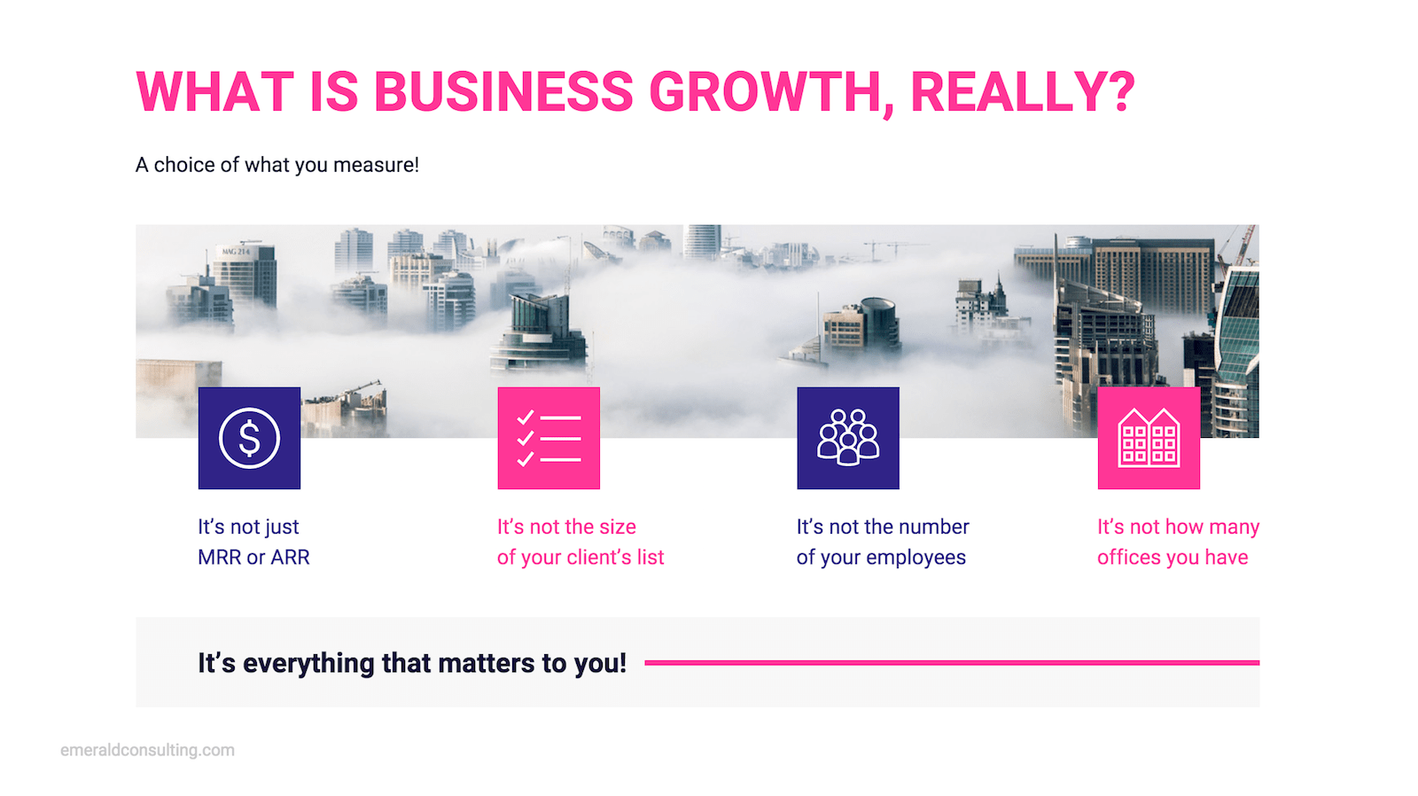
The slide template below, for example, uses four different symbols to represent a few different facets of business growth, including revenue, clients, and employees.
If you’re focused on increasing recurring revenue, you may wish to visualize business growth with cash symbols. If you care more about improving other metrics, you might use icons showing data trending upward.
Or you could take a metaphoric approach to showing business growth, like some of the business growth symbol examples below:
Design Pro Tip: Try the following search terms to find these symbols in the Venngage icon library: “work”, “data”, “growth”, “incline”, “success”, “money”.
Symbols to represent design, art, creativity:
- Pencil symbol: used to represent drawing, sketching, and ideation.
- Shape symbols: used to represent abstraction, creativity, and graphic design.
- Browser symbol: used to represent user interface design.
- Color palette symbol: used to represent graphic design, art, and interior design.
- Lightbulb or brain symbol: used to represent brainstorming, creativity, and ideas.
When talking about design, there’s a bit of pressure for your design to be unique. This is the perfect place to think outside the box when it comes to symbolism.
A clever symbolism example is the use of an empty box icon to represent whitespace in the logo design-themed infographic below:
Talking about creativity is also the perfect time to branch out into funkier illustrated icon styles. Illustrations were all the rage 2019, and we think they’ll continue as a graphic design trend in 2020, too.
Here are a few fun illustration-style design symbol examples from the Venngage icon library:
Design Pro Tip: Try the following search terms to find these symbols in the Venngage icon library: “design”, “website”, “color”, “paint”, “draw”.
Symbols to represent safety, security:
- Hard-hat symbol: used to represent safety in the workplace.
- Lock symbol: used to represent data security in browsers and other digital products.
- Pylon symbol: used to represent physical safety and caution.
- Shield symbol: used to represent both physical and digital security.
- Umbrella symbol: used to represent protection.
One way to find unique symbols is to take the meaning you’re trying to convey from one context and use it in another context.
For example, using symbols for construction safety (like the ones below) in the context of tech security, or home security.
Or just stick to the traditional symbols for safety like the locks and shields seen in the security symbol examples below.
Design Pro Tip: Try the following search terms to find these symbols in the Venngage icon library: “construction”, “safety”, “lock”, “shield”, “security”.
Symbols to represent alert, attention:
- Exclamation mark symbol: used to show emphasis, importance.
- Loudspeaker symbol: used to represent an announcement or alert.
- Hand symbol: used to indicate that stopping is required.
- Bell symbol: used to represent an alert or notification.
The classic symbol for attention is a triangle or diamond shape with an exclamation mark inside.
Other more unique attention-grabbing alert symbol examples are bells, alarms, red lights, loudspeakers, or even a simple circle with an exclamation point. Anything that screams “look at me” works well for this application.
Design Pro Tip: Try the following search terms to find these symbols in the Venngage icon library: “priority”, “announce”, “alert”, “caution”, “warning”.
Symbols to represent metrics, research:
- Magnifying glass symbol: used to represent research and analysis.
- Graph symbol: used to represent trends and associations.
- Target symbol: used to represent goals.
- Microscope symbol: used to represent research and discovery.
- Gear symbol: used to represent work or progress.
When it comes to symbolizing metrics and data, the options are practically limitless. You could stick with the standard visuals showing charts and trends, but there is so much more out there.
Some of my favourites are the more intricate illustrated icons that combine magnifying glasses with data to show analysis in action, as seen in this advertising plan design:
Here’s just a small taste of the possibilities for symbols for metrics and research:
Design Pro Tip: Try the following search terms to find these symbols in the Venngage icon library: “analysis”,“report”, “data”.
Symbols to represent goals, strategy:
- Target symbol: used to represent a goal or a success.
- Path symbol: used to represent a plan or procedure.
- Mind map symbol: used to represent planning, connections, or strategy.
- Checklist symbol: used to represent planning or strategy.
The tried and true way to symbolize goals is to use a target icon. Which is great, and all…but we can do better.
You could show progress to a goal with a partially completed checklist, like the one featured in the infographic below:
When it comes to visualizing strategy, consider using icons that show many connecting parts or a winding path to some target, as seen in these strategy symbol examples:
Design Pro Tip: Try the following search terms to find these symbols in the Venngage icon library: “target”, “goal”, “objective”, “trend”, “strategy”.
Symbols to represent information, ideas, insight:
- Lightbulb symbol: used to represent invention, ideas, and creativity.
- Spreadsheet symbol: used to represent information and organization.
- Lightning bolt symbol: used to represent insight, clarity, and inspiration.
- Document symbol: used to represent knowledge and communication.
We have been using a lightbulb to represent ideas for ages. It’s effective, but probably a bit overused.
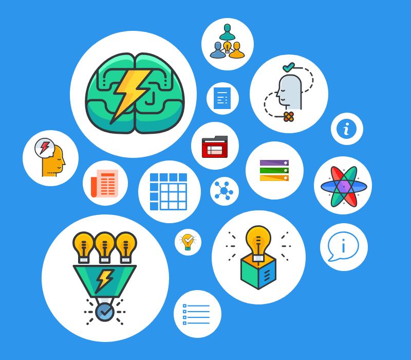
Some alternatives? Use sparks to represent flashes of insight, like the design below, use branched, connecting lines to show creativity, or combine the lightbulb with other symbols to create a scene.
Here are some more idea and information symbol examples with some variations on the simple lightbulb:
Design Pro Tip: Try the following search terms to find these symbols in the Venngage icon library: “mindmap”, “mind”, “idea”, “list”, “about”.
Symbols to represent change, progress:
- Gear symbol: used to represent progress, work, and innovation.
- Curved arrow symbol: used to represent cyclicity or process.
- Checkmark symbol: used to represent success or show that goals have been met.
Outside of the business world, symbols to represent change are related to rebirth, renewal and transformation…symbols like the sun, the moon, and water.
The key to visualizing change in a professional context is to go way more concrete. Find symbols that show a beginning state and ending state, suggest movement, or show a path from one place to another.
Here are a few change and progress symbol examples to get you thinking:
Design Pro Tip: Try the following search terms to find these symbols in the Venngage icon library: “sync”, “transition”, “change”, “progress”.
This just scrapes the surface of how creative you can get with symbolism in graphic design, but hopefully it’s enough to get you started. For more inspiration, check out our infographic icon design guide.
How to use symbols and icons in infographics and creative designs
Use icons to reinforce key ideas
A powerful way of using icons in creative designs is to use icons to reinforce points you’d like your audience to latch onto.
Used this way, icons and symbols become visual cues that will guide your audience’s eyes towards important areas of your design. That’s why you’ll often see icons next to list items or infographic section headers, as shown below.
Get inspired by stylized, illustrated icons
An easy way to add character to an infographic (or other informal design) is to use more intricate, illustration-style icons as the core of the design.
Start the design process by finding an icon style that you like, then simply pull colors from those icons for the rest of your design. This is a pretty foolproof way to create a unique, eye-catching design that’s still cohesive (like the infographic template below).
Use consistent icon styles
It’s critical that all of your icons match throughout any design or multi-page document.
Combining mismatched icons, even if they look great on their own, is a major design faux-pas that is sure to turn off your readers.
Here is an example of a simple process infographic with a cohesive icon set that lends a clean, polished effect.
How to use symbols and icons in professional documents
Designing formal documents like status reports and project plans requires a different approach than fun, creative designs like infographics.
Use minimal, monocolor icons for a sleek, professional look
In formal documents it’s usually best to skip over the stylized, illustrated icons in favor of more minimal single-color icons and symbols.
This will ensure your business proposals and pitch decks hit all the right notes in your next pitch meeting.
Use symbols and icons to break up long passages of text
Symbols and icons are a useful tool for improving the readability of dense documents. Your readers will thank you if you intersperse some relevant visuals into any longer passages of text, giving them a place for their eyes to rest.
How to use symbols and icons in web design
Symbols and icons are essential to many website interfaces. Used properly, they can help guide users through a site, while saving screen space and making interfaces more visually appealing.
For symbols to be effective in a website interface, they must be:
- Easy to understand
- Unambiguous and universal
- Simple and compact
Users should be able to understand, without thinking, what that symbol means. If they can’t, this can lead to some serious usability issues.
It’s best to stick with glyph-style icons–icons that are ultra-simple and designed for use on the web. They won’t distract from the content of your website and they can be colored to match your brand style guide (just like InVision does, below).
Where to get symbols, icons, and illustrations for your designs
The Venngage icon library is a go-to resource for all kinds of icons, from basic shapes and symbols to stylized illustrations.
In the Venngage icon library you can find a wide variety of icons in 4 different icon styles:
- Outline/glyph icons: minimal, modern filled icons perfect for professional designs
- Colored icons: simple, geometric icons with a few colors
- Flat icons: 2D icons made with geometric shapes and bold colors
- Illustrated icons: detailed icons with distinct, illustrated styles
Just use the search function to find icons by keyword, then filter for the icon style of your choice!

The best part?
We’re always updating our icon library to include new icons. Check out our latest font and icon additions.
Get more information on how to work with Venngage icons in our how-to guide.


