Presenting to a client, business partner, or a potential investor? Being articulate isn’t enough anymore. Your presentations need to have strong, memorable visuals.
Don’t overwhelm your presentation design with too many design elements. A presentation template should be as simple as possible. You don’t want to steal the limelight from the product or service you’re offering.
Creating a simple PowerPoint background for your slide deck doesn’t have to be a challenge. In this guide, we’ll share examples of great background graphics, with tips to create them.
Get a headstart when creating slide decks with the Venngage Presentation Maker. You don’t need any design experience to use our presentation templates.
Click to jump ahead:
- 10 best simple Powerpoint backgrounds
- How to format PowerPoint backgrounds on Venngage
- FAQs about PowerPoint presentations
10 best simple PowerPoint backgrounds
- Sequoia Capital pitch deck
- Uber pitch deck
- Iconics pitch deck
- Blue Guy Kawasaki pitch deck template
- Product pitch deck
- Gradient Guy Kawasaki pitch deck template
- Blue investor pitch deck
- Client marketing pitch deck
- Airbnb pitch deck
- Yellow start-up pitch deck
1. Sequoia Capital pitch deck
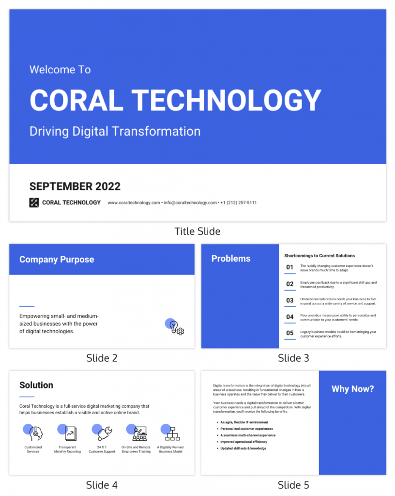
If your company has conservative and traditional values, this straightforward design should work best for your PowerPoint template.
Note how the PowerPoint slides avoid using long paragraphs. Instead, each slide uses bullet points and icons to get the message across and make the slides more readable.
You can change the color of the slides to be consistent with your branding. To improve the visual appeal of your PowerPoint templates, vary the slide layout throughout the presentation.
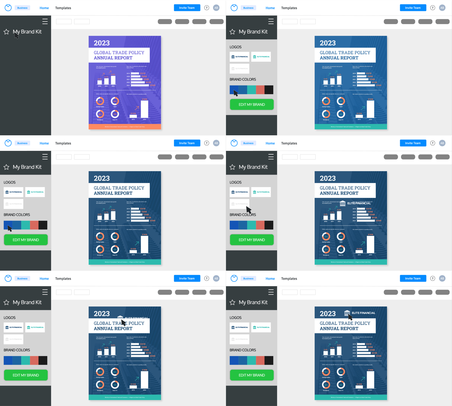
Easily add your branding to a PowerPoint template with Venngage’s My Brand Kit feature, available with business accounts. Add your website when prompted and the editor will import your logos, brand colors, and brand fonts.
2. Uber pitch deck
A simple PowerPoint template doesn’t necessarily have only a few images. Photos are powerful as you can see from the slide layouts in the Uber pitch deck below.
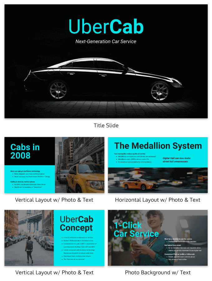
Choose the best brand pictures you have for backgrounds. You can overlay some areas with a solid brand color to contrast with the color of the text. This way, you don’t hide background graphics but still keep the slide readable.
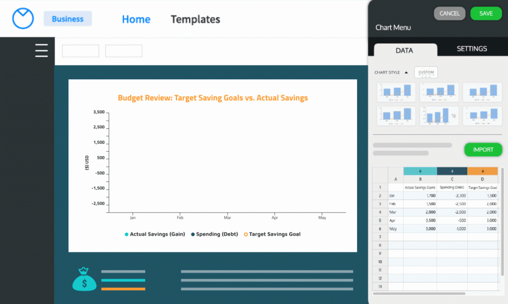
Using data visualizations can also improve your PowerPoint template. Add tables, charts and graphs for a more professional look. People are easier to convince if you show the numbers.
3. Iconics pitch deck
A black background can be impactful as long as you know which design elements blend well with it. From the example below, using neon icons is a clever technique. This is suitable for digital companies or brands offering modern products and services.
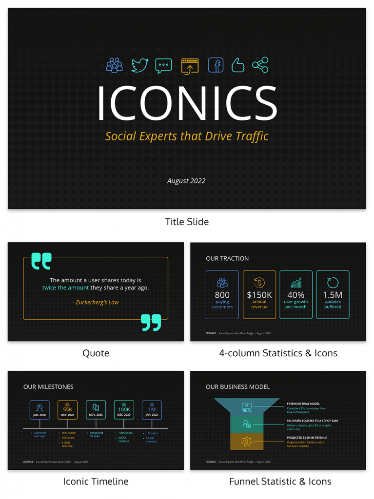
Adding quotes to a blank presentation is an excellent way to show social proof. If you can back it up with numbers, like in the above example, even better.
4. Blue Guy Kawasaki pitch deck template
The Guy Kawasaki slide deck design uses the 10/20/30 PowerPoint rule. This outline is made for 10 slides, that can be presented in just 20 minutes. How? None of the fonts can be anything smaller than 30 points.
Venngage has created slide layouts based on Kawasaki’s rule. The longer version is below, to accommodate larger presentations.
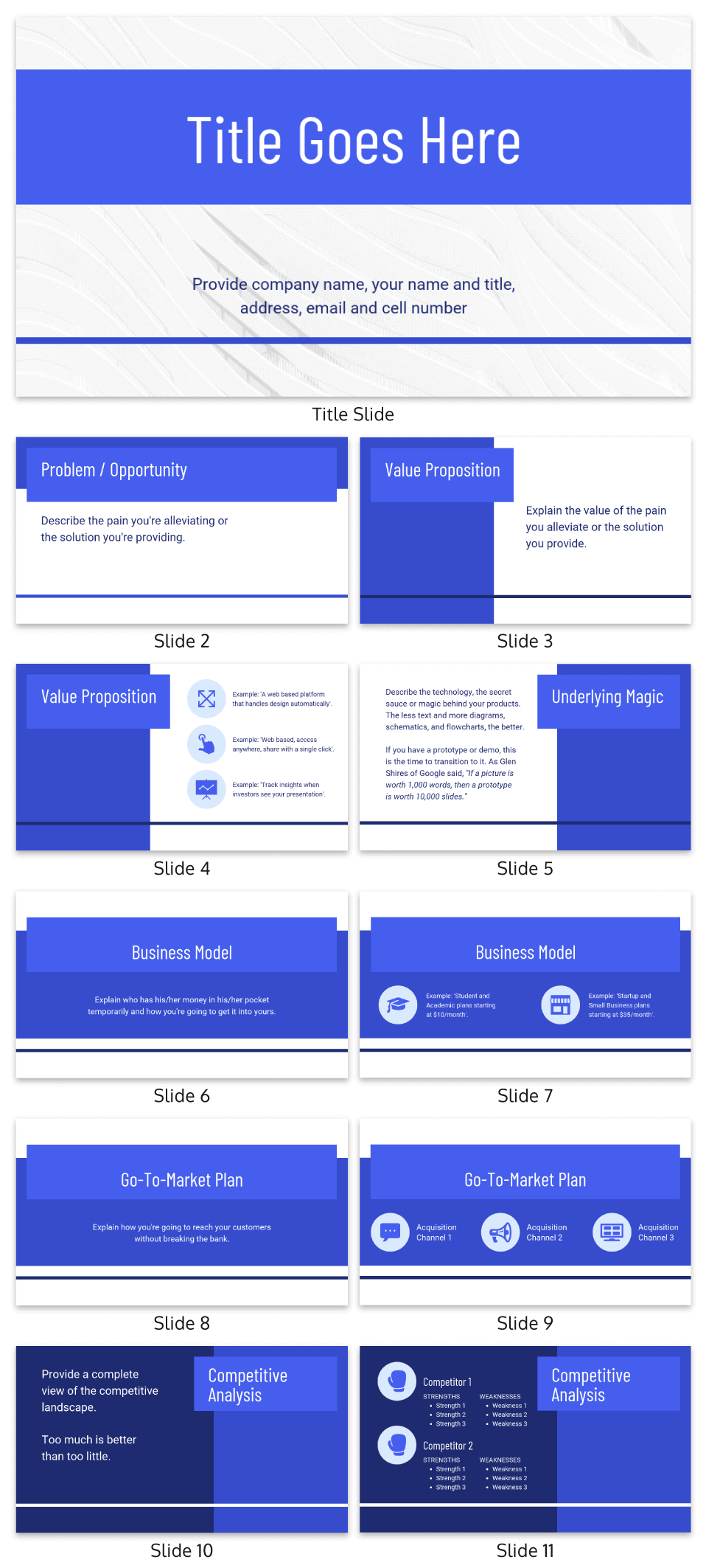
Note how the slide layouts vary considerably from the master slides. This helps maintain audience attention and allows for a variety of information to be presented.
5. Product pitch deck
Create a PowerPoint template with this equally powerful design. Instead of using one or two colors in your presentation, you can use different shades per PowerPoint slide.
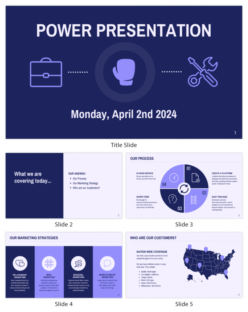
As brutal as this may sound, people easily get bored. The technique is to tweak slide layouts and leave an impression that you have something new to present on each slide.
6. Gradient Guy Kawasaki pitch deck template
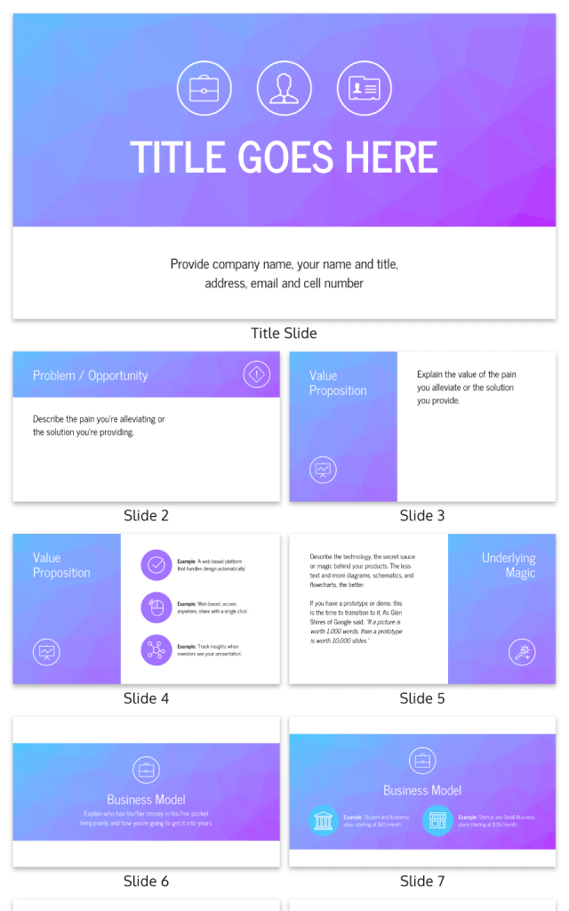
Your presentation background can be both simple and interesting by using a gradient. It never goes out of style and is highly recommended for companies offering creative services.
If you are working in the advertising or marketing industry, this template will serve you well.
7. Blue investor pitch deck
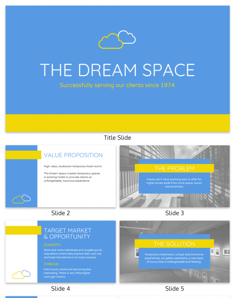
There’s so much to love about the PowerPoint template below. The colors are vibrant, the texts are of perfect length, and there are different business background styles. Some are plain while others have real pictures.
While there are many design elements in the presentation, they were able to follow a single theme. It makes the deck even more appealing, not to mention, powerful.
8. Client marketing pitch deck
How about something bold for your PowerPoint templates? The design below gives off that fun vibe.
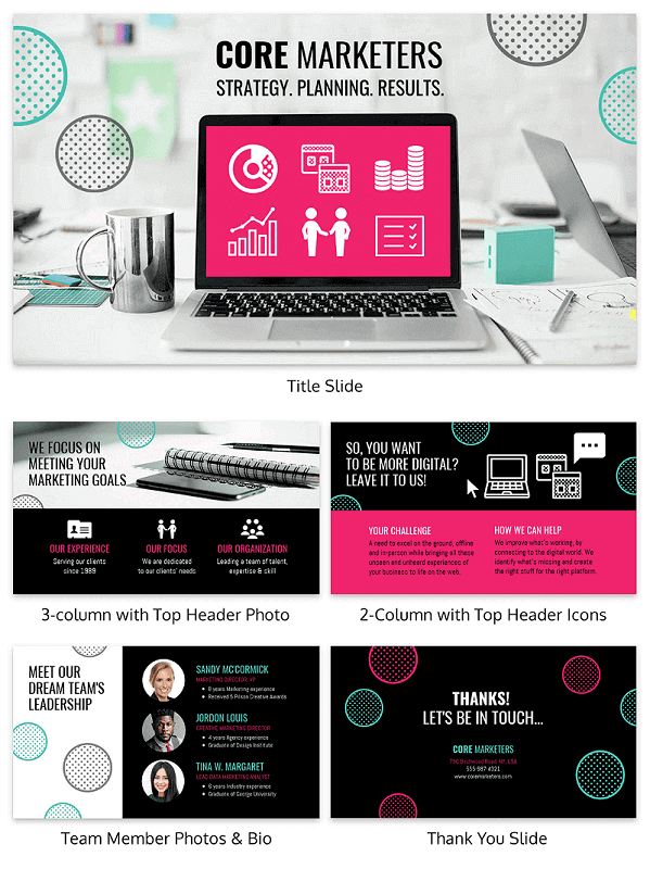
Change the color to a muted tone and add your preferred icons. These minor alterations can help you design PowerPoint presentations that are anchored on your branding.
The template below is a great option for digital marketers, fashion lines, and even cosmetics. Use your own pictures and you’re all set.
9. Airbnb pitch deck
If you want to highlight your content, be sure to use the template below. As you can see, the design only has a few images but is heavy on information and data.
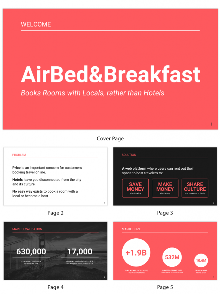
This would be perfect if you are introducing a new product or service. After all, you wouldn’t want your audience to be distracted by your design elements, would you?
10. Yellow start-up pitch deck
If you want to improve your conversion, use an image of people. It is a proven design technique in marketing, for posters, billboards, and websites. Visuals of people can be added to your custom PowerPoint template, like in this example.
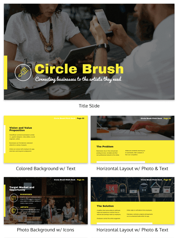
You can add stock photos to the PowerPoint template. Venngage has over 4 million of them. Or upload original high-quality pictures of your team working together.
Apart from providing your audience with company facts, you are subtly showing them your working environment. That could also influence their decisions.
How to format PowerPoint backgrounds on Venngage
Step 1: Sign in or create an account
- Go to Venngage and sign in to your account or create a new one if you haven’t already.
Step 2: Choose a template
- Navigate to the “Templates” section and select “Presentations” from the available options. Browse through the templates and choose one that suits your needs.
Step 3: Choose background type
- Solid Color: Select a color from the palette or enter a hex code.
- Gradient: Choose the gradient option and customize the colors and direction of the gradient.
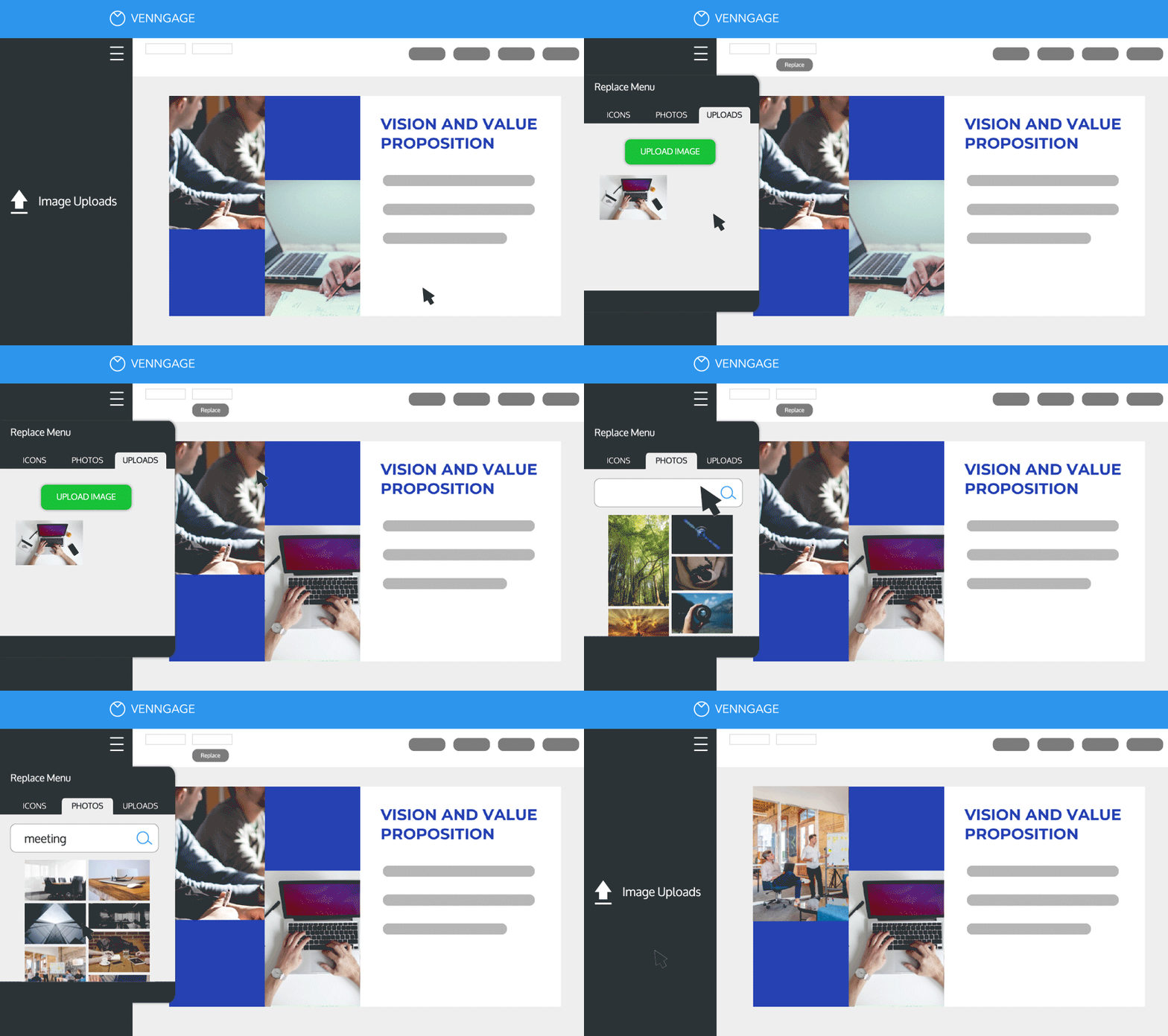
- Image: Upload your own image or choose from Venngage’s stock images. To upload an image, click on “Upload Image” and select a file from your computer.
Step 4: Adjust background image
- If you’ve chosen an image, you can adjust its size, position, and opacity.
- Use the sliders to make these adjustments until the background looks just right.
Step 5: Add text and graphics
- Customize your slides further by adding text, charts, icons, and other graphics.Use the tools on the left-hand side to insert and format these elements.
Step 6: Preview and make final adjustments
- Preview your presentation to see how the slides look together and make any final adjustments as needed.
Step 7: Download your presentation
- Once you’re satisfied with your presentation, export it as a PowerPoint file. Click on the “Download” button and choose the PowerPoint format (.pptx).
FAQs about PowerPoint presentations
What is a custom PowerPoint template?
A custom PowerPoint background template is a personalized background design for your slide deck. Using a customized design means your presentation is unique, giving you a competitive edge in the industry.
How do you create a background in PowerPoint?
Here are the steps to creating a background in PowerPoint.
- Access the Slide Master menu
- Choose the slide you want to change
- Select format background, and you can change to a solid fill, texture fill, or picture from file
- Choose the style or file for your background
There’s also a feature to hide background graphics and show a plain design for selected slides.
What makes a good PowerPoint presentation?
When creating a PowerPoint presentation, always remember that less is more. Here are a few things to consider as well.
It must be organized.
When you organize your presentation, you should think about the design elements and how they could fit well into your layout. It shouldn’t look cluttered because that can cause your audience to lose attention.
It should tell a story
As much as possible, make your PowerPoint seamless by following a storyline. Your content should flow smoothly and the slides must be connected. Just imagine going back multiple slides during your presentation to clarify a point. It’s a waste of time.
It must be according to your company’s branding
Your PowerPoint presentation must reflect your company’s branding. Use your brand’s color and don’t forget to add your logo.
Is creating a PowerPoint template hard?
It is challenging to create a PowerPoint template from scratch especially if you are a nondesigner. You have to think about all the design elements that will go to the Slide Master.
This is the top slide in a hierarchy that keeps the information about your chosen theme, fonts, and layout. You can edit this from the Slide Master tab.
But it doesn’t stop there because you still need to check each slide to see if it goes well with your central theme.
Use Venngage to create an effective PowerPoint template
Having to create a custom PowerPoint template and deciding on background styles can take up a lot of time. Save time and energy by using ready-made presentation templates.
Venngage is one of the best platforms where you can choose from dozens of designs perfect for your presentation deck. Use the Venngage presentation maker and create slide layouts like the ones in this post.
Sign up is completely free and then you can start designing your slides with Venngage’s custom PowerPoint templates.


