A good report design encompasses a visually appealing and well-structured layout that effectively communicates information. It involves a clear and logical organization with headings and sections, consistent branding elements, readable typography and a visual hierarchy to emphasize key points.
Ultimately, designing a good report goes beyond aesthetics and encompasses strategic elements that facilitate effective information communication. This includes implementing visually appealing and well-structured layouts.
Ideally, your report should be mobile-friendly too. Sounds like a lot, but I’ve got everything covered in this guide so keep reading or get started right away with one of Venngage’s professionally designed report templates.
Report design essentials with examples
I’ve seen reports that kept me engaged and others that feel like a wall of text. The difference? Good design. A well-structured report enhances readability, highlights key insights, and keeps readers engaged.
In this section, I’ll share essential report design principles with real examples to help you create professional, visually compelling reports that inform and impress.
- Balance text and visuals for engaging and readable reports
- Use a highlight color to emphasize key data and insights
- Structure text for clear hierarchy and easy navigation
- Apply branding for a professional and consistent report design
- Visualize data with charts and graphs for better storytelling
- Use a 2-column layout for better readability and organization
- Improve readability with whitespace and proper formatting
- Maintain consistency with visual motifs and design elements
- Group related information with color blocks for clarity
- Include an appendix with detailed tables, charts and data
- Add an eye-catching cover to your report
First things first, when writing a report that uses a lot of data, you should use the IMRaD format. IMRaD is an acronym that stands for Introduction – Method – Results – and – Discussion.
If your report is more text than data-heavy, such as if you were creating an annual report or a nonprofit report about a program of activities, you should broadly follow the IMRaD format too. Although with less emphasis on the ‘method’ section. Instead, focus on showcasing the results of your work.

Once you feel confident and inspired, you can jump to our reports templates page to start designing your own custom report! Keep reading for some report design ideas.
1. Balance text and visuals for engaging and readable reports
As humans, we’re much better at grasping information presented in the form of visuals than written text. So when designing a text-heavy report, look for opportunities to summarize information by transforming text into visuals to make your information more engaging and easier to digest.
Don’t use words if the same information can be presented visually.
Aim for at least a 50/50 balance between text and images. At least half of each page should be dedicated to visuals like charts, diagrams, and helpful images.
As with the simple report design above, every chunk of text in the report should be accompanied by a representative visual. The visual should communicate the bulk of the information, and the accompanying text should list the major takeaways.
Even if your report requires a more text-heavy approach, try to scatter visuals between the longer paragraphs of text. Alternating text with visuals will help keep your readers engaged from page to page like in this report design idea:

Just remember, functionality should always come first. Visuals should be used to enhance understanding–to categorize, highlight, and emphasize information–not just to break up the text. Choose visuals that make your content easier to understand.
Our progress report templates are ideal for businesses and consultants to showcase the right data and ignore all the minutiae in the process.
Our consulting report templates are another good resource.
2. Use a highlight color to emphasize key data and insights
Color is one of the most important elements of any design.
Besides playing a role in the overall look and feel of a design, color can be even be used to control where our readers look. We can use bold color accents to draw our readers’ attention to any key facts and figures that we think are particularly important.
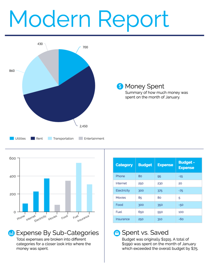
As shown in the modern report design below, color is a powerful tool for highlighting significant data points and drawing attention to report headers.

Just make sure you use highlight colors with restraint. Many bright, contrasting colors will compete with each other and overwhelm the senses, distracting from the message you’re trying to communicate.
Sticking with a single highlight color will enhance your readers’ comprehension, and even help to tie your document together.

3. Structure text for clear hierarchy and easy navigation
Similar to the way we can use color to tell our readers what to look at first, we can use text size to tell our readers what to read first.
This is what a typographic hierarchy is all about–sizing and styling text so that readers can easily navigate our reports with just a quick glance.
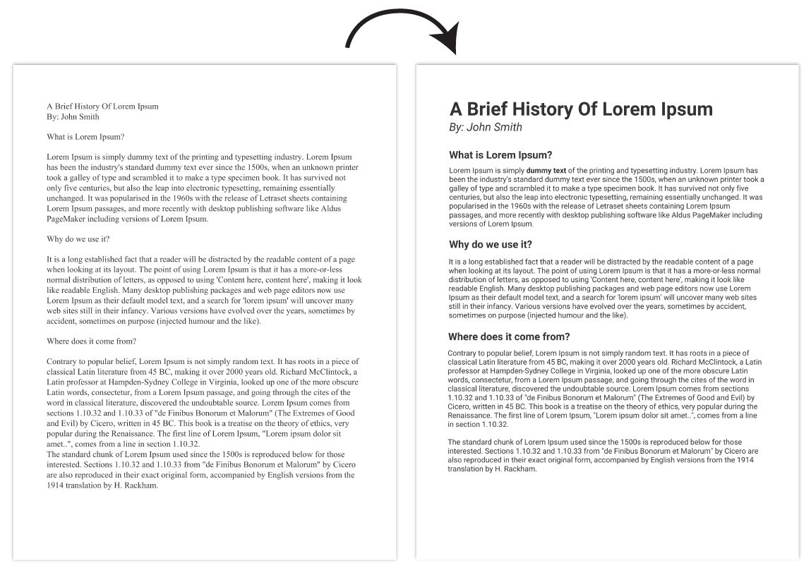
Every report should have at least three levels of text hierarchy, and this hierarchy should be applied to the entire document.
Your text hierarchy should contain, at the very least:
- Header text
- Subheader text
- Paragraph text
As seen in the report design below, headers should be big and bold enough to grab your reader’s attention, and a bit stylized. Subheaders should be a little smaller, and a little less stylized. Paragraph text should be more minimal in style, and highly readable.

Check out our guide on choosing fonts for more information on creating text hierarchies.
4. Apply branding for a professional and consistent report design
It’s usually a good idea to take your company’s branding into account when you create your reports.
Using your brand elements will help you stick with a single visual theme from start to finish, which is critical to creating a report design that feels like one cohesive document.
As seen in this example from IPG Media below, consistently applying company brand colors can have a dramatic effect.
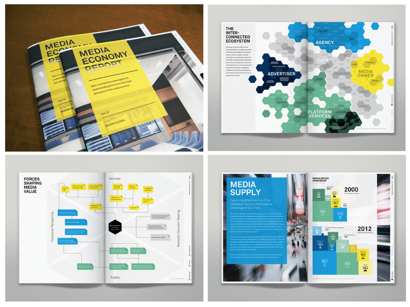
But don’t be afraid to add your own personal touch! Just because your design is consistent with your company’s branding doesn’t mean you have no creative freedom.
You can riff on your company’s core brand elements to create a fun design that still meets the brief. This report design from Maine Tourism mixes some secondary colors with the core brand colors to give the report a unique feel.

If you haven’t already, check out Venngage’s My Brand Kit. We’ve made it even easier to apply your company’s brand colors, fonts, and logos to all of our report templates!
Just upload your company logo, and add your company’s fonts and brand colors, then generate branded report templates with one click!

5. Visualize data with charts and graphs for better storytelling
Data visualizations in a long report don’t have to be fancy. In fact, simpler is usually better!
And that’s why knowing the basics of chart design can be a game changer for your report design.
Using simple charts like line, bar, bubble, and big number charts makes data easier to interpret, ensuring clarity and engagement. This is especially important for competitive analysis reports, where clear visuals help stakeholders quickly grasp key insights and make informed decisions.
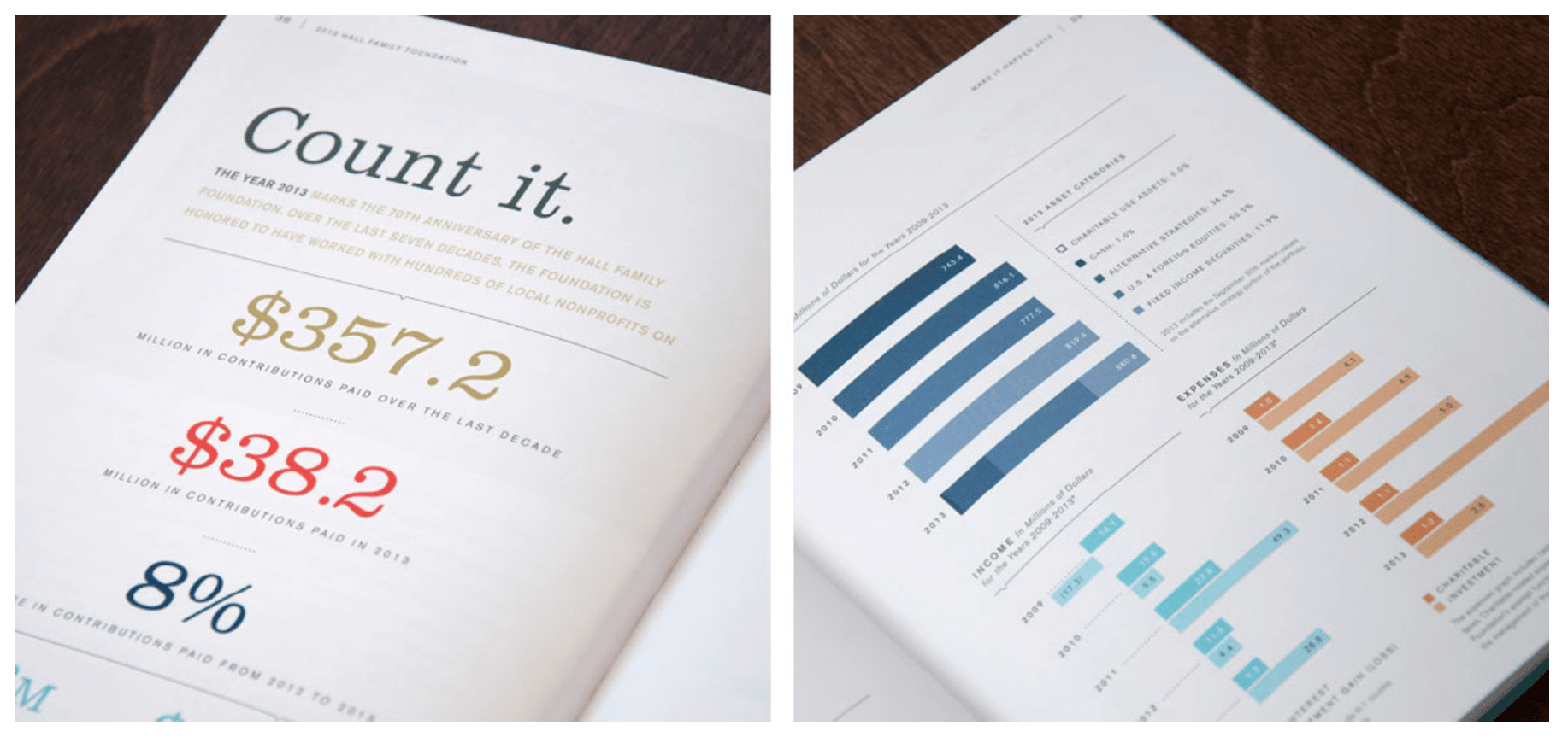
These basic charts can even be quite engaging if incorporated cleverly into your overall design. Check out this annual report design from the Hall Family Foundation, which uses very basic data visualization techniques (big number charts and bar charts) to great effect.
Just make sure you’re using charts that are appropriate for the type of data that you have and the message you’re trying to convey.
Here are a few guidelines on how to choose the right type of chart:
- Use line charts to highlight trends over time
- Use bar charts and bubble charts to show difference among categories
- Use big number charts to emphasize key performance indicators
Watch: How to Pick The Right Chart For Your Data
One final tip for visualizing data in reports: include descriptions for all charts or tables to add context for readers. As seen below, each chart should have some accompanying text (a header, at the very least) that provides clarification and explains important trends.
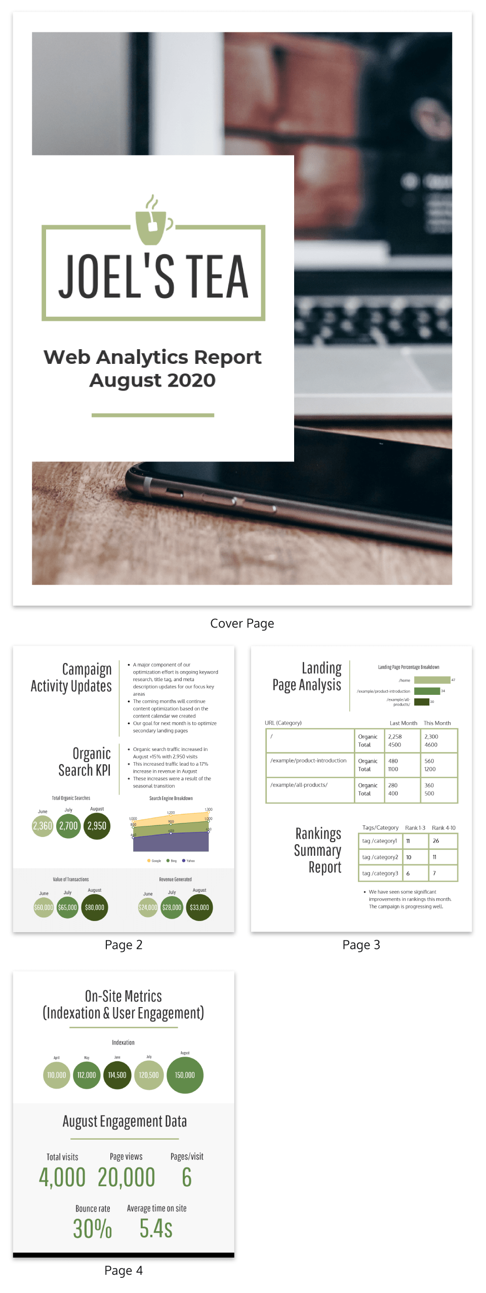
If you’re not sure of the best way to visualize your data, look for inspiration in our statistical infographics. Many of the same visualization techniques used in data-heavy infographics work surprisingly well in report designs, too.
6. Use a 2-column layout for better readability and organization
Messy, disorganized reports not only look unprofessional, they can be confusing!
Keep your reports organized by building them on a grid–ideally, a 2-column grid, as seen in this report design from the Global Fund for Children. A grid gives a report some visual structure, prevents visual clutter, and creates a satisfying sense of rhythm in the design.
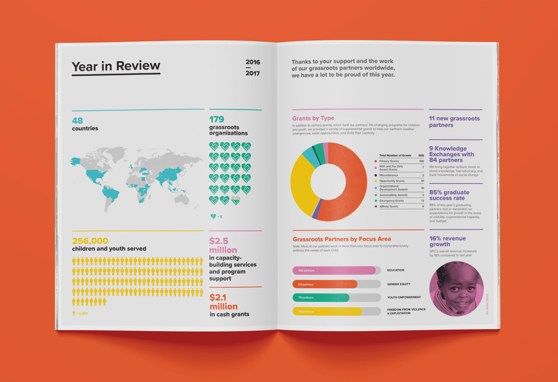
Designing on a 2-column grid will also prevent your paragraphs from getting too wide. The optimal line length of readability is about 60-70 characters per line, which usually works out about right in most 2-column layouts.
7. Improve readability with whitespace and proper formatting
Whitespace, the empty space around every piece of content on a page, is an essential element of good design.
The perfect amount of whitespace makes a design feel balanced and pleasing, while a lack of whitespace makes a design feel cramped and unfinished. Just take a look at what a difference a bit of whitespace makes in a simple design:

This report from Samsung Fire & Marine Insurance is a bit of an extreme example of whitespace in practice, but you get the point. The blank space around the text, numbers, and images helps a design feel light, polished and balanced:

When it comes to adding whitespace to your reports, keep in mind that readers might get turned off when faced with large walls of text. Try to summarize your information, break text up into smaller sections and space those sections out to prevent pages from getting too busy.

Whitespace is especially important in information-dense reports, which can easily look heavy and overwhelming in the page. By leaving generous margins around text sections and charts, we can prevent our reports from looking too formidable.
8. Maintain consistency with visual motifs and design elements
Consistency is crucial to a great report design. Since your text and visuals are changing from page to page, for the pages of a report to feel like they belong together, they must have similar design elements that remain consistent from page to page.
These consistent design elements (or motifs) could be images, illustrations, icons, or even just shapes!
Check out the annual report design below. The simple band along the right side of the page creates that essential visual consistency to tie the design together.

To add motifs to your report designs in Venngage, head to our Icon Library in the left panel of the editor. You can browse the library by category:

Or search for specific icons by keyword with our search bar. When using the search, you can even filter your search to find multicolored icons or single color icons (which can be customized to any color)!

9. Group related information with color blocks for clarity
The layout and design of a report should support readers’ understanding of the information within that report.
For example, we can use basic design elements (like blocks of color, lines, and borders) to indicate which information belongs together, making it easier for our readers to quickly interpret that information.

Let’s take a look at how this can help us design data-heavy pages of our reports.
Data-heavy pages can easily get visually overwhelming, with a ton of data points, lines, and bars all competing for our attention. By dividing these pages into defined sections, we can create a dashboard-style report design that’s much easier to take in:

Never underestimate the power of a color block!
10. Include an appendix with detailed tables, charts and data
To avoid overwhelming readers with too much information at once, detailed tables and graphs should be left out of the main body of the report and included in an appendix instead.
This gives interested readers the opportunity to explore your content in greater depth while keeping your core report short and sweet.
When creating tables for your appendices, there are a few design tips you should keep in mind:
- Use a bright color to clearly distinguish header rows from body rows.
- Alternate the color of body rows between white and light grey to make the table easy to scan.
- Use brightly-colored boxes to draw attention to important values in the table.
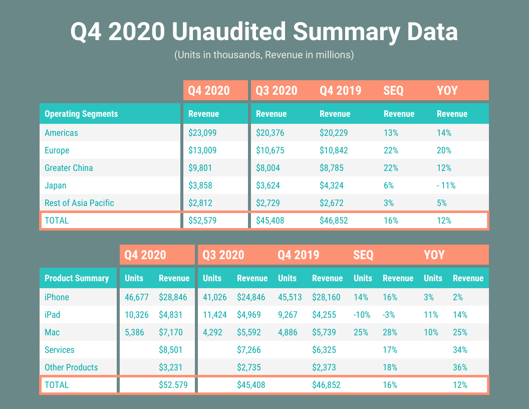
Designing an effective report is all about including the right amount of information. Your goal in the body of the report should be to state any key takeaways and back up those statements with supporting visuals. Any information beyond that should be relegated to an appendix.
11. Add an eye-catching cover to your report
“Don’t judge a book by its cover” might be good advice in your daily life, but the truth is that people still do it—and you need to take that into account if you want people to walk away with a positive impression of your report.
For printed documents, consider using a report cover page or book cover with an engaging photo, illustration, or other design on it. Make sure it’s an image that expresses the brand voice or subject matter associated with the report. You’ll also want something that matches the report’s overall tone; if it’s optimistic, sobering, or conflicted, choose an image that helps to convey those feelings.
Even if your report cover takes a fairly minimalist approach (with a design comprised of little more than the title of the report), that still adds a great deal more professionalism than there would be with no cover at all.
PS: If you’re an HR professional, you can use our HR report templates to create anything from incident reports to performance reviews.
Related: 20 Professional Report Cover Page Examples & Templates [100% Customizable]
Conclusion
Even if the content of your report is dry, the design of the report doesn’t have to be. With these report design best practices in mind, you can create documents that make the information they contain easy to digest and a pleasure to read.
Get a head start on your next report design ideas with one of our many report templates and our easy-to-use report creator.
More report design guides:


