


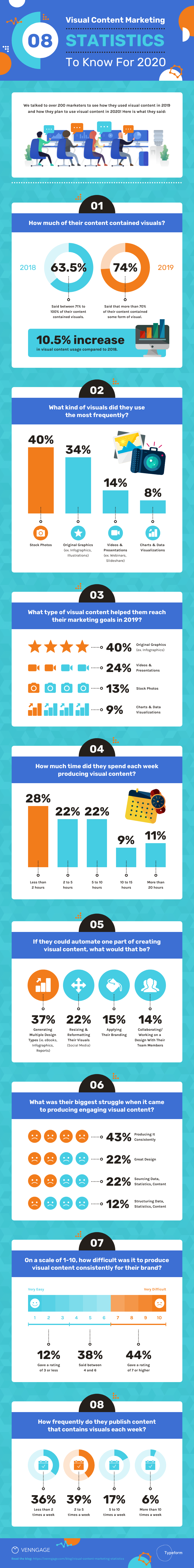
Pie charts and donut charts have become the go-to data visualization types, especially in infographics, but it’s worth asking: do they always fit the bill? Sure, they are the most familiar, but there may be better options.
The rule of thumb should always be: Will this visual help someone interpret and understand this data better?
You’ll have all your questions answered about pie chart infographic best practices and other ways to show percentages in infographics in this post. You can then start working on your infographic by customizing Venngage’s pie chart templates. Just upload, copy and paste, or manually enter data with our Chart Maker.
Click to jump ahead:
- What are the best practices for using pie charts
- How to show percentages with bar charts
- How to show percentages with pictograms
- How to show percentages in infographics using pie charts, bar charts and pictograms
What are the best practices for using pie charts
Because pie charts are so well known, they are generally easy for people to read and understand.
Before you dive in, though, think it through. Unfortunately, it’s really easy to make pie charts that don’t make much sense. These are some big errors to look for and avoid:
1. Too many slices – The slices get smaller and harder to read if there are any more than 3 or 4 of them.
2. Poor use of colors – They should be different enough that someone can easily identify which slice is which.
3. Awkward labeling – Labels should help someone easily make connections, like in the example below. If you need to use a legend, you probably have too many slices or aren’t using the best colors.
4. 3D pie charts – They make it harder for people to make visual comparisons, which is the whole point of visualizing data to begin with.
5. Using pie charts to visualize anything other than percentages or parts of a whole! (Yes, some people make that major mistake.)
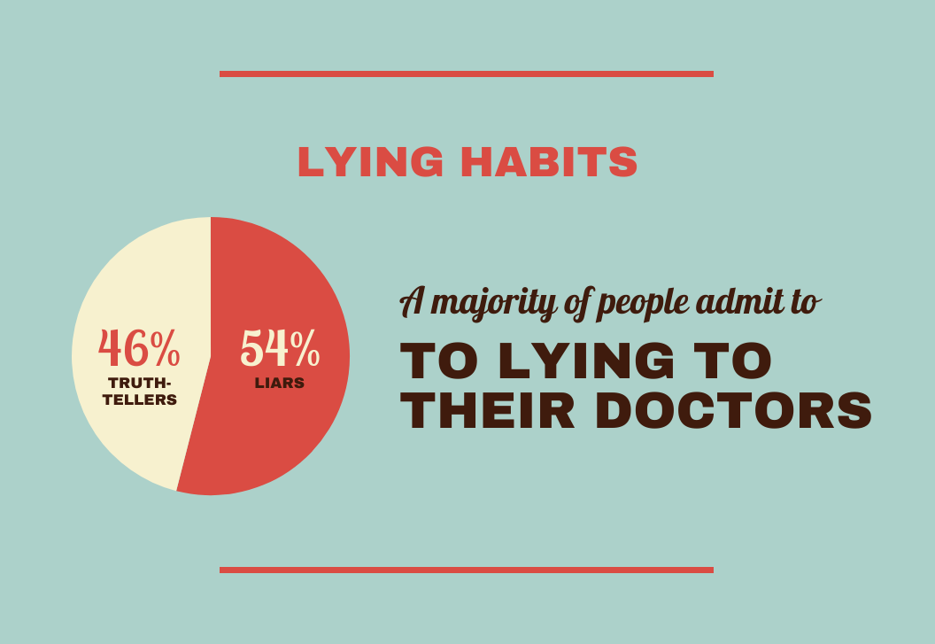
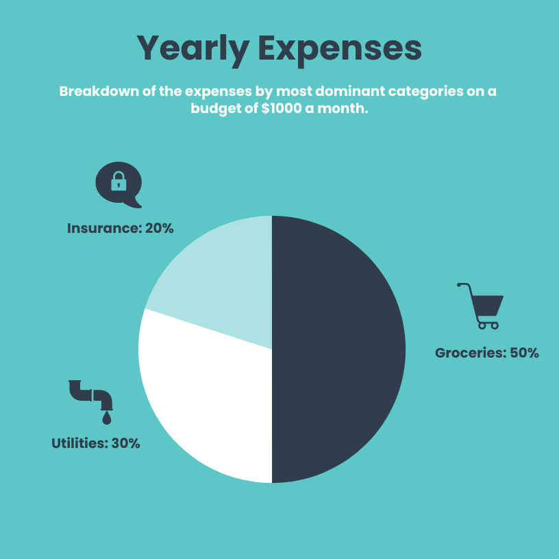
In recent years, more and more people have been using donut charts too. These are more difficult to make meaningful because by removing the middle of the pie, your audience may not be able to see the angles in the center to help them better make comparisons.
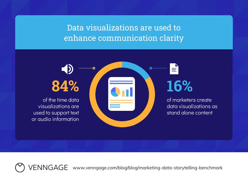
So they are best used if you are showing one single percentage figure, or if you are showing two very different parts of a whole like in this example.
How to show percentages with bar charts
Bar graphs are usually better for visualizing data than pies and donuts. (Research has proved it.) They are also well-known and easy to make.
They are also easy to interpret because the reader is comparing length, rather than area, angle, or curvature—all of which are much harder to do.
Think about it this way: It’s always easy to spot the tallest person in a crowd but usually, it’s more difficult to determine which person weighs the most or has the straightest spine. Remember, you want to make it super easy for your audience to have their “aha” quickly, not make them have to think about it—that’s why visuals are so valuable!
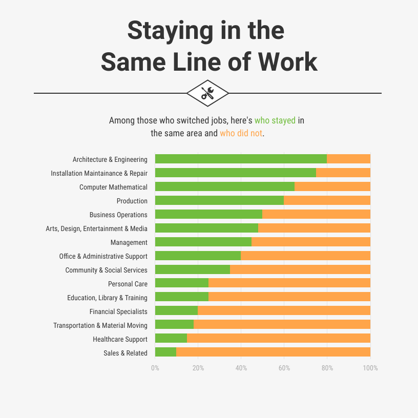
Stacked bar graphs can also be good for making comparisons, for example showing two percentages that add up to 100%.

Here are some tips for making bar charts that will wow your audience:
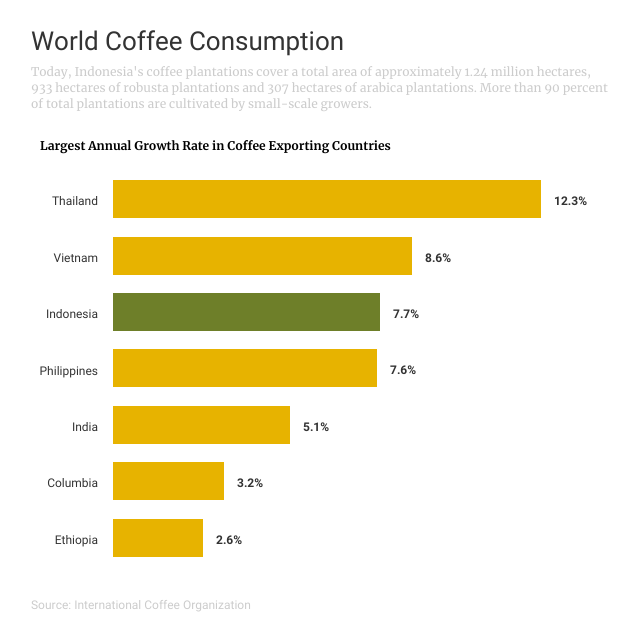
1. Stack the bar charts in order
This way your audience can very quickly determine which value is the lowest and which is the highest.
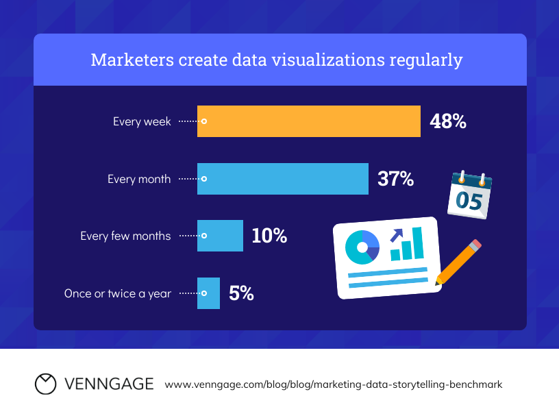
2. Highlight bars of note with a different color
This is especially helpful if you are trying to help your audience compare a percentage that is not the highest or lowest in a set of categories. Here is an example.
3. Label the graph well
Be sure to label the axes so your audience knows what they are comparing. Usually, it’s a good idea to have the percentage axis go from 0% to 100% so your audience can compare the values not only to each other but to the maximum value possible.
If you have room, you can add meaningful icons like in this stacked bar example.
4. Use subtle grid lines if there are lots of bars to compare
In this stacked bar chart, the reader can use the lines for the percents on the axes to read the bars in the middle.
How to show percentages with pictograms
Another option for showing percentages is the pictogram. Pictograms could be the best option of those mentioned, for several reasons.
1. Pictograms are great for showing ratios, which are often more relatable
If you can simplify percents into ratios, they are often easier for people to understand; for example, 1 in 4 women instead of 26% of women.
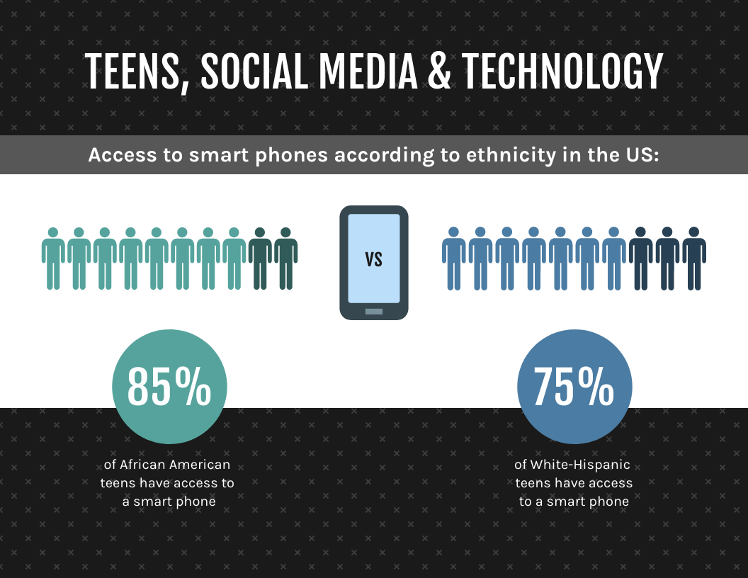
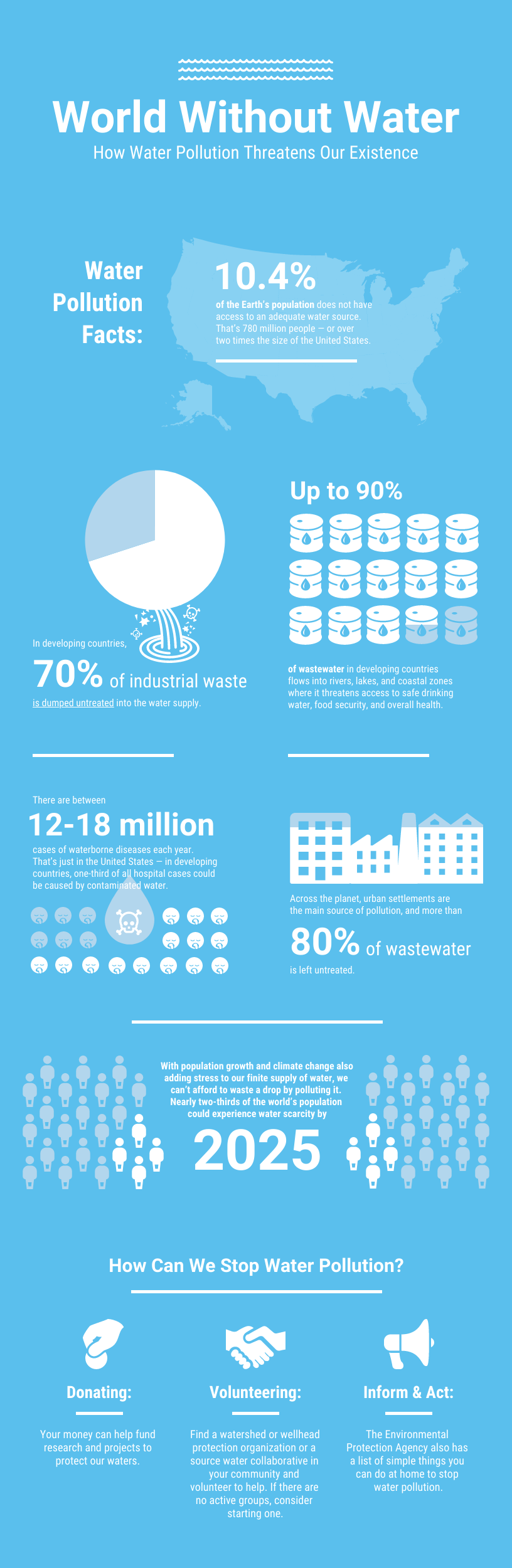
With a pictogram, you can easily show the ratio and help your audience see the number. Here is an example that shows 8 of 10 African American teens versus 7 of 10 White-Hispanic teens.
2. Pictograms make it easy to make comparisons
As you can tell in the example above, pictograms make it very easy for your audience to compare percentages. In that example, instead of comparing 75% to 85%, your audience is basically comparing 7 to 8.
Here is another example. The percentage numbers being compared are much lower (4-10%), so this visual helps people notice small differences that would likely be masked in a bar chart with an axis that goes up to 100%.

3. Icons help readers connect better with the data
This is particularly important if you’re telling a story about actual people because it allows readers to build empathy when they are reading data, which may create emotional distance.
Here is an example that visualizes a larger percentage, instead of a simpler ratio. If the statistic you are drawing attention to is compelling, for example 60% of people know someone who has had cancer, then it’s worth showing how large of a percentage that actually is in this way.

How to show percentages in infographics using pie charts, bar charts and pictograms
Now that you have a better understanding of these chart types and how to best use them to show percentages, you can thoughtfully consider including them in your infographics. Just remember to always ask yourself which visuals will most help your audience understand the data.
If your infographic includes many percentage points of note, you can combine them alongside copy and other visuals to help tell a story.
Related: How to Tell a Story with Data: A Guide for Beginners
Here are a couple of examples. This first one uses pictograms and a pie chart. What do you think is most effective?
Here is another example that includes more data. The different visuals—pie charts, bar charts, and pictograms—create variety for the reader. Now that you are more familiar with various options, would you show this data differently? You can use this template to try out new approaches right now!
If you are looking for more tips, check out these dos and don’ts for chart design.
Once you’ve gathered all the tips you need, it’s easy to start making a pie chart infographic using Venngage’s easy-to-edit templates and drag-and-drop editor. You can start creating your infographics for free, and upgrade to a paid plan to download.


