


The first infographic I ever made looked perfect on my screen. I picked a template I liked, edited the content, downloaded it headed straight to social media to post it. Ready to go.
Except it wasn’t. The bottom of the infographic was cut off. Turns out I had picked a long-format template when the platform needed something much shorter. I spent the next hour rearranging the entire layout just to fix a sizing mistake I could have avoided.
If you have been there or want to avoid making this mistake, this guide will help you.
The tricky part is that there is no uniform infographic size. The right dimensions depend on where you are publishing and whether your content is actually readable at that size. In this guide, I break down the correct dimensions for every major platform.
What’s the best size for an infographic?
The best infographic size depends on where you are publishing. For blogs, start at 800 to 1000px wide with height driven by content. For Instagram, use 1080x1350px (4:5). For Pinterest, 1000x1500px (2:3). For print, design at A4 or US Letter size at 300 DPI and export as PDF.
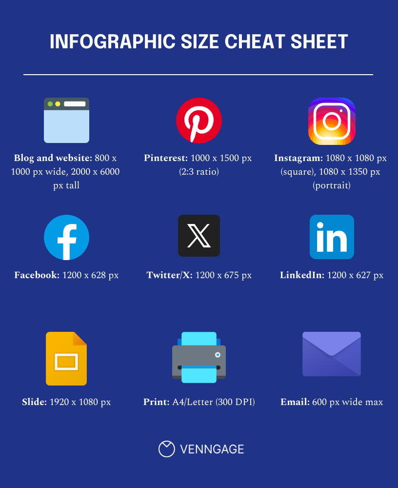
- Blog and website: 800 x 1000px wide, 2000 to 6000px tall. Vertical format works best for detailed, scrollable content.
- Pinterest: 1000x1500px (2:3 ratio). Taller pins get more real estate in the feed.
- Instagram: 1080x1080px for square, 1080 x 1350px for portrait. Portrait gets more screen space.
- Facebook and LinkedIn: 1200 x 627px for shared posts.
- Twitter/X: 1200 x 675px. Stick to this, or it will get cropped on mobile.
- Slides and presentations: 1920 x 1080px (16:9) for modern screens, 1024 x 768px (4:3) for older formats.
- Print handouts: A4 or US Letter at 300 DPI, exported as a PDF. Anything below 300 DPI will look blurry in print.
Infographic size chart for different platforms and use cases
If you find yourself jumping between tabs every time you start a new infographic design, this section is worth bookmarking. All infographic dimensions are in pixels unless stated otherwise and the social media specs have been verified as of March 2026.
Web and blog infographic sizes
800px is the safe default for infographics added to blog posts. Most blog themes are built around it as it renders cleanly on mobile, and you will rarely run into layout issues.
Here is when to go wider or narrower:
- 600px: Narrow blog columns, sidebars, or email embeds. Best when your content area is tight, or page speed is a priority.
- 800px: The default for most blogs and CMS platforms. Works across themes without horizontal scrolling.
- 1000px: Wider blog layouts or content-heavy visuals, such as comparison infographics where text density is high.
- 1200px: Full-width layouts and data-heavy designs built to maximize time on page. Keep a close eye on file size at this width.
On height, there is no fixed limit for different types of infographics. The classic vertical infographic baseline used by most professional design agencies sits at around 1000px wide by 6000px tall, but that is a common deliverable convention, not a rule. Let your content decide the height.
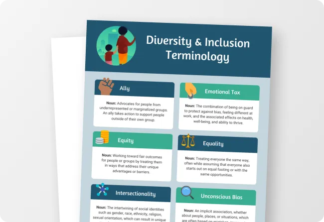
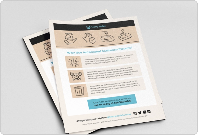
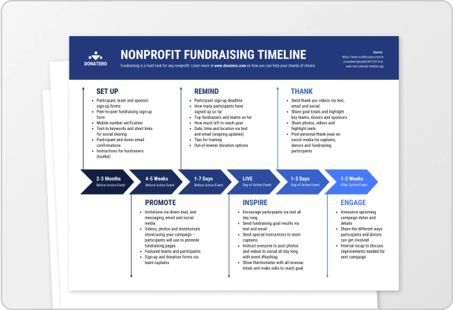
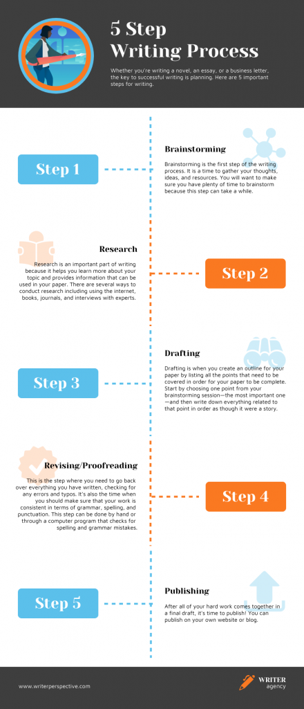
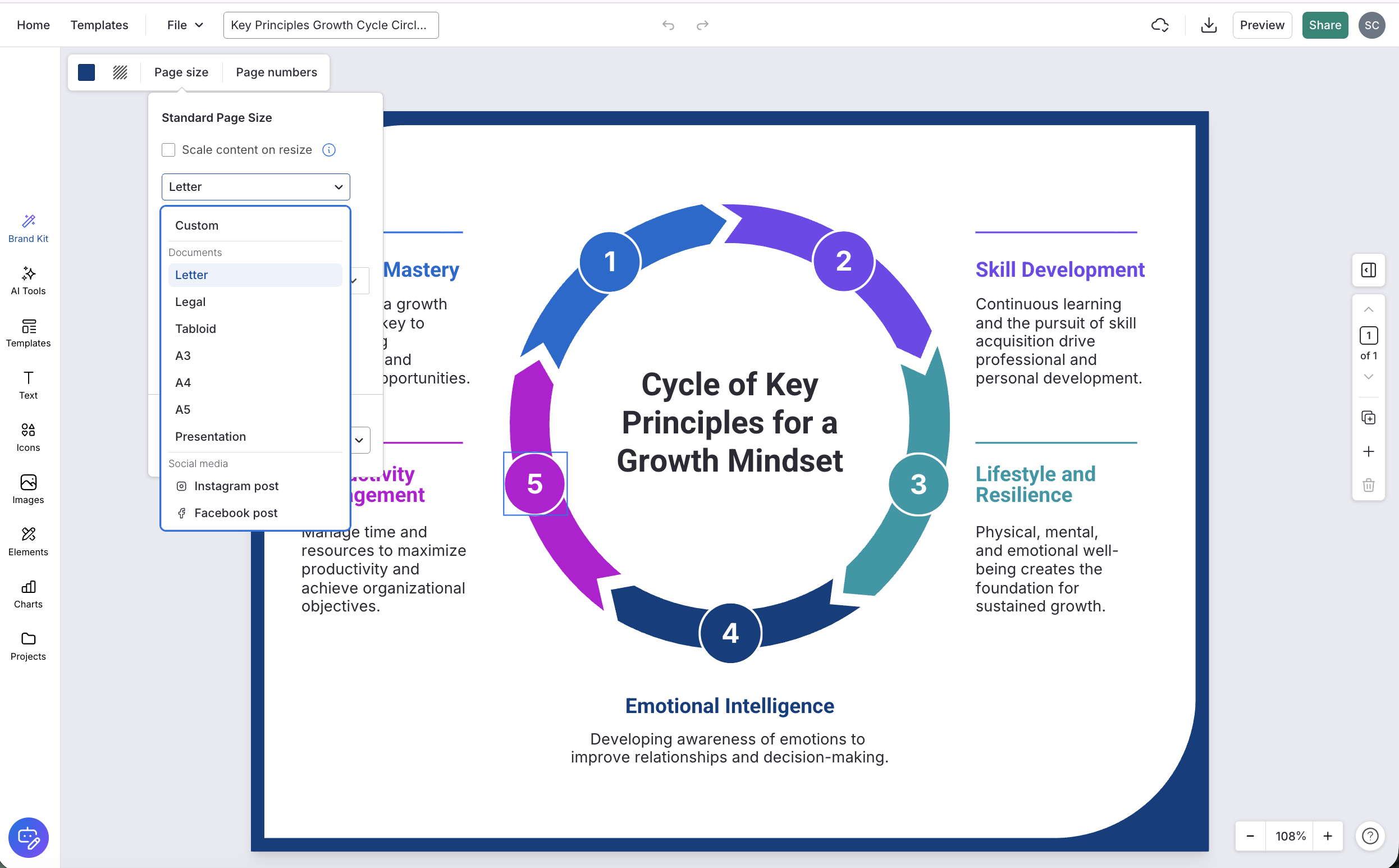
For example, if you want to explain a process, a vertical infographic like the one shown below, works best.
That said, very tall infographics come with a few practical problems you should plan for:
- Add a jump link above the infographic so readers can skip past it if they just want the text
- Embed a compressed version on the page and link out to the full-res file separately
- A very tall infographic exported at high resolution can slow your blog post load time noticeably, so aim to keep your embedded image under 1 to 2MB
Before you pick a pixel dimension for social media infographics, get the aspect ratio right. It controls how the platform crops and previews your image in the feed.
Instagram infographic size
- Square feed: 1080 × 1080px (1:1)
- Portrait feed: 1080 × 1350px (4:5) — portrait gets more screen space in the feed
- Stories and reels: 1080 × 1920px (9:16)
- Carousel: 1080×1350px per frame
Pinterest infographic size
- Standard pin: 1000 × 1500px (2:3)
- Tall infographic pin: 1000 × 3000px for vertical, tall infographics
- Important: Pinterest only shows the top portion of very long pins in the feed unless someone clicks. If your Pinterest infographic is taller than 2:3, design the top section to work as a standalone hook.
LinkedIn infographic size
- Landscape post: 1200 × 627px
- Square post: 1200 × 1200px
- Document or carousel upload: 1080 × 1080px per slide
Facebook infographic size
- Shared post: 1200 × 628px (16:9)
- Stories: 1080 × 1920px (9:16)
X (Twitter) infographic size
- In-feed image: 1200 × 675px (16:9)
- Square: 1200 × 1200px also displays in full in the tweet stream without cropping
Platform specs change without much notice. The social media image sizes mentioned above are verified as of March 2026, but always double-check before you publish something important.
Print infographic sizes (A4, Letter, A3) and DPI
For print, resolution matters more than pixel dimensions. The rule is simple: 300 DPI (dots per inch) minimum. Below that, your infographic will look crisp on screen and blurry on paper. Every time.
- A4 (210 × 297mm/8.3 × 11.7in): This is the global standard for handouts, reports and one-pagers. If your audience is outside the US, this is your default.
- US Letter (215.9×279.4mm/8.5×11in): This is the US equivalent. It’s slightly wider and shorter than A4.
- A3 (297 × 420mm/11.7 × 16.5in): This size works best for posters and conference handouts where content would be too cramped at A4.
Pro Tip: always export print infographics as a PDF rather than a PNG or JPEG. A print-ready PDF preserves your fonts, colour profiles and resolution in a way that image formats simply do not.
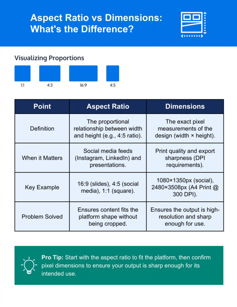
Dimensions vs aspect ratio (why both matter)
These two terms get used interchangeably all the time.
- Dimensions are the exact pixel measurements of your infographic, the width multiplied by the height. So when someone says an infographic is 1080 × 1350px, they are giving you the dimensions.
- Aspect ratio is the proportional relationship between the width and height. That same 1080 × 1350px infographic has a 4:5 aspect ratio, meaning for every 4 units wide, it is 5 units tall.
You need to understand both because they solve different problems.
When aspect ratio matters for infographics
Think about aspect ratio when you are designing for social media previews or slides. Platforms like Instagram, Pinterest and LinkedIn do not crop based on your exact pixel count. They crop based on shape. If your infographic has the wrong proportional shape for the platform, it will get cut off in the feed regardless of whether your pixel dimensions are technically correct.
The same applies to presentations. A slide deck set to 16:9 will letterbox or stretch any content that was not built to that ratio.
When exact pixel dimensions matter
Pixels are what you need to nail for print and export sharpness. A print infographic does not care about its aspect ratio in isolation.
It needs enough pixels per inch to reproduce the design at the size you are printing. That is why a print-ready A4 infographic needs to be 2480 × 3508px at 300 DPI.
Start with the aspect ratio to make sure your design fits the platform, then confirm the pixel dimensions to make sure the output is sharp enough for how you plan to use it.
How to choose the right infographic size?
Before you open a design tool and start dragging things around, answer these four questions in order. Each one narrows your options and saves you from rebuilding the layout later.
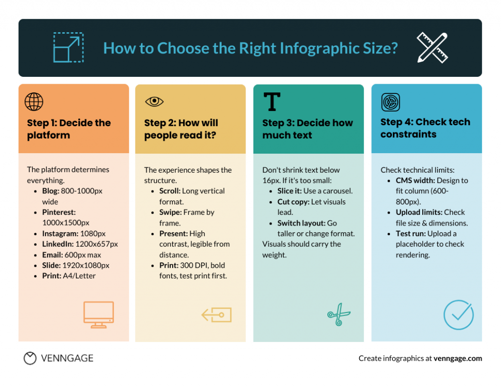
Step 1: Decide the platform
The platform your infographic lives on determines everything else, so start here before you make any other decision.
- Blog post: Vertical format, 800 to 1000px wide, height driven by content
- Pinterest : 1000 × 1500px (2:3) for standard pins, 1000 × 3000px for tall infographic pins
- Instagram feed: 1080 × 1080px square or 1080 × 1350px portrait for more feed space
- Instagram carousel: 1080 × 1350px per frame, one idea per slide
- LinkedIn: 1200 × 627px landscape or 1200 × 1200px square, document upload at 1080 × 1080px per slide
- Email: 600px wide maximum, keep height short and file size under 1MB
- Slide deck: 1920 × 1080px (16:9) for most modern tools
- Print: A4 or US Letter at 300 DPI minimum, exported as PDF
If you plan to publish it in more than one place, design for the most restrictive format first and adapt outward from there.
Step 2: Think about how people will read it
The reading experience shapes how you structure the content inside those dimensions.
- Scroll (blog, Pinterest): Readers move top to bottom at their own pace, so a long vertical format works. You have room to layer information, add context and let the story breathe.
- Swipe (Instagram carousel, LinkedIn document): Readers move frame by frame. Each frame needs to work on its own. If your infographic must be readable in-feed, prioritise larger text and fewer points per frame.
- Present (slide deck): Your infographic is being viewed from a distance on a screen, often while someone is talking over it. Keep it clean, high contrast and legible from across a room.
- Print (handout, poster): People are reading up close and holding the material in their hands, so the design needs to hold up at full size. Use high-contrast colours, bold enough fonts to stay crisp at 300 DPI and always do a test print on plain paper before sending anything to a professional printer.
Step 3: Decide how much text to add
This is where most people run into trouble. They try to fit everything into a single format and end up shrinking the text until it is barely readable.
The rule of thumb is straightforward: if your body text has to drop below around 16px to fit the layout, the format is wrong for the content. You have three options at that point.
- Slice it into frames: Break the infographic into a carousel or multi-part series
- Reduce the copy: Cut ruthlessly and let the visuals carry more weight
- Switch the layout: Go taller on web, or move to a format that gives you more room
If you are unsure about which format works best for your content, check out our guide on the best visual content formats.
Step 4: Check technical constraints before you design
Before you start designing the infographic, check technical capabilities as well:
- CMS column width: Most blog themes have a content column somewhere between 600 and 800px wide. If you design at 1200px and your theme caps out at 700px, the image will either get scaled down or overflow the layout. Find your column width first and design to fit it.
- Upload limits and max image dimensions: Some platforms cap file size or pixel dimensions at the upload stage. WordPress, for example, has server-side limits that vary by host. Find out what your platform allows before you commit to a large canvas size.
If you are working on a large or complex infographic, do a test run before you invest hours in the design. Save a placeholder image at your intended dimensions and upload it to the exact page or platform where the final version will live. Make sure to check how it renders on both desktop and mobile.
Export settings: best format for an infographic (PNG vs JPG vs PDF vs SVG)
Getting the dimensions right is only half the job. You also need to export the infographic in the right format to avoid blurry images.
For web and blog
For most web infographics, the choice comes down to PNG or JPG.
- Use PNG when your infographic has text, icons, flat colours, or a transparent background.
- Use JPG when your infographic is photo-heavy and has minimal text.
- If your platform supports it, WebP is worth considering as a modern alternative to both. Smaller file sizes, comparable quality, better page load performance.
- Consider SVG if your infographic is built entirely from vectors with no photos embedded and needs to scale across different screen sizes. It stays perfectly sharp at any size and works well when you are working with a developer to implement it properly.
Pro Tip: On file size, aim to keep embedded web infographics under 1 to 2MB. Run the file through a compression tool like Squoosh or TinyPNG before uploading.
For print
Export as a PDF, not a PNG or JPG.
A print-ready PDF bundles your fonts, colour profiles and resolution data into a single file a printer can interpret exactly as intended. Flatten it into pixels and you lose all of that, which is how colours end up looking different in print than on screen.
When exporting, make sure images are embedded at 300 DPI and the page size matches the intended print size. If you are sending to a professional printer, ask about bleed and safe margins.
Bleed extends your background a few millimetres beyond the page edge, so there is no white border if the cut is slightly off. Safe margins keep your text and key visuals at least 3 to 5mm from the trim edge for the same reason.
A high-resolution PNG or JPG is fine for home or office printing. For anything going to a print shop or being distributed professionally, always use the PDF.
Infographic sizes in Word and PowerPoint
Most infographic design happens in dedicated tools like Venngage, Piktochart or Adobe Illustrator, but if you are working in Word or PowerPoint, here is what to know.
Word (print-first)
Word is built around print, so treat it that way. Set your page to A4 or US Letter before you start designing, not after. When you are done, export to PDF for print and PNG for web insertion.
PowerPoint (screen and slide-first)
Use the 16:9 slide size (33.87 × 19.05cm or 1920 × 1080px) for anything going on a screen. If you want to repurpose slides as social content or carousel frames, export individual slides as PNGs at the highest resolution the export settings allow.
PowerPoint’s default export resolution is lower than you would expect, so go into the settings and manually set it to 300 DPI before exporting.
Layout and readability rules
Picking the right dimensions gets your infographic in front of people. Getting the layout right is what makes them actually read it.
Simple layout formula
Start with a clear title, move into sections and keep a consistent grid throughout.
- One-column layouts work best for tall vertical infographics, step-by-step content and anything being read on mobile.
- Two-column layouts suit comparison content, data-heavy designs and print formats where you have more horizontal space to work with.
Typography guidelines
Design for the smallest context your infographic will appear in, which is usually a mobile feed. If the text is readable there, it will be readable everywhere else.
Keep type styles to a maximum of two or three across the whole design. A heading style, a body style and an accent or label style are usually enough.
Avoid dense paragraphs inside an infographic. If you are writing in full sentences, you probably need to edit the copy down, not shrink the font.
Common mistakes to avoid while creating infographics
- Endless length with no structure: If there are no clear sections or visual breaks, readers drop off. Break long infographics into labelled sections.
- Tiny text after repurposing: Resizing a blog infographic for Instagram without adjusting the layout almost always results in unreadable text. Resize the content, not just the canvas.
- Too many colours and fonts: More than three colours and two or three fonts and the design starts to feel chaotic. Pick a palette and stick to it.
- Ignoring file weight: A 10 0MB infographic embedded in a blog post will slow the page down noticeably. Compress before you upload.
The faster way to avoid these mistakes
A lot of these mistakes happen because designing an infographic from scratch, sizing it correctly, editing the copy and exporting it in the right format are all separate decisions that are easy to get wrong in isolation.
A tool like Venngage handles most of this in one place. Venngage’s AI Infographic Generator turns a text prompt into a structured, properly laid out infographic in seconds.
You can select the intended canvas size upfront, whether that is A4, US Letter, a presentation slide, or an Instagram post, and the tool sets the dimensions automatically.
Plus, social media infographic templates are already sized for their intended platform, so you don’t have to adjust the infographic size manually.
The built-in AI editing tools help you tighten the copy so it fits the design easily. And when you are done, you can export directly as PNG for social, PDF for print, or PPTX for presentations, all from the same file.
Frequently asked questions
1. Does an infographic have to be vertical?
No. Vertical is the most common format because it works well for scrolling and social feeds, but horizontal infographics work well for timelines, comparisons and slide decks. The format should follow the content, not the other way around.
2. How long should an infographic be?
Long enough to cover the topic clearly, short enough that it does not need a scroll bar on a desktop screen to feel manageable. For the web, most well-structured infographics land between 2000 and 6000px tall. If you are pushing past that, consider breaking it into a series.
3. How big is a typical infographic size for a blog?
The most widely used baseline is 800px wide, with height driven by content. Research across 150 popular infographics puts the average height at around 5000px, though the range varies widely.
4. What size is A4 in pixels at 300 DPI?
2480×3508px in portrait orientation. If you are designing for print, this is your starting canvas size.
5. What is the best aspect ratio for an infographic?
It depends on the platform. For Pinterest, 2:3. For Instagram feed, 4:5. For slide decks, 16:9. For web and blog, there is no fixed ratio since height is determined by content.
6. Can one infographic size work across platforms?
Not really and trying to force it usually means the design is compromised everywhere. The practical approach is to design for your primary platform first, then create adapted versions for the others rather than stretching one file to fit everything.
7. What file type should I use to email an infographic?
PNG for a standard image attachment, kept under 1MB where possible, so it does not get flagged or clipped by email clients. If the infographic is long, consider linking to a hosted version rather than attaching it directly.
Create infographics with Venngage
Infographic sizing does not have to be complicated, but it does require a decision at each step. Start with the platform, match the dimensions to the aspect ratio that the platform expects, export in the right format and do a test upload before you commit to the final version. That sequence alone will save you from most of the layout and quality problems that come up after the design is done.
If you want to skip the guesswork entirely, Venngage’s AI Infographic Generator handles the sizing, layout and export settings for you. Just bring your content and let the tool do the heavy lifting.