


I have written about how to create an infographic from scratch many times (you can see some of those here, or here, and maybe even here).
But I have neglected a question that many new infographic creators may run into.
I would have never known about it until we talked to one of our customers.
They asked us what size their infographics should be and where they should place their infographics in their blog posts.
This may sound like an simple thing, but infographic size and placement could be the difference between readers seeing your infographic and readers missing it altogether.
Because if it is too small to or do not know where it is placed then how are they going to read and share it?
Now, I know how we do it at Venngage, but there’s more than one approach.
So I decided to look at 150 of the most popular infographics from 2017 to figure out how the other creators incorporated them into their content.
I found out that there are definitely some best practices but in some cases, it really depends on the length of your content.
1. Make your infographic width around 800 pixels
A huge problem that new infographic creators can run into is not getting their infographic size right for their blog dimensions.
It is one of those things that you do not think about until it is too late, and then a lot of time is wasted already.
Most of the time, the infographic is way too small, which makes the image look terrible when you finally upload it to a blog post or article.
Or your readers can barely read the text, like on this page:

When you encounter this issue, using an image enhancer tool can help improve the readability. However, it’s always better to start with the right dimensions from the beginning
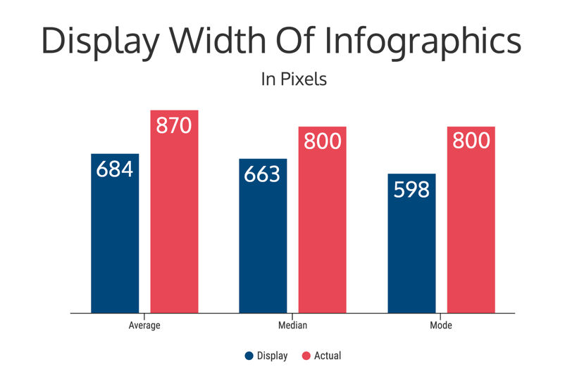
I found that there is a generally agreed upon infographic width of about 800 pixels.
In fact, the average infographic width was 870 pixels, with the median and mode coming in at 800 pixels.
Most of our templates on Venngage have a width of around 800 pixels:

Even if the width of your blog or site is much smaller than 800 pixels, I recommend sticking to that dimension for your infographic. That will ensure that the quality of your image is good.
For example, this infographic was designed to be almost exactly 800 pixels wide:

And this one as well–it’s 816 pixels wide:

And no matter what screen they are viewed on, they look great!
You never know where your awesome new infographic is going to be shared or repurposed, or even what type of screen your reader is using.
In fact, most of the infographics I looked at were uploaded at a higher pixel count than they were displayed at.
This gives the image room to expand and not look terribly pixelated, depending on the screen or the specific site.
So there is really no reason to go below a width of 800 pixels if you are creating a traditional infographic.
Otherwise, it will look like this:

If you can read that infographic easily then I commend you.
2. Let the content determine your infographic’s height
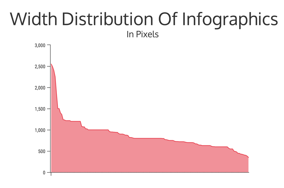
When I looked at the heights of all the sample infographics, the results were not as unanimous as the width.
In fact, the widths of the infographics I looked at ranged from 377 pixels to 18647 pixels:

This basically means that there was not an agreed upon height for infographics in this sample.
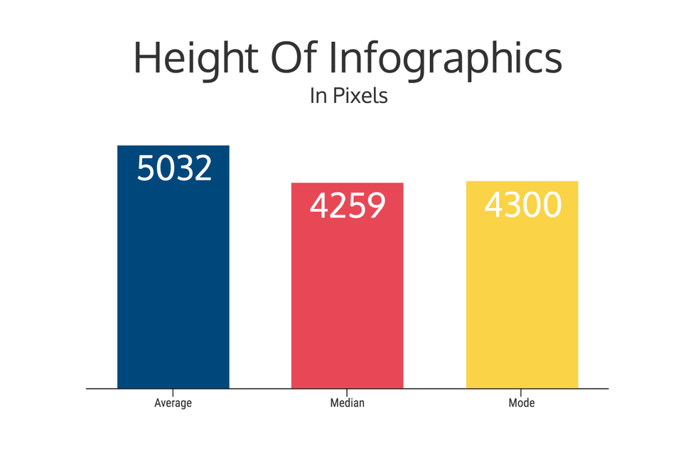
When I took a look at the average of the sample it was a very readable height of 5032 pixels.
But the median and mode pushed the height even lower at 4259 and 4300 pixels, respectively.
This makes it hard to recommend a perfect infographic height.
So I am not even going to try!
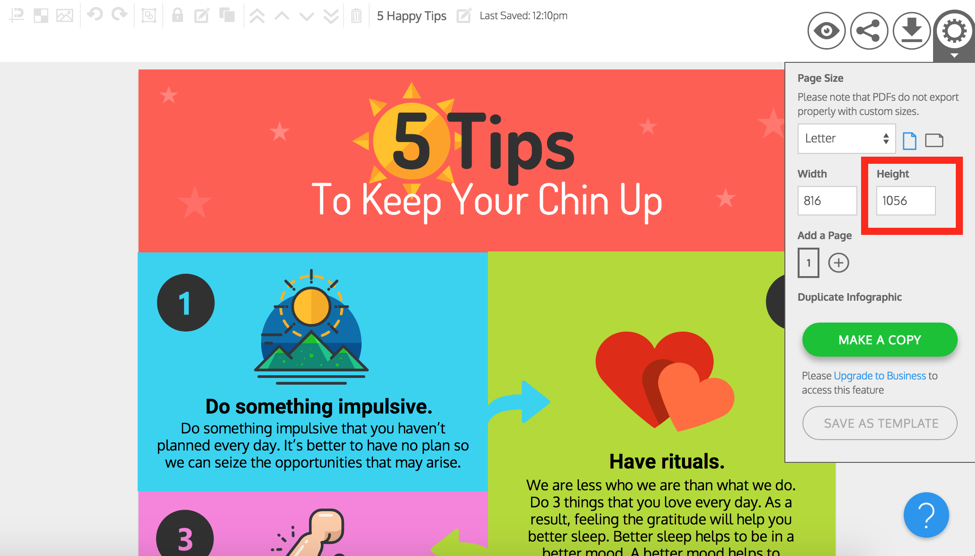
Our templates vary when it comes to the height as well. For example, this template has a height of 3600 pixels:

But this one only needs 1056 pixels:
That’s why it’s best to let your information determine the height of your infographic.
This means that you should set a width of around 800 pixels and adjust the height as needed to fit all your text, icons or charts.
Or, to help keep your infographic size in check, start with a height around 2000-3000 pixels and then adjust as needed.

Then, when you run out of things to add, you have hit the perfect height for your infographic!
I know it sounds simple, but there have been plenty of people who try to make their content fit their infographic size and get very frustrated.
So don’t be like them and let your content, the most important part, guide your infographic height. Not the other way around.
3. Let the purpose of your infographic determine where you place it in a blog post
Before you start designing, think about where you are planning on placing your infographic within your blog post.
After all, where you place your infographic could be the difference between someone seeing it or missing it entirely.
There are two things that you should think about before you select a position for your infographic:
1. The size of your infographic.
2. How your infographic relates to your blog post.
One of the worst things, in my opinion, is to insert a particularly long infographic in the middle of your content. Often, it distracts from your written content or causes your readers to not finish your article.
And the sample infographic articles I looked at seemed to agree. The articles with infographic placed infographic in the middle of content had the lowest average height:

When your infographic is shaping up to be very long, it is more effective to break the infographic down into smaller sections and then insert them in the body of your blog post.

This way you can get all your graphical information into your blog post without disrupting the flow. In fact, breaking up text with visuals helps keep readers engaged.
To see how one company used short infographics to make their blog content more engaging, check out this case study we did.

So where should you put a long infographic within a blog post?
There are really only two options.
1. Right under the intro of your blog post, like we do:
2. At the end of your blog post, like Entrepreneur does for all of their infographics:

But based on the sample articles I looked at, really long infographics should be saved for after the written content in a blog post:

It makes sense; you do not want a 8000-pixel block of infographic between your readers and the blog content.
But there are exceptions to that rule, which leads us into the next question:
How does your infographic add to your content?
If your infographic is only a summary of the written content in your article, I would recommend placing it either after the introduction or at the end of your article.
Kinda like Living Business did when presenting their infographic below:

Additionally, I would recommend not publishing an infographic on a blank page. Not only is this bad for SEO, you are going to have a lot of confused readers.
I saw this more often that I thought I would, and was not sure why the content creators would do such a thing.
Now, when should you put your infographic before the written content, you may be asking?
Only when it will add to the written content without much extra context.
Like Toggl did in their infographic about developer hell below:

Toggl use only a sentence or two to set it up and then let the amazing infographic speak for itself.
But if your infographic doesn’t require any context, you can place it at the very beginning of your blog post. Again, the only catch is that people may not bother to read any of the text after the infographic.
Visual Capitalist took this approach to present an infographic about The World’s Largest Factories:

I was able to read and understand this infographic pretty easily with no prior knowledge about factories.
At Venngage, we usually place our infographics at the beginning of each page, like this one about Graphic Design Trends:

So where you place your infographic within a blog post depends on the purpose of your infographic. Use these examples as a guide but make your decision based on each specific blog post.
Conclusion
Now you should be equipped with some best practices for infographic sizing and placement within your blog content. But remember: these are guidelines. You will have to test out what works for your specific blog posts.
When deciding on your infographic size and placement within a blog post, remember these 5 things and you will be set:
1. Never set the infographic less than 800 pixels.
2. Let the content of your infographic determine its height.
3. It is better for your infographic to be sized too big than too small.
4. Small infographics can be placed in the middle of the content
5. Large infographics should only be put at the end or at the beginning of a blog post.
Now you know what to do. Have you created an infographic yet?


