


Let’s face it, infographics just belong on Pinterest.
Whether it be on mobile or desktop, an infographic just looks at home on the site. And unlike other social media sites, your infographic fits perfectly into the Pinterest feed.
And because they fit so well, there are now thousands of infographics on the platform.
Which is great but it also makes it harder for the infographics you create to stand out.
That’s why we studied over 200 Pinterest infographic examples to try and figure out the formula for the perfect Pinterest infographic.
We manually evaluated the infographics based on a variety of qualitative and quantitative characteristics. Those included topic, type of infographic, dominant style, expected reaction, the number of story points, font, colors used, chart types, the ratio of length to width.
Although a few people evaluated the infographics, we did a big normalization process within the team to make sure that all of the infographics were coded consistently on each dimension.
To measure the performance of the infographics, we looked at the number of pins and likes. Which is a better indicator?
For Pinterest, pins are a far better indicator of success as pinning is a combination of liking and sharing and is the main user action on Pinterest. This is helpful information if you’re looking to grow your Pinterest but don’t know which metric influences it.
Based on our research we identified 6 factors for a great Pinterest infographic. You can view the infographic summary and read the details in the write-up that follows below.

1. Choose a popular Pinterest infographic topic
Does the topic of your infographic matter?
Yes, it really does.
Just like any other type of content, an infographic should have a topic that resonates with your audience.
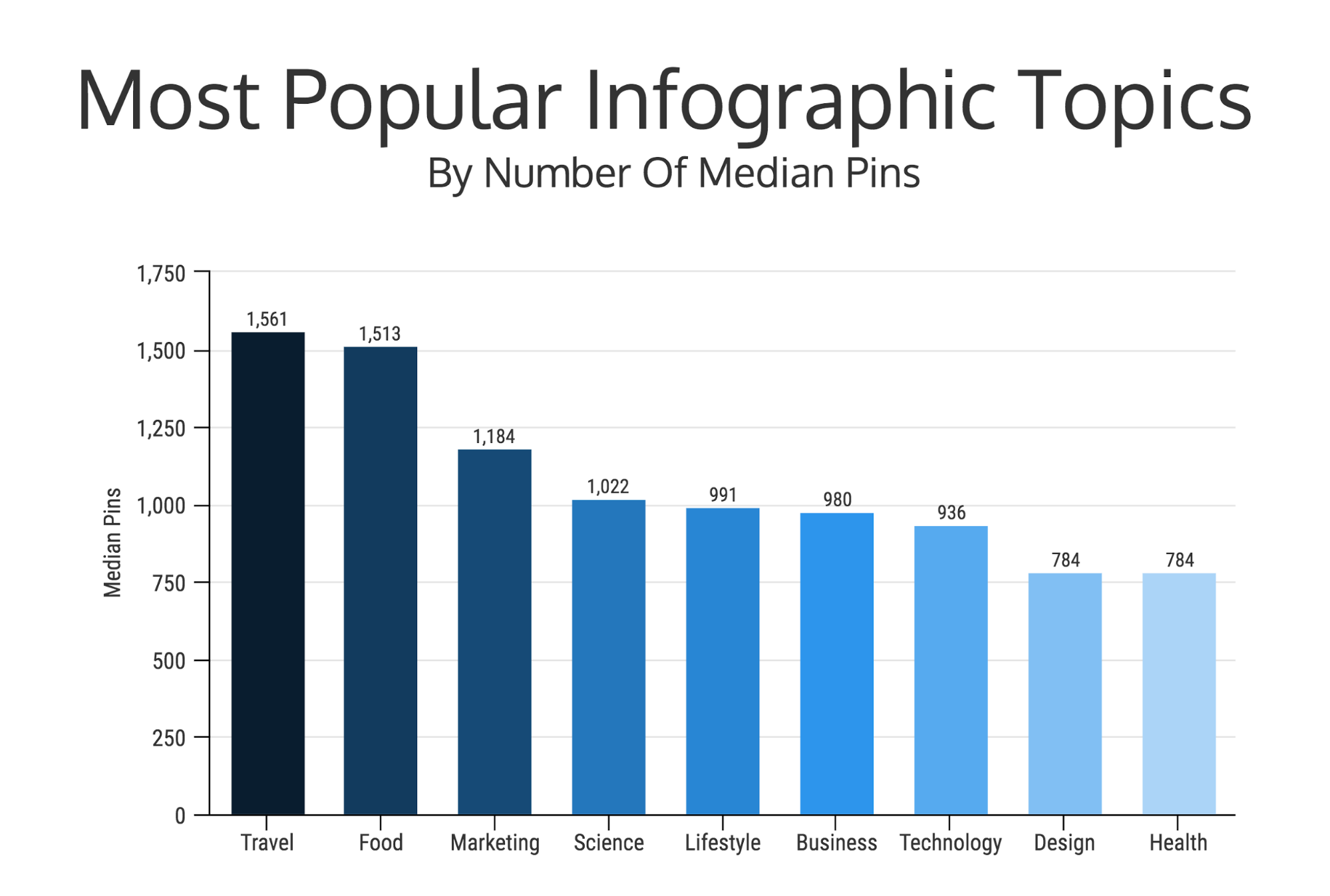
On Pinterest, the most popular topics were travel, food, business, and marketing. This probably won’t surprise you if you use Pinterest regularly.
Travel and food images do extremely well on Pinterest, given the demographic of their users. These three topics performed a lot better than all the other topics.
Just take a look at this graph to see the most popular topics:
If you take a quick look at Google, there are about 12M and 10M results on Pinterest for both Food Infographics and Travel Infographics, respectively.
So it is safe to say there is a demand for those topics.
For example, this infographic about how to cook with bone broth in a simple way would do great on Pinterest:

If you are looking for some inspiration based on those popular topics, here are a few examples as well.
First, we have a food infographic that looks pretty helpful:

Next here is a funny travel one:

And finally here is one that is all about being creative in business:

Now just because you picked a popular topic doesn’t mean your infographic is going to be popular instantly.
Your Pinterest infographic has to offer a little more than just a popular topic. Something that someone will not only read but also feel compelled to share.
2. Be funny, challenging or useful
The best infographics have a clear angle: Will your infographic make someone laugh, help them do something, answer their questions or change their lifestyle?
We looked at our sample of Pinterest infographics and coded each one with what we thought would be the reaction the infographic produced:
- Funny or cute: the infographic gave us a good laugh or an “awww” like when you see a cute kitten
- Challenging: the infographic made us a bit uncomfortable as it took us out of our comfort zone, similar to how you would react when seeing a chart with the number of deaths caused by Malaria.
- Useful: the infographic gave us practical information and made us feel like we learned something we could use in real life.
- Aspirational: the infographic was motivational, and made us feel like we could achieve something we want.
- Surprising: the infographic gave us a pleasant surprise, either because the information was counterintuitive or was completely not what we expected.
- Interesting: the infographic was informational (though not directly practical for our own usage), similar to learning some interesting fact (ie, 65% of Coffee drinks like instant coffee) on a news article.
Here is what we found:
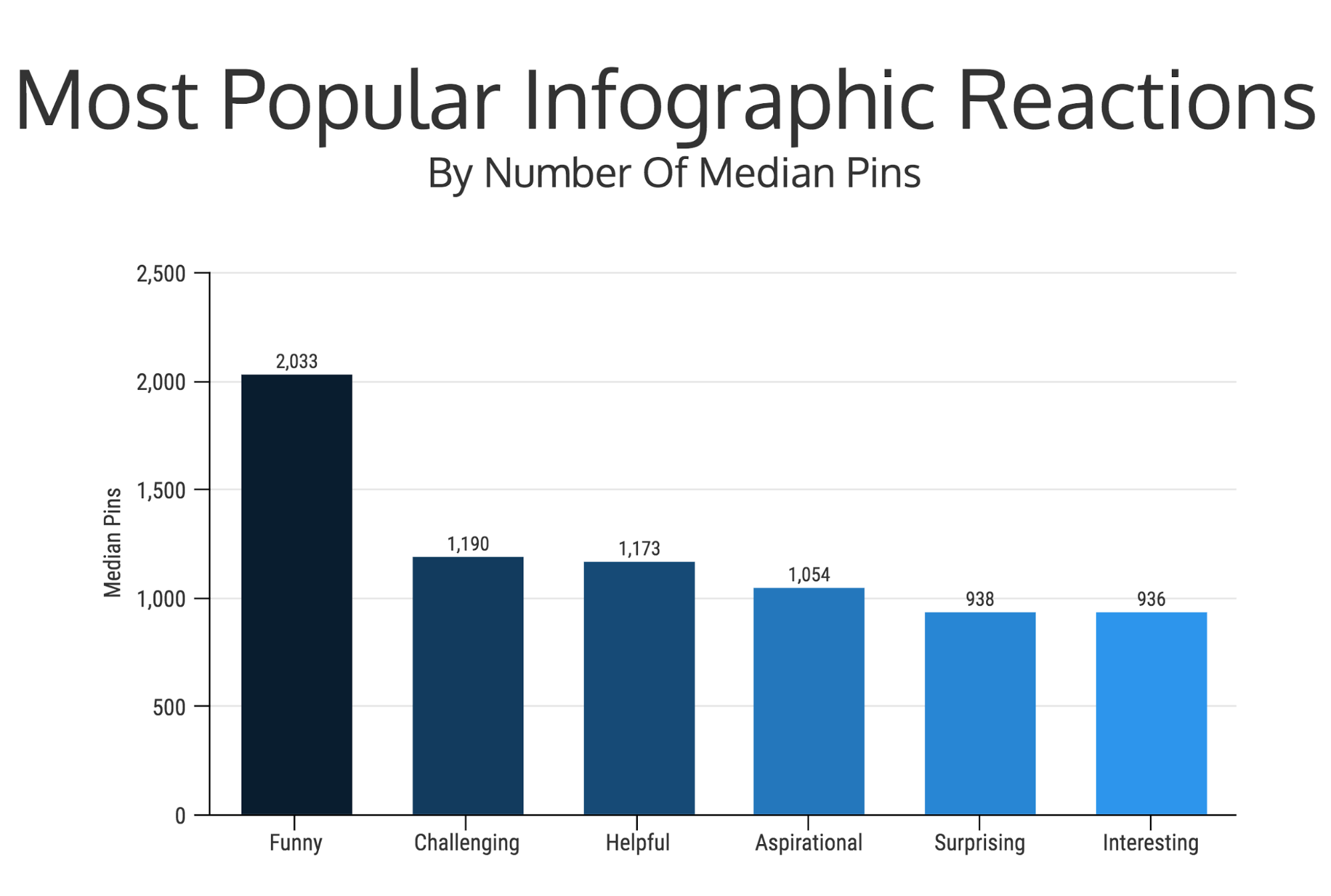
If they find it helpful, funny or interesting they will be more likely to share it with their friends…and if you can get two or all three of those you will have a winner!
For example, this infographic about commonly misspelled words checks both the “funny” and “helpful” boxes:

I mean, they help you remember how to spell definitely with this charming quip:
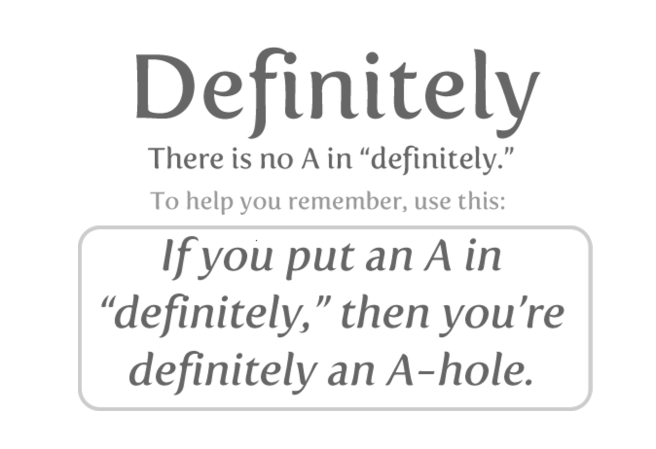
That is something that is definitely going to stick in my brain for a long time.
Another way to create a successful Pinterest infographic is to offer genuinely useful information. These types of infographics are usually formatted using numbered steps, section headers, or bullet points.
This list of smoothie recipes is a great example of turning simple but useful information into an infographic.

That example could be very impactful for someone if they are looking for diet ideas but aren’t sure where to start.
And best of all, if someone tries those ideas and it helps them, they are more likely to share it with others.
You could find a something simple angle like this in almost any industry and turn it into an infographic.
3. Stick to simple informational infographics
One of the biggest misconceptions out there is that your infographic needs to be complex and packed with data for it to be successful.
Our research proved that wrong.
We found that simple informational infographics, or text-based infographics, perform the best.
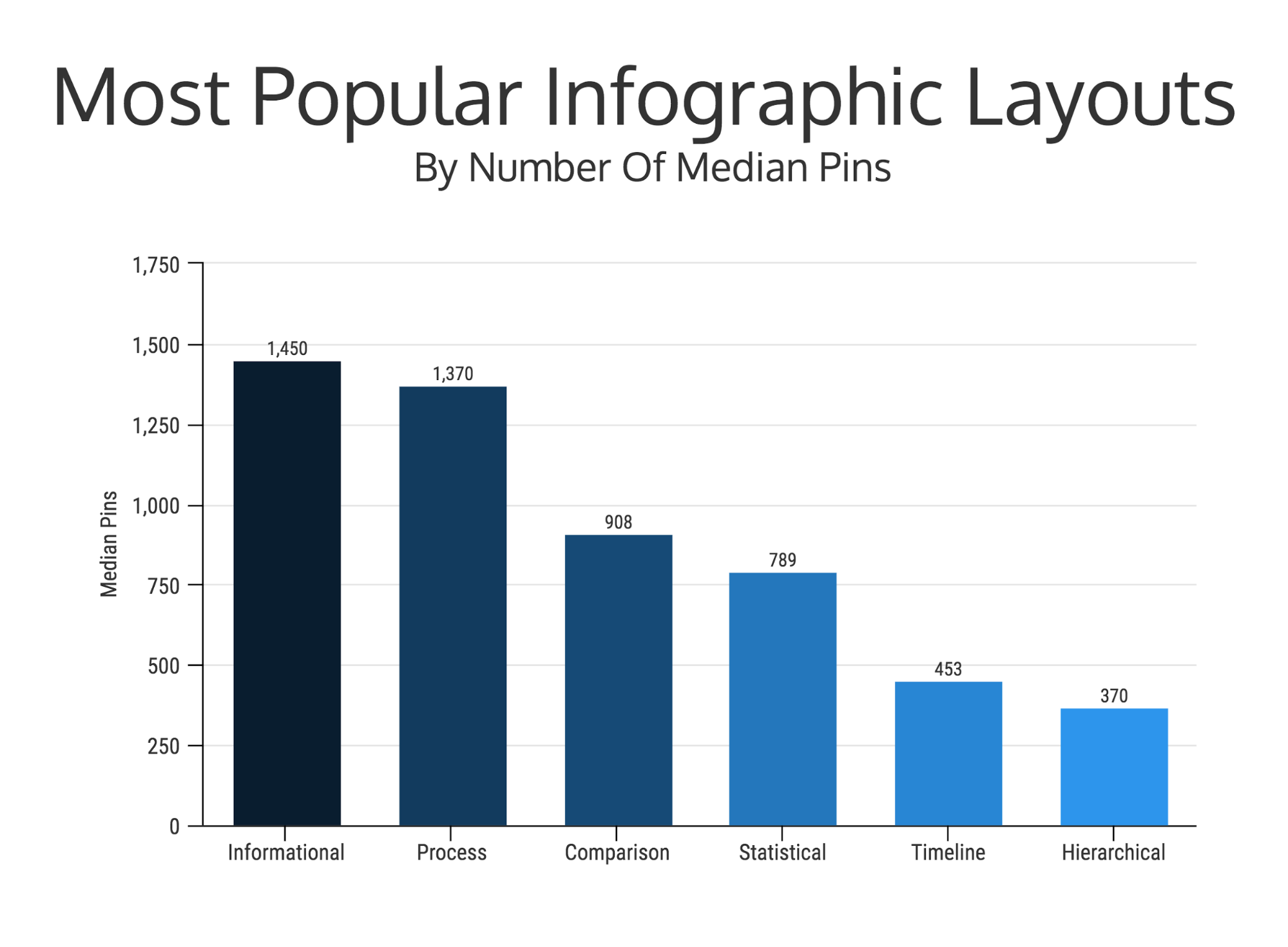
Surprisingly, statistical infographics that use charts and data performed terribly in this study!
I think that this is because people do not want to get lost in a complex infographic when they are browsing through Pinterest. People go to Pinterest for inspiration, quick tips and entertainment.
So not only should your infographic pull people in with a popular topic and a compelling angle, it should also make information easy to digest.
Which I think is why we saw simple text-based infographics perform so well.

An informational infographic should be used to summarize, explain or introduce a topic. Here are some examples of informational infographics:
List Infographics
A list infographic uses numbers or bullet points to organize information. These types of infographics are extremely popular on Pinterest because they are easy to read and understand quickly.
Here is a great example of a simple list you can edit right now!

Timeline Infographics
Timelines can be used to show a process, tell a story and outline events. If you need some more info on these types of infographics, read this step by step article.
In the example below, the author uses an infographic to show the history of the cloud:

Step By Step Infographics
A step by step infographic is similar to the list infographic but in this case it outlines a process. These types of infographics are extremely popular on Pinterest because they can easily summarize things like a workout, a recipe or a DIY project.
In the example below once you check all of those boxes, you are ready to launch your startup.

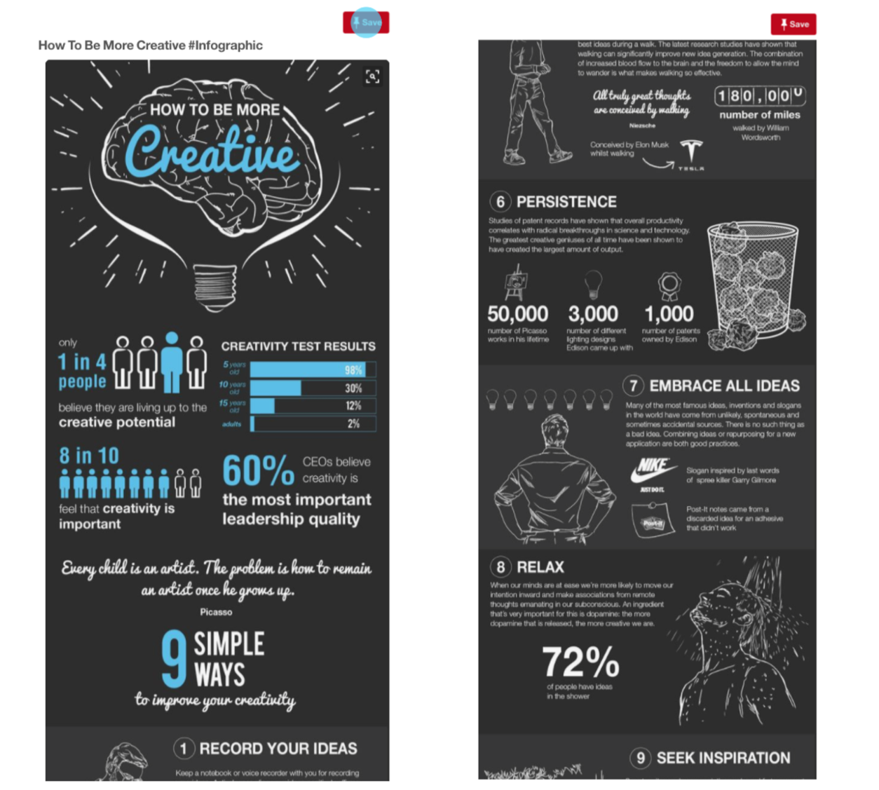
Simple Statistical Infographics
Statistical infographics present numbers and statistics as the main focus.
Statistical infographics shared on other platforms will often include multiple graphs and charts. But statistical infographics on Pinterest typically contain only key stats or numbers, with big visuals like icons and illustrations. This makes them easier to read.
Below is a fantastic example of a simple statistical infographic:
Whatever you decide to create, just make sure the information is organized and easy to follow.
4. Serif fonts are popular but make sure it fits your topic
One of the biggest mistakes you can make when creating an infographic is using the wrong font. This is especially true when it comes to mobile browsing. If the font you use is too hard to read, people are more likely to skip over your infographic.
The main problem is that there are literally too many fonts to choose from sometimes.
Serif fonts were the most popular in Pinterest infographics:

That being said, picking the “right” font is subjective and a popular font is not always the right font for your infographic. What matters is that your font is legible.
Here are a few tips for picking a good font for your infographic:
Choosing a font that fits the theme of your infographic.
Are you trying to convey a playful or serious tone? Humorous or dark?
Think about the audience and the purpose of your infographic. If the goal of your infographic is to share data, you probably want to make the infographic look more professional than cartoonish.
Sometimes, it helps to take a look at other infographics that cover similar topics, to grasp how you should think about a font choice.
For example, this fun example from the infographic masters at Office Vibe uses a very whimsical font that fits its zombie theme:

They are taking a potentially boring topic and using fun visuals and font styles to make it engaging. People will read it because it is funny and helpful.
Match your font with the images you include.
In the following infographic, the creator matches minimalist icons with a mix of simple serif fonts and sans serif fonts.
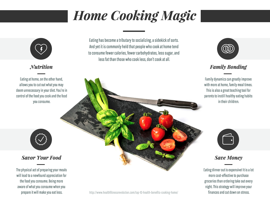
This combination makes the infographic look modern and efficient, which fits the cooking theme. If you need help selecting fonts, I think the Google Font tool is a lifesaver.
Use a big and bold font for your infographic header.
When people are scrolling through their Pinterest feed, your infographic header should grab their attention and entice them to read the entire thing.
This infographic by AliveWithIdeas is a great example:

This infographic uses a header font that almost jumps off the screen and asks you to click on it. That is exactly what you should be going for on Pinterest.
If not, people will just keep scrolling because the infographic is too hard for them to read.
Once you realize people go on social media to give their brains a rest, the easier it will be to create great infographics.
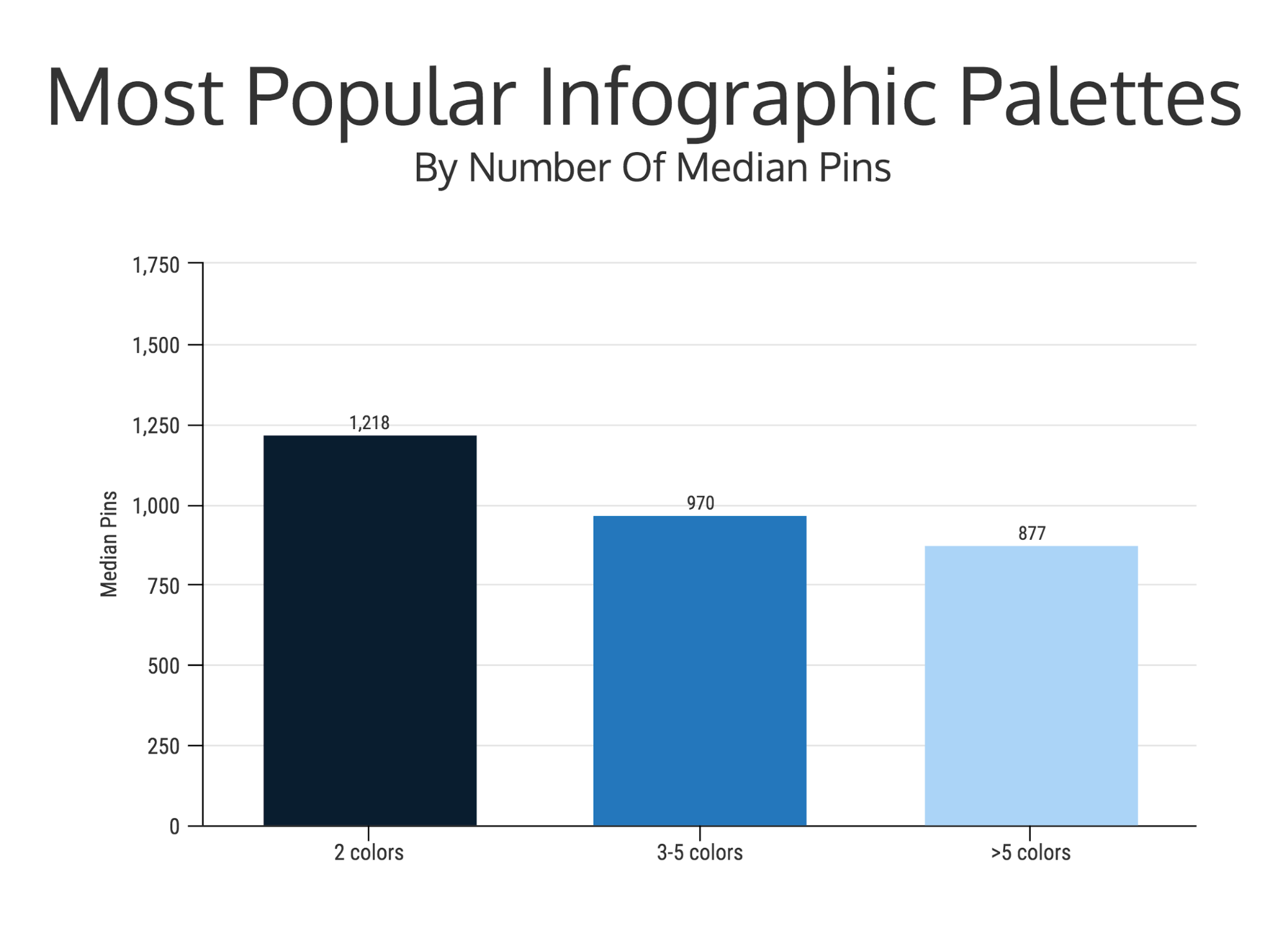
5. Stick to a few colors in the red or yellow spectrum
We are not all designers.
But that doesn’t mean we can’t fake it ‘til we make it and learn the basics in the meantime.
One important basic tip? Using color effectively in your designs.
Color is a powerful design element because it helps you convey emotion, create themes, and add contrast to your design.
But, using the wrong colors can dilute the ideas you’re trying to share or confuse the reader.
We saw that keeping a simple color palette helped infographics stand out on Pinterest:
For example, this infographic has a simple, natural color palette of greens and browns to convey a healthy feeling:

I would recommend starting with a red or yellow palette for Pinterest success. We found that infographics with a red color palette outperformed the others by a significant margin:
That being said, pick colors that make sense for your information. Don’t just go out and change all your infographics to red hues–that is the wrong way to take this info!
6. Longform Pinterest infographics rule
The way Pinterest is laid out makes it extremely friendly to infographics.
That is why long form infographics do so well on this platform. Instead of just being able to share a small snippet of your infographic like on Twitter or Facebook, you can share the entire thing on Pinterest.
We found that the most popular infographics have a height that was 9 times its width:

And these findings are backed up by another study we did on infographic size, which found that the most popular width for infographics, in general, is around 800px.
Just look at all of these examples on Pinterest:

There are no extra clicks required to see the full infographic on Pinterest. You know exactly what you are clicking on from the beginning and I think that is why infographics are so popular on Pinterest.
Plus, with the rise of mobile, I expect long form infographics will continue to rule. This is because they fill the entire screen and still look fantastic.
Now make your own Pinterest infographic!
Whether you are an old Pinterest vet or a new user looking to share your infographics, I think these tips are great for both of you.
Pinterest is such a large and diverse site that there are tons of opportunities for you to create a popular infographic.
Just remember to:
- Pick a solid topic
- Be funny, impactful or helpful
- Stick to simple informational infographics
- Use fonts that are easy to read
- Use colors that reflect the mood of your infographics
- Don’t be afraid to create long infographics
If you haven’t created an infographic before, it may be a little intimidating to create one from scratch. Check out our in-depth guide to creating an infographic, Infographic For Beginners: The Ultimate Guide.


