


Feeling stuck? Struggling to connect ideas? Overwhelmed by complex information?
Concept mapping can help. By visually organizing relationships between ideas, these maps make complex topics easier to understand, enhance learning and support critical thinking.
Not sure where to start? I will guide you through the essentials of creating a concept map and provide ready-to-use templates to help you get started.
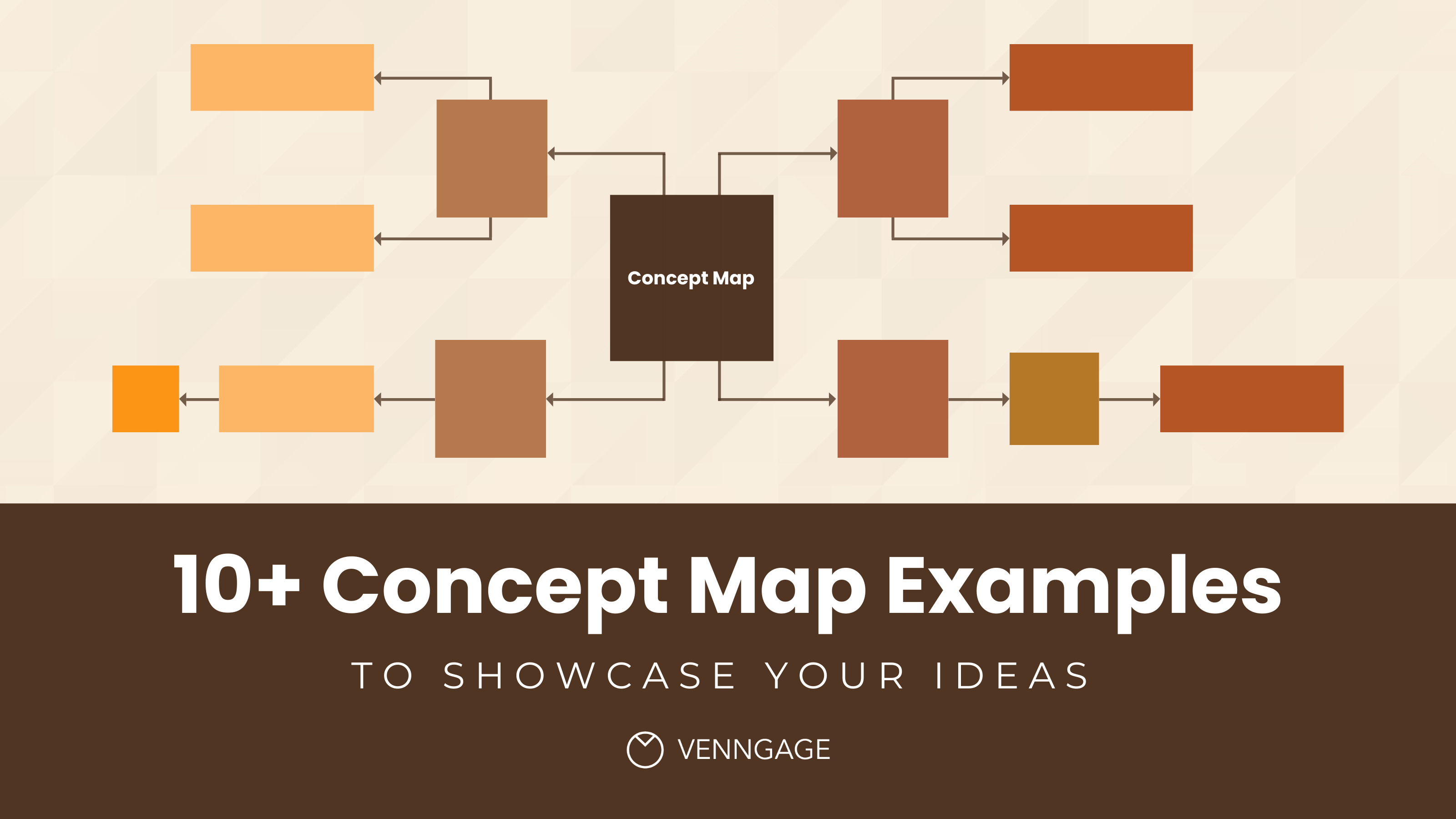
11 Concept map examples with design ideas
Struggling to organize ideas or make sense of complex topics? A well-designed concept map can help. The examples below cover different ways to use them—whether you’re planning a project, brainstorming ideas, or structuring lessons.
Each concept map template is tailored to different needs, with practical design tips to make your maps more effective. Let’s dive in!
Click to jump ahead:
- Evaluation essentials for nonprofit concept map
- Light reaction chemistry concept map
- How does Bitcoin work concept map
- Light biodiversity concept map
- Red protein biology concept map
- Dark cell biology concept map
- Protein biology concept map
- Science chemistry concept map
- Green plant biology concept map
- Large reactions chemistry concept map
- Patient treatment plan concept map
1. Evaluation essentials for nonprofit concept map
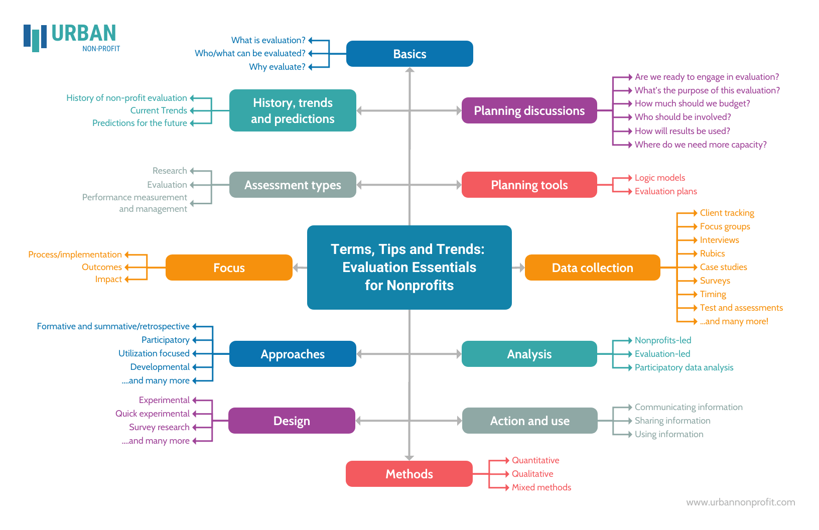
This template uses one of the most popular formats for a concept map: the spider map (also called a spider diagram). Spider concept maps feature a main topic in a central node with sub-concepts branching out in various directions.
This format works well for early-stage brainstorming and idea generation. It’s flexible, easy to expand and helps teams capture many thoughts quickly without overthinking structure. If you’re starting from a blank slate or running a group discussion, this layout keeps ideas flowing. You might also explore these brainstorming examples and techniques to support problem-solving sessions.
However, spider maps aren’t ideal when you need to show clear cause-and-effect relationships, processes or hierarchies. Because all ideas branch out equally from the center, this format doesn’t communicate priority, sequence or dependency very well. If your evaluation involves workflows, timelines or ranking criteria, a flowchart or hierarchical concept map may work better.
Design tip: Create a stronger visual connection between related ideas by color-coding similar nodes. For a cleaner look, pick colors in the same tone family (for example, all pastels). This color-matching guide can help you choose color combinations that stay readable and consistent.
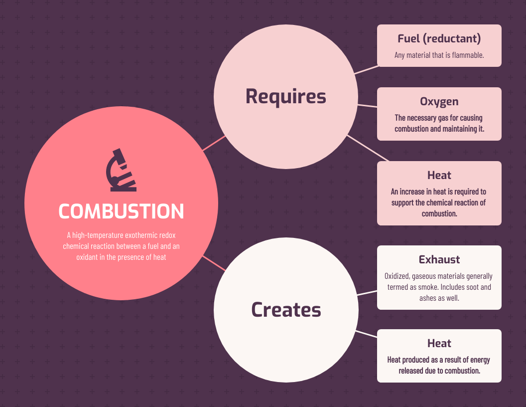
2. Light reaction chemistry concept map
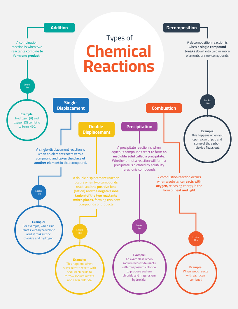
This is an example of a concept map with a hierarchical structure. This format organizes information from broad concepts at the top to more specific details as you move downward, making it easy to see how ideas build on each other.
This type of concept map works well for studying complex topics or creating job aids, especially when learners need to understand how concepts connect within a system. The layout also gives you room to explain relationships in more depth, such as inputs, outputs or dependencies between processes.
That said, hierarchical concept maps aren’t ideal for topics that involve cycles, feedback loops or non-linear relationships. For example, in chemistry or biology, processes that repeat or influence each other in multiple directions may feel awkward in a strictly top-down layout. In those cases, a cycle diagram or systems-style concept map can communicate the process more accurately.
Design tip: For legibility, avoid adding more text than the placeholder content already shows. If you need more room, extend the page size in Venngage and add additional nodes to keep the layout easy to scan.
3. How does Bitcoin work concept map
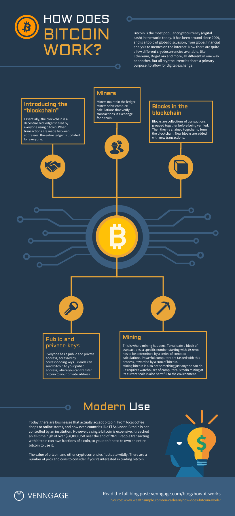
Trying to explain Bitcoin without drowning people in jargon? This concept map keeps things visual and approachable. With space to break down ideas like mining, wallets and transactions, it helps simplify a complex system into digestible chunks.
The infographic-style layout works especially well for non-technical audiences. It’s useful in presentations, workshops and blog posts where clarity matters more than precision. The icons do a lot of the heavy lifting, helping people remember key concepts without reading walls of text.
Where this format struggles is with detail and precision. If your goal is to walk someone through cryptographic steps, transaction verification or network protocols, this layout won’t go far enough. A step-by-step flow diagram or technical schematic would communicate accuracy better than a high-level concept view.
Design tip: when customizing the icons in this template (which you can do with a click in Venngage!), try and stick to one icon style. For example, if all your icons are flat, don’t add a three-dimensional icon to the mix. For more tips on styling icons, check out this post.
4. Light biodiversity concept map
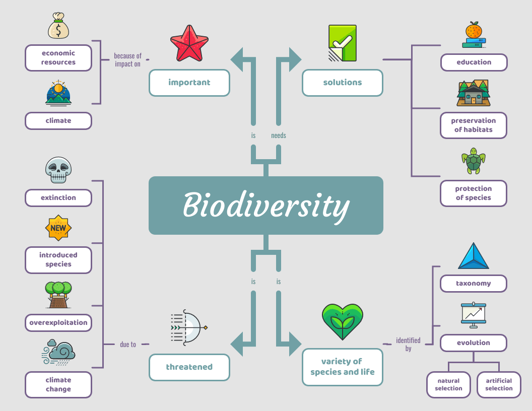
At first glance, this concept map stands out because it doesn’t feel academic. The playful visuals draw people in, which makes it easier to explore ideas like ecosystems, habitats and species interactions without intimidation.
This layout shines when the goal is engagement over depth. It’s a strong fit for classroom posters, workshop materials or informal learning where visual appeal helps spark curiosity and discussion.
Where it falls short is in serious analysis or dense scientific explanation. If you need to model ecological systems in detail or show cause-and-effect relationships between variables, this format may oversimplify things. In research-heavy contexts, a systems diagram or data visualization would communicate complexity more accurately.
Design tip: make sure you size your icons as consistently as possible. Consider both the positive space an icon takes up and the negative space (also called white space) around it. If your icons are near other elements, it can actually be easier to gauge whether they’re sized properly by looking at the padding (space) around them, than just the icons themselves.
5. Red protein biology concept map
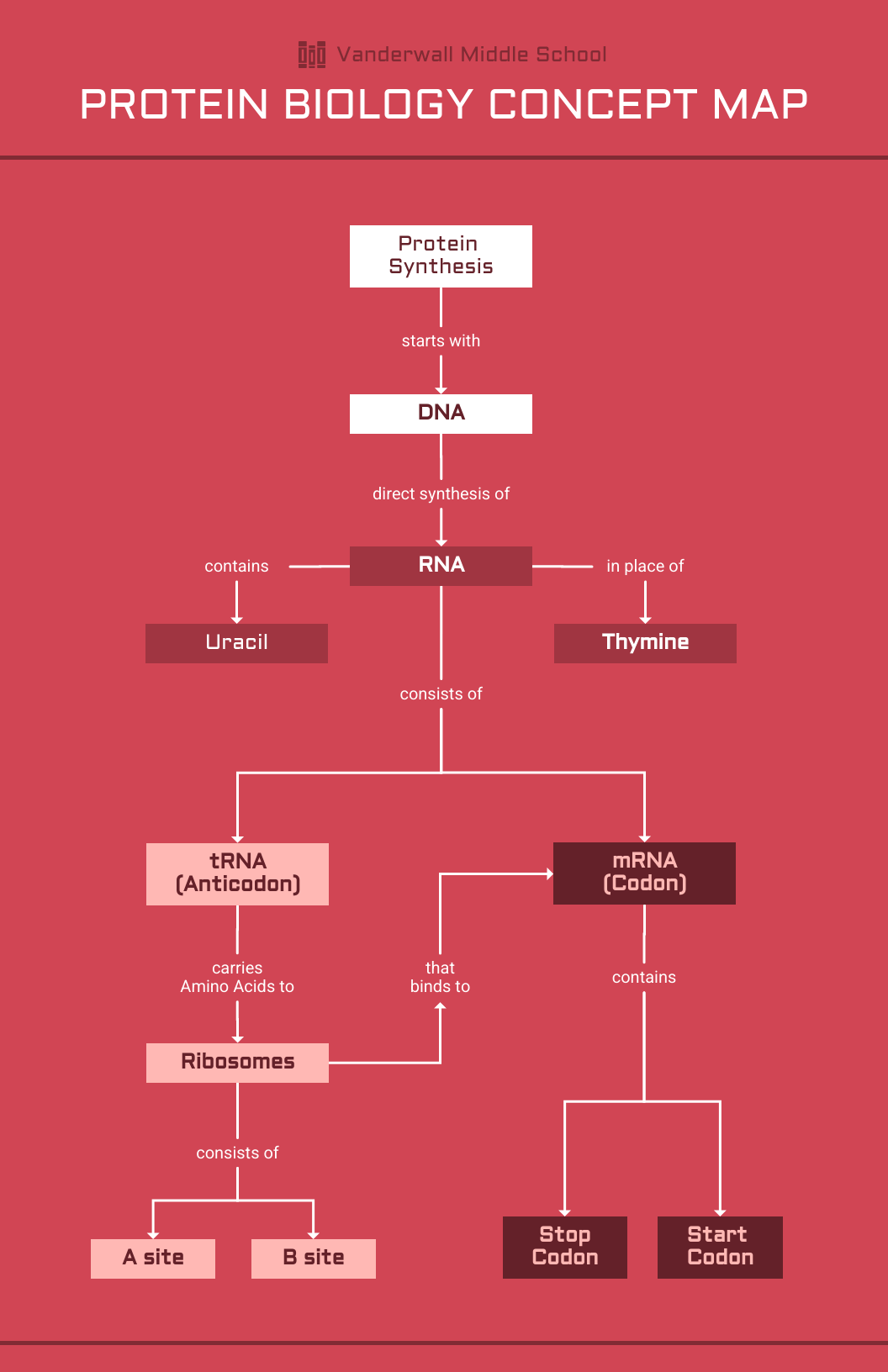
This template strips visual noise down to the essentials. Instead of decorative elements, it relies on labels, arrows and spacing to walk readers through processes like protein synthesis in a logical order.
It’s especially useful when clarity matters more than creativity. If you’re explaining a lab concept, summarizing research or outlining a process for a presentation, this layout keeps attention on the content instead of the design.
The trade-off is flexibility. Once your topic starts branching into overlapping interactions or parallel pathways, this layout can feel rigid. Complex biological systems don’t always behave in neat sequences, and forcing them into a linear structure sometimes hides important relationships.
Design tip: not big on red? No biggie. You can swap out any of the colors in this template with your company’s brand-approved options. In fact, with a Venngage business account, you can even change colors with a click using My Brand Kit.
6. Dark cell biology concept map
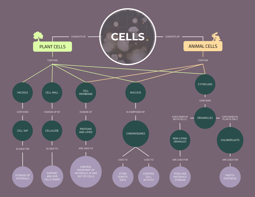
If you love structure, this concept map is for you. With multiple branches and clear relationships, it simplifies even the most complex systems. Thoughtful design elements—like the highlighted main node and icons—guide the eye to key concepts, making it both functional and visually engaging.
I used to struggle with organizing large amounts of information, especially when everything seemed interconnected. A structured layout like this helped me break things down logically and see patterns more clearly. While it’s perfect for biology, it also works for mapping out company structures, competitive landscapes, or any intricate system you need to visualize.
The downside? Structure can become a constraint. When relationships between ideas are fluid, overlapping or circular, a rigid map can give the false impression that everything fits neatly into categories. Some systems simply aren’t that tidy and forcing them into a structured layout can oversimplify reality.
Design tip: as a rule of thumb, stick to using a maximum of two to three typefaces per design, like in this example. Any more than that and your design may become messy! For more on choosing fonts, check out this guide.
7. Protein biology concept map
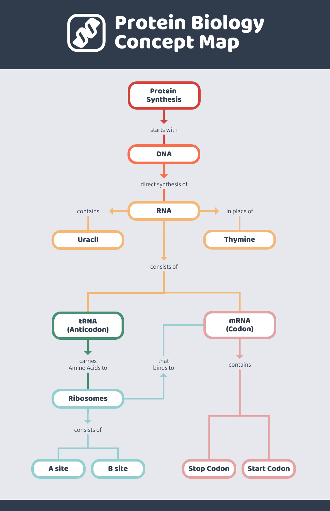
Same content, different look! This concept map keeps things clean and modern while using pops of color to make key points stand out. It’s a great example of how design choices can shape the way information is understood and retained.
I’ve found that small design tweaks—like adding color or adjusting spacing—can make a huge difference in how easy a concept map is to follow. This structured layout works just as well for biology as it does for business workflows, research findings or any process that needs clear, organized steps. Give it a try and make it your own!
The catch is that design can sometimes do too much. Heavy color use or dramatic emphasis may suggest importance where none exists or distract from the actual relationships between concepts. If accuracy matters more than aesthetics—like in research or formal documentation—a simpler layout may communicate more honestly.
Design tip: notice how this template uses just one icon to support the main idea. Consider this clutter-free approach for more complicated concepts where icons might just create confusion.
8. Science chemistry concept map
Here’s a fresh take on concept mapping! This template follows a system structure—kind of like a flowchart, but with more flexibility. Instead of rigid paths, it branches out freely, making it great for visualizing complex relationships in a clear, structured way.
I’ve used system maps when tackling tricky topics that don’t fit neatly into a hierarchy. They help break things down step by step while still allowing room for connections between ideas. While this one’s built for chemistry, it’s just as useful for mapping out business processes, ecosystems or any system with multiple moving parts.
One thing to watch out for: when too many connections pile up, the map can start to feel busy. Without careful spacing and visual hierarchy, important ideas can get buried in the noise. If your goal is to teach a single process step-by-step, a simpler flowchart may communicate more clearly.
Design tip: a surefire way to make sure your color choices complement each other? Choose a one color and use varying shades of it, from dark to light. Find even more color selection tips here.
9. Green plant biology concept map
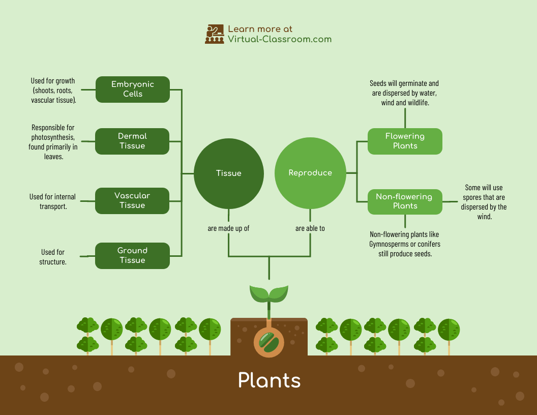
This concept map feels more like a network than a chart. Ideas spread outward in every direction, which makes it easier to explore how processes in plant biology influence one another rather than treating them as isolated topics.
It’s a natural fit for subjects where relationships matter more than order—things like nutrient cycles, growth conditions or environmental impact. The same layout also translates well to business strategy or systems thinking, where outcomes depend on multiple inputs.
The drawback, however, is focus. When everything connects to everything else, it can be harder to tell what actually matters most. If your audience needs a clear takeaway or priority list, a more linear format may get your point across faster.
Design tip: add a little depth to your concept map by playing with patterns and icons with dual toned icons. You can choose from many pre-made backgrounds in Venngage or import your own. Check out this post for some simple background inspiration.
10. Large reactions chemistry concept map
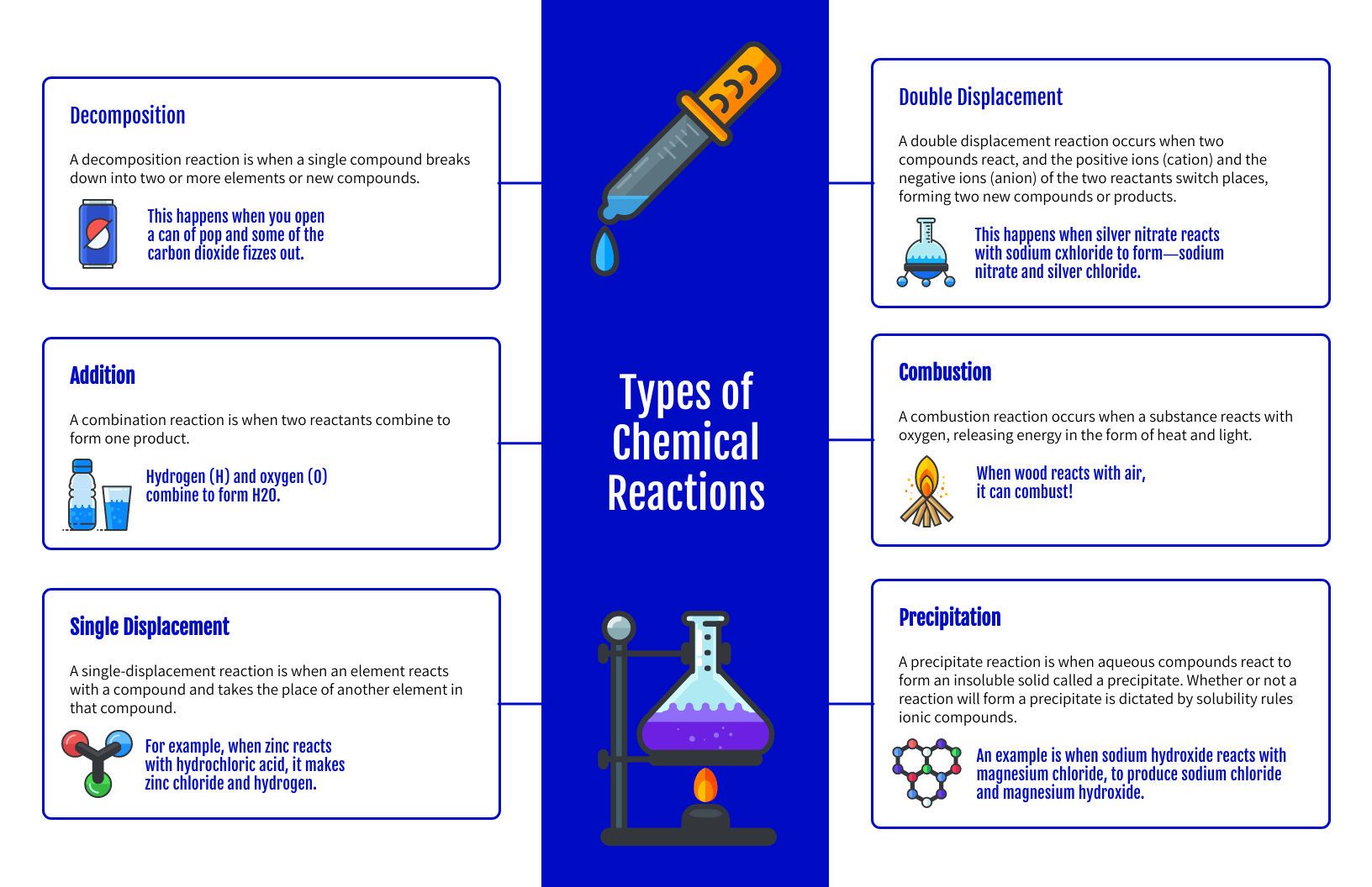
This template leans into bold design. Color, icons, and symmetry work together to make intimidating material, like reaction systems and chemical interactions, feel more approachable.
It’s a smart choice when you need to hold attention while organizing a lot of information. The layout keeps ideas evenly distributed, which helps prevent one section from overpowering the rest. That makes it useful not just in science classes, but also in presentations where clarity and visual interest both matter.
What to watch out for is overload. When too many icons and colors compete for attention, the design can start doing more work than the content. If your audience needs to focus on precise data or equations, simplifying the visuals can improve understanding.
Design tip: choose a symmetrically balanced design like this one when all the elements in your composition have equal importance. Read up on the balance design principle here.
Patient treatment plan concept map

This concept map mirrors how clinicians actually think through care. Instead of listing symptoms, tests and treatments separately, it connects them into one visual system, showing how a diagnosis leads to testing, how results affect medication choices, and where follow-ups fit in.
It’s especially helpful in cases where one decision triggers several others. Treatment side effects, risk factors, and patient history can all be mapped together, making it easier to spot conflicts or gaps in care. In team settings, this kind of layout also aligns doctors, nurses and specialists around the same plan.
The limitation here is speed. In emergency settings or fast-moving situations, drawing out a map takes too long to be practical. These maps work best for ongoing care planning, case reviews or training but not for real-time decision-making during critical moments.
Design tip: Use color to distinguish between symptoms, diagnostics and treatments. That separation helps the map read like a plan instead of a pile of notes.
What is a concept map and why do we use them?
Rather than memorizing isolated facts, concept maps encourage learners to organize knowledge into connected structures. Research shows that this structure improves comprehension, long-term retention, and the ability to transfer knowledge to new problems (Novak & Cañas, 2008).
In addition to education, concept mapping is widely used in problem-solving, knowledge management, and strategic planning. Studies show that concept maps outperform linear note-taking and traditional outlines when analyzing complex systems or unclear information because they make relationships and assumptions visible (Nesbit & Adesope, 2006).
Concept maps work by placing a main idea in a box or circle (a node), then linking related ideas with labeled lines (called propositions). This structure helps users:
- clarify thinking
- identify patterns and gaps
- synthesize information
- generate better decisions
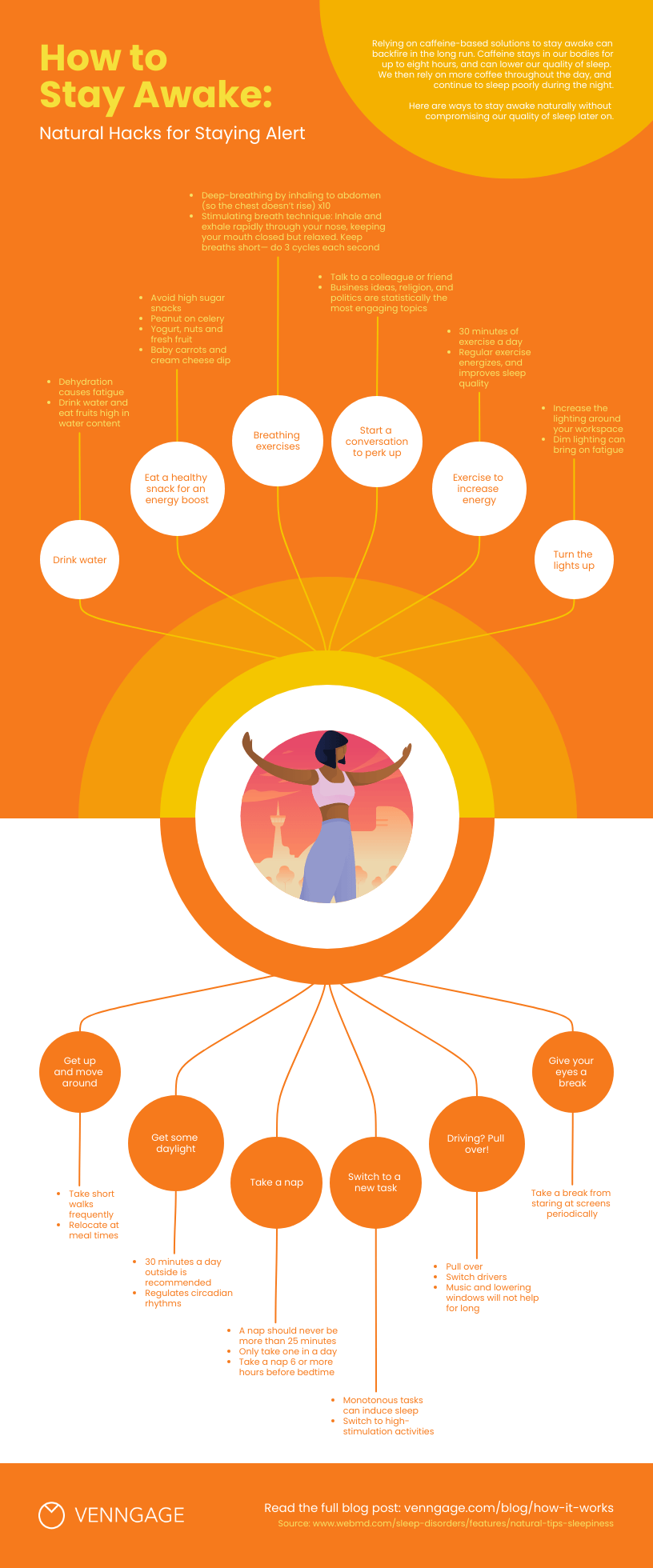
For example, a concept map that focuses on “staying awake and alert” might connect strategies like hydration, sleep habits, and light exposure, while linking each to evidence-based effects and actions.
How can businesses use concept mapping?
From clarifying complex concepts and promoting memory recall to solving sticky problems and generating fresh ideas, concept maps have many uses in the realm of business. But let’s get a little more concrete about it…
Here are a few quick examples of how businesses can use concept mapping:
- To simplify complex topics. When onboarding new employees or training existing ones, concept maps can help you convey processes and information (and help them retain it!).
- To make decisions. By mapping out a strategy or problem, you can identify any information or resource gaps and decide on next steps.
- To brainstorm new ideas. Visualizing the relationship between different concepts can help you uncover new connections and, as a result, new strategies.
- To map customer journeys. Understanding how customers interact with your brand and product is key… and with a concept map, you can create a visual representation of these journeys.
- To facilitate communication. Concept maps can come in handy if you need to convey a vision or strategy — your team will be able to see the big picture and how everything fits together.
Concept map example FAQs
What are the different types of concept maps?
There are four main types of concept maps: spider, hierarchy, flowchart and system.
- Spider concept maps feature a central concept with sub-concepts radiating outwards. This format is great for brainstorming or conveying simple concepts.
- Hierarchical concept maps showcase a main concept on top with sub-concepts underneath. It follows that this type of map is a good choice for getting across the relative importance of concepts.
- Flowchart concept maps organize concepts in a linear manner. Choose this type of concept map to outline processes and workflows.
- System concept maps are similar to flowcharts but more free-form with additional nodes and concept clusters. This type of concept map is the best choice for visualizing complex systems and data.
What goes on a concept map?
Concept maps are made up of several key elements, including nodes (circles or squares that contain a concept), links (lines or arrows with words describing the connection between concepts) and cross-links (lines or arrows that connect concepts across a map).
A concept map may also include longer descriptions and examples, depending on the content at hand. It’s common for a concept map to feature visuals, like icons, illustrations and images as well.
How do you make a concept map?
There’s no hard rules that dictate how to make a concept map. But there are some general guidelines you can follow when creating your own.
Start by identifying the core concept or topic you’d like to map out. It can help to turn this concept into a focus question to better define the problem you’re trying to solve.
Next, brainstorm a list of related concepts. Write everything down that comes to mind. Organize these concepts from least to most specific.
Now you’re ready to start creating your concept map. Copy your ideas into a concept map template, connecting them with lines or arrows and linking words as you go along.
Take a step back and consider whether there are any missing links, cross-links or concepts. Once you’re happy with the contents of your concept map, add graphics, like icons and illustrations, to clarify your ideas and make your map visually appealing.
What is the difference between a mind map and a concept map?
While both mind maps and concept maps help visually organize information, they serve different purposes.
Mind maps function like a brainstorming session, radiating outwards from a central topic to capture ideas and connections. They’re ideal for sparking creativity and generating new thoughts.
On the other hand, concept maps take a more structured approach. They are like flowcharts, with connections between concepts explicitly defined using linking words or phrases. This makes them perfect for studying complex information and demonstrating a clear understanding of how different ideas relate to each other.
Is a bubble map a concept map?
Bubble maps and concept maps aren’t the same thing. In fact, they’re quite different. A bubble map may refer to an actual map that uses circles of different sizes to represent numeric values in various regions. Or, it may refer to a mind map style diagram that showcases related ideas.
Bubble chart mind maps are likely the version that get confused with concept maps. But as we’ve seen, concept maps also describe the relationship between concepts via linking words. Bubble maps lack linking words and the additional context they provide the reader.
Concept maps aside, check out our guide on the best brainstorming tools that can be a game-changer for you and your team.
Make your own concept map in minutes with Venngage
You may have noticed many of the concept map examples we covered featured educational content… and this is no coincidence!
Concept mapping has its roots in education.
But nowadays, the practice is popular across many professions: product managers, business leaders, L&D professionals and more create concept maps to simplify information and stimulate innovation. After all, who doesn’t need to come up with new ideas? Or communicate existing ones, for that matter.
Ready to give concept mapping a try? Get a head start by choosing a Venngage template and make your own concept map for free.


