


As a marketer, I’ve learned that one of the biggest challenges in growing a brand is keeping everything consistent—especially when multiple teams, partners, or agencies are creating content on your behalf.
That’s where brand guidelines come in. Think of them as your go-to rulebook for how your brand should look, sound, and feel across every touchpoint. They’re used to make sure everyone—from designers to external vendors—stays on the same page and represents your brand accurately.
In this post, I’ll walk you through how to create a brand style guide that helps you maintain consistency, build trust, and look polished at every stage of growth. I’ll also share some easy-to-edit brand guidelines templates you can use to get started right away.
How to create brand guidelines:
- Create a compelling brand story
- Set guidelines for your logo
- Define your brand color guidelines
- Outline how brand fonts are used
- Spell out your brand voice
- Include image and data viz guidelines
What is a brand style guide?
A brand style guide is a rulebook containing specifications on everything that plays a role in the look and feel of your brand–everything from typography and color to logos and imagery.
It also lets everyone know exactly how to present your brand to the world. It guides the design for all your content, from blog posts and presentations to office spaces and business cards.
A ton of the world’s top tech companies have rebranded over last few years, and dedicated some serious time and effort into developing thorough brand style guides.
Luckily for us, many of these brand style guides have been released publicly, so why not capitalize on all of their hard work?
Here’s what you can learn from the brand style guides of my favorite brands (with some handy brand style guide templates sprinkled in) in this slick branding infographic:

Before I dive into this guide, have you heard about Venngage’s Brand Kit feature? It helps you add your brand logos, fonts and colors to your designs in a fraction of the time it would normally take.

1. Kick off your brand style guide with a great brand story
Every great brand is driven by a compelling brand story. If you’re unfamiliar with the term, a brand story defines and describes the things that a company cares about most. It’s used to communicate a company’s values to the public, and can also help guide major decision-making within an organization.
Brand stories can look pretty different at different companies, but there is one key thread that ties them all together:
Brand stories wrap up a company’s vision, mission, and core values in one nice little package.
Many businesses draw inspiration from brand archetypes, and the best brand stories add in a dash of their own personality.
To bring your brand story to life, start by identifying your brand archetype. These are universal character types—like The Hero, who’s bold and driven to make a difference; The Creator, who values innovation and originality; or The Caregiver, who focuses on support, trust, and compassion.
Once you’ve nailed down your archetype, it naturally influences your tone (confident vs. nurturing), your visuals (bold colors vs. soft palettes), and your messaging (action-oriented vs. empathetic). It becomes a shortcut for staying authentic across every brand touchpoint.
Atlassian, a well respected software company, has made their brand story all about personality. They’ve made it clear that they know exactly who they are and what they want to be, describing themselves as “bold”, “optimistic”, and “practical with a wink”.

This lighthearted stance has helped them establish their voice after a recent and dramatic brand overhaul, and I, for one, am a big fan.
Trello (acquired by Atlassian about a year ago) tells a similar brand story in 10 principles, each one accompanied by a fun custom illustration.

Skype’s brand story is one of my favorites. They’ve really captured a playful, down-to-earth tone that rings true with their brand. It clearly reflects in their visual identity:

There’s nothing wrong with a more traditional approach, either. In Meta’s brand style guide, the company’s principle is just spelled out, plain and simple:

Either way, the brand story should always come first in a brand style guide. It sets the stage for the brand experience, and should inform the rest of the style guide.
Create a brand story that communicates to the world what your brand is all about.
Check out this list of nonprofit mission statements created by our friends at Elevation for more inspiration!

Pssst…Want to learn how to build your own Brand Style Guide from scratch? Check out this FREE ebook we created with our friends at HubSpot. It’s filled to the brim with tips, examples, and templates:
2. Use logo guidelines to create a recognizable brand signature
Brand story aside, your logo, the visual identity of your business is the most important part of your brand. It’s the one thing that everyone should immediately recognize as belonging to you, and only you.
To make a logo instantly recognizable, it has to be used consistently!
Tell me, have you ever seen the Facebook logo in any color other than “Facebook blue”?
I haven’t, and that doesn’t happen by accident.
All of the top brand style guides outline clear brand guidelines and rules for exactly how to use their logos, to make sure nobody sends the wrong message with their brand.
That includes specifications on how much space to leave around their logos, just like Snapchat, Medium, Facebook, and Spotify have done in their brand style guides:

They’ve clearly marked “exclusion zones” around their logos. Usually about half the width of the logo itself, these image-free zones give logos space to breathe to ensure they maintain visual impact.
A great brand style guide also includes every acceptable color variation for a logo, making it tough to go wrong:
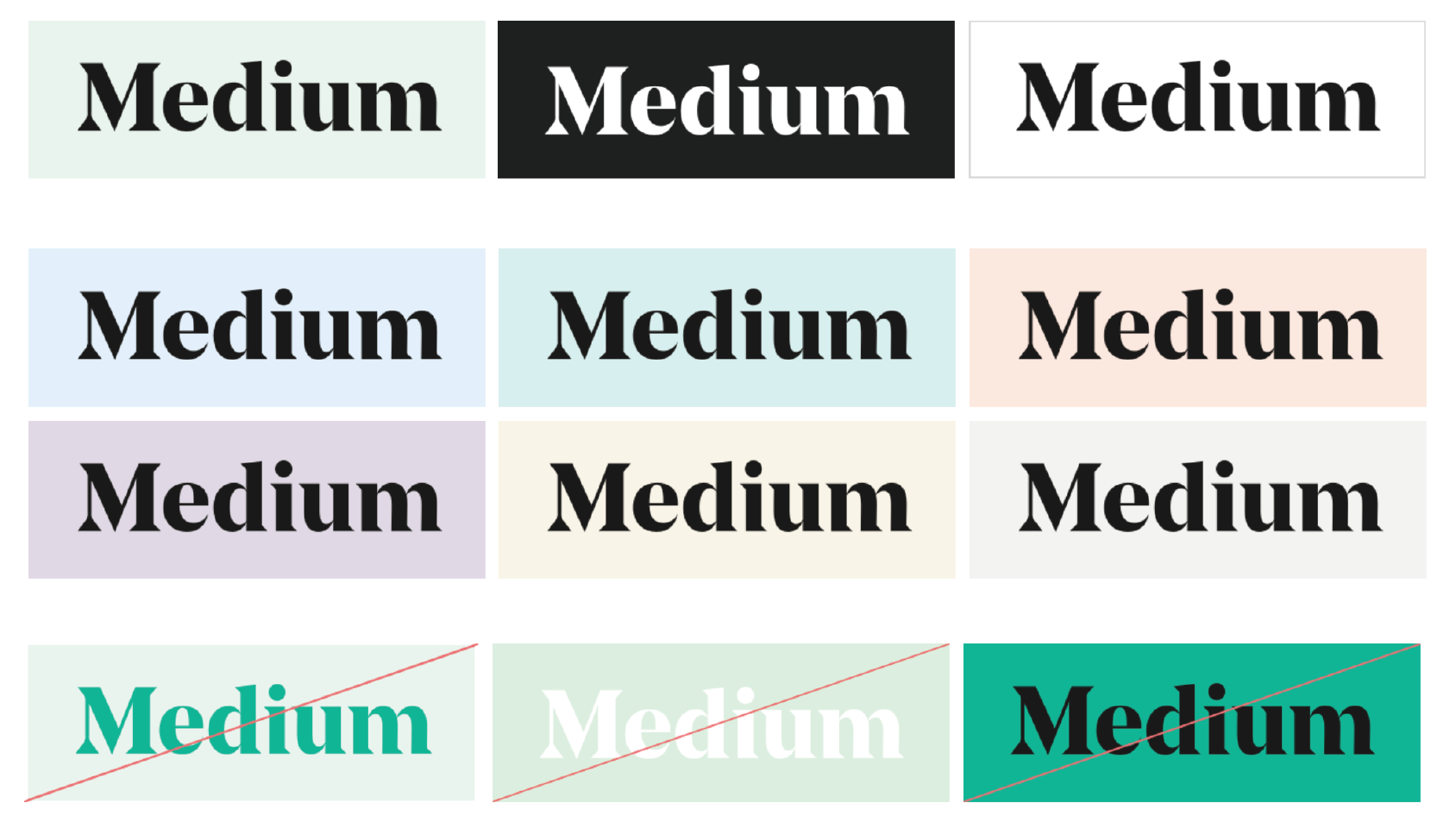
Medium has gone one better, removing any ambiguity about logo color by specifying primary, secondary, and incorrect logo color usage.
It’s usually a good idea to dictate minimum logo size here too. Figure out the smallest size at which your logo is still legible in print and on screen, and make sure it doesn’t appear any smaller than that.
It doesn’t hurt to give some concrete examples, either. Make it dummy-proof by including what not to do:
Follow the lead of top brands like Spotify, Medium, Facebook and Snapchat and create clear brand guidelines to make sure your logo is represented in the best light.

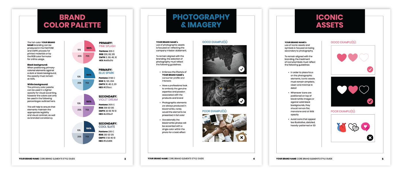
3. Include your brand’s core color palette in your brand style guide
In the past, brand colors were simple. You might have had to pick one or two colors that matched with your logo, and you were all set.
But that’s all starting to change.
Many companies are now using multiple color schemes to add vitality to their brand communications.
To keep brand recognition intact, it’s more important than ever to make core brand colors well known and consistent.
In your brand style guide, clearly define your brand’s color palette. Whether you, like Snapchat, have one primary brand color and some secondary shades:

Or like Netflix, you have specific color combinations you want your designers to stick with:

It’s a good idea to make your core brand colors absolutely clear. This helps in maintaining brand standards. Don’t forget to include the necessary hex codes, RGB values, and CMYK color codes to make sure your colors are presented consistently across media.

Brands like Trello that rely more heavily on color to express functions and components of their product tend to develop more comprehensive color systems. Spelling out every shade of each color in their palette means no more fiddling around with color pickers!

Atlassian has gone the extra mile to come up with color combos that pass web accessibility standards, and given some handy examples of good and bad color contrast:

On top of the social media graphic design trends of the moment, Spotify has even included realistic examples of where not to use their distinct “Spotify green”:

Whichever way you shake it, the more examples the better when it comes to color in your brand style guide. Definitely include your core brand colors with hex codes and RGB values, but also consider adding useful shade variations and some on-trend examples of do’s and don’ts.

Venngage’s Brand Kit allows you to save your brand colors for easy access later.

Once you’ve selected your brand colors, they’ll always appear right away in the color picker tool:

Learn more about your Brand Kit here.
4. Choose typography that matches your visual style
Typography is one of those things that goes unnoticed if it’s done well, but sticks out like a sore thumb if it’s not. Allowing font choices to slip under your radar can really cheapen your corporate identity.
To enhance your brand experience, use a brand style guide to ensure you’re applying typography consistently across your collateral.
This means outlining what fonts are used for what purposes (in print and on the web).
Snapchat kept it simple with their typography by choosing one font to use for pretty much everything:

Trello takes it a few steps further by specifying a design hierarchy of font styles and sizes, text colors, and styles for lists and paragraphs:

Depending on your product or business, sometimes it’s necessary to specify different fonts for different platforms. iHeartMedia has left nothing to chance by including options for Android, wearables, Microsoft products, and even autos:

Some companies even design their own fonts! If you do, it’s a good idea to include fallback options for external use:

Overwhelmed?
Don’t worry. A simple brand style guide doesn’t need to this extensive–just focus on your most used fonts, usually just one or two. Specify your font and design hierarchy with respect to font sizes (big for headers, medium for subheaders and smaller longer paragraphs) and font weights (light, bold, heavy, etc.):

Need to learn about choosing fonts? Check out our article on how to choose infographic fonts–all the same rules apply!
5. Find your brand voice
The importance of having a consistent brand voice in your messaging should not be underestimated.
Spend some time finding the style that resonates with your audience and aligns with the personality of your brand.
Once you have it figured out, ensure that it’s replicated across your channels by spelling it out through your brand guidelines in your style guide!
Shopify has gone above and beyond in defining their voice–including a ton of do’s and don’ts for grammar, punctuation, spelling, vocabulary, naming and tone. By giving tons of examples they make it impossible to go awry with messaging.

On the other side of the spectrum, Atlassian has kept it short and sweet, simply outlining their writing style in a couple brief sentences. Sometimes that’s all you need!
However, in today’s technology-driven world, an innovative solution like an AI writing tool can enhance and streamline the writing process even further.

If I could suggest one thing for your brand style guide, it would be to include a writing sample (or two) that heroes your company’s brand voice. We learn best by example, right?
Need some help creating your own brand guidelines? Check out this FREE ebook we created with our friends at HubSpot. It’s filled to the brim with tips, examples, and templates:
6. Include image and data visualization guidelines in your brand style guide
Last but certainly not least, it’s time to talk imagery. Everything about your imagery, including style, color, and content, contributes to the perception of your brand.
Create some guidelines for imagery (photos, illustrations, charts, infographics, etc.) to include in your brand style guide.
What might these guidelines look like?
Well, Trello loves to feature custom illustrations, but knows it can be hard for different artists to produce illustrations with a cohesive style. They leave nothing to chance by outlining what it means to make a “Trello-y” illustration–with guidelines on concept, composition, shadows, and more.
Most importantly, they give examples!

Along the same vein, Shopify goes all out, specifying when and where to use illustrations, the principles with which to critique illustrations, and the stylistic choices (like background color, level of detail, scale, and blending modes) that make an illustration “on-brand”.

Illustration principles from Shopify’s brand style guide.
Atlassian takes a more minimalist approach, wrapping their illustration style up with words including “practicality”, “optimism”, and “friendliness”.

Photographic style is just as important as illustrative style. If you use photographs frequently in your branding, your style guide should specify the level of complexity, compositions, color schemes, styles, and technical specs that make photographs fit within your brand.
Berkeley’s brand guidelines describe their photographic style as light, airy, and natural, only featuring images that fit into one of three categories: topical, cultural, or historical.

They also provide some more concrete direction to their photographers:
“We use natural light whenever possible. Light is also used as an active element in our photography, sometimes to the point of slight overexposure. To avoid unnatural angles, never rotate the camera to an angle other than 90 degrees.”
Whether you work with photos or illustrations, providing lots of examples and thorough descriptions is the way to go! Here’s an example of a branding infographic that showcases this:
If your branding features infographics or data visualizations (which it definitely should), don’t forget to include some stylistic guidelines for them as well.
Specify when and where to use infographics and data visualizations, and include style preferences and technical conventions.
Shopify gives their designers clear directions on how to approach a data visualization:
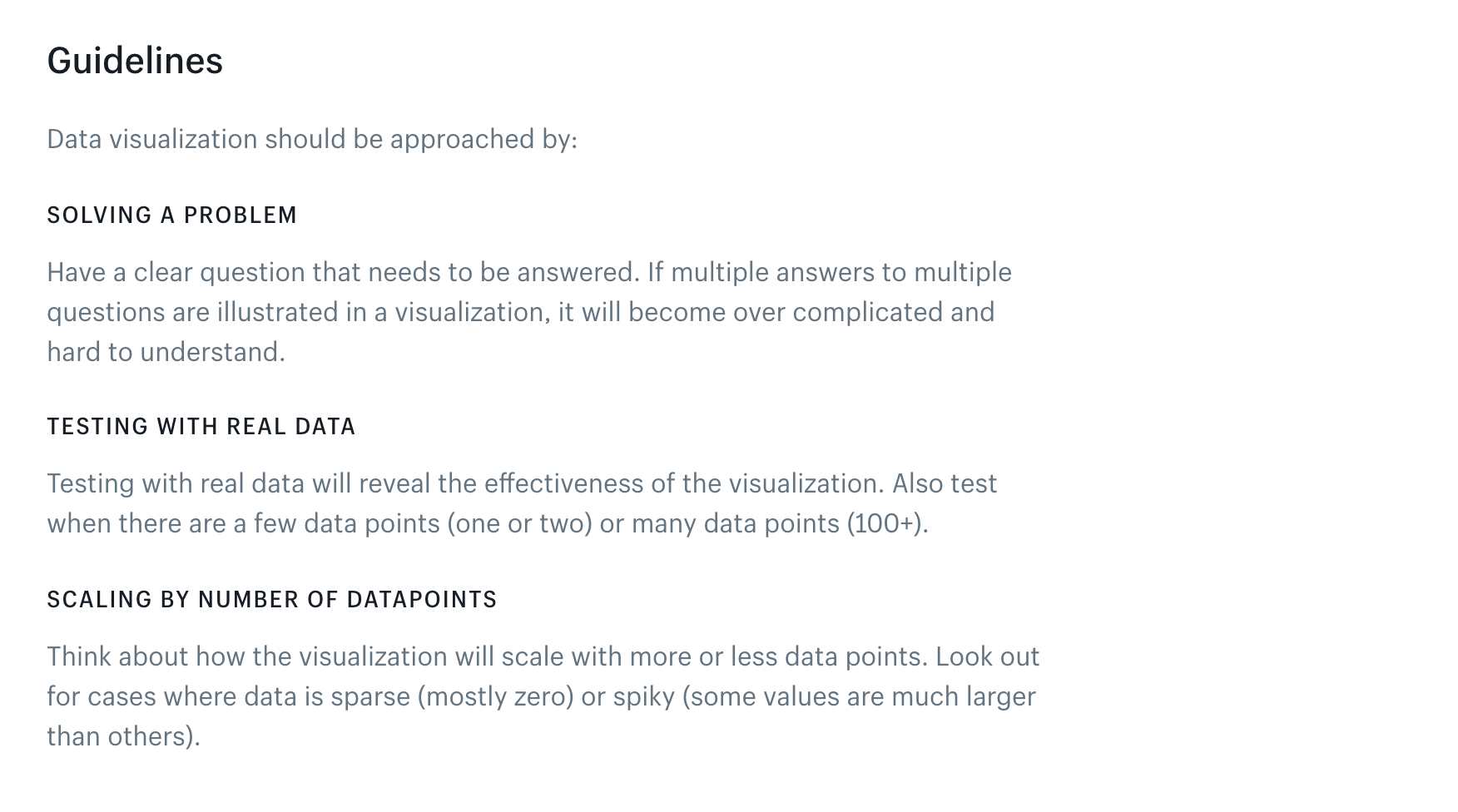
Followed by some definitive rules for labeling and styling those visualizations:

Guidelines such as these are easy to overlook, but when used properly go a long way towards fostering a cohesive brand presence – especially for more complex media like infographics and data visualizations.
Get an insider look at how to create a cohesive and actionable brand strategy. Download a FREE copy of this eBook we created with HubSpot, the famous CRM software.
- Learn how to avoid common mistakes
- Define your brand story
- Set rules for how your brand assets are used
- And much more!
Explore brand guidelines examples
Putting together brand guidelines can be a bit tricky since it involves juggling various aspects like visuals, tone and consistency to make sure your brand looks and feels just right. You could always use a brand guideline template or check out some of the brand guidelines by these big names for inspiration:
- Apple
- Apple’s brand guidelines are known for their simplicity and consistency, reflecting the company’s design principles. They cover logo usage, color palette, typography and overall brand tone.
- Google:
- Google’s brand guidelines are detailed and cover various aspects, including the use of the logo, color schemes, typography and even motion graphics. The guidelines ensure a consistent visual identity across all platforms.
- Nike:
- Nike’s brand guidelines emphasize the dynamic and energetic aspects of the brand. They cover logo usage, color applications, and provide guidance on creating impactful visuals that align with Nike’s brand identity.
- Microsoft:
- Microsoft’s brand guidelines are comprehensive, covering logo usage, color schemes, typography, and even specific guidance for different product lines. The guidelines help maintain a cohesive brand image across the diverse range of Microsoft products.
- Starbucks:
- Starbucks’ brand guidelines focus on maintaining the warmth and connection associated with the brand. They cover logo usage, color applications and even offer guidance on store design to ensure a consistent brand experience.
- NASA:
- NASA’s brand guidelines are unique in that they are publicly accessible and cater to a diverse audience. They provide insights into the use of the NASA logo, imagery and even social media guidelines.
Importance of maintaining a consistent brand identity across all channels
Maintaining a consistent brand identity is crucial for building trust and recognition.
Enhances brand recall: Consistent visuals and messaging improve brand recognition and recall.
Builds trust and credibility: A unified brand image increases customer confidence.
Differentiates from competitors: A unique, consistent brand stands out in the market.
Improves customer experience: Seamless interactions across channels boost customer satisfaction.
Strengthens brand equity: Consistency reinforces brand values and positioning in a competitive market.
Legal guidelines and trademark usage
To keep everything above board and protect your brand (and others), here are a few key things to keep in mind:
- © (Copyright): Use the © symbol with the year and your company name (like © 2026 Your Company) to show you own the content.
- ™ vs. ®: Use ™ for names or logos you’re claiming as yours but haven’t officially registered. Use ® only if it’s legally registered—using it incorrectly can cause legal issues.
- Third-party visuals: If you’re using someone else’s logos, icons, or images, be sure to add a quick disclaimer like: “All third-party trademarks and visuals belong to their respective owners and are used for reference only.”
- Working with vendors or partners? They’ll need written permission before using any of your brand assets. This keeps things consistent and avoids any confusion about what’s officially endorsed.
Sticking to these simple rules helps build trust and keeps your brand legally protected.
Brand style guide FAQs
What’s included in a brand style guide?
A brand style guide typically includes your logo variations, color palette, typography, imagery style, and voice/tone guidelines. It may also cover rules for social media, email design, and how to (and not to) use brand assets. Think of it as the instruction manual that keeps your brand consistent everywhere it shows up.
Why large companies need corporate brand guidelines
When you’re working with dozens—or hundreds—of team members, agencies, and global vendors, things can get messy fast. Corporate brand guidelines create a centralized source of truth that protects your brand identity and keeps everything cohesive across markets, departments, and channels.
How to build a brand book
Start by collecting your core brand elements: mission, vision, values, logo usage, brand colors, fonts, and tone of voice. Then, organize them into a visually appealing, easy-to-navigate document. Tools like Venngage or Canva can help you design a professional-looking brand book even without design experience.
What’s the difference between a brand book and a style guide?
A brand book is the big-picture document—it includes your brand story, purpose, personality, and values alongside your visual and verbal guidelines. A style guide is more tactical, focusing on the how-tos of brand application (like logo spacing or headline fonts). In short: the brand book tells who you are, the style guide tells how to show it.
Conclusion
Don’t send mixed messages when it comes to your brand.
Take inspiration from today’s top brands and make your own brand style guide to allow everyone representing your brand to produce collateral quickly, efficiently, and with confidence. Build one with these 6 simple steps:
- Kick off your brand style guide with a great brand story
- Use logo guidelines to create a recognizable brand signature
- Include your brand’s core color palette
- Dictate your typography hierarchy
- Define your brand voice
- Specify the imagery and iconography that makes up your visual style
Or work with one of our pre-designed templates–just pop in your own branding and you’re off to the races!
If you find that something about your brand is not working, fix it! A brand style guide should be an ever-evolving document, which is why we’ve made editing and sharing a breeze.
WATCH: Everything you need to know about brand in under 3 minutes!


