


I’ve been writing Venngage’s bi-weekly newsletters for a couple of months. At first, I thought it would be simple: add a few design tips, share some company updates, format it and hit send.
Turns out creating a newsletter people actually want to read is not that easy. The content was solid, but I kept second-guessing the layout, stressed over visuals and made basic errors like inconsistent fonts.
Thankfully, with every send and consistent feedback from my team, I began spotting patterns, which helped me tighten the layout and overall design of the newsletter.
This article is a summary of that learning curve. I’ll break down the newsletter mistakes I made early on and share some newsletter design tips I swear by.
If you’re looking for a practical resource to improve your newsletter design, check out our Newsletter Design Playbook. It covers layout principles, visual hierarchy tips, CTA placement and even a design checklist.
Mistake #1: Ignoring visual hierarchy
When I first started writing email newsletters, I focused almost entirely on the content. I thought if I added compelling copy and snappy headlines, the clicks would naturally follow.
And for a while, it looked like things were working. Open rates were steady. But the click rates? Not so much.
People were opening the emails but not engaging with them. It hit me that the problem wasn’t my messaging but the email layout and cognitive load I was placing on readers. My design lacked hierarchy and clear CTA placement, so nothing guided the reader’s eye.
I took a step back and started asking: What’s the first thing I want someone to notice? And what’s the one action I want them to take?
That simple exercise helped me simplify the layout and establish a clear visual hierarchy. The click rate improved from 1% to 2.8%, a 2.8× lift in user engagement metrics.
What helps improve visual hierarchy:
- Adopt an F-pattern layout: Place your headline in the top-left then arrange subheads and bullet points down the left edge, and position to guide the eye naturally through your content.
- Use a 30/24/16 font scale: Use a typography scale of 30 px for H1, 24 px for H2, and 16 px for body text to improve content readability and create a responsive email layout.
- Break up text with visuals: Add an icon or illustration to break the text. According to a study by GetResponse, emails featuring graphics achieved an average open rate of 43.12% and a click-through rate of 4.84%, compared to 35.79% and 1.64% for those without graphics.
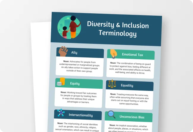
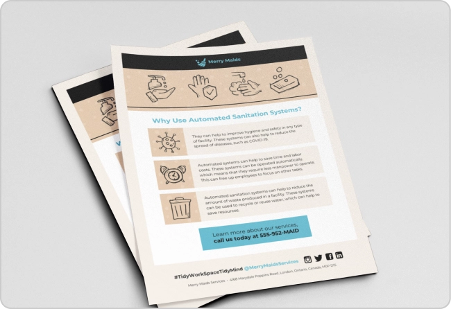
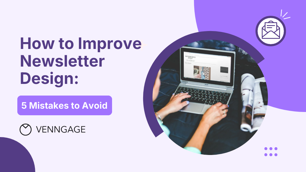
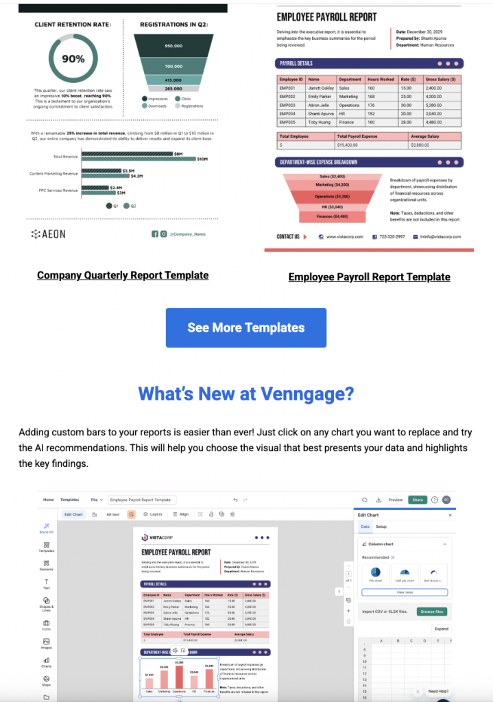
For example, this newsletter has a bold headline, a clear subhead and an image to create a strong visual hierarchy that naturally leads the reader toward the call-to-action button.
Related: 12+ Best Newsletter Examples to Inspire Your Next Email Campaign Strategy
Mistake #2: Overloading without prioritization
For a while, I treated the newsletter like a to-do list. New blog post? Add it. Upcoming webinar? Throw it in. Product update? Why not? The result was a cluttered email newsletter layout that diluted every message.
The unrelated items felt disjointed and impacted content readability and reader engagement.
But it ended up feeling more cluttered than helpful. My teammate suggested narrowing the focus to key events and templates.
Here’s what I did to improve email engagement:
- Pick one hero story: Decide on a single “big idea” per issue — whether that’s a product launch, an in-depth tutorial, or a template feature.
- Apply the 80/20 rule: Focus 80% of real estate on your hero content and 20% on supporting updates.
- Group by theme: If you have to include additional details, bundle them under clearly labeled sections (e.g., “Design Tips,” “Template Spotlight”). This thematic grouping improves email workflow and helps readers know where to look.
- Cut or link secondary items: Move less-critical content to a footer or link to a “Read more” landing page instead of adding it into the main body.
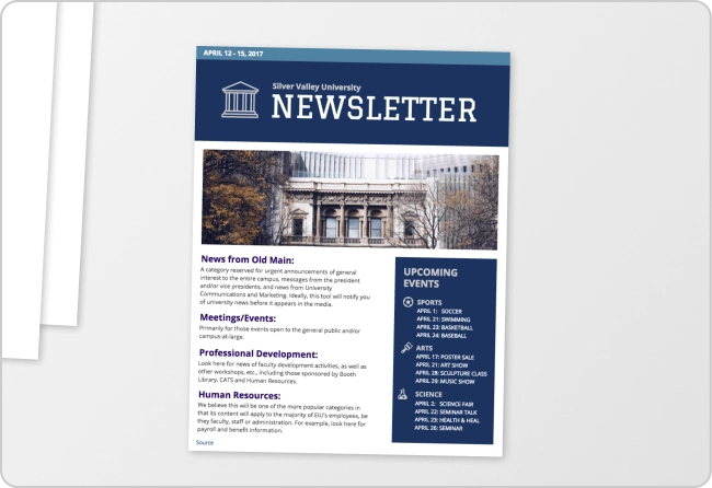
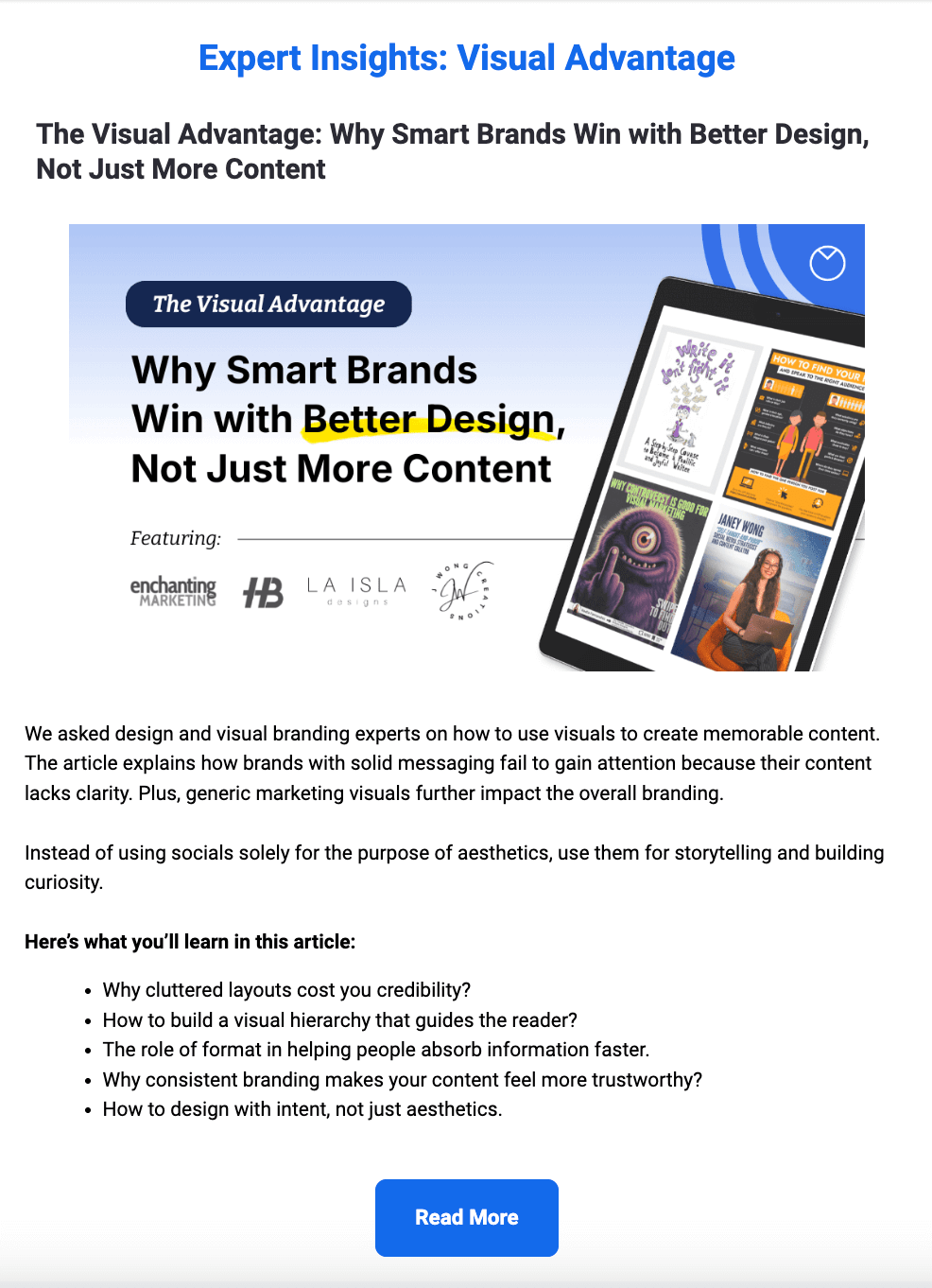
For example, in this newsletter, I focused on the AI Report Generator. It features report templates and Venngage’s custom chart feature that helps create reports easily.
Pro Tip: If you are struggling to create a newsletter from Scratch, try Venngage’s AI Newsletter Generator. Just add a text prompt with the newsletter theme and the details you want to include. You’ll get a customizable newsletter template in seconds.
A few weeks into the newsletter routine, one of my teammates messaged: “Hey! I noticed a slight font size inconsistency in the email on mobile this week.”
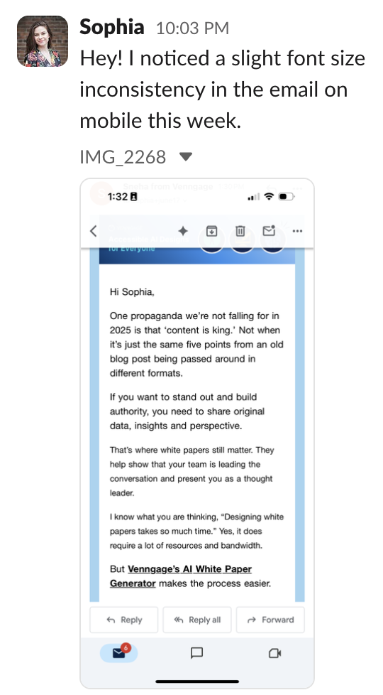
I panicked a little and opened the Mailchimp preview. Everything looked fine on the desktop. But when I clicked the mobile preview, two paragraphs were in a different font style than the rest.
Guess who forgot to check the mobile version? 🙋
More than half of our audience reads emails on their phones. If your email newsletter design isn’t optimized for mobile, it doesn’t matter how good the copy is or how beautiful the design looks on desktop. You’ve already lost the reader.
What I learned:
- Always check both previews: Design tools like Mailchimp have mobile previews for a reason. Don’t skip that step.
- Test before you send: Send a test email to yourself and open it on an actual phone — not just the preview.
- Keep CTAs thumb-friendly: Make buttons at least 44 × 44 px, center them, and give ample padding so they’re easy to tap.
According to Mailchimp, responsive email designs, which can be adapted to different devices and screen sizes, get higher click rates.
Mistake #4: Skipping accessibility checks in email layout
This one was a terrible miss.
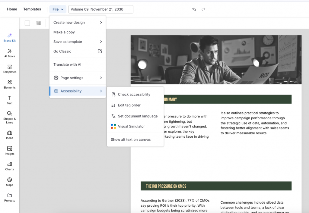
I had changed the colors of the newsletter header to match the campaign theme. It looked fine at first glance. But a teammate mentioned the updated design didn’t pass the accessibility test.
The color contrast was low, which made the icons and text blend into the background.

Since then, I’ve made it a point to run the visuals for every newsletter design through Venngage’s Accessibility Checker. It flags accessibility issues in your design, such as low contrast, missing alt text, and any layout issues that might affect readability. This ensures I create an accessible email newsletter.
Here’s what to do before sending the newsletter:
- Pick an accessible color palette: According to WCAG, the minimum contrast ratio for text and images of text should be 4.5:1. Test color contrast with tools like Venngage’s Accessibility Checker or the WebAIM Contrast Checker to create an inclusive newsletter design.
- Use semantic HTML: Structure content with <h1>–<h3> tags, <ul>/<ol> lists, and proper lang attributes so screen reader optimization is built in.
- Add meaningful alt text: Write descriptive alt text for charts, icons, and images — avoid “image123.jpg” or “chart” and instead use “Q2 revenue up 35% vs. Q1.”
- Double-check with the Color Simulator: Use Venngage’s Color Simulator to see how your designs appear to people with visual impairments.
According to the Email Markup Consortium, over 99% of emails have “serious” or “critical” accessibility issues.
Mistake #5: Forgetting visual spacing between different sections
This is one of those things you don’t notice until someone points it out.
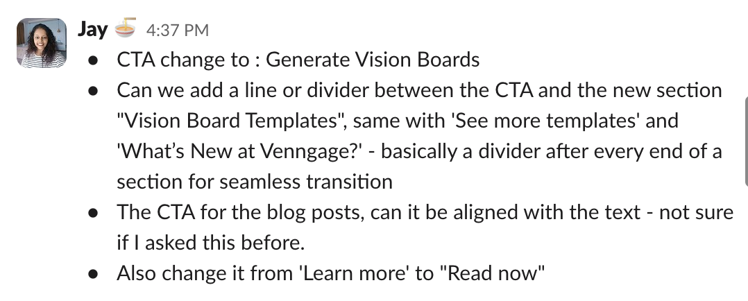
A teammate suggested adding dividers between sections in the newsletter. The flow felt a bit cramped, especially between the CTA and the next section. The moment I added some breathing room, the layout felt much easier to follow.
Here’s what I keep in mind now:
- Add a visible divider between major sections: Place a visual separator before and after each major section — especially around your primary CTA and when shifting topics (e.g., from a template highlight to a blog roundup).
- Maintain uniform padding: Apply the same top and bottom margin (e.g., 30 px) to every content block so each section stands out and remains easy to scan.
- Align CTAs with body text: Misaligned buttons or uneven spacing can make things look off — even when the content is good. According to Sender, centered CTAs get up to 682% more clicks than left- or right-aligned ones
- Label your CTAs clearly: “Read now” or “Get the template” often works better than a generic “Learn more.”
Final Thoughts: Newsletter design is a skill you build
Writing a great newsletter takes more than helpful content. It’s about how that content is presented, how it reads on mobile, how it flows visually and how easy it is to act on.
These mistakes taught me a lot, and they’ve helped me create newsletters that people actually open, read, and click through.
If you’re wondering how to design an email newsletter or trying to grow your newsletter and want a practical resource on how to design better emails, check out our Newsletter Design Playbook.
It covers layout principles, visual hierarchy tips, CTA placement, and even real newsletter makeovers you can learn from or repurpose.