


HR departments handle a wealth of data, from employee performance metrics to hiring trends. Navigating this sea of information can be overwhelming — after all, we’re now exposed to five times as much information on a daily basis than we did in 1986 (imagine that).
But there’s a lifeline: data visualization. High-quality infographics are 30 times more likely to be read than plain text. And people who follow illustrated directions perform 323% better than those who follow text-only instructions.
In this article, we’ll explore the power of HR data visualization. I’ll show you how to create impactful visuals that can streamline decision-making and improve communication.
Need a jumpstart? Check out Venngage’s Data Visualization Graph Maker or browse our professionally designed Data Visualization Chart Templates.
What is HR data visualization?
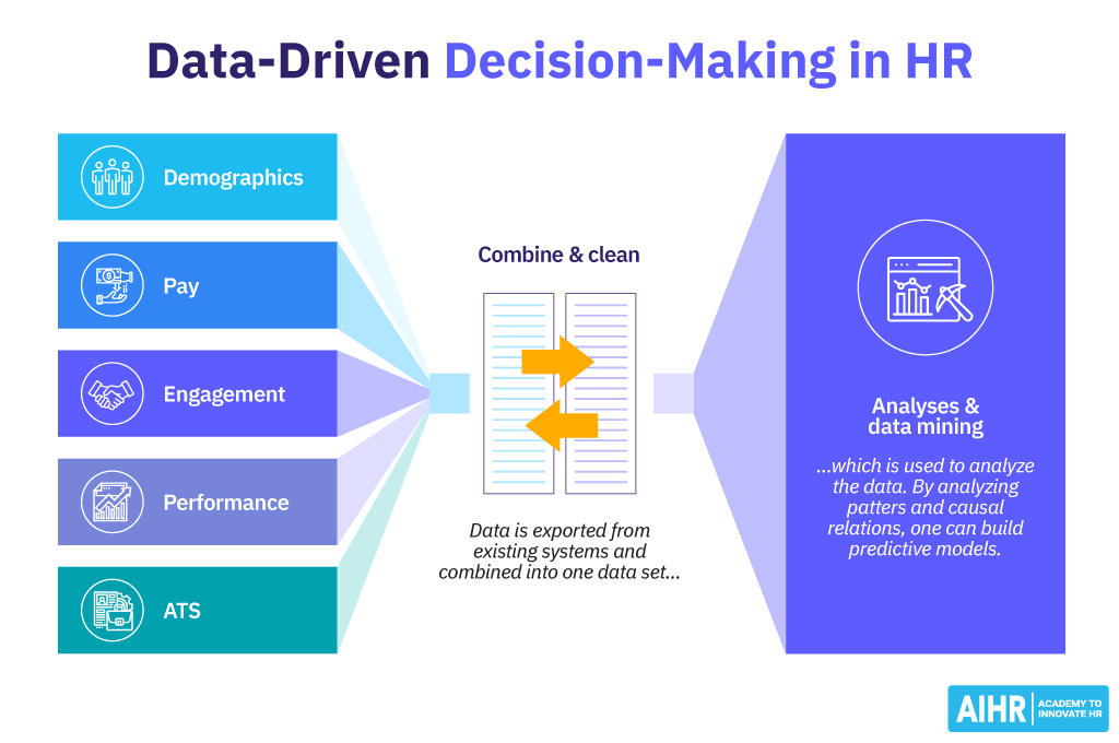
HR data visualization is the process of transforming raw HR data into visually appealing and easy-to-understand formats, such as charts, graphs and dashboards. It helps HR professionals quickly identify trends, patterns and insights from complex datasets. By presenting data visually, it simplifies decision-making and enhances communication within the organization.
The importance of data visualization in HR
That said, data visualization in HR isn’t just about creating pretty charts—it’s about making sense of the numbers so you can take action.
HR teams deal with tons of data, from performance reviews to hiring stats. Without the right tools, all that information can feel overwhelming. But when you visualize it, suddenly patterns and trends start to jump out, giving you a clear path forward.
By transforming complex HR metrics into visually appealing and easy-to-understand formats, data visualization can help you:
Enhanced decision-making
Data visualization is a game-changer for decision-making. Instead of sifting through endless spreadsheets, you can see the big picture at a glance. This level of insight is essential when analyzing extensive job posting data, as it allows organizations to make high-reliability decisions based on millions of fresh external records.
Imagine looking at a graph that shows employee turnover trends over the last year. Instantly, you can spot any red flags and figure out what’s causing them. And it’s not just about what’s happening now—visualization tools can also help you predict future trends, so you’re always one step ahead.
Improved communication
Let’s face it—communicating complex HR data to others can be tricky. Whether you’re talking to executives or team members, it’s easy for important details to get lost in translation.
But with data visualization, you can present information in an engaging and easy-to-understand way. This makes it simpler to share insights with executives or team members, improving collaboration and alignment on strategies.
Increased efficiency
Time is always precious in HR and data visualization can help save it. By automating data analysis and reporting, you cut down on manual work. Real-time dashboards provide instant insights into various HR metrics, letting you quickly adjust strategies and streamline processes.
Data presentation today is no longer just about numbers on a screen; it’s storytelling with a purpose. Turn your data into stories that stick with these 10 data presentation examples for strategic communication.
Types of data visualization techniques
Data visualization techniques are like tools in a toolbox, each serving a unique purpose to help you make sense of complex data.
Before you start, it’s important to pick the right data visualization chart to present your data. New to charts? This post lists down the 10 different types of data visualizations to help you choose a data analytics style that best fits your needs
Now, without further ado, let’s have a closer look at some of the most common HR data visualization techniques, along with examples to show how they can be used:
Line charts
Line charts help you track changes over time, like watching a trend unfold. Imagine you’re monitoring employee turnover month by month.
A line chart can show you the ups and downs throughout the year, helping you spot any patterns or issues that might need attention.

Think of data visualization like choosing the right outfit. You wouldn’t wear a swimsuit to a formal dinner, right? It’s the same with data.
Use line charts for trends (like watching your weight over time), bar charts for comparing things (like sales by department) and scatter plots for seeing how things are connected (like how experience affects salary).
Bar charts
These are perfect for comparing different groups or categories. For example, if you’re in HR and want to see how many people each department hired this year, a bar chart can break it down for you visually. Each department gets its own bar, making it super easy to compare.

Always make sure your axes, categories and data points are clearly labeled. This might seem obvious, but unclear labels can lead to confusion and misinterpretation. Make sure that anyone looking at your visualization can immediately understand what each part represents.
Scatterplots
Scatterplots are great for showing the relationship between two variables. Let’s say you want to see if there’s a connection between how much experience employees have and how much they’re paid.
A scatterplot can plot each employee’s experience against their salary, helping you see if there’s a trend—like whether more experience usually means higher pay—or if there are any outliers that stand out.

When designing your data visualization charts, add the necessary context so that the data makes sense to your audience. This might include titles, subtitles or brief explanations that guide the viewer through the data.
Context helps your audience understand why the data is important and what they should take away from it.
Pie charts
Pie charts are all about showing parts of a whole. If you’re looking at the breakdown of your workforce by job level—like entry-level, mid-level and senior-level—a pie chart can give you a clear picture.
Each slice of the pie represents a different job level, making it easy to see how the workforce is distributed.

Color is a powerful tool, but it should be used thoughtfully. Choose a consistent color scheme that enhances readability and helps highlight key points.
Heat maps
Heat maps use color to show the intensity of data across a grid, making patterns pop out visually.
Imagine you’ve just run a company-wide employee satisfaction survey. A heat map could show the results by department, with colors ranging from green (high satisfaction) to red (low satisfaction). This makes it easy to see which departments are thriving and which might need some attention.
Or, try a heatmap to visualize talent risk assessments like this:

Your first draft might not be perfect — try it out with a small group to see if they get the message and be open to feedback and make changes to improve your design.
Matrix diagrams
Matrix diagrams display data in a grid format, where you can compare multiple variables at once. For example, if you’re tracking employee skills across different departments, a matrix diagram could be your go-to.
Rows could represent employees, columns could represent skills and the cells could indicate who has which skills. It’s a quick way to spot gaps or areas where you might need to offer training. Check out how it’s done in this Impact vs. Effort Matrix Diagram Template:

The goal of data visualization is clarity — so avoid cluttering your visuals with unnecessary elements. Stick to the essentials that help convey your message clearly.
Why data visualization is essential for HR
Your HR team is the heart of your company and to keep everything running smoothly, you need the right tools. That’s where data visualization comes in. It helps you see the big picture, catch problems before they grow and make smart choices in terms of:
Recruitment
Data visualization is like a secret weapon for recruitment. By turning numbers into clear visuals, you can easily track important metrics like time-to-hire, where your best candidates are coming from and why some applicants drop off line in this recruiting metrics template:

Many HR teams now pull real-time labor market insights from a jobs data API to enrich these recruitment dashboards with external hiring trends, in-demand skills, and location-based demand signals.
These insights help you spot and fix any hiccups in your hiring process, so you can attract the right talent more effectively and efficiently.
Retention
Employee turnover is a significant cost to businesses. Data visualization can help HR departments identify the root causes by visualizing data on factors such as employee satisfaction, compensation, workload and career development opportunities.
By analyzing metrics such as staff turnover rate, employment length and reasons for resignation, HR can implement targeted retention strategies. Think — improving employee engagement programs, offering competitive compensation packages or providing opportunities for professional growth.

Source: Alex Kolokolov Website
Productivity
Understanding employee productivity is crucial for a successful team and data visualization simplifies this process. A quarterly performance review, enhanced with visual insights, is an effective way to keep track and make informed improvements.

By tracking things like task completion rates and performance over time, you can quickly see where productivity might be slipping.
These visual insights help you pinpoint issues and create solutions, whether it’s through targeted training or streamlining processes, to keep your team performing at their best.
Transition to data-driven decisions
While gut feelings and employee feedback are important, they can sometimes be subjective. Data visualization turns hard facts into easy-to-understand visuals, helping you make decisions based on solid evidence.
This approach ensures that your strategies in hiring, retention and productivity are more effective and aligned with your organization’s goals.
For example, Under Armour used data analytics to predict and reduce employee attrition. By analyzing employee data, they pinpointed key reasons for turnover and implemented targeted strategies, leading to a significantly lower attrition rate than expected.
A brief history of data visualization
Data visualization has come a long way from its early days of simple maps and diagrams to the advanced tools we rely on today.
Ancient civilizations like the Egyptians and Greeks used basic visuals to convey information, but it wasn’t until the 18th and 19th centuries that more sophisticated methods, like statistical graphs, started to take shape.
Key figures in this journey include William Playfair and Charles Joseph Minard. Playfair, an 18th-century Scottish engineer, pioneered the use of bar charts, line graphs and pie charts, transforming how data is presented.
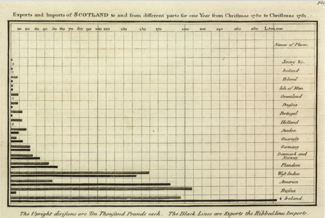
Source: A bar chart in William Playfair’s Commercial and Political Atlas (1786) showing Sctoland’s imports and exports.
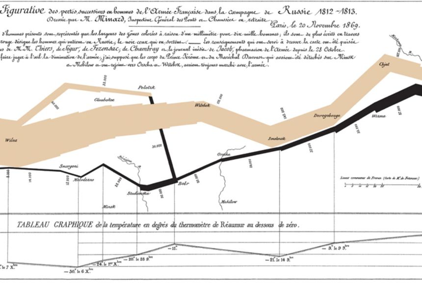
Minard, a 19th-century French civil engineer, created one of the most impactful visualizations with his map of Napoleon’s 1812 Russian campaign, These early developments set the stage for the modern techniques that help us make sense of complex data.
What makes for good data visualization
Imagine your HR data is a pile of puzzle pieces. To see the big picture, you need to put them together in the right way. Data visualization is the glue that holds it all together — but to create a beautiful and meaningful puzzle, you need to plan carefully and consider all the pieces.
Steps in creating effective HR data visualizations
- Define the purpose: Clearly identify the goals of your visualization. What story do you want to tell? What insights do you want to convey?
- Choose the right data: Select the relevant data that will support your purpose. Ensure the data is accurate, reliable and representative.
- Select the appropriate visualization type: Choose a visualization type that best suits your data and purpose. Consider factors such as the type of data (e.g., categorical, numerical), the number of data points and the desired level of detail.
- Design the visualization: Create a visually appealing and informative design. Use clear labels, consistent formatting and appropriate colors.
- Test and refine: Evaluate the effectiveness of your visualization. Get feedback from others and make necessary adjustments to improve clarity and understanding.
Important considerations for effective HR data visualizations
- Content: Ensure that the content of your visualization is relevant, accurate and easy to understand. Avoid clutter and focus on the key messages.
- Color: Use colors effectively to highlight important information and improve visual appeal. Choose colors that are easy to distinguish and that complement each other.
- Dynamics: Consider incorporating interactive elements, such as tooltips or drill-down capabilities to provide additional context and allow users to explore the data in more detail.
Looking to bring your data to life with interactive elements? Here’s how you can master interactive data visualization along with examples to help you get started.
Challenges and best practices of HR data visualization
While data visualization offers significant benefits for HR departments, it is not without its challenges. To get the most out of it, you need to address some challenges first.
Here are some common challenges and best practices to help you overcome them:
Common challenges:
- Data quality issues: Having inaccurate or incomplete data can lead to wrong conclusions. For example, if your employee satisfaction survey data is missing information from a key department, you might get a skewed picture of overall morale.
- Lack of technical expertise: Many HR professionals might not be tech-savvy enough to use data visualization tools effectively. This can make it difficult to turn raw data into meaningful insights.
- Resistance to change: Introducing data visualization into an organization may face resistance from employees who are comfortable with traditional methods of data analysis. Overcoming this resistance requires effective communication and training.
Best practices:
- Data quality management: Make sure your data is accurate and complete. This might involve removing duplicates, fixing errors and ensuring consistency across different data sources.
- Technical training and support: Provide training for your team on data visualization tools. Consider starting with basic training and then offering more advanced courses as needed.
- Explain the benefits: Show people how data visualization can help them do their jobs better. For example, you could demonstrate how data visualization can be used to identify trends in employee turnover or to measure the effectiveness of training programs.
- Start small and gradually scale: Begin with simple visualizations and gradually get more complex. This will help your team become comfortable with the technology and build confidence in their ability to use it effectively.
- Collaborate with IT: Collaborate with your IT department to make sure you have the right tools and support. They can help you select the best data visualization tools and provide technical assistance when needed.
- Focus on actionable insights: Make sure your visualizations provide clear and actionable insights that help you make better decisions. Avoid creating visualizations that are merely decorative or do not add value.
How to make an organizational chart with Venngage
Organizational charts are more than just visual representations of a company’s hierarchy—they are essential tools for HR data visualization.
With a well-designed organizational chart, HR professionals can quickly assess staffing needs, identify gaps in the workforce and make informed decisions about recruitment, promotions and restructuring.
Fortunately, creating an organizational chart with Venngage is a straightforward process. Here’s a step-by-step guide to help you create an organizational chart using Venngage:
1. Sign up or log in
If you don’t have a Venngage account, you’ll need to sign up for one. You can start with a free account or choose a premium plan if you need access to more advanced features.

2. Choose an organizational chart template
Once you’re logged in, go to the Venngage template library. Use the search bar or browse through the “Organizational Chart” section to find a template that suits your needs.
Venngage offers a variety of organizational chart templates, from simple hierarchical charts to more complex matrix charts. Choose one that best fits the structure of your organization.

3. Customize your organizational chart
Customize the look of your chart by changing the color scheme to match your company’s branding. You can also add icons or images to represent different roles or departments, making your chart more visually engaging.

4. Review and share
Venngage allows you to download your organizational chart as a PNG, PDF or other file formats. You can also share it directly via a link, a QR code or even print it for physical distribution.

5. Update as needed
Organizations evolve, and so should your chart. Venngage makes it easy to update your organizational chart whenever roles or departments change. Simply log in, edit the chart and save the updated version.
Leveraging data visualization for HR success
Turning raw numbers into engaging visuals makes complex information easier to understand and use.
By visualizing metrics like turnover, productivity and satisfaction — you can see patterns, spot issues early and understand what’s working (and what’s not). It’s like having a crystal ball for your HR department, helping you make better decisions and create a better workplace.
As you start using these visualization techniques to guide your HR strategies, you’ll see how they simplify data analysis and make a big difference.
What are you waiting for? Embrace the power of visual storytelling to guide your HR strategies, connect with your team and build a data-driven culture. Data visualization can help you transform your HR department and create a more engaged and productive workforce.


