As data becomes more and more a part of how we understand our world and our work in it, data visualization and infographics are becoming more commonly used words that refer to how we learn about and share this data with others.
But these are still relatively new ideas for the public to grasp. Although bar and pie charts have been around for more than a century, they are no longer used only by journalists, analysts, and designers.
I’ve been creating them for almost a decade now, so I can help you better understand what these terms mean and how they relate to one another. I will also walk you through how you can visualize data with the help of Venngage’s infographic maker and infographic templates, even if you aren’t a professional designer.
Table of Contents (click to jump ahead):
- Examples of data visualization infographic
- What’s the difference between data visualization and infographics?
- How to use data visualization in your infographics
Examples of data visualization infographic
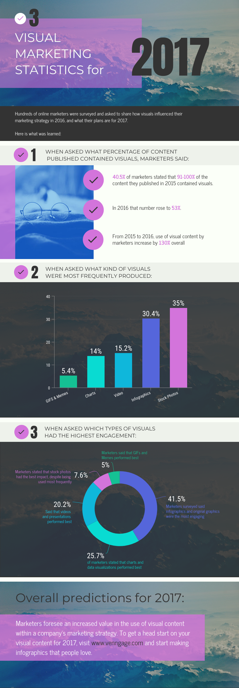
Here is an example of a fairly typical infographic that includes some data and visualizations. Because it is a report on survey findings, the data points are provided as support for the seven insights.

Not all infographics are in the long web-based format above.
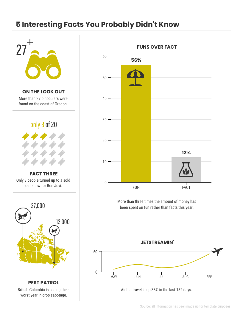
This next one is much smaller, but includes visuals and text in addition to the line graph visualization. This would be a great infographic for a print product like a magazine or newspaper.
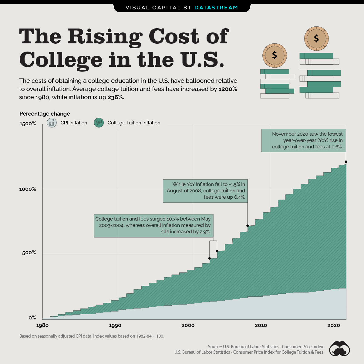
This next example is pretty simple, which makes it ideal for use on social media. It includes two line graphs to support audience understanding.
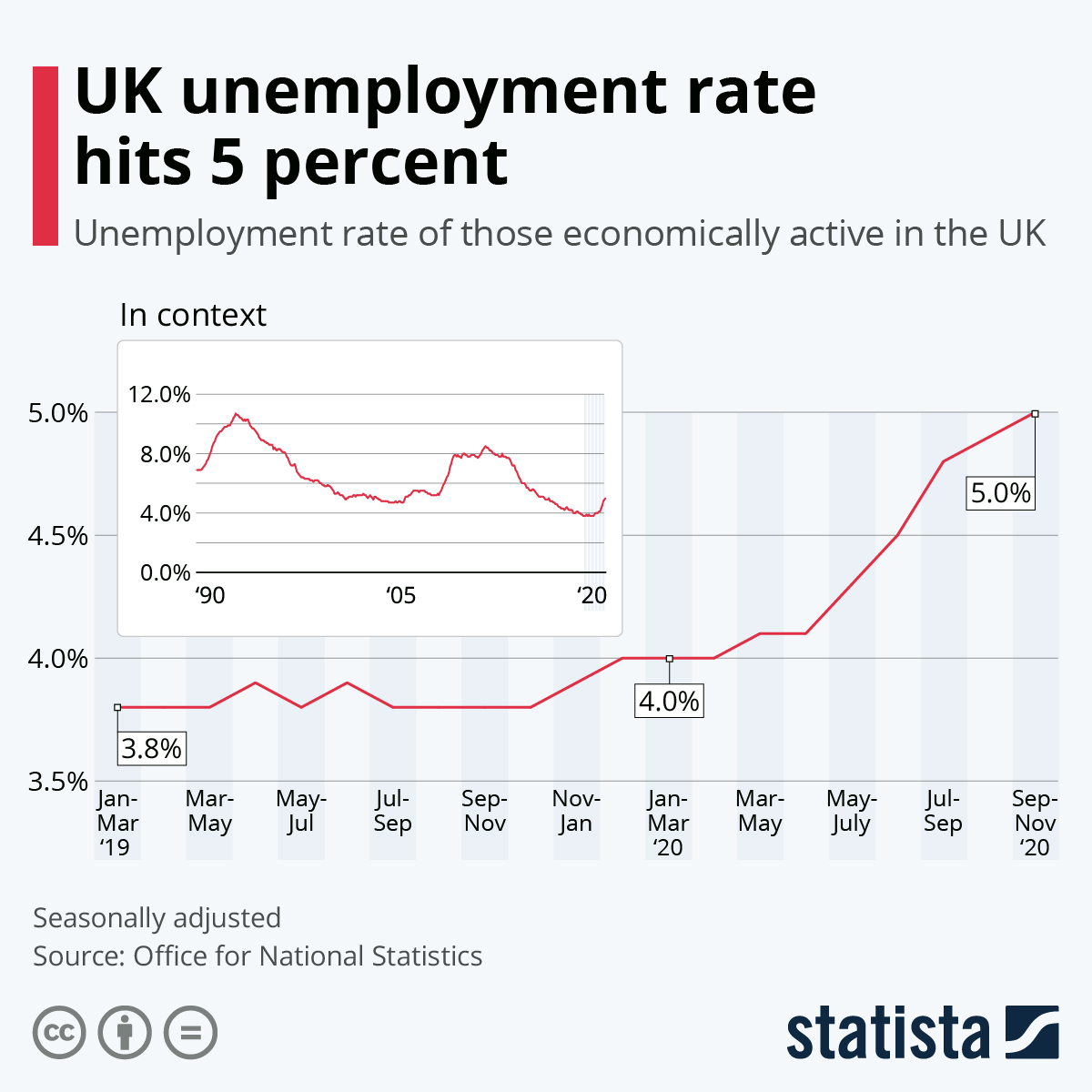
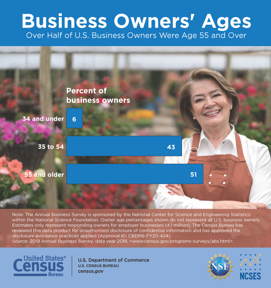
This one is also a good fit for social media. It uses a photo as a background, which increases the visual impact.
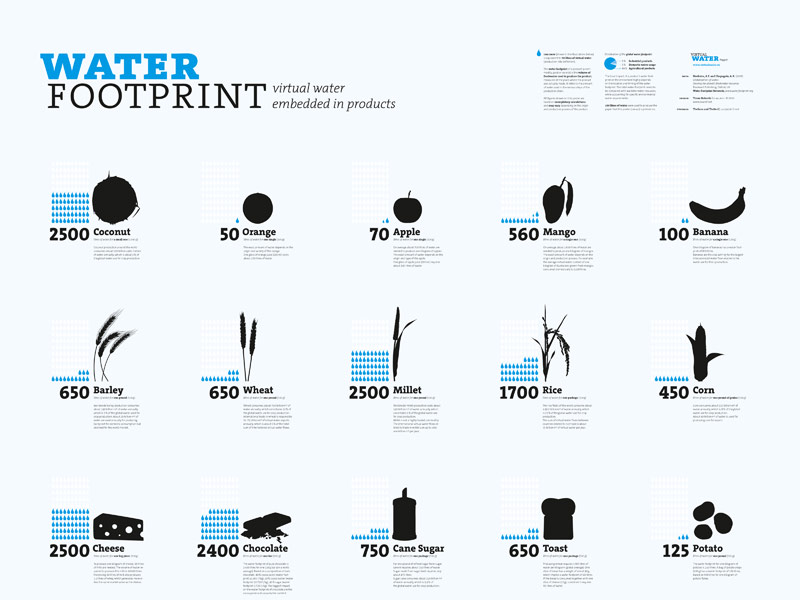
This last one is meant to be a printed poster. It shows a series of pictograms that can be compared to one another.
What’s the difference between data visualization and infographics?
Data visualizations are certain types of visuals that help us see and understand data, ideally in ways that lead us to have quick insights and “aha”s.
Common examples of data visualizations:
- Bar graphs
- Timelines
- Line graphs
- Pie charts
- Scatterplots
- Venn diagrams
- Maps
They can stand alone but we often find them in reports, white papers, brochures, posters, presentations and infographics.
Infographics, short for informational graphics, are design products or ways to share information in a form that is highly visual.
Infographics usually tell a story of some kind, and they can be short and simple or long and in-depth. They can include a variety of elements such as narratives, illustrations, icons, photos, and data visualizations.
Related: How to Tell a Story with Data (A Guide for Beginners)
You can create both infographics and data visualizations in Venngage, the simple (but powerful) design tool for business communication.
Data visualization vs infographics: the verdict
Infographics and data visualizations are not the same thing, but they are interrelated.
Data visualizations often need some accompanying storytelling in order for the data to become actionable, and this is something infographics can do well. Data visualizations can also play fantastic parts in the stories that infographics can tell.
Here’s a simple example of how the two can work together: a pictogram within a broader story about teens who have access to technology.
Related: What is Data Visualization? Definition, Examples and Best Practices
How to use data visualizations in your infographics
The best way for you to understand is for me to show you.
This is why we use data visualizations and infographics in the first place, because visuals are such an easy and effective way for us to grasp information.
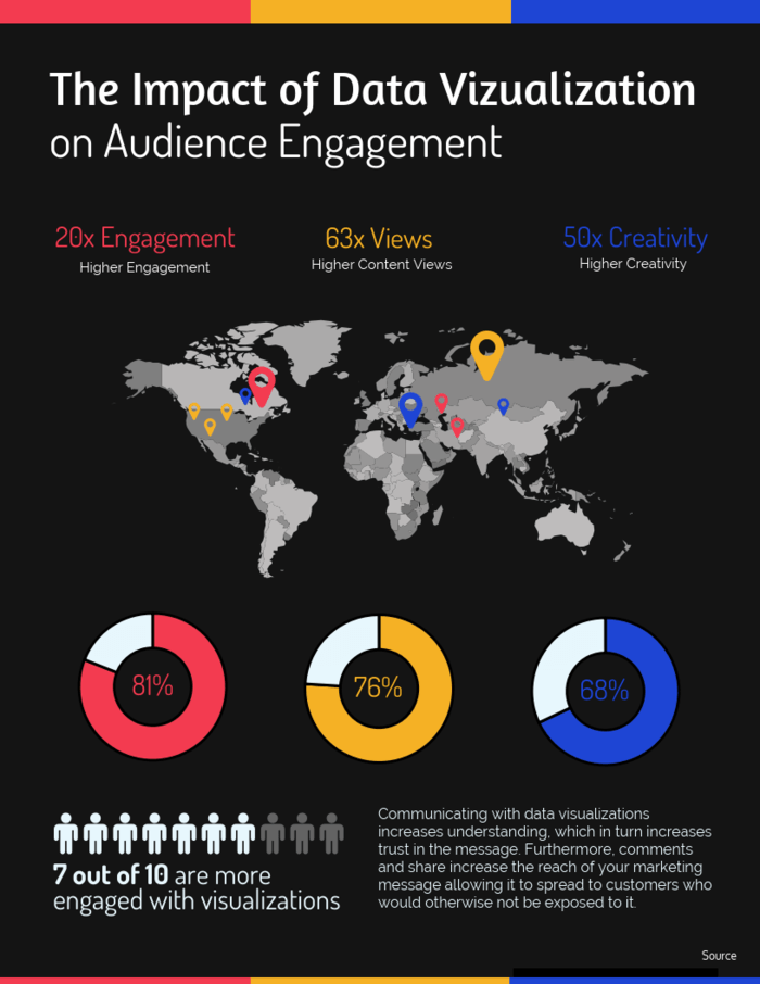
Here’s another example of an infographic that includes contains data visualizations (maps, donut charts, and pictograms) that help tell a story.
I will walk you through an example of how to use data visualizations in an infographic.
This video is also a great primer on how to plan and make infographics (without any design experience).
1. Consider the purpose, and if possible the audience
There are a number of reasons you might decide to include data visualizations in your infographic.
Perhaps you are:
- Creating an internal report
- Using infographics in your social media
- Printing posters for your workplace
Knowing who you are communicating with and why is critical as it will inform all the decisions you will need to make.
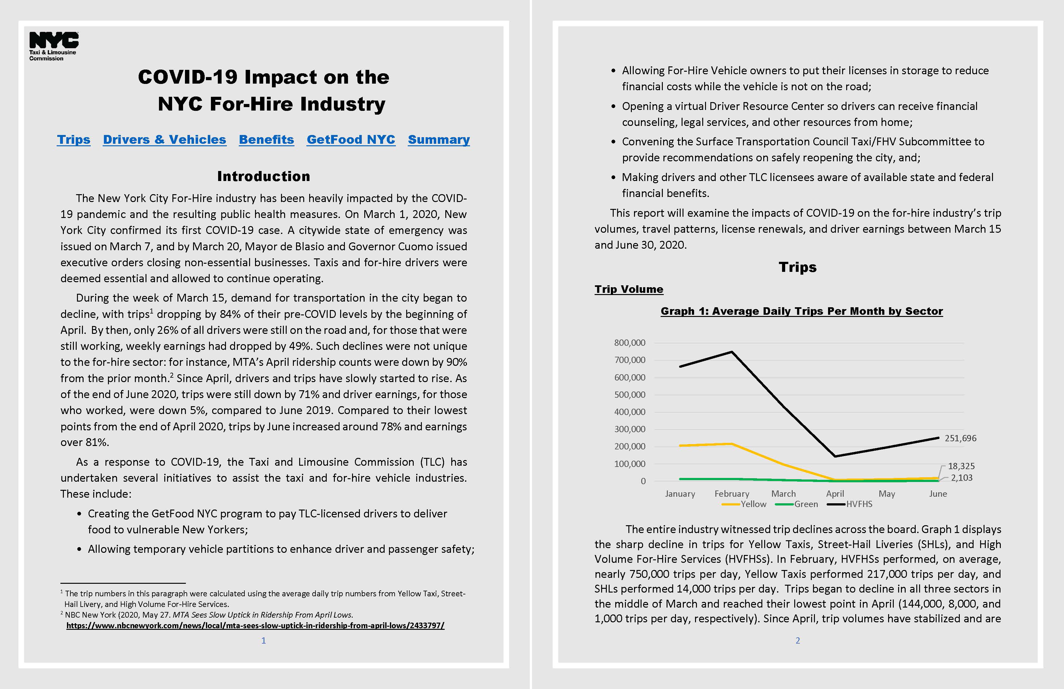
For this example, I will use public data from New York City’s Taxi & Limousine Commission. I can use this data to show a number of things, but I am curious about using it to show the impact that COVID-19 had on New York City, since this is a timely topic and because I know that this city has been one of the hardest hit in the U.S.
The Commission’s report highlights a number of significant trends in the data, including declines in trips, increases in trips to and from hospitals, declines in numbers of drivers, declines in drivers’ incomes and drivers’ participation in a city program that delivers food to New Yorkers in need.
The report includes some data visualizations (see below) but it’s not as attractive or concise as an infographic would be.
Visualizations of this data could be used in an infographic for transportation industries, hospitals, employment agencies, charities, etc.
To keep this example fairly straightforward, I will create an infographic that explains to a lay person how these data trends alone demonstrate the massive changes that occurred in New York City in the spring of 2020.
2. Review the data and determine the best data visualizations
Now that I know what I want to explain and to whom, I can decide what is best to show to make the insights clear.
I know I will be essentially showing change over time, so some obvious options are to include a timeline and/or a line graph, but these aren’t the only ones to consider.
I could also create a bar graph or a pictograph, especially if I want to reference percentage changes. If I had the right type of data, I could also consider using a map of this city, like this one created for a blog published a couple years ago.
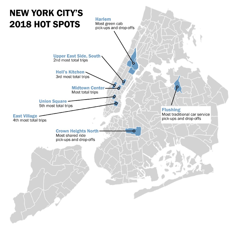
Create your own map for free with Venngage’s Map Maker.
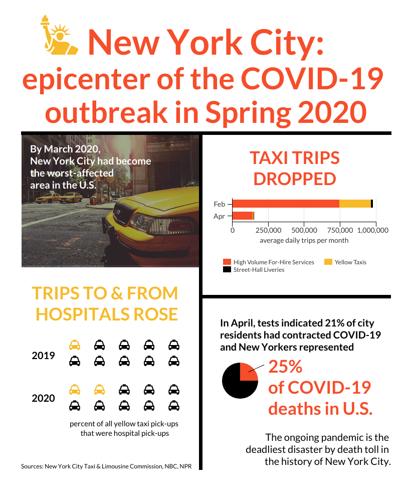
I want to keep this example fairly simple. So, I will use data about the average daily trips in February and April of 2020, and for this data I will create a stacked bar graph so I can also show how the numbers changed for three categories of services offered.
I want to include more than one data visualization in my infographic, so I will also use data about trips to and from hospitals in 2019 and 2020. For this data, I will create a pictograph as that could help the audience also picture in their minds the taxis crowding emergency room driveways, and thereby evoke some emotion (which is always a good thing to try to do with visuals).
Related: How to Make an Infographic in 5 Steps (Guide)
3. Lay out your infographic
Since I now know I’m going to include at least two data visualizations, I can start to lay out the composition of my infographic. For this example, I will look through Venngage’s infographic templates to get some ideas of what I might want to work with.
This one has a lot of the elements I’m looking for, and it gives me the idea that I could consider adding a map even if I don’t use any data in the map.
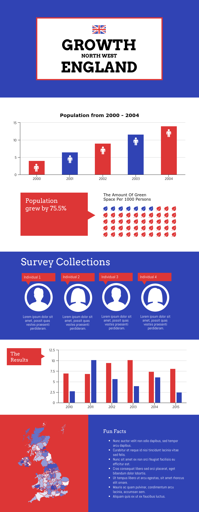
I like this one even more because of the photographic backgrounds. This would be a great one to use if I wanted to create a more actionable story.
I may want to consider something much simpler, though, especially for this example. Here’s a couple more I could run with. These might work well for sharing on social media.
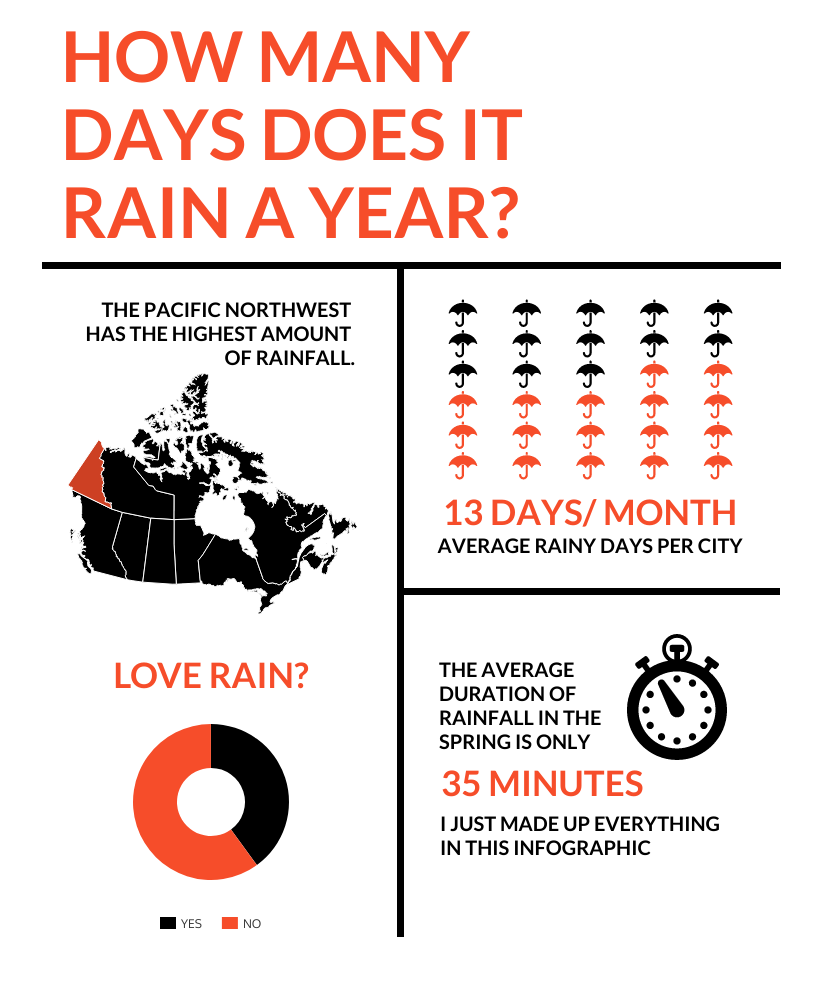
4. Create data visualizations that are accurate, clear, and compelling
With these goals and plans in mind, I am now ready to begin creating.
Using the last template pictured above, I will use Venngage’s drag-and-drop online editor to:
- Copy data I found in the Commission’s report into the tables for two pictographs.
- Change the icons to cars.
- Replace the pie chart with a stacked bar graph using different data from the report.
- Swap the placement of these two visuals because this makes for better reading from left to right.
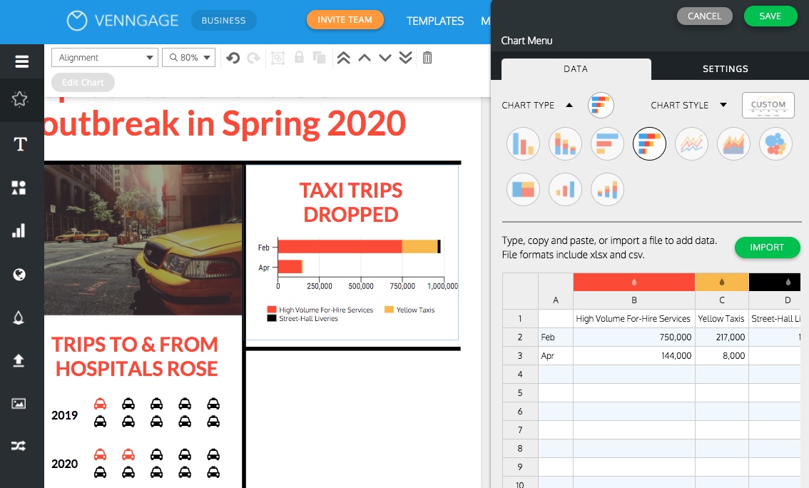
Now I need to make sure the visuals are clear and compelling. I will:
- Label the graphs appropriately.
- Use colors that match the template, including yellow for the taxi icons.
- Replace the Canada map with a photograph that connotes the topic.
It’s a good rule of thumb to remove anything that seems to clutter the visual, but keep the things that help my audience fully understand the data.
Here’s a simple Venn diagram that shows what makes a good data visualization–and what doesn’t.
Create your own Venn diagram for free with our Venn Diagram Maker.
5. Polish up the rest of your infographic
Of course my infographic is not complete just yet. I need to add text that tells the story of what happened in New York City during this time and that explains what this data contributes to understanding that story.
While looking for supporting information, I ran across an additional statistic and decided to add another data visualization: a pie chart in the bottom right.
I can also add icons or other elements that can help my audience connect with the data and the story. I will be sure to note the data sources at the bottom too.
Make your own pie chart for free with Venngage’s Pie Chart Maker.
Related: 25+ Statistical Infographic Templates to Help Visualize Your Data
In summary: data visualization vs. infographics
The ship has sailed and we’ll all be swimming in data from now on.
While data visualizations can help us better navigate the numbers, infographics can help us transition from knowing better to doing better.
By using them together, we can share new insights with one another and collectively make sense in this information age.
Create your own infographics and data visualizations today using Venngage’s templates. It’s free to sign up and use.


