In a world where people are bombarded with countless messages, your brand’s design can be the difference between being noticed and being ignored.
But if you are a marketer without a design team, maintaining brand consistency across platforms can be daunting.
Inconsistent visuals can confuse your audience, hurt your engagement and even damage your brand’s credibility. Studies show that brands that lack visual consistency see a 23% drop in perceived value.
As DIY designers, we can’t afford to overlook this statistic.
This blog will dive into why visual consistency is essential for us and provide actionable tips to help you maintain it without a dedicated design team. Plus, you’ll get access to a free downloadable guide to keep you on track.
Click to jump ahead:
- The importance of design in content creation
- How DIY designers tackle daily struggles in branding
- Real-world examples of brands that are doing visual consistency successfully
- Actionable tips to to maintain visual consistency as a non-designer
- Best practices for maintaining brand consistency across platforms
The importance of design in content creation
Design plays a major role in creating engaging content that shapes how your audience perceives your brand. Research shows that people remember 80% of what they see and only 20% of what they read. This means that content without complementing design is often forgettable — quickly lost in the sea of information available online.
Platforms like Google and LinkedIn know this well, which is why their algorithms prioritize visually rich, attention-grabbing content. For example, posts on social media with visuals receive 94% more views than those without. And content with visuals improves your chances of ranking higher in search results. This means more brand visibility and website traffic in the long run.
But while having visuals is important, what’s even more important is maintaining consistency in your designs. That’s because cohesive visuals create a unified brand experience that improves your overall messaging.
It’s tough to keep visuals on brand if you aren’t an expert graphic designer. Fortunately, there are a ton of AI-driven tools that make that process a lot easier than it once was, and the results are pretty impressive! You absolutely need a project management tool to thrive rather than just stay afloat. You need a single source of truth and a centralized space to visualize projects, streamline workflows, and make sense of the madness.
Elisa Montanari, Head of Organic Growth, Wrike
In marketing and design, we absolutely need a project management tool to thrive rather than just stay afloat. I need a single source of truth and a centralized space to visualize my projects, streamline workflows, and make sense of the madness.
Consistent visual branding is crucial for fostering consumer trust and loyalty. A study by the Branding Journal found that brands with consistent presentation across all platforms can increase revenue by up to 33%.
This ties into the Mere-exposure effect, a psychological phenomenon where familiarity breeds preference. The more consumers see your brand presented in a cohesive and appealing way, the more likely they are to choose it over competitors.
Ultimately, investing in thoughtful design enhances your content, making it not just more engaging but also more memorable.
How DIY designers tackle daily struggles in branding
As a content marketer working for a small business or a startup, you might often find yourself wearing multiple hats.
One moment, you are planning social media campaigns and the next, you are engrossed in writing blog posts or perfecting newsletter graphics. Juggling between these roles demands time and focus — and it makes it even more tricky for you to keep up consistency in design.
It’s especially easy for your visuals to look generic, off-brand and inconsistent if you don’t have a brand design guideline in place. We don’t blame you — it’s the story of most one-person marketing teams that face the dilemma of growing fast with limited resources.
The most difficult task? Ensuring that our images remain the same on all platforms. Without a committed designer, it’s simple for assets to deviate from the brand.
Hack? Make a brand kit using style guides and templates. Even for non-designers, we can consolidate assets and simplify content production with tools like Canva Pro or Figma.
Juggling design tasks? Set impact-based priorities. During downtime, we batch-create material and concentrate on the visuals that encourage interaction, such as social media graphics.
Joel Popoff, CEO, Axwell
But imagine for a moment what happens when you create designs that lack uniformity and a brand identity. It dilutes your brand identity and might confuse your audience. Not to mention it weakens your brand recognition.
Let’s put this theory to test. Can you guess which brands these logos belong to?


Want to create a logo that helps build your unique brand identity? Start by designing one that truly captures your essence.
Pretty indistinguishable, right? These look-alike logos do the exact opposite of what a logo is supposed to do — to create distinct brand identities.
But what does this have to do with the lack of brand guidelines — or creating consistent brand designs? The point here is that when your designs lack cohesion, you risk blending your brand into the crowd. You make it difficult for your audience to distinguish your brand from competitors.
And if your designs overlap with one of your competitors in the same domain (like Gucci and Chanel), you might waste all your hard work sending more customers their way.
Typography is another common pitfall for marketers who double as designers. You might not realize doing it, but mixing fonts across your designs can make your content appear disjointed from your brand.
Let’s do another round of eye tests. How many of these brand logos can you recognize?

They all look off, don’t they? That’s because while we have used the logos of some world-famous brands like Nivea, Levi’s and Ford, we just switched up the texts, with fonts resembling the original logos, with different brand names.
The lesson here is that brand fonts play a crucial role in design to help you create a respectable brand. Consider this: 75% of people form judgments about a company’s credibility based on their website design, which includes typography choices.
One of the biggest challenges for content marketers is understanding how to apply design variety consistently—like using minimalism in one post and a bold style in another.
This creates a fragmented brand image and can undermine your efforts to build a cohesive brand narrative.
For you to create good brand recognition and trust, you must come up with a unified brand approach.
Strategic planning is necessary to manage design work in addition to other obligations. We make sure that significant design pushes fit with team bandwidth by coordinating our design projects with the marketing calendar. We also take care to reuse resources—a single infographic frequently acts as the foundation for presentations, blog entries, and social media pieces. These procedures enable us to operate effectively while preserving Prove’s brand identity.
Rodger Desai, CEO, Prove
How brands achieve visual consistency without a design team: Real-world examples
When it comes to brand recognition, some brands have mastered the art of visual consistency, ensuring their designs become synonymous with their brand identity.
McDonald’s
The golden arches are one of the most iconic symbols worldwide.

Studies show that kids recognize the McDonald’s logo before they can even read and write. Its logo is more widely recognized than the Christian cross, which speaks volumes about the power of consistent visual branding.
The food chain brand also uses its logo along with a distinct color scheme and recognizable brand elements across all touchpoints to ensure a unified visual identity. And you would instantly recognize a McDonald’s brand design even if you spotted it in the wild. Everything from their tray liners and Big Mac takeaway boxes to their website and social media graphics have the same overarching design themes, colors and fonts.
Vennage is my go-to for putting together infographics and brand kits. Their pre-made templates are so convenient for DIYers like myself who don’t necessarily have any professional design background.
Then, I use a content scheduling tool like Buffer to plan and schedule posts ahead of time. It’s such a helpful tool to have a system and structure for an otherwise chaotic workflow. Frankly, I can’t imagine going back to a time without content scheduling tools.
Toni Farrell, Marketing Manager, Coastal Motorhomes & Caravans
Coca-Cola
Coca-Cola has been a masterclass in brand consistency for over a century. The company’s commitment to its visual identity — using the same red and white color scheme and the iconic Spencerian script across platforms. Wherever you encounter Coca-Cola, it feels like the same familiar brand. This level of consistency strengthens its global dominance.
You would still know it’s Coca-Cola if you are looking at a Coke bottle in English, Arabic, Chinese or Hindi. From packaging and advertisements to Christmas-themed ads, their visual identity remains seamless across different languages and regions — not just different platforms.

Mailchimp
Mailchimp maintains its playful and quirky visual identity across all its platforms. From its cheerful yellow color palette to the whimsical illustrations of Freddie (the brand’s monkey mascot), everything about Mailchimp’s design is unmistakably…well, Mailchimp.
No matter if you are exploring their website, using their email templates or scrolling through their social media, the consistent tone and style ensure that you instantly associate the experience with Mailchimp’s creative and friendly persona.
The result? Instant brand recognition in the crowded email marketing space, making Mailchimp both memorable and trustworthy.

Slack
When Slack underwent a major rebranding in 2019, one of its key priorities was maintaining visual consistency. The brand successfully retained its familiar design elements like its color palette and logo style while assuring its users that the product they loved would remain reliable — despite the visual changes.
This smooth visual transition helped Slack maintain user trust and loyalty during a critical time.
Notice how Slack’s updated pentagram and color palette are more refined yet keep the spirit of the old logo. This allows the logo to scale effectively and work across more platforms.

4 Actionable tips to to maintain visual consistency as a non-designer
Maintaining visual consistency can feel daunting, especially if you don’t have your own in-house design team. However, with the right tools and a clear set of guidelines, you can ensure your brand always looks cohesive and professional, no matter who’s handling the design work.
Here are 4 tips on how you can maintain visual consistency in your designs as a DIY designer:
1. Create your brand guidelines
Your brand’s visual identity is only as strong as the guidelines that shape it. Think of your brand guideline as your brand’s DNA. A well-documented guide helps everyone stay on the same page, even if they are not design-savvy.
If you don’t know how to create a brand guideline, start by clearly defining your brand’s core visual elements — colors, fonts, logo usage and design style.
Take Google, for example. Their design guidelines, known as Material Design, are a masterclass in documenting everything from typography to iconography. It’s this kind of clarity that ensures visual consistency across Google’s many platforms.
If Google is too big an example for you to emulate, here are a few more examples of brand guideline from smaller businesses that you can take inspiration from:
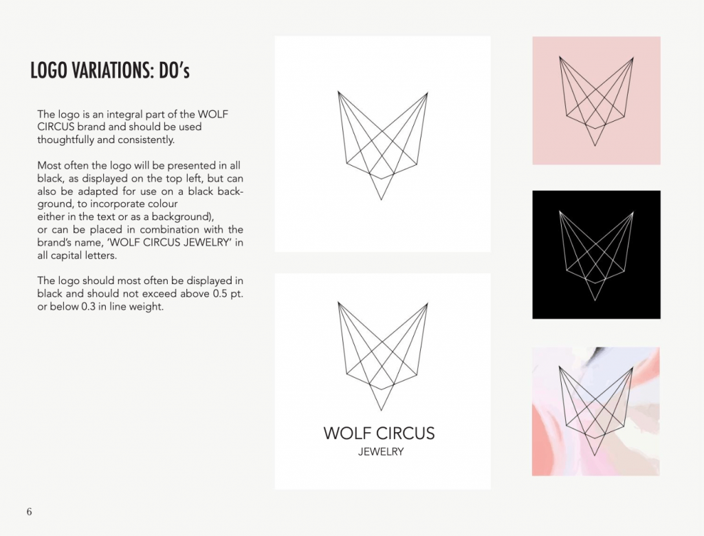
If these businesses can create a brand book, there’s no reason you shouldn’t have one for your own. If your business matters to you, then maintaining brand guidelines should be a priority.
Without documented guidelines, even a small tweak to your brand colors or logo placement can create confusion, making your brand feel inconsistent.
2. Leverage design tools to simplify the process
Visual storytelling in today’s business landscape is not an option — it’s a necessity. And brands that invest in powerful design tools clearly have an edge over the competition.
Thanks to user-friendly DIY design tools like Venngage, today you don’t need to be a designer to create visually appealing, on-brand assets. Such tools allow non-designers to produce high-quality graphics quickly.
Venngage, for instance, lets teams collaborate in real time and ensure that any design updates are made consistently across the board. Its drag-and-drop editor is perfect for non-designers who need to create professional infographics or reports without worrying about design rules.
One clever hack is employing Bannerbear to automate branded image creation. We integrate it with our content calendar to create visuals for blogs and social media without the need for manual design. Another suggestion is to use ColorZilla to ensure precise brand color consistency across tools and platforms. Additionally, our in-house scripts scrape design inspiration from industry leaders, maintaining our branding vibrant and competitive.
Peter O’Callaghan, Head of Marketing, ScrapingBee
Investing in a quality design tool is crucial for anyone aiming to maintain brand consistency — especially if you don’t have a design team within your arm’s reach.
Good design software can help you save time and effort and simplify your workflow. And the best part? The productivity payoff is worth every penny of your investment. Additionally, tools like Kittl’s Album Cover Maker can be a lifesaver for musicians and marketers alike, offering easy-to-use templates for creating stunning visuals that stay on-brand without requiring design expertise.
As Joel Spolsky, who co-founded brands like Trello and Stack Overflow, once said:
“Design adds value faster than it adds costs.”
3. Use templates to scale your design process
For one-person marketing teams tasked with writing blogs, scheduling social media posts and sending monthly email newsletters, templates can be a lifesaver.
Design templates can save you loads of time and ensure visual consistency while eliminating the stress of coming up with new design concepts from scratch. Design tools like Visme offer ready-to-use templates that you can easily customize to fit your brand’s aesthetic. Whether it’s for social media posts or presentations, having a go-to set of templates guarantees your visuals remain cohesive.
Take for example Airbnb, a famously design-led global brand. A close look at their brand assets tells you that the brand uses a standardized set of templates for its marketing assets. From pitch decks to their website, their visuals always reflect their brand identity no matter the region or medium.
But you probably don’t have the muscle power to come up with in-house design templates on your own. That’s why you can lean on tools like Venngage that have thousands of pre-built design templates to match your needs. The point is — smart use of templates in combination with the brand guidelines makes scaling your design requirements much more efficient.
As a side note, Airbnb also prioritizes inclusivity in its design — which reinforces its reputation as a design-led company. They have a dedicated in-house team to drive the initiative of ensuring accessible designs in all of their brand assets as well as their offline properties that they rent out.
I rely heavily on tools like Venngage and Canva, which help me create templates to ensure consistency. I also use color palettes and printed guides to make sure whatever I’m designing — whether it’s a post on social media or a photo on a blog is consistent with the tone and aesthetic of the brand. There is a simple but powerful hack to avoid design chaos.
Raviraj Hegde, SVP of Growth, Donorbox
4. Create a brand kit
A brand kit is your shortcut to consistency. It works as a centralized library of brand assets that defines your visual identity so that you can ensure consistency across all marketing materials.
A brand kit saves you time, ensures brand recognition and lets you use design elements without recreating them for every project. For instance, it consolidates your brand’s colors, fonts, logos and even icons into one accessible space.
According to research, consistent branding can increase revenue by up to 23%, so a well-structured brand kit isn’t just convenient — it’s strategic.
Tools like Adobe Express and Venngage offer brand kit features where you can upload your brand assets for easy access. This means that even if multiple people are creating designs, you will maintain a unified look.
Here’s a perfect example from Skyflow. The brand maintains a brand kit on its website to ensure that all of its designs have a consistent style across the board, no matter who’s designing it. And that includes external stakeholders like media or PR agencies. Take a look:

Best practices for maintaining brand consistency across platforms
Maintaining brand consistency helps your audience recognize and trust your brand, no matter where they interact with it. In this section, let’s explore eight actionable steps you can apply to keep your visual identity intact across different channels.
1. Map your designs to your target audience’s preferences
Achieving the goal of maintaining brand consistency in your designs starts with audience research. Begin by studying your ideal customer profile (ICP) and their demographics. That way, you can tailor your visuals to match their preferences.
If your target audience is teenagers, for instance, it’s a no-brainer to go for vibrant images, peppy colors and bold shapes to match their vibe. If it’s new moms that your brand caters to, your designs should evoke warmth and trust — soft and nurturing tones and imagery.
And if you sell to business-to-business professionals, you will need to lean toward sleek and modern corporate elements such as neutral colors, clean lines and minimalistic styles.
A great example of this is Apple, whose sleek and minimalist design aligns perfectly with its tech-savvy, professional audience. Apple’s use of neutral colors, clean lines, and simple visuals across products and ads reinforces the brand’s image of quality, elegance and innovation.

Understanding these nuances ensures that your designs not only align with your audience’s expectations but also foster deeper engagement and brand loyalty by resonating with their specific preferences and lifestyles. Plus, it will be easier for you to replicate your visual styles consistently across all communication channels.
2. Ensure uniformity in brand messaging across all touchpoints
It’s important to spell this out — maintaining consistency in your designs goes beyond just visuals. You also need to align your overall brand messaging and positioning across all touchpoints.
Yes, it’s true that every element of your design, from colors and fonts to imagery and layouts, should reflect a unified identity that resonates with your target audience. However, true consistency isn’t limited to aesthetics. It should spread through your brand’s tone of voice, content and the way you communicate across platforms.
For instance, if your brand tone is professional and authoritative, this should be reflected not only in your website design but also in your social media posts, email marketing and even customer service interactions.
If your positioning is fun and approachable, your messaging should maintain that energy across every platform — whether it’s a quirky design, playful copy or engaging social media interaction.
Ensuring uniformity in both design and messaging creates a cohesive brand experience. This builds trust and recognition and makes it easier for your audience to connect with your brand.
Uniformity in messaging complements visual consistency because it reinforces your brand identity and makes it more recognizable and memorable.
Nike offers a perfect example of consistent brand messaging. From their website and social media to their ads and product designs, Nike maintains a consistent message of empowerment and inspiration across all touchpoints.
Whether through their “Just Do It” slogan or sleek, athletic visuals, Nike ensures its tone is always focused on strength, determination, and personal achievement, reinforcing their brand identity across every platform.
Here are four Nike emails side by side. Notice how the typeface, imagery, and tone of voice are consistent across all copies:

3. Tailor visuals for different platforms
Alright, we will keep this brief since you (as a marketing expert) already know the importance of personalizing your content for different platforms — and repeating this would be like playing a broken record.
Instagram thrives on vibrant, eye-catching visuals that quickly capture attention and encourage engagement. Instagram users love bold colors, trendy designs and dynamic layouts with an instant visual appeal. Quick, snackable content is the name of the game.
On the other hand, LinkedIn requires a more professional touch. Here, your visuals should communicate credibility and more polished designs. Think about incorporating data-rich infographics, slide deck-like carousels or graphs and charts that business professionals are used to seeing daily.
A great example is Spotify. On Instagram, they use vibrant, engaging visuals like colorful album covers and animated playlists to capture attention and engage their audience. However, on LinkedIn, Spotify’s posts are more polished, focusing on professional insights, data-driven content, and industry trends to appeal to business professionals.

Tailoring your visuals to fit a specific platform helps you build a powerful brand identity and improves your engagement rate. It also ensures that your content resonates with your audience’s preferences and platform norms.
4. Identify and remove design bottlenecks
Bottlenecks in the design process can severely hinder your consistency. These process blockages can come from various sources: using difficult-to-navigate tools, lacking brand guidelines, having unclear processes or facing tight publication deadlines.
Small marketing teams frequently run into friction points that don’t just interfere with their content publication cadence but also lead to design inconsistencies.
The first step to avoid process bottlenecks is to identify them. Start by re-evaluating your current design tech stack. If they aren’t user-friendly or lack features that can speed up your process, consider alternatives that can improve your efficiency.
If the lack of guidelines is a recurring issue, fix that. We have already covered how to create a brand guideline from scratch.
Slack prioritizes simple design processes with clear brand guidelines and user-friendly tools.

And if time constraint is a frequent bottleneck to your design outputs, communicate about it with your higher-ups. Either negotiate for more realistic deadlines or plan things in advance so that you can avoid the last-minute rush. In any case, allocate enough time to your design so that you don’t treat it like an afterthought.
5. Carve out enough time for design work
Marketing teams treating design as a last-minute task or a back-of-the-napkin sketch is one of the leading causes of design inconsistencies.
When you don’t allocate sufficient time for design work, you risk creating visuals that are haphazard or poorly aligned with your brand identity. Thoughtful design requires an investment of time to explore ideas, refine concepts and ensure cohesiveness. Without this commitment, you are likely to create designs that lack depth and fail to resonate with your audience.
Being a startup owner means wearing many hats. As a one-man marketing and design team, I stayed on top of things by dedicating “batch design days” once or twice a week.
Blocking off days allowed me to strictly focus on producing consistent, good quality publication materials. Instead of oscillating between marketing and design tasks, following a schedule for my batch design days offered a more organized system.
Matthew Channell, Learning & Development Director, TSW Training
To achieve maturity in your brand style, it’s important that you prioritize your design process. Create a proper workflow if you need to. For instance, make design an integral step in your content publication process. Set deadlines that allow ample time for revisions so that you can make sure each element aligns with your brand’s message and style.
Does workflow matter if you are a one-person marketing team or a small team that just operates on an ad-hoc basis? Absolutely. The more structured your approach to design, the better the quality of your visuals.
Basecamp exemplifies this well. As a smaller business, they include design into their workflows and allow enough time for iterations. Their Shape Up approach helps them ensure their visuals remain consistent and align with their straightforward, no-nonsense brand identity.
“We give full responsibility to a small integrated team of designers and programmers. They define their own tasks, make adjustments to the scope, and work together to build vertical slices of the product one at a time. This is completely different from other methodologies, where managers chop up the work and programmers act like ticket-takers.”
Ryan Singer, Former Head of Strategy, Basecamp
6. Centralize your brand assets
Centralizing your brand assets is important for maintaining visual consistency across the board. Using digital asset management ensures that logos, colors, fonts, and other essential design elements are stored in a single accessible location, so everyone involved in the process is working with the same resources.
This is important if multiple team members contribute to different content projects — like a social media intern creating LinkedIn carousels and a product marketer designing a user onboarding workflow.
A shared repository reduces the chances of discrepancies and miscommunications and allows your visuals to reflect a unified brand identity. It also makes it easier for you to find resources quickly and easily, in contrast to looking for design assets scattered all over the place.
As a remote collaboration video platform, Loom maintains a centralized repository of its logos, product images, and leadership headshots, ensuring team members can access consistent resources. This lets them maintain a cohesive brand image across all marketing channels and simplify collaboration within their team.

7. Update your brand elements
As your brand grows and evolves, so should your visuals. Updating and refining your brand elements — like logos, colors, fonts and imagery — helps you align your designs with your brand’s evolving identity even as trends or strategies shift.
Regularly updating your brand guidelines or assets ensures that your designs stay fresh without losing the core brand identity. For example, refreshing your typography or tweaking your logo — like we saw in Slack’s case earlier — can give your brand a modern feel without a complete overhaul.
Just make sure that if you update your visuals on one channel, the same changes are reflected everywhere — on your website, social media, ads or print materials. Consistency leads to a unified brand experience and builds trust.
To understand the importance of updating brand elements, consider Dunkin’s recent refresh when it dropped “Donuts” from its name. This change modernized its brand identity and reflected its broader focus on beverages and food.

8. Document your learnings
Every design iteration brings valuable insights that can help refine your visual strategy. Documenting these learnings is critical for maintaining consistency across future designs.
For instance, keeping track of which designs get your more engagement on social media can help you align your design approach more tightly with your brand guidelines. If certain templates perform better among your Instagram followers, documenting that insight will let you replicate the success.
Similarly, documenting design challenges — such as what design tools or features to avoid — will help your team avoid repeating mistakes.
Over time, these learnings can help you speed up the efficiency of your design process and stay consistent across the board. You can also ensure that everyone follows the same design principles, no matter who’s handling the next project.
The folks at Claritee.io highlight the importance of documenting design iterations and creating a unified approach across teams in one of their blogs:
Clear documentation serves as a common language that bridges gaps between designers, developers, and stakeholders, ensuring that design decisions are understood and aligned across teams.
Claritee team
Build trust through consistent visual branding
Maintaining visual consistency is essential for building a trustworthy brand, especially for fledgling businesses. Your audience’s perception of your brand is directly linked to how unified your overall brand messaging and designs are. Even if you’re a DIY designer with limited resources, you can still create consistent designs if you take the right approach.
Just make sure you have a clear brand guideline and access to the right design tool and templates.


