Once upon a time, presentations were limited to lecture halls and boardrooms.
Remember Microsoft PowerPoint? Everyone used it to create slides or pitch decks to share knowledge and exchange ideas with an audience.
But those times are long gone.
Today, Canva and Adobe Express have become the gold standard for creating presentations with a global audience online.
And while these tools offer plenty of presentations templates and customization options to make creating presentations easy, none of them prioritizes accessibility.
This means presentations made on Canva exclude people with visual impairments or other disabilities because the design does not focus on their needs.
To prevent that, you need graphic design software that prioritizes accessibility, like Venngage.
In this post, I’ll show you how Venngage can help anyone create accessible presentations with a WCAG-compliant Accessible Design Tool.
Some of our accessible presentation templates are free and some require a small monthly fee. Sign-up is always free, as is access to Venngage’s drag-and-drop editor
Click to jump ahead:
- What is an accessible presentation?
- 7 tips to make accessible presentations
- 4 examples of accessible presentations
- FAQ
- Conclusion
What is an accessible presentation?
An accessible presentation is a type of content that can be understood by everyone, including people with disabilities such as color blindness or dyslexia.
An accessible presentation is different from a normal presentation as there is a greater emphasis on ensuring design (slides, images, charts, and text) can be understood by all types of people.
Here’s an example of an accessible presentation:
Why should you make your presentations accessible?
Making inclusive and accessible presentations is important because they’re no longer limited to a physical presence.
Anyone can create a presentation and share it online for the world to consume.
And with the rise of remote work and interactions happening on platforms like Zoom and Google Meet, presentations fall under the category of accessible documents.
Want to learn about other accessible content types? Check out our other posts:
Imagine what happens when someone creates a presentation that isn’t accessible for a remote meeting with a disabled attendee.
It not only renders the content unusable but hinders effective communication, collaboration, and knowledge dissemination.
How do you make a presentation accessible to everyone?
The best strategy to make your presentations accessible is to follow WCAG guidelines 2.2 developed by the World Wide Web Consortium.
If you’re in the US, you should refer to the ADA standards for accessible design.
This is a federal law that was signed in 1991 to prohibit discrimination against individuals with disabilities in all areas of public life.
ADA standards were later amended in 2008 to ensure websites and digital content are accessible to people with disabilities after a case was settled covering the inaccessibility of Target’s website to individuals with visual impairments.In the EU, accessibility falls under Web Accessibility Directive (Directive 2016/2102/EU), which covers accessibility of websites and mobile applications of public sector bodies.
Regardless of the law that applies to your jurisdiction, most governments follow WCAG guidelines.
This means to make your presentations accessible, you’ll need to set alt text to images, avoid using tables, choose accessible fonts, use accessible colors, and more.
I’ll cover each of these factors and more in detail in the next section.
7 tips to make accessible presentations
Typography
Typography refers to how you arrange and present text in your slides.
This covers everything from font selection, text size, and line spacing as these elements can either enhance accessibility or become a barrier.
Fonts
When it comes to fonts in presentations, make sure to select a sans-serif type.
Fonts like Arial, Helvetica, and Roboto have a clean appearance, but what makes them accessible are distinct letterforms that minimize confusion.
This helps make text easier to read for people with dyslexia or other reading difficulties.
Here’s an example of an accessible presentation using the sans serif font Karla:
Text size
Font size is also another crucial factor in ensuring presentation accessibility.
That’s because a large text size makes content on slides easy to read.
I recommend at least a text size of at least 16px for digital presentations and 24px for presentations that will be delivered in person.
Why?
The back row of a room is much further than the distance between you and your laptop screen. So keep in mind where and how your presentations will be consumed when selecting a text size.
Limit the amount of text
Slides are supposed to support a presentation and not be the central focus.
If you include too much text on a slide, you will lose your audience as they will try to read what’s on the slide rather than pay attention to what you’re saying.
And if someone has an attention deficiency, they will struggle even more to read a slide and listen to what is being said simultaneously.
So, limit the amount of text in your slides.
One method to write great slides is to use short phrases and keywords rather than whole sentences or paragraphs.
Here’s a great example:
Skip the slide transitions
Transitions between slides used to be a cool thing to do.
I’m sure many of us spent obsessing over them while creating a presentation for a school assignment.
It was believed that they added visual interest to a presentation, helped break up the monotony of static slides, and could engage an audience.
But guess what?
They’re a strict no-no for accessibility.
Slide transitions can be visually distracting for people with visual impairments and cause discomfort, confusion, or difficulty in focusing on the content.
They can also increase the load for individuals with cognitive impairments as rapid or complex transitions may make it harder for them to process the information.
Alt text
Alt text (alternative text, alt tags, alt descriptions or alt attributes) is descriptive text attached to visual elements like photos, icons, and even graphics in presentations.
Here’s an example:
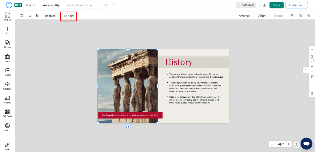
If a user with visual impairments using a screen reader comes across this slide, they might not be able to see the image.
Even assistive technology such as a screen reader cannot provide them context unless you specifically write an image alt text for it to describe the image.
In this example, you might write: “an image of the Caryatid Porch of the Erechtheion where six maidens take the place of columns in supporting the entablature.”
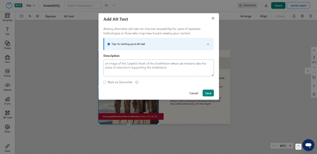
To write a good alt text for graphics in your slides, follow these guidelines:
- Describe the intent of the image
- State why the image is important
Want to learn how to write alt text that’s actually helpful? Read our guide here:
Color contrast
A key section in WCAG guidelines 2.2 is color contrast recommendations to ensure content is visible to people with different vision capabilities.
The minimum contrast ratio recommended is 4:5:1.
In other words, for every 5 units of luminance (brightness) in the background, there should be at least 4 units of luminance in the foreground text.
But I recommend going a step above these recommendations.
You don’t know what type of device users will use to view your presentation and this could affect the clarity of your slides.
A good color contrast scheme will ensure your decks are visible in dim and bright rooms:
Here are some tips to ensure adequate contrast in your presentations:
- Use dark colors on a light background, or light colors on dark background
- Use solid patterns to make any elements layered over it more visible
To learn more about contrast as a design principle, read this post:
If you were creating a slide deck in Canva, Adobe, or other cloud-based design tools, you’d have no way to ensure color contrast in your slides directly.
Instead, you would have to first create a presentation, export it, and use a third-party accessibility tool to test it.
And if your design failed, you’d have to come back to your tool and repeat the process.
See the issue here? It can get repetitive and waste time.
But Venngage’s Accessible Design Tool lets you create accessible presentations from start to finish without having to leave the platform.
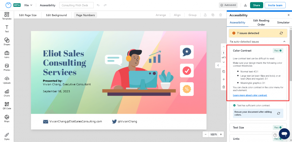
Venngage integrates a WCAG-compliant Color Contrast Checker to let you test your slides as you design.
Here’s how you can use it:
- Select “File” from the top navigation menu, and select “Check Accessibility” to open the Accessibility panel.
- All elements are tested against WCAG contrast requirements and results will be listed under the “Color Contrast” header.
Here’s an example:
Reading order
If you’re not familiar with screen readers, you might know about the importance of reading order.
Reading order in accessible presentations refers to the sequence in which text and non-text elements are presented.
A user without a disability might be able to understand the reading order of content by looking at a design, but screen readers require extra information to interpret the order in which they should present content.
If you don’t set the reading order, a screen reader might go off course and confuse users.
Learn more about reading order in this post:
Again, most graphic design tools don’t allow you to directly set the reading order of content in your presentations.
But Venngage’s built-in Accessibility Checker does.
Here’s how you can use it:
- Open “Reading Order” in the Accessibility panel by clicking on “File” next to the Venngage logo above the top toolbar.
- Under “Accessibility”, select “Edit Reading Order.”
- Select the page you want to work on. This should open a list of all text elements on the page
- Click on items in the list to highlight the corresponding text box or non-text element
- Move any item in the list into its logical position with your mouse or keyboard
Here’s an example:
Did you know that Venngage also has a free PDF accessibility checker that can help you meet the accessibility standards? Use this tool to quickly scan your PDF documents, fix inaccessibilty issues and make PDFs accessible to everyone!
Save in an accessible format
When sharing your presentation or pitch deck, most people save in the default .ppt or .pptx format.
It’s always better to share as an accessible PDF instead.
While PowerPoint files can be made accessible, this process requires additional effort, but a PDF already support features that enhance accessibility.
Again, if you use Venngage’s Accessible Design Tool to create your presentations, you’ll be able to export your slide deck as an accessible PDF.
Note: This feature is only available for our Business users, but anyone can share a link to their design for free without any impact on the accessibility of your design.
4 examples of accessible presentations
Presentations are meant to be engaging and leave a lasting impression.
But depending on the end objective, knowing the type of presentations to help you best achieve your goal is important.
A sales-format presentation isn’t going to work for an academic presentation, no matter how accessible you make it.
Informative presentation
An informative presentation is one where the main goal is to provide the audience with valuable and factual information on a topic.
The goal is to educate, enlighten, and enhance the audience’s understanding.
This type of presentation is commonly used in educational settings, professional environments, and public speaking engagements.
Here’s an example of an accessible informative presentation:
Pitch presentation
A pitch presentation helps present an idea, product, service, or project to an audience to gain their interest, support, or investment.
Pitch decks are commonly used in business to persuade potential clients or investors.
Here’s an example of an accessible pitch deck:
Classic presentation
A classic presentation is the traditional approach to communicating information to an audience.
These presentations follow a structured format that includes a clear introduction, main content, and conclusion. Classic presentations can be used in various contexts, such as business meetings, academic lectures, and seminars.
Here’s an example of a classic presentation:
Sales presentation
A sales presentation is a targeted communication effort aimed at persuading clients or customers to purchase a product, service, or idea.
Sales presentations are used to showcase the features, benefits, and value. These presentations are used in various industries, from retail and technology to B2B.
Frequently Asked Questions
How do accessible presentations benefit different audiences?
Accessible presentations benefit different audiences by ensuring information can be easily understood by everyone. Accessible presentations benefit the following groups: people with visual impairments, people with hearing impairments, people with cognitive disabilities, and people using assistive technology.
What tools can help in creating accessible presentations?
There are many tools on the market that can help you make accessible presentations such as Canva or Adobe Express, but only Venngage offers a comprehensive accessible design tool that allows you to make and export accessible presentations without having to use a third-party tool or other software.
Are Google Slides accessible?
Google Slides are not automatically accessible. Though Google provides some accessibility features like setting alt text to images, other features such as an in-built color contrast checker are missing and will require you to export your design to test on a third-party tool. Therefore, I recommended you use Venngage instead of Google Slides to create fully accessible presentations from start to finish.
In Summary: Making your presentations or slide deck inclusive is not only an ethical obligation but a necessity to reach a larger target audience
How presentations are created and shared has completely changed.
In today’s digital world, web-based tools like Venngage are leading the way to make it for anyone to create presentations, including accessible presentations.
Besides the legal requirements, taking a few moments to make presentations that resonate with everyone will pay off in the long run.
And Venngage will be there with you the whole way to make it as easy as possible for you no matter the presentation type you need.
So don’t hesitate. Make your next presentation count by making it accessible.


