The influence of technology on our lives is vast, deep and evolving. Most of us interact with technology on a near-constant basis, and you’re reading this right now thanks to multiple forms of technology.
As diverse as technology itself is, the number of stories that can be told through technology infographics is just as diverse, regardless of whether they’re for internal audiences or created as part of a marketing infographic strategy.
Communicate complex concepts, explore the history of technological developments, inspire your audience and more by creating a technology infographic. Let’s explore the many types of technology infographics, including some that you can create using Venngage’s Infographic Maker and our professionally designed technology infographic templates.
Click to jump ahead:
- Timeline technology infographic
- Data-driven technology infographic
- Explanatory technology infographic
- Best practices technology infographic
- Biographical technology infographic
Timeline technology infographic
Timeline infographics are effective ways of telling many types of stories, and the field of technology is no different. Timeline infographics about technology can help readers understand the history of a particular innovation, how technology use has grown or how a company became an industry leader.
Where technology infographics vary from timelines in other subjects is that they lend themselves not only to exploring the past but to projecting what might happen in the future.
Let’s explore some of the best examples of timeline technology infographics.
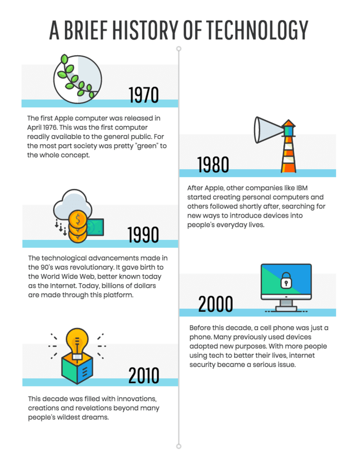
Technology timeline infographics can go back decades and, like this one, cover many types of technology, including computers, the internet and smartphones.
This approach can also apply to just one segment of the broader technology landscape, which in this case, is blockchain technology. Note that this timeline technology infographic doesn’t explain blockchain, as the creator assumes anybody reading it will have some basic knowledge already.
Other technology timeline infographics may split the difference between appealing to broad audiences and creating content for niche readers. This one focuses on a single aspect of technology (online learning), but it’s one that most people can relate to, especially after 2020.
Timeline infographics about technology can be created and customized with a specific look and feel in mind. This technology infographic about the history of the internet uses a subdued color palette that establishes a retro style.
This example, on the other hand, uses the same basic information but employs a minimalist color palette and modern icon style to make the infographic feel more rooted in today’s aesthetic.

Here’s another example of how a bold, retro style can be applied to a technology infographic that begins far in the past and advances to modern times. Not sure we can call 1886 retro or if that’s just considered ancient at this point, but the effect is striking and engaging.
Timeline infographics aren’t just for recounting technological advancements that have already happened or are currently underway. They can also be used to predict what’s to come, as in this stylized, minimalist example based on expert opinions.
Technology timeline infographics are great for telling newsy or editorial stories, but they’re also excellent visuals for company histories, like this one on the Dell computer company.
In addition to stories about individual companies, technology timeline infographics can also speak to a commercial audience interested in specific products. The example above deals with a type of software, but this approach would work for other types of products.
Data-driven technology infographic
Technology infographics are no-brainer opportunities to inject data, whether they’re informed by an original survey, user data or outside research.
Data-driven technology infographics are ideal for understanding how people use certain types of technology and what major differences might exist among populations when it comes to tech.
Here’s a look at some excellent data-driven technology infographics.
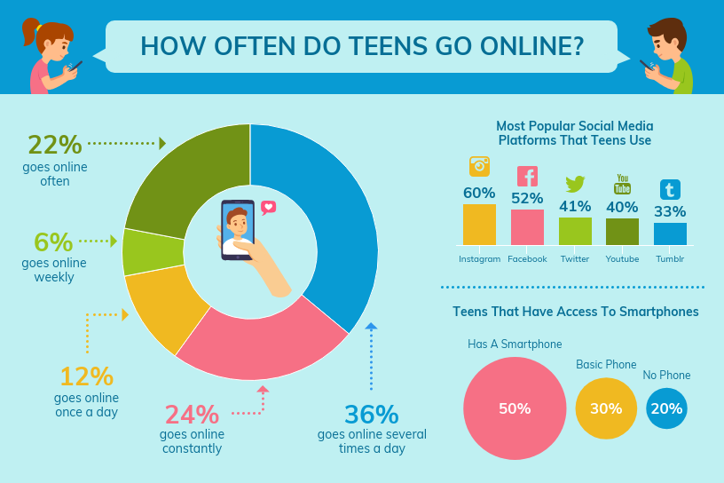
This technology infographic shares survey data about one subset of users, teenagers. The approach here would be appropriate for external data, but it’s also an ideal method of showcasing original research about technology-related topics.
In this data-driven technology infographic, survey results are shared about a very different group of people, IT professionals. In contrast with the bright color scheme of the previous example, this one is understated and simple, which appeals to the target audience.
Unlike the two previous examples, this data-driven technology infographic uses outside data gathered by the infographic’s creator, and it tells a longer, more expansive story. In doing so, it uses several types of data visualization and statistics.
External data can also be used to tell a tightly focused story; in the technology infographic above, that story is how teenagers use technology like the internet and social media vs. how adults use those tools.
Explanatory technology infographic
Technology is advancing, expanding and evolving every day, and few people are able to keep up with those changes. Infographics about technology lean to the explanatory side when they take a new piece of tech or a confusing concept and boil it down into an understandable format, whether that’s artificial intelligence, the Internet of Things, or modern Cloud Container Solutions like application containerization.
Explanatory technology infographics can be extremely detailed, effectively serving as user tutorials, or they can be much more general, helping readers grasp trends, connections and other concepts.
Let’s check out some effective explanatory technology infographics.
Explanatory technology infographics give readers a deeper understanding of a topic, including how certain aspects might be connected. The example above uses icons and minimal text in a mind map format to describe metrics, content and tasks by channel.
Developing a coherent multichannel marketing and advertising strategy is a challenge, and simplifying the topic is the goal of this infographic that describes a mobile buyer’s journey. The content could be updated for any channel or type of technology.
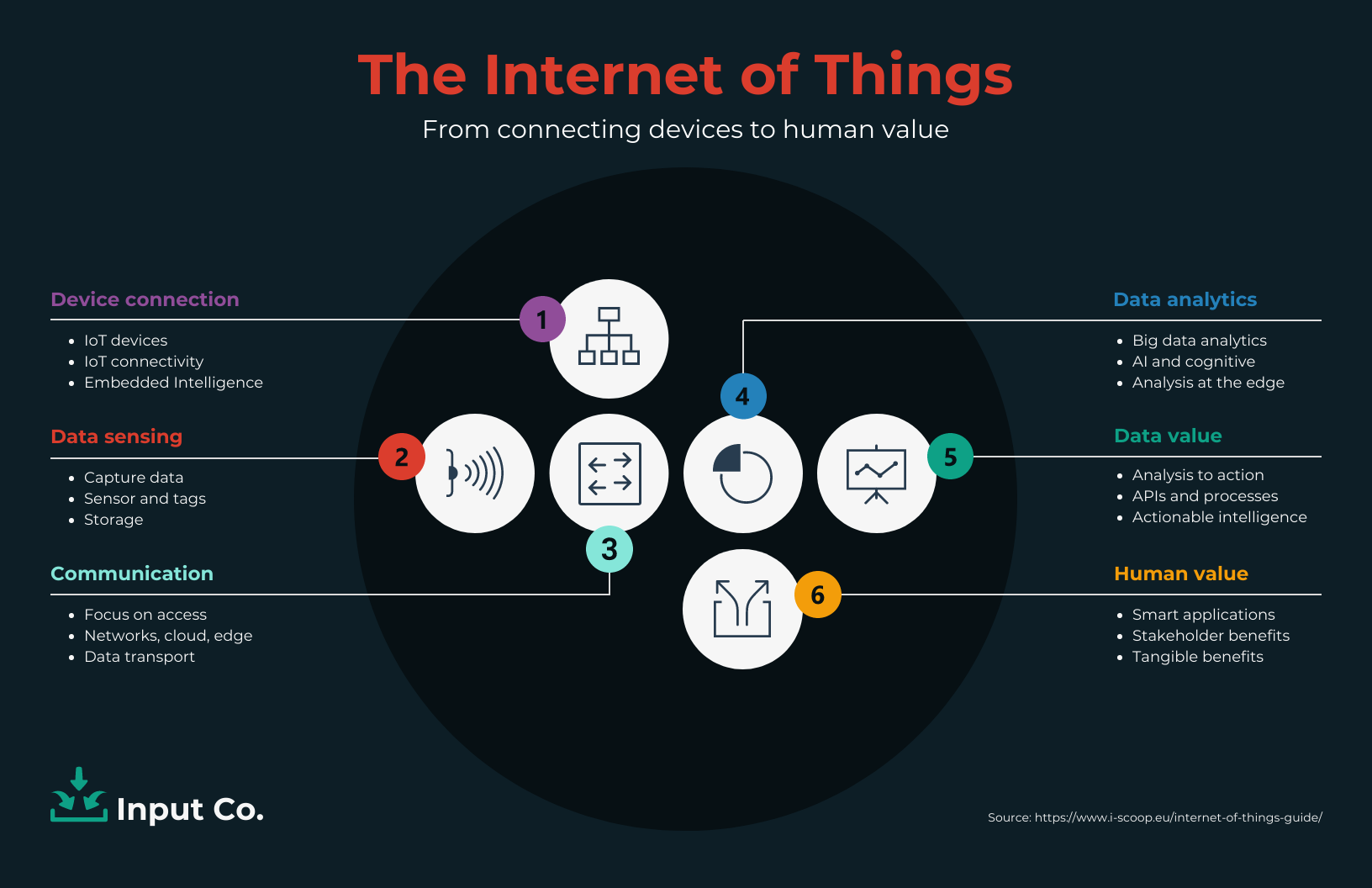
Explanatory technology infographics can also be used to help readers understand multiple aspects of a given topic, such as this one that’s focused on the internet of things.
Using the same basic information, this example shows how changing up the icon style and color palette can make information feel more substantial. In both cases, the list-style approach doesn’t take the reader down a rabbit hole but rather gives them the basics.
While the previous set of examples illustrated how topics relate to each other and to one broader area, explanatory technology infographics can also be used to show important distinctions between technological topics. It’s easy for related areas to become muddled, and this one helps the reader sort similar but distinctive technologies.
Similarly, this example assumes the reader has a base level of knowledge or interest in cryptocurrencies but that they would benefit from seeing how various crypto assets differ from each other.
Explanatory technology infographics can also get deep into the weeds on a subject, as in this example that’s designed to help a user understand a piece of software. The flat illustration style helps simplify the program and makes it feel approachable to the average user.

Explanatory technology infographics can be aimed at general audiences, but they can also be designed for serious gearheads. In this technical infographic example, a schematic illustration style combines with space travel data to create a cool, stylized vibe.
As illustrated by this infographic that deals with marketing technology, or martech, informational research can be doubly effective when backed up by data, helping bridge the gap between data-driven and explanatory technology infographics.
Best practices technology infographic
A close cousin to explanatory infographics that cover technology is one that deals with best practices. Rather than explaining the basic function of a piece of tech or new innovation, best practice technology infographics are aimed at helping the reader get the most out of the tech in question.
Best practice technology infographics could explore little-known features, list out the major benefits or share pro tips, depending on the target audience.
Here are a few examples of effective best practices technology infographics.
This information technology infographic describes the biggest advantages of outsourcing services, using short content blurbs and icons to illustrate the benefits, some of which are directly technology-related. But given the impact technology spending has on an organization, many of the plusses aren’t tech-related at all.
In this example, we see an even more simplified version of that list of benefits, which just goes to show how simple but effective icons can tell information technology stories all on their own.
This tips infographic produced by the University of Washington IT department is aimed squarely at staff members who were new to Zoom when the COVID-19 pandemic came along. It’s not a user tutorial but rather offers pro tips to turn newbies into experts.
Some audiences need to be convinced to use new technology, and this best practices technology infographic uses a futuristic look as it speaks to the educational community.
It’s also important when creating your technology infographic to consider how you’ll share it with your audience. Is it meant to be used for your blog, or do you want to use it as a social media infographic?
For example, the technology infographic above is sized for pairing with a LinkedIn post, while other social media platforms have their own size recommendations and best practices to keep in mind.
Speaking of social media, this technology infographic example explains how Twitter works but, more importantly, offers concrete advice on writing engaging tweets.
Biographical technology infographic
As in every other industry, the history of technology is replete with trailblazers, innovators and heroes. Some have been highly celebrated already, while others haven’t quite gotten their due.
Biographical technology infographics are those focused on telling the stories of the people working in the technology field, famous or not.
Their specific layout approaches can vary, and they often cross multiple genres, such as timelines and explanatory infographics. While they don’t always deal with titans of technology, they are at their best when helping readers get a genuine sense of the humans behind tech.
Here’s a look at some of our favorite biographical technology infographics.
The name Tesla is better known as the inspiration behind Elon Musk’s electric car brand, but Nikola Tesla led an incredible and in many ways uncelebrated life, as this biographical technology infographic illustrates.
Biographical technology infographics are ideal for telling stories of people whose achievements threaten to be obscured by time or cultural forces. This example of Black computer science pioneers leads off with Katherine Johnson, who was instrumental in the early moon missions at NASA.
Few individuals in the history of technology have been as celebrated as late Apple founder Steve Jobs, but even he can be the subject of fascinating technology infographics, like this one that uses the novel approach of discussing the tech he championed.
Biographical technology infographics don’t have to be focused on those celebrated by history, and they should serve to inspire as much as they inform.
This technology infographic honors the voices of women in tech, and you can use the same template to honor the voices of the people you work with and show them your appreciation too.
Want to learn more about other types of infographics? Read our blog on the 9 main types of infographics or watch the video below:
Infographics are made by technology, and they’re made for technology
Whether the story is informational or inspirational, technology infographics can help explain an area that’s become easy to overlook in everyday life.
Technology and infographics are a fertile area for discussion, whether you’re telling an internal story that’s aimed at helping employees learn how to use new software or you’re engaging with your audience on social media about the history of a piece of tech.
As vast as the field of technology is, the infographic approaches to talking about technology are just as diverse. With Venngage’s Infographic Maker, you don’t even have to be a tech expert to create something beautiful. Start creating your own technology infographic today for free, in minutes.


