Good infographics don’t have to be long and complicated. Simple infographics that convey a meaningful story clearly can be just as effective, and simple infographics examples show just how impactful minimal design can be.
The best infographics are those that capture attention, engage the reader, and make complex information easy to understand. But how does someone with no design background create a simple infographic? Easy—start with a template.
In this post, we’ll show you quick hacks using color, icons, layout and more to make simple infographic templates your own. Even better, you can started now with our drag-and-drop online Infographic Maker.
Click to jump ahead:
- Simple informational infographic
- Simple list infographic
- Simple timeline infographic
- Simple process infographic
- Simple comparison infographic
- Simple statistical infographic
- Simple infographics FAQ
1. Simple informational infographic template
You can use a simple informational infographic to give a quick overview of a topic or explain a new concept.
As these infographics tend to be information-heavy, it’s a good idea to divide them into sections and use concise headers to make the information easier to read.
For instance, this simple infographic example is one of our most popular templates. It uses descriptive headers and illustrations to communicate information clearly.
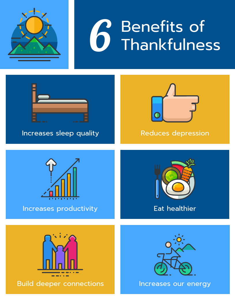
If you have no particular order to follow, here’s another simple informational infographic template you can use. This template uses boxes for every section and pairs them with a bold header and icon.
2. Simple list infographic template
Whether you want to summarize tips from a blog post or share a list of resources with your employees, list infographics are a versatile visual communication tool you can turn to.
But that doesn’t mean you overwhelm your audience with an exhaustive list of items.
The solution? Create a simple infographic that organizes your list into groups while using icons, numbers and colors to make the information stand out.
Look at this simple list infographic template: it’s straightforward and uses icons and colors for the different sections, keeping readers engaged.
This simple infographic also works to visualize lists. It’s one of our Smart Templates, so you can add and delete sections with one click.
3. Simple timeline infographic template
Storytime: the first Apple computer was released in April 1976 and by 1980, companies like IBM had started creating personal computers.
But 1990 was a revolutionary year for technology as it gave birth to the World Wide Web or the internet, as we know it today.
Wait, have I lost you? What if I summarized this complex history with a simple timeline template like this one, instead?
Chances are, you’re more interested now. That’s the power of a timeline infographic.
This template emphasizes each year using a larger font and colorful icon, giving you a clearer picture of the sequence of events.
A simple timeline infographic template can be used to visualize a project, provide an overview of events, detail out an agenda or highlight milestone dates.
Here’s another example of a simple timeline infographic template. Notice how it uses a gradient color scheme to show the progression of time.
4. Simple process infographic template
Explaining processes can get tricky. Instead of solely relying on words, use a simple process infographic to explain the steps of a process with the help of visuals.
From customer journey maps and employee onboarding guides to project plans and presentations, process infographics are an effective way to clarify each step of the process.
If the process follows a chronological order, make sure you number the steps. This makes it easier for readers to follow the flow of information.
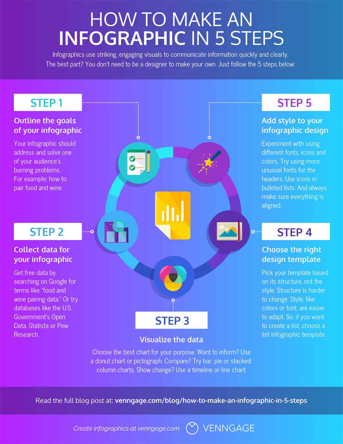
Alternatively, you can also use visual cues such as arrows the way this simple process infographic template does. Notice how the arrows guide your eyes and point you towards the next step. The template also uses colors, helping each step stand out on its own.
5. Simple comparison infographic template
We’ve all had instances when we’ve found it difficult to make up our minds. At such times, it helps to have our options laid out in front of us along with their pros and cons.
That’s the objective of a comparison infographic. They can be used to:
- Visualize pros and cons
- Compare and highlight features or benefits
- Debunk myths
- Make information easier to understand
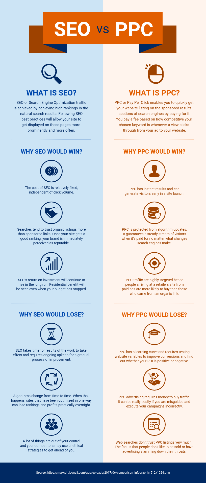
Here’s an example of a simple comparison infographic template. It divides the infographic into half and does a side-by-side comparison. Notice how it uses contrasting colors for both the columns along with illustrative icons which make the text stand out.
6. Simple statistical infographic template
Data without accurate presentation is likely to fall flat. The only way to get people to take note of your data is to present it in a visually appealing way.
Enter statistical infographics.
Considering that you’re dealing with numbers, it’s common to wonder if statistical infographics can be anything but simple. Well, they can.
Pick out key statistics and use icons or illustrations to highlight them. You can also group the data into sections, making it easier for readers to find patterns and connections.
Here’s an example of a simple statistical infographic template. With a neutral background color and matching flat icons, it has a minimalist design that puts all the focus on the statistics.
7. Simple marketing infographic template
According to Venngage’s content marketing survey, 40% of marketers agreed that infographics proved to be the best performing content.
Marketers can use infographics to educate their audience, create brand awareness, drive website traffic, generate leads and boost social shares.
What’s more, you don’t have to rely on a designer to create engaging marketing infographics. A simple, well-designed infographic template that puts the message across is likely to do the trick.
Here’s an example of a simple marketing infographic template. You can use such a template to summarize a blog post or educate your audience about your product. This eye-catching template uses bold headings, icons and a bright color scheme, making the information pop.
8. Simple real estate infographic template
As real estate professionals, there might be situations when you might need to explain a process, compare options, communicate complex information or show trends.
Real estate infographics are an effective way to communicate all this and more. Not only do they help you communicate clearly but they also aid decision-making.
The key lies in keeping things simple yet engaging. Here’s a good example of a simple real estate infographic template.
It organizes the information into numbered points and pairs bold headers with icons to present it in a visually engaging way. The design is clean, clear and easy on the eye.
9. Simple nonprofit infographic template
Whether it’s promoting an important cause or highlighting the impact your nonprofit has had, a lot matters on how you choose to communicate.
Instead of creating text-heavy content and having people turn a blind eye to it, why not use a nonprofit infographic to strengthen your communication?
You can create infographics for your nonprofit website, social media pages, impact reports, annual reports and presentations.
Don’t have a designer on the team? Don’t worry.
There are several templates you can customize and use. Here’s an example of a simple nonprofit infographic template.
Here’s another example. It uses large fonts and focuses on three hard-hitting statistics with minimal text. The choice of background image reflects the data. As it uses a landscape orientation, it can easily be used on social media posts and presentations.
10. Simple human resources infographic template
Like it or not: people are not going to read your lengthy employee onboarding guides. They’re dry and boring.
But what if you could communicate that information in the form of an engaging yet simple infographic?
When you share human resource infographics with your team, they’re likely to be more interested and invested in what you have to say, leading to better engagement and retention.
Here’s an example of a simple human resources infographic template you can use. It presents the company FAQs in the form of a fun and easy-to-digest infographic. It uses contrasting colors for the questions and answers.
Simple infographics FAQ
1. How do you create simple infographics?
Creating simple infographics might sound intimidating for someone with no design background but that’s not really the case. Here’s how you can create a simple infographic in 5 steps:
- Outline the goals of your infographic
- Collect data for your infographic
- Visualize the data
- Choose the right design template
- Add style to your design template
Want to know more? Check out our detailed guide: How to Make an Infographic in 5 Steps
2. What makes a simple infographic design effective?
Simple yet effective infographics are engaging, eye-catching and have the ability to make complex information easy to understand.
Here are some simple infographic design best practices you can implement:
- Use design elements such as lines, circles and squares to group related information and break up the information into multiple sections.
- Use one contrasting color to draw attention to the most important information.
- Use icons, images, illustrations and charts to make key takeaways memorable.
- Combine two to three different font styles to create a text hierarchy.
3. What are some simple topics for infographics?
A good infographic topic is one that delivers value to your audience and is focused. It is possible to create an infographic on a simple topic and still make it worth a read.
Here are some simple infographic topic ideas for your inspiration:
- Collate and design an infographic on the top 5-7 trends in your niche
- Create a statistical infographic on your company culture
- Design a list infographic with tips or a list of resources
- Outline a process with a process infographic
- Compare two products and highlight their features or benefits
- Repurpose a blog post into a simple infographic
In summary
Now you know that you don’t have to be an expert designer to create infographics. You can customize these simple infographic templates and follow design best practices to attract and engage your audience.
Need to make an infographic? Start creating in seconds with our professional templates and simple online editor.


