


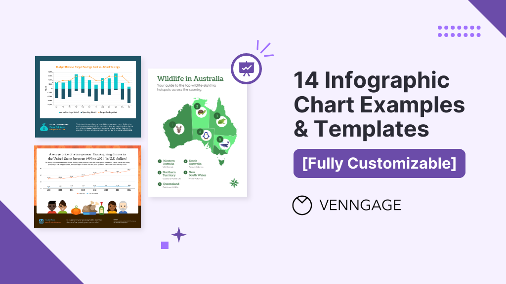
Infographic charts are increasingly popular in today’s fast-paced world where people prefer information that is accessible and easy to understand. They can be used to:
- Illustrate patterns, trends, and relationships in data
- Enhance comprehension of complex data
- Make data visually engaging for a wide range of audiences
By combining the power of graphs with the creative potential of infographics, these designs can be customized to fit specific needs. But how can you choose the right charts and graphs that would best convey your data?
In today’s blog, I’ll walk you through the different types of infographic charts and how to create one with Venngage’s Infographic Maker. To get a head start, browse our gallery of infographic templates.
Click to jump ahead:
- What is an infographic chart?
- How do I make an infographic chart?
- How to choose the right infographic chart?
- Do graphs count as infographics?
What is an infographic chart?
An infographic chart is a powerful tool for communicating information and making data more accessible. Infographic charts can also be highly effective in supporting data-driven decision-making. Here are some examples of how professionals across industries use infographic charts to visualize data:
Marketers and Executives: A great tool for summarizing data, marketers and executives often use them to showcase their products and services, present market research data, and provide financial information to stakeholders.

Educators: Teachers and professors use infographic charts to help students understand complex concepts and data. They are also great for displaying academic information such as historical data, scientific research and mathematical formulas.

Journalists: Infographic charts are often used to display statistical data, survey results, and other types of information to help illustrate news stories and convey information.

Researchers: Scientists and researchers use infographic charts to present their findings and display data from experiments, surveys, and other types of research studies.

Social media specialists: Great for displaying fun facts, tips and tricks, and other types of information that are easily shareable and visually appealing, social media platforms are often used to share infographic charts.

How do I make an infographic chart?
Your audiences are more likely to remember information that is presented visually rather than in text format. Graphs and infographics also broaden the reach of your message or data to a larger audience as they can be easily shared on social media platforms.

Not sure where to start? Follow the steps below to create an infographic chart that effectively communicates and engages with your audience.
- Determine your message: Give some thought to what you want your audience to take away from it and the message that you want to send out.
- Choose the graph that works for your message: The type of graph you choose will depend on the data you have and the message you want to convey. There are many different types of graphs you can use, including bar graphs, line graphs, pie charts, scatter plots and more.
- Collect and organize your data: Make sure your data is accurate, reliable and supports the message you want to convey. Then, organize them by categories and create an infographic chart that works best for your data. Use Venngage’s CSV import to add your data to your graphs and easily visualize them in just seconds.
- Get creative: Get creative and design your infographic chart and more on Venngage with more than 10,000 templates to choose from. You can utilize different colors, graphs and fonts to complement the message and communicate your data.
- Review and revise: Once you have your design ready, review your graph and make sure that the data is concise and easy to understand. You can also add contexts such as annotations, titles and captions to help your audience better understand what the data is about.
How to choose the right infographic chart?
When choosing the best graph for your infographic, take into consideration factors such as your data type, message, audience and context. Ultimately, your infographic chart should effectively convey your data and enhance engagement with your audience. Here are some examples of infographic charts that would best suit the data you have.
1. Bar graphs
Bar graphs are one of the most common infographic charts that are especially handy when it comes to data or product comparison. For example, you can compare and measure your company’s monthly revenue.


Other than that, you can also use bar graphs to compare different categories or groups of data to show trends over time. This infographic compares the average annual income by different career paths and is a great example of how you can effectively present data through bar graphs.

Visualize your data with Venngage’s Bar Graph Maker today.
2. Line graphs
Line graphs are your best option to display continuous data and show changes in trends over time.
One advantage of line graphs is that they can show changes in data that may be difficult to spot in a table of numbers. They are perfect for identifying trends and patterns in data such as product sales, temperature readings, or population growth.


To highlight a specific point in your line graph, consider using annotations in your graph by adding a label or brief description. For example, this statistical infographic template uses a red circle to highlight and explain the dip in numbers at that particular point:

Make your own line graph for free with Venngage’s Line Chart Maker.
3. Pie charts
Pie charts are great for comparing parts of a whole, with each segment being proportional to the percentage of the total that it represents. You can use pie graphs to show how a total amount is divided into different segments. For example, this template utilizes pie graphs to visualize the distribution of cash expenditures:

Or this one that showcases marketing trends on the top visuals online marketers use in their content:

While pie graphs are easy to understand, they can be challenging to interpret when there are a lot of slices and when displaying complex data. Here are some tips on designing a pie graph:
- Start your first segment at 12:00 and continue clockwise
- Order your segments from greatest to least
- Limit your graph to a maximum of 7 segments

Create a pie graph in minutes with Venngage’s Pie Chart Maker.
4. Bubble charts
Great for comparing independent values with clear outliers or large gaps between each value, bubble charts display data in the form of bubbles. You can use the bubbles to represent multiple dimensions of data such as the percentage of women in leadership around the world in this template:

However, bubble graphs can be less effective for displaying large amounts of data or when the differences between each value are too small. To make it easier for your audience, try labeling each bubble with its value to better visualize your data.

5. Stacked bar charts
If comparing the compositions of multiple values is your goal, I recommend that you use a stacked bar graph. They are effective for showing how different components contribute to an overall total and for comparing the proportion of different subcategories.

That said, I wouldn’t recommend using a stacked bar if your data has too many subcategories. Ultimately, stacked bar graphs work best when differences between bars are very large, so be sure to limit your segments.

Browse Venngage’s gallery of Stacked Chart Templates to make data comparison more engaging for your audience today.
6. Scatter plot graphs
Another infographic chart that I would recommend for visualizing multiple data sets would be none other than — scatter plot graphs.
Scatter plots present individual data points in a two-dimensional coordinate system using dots or symbols and are often used to examine the relationship between two variables. For example, this scatter plot is used to show the relationship between healthcare spending and life expectancy across different countries:

Create a professional scatter diagram with Venngage’s Scatter Plot Maker.
7. Multi-series graphs
Alternatively, combine some of the infographic charts above such as line graphs, bar graphs, scatter plots or bubble graphs to create a multi-series graph. This type of graph is especially useful for displaying and comparing multiple sets of data.
Multi-series graphs can also be effective for identifying trends and patterns or highlighting relationships between variables. A different color or symbol is often used to represent a different set of data and to help distinguish it from the others.

8. Doughnut charts
Commonly used in presenting survey findings, doughnut graphs are perfect for comparing data in different categories or groups.

A doughnut graph can also be combined with other types of charts and graphs to create a statistical infographic, product comparison infographic or even a professional report that provides an overview of key data points. For example, you could use a doughnut graph to show the percentage of sales by product category, and then highlight the top-selling category with a different color or shading.

Create your own report in minutes with Venngage’s Report Maker.
9. Area charts
Like line graphs, area charts can be useful for identifying trends and patterns in data, such as increases or decreases in values over time. Area graphs can be more effective than line graphs for highlighting the magnitude of changes in data across categories through the shaded areas.
Here’s an example of how an area graph is used to display and analyze the number of followers between two companies across different social media platforms:

Show trends over time with Venngage’s professionally-designed Area Chart Templates.
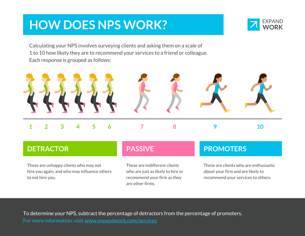
10. Pictogram
Pictogram is one of the simplest and most popular forms of data visualization and is often used to create posts on social media. Pictograms are made up of pictures or symbols that represent a certain quantity or value.
When designing a pictogram, it is important to choose symbols or pictures that have a clear association with the data and try to stick with nice round numbers such as 10 or 100 like this:

11. Choropleth map
Choropleth maps are perfect for visualizing data values for specific geographic areas by shading or coloring the areas. You can use them to display data such as population density, average income or election results.

By looking at the colored or shaded areas, your audiences can easily compare which areas have higher or lower values. Presenting data on a geographic infographic also makes it easy to show location-based patterns and make predictions on future trends.

Make your own map for free with Venngage’s Map Maker.
12. Timeline charts
Timeline charts are best suited for data that involve timelines such as historical events and project schedules.

Project managers and team members can also use them to track task progress or present information about milestones. It can also be turned into a timeline infographic and used for event planning or product development.

Timeline graphs are also good for explaining events in chronological order, showing the differences between different events and how they are related to one another.

13. Flow graphs
A flow graph is a visual guide that breaks down a process into individual steps, making it easier for others to understand and follow.
Flow graphs are also good for troubleshooting problems. They help users identify where errors or issues may be occurring by visually displaying the steps in a process. For example, a business can use this flow graph template to list down step-by-step instructions on how to handle a negative customer review:

Process infographics often use flow graphs to visualize marketing strategies, new employee onboarding, customer journey maps, product guides, recipes and more.

Designing a flow graph has never been easier with Venngage’s Flow Chart Maker.
14. Mind map
Mind maps are commonly used by students for note-taking or brainstorming sessions during team meetings. A great tool for exploring new ideas, a mind map starts with a central idea that branches out into related angles and concepts to help with brainstorming.

If you have a large amount of information, mind maps are the answer. They can effectively showcase a visual representation of the relationships between subtopics, making them a useful tool for creating list infographics. By organizing information into a visual format, it is also easier for audiences to remember and recall important details.

Not only are mind maps great for the classroom, but you can also use them to present skills, experience and achievements in a visually organized way in your resume. Another tip for designing a successful resume is to use icons, images and other visual elements in your mind map to highlight your key achievements and strengths.

Create a CV that would stand out with Venngage’s free Resume and CV Maker.
Do graphs count as infographics?
Now that you have an idea or two about infographic charts, you must be wondering — are graphs considered infographics? While graphs can be considered a type of infographic, they are not the same thing.
A graph is a visual representation of data, typically used in a scientific, technical or business context. They show the relationships between variables, making it easy for the audience to understand and analyze. Infographics on the other hand include other visual elements such as icons, illustrations, images and text to summarize and communicate complex information.
If you’re new to the world of infographics, this article on what is an infographic will give you a better understanding of infographics and infographic design.

Interested in exploring the possibilities of visualizing your information through infographics? Here’s an article on the 9 types of infographics that will help you get started!
Conclusion
To sum it all up, infographic charts are a great tool to present your data clearly and concisely. You can use them to show relationships, trends, comparisons, and other types of information. To create an effective infographic, it’s important to use the right graphs and other visual elements that will convey meaningful information and add visual interest.
It might sound a little confusing but you don’t have to be a designer to create an infographic that works for your data. With Venngage, all you have to do is pick the template you want to use, import your data, and you’re all set!


