


I’ve lost count of the times I’ve come across posters with great visuals but vague headlines and missing CTA. In ad poster design, looking good isn’t enough. If it doesn’t stop someone in three seconds and tell them exactly what to do, it fails.
In this guide, I’ll show you how to create an advertisement poster that converts, no matter if you’re designing from scratch or using a structured tool like an online poster maker to speed things up.
Before you design: Nail the 3 decisions that make posters work
Most advertising poster designs fail before you even open a poster maker. Clarity beats decoration. Decide these three things first.
1. Define your goal
Before you compare tools, before you debate Canva vs Photoshop for posters, before you ask does Google have a poster maker, lock this in. Tools won’t fix an aimless poster.
If you’re wondering how to make an advertisement poster, start with the end in mind. Most amateurs do the opposite; they start with the colors, fonts or other decorative elements.
Use this one-sentence formula:
“Get [audience] to [action] by offering [offer] at/by [time/place].”
Examples:
- Get restaurant patrons to try our new menu starting March 1.
- Get local buyers to visit your store this weekend by offering 20% off at our store.
- Get job seekers to apply by offering walk-in interviews on Saturdays.
That sentence becomes the backbone of your advertisement poster template.
Without it, you’ll end up stuffing random information into a layout and asking, “What are the parts of an advertisement poster again?”
2. Identify your audience
A poster on a busy street works very differently from one inside a cafe. Location matters a lot in advertising, which means you have to pay attention to the headline size, copy, color, call-to-action, etc., based on who your audience is.
Here’s a quick context matrix you can use before you design:
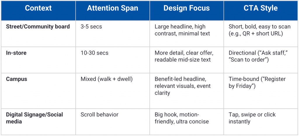
If you’re learning how to make a poster on your phone or doing poster design on mobile, this step matters even more. Mobile screens make you zoom in and small text can make your ad unreadable.
This is also where decisions like poster size for printing and poster resolution DPI start to make sense. We’ll cover this in more detail later.
3. Choose ONE primary action
This is an area most people struggle with, especially if they don’t have a background in advertising or marketing.
They give their audience too many choices in an ad, such as visit us, call now, follow us on Instagram, scan the QR and so on.
Giving people more choice than they need creates the paradox of choice and it impairs their decision-making abilities.
According to The Nudge Panel, simplifying choices can dramatically increase purchase rates…in some tests, conversions rose from 3% to 30%.
Remember to limit your advertising poster to just one primary action. You can include some supporting info, but it cannot compete.
Your CTA should answer one question: “What do you want them to do next?”
Here are some examples:
- Book an appointment
- Sign up
- Visit today
- Call for pricing
The 5 parts of a good advertisement poster
To make your ad poster convert, you have to nail some basic design and copywriting principles. Here are the 5 parts of a good advertisement poster:
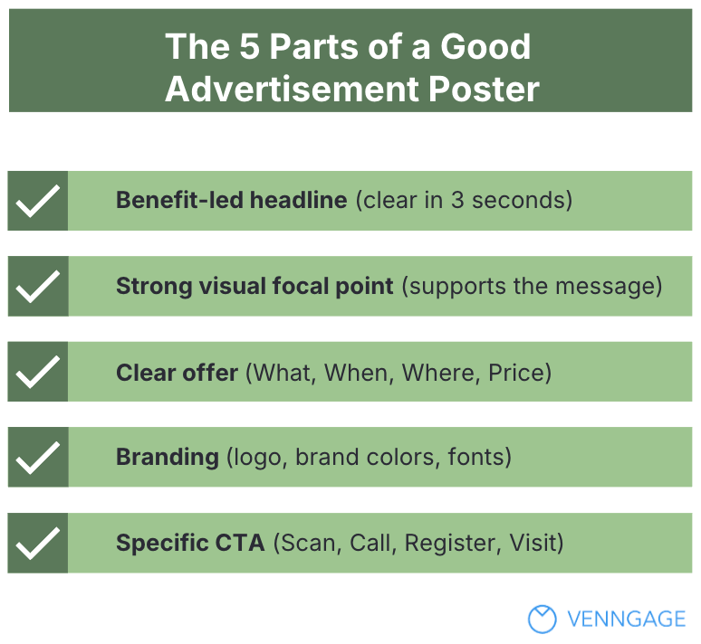
1. Headline
Make sure you lead your headline with a clear benefit and it’s easy to read.
In copywriting, the headline is the hook that draws people in. People should grasp it in three seconds. And you have to be as specific as it gets. For instance:
A bad headline might say “Annual Community Gathering.” But a better will state “Free Health Checkup This Sunday.”
If you’re learning how to make an advertisement poster, start here. The headline does 60 percent of the work.
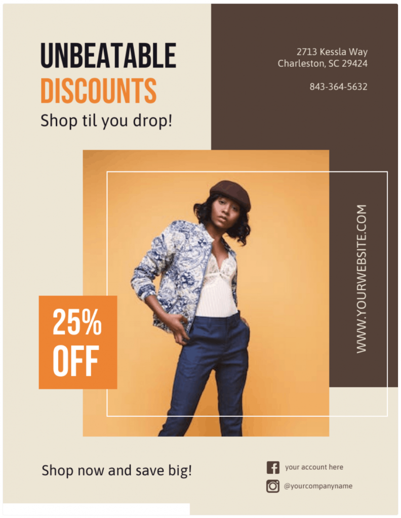
Here is a good example. This fashion discount ad poster template is perfect for retail businesses that want to promote a sale with stylish visuals and clear offers that grab attention fast:
Related: Want to learn about writing captivating hooks? Read this guide on how to write a captivating introduction from expert marketer Ross Simmonds. It has many parallels to writing great headlines.
2. Visual focal point
Your visual should do more than decorate the page. It should make the offer obvious before anyone reads a word.
For instance, if you’re hiring, show real people, not abstract shapes or generic stock photos. If you’re promoting a burger deal, let the burger dominate the frame. If it’s a tech event, the visual should signal innovation and movement.
A focal point in design refers to the area or element of a composition that draws the viewer’s attention first. It serves as the visual anchor that organizes the piece, ensuring that the viewer’s eye is naturally drawn to the most critical part of the design.
Pangea
A strong focal point anchors attention and pulls the eye toward your headline and CTA. Like this one does.
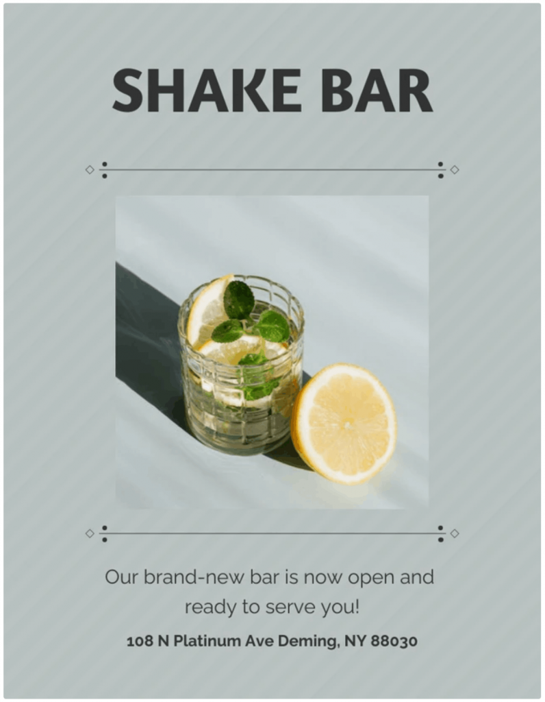
This bar promotion poster template works well for bar owners or event promoters who want a clean and eye-catching design that highlights offer details at a glance:
3. Offer
An ad without an offer is like a store with no price tags. Your ad poster should answer four questions instantly:
- What
- When
- Where
- How much
Think event date, exact location, discount amount and deadline (e.g., if you have store hours or if it’s a limited-time offer).
These details build trust and reduce friction. But you still have to keep everything scannable. If you’re wondering what should you not include on a poster, start by cutting full sentences and anything that slows the reader down.
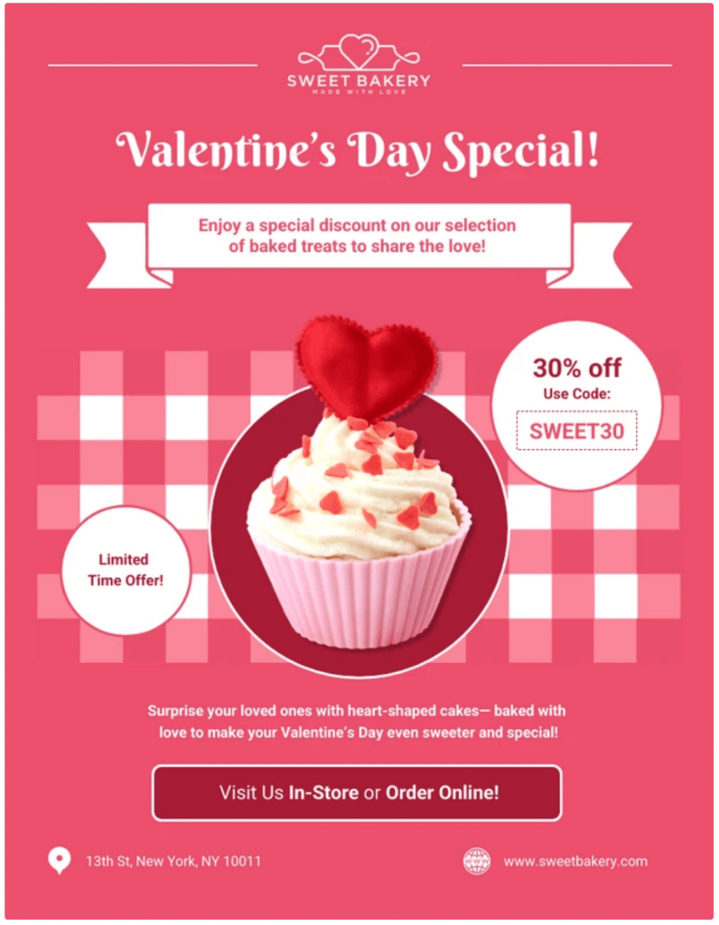
Take a look at this Valentine’s Day bakery sale poster, for instance. It’s ideal for bakery businesses that want a seasonal design that communicates specials and promotions.
4. Branding
Your poster should look like it came from your business, not from a random template library.
Add your logo, use your brand colors and stick to consistent fonts so people recognize you instantly.
When branding is missing, the poster feels generic and forgettable, even if the layout looks good. Strong branding turns a simple design into a strategic asset.
81% of consumers need to trust a brand before making a purchase.
Canny Creative
Whether you’re using a free online poster maker or figuring out how to make a poster for free, consistency builds familiarity and familiarity breeds trust.
Most templates don’t come with logos, you have to add your own to make it on-brand. Some templates, like the one below, have placeholder logos that you can replace.
This template is perfect for agents or property marketers who want a professional layout to highlight listings and contact details:

5. Call to action
Don’t assume people will figure out the next step. Clearly specify the action you want them to perform.
Do you want them to scan, register, call or visit? Spell it out.
A strong CTA removes hesitation and turns attention into movement. If a QR code makes the action faster, include it, but always add a short URL as backup.
Make it clear what you want the reader to do.
Donald Miller, Building a StoryBrand
And before you export your poster to be distributed online, double-check the CTA link. A broken CTA wastes the entire campaign.
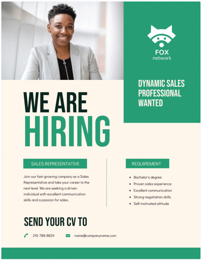
It’s not really hard to know what the CTA in this poster is.
It’s a template that’s great for HR teams or small business owners who want a clear design to advertise open roles and attract candidates fast.
How to create an advertisement poster
If you want to know how to make an advertisement poster without wasting hours, this is the simplest order you should stick to:
Template > Customize > Export.
But simple doesn’t always mean easy and the nuances matter more than you think. Let’s go through the process step by step so you get it right the first time.
Step 1: Pick the right poster size
Your poster size always depends on placement.
For instance, the poster size for printing affects readability, while digital dimensions affect cropping. Poster resolution DPI matters for print, which is generally 300 DPI.
Print sizes:
- 8.5×11 for counters and small boards
- 11×17 for windows and walls
- 18×24 for events and street boards
- 24×36 for high-visibility areas
Digital formats:
- Instagram post or story
- Digital signage screens
- WhatsApp or email graphics
As a rule of thumb, always prioritize placement over size. That means if it’s a street poster, make it bigger and easy to read. If it’s for Instagram, keep the poster design vertical. And if it’s for an in-store promotion, keeping it medium is best.
Step 2: Choose a template that matches your goal
When you open a free online poster maker or browse an advertisement poster template library, do not filter by “blue” or “modern.”
Filter by purpose. For instance, Venngage’s advertisement poster templates allow you to filter templates by size, accessibility or even the plan type.
A good thing about template designs is that they already solve hierarchy issues. For instance, most Venngage templates come up a big headline space, a clear CTA block and balanced spacing.
Of course, you can always customize the colors, images, fonts and other decorative elements later.
Step 3: Replace content in the right order
Once you have picked a template that aligns with your goals, don’t start randomly editing it. Instead, follow this sequence:
- Headline
- Visuals
- Offer
- CTA
- Logo/brand
Why? Because this process will help you keep a good structure. Most beginners start tweaking fonts before fixing the headline.
Step 4: Make it readable from a distance
Posters are not blog posts. You don’t have to pour all the details to the customers. Instead, follow the 3-second rule.
In most real-world settings, you have about three seconds to make your poster count. That’s all the time you get to grab attention, signal value and stop someone from walking past, scrolling by or tuning you out.
In a 2026 review by National Geographic, researchers reported that average focus time on a single task has dropped from about 2.5 minutes in 2003 to roughly 40 seconds today.
If your message isn’t clear in those first few seconds, you’ve likely lost them. That means you have to:
- Use a big headline
- Avoid paragraphs
- Run a contrast check
- Stick to 2–3 fonts
If you want to get this right, test your poster design on a smaller screen. Zoom out on your screen to check if you struggle to read it quickly. This applies even if you’re creating a poster design on mobile or for social media ads.
Step 5: Export correctly
Good design dies in bad export settings. Here’s a quick guide to help you:
For print:
- Choose PDF Print
- High quality
- Add bleed and safe margins if available
- Export poster as PDF
A proper PDF print poster prevents fuzzy text and clipped edges.
For digital:
- Use PNG or JPG
- Match the exact dimensions of the platform
Do not upscale small images. A 72 DPI web image will look terrible at large poster size for printing. Use high-resolution assets from the start. Aim for 300 DPI for print.
How to make an advertisement poster on your phone
You don’t always need a laptop to make an advertisement poster. Just using your phone is enough if you have the right mobile workflow and the right app.
The phone workflow
To create an ad poster on your mobile, start with the right app. For this walkthrough, let’s use Desygner.
If you’re learning how to make a poster on your phone, follow this exact flow inside the Desygner app:
Step 1: Open Desygner > Tap “+” > Choose “Poster”
You’ll see preset design categories and sizes on the home screen. Select “Poster” to start with the right canvas.
Step 2: Pick a template
Browse by purpose. Sale. Event. Hiring. Grand opening. Choose an advertisement poster template based on your goal, not just colors.
Step 3: Edit text first
Tap directly on the text boxes and update:
- Headline
- Offer
- CTA
This keeps the poster’s hierarchy intact.
Step 4: Replace images and adjust layout
Upload your own photo or use Desygner’s built-in stock library. Pinch the images if you want to resize them. Keep your visual focal point strong and uncluttered.
Step 5: Download or share in high quality
Tap “Download” and choose PDF for print if you need a PDF print poster.
For digital use, export a high-resolution PNG or JPG. Always check a poster resolution DPI if you plan to print.
And that’s it. Poster design on mobile works well when you follow the structure and avoid over-editing.
Best mobile apps
If you’re wondering about the best app for poster making, here’s a practical breakdown:
- Beginner / All-around: Canva, Adobe Express
- Promo and event templates: PosterMyWall, Desygner
- Photo-heavy effects: Picsart
- Video-first workflow: CapCut
If you plan to animate your poster or turn it into a reel, CapCut fits better. If you want drag-and-drop simplicity, Canva or Adobe Express feels easier.
Mobile pitfalls to avoid
Designing an ad poster on your phone is convenient, but small screens make it easy to miss obvious mistakes.
Here are 3 common pitfalls people run into with mobile poster design:
Tiny text: Always preview at 100 percent. If you must zoom in to read it, strangers won’t bother.
Too many icons, stickers or effects: Just because the app offers them doesn’t mean you should use them. Advertising poster design needs clarity.
For tips on using icons effectively, read our blog on how to tell an icon story.
Low-quality export defaults: Many apps default to compressed files. Check the resolution before downloading. Poster size for printing requires high resolution. Aim for 300 DPI for print.
Design rules that make ad posters “pop”
You don’t need a design degree to learn how to make an advertisement poster that looks professional. Most advertising poster design follows a few proven rules.
Once you understand them, any poster maker or free online poster maker becomes easier to use.
1. Visual hierarchy
When someone looks at your poster, their eyes move in order. You control that order.
- First, they should see the headline.
- Second, the offer or key detail.
- Third, the CTA.
That’s visual hierarchy. If you want a deeper breakdown, read this guide on visual hierarchy.
You create hierarchy with size, contrast and spacing. Bigger text gets attention first, while high contrast pulls focus. Meanwhile, extra space isolates importance.
Here’s a simple hierarchy recipe you can follow inside any advertisement poster template:
- Make your ‘headline’ the largest element.
- Present the ‘offer’ slightly smaller.
- Close with a clear and easy-to-notice ‘CTA’ that doesn’t compete with the headline.
2. Color contrast
Brand colors matter, but readability matters more.
Use a light background with dark text or a dark background with light text. High contrast improves visibility, especially for a large poster size for printing.
Stick to one primary color and one accent color. That’s enough. When you add five colors, the design feels chaotic.
Whether you are doing poster design on mobile or exporting a PDF print poster, contrast decides whether people can read it from a distance.
3. Typography
Fonts can make or break your poster.
Use a clean sans-serif font for headlines since it reads better from a distance. Avoid long sentences in all caps because it slows down reading.
Stick to 2–3 fonts per poster. Instead of adding new fonts for emphasis, use bold formatting instead.
Typography is the convergence of art and language.
Ellen Lupton
4. White space
White space is not empty space. It gives your content room to breathe.
Cluttered designs feel stressful. If your design feels noisy, remove something instead of shrinking everything.
Here’s a quick check: if every word is bold, every color is bright and every section is packed, you ignored hierarchy.
What you should NOT include on an ad poster
A lot of ad posters fail to convert because the person designing them overlooks the simple fundamentals. Here are 5 small but avoidable mistakes that often weaken your poster’s message:
1. Too much text
I remember seeing a gym poster a few years back that tried to fit its entire membership brochure onto an 11×17 flyer. Think of details like trainer bios, equipment list, pricing tiers and customer testimonials.
They obviously struggled to get more people to join. I know because the gym was located near where I lived.
A poster is not a webpage. Its job is to spark interest, not explain everything. If you’re writing an essay on your ad poster, you’re asking too much from a passerby.
Just stick to only what’s necessary: headline, offer and CTA. That’s it. The rest belongs on your website or other touchpoints.
2. Low-resolution images
This is a big one because you usually don’t notice it until you print a poster. You might look at your ad design on your phone and think that it looks great.
But when you print it at 18×24, you notice your hero image looks blurry and pixelated.
Nothing kills credibility faster than a low-quality image. Even a good offer feels sketchy when the visuals look cheap.
Don’t blame yourself for it. This is usually a poster resolution DPI issue, not a design skills problem.
Web images are typically 72 DPI, which works for screens but falls apart at larger poster size for printing. For print, aim for 300 DPI and export your poster as a PDF using proper PDF print poster settings.
3. Low contrast
If your text blends into the background, it fails the 3-second rule we talked about earlier. People should grasp your message instantly, not squint or walk closer to read it.
I remember passing by a bakery shop recently that ran a promo with pale yellow text on a pastel pink background. Was it cute, design-wise? Yes. But the copy was unreadable unless you stood right in front of it.
Your favorite brands pay attention to contrast for a reason. Accessibility guidelines, including many used by big retailers and public transit systems, require clear contrast so people from all distances and lighting conditions can read the content easily.
Not sure if your poster’s colors pass the test? Run them through this free color contrast checker to be sure.
4. No clear CTA
I notice this more often than other common mistakes. And not just on posters, but on flyers or brochures too.
For instance, a few weeks ago, I came across a bunch of posters around my neighborhood from a real estate company that said, “Luxury Apartments Now Available.” The photography looked premium, the layout was polished and the paper it was printed on looked expensive.
But they had no phone number, no website, no QR code and nothing that told me what I was supposed to do next.
A poster without a CTA is a missed opportunity and a colossal waste of everyone’s time.
5. Too many fonts and effects
Overdecorating is one of the most common mistakes among beginners. But just because a poster tool offers gradients, shadows, stickers, textures and animations doesn’t mean you have to try them all at once. If you aren’t careful, your poster will look like a middle-school project rather than a business promotion.
If you want people to take your advertisement seriously, stick to two or three fonts at most. When something needs emphasis, use bold formatting. Let clear hierarchy and spacing do the heavy lifting instead of decorative effects.
6. Misalignment and cramped spacing
Ever looked at a poster and felt like something was “off,” even if you couldn’t explain why? It’s usually alignment and spacing.
Maybe the text box is slightly right-aligned or perhaps the margins are uneven. The logo might be placed a little too close to the edge. On their own, none of these screams “bad design,” but together it makes the whole thing feel rushed.
Good spacing feels relaxed and credible. When everything lines up and there’s enough white space, your poster feels intentional and easy to read. But when everything is crammed together, it signals hurry and low effort.
7. Generic template
We’ve all been guilty of this at some point. You might open a free online poster maker, scroll for a few seconds, pick the first decent layout, tweak the headline and export the design without changing anything much.
It feels like you’ve saved time, until you notice your poster looks exactly like nine others using the same template.
Templates are great starting points, but they’re not finished products. If you don’t swap the default colors to match your brand, add your logo properly or refine the copy so it sounds like you, the design will always feel generic.
Using AI to create a better poster faster
Most of the time you spend on designing a poster goes into thinking what the headline should be, what the offer should be and second-guessing the layout.
That’s exactly where AI changes the game. I’ll use ChatGPT specifically to show you how to create an advertisement poster faster:
What ChatGPT can do well
Let’s say you run a dental clinic and you’re promoting a free whitening consult. You know the offer, you just can’t phrase it cleanly.
This is where people ask, can ChatGPT create a poster?
The truth: It might not be able to give you the finished output that you expect. But it can:
- Generate headline variations
- Refine your offer
- Suggest CTA copy options
- Shorten or clean up your poster copy
- Recommend a layout structure
Copy-paste prompt templates
Let’s make this practical. Below are 3 AI prompts you can copy, paste and use to create a poster in minutes.
Try them on Venngage’s free AI Poster Generator, then click “Customize” to tweak the layout, colors and copy so it actually fits your brand and goal.
You can edit the prompts to meet your needs or swap the placeholder text with your specific product, audience and offer details.
Option 1: Conversion-focused poster
Headline prompt: “Write 10 benefit-led headline options for a [product/service] targeting [audience]. Keep each under 8 words and easy to understand in 3 seconds.”
Poster copy prompt: “Turn these details into poster-ready copy: headline, short subhead, 3 benefit bullets (max 6 words each), clear CTA and one urgency line. Keep it scannable. No full paragraphs.”
Layout prompt: “Suggest a simple visual hierarchy for an 11×17 poster viewed from 3–5 meters. Specify what should be the largest, second and third. Include spacing and contrast guidance.”
Option 2: Offer-based business promo
Headline prompt: “Generate 8 strong promotional headlines for a [sale/event/service]. Focus on clarity and immediate value.”
Poster copy prompt: “Create 3 versions of this poster copy: urgency-led, value-led and social-proof-led. Include key details (what/when/where/price) and a strong CTA.”
Layout prompt: “Recommend a clean layout with one visual focal point, high contrast between text and background and clear separation between headline, offer and CTA.”
Option 3: Print-ready professional poster
Headline prompt: “Write short, punchy headline ideas (max 7 words) for a [product/service] poster aimed at [audience]. Avoid vague phrases.”
Poster copy prompt: “Structure concise poster copy using: headline, 1-line subhead, 3 short benefits and a direct CTA. Keep it tight and persuasive.”
Layout prompt: “Suggest font pairing (max 2–3 fonts), color contrast direction and a simple hierarchy recipe: Headline > Offer > CTA. Optimize for readability from a distance.”
AI image notes
AI can speed up your poster design process, but it can also flood your poster with what people now call “AI slop.” Relying too much on AI can lead your design to be generic and quickly forgettable.
AI works best for abstract backgrounds, subtle textures or basic illustrations that support your message instead of overpowering it. But it’s risky when you start imitating branded visuals or anything close to trademarked characters.
And don’t ignore technical quality. An AI image might look sharp on your phone, but if the poster resolution DPI isn’t high enough, it breaks when you export your poster as PDF for print. Always check the resolution before committing to a PDF print poster.
What software should you use to make an ad poster?
The tool won’t fix weak messaging. But the right tool will save you time, reduce friction and help you ship your ads faster.
Here’s how to choose based on your situation.
Best for beginners/fastest
1. Venngage
Venngage works well when you want structure without design chaos. It offers drag-and-drop editing, plenty of ready-to-use poster templates and smart features like Brand Kit to help you keep your ad posters on-brand.
Venngage lets you export high-resolution PDFs for print and even create a poster design with AI if you want a head start. It’s a great tool for marketers who care about clarity more than flashy effects.
Pricing: Free plan available; paid plans start at $10/month.
2. Canva
Canva comes with built-in grids and alignment guides to help with spacing and one-click background removal for product or portrait shots. The tool also offers easy resize options for different formats and access to a stock image and icon library.
Pricing: Free plan available; paid plans start at $14.99/month.
3. Adobe Express
Adobe Express offers auto-alignment features, access to Adobe Fonts and tight integration with Adobe’s stock photo and font libraries.
Pricing: Free plan available; paid plans start at $9.99/month.
4. PosterMyWall
PosterMyWall is built specifically for event and social media promotions. You can also schedule posts to social media or manage basic email campaigns directly from the platform.
Pricing: Free plan available; paid downloads and subscriptions available.
Best for pros/print control
5. Adobe Illustrator
Adobe Illustrator is great for vector-heavy designs, large-scale prints and greater control over typography. It’s an ideal tool when you want more precision over the poster size for printing.
Pricing: Paid plans start at $22.99/month.
6. Adobe InDesign
Adobe InDesign also gives you full control over typography with Smart Text Reflow and deep Adobe Fonts support. The tool comes with built-in bleed guides for accurate printing and integrates seamlessly with Photoshop and Illustrator.
Pricing: Paid plans start at $22.99/month.
7. Adobe Photoshop
If your poster requires detailed image editing and visual effects, Photoshop is the go-to tool It gives you pixel-perfect control, advanced masking and selection tools, powerful color correction and robust layering for complex visuals.
Pricing: Paid plans start at $22.99/month.
If you only have Microsoft or Google
8. Microsoft PowerPoint
You might not think of it first, but many people use Microsoft PowerPoint to make posters. It lets you set custom dimensions, arrange text and visuals with familiar drag-and-drop tools and export your design as a print-ready PDF.
Pricing: Included with Microsoft 365 plans starting at $6.99/month.
9. Microsoft Word
Microsoft Word can handle very simple posters or basic flyers if you’re in a hurry. You can insert images, text boxes, shapes and set custom page sizes before exporting as a PDF for print.
That said, Word isn’t built for visual hierarchy or precise alignment. Designing complex posters can feel frustrating.
Pricing: Included with Microsoft 365.
10. Microsoft Designer
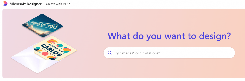
It’s an AI-powered, web-based graphic tool that turns words into layouts, visuals and copy suggestions. The tool can help you jumpstart a poster concept quickly. It comes with AI-generated templates, basic editing tools and automatic layout suggestions based on your input.
Pricing: Free with a Microsoft account; premium features available.
11. Google Slides
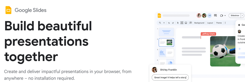
Google Slides isn’t a dedicated poster maker, but you can turn it into one by setting a custom canvas size and designing a single slide like a poster. You can insert text, shapes and images, use basic alignment tools and share or export your final work as a PDF for printing. It also lets collaborators edit in real time, which can help when you’re gathering feedback.
Pricing: Free with a Google account.
12. Google Docs
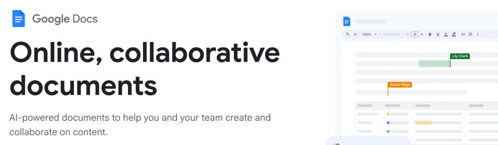
It’s primarily a text editor, so it’s very limited for visual design work. You can set custom page sizes and add text or images, but it doesn’t offer layout tools like alignment guides, grid snapping or poster-specific presets.
Pricing: Free with a Google account.
Printing and distribution tips so your posters actually perform
A good poster can still flop if your printing and placement are off. Once you print it off, things like size, paper quality, lighting and where you place it matter more than anything.
Here are 3 simple tips to make sure your poster converts:
1. Add a QR code
If you’re promoting a webinar or a limited-time offer, a QR scan is the best way to take someone directly to the signup page. QR codes are great for trackable links and you can update the destination without reprinting.
Pro-tip: Add a short URL below the code as backup because not everyone scans or in case the code doesn’t scan.
2. Placement basics
Designing without thinking about placement is like shooting in the dark. A poster on a cafe door, right in someone’s line of sight, will get far more eyeballs than one taped to the checkout counter below eye level.
Use larger headlines for distance, keep the CTA at eye level and avoid cluttered backgrounds. If you’re printing a big poster, make sure your poster resolution DPI can handle the size.
3. Final checklist
Before you print or post, take five minutes to double-check everything. Confirm spelling, dates, location and test the QR code and URL yourself.
Zoom out and read the copy aloud. If you’re planning to print the poster, download it as a PDF print file and make sure the size and image quality are optimized for print.
FAQs about advertisement poster design
Here are answers to some of the most common questions about poster design tools.
1. Is Canva good for beginners?
Yes. Canva is beginner-friendly because of its drag-and-drop editor, template options and simple export options. It’s widely used for quick poster design, social graphics and small business promotions.
2. Is Canva better than Photoshop?
That depends on your goal. Canva is better for speed and ease of use. Photoshop offers better image editing, layer control and advanced features that are ideal for complex, photo-heavy designs.
3. Does Google have a poster maker?
No, Google doesn’t have a dedicated poster maker. However, you can create simple posters using Google Slides or Google Docs by setting custom page dimensions and exporting the files as PDFs.


