


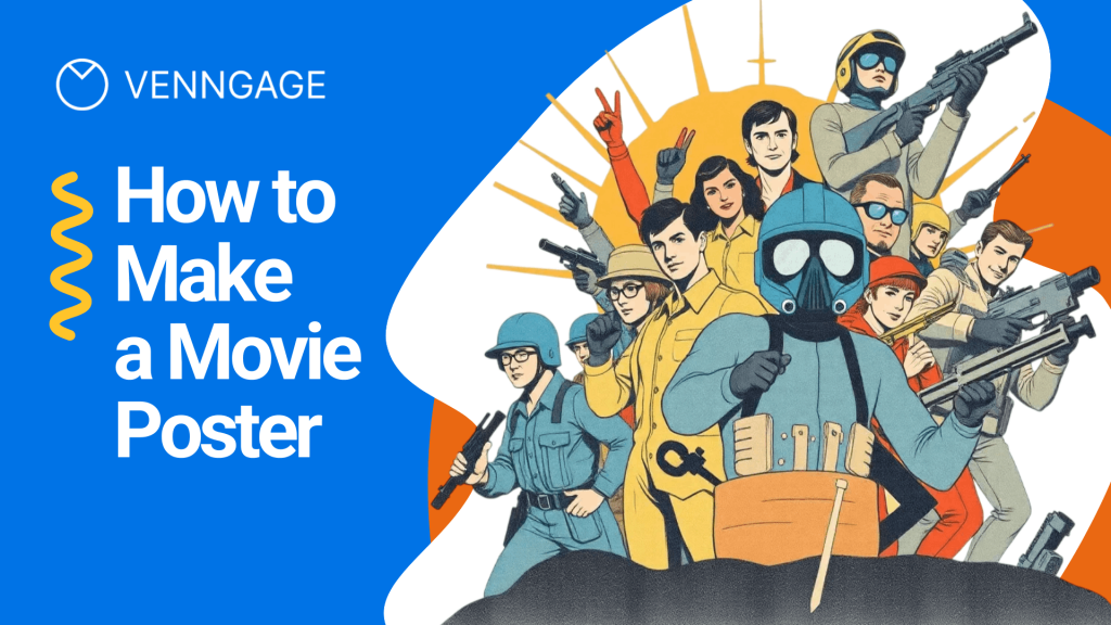
Designing a movie poster requires a different mindset than creating a regular graphic. It needs a cinematic vibe that convinces someone your film is worth their time.
The goal is to create a composition that feels like a scene pulled straight from the movie, not a random collage of images and text. Every choice, from color and lighting to type and spacing, should signal genre and tone instantly.
When it works, the poster doesn’t just look good. It creates anticipation before the trailer even plays.
What makes a movie poster work?
What makes a movie poster work? I’ve noticed that most other guides on this topic list the best poster-making software. Very few explain what should a movie poster contain to feel legit.
If you’ve wondered what the 7 elements of a great movie poster are, here’s a clear breakdown that can take your design from “nice” to truly compelling.
1. Attention
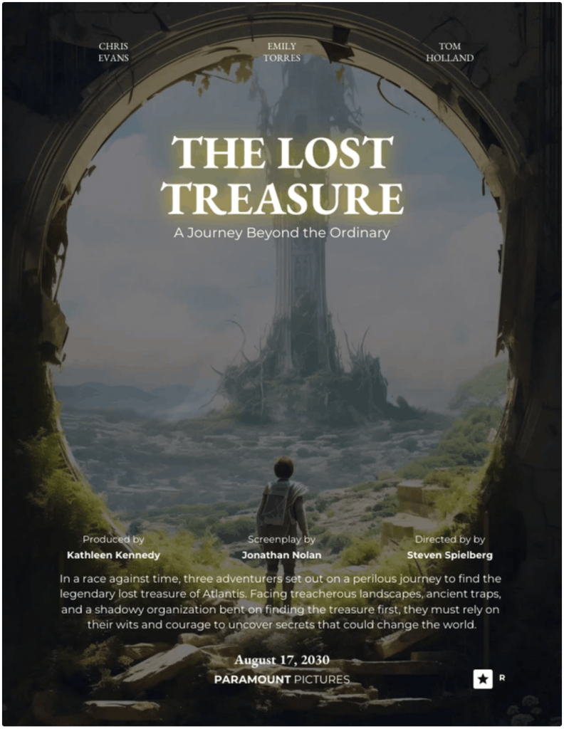
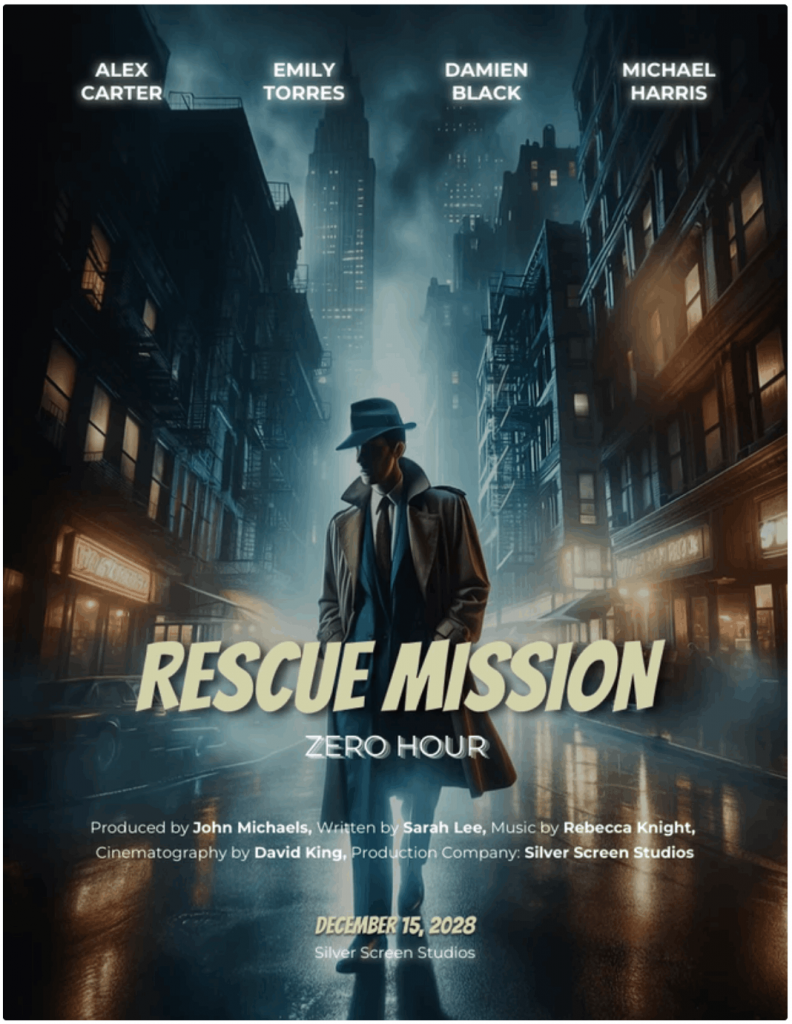
You need one clear focal point. High contrast pulls the eye fast. Think of the glowing ring in The Lord of the Rings: The Fellowship of the Ring poster. Your viewer should know where to look in one second.
Here’s a movie poster template that nails this perfectly:
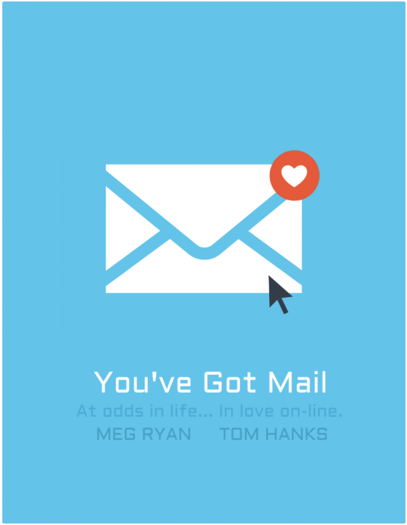
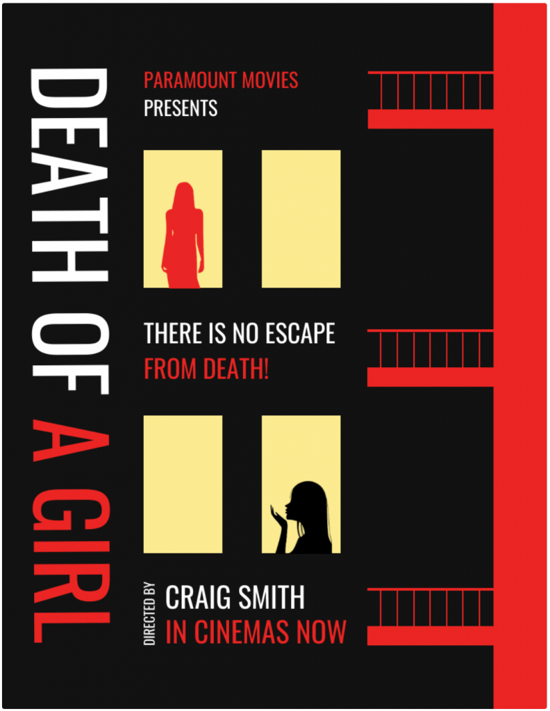
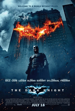
2. Iconography
Great posters lean on one strong symbol. The bat emblem in The Dark Knight or the mask in Scream. One image carries the idea.
Choose a visual that represents your story without explaining the plot. Like this one:
3. Interest
Your poster should raise a question. Who is she running from? Why is the city on fire? The Inception poster bends a city block. That image creates tension. Curiosity keeps eyes on your design longer.
4. Appeal
Your viewer should know the genre instantly. A horror poster leans on dark, suffocating tones to signal dread, while a rom-com uses bright, warm colors to suggest something lighter.
Barbie embraces bold pink to telegraph pop fantasy, whereas The Conjuring relies on muted, cold tones to convey fear. Clarity always beats cleverness.
Can you guess which genre this movie belongs to just by looking at its poster?
5. Style
Pick one mood and commit. Your color palette and typeface must complement each other. A gritty thriller needs sharp contrast and bold type. A period drama needs restraint.
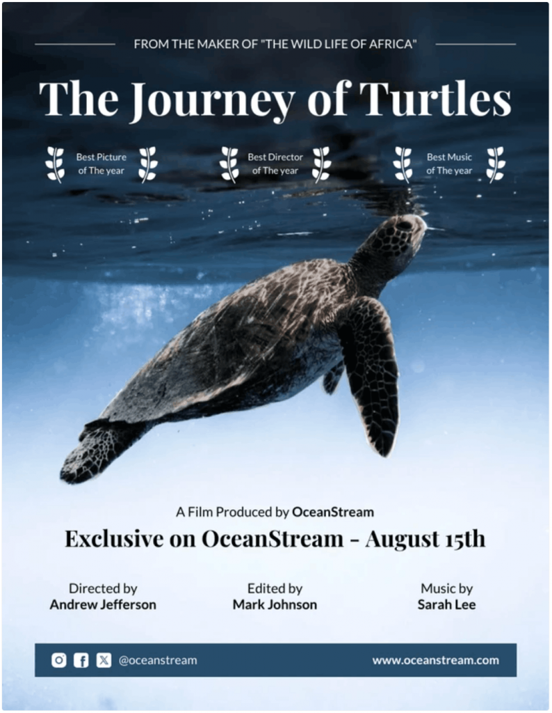
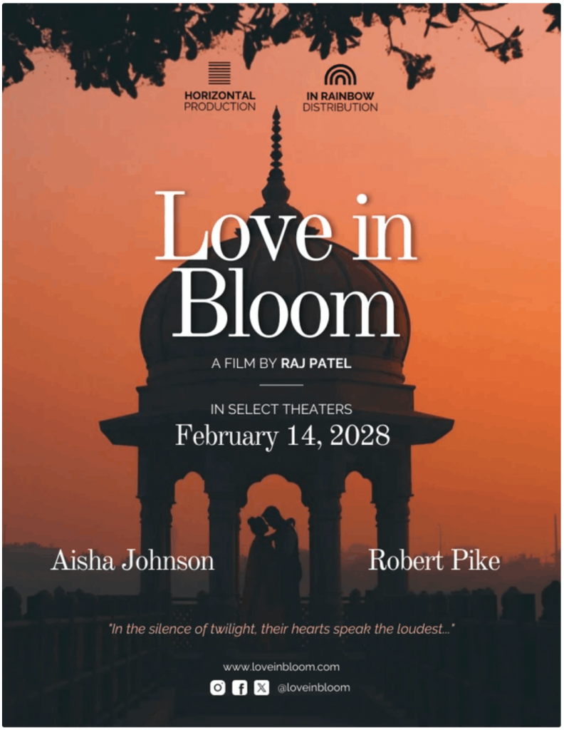
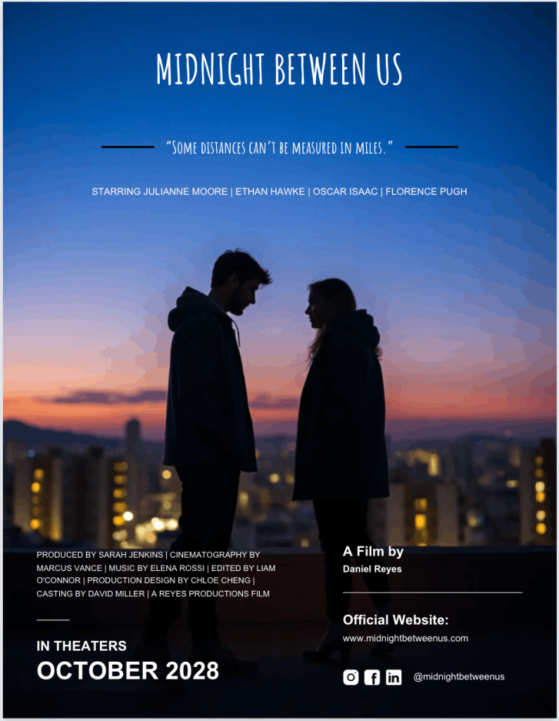
Mixed signals make posters look amateur. Consistency makes them feel intentional. Here’s an example of a poster that screams suspense in every aspect:
6. Lasting appeal
Most people will see your poster as a tiny thumbnail before they ever view it full-size. Streaming platforms shrink everything, so what looks great on your screen might fall apart on a phone. Zoom out and check it small. If the title blurs or disappears, adjust it.
In this poster, the large high-contrast serif title and simple silhouette composition stay clear and readable even at thumbnail size. This gives the poster lasting appeal across screens.
7. Recognizability
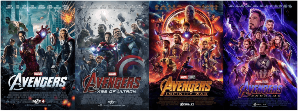
Your poster must feel like one specific film, not a stock template. Franchise films like Avengers: Endgame maintain a visual identity across campaigns.
Even student films need this discipline. Define your visual voice and stick to it.
Before you design: Nail the concept in 10 minutes
Most movie posters look generic and amateur because a lot of beginners jump straight into templates.
If you want to know how to make a movie poster that feels intentional, pause for ten minutes and define the idea first.
Your layout, colors, title placement and even your billing block will depend on this step. Get the concept right and every design choice becomes easier. Let me walk you through the entire process:
1. Write the “one-sentence promise”
Before you open any movie poster maker online, write one sentence that captures your film’s promise.
It’s not the plot or synopsis, but the promise. Answer:
- Who is it for?
- What emotion should it create?
- What tone does it carry?
For example:
- “A grieving father hunts the truth in a corrupt coastal town.”
- “Two rivals fake a romance and fall for real.”
That line defines theme, tone and audience in one move. Now turn that into a movie poster tagline.
Keep it between five and ten words. Make sure you don’t give out spoilers or summarize the plot. Just tease the tension.
Examples:
- “Trust no one.”
- “Love was never part of the plan.”
- “Some doors should stay closed.”
Short taglines read better at thumbnail size. They also sit well above or near the title in most movie poster layout structures.
I’ve seen this mistake often. Designers overwork visuals because the concept was never clear.
2. Choose your poster type
Now decide what you’re actually designing. A one-sheet movie poster includes the full package:
- Title
- Tagline
- Cast
- Release date
- Logos
- Billing block or credits
The classic one-sheet movie poster dimensions in the US is 27 × 41 inches. Many designers also use 24 × 36 inches because printers widely support it.
If you’re creating a festival submission poster or classroom project, a one-sheet makes more sense. If you’re promoting a concept or early draft, a teaser keeps things clean.
A teaser movie poster is different. It has minimal copy because it’s meant to build anticipation. Often just a logo or title and a date. Sometimes, there is no billing block at all.
3. Gather assets
Before you open how to make a movie poster in Canva or how to make a movie poster in Photoshop tutorials, gather your assets.
You’ll need:
- A high-resolution still photo or key art
- Title text in editable format
- Final release date or “Coming Soon”
- Production logos
- Legitimate festival laurels if earned
Do not design around blurry screenshots. That’s one of the most common movie poster mistakes.
Quick quality rule: start high-res. For print, aim for 300 DPI as the final size. If you plan to print a 24 × 36 poster, your file should support that resolution from the start. Upscaling later rarely works well.
If you plan to use an AI movie poster generator for concept art, treat it as a draft tool. Then finalize the layout and typography manually.
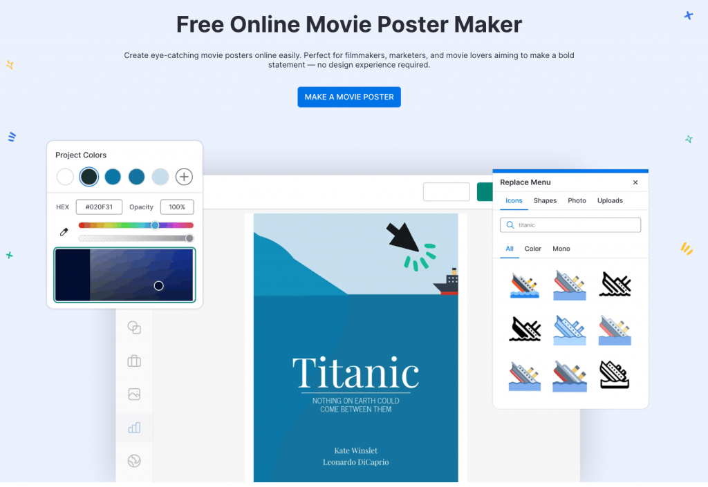
Here’s a poster I created with Venngage with little manual edits:
4. A quick reality check before you move on
Ask yourself:
- Is the genre obvious without explanation?
- Does the one-sentence promise align with the visual you chose?
- Do you know whether this is a teaser movie poster or a full one-sheet?
- Are your assets print-ready if you plan on learning how to print a movie poster later?
Ten minutes here saves hours of redesign later.
Once your concept, type and assets are locked in, you’re ready to move into layout and tool decisions. That’s where movie poster design tips start to matter.
Pick the easiest tool for your skill level
If you’re wondering what’s the easiest program to make a movie poster, the honest answer depends on your skill level and how much control you want.
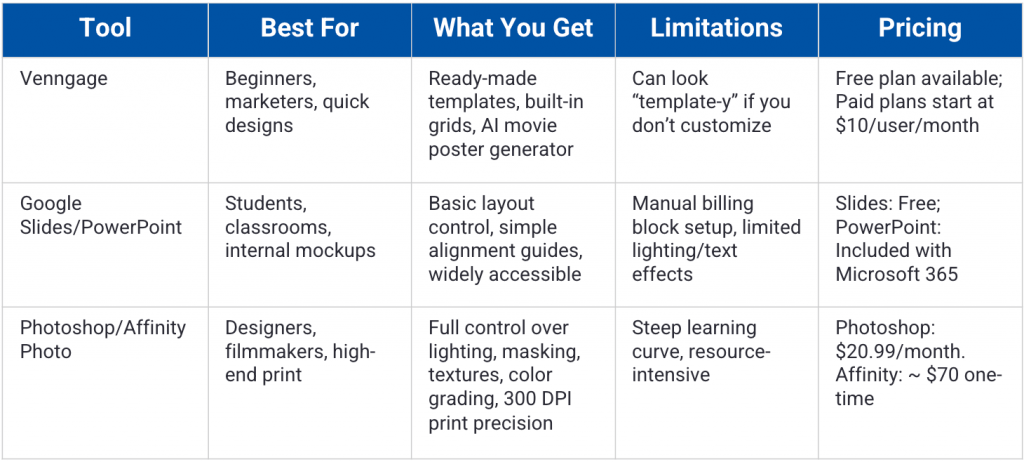
More often than not, the tool that you choose for creating a poster will determine your speed, workflow and limit. Here’s a decision table that can help you choose the right tool for your needs:
Let’s do a full breakdown of the best movie poster generator tools and what each one is realistically capable of.
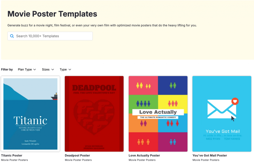
1. Venngage
Venngage is an online design platform with ready-made poster templates, brand kits and an AI-powered movie poster generator.
You can start with one of the movie poster templates and customize the layout, colors, type and imagery. The built-in grids help you structure your movie poster layout with clear top, middle, and bottom zones.
Venngage Movie Poster Maker works well for one-sheet movie poster size formats like 24 × 36 inches and digital vertical layouts. You can duplicate designs for teaser movie poster versions without rebuilding from scratch.
The AI movie poster generator is useful for early concept exploration. You can draft visual directions fast, then refine hierarchy and typography manually.
There’s a risk of designs looking “template-y” if you don’t adjust fonts, spacing, and imagery. The fix is simple. Swap stock visuals, limit typefaces, and refine alignment.
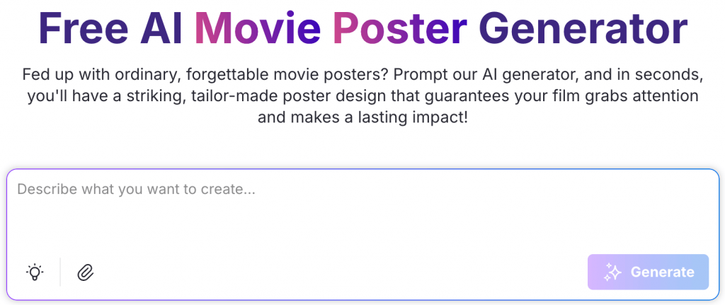
If you want a quick headstart and save time, you can also try Venngage’s free AI Movie Poster Generator.
Pricing: Free plan available. Paid plans start at $19 per user per month.
2. Google Slides or PowerPoint
Both Google Slides and PowerPoint are presentation tools. Most students and corporate teams already have access to either one of them.
Both tools allow custom slide sizes. You can set movie poster dimensions like 24 × 36 inches and design vertically.
They support text styling, image placement, background fills and simple layering. You can build a clean movie poster layout with basic alignment guides. They’re solid for school projects and internal mockups.
However, they’re not built for advanced compositing. Complex lighting effects, detailed masking or high-end texture work will feel limiting.
Billing block typography also requires manual spacing, since there’s no built-in movie poster credits template.
If you want step-by-step guidance, check out our detailed tutorials on how to make a poster in Google Slides and how to make a poster in PowerPoint.
Pricing: Google Slides is free with a Google account. PowerPoint is included with Microsoft 365 subscriptions.
3. Photoshop or Affinity Photo
Photoshop and Affinity Photo are professional graphics editors. They’re built for image manipulation, compositing, and high-resolution print work.
If you’re learning how to make a movie poster in Photoshop, you’ll have full control over lighting, blending modes, masking, textures, and typography. You can create cinematic depth through layered compositing and controlled color grading.
These tools handle large one-sheet movie poster size files at 300 DPI with precision. They’re ideal for theatrical-quality outputs and detailed billing block typography.
The trade-off is complexity. There’s a learning curve. Beginners often struggle with layers, masking, and export settings for print.
Affinity Photo offers similar capabilities at a lower one-time cost. Photoshop integrates deeply with other Adobe tools.
Pricing: Photoshop starts at $20.99 per month as part of Adobe Creative Cloud. Affinity Photo is a one-time purchase, typically around $70.
Step-by-step: Make a movie poster using a template
A good thing about using design tools is that you don’t always have to start from a blank canvas.
A poster template saves time and gives you a headstart. And using a template is often a lifesaver, no matter if you’re just learning how to make a movie poster in Canva or are a Photoshop pro.
Let’s go through the step-by-step process to understand how to make a movie poster using a template.
Step 1: Set the right size
The most common movie poster mistake starts when you pick the wrong canvas dimension.
If you’re creating a theatrical-style one-sheet, the traditional one-sheet movie poster size is 27 × 41 inches. Many designers use 24 × 36 inches because printers widely support it.
Those are standard movie poster dimensions for print.
If your poster lives online, design a vertical master first. Then export square and landscape crops for social or streaming thumbnails.
Set dimensions before adding anything, because resizing later breaks layouts and ruins image quality.
Step 2: Choose a template that matches your genre
Don’t just pick the coolest template. Pick the one that matches your film’s tone.
If you’re exploring genre movie poster ideas:
- Horror leans dark and minimal.
- Rom-coms feel bright and open.
- Thrillers often center on one intense focal point.
Filter templates by mood. With Venngage movie poster templates, you can filter them by free or paid, size or accessibility.
Avoid over-designed layouts with too many shapes, textures and font styles. Let the main art in the poster lead instead of making it compete with other elements.
Similarly, if you’re using an AI movie poster generator for concept art, use it to generate visual ideas first, then refine the layout manually for structure and polish.
Step 3: Build a clear visual hierarchy
Visual hierarchy is where most posters win or lose. Your movie poster layout should follow this order:
Focal point → Title → Supporting info.
The eye must land on the main image first, then move to the title, then read the movie poster tagline, names and date.
Use a simple grid or rule of thirds (we’ll discuss this in detail later) to align elements. Centered layouts work well for drama. Off-center compositions work for action or psychological tension.
If someone asks what a movie poster should contain, hierarchy is the hidden answer. The 7 elements checklist only works when the order is clear.
If you want to strengthen your layout and visual decisions, I highly recommend you read our guide on the 13 design principles.
Step 4: Add title + tagline
The title carries a lot of weight in movie posters.
Avoid thin fonts and low contrast. If your background is busy, add a subtle dark overlay behind the type.
Run the thumbnail test, i.e., shrink your design to phone size. If you can’t read the title instantly, fix it.
Also, place your movie poster tagline either above the title or near the focal point. Keep it limited to five to ten words. You don’t have to offer a summary.
This single step fixes many common movie poster mistakes.
Step 5: Add names, date, logos
Next, let’s build structure into your poster.
- Top: Lead cast names, if needed. Keep it clean and evenly spaced.
- Middle: Key art and title. This is your visual engine.
- Bottom: Release date, logos and billing block.
The billing block, a.k.a the “credits,” is a block of text at the bottom of a poster. It includes producers, writers, director, production companies and other key credits.
It’s standard on most one-sheets. You can use a movie poster credits template to save time. But make sure to keep it small, aligned and condensed.
Teaser movie posters often skip the billing block. That choice to keep it or not depends on your goal.
Step 6: Export correctly
We are done with designing the poster. Now, let’s talk about not ruining it at export.
- For web: Export as PNG or high-quality JPG, test on your phone, check readability and cropping.
- For print: Export as PDF Print if possible. Use 300 DPI. If your printer asks for bleed, make your background slightly bigger than the final poster size so there are no white edges after it’s trimmed.
If you’re wondering how to print a movie poster, ask the print shop what file size and format they need before you export.
Try the 3-second test
Can someone identify the genre and read the title in three seconds?
If yes, you’re close. If no, simplify.
That one question captures what makes a movie poster work better than any checklist.
Movie poster must-haves: What to include (and what to leave out)
If you’re still wondering what should a movie poster contain, here is a quick guide.
1. Essential elements checklist
These are the core components you’ll see on most one-sheet movie posters. However, not every poster needs all of them.
Title
Your title is the anchor. It should be readable at thumbnail size and strong enough to stand alone. Most movie poster layout decisions revolve around this one element.
Key art, photo or illustration
This is your focal point. One strong image beats five average ones. The image should communicate tone before anyone reads a word.
Tagline
A short movie poster tagline adds intrigue. Keep it tight, up to ten words max. Don’t give the plot summary. The tagline should amplify the concept, not explain it.
Cast names
Many posters treat this as optional, but recognizable names add credibility and attract attention. Lead actors often appear at the top. For student films or indie projects, this might be useless.
Director nameThis is similar to mentioning the case name. Highlight the director’s name if they are established and well-known. If they don’t have a brand recall, you have one less thing to worry about in your poster hierarchy.
Release dateThe movie release date, or “coming soon,” is often your movie poster’s call to action. Even teaser movie posters often include a date or season. Without it, the poster feels incomplete.
Logos (If applicable)
Production companies, distributors, or festival marks go at the bottom. Keep them small and aligned.
- CreditsMost theatrical one-sheets include a billing block. It signals professionalism and helps your design look “real” instead of like a school assignment.
2. Billing block basics
Place this at the bottom of your poster. Keep it centered or aligned to a grid. Use condensed type, but make sure it’s legible.
Just don’t stretch or distort the text unnecessarily or scatter credits all over the place.
A clean movie poster credits template can save time here. It keeps spacing consistent and avoids common movie poster mistakes like uneven alignment or missing roles.
3. What NOT to include
Some elements instantly make a poster look amateur. Avoid these at all costs:
Plot summary paragraphs
A poster is not a synopsis page. Long blocks of text kill visual impact. Curiosity beats explanation.
Too many fonts or colors
Limit yourself to one or two typefaces. Choose a tight color palette. Visual noise weakens authority.
Low-resolution imagery
Blurry screenshots ruin credibility. Start high-res, especially if you plan to learn how to print a movie poster later.
ClutterLeave room for white space when possible. Every element needs breathing room. If everything screams for attention, nothing wins.
Fake laurelsNever add awards you did not earn. And avoid including incorrect credits. Inaccurate billing block information damages trust immediately.
Make it look “cinematic”: 6 design rules pros use
Designing a cinematic poster demands good judgment and structure and the strongest ones always follow a few clear rules.
Here’s what separates a cinematic poster from something that feels like a template:
1. Genre signaling
Your poster should communicate the genre before anyone reads the title.
Color does most of the work. Horror leans into deep blacks, desaturated blues and sharp contrast. Rom-coms favor soft pinks, warm tones, and airy lighting. Sci-fi often uses neon accents against dark space.
Type matters too. For instances, a condensed sans serif feels modern and tense while a serif font can signal drama or period storytelling.
Composition seals it. Off-center framing builds tension. Centered symmetry feels controlled and serious.
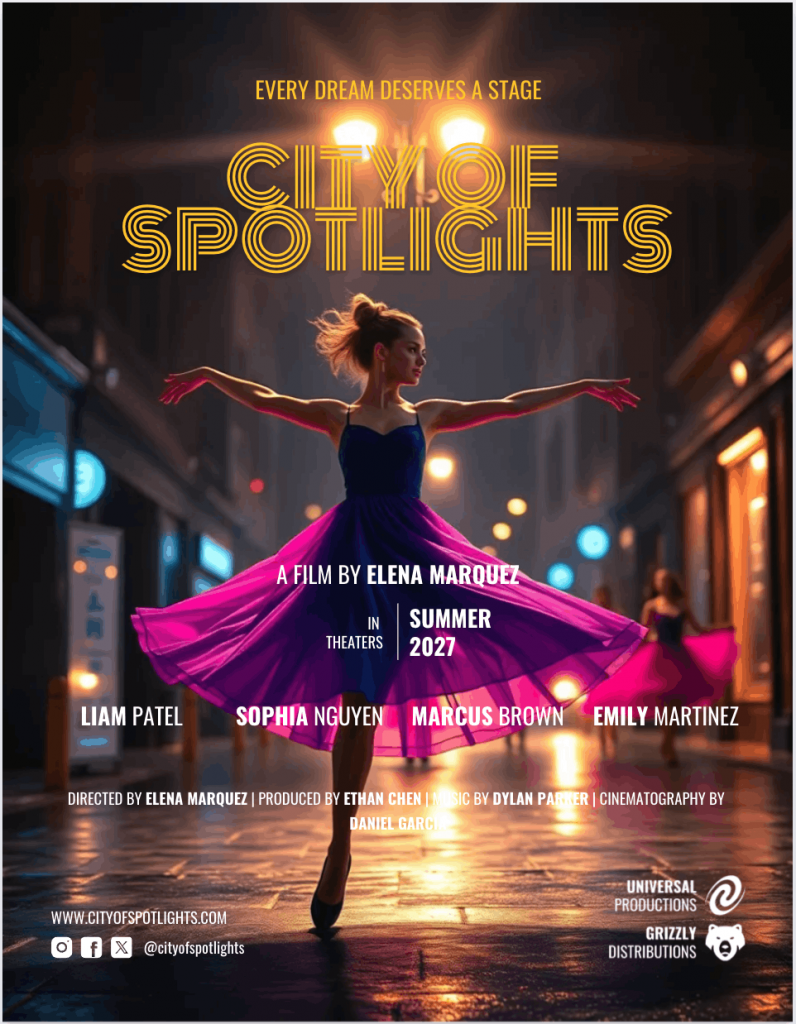
If viewers cannot tell the genre instantly, your design is confused. Here’s an example of a movie poster I created with an AI prompt. Easy to guess the genre right away, isn’t it?
2. Contrast
Contrast creates drama, and drama feels cinematic.
You need contrast in three places: light versus dark, large versus small and bold versus subtle.
Lighting consistency matters. If your subject is lit from the left, shadows should agree. Mismatched lighting is one of the most common movie poster mistakes I see.
High contrast behind your title improves readability. Soft gradients or overlays can separate text from busy backgrounds without looking heavy.
Strong contrast gives your poster depth. Flat lighting makes it look cheap.
3. Limit typefaces
This is design principle 101. Use one typeface for the title. One supporting typeface for everything else. That’s it.
More fonts create visual noise and weaken hierarchy. They make your poster feel like a college flyer.
Even large studio films rarely use more than two families. They adjust weight, size, and spacing instead.
4. Use a grid
A grid is an invisible alignment structure. It keeps elements balanced.
The rule of thirds divides your canvas into a 3×3 layout. Placing your focal point on one of those intersections creates natural tension and flow.
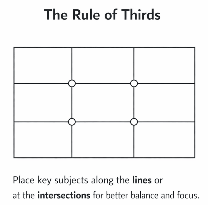
Most strong movie poster layouts follow some version of this structure. The eye moves predictably. The design feels intentional.
When elements float without alignment, the poster feels off. You may not know why. The viewer still senses it.
Turn on guides if your design tool offers them. That will allow you to align titles, logos and billing blocks cleanly.
5. Use negative space
Negative space is empty space used on purpose.
It gives your design breathing room. It also makes it feel premium.
Look at minimalist posters like 127 Hours. The designer uses negative space to form an hourglass shape, indicating the passage of time and the isolation at the center of the story.
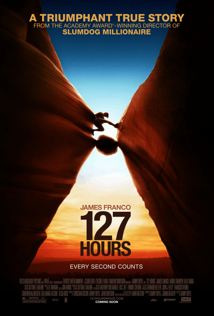
Crowded posters feel desperate. Space signals confidence.
Remove at least one unnecessary element from your layout, then reassess it. Most posters improve immediately.
6. Use the thumbnail test
Most posters are first seen small. Streaming platforms, social feeds, and mobile screens shrink everything.
Create a repeatable workflow:
- Zoom out until your poster is the size of a phone thumbnail.
- Ask: Can you read the title?
- Ask: Is the genre clear?
- Ask: Is there one obvious focal point?
If the answer is no, simplify.
For a deeper breakdown of optimizing small-format visuals, read our guide on how to optimize thumbnails to boost your search presence.
Genre cheat sheet
Here are quick recipes to shape your poster fast without second-guessing every choice.
1. Horror
Palette: Deep blacks, desaturated blues, muted greens, sharp shadows.
Type vibe: Condensed sans serif or distressed serif. Tight spacing feels tense.
Composition cue: Isolate one subject. Use darkness to swallow the frame.
Tagline tone: Ominous. Minimal. “You’re not alone.”
Negative space works hard here. Let the dark areas breathe.
2. Rom-com
Palette: Warm pinks, soft reds, light blues, bright neutrals.
Type vibe: Clean sans serif or playful script for accents. Nothing heavy.
Composition cue: Two characters centered or facing each other. Light, open framing.
Tagline tone: Playful or ironic. “Love wasn’t in the plan.”
Keep lighting bright and inviting. Avoid harsh contrast.
3. Sci-fi
Palette: Neon blues, purples, high-contrast blacks, metallic tones.
Type vibe: Geometric sans serif. Wide tracking. Futuristic feel.
Composition cue: Strong central object. Planet, ship, or lone figure against scale.
Tagline tone: Philosophical or epic. “Beyond the edge of humanity.”
Add subtle glow or atmospheric depth for scale.
4. Action/Thriller
Palette: High contrast. Orange and teal combinations are common.
Type vibe: Bold sans serif. Heavyweight. Tight kerning.
Composition cue: Dynamic angle. Motion implied. Off-center framing builds urgency.
Tagline tone: Direct and punchy. “No way out.”
Energy comes from diagonals and tension in posture.
5. Drama/Indie
Palette: Muted earth tones. Natural light. Subtle color grading.
Type vibe: Elegant serif or understated sans serif. Nothing flashy.
Composition cue: Intimate framing. Close-up or quiet environment.
Tagline tone: Reflective. Human. “Every choice leaves a mark.”
Simplicity wins here. One subject. Clean space. Emotional focus.
Common movie poster mistakes (and how to fix them)
Most bad posters fail for the same five reasons. Here’s how to spot them and correct them quickly.
1. Unreadable title
If your title is hard to read, it doesn’t matter how great your poster design is. Viewers decide in seconds. A weak title kills attention and fails the thumbnail test.
This usually happens because the background is too busy or the font is too thin.
Fix: Add contrast behind the title or increase the title’s weight. Use a subtle dark overlay or gradient. Simplify the background near the text. Clarity beats decoration every time.
2. Too many elements
When everything is loud, nothing is important. Extra textures, five taglines, oversized logos and floating shapes. They fight each other.
A cluttered movie poster layout confuses the eye. It also makes your design look amateur.
Fix: Remove 30 percent of what you added, then review the visual again. Make sure it has just one focal point and one clear title. Add supporting details only where needed.
3. Looks generic
This happens when you rely too heavily on a default movie poster template, stock photos, default fonts and/or predictable color grading.
The result feels replaceable. It lacks identity.
Fix: Choose the fonts to match the movie’s message. Adjust the color palette. Stock imagery is a big no-no in movie posters. Instead, add subtle texture or film grain for depth. Small custom touches make a big difference.
4. Bad cutouts
Rough edges around subjects break the illusion instantly. Lighting mismatch makes it worse. Poor masking is one of the most common movie poster mistakes in beginner designs.
Fix: Soften edges slightly. Match shadows and highlights to the background light source. Add a subtle shadow beneath the subject to anchor it.
5. Credits chaos
If your poster has misaligned text, random font sizes and uneven spacing, the bottom of the poster often looks messy.
It’s not fair for the billing block to look chaotic.
Fix: Use a proper billing block template. Keep the type condensed and align it to your grid. Keep it centered or cleanly justified works well.
Printing and paper
If your poster is meant for a wall, print decisions matter as much as design.
Matte vs glossy
Matte paper reduces glare. It feels subtle and refined. It works well for drama, indie films and darker compositions where reflections could hide detail.
Glossy paper boosts contrast and saturation because it allows colors to pop more prominently. Action, sci-fi and high-energy designs often benefit from that shine.
If your poster has deep blacks and moody lighting, matte usually preserves detail better under room light.
Ask your print shop for a small test print before committing.
Paper weight basics + Common sizes
Paper weight affects durability and feel. Lightweight paper bends easily and feels closer to a flyer. Heavier stock feels premium and holds flat better on walls.
For most posters, printers recommend stock in the 170 to 250 GSM range. That balance gives strength without feeling like cardboard.
As for size, 24 × 36 inches is widely supported by online and local vendors. It’s also easier to frame. The traditional one-sheet movie poster size is 27 × 41 inches, but not every printer offers it standard.
Before exporting, confirm exact movie poster dimensions, bleed requirements, and file format. It saves reprints and frustration.
Using AI to make a movie poster
AI can speed up your early thinking. However, it should not replace your design judgment.
Best uses
Use AI for mood boards and visual exploration. Generate multiple concept directions in minutes. Test lighting styles. Try different genre looks without committing hours.
It also works well for drafting movie poster tagline ideas. If you have the time and curiosity, you can ask the AI for ten short variations and refine the best one manually.
If you want a starting point, you can experiment with Venngage’s free AI movie poster generator. I already showed you the results that you can expect out of it earlier.
Watch-outs
AI images often contain subtle errors, such as extra fingers, warped typography or inconsistent lighting. These flaws break credibility fast.
Be careful with likeness and copyright issues. Do not generate images that copy real actors, characters or copyrighted properties without permission.
Resolution is another limitation. Many AI images are not print-ready at large movie poster dimensions. Upscaling can reduce clarity.
Always check DPI and final size before planning how to print a movie poster.
A smarter workflow
Here’s the balanced approach:
- Use AI for ideation.
- Select the strongest concept.
- Rebuild the layout manually in your design tool.
- Refine hierarchy, typography, and spacing with intention.
AI can help you think, but you still need to design.
Cinematic posters come from disciplined layout, strong type and careful alignment.
Quick final pre-publication checklist
Before you hit export or send it to print, pause. This is your last quality check. Strong posters usually pass this test in under a minute.
1. Title readable at thumbnail size
Ask yourself: Can you read the title without squinting? If not, increase contrast, adjust weight or simplify the background.
2. Genre reads instantly
Show it to someone for three seconds. Can they guess the genre without explanation? If they hesitate, your visual cues need tightening.
3. One clear focal point
Where does the eye land first? If you cannot answer that clearly, your hierarchy is weak. Eliminate distractions and improve contrast around your main subject.
4. Max two fonts
Count your typefaces. More than two usually means visual noise. Adjust weight and size instead of adding new fonts.
5. Clean alignment and spacing
Check your edges and margins. Are elements aligned to a grid? Is your billing block straight and evenly spaced? Small misalignments make designs look unfinished.
6. Correct names, credits, logos and date
Double-check spelling, verify roles and confirm release date. Incorrect billing block details or fake laurels damage trust fast.
7. Correct export size and format
For web, export high-quality PNG or JPG and test on your phone. For print, confirm movie poster dimensions, DPI, bleed, and file format with your printer. PDF Print at 300 DPI is standard for large formats.
Now build your poster
The next step is simple: pick a tool and create a poster today. Don’t aim for perfection. Instead, aim for clear genre, strong hierarchy and a readable title.
Run the thumbnail test and clean up the spacing. Fix one mistake at a time.
Creating a cinematic poster isn’t complex as long as you focus on clarity, hierarchy, and intentional design choices. Start with a template, apply the rules and refine until it feels intentional.


