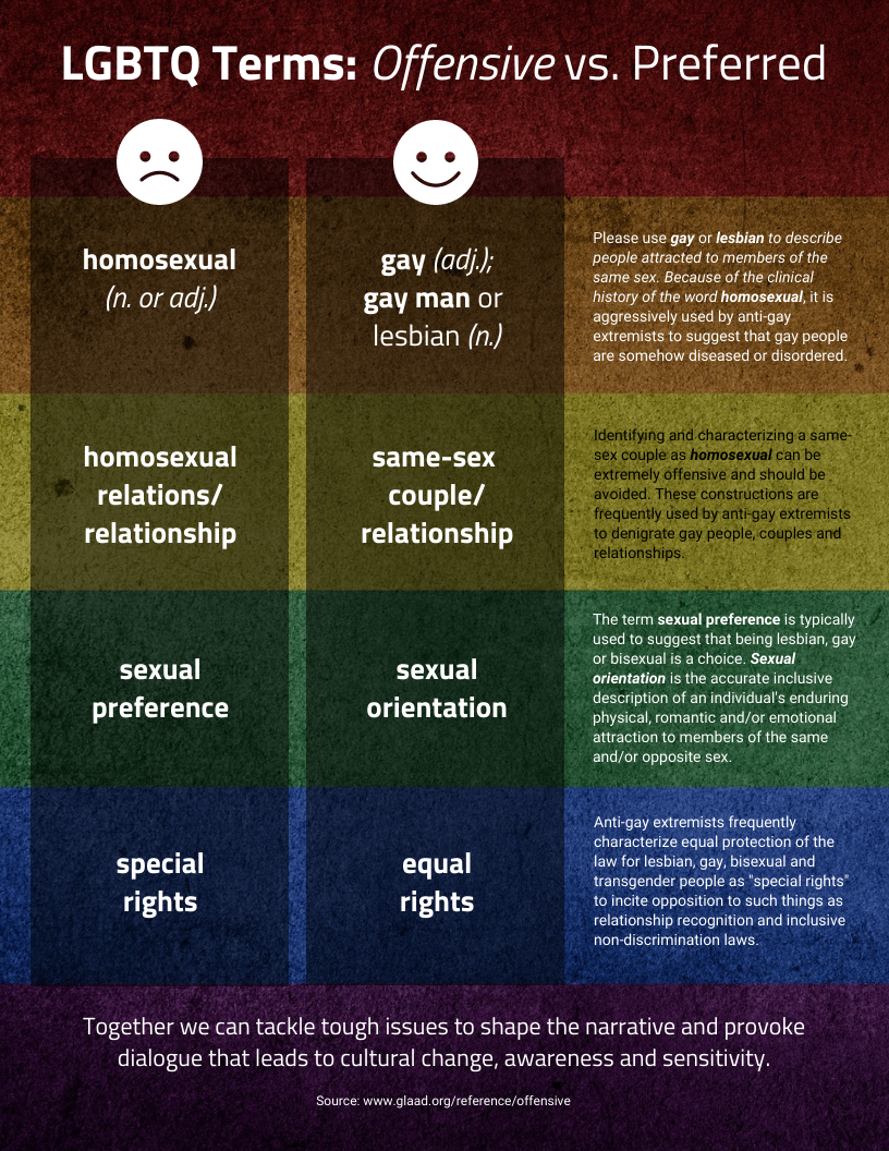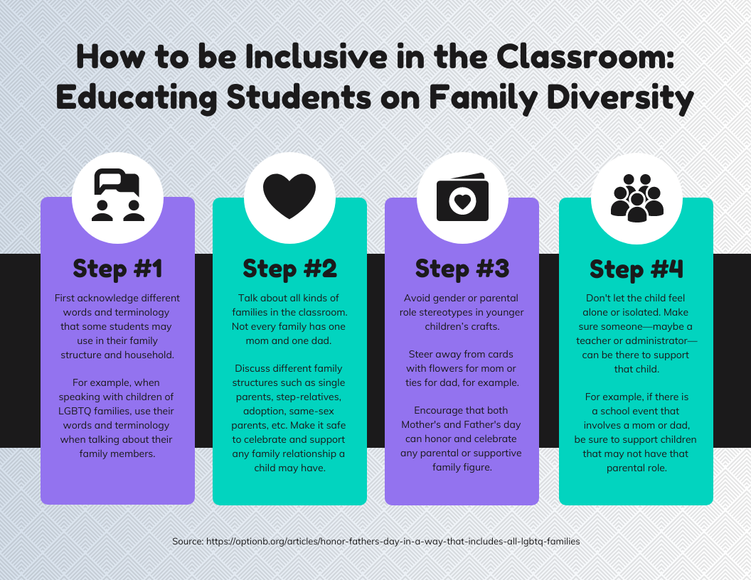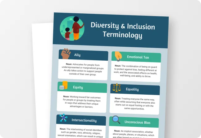
Happily, today more people than ever are paying attention to the importance of people experiencing fairness and justice. When it comes to information design, there are many things one can do to make a difference.
For the past decade or so, I have been working at the intersection of information design and DEIJ (diversity, equity, inclusion, and justice) as a professional designer. I am a White, able-bodied, cis-gendered female living in the U.S. who follows diverse leaders in the field, some of whom will be quoted in this article.
Regardless of your own identities, and whether you consider yourself to be a designer or not, there are practical things you can do starting today to help create some cultural shifts toward diversity, equity and inclusion.
Table of Contents:
- Why diversity and inclusion is important in information design
- Questions to ask yourself when it comes to diversity and inclusion
- Designing for diversity: 8 best practices for infographics
- Inclusive templates you can create now
Why diversity and inclusion is important in information design
If you are creating presentations, reports, or other materials to help you communicate inside your organization, taking diversity, inclusion and equity into account can help you better express care and concern for all of your team mates and increase trust, collaboration and even innovation.
If you are creating newsletters, social media graphics, or other visuals to help you connect with customers and clients, keep in mind that they are paying attention to how businesses and organizations are demonstrating care and concern about fairness and justice.
Because visuals are critical for communication, when designs value, reflect, and include all types of people they help us go beyond good intentions to creating positive impact. When teams and professions in general are diverse, including the design profession, they are more likely to consider using inclusive design practices to ensure all people feel valued and respected (and these teams are more innovative, according to Harvard Business Review).
When our designs include information and data, there are additional ethical considerations to keep in mind, and there are additional opportunities for us to contribute to a shift toward our collective good.
Data can be collected and/or shared in ways that create harm. For example, maps have been used to enforce segregation and deny families of color access to housing and economic opportunities (this is known as redlining). Data can also be collected and shared in ways that make inequities more visible and motivate changes. For example, data has been used to track hate crimes, healthcare disparities, and much more.
Determining whether harms happen intentionally or unintentionally is not as important as committing ourselves to considering the impact of our own design decisions. While there’s some things we may not feel certain we can do, like transform public policies, we can always do our part to mitigate harms and create new possibilities. Paying attention to what we are creating and sharing is a great place to have significant impact.
Questions to ask yourself when it comes to diversity and inclusion
1. Am I using diversity, equity and inclusion correctly?
First, let’s clarify that I’ve been using words like “diversity,” “equity,” and “inclusion,” and while these words are often used interchangeably or in tandem with one another, they have very different and distinct meanings.
Diversity is about making sure all people are represented. People themselves are not diverse, but teams, businesses, neighborhoods, etc. should be. There are many types of diversity, including race, ethnicity, gender identity, sexual orientation, socioeconomic status, language, culture, national origin, religion, age, ability, family composition, body type, and political perspective. Some of these social locations are visible, while others are not.
Inclusion is about more than demographics, it’s about a sense of belonging. It takes effort to ensure that all people, regardless of their differences, feel valued. When it comes to design, we must work with the people we’re designing for, from our team members to our audiences, to understand what people need in order to feel included.
Equity is not about offering the same opportunities (that’s equality), it’s about paying attention to the outcomes of those opportunities. Because we are still living with systemic inequities, if we treating everyone the same, those inequities will persist. Equity is about acknowledging that people have different experiences and different needs. Some have more barriers to overcome, so we need to elevate them in order to create an equal playing field. This includes increasing accessibility for people with different abilities, be they situational (such as a broken arm) or diagnostic (such as dyslexia).
Now, taking all of these into account, we can identify a few things we need to ask ourselves when it comes to our designs.
2. Who is being excluded or disempowered? Who can be included and empowered?
Have you considered the experiences of people who are often left out and oppressed? Have you represented their stories, their ideas, and their bodies in your designs? For example, how are BIPOC (Black, Indigenous, People of Color) and LGBTQ+ people represented, if at all? Are you creating materials in all the languages your audiences prefer? Have you considered how people with cognitive or physical impairments will access and understand your designs?
Related: How to Create Accessible Designs (Templates + Tips)
If you are someone with a social location that is dominant in our culture (White, male, cisgendered, able bodied, middle to upper class, etc.), it is especially important to be mindful of power dynamics are portrayed and even perpetuated in your visual designs.
3. Have I considered my own biases and assumptions? Have I balanced the use of data and emotion?
We all have human brains which are prone to take mental shortcuts, and unfortunately these shortcuts can lead to significant errors in perception and judgment. Cognitive biases have profound social impacts, from racial profiling to political polarization. Visual designs are one of the major ways that stereotypes are perpetuated, so we need to be wary of where we are deliberately or inadvertently playing to them.
Working with data does not guarantee our objectivity. The way information is presented or framed is what matters, and we are all drawn to create the stories that best fit our preexisting beliefs. Stories can be powerful, especially because they elicit emotions. The best information designs put data into context, and it is the responsibility of the creator to make sure these stories are not creating harm. Considering view points that are different from or even conflict with our own can help us not only broaden our understanding, it can also help us share a more complete story with our audiences.
4. What might be the potential impacts of my design decisions? What impacts have already occurred that I can learn from?
The stories we tell through our information designs can have a bigger impact than we might imagine – we can affect a person’s safety, privacy, livelihood, health, and relationships. For example, we might frame systemic harms in ways that make them seem like they are individual failures, or we might discuss policies or practices that disproportionately affect or impact certain populations without mentioning that that is the case.
We may not always be able to see the harm ourselves, and if we do see it we might struggle with guilt or denial. This is why inclusive design practices are so invaluable – by allowing those who are different from us to inform our thinking and process from the start, we are more mindful of concerns going forward. At the very least, if someone offers us the incredible gift of being able to learn from our mistakes, we can do our best to repair and reengage.
Accessibility creates an equal opportunity for anyone to engage with your content. But sometimes we treat accessibility as an afterthought, rather than a priority. Venngage’s accessible design tool makes inclusivity an integral part of your design process — with accessibility testing and insights included in our editor. Helping you ensure your content is fully inclusive. No barriers and no one left behind.
Designing for diversity and inclusion: 8 best practices for infographics
When we know what matters, we can identify those practices that will help us continue to learn and grow as we practice designing infographics for diversity and inclusion.

1. Practice self awareness consistently
We will be hard pressed to do anything differently until we are aware of our own limitations. Biases operate unconsciously, so it doesn’t matter what we think consciously about ourselves (that is a bias in and of itself). There are about 175 known cognitive biases to date, and you can take some free online tests provided by Harvard to learn more about your own biases here.
What’s important is that we learn about ourselves, not to criticize nor rationalize, but so we can become more capable of spotting errors in our own thinking and decision-making. Our biases will make this even more difficult for us, because so many of them keep us from having to challenging ourselves. That’s why it’s best to think of this as an ongoing practice, one that is more important than any of the others listed here.
2. Learn from those who are different from you and acknowledge them
Our biases will also incline us to limit the people we interact with to those who are similar to us. It takes effort to connect with those different than us, but investing in building these relationships will have the strongest impact on our decision-making process.
To do so, we need to deeply appreciate differences and understand that our diversity is our strength. We will need to learn how to ask for feedback, demonstrate we are listening, and do things differently because of what we heard. It’s very important to publicly acknowledge, and if possible compensate them for, their contributions to our work!
The earlier we can ask for input in our design process, the better. If we wait, it might become more difficult to make changes (best case scenario) or there may be harm caused to people (worst case scenario).
Pro Tip: Want to see how your website looks to an audience with color blindness and other visual impairments? Create accessible designs your whole audience can appreciate with Venngage’s Color Blind Simulator.
3. Double-check your data
The ways that data is collected, analyzed, interpreted, and shared can also either reinforce existing inequities or attempt to reverse them. Data can be used to exacerbate racial bias, violate personal privacy, or justify harmful decision making.
If you are collecting information yourself, a lot of thought needs to go into things like appropriate methodology, collector behavior, cultural translation, and much more. Data collection often involves power imbalances, with the researcher acting as a person with control and the researched as a person being controlled. Something that may seem as innocuous as asking someone a simple question can elicit frustration or even despair if the question happens to be “What’s your ethnicity?” (Here’s some suggestions for rethinking that question and similar ones.)
If you are using data from a different source, investigate the dataset, looking especially for where, how, and with whom the data was collected. Determine whether the data you would like to use is open or not.
Here is an example of an infographic Venngage created using open/public data from the Human Rights Campaign. If you look into it, you can easily find that their data comes from surveys conducted by reputable organizations (some of their reports even include the actual questions asked, which is ideal.)
Public data can be more accessible, transparent and verifiable, but depending on the source, purpose, and context, it may or not be equitable in nature. Data that is not open may carry special privacy concerns and risks of harm, for example reports about HIV status, domestic violence, etc.
Since data sharing can involve significant privacy risks, it should not only be legal and ethical, but ideally also purposefully tied to improving outcomes for people who are oppressed. The impact of sharing data can disproportionately impact some people, and so can the impact of not sharing data that could help people understand or address an important problem.
If you are able to share data that helps illuminate inequities, that can be very powerful. You can check out this toolkit from the University of Pennsylvania’s Actionable Intelligence for Social Policy for more tips.
Again, the earlier you can involve people who will have a different perspective than you in a conversation around what data should be collected or used, the better. Working with data can be complicated and challenging, so put some people in your corner who can help you be wise about it.
4. Watch your language
Words like “underrepresented,” “underserved,” “marginalized,” “minority,” and “non-white” are deficit-based and belittling, and words/phrases like “Blacks” and “Hispanics,” “Latinx,” and even “People of Color” can be too reductive. The word “diverse” should also not be used to refer to people who are different from what might be considered “normal” or dominant.
As of this writing, the preference of the communities referenced is either “BIPOC” (Black, Indigenous, People of Color) or the actual names of the nationalities, ethnicities, or other specific identities that the referenced people themselves claim. Each of these as well as “White” should be capitalized too – here’s a style guide that can help you learn more.
Use them/they instead of he/him or she/her whenever possible. It’s easy, not confusing, and inclusive of the many gender identities people claim. Pay attention when referencing people with disabilities too.
If you can, help your audience not only know better but also to do better by offering clear suggestions for what they can do to minimize inequities and oppression and lift up justice and liberation.
5. Pay attention to hierarchy
Visual hierarchy is a technique that designers use to structure and arrange elements in a way that allows audiences to quickly perceive how important each of them are. Social hierarchies on the other hand are implicit or explicit ways we perceive the importance of people. Often the former incidentally reflects the latter.
Pay close attention to whether certain people and experiences are being emphasized more. For example, if you are creating a graph that depicts demographics, list the people who are most relevant or impacted first in the accompanying legend, rather than the dominant group.
Here are two good examples. In the first, the dominant racial group (White) is not included at all, and in the second where it’s useful for comparison it’s listed last.
These sorts of subtle design decisions are often made unconsciously, but when you are careful you can be sure you are not reinforcing existing cultural messages.
6. Be careful with color
When it comes to color, there are several things to consider.
First, check whether the colors you are using are accessible for those with visual impairments. Avoid certain color combinations, such as red and green, green and brown, blue and purple and green and black, as they can be harder to distinguish for people wth color blindness. Our post linked below has more details.
Related:
- Color Blind Design Guidelines: How to Convey Meaning to Everyone [With Examples & Templates]
- How to Use Color Blind Friendly Palettes to Make Your Designs Accessible
- ADA Standards for Accessible Design: How to Be Compliant
Second, avoid “standard” patterns like pinks for women and blues for men.
Third, if you are in any way depicting race, don’t use colors associated with skin tones as these might trigger your audiences’ implicit biases. I suggest using a palette with blues and/or secondary colors (oranges, purples, and greens). Here is an example:
Also be aware of the cultural implications of colors, especially if your audience is multicultural. For example, in Chinese culture red signifies fortune, but in the Middle East it connotes evil and danger.
When you have your desired color palette, you can add it to your My Brand Kit in Venngage so your whole team can use it and apply it with one click to any of our templates.
Learn more about color theory and choosing color palettes in this video:
7. Use inclusive imagery
Infographics are highly visual, so it’s important to use photos, illustrations, and icons that help your audience connect with diverse experiences. Use images that represent diverse identities, but not in a way that enforces stereotypes. This includes people of different races, gender identities, abilities, body types, etc.
If you can, use icons that are gender-neutral (generally head and shoulder outlines) and with a variety of skin tones. Venngage has 10,000+ free icons in its in-editor icon library, with an incredible number of diverse illustrations (more than any other design tool).
These images should be used in all infographics, not only ones related to diversity and inclusion. Here is an example of a Father’s Day infographic that includes same sex parents.
The next infographic shows Black people in a variety of genders, ages, and professions. It is especially important to include images of BIPOC that disrupt social norms, such as in roles where they are typically the minority.
Here is another example of disrupting norms: only one body is shown and it is a body type that is not generally used in imagery.
The image above is also a good example of using imagery to accompany a data visualization in order to better connect the data with the lived experiences that the data is referencing.
Lastly, it’s important to not use symbols from or otherwise reference cultures without deeply understanding them first. This is known as cultural appropriation, the unacknowledged or inappropriate adoption of aesthetics of oppressed people by dominant groups. If you need to refer to a culture that is not your own, you can ask for feedback from people in that culture, and if you are unable to do that you can use abstract designs or photographs, like this example demonstrates:
8. Don’t forget other accessibility concerns
There are several more things you’ll want to think about to make sure your designs are accessible to people with varying abilities. For example, using large sans-serif fonts and avoiding patterned backgrounds and lengthy paragraphs of text.
Also consider what mediums you will share information through. Web-based animations will be less accessible to those without an internet connection, while lengthy print publications could be too costly for some people to purchase. You will need to weigh the options based on the aforementioned principles related to exclusion and impact.
Related: How to Create Accessible Infographics with Venngage
Templates you can use to design for diversity
Do you want to support others in creating diverse and inclusive environments and equitable outcomes for all? Venngage has a number of templates that you can use to help educate people about diversity and inclusion. Many are free; some are paid.
Feel free to download as-is or modify for your audience and share (free) or download (paid plans). It’s always free to sign up and start creating.
Summary: designing for diversity and inclusion means considering the impact of our design decisions
Just like you don’t need to be a professional designer to create infographics, you don’t need to master all these practices at once. Starting today, you can pause throughout your process to consider whether the data you are using and the designs you are creating fully value, reflect, and include all types of people.
Remember, it’s less important whether harms that happen are intentional or unintentional. What matters is that we commit ourselves to considering the impact of our own design decisions, that we do our best to do our part to mitigate harms and create new possibilities.
Want to create your own inclusive designs? Venngage has easy-to-customize templates and an online editor anyone can use. Get started for free today.


