


Recently, accessibility and inclusive design have become a crucial topic of discussion and concern. Accessible communication is now a must, and in doing so, learning and applying accessibility is crucial for everyone. When it comes to reports as well, accessibility plays a vital role.
Reports are essential for decision-making, strategy development, and compliance. However, if they aren’t accessible, they may exclude crucial insights from those who need them most. This means individuals with visual impairments may be unable to access these reports.
Creating accessible reports in accordance with accessibility guidelines is not only ethically important but also legally mandated in many regions. For example, in the United States of America, there is the U.S. Department of Justice – Americans with Disabilities Act (ADA) that prohibits discrimination against people with disability in everyday activities.
Whether you’re a business owner, legal professional, or a teacher, creating accessible reports is a crucial skill. So, how do you create reports that are inclusive and accessible? In this post, I will walk you through how to create an accessible report. To get started, check out our collection of accessible templates where you can easily create an accessible report for your audience.
Click to jump ahead:
- What is an accessible report?
- Importance of accessibility
- Why make your report accessible?
- Things to consider when making an accessible report
- Steps to make an accessible report in Venngage
What is an Accessible Report?
An accessible report is a document designed so that everyone, including people with disabilities, can easily read and understand it. Think of it as a party invitation that’s not just in English—it’s also available in sign language, braille, and any other language your guests might need. Accessibility ensures that individuals with disabilities can participate fully.
While creating digital reports can solve some communication issues, it doesn’t guarantee compliance with digital accessibility standards like WCAG (Web Content Accessibility Guidelines).
Some common barriers that can exist in a non-accessible report include:
- Images without alt text: Without alt text, images become inaccessible to people using screen readers, leaving them without important visual information.
- Poor color contrast: Low contrast between text and background can make content hard to read, especially for individuals with visual impairments or color blindness.
- Inconsistent heading structure: Disorganized or missing headings can make it difficult for screen readers to navigate the report, leading to confusion and frustration.
- Complex language: Using overly complicated language can create barriers for people with cognitive disabilities or those who are not fluent in the language.
- Inaccessible charts and graphs: Charts and graphs without clear labels or descriptions can be challenging for people with visual impairments to interpret.
- Lack of keyboard navigation: Reports that rely solely on mouse input can exclude individuals who use keyboard navigation or assistive devices.
- Unlabeled forms or buttons: Interactive elements like forms or buttons without clear labels can make it impossible for screen readers to convey their purpose to users.
- Missing or inadequate captions for multimedia: Videos or audio content without captions or transcripts can exclude those who are deaf or hard of hearing from the information presented.
Importance of accessibility
Accessible reports make your content available to everyone, regardless of their abilities. This approach not only fulfills legal obligations but also promotes better communication, enhances user experience, and broadens the reach of your content.
Accessibility is important for many reasons. Let’s look at some of them.
Inclusive access
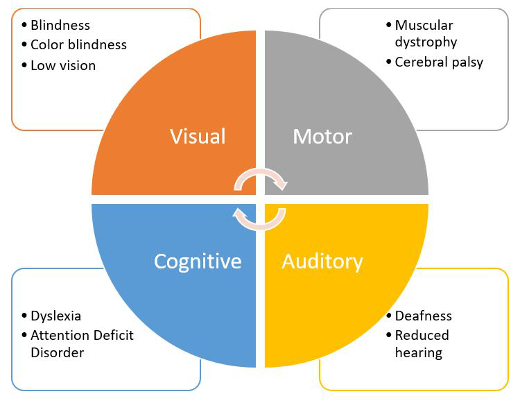
Creating accessible reports ensures that individuals with visual, auditory, motor, or cognitive impairments can access and understand the content of your report.
This inclusion is vital in a world where digital information is a key driver of decision-making, education, and communication. Therefore, digital accessibility is a concern that should not be taken lightly. When reports are accessible, they can be used by everyone, ensuring that no one is left out due to their disabilities.
For people with color blindness, identifying colors pose a problem and they might misinterpret reports and data. This visual explains color blindness better.
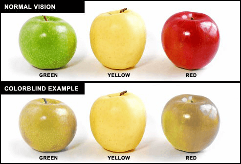
Also note that there’s different types of color blindness, so the distortion of colors will vary depending on the exact type of color blindness they have. Here’s a visual that shows the types of color blindness for reference:

Some people are not color blind, but still cannot see properly. Consider someone with an impairment like low vision. Without accessibility features like screen reader compatibility, they might struggle to understand a report is a visual content. People like these rely on alt text (I’ll explain this much later in the article, so read on).

Similarly, individuals with hearing impairments may miss out on important information if videos or audio content within a report lacks captions or transcripts.
In 2019, Fox News Network was sued for not having closed captions in their online videos, making it difficult for people with disabilities to understand the news. As a business owner therefore, you owe it to your audience, customers and the community at large to enforce accessibility in your content.
Our Accessible PDF Maker is a great tool for creating accessible reports. There are other resources and tools provided by the Website Accessibility In Mind (WebAIM) that can help you as well.
Breaking barriers
One of the most significant benefits of creating accessible reports is that it breaks down barriers that can prevent people from fully engaging with your report. Non-accessible reports often present challenges that exclude certain users. These barriers can take many forms, including images without descriptions (alt text), poor color contrast, or complex layouts that are difficult to navigate.
For example, poor color contrast can distort the understanding of a report to someone with low vision as shown in the visual below:
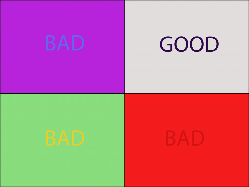
Our visual capacity and lights determine how we perceive color. Poor color contrast (that is the difference between different color hues) can make text hard to read, especially for users with visual impairments or color blindness. This can ultimately lead to frustration, misunderstanding and even feelings of inequality.
For those without visual impairments, these issues may go unnoticed. But, images without alt text are invisible to users who rely on screen readers. They can miss out on the context or information conveyed by the images, leading to an incomplete or totally different understanding of the report.

Additionally, a report without proper headings or one that has complex layouts can confuse users with cognitive disabilities or those using assistive technologies. making it hard for them to navigate and comprehend the content. Proper heading structure allows assistive technologies to scan your report and highlight key information for readers.
By addressing these issues, you eliminate barriers to understanding, making your reports both accessible and user-friendly.
Why make your report accessible?
When creating a report, accessibility might not be the first thing that comes to mind, but it should be a top priority. Accessibility in your report goes beyond meeting requirements; it ensures everyone, regardless of abilities, can understand and use the information.
No matter the purpose or audience of your report, accessibility is essential. In this section, I’ll show you compelling reasons why making your report accessible is crucial for effective communication and inclusivity.
Legal and compliance
Beyond profit as an organization or a business owner, you want to avoid lawsuits in every way you can. One lawsuit you can avoid for you and your business is the accessibility lawsuit. Infact, the Americans with Disability Act report in 2023 suggests that smaller companies that generate less than $25million annually face 73% of accessibility lawsuits. Therefore, to mitigate legal risks, small and large businesses are advised to ensure their websites comply with accessibility regulations.
Start by considering the laws and regulations regarding accessibility and digital content, including reports, in your region or country. Some of these laws include the Web Content Accessibility Guidelines (WCAG) and the Americans with Disabilities Act (ADA). Depending on the country you’re based in, the country you’re creating reports for, these laws may vary, but they’re almost similar. This way, you get a clear understanding of what is required of you to champion accessibility in your reports.
Also, meeting these required standards ultimately helps you avoid legal risks, ensures that your report is compliant and mitigates against the possibility of lawsuits or complaints related to inaccessible reports.
Ethical responsibility
Let’s consider a scenario where a report is being presented to the board of management of a company, but one of the board members is hard of hearing. In that moment, that person will feel left out of the presentation, and sometimes, feel discriminated against.
Inclusivity basically means actively ensuring that all individuals, regardless of their background, abilities, or circumstances, have equal access to information and opportunities. Inclusion and accessibility is an ethical responsibility that everyone has. Inclusion and accessibility help foster a diverse and dynamic workplace where everyone feels seen, valued and respected.
By prioritizing inclusivity, on a larger scale, you contribute to a more equitable society. This involves recognizing and addressing systemic barriers that prevent certain groups from accessing information or opportunities, thereby promoting fairness and equality.
Business benefits
Accessibility and inclusivity positions you for more customers. It’s like putting your best foot forward when your customers interact with you and your content.
When your report is accessible and inclusive, you break barriers with your audience, especially people who have been excluded. This not only broadens your reach to more readers and stakeholders but also opens new markets and business opportunities. A report with an accessible design ultimately builds an image of responsibility and inclusiveness.
When your audience knows they can trust your report to include them regardless of their disability, their experience is better. When your reports are designed with accessibility in mind, it generally becomes easier for everyone to use, improving usability and boosts engagement. This can lead to higher user satisfaction, longer engagement times, and better overall interaction with your reports.
Things to consider when making an accessible report
When creating a report that is accessible, some things are non-negotiable. There are elements, including text and fonts, color contrast, alt text for images, document structure, tables, and links that can make or break accessibility for your report.
Each of these components plays a vital role in making the report user-friendly and accessible to everyone, particularly those using assistive technologies like screen readers. This way, you can keep accessibility challenges at bay. Let’s look them in detail:
Text and fonts
Have you ever struggled with reading a document because the fonts are too small or you can’t tell which is the heading or the body of the document? That can be pretty frustrating as a user.
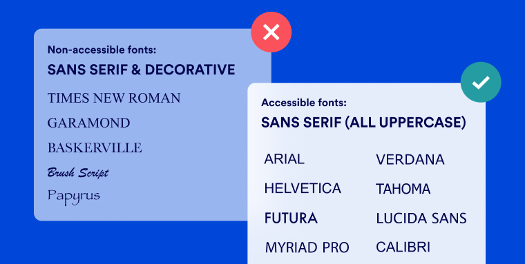
As a forward thinking HR professional or business owner who is accessibility minded, when creating an accessible report, using an accessible font like Arial or Verdana is advisable. You want your report to be clear and easy-to-read.
These sans-serif fonts are widely recognized for their simplicity and legibility, which helps all users, especially those with visual impairments, to read the text without difficulty. So use fonts that are easy to see, read and understand.
In the same vein, Ensure the font size is large enough to be easily read by all users. Ensure adequate font size (at least 12pt) for readability. Although for other headings, the font size is different. This is to help with readability, especially for screen readers.
Color contrast
Colors can be used to literally do anything, from making purchasing decisions, to investments, and even down to what to eat. Colors play a vital role in our lives as individuals, and even as a company – branding!
How do you use colors to your advantage and position your message or report data in such a way that it is appealing to your audience? First, provide sufficient contrast in your reports. Maintaining a high contrast ratio between text and background colors for your report is very important for visual clarity. It helps to identify and differentiate words from backgrounds.
According to WCAG standards, the ideal contrast ratio between text and its background should be at least 4.5:1 for standard text and 3:1 for large text. You don’t want your audience to struggle or fiddle with your report before grasping the needed information because the colors are not letting them see it.
Create for people with color blindness in mind. Asides from using accessible colors, you can pass your message across and present your data in a report using patterns. In your graph or charts, for example, you can use different patterns in addition to colors to emphasize difference. This report highlights how color contrast can boost your report for accessibility:

Alt text for images
Have you considered people who cannot properly see images? How do you include them in your report and ensure they are not left behind? One of the ways to ensure this is through alt texts. Alt text, or alternative text, is a brief description added to images in HTML or other web content.
You know Beyonce? Of course you do! Do you know that in 2019, her company, Parkwood Entertainment’s website, was sued for violating the Americans with Disabilities Act (ADA)? The website did not have alt texts on images, accessible drop down menus and keyboard access. This goes to tell you how vital accessibility is, even in the entertainment industry.
Alt text explains what an image shows and is mainly used to make content accessible for people using screen readers. The screen reader then reads the alt text aloud, helping visually impaired users understand the image’s content. In your report, add concise and accurate descriptions of images, charts, icons and graphs for screen reader users. This alt text should be descriptive and convey the content and purpose of the visual elements in your report.
Headings and structure
If you’ve struggled with locating the headings in a document piece or finding the exact information that you need, then you definitely understand why headings and structure are important.
Organizing your report logically will not only help you to capture important and essential information in a chronological order, it also helps your readers find, see and understand quickly. This makes it easy for screen readers to easily navigate through the report. Use headings (H1 for the main title, H2 for major sections, H3 for subsections, etc.) to organize your report in a clear, hierarchical manner. This improves the visual structure and makes the document easier to navigate.
Structuring your report or presentation properly helps screen reader users to navigate your report hitch free. They can quickly and easily find the information and data that they need without having to go through the entire document, saving them time and stress.
Related: 7 Tips on How to Make Accessible presentations
Tables
Asides reading long texts, people want to see your research or report presented in what can be easily and quickly digested. When designing tables, ensure they are straightforward and capture the needed data effectively. Use clear headers to show the relationships between rows and columns.
Properly mark up tables with HTML or document tags to identify headers and data cells. This enables screen readers to accurately interpret and convey the table’s information to users.
Links
Quick call to action can help your users that use screen readers also navigate through the document and find useful links for further research or reading. Use link text that clearly describes the destination or action. Instead of “click here,” use “Read the full report” or “Download the executive summary.” Descriptive link text helps all users, including those with screen readers, understand the link’s purpose without needing extra context.
To ensure your reports and presentations are accessible to all users, consider incorporating a PDF remediation checklist into your workflow. This checklist will guide you through essential steps to identify and fix accessibility issues, ensuring compliance with accessibility standards and enhancing the usability of your documents for everyone.
Steps to make an accessible report in Venngage
I have shown you what an accessible report is, why document accessibility is important and the barriers to creating them. Now, let me show you how you can create accessible reports, simple and easy.
Venngage stands out as a resource for creating accessible reports. Venngage’s tools come with built-in accessibility features, making it easy to create documents that meet accessibility standards without added effort.
Accessible report templates
One thing Venngage is known for is templates. Browse through and select from thousands of accessible templates to start creating your accessible document or report. Venngage’s templates are crafted with accessibility in mind, complying with best practices for layout, color contrast, and readability.
This provides a strong foundation for easily creating accessible reports without the hassle of crafting one from scratch. Our range of templates will help you comply with internationally recognized accessibility regulations including the Americans with Disabilities Act (ADA), Web Content Accessibility Guidelines (WCAG) 2.1, and Section 508.
Color contrast checker
If you’re unsure of the colors you have chosen for your report, Venngage is here to help. With a built-in color contrast checker, you can easily check to see what colors work best in your report to ensure it is accessible to all.

At the click of a button, you can tell if the selected colors in your report pass the accessibility test or not. Our color blind simulator also helps you know what colors work for people with color blindness.

Alt text
Alternative text (alt text) is an important pillar of accessible design, so it is essential that you include it in your report. Alt-texts in the Venngage editor are AI-powered. This means that the alt texts for the images, charts and graphs in your report are automatically and accurately generated, saving you time and energy.
To generate alt-text for your report, click on the non-decorative image and then Alt text. You can toggle the Generate button to get different alt text ideas.

A rule of thumb is to keep alt tags short, functional, informative, contextual and focused, and ensure that all the necessary information is captured in it.

Tags
Tags organize your report’s content in a way that assistive technology can interpret, making the report accessible to all readers. Proper tagging ensures everyone can access the information, which is one of the aims of accessibility and inclusion.
Tags help users with a screen reader to identify its structure by assigning content types to it. It basically means sectioning your report into parts so it is easier for the reader to identify and understand important parts in it. Document tags could be headings, paragraphs, lists or tables.
When creating accessible reports, manually tagging your report can take a lot of time and energy. Venngage’s Accessible PDF Design Tool can help you create intuitive, accessible PDF reports by reducing the time and effort needed for manual tagging.

With our free PDF accessibility checker tool, you can restructure the order of your tags or edit incorrect tags in a few clicks, as shown here:

Color simulator
With our built-in color simulator, you can see how your report looks to people with different visual impairments. Toggle between each one and see how you can make necessary adjustments to accommodate everyone in your report.
The color simulator covers these impairments: Protanopia, Deuteranopia, Tritanopia, Achromatopsia, Cataracts and Low Vision.

To get a hang of this, input the URL of the report you’re trying to create in our Color Blind Simulator to begin.
Venngage simplifies the process of creating accessible reports, saving you time and money by incorporating built-in accessibility features and eliminating the need for external services. With an intuitive interface, anyone can create professional, compliant and accessible reports.
Be compliant and start creating accessible reports effortlessly with Venngage
Accessibility and inclusivity is everyone’s responsibility. Creating accessible reports is key to ensuring that everyone, regardless of their abilities, can engage with your report. By emphasizing accessibility, you not only meet legal obligations but also create a more inclusive and socially responsible environment within your organization.
Creating accessible reports can seem like a daunting task at the beginning, but I can assure you that with Venngage, it’ll be a walk in the park. So, get started with the tools offered by Venngage today to begin your journey to creating accessible reports today!


