Did you know that January was named after Janus — the two-faced Roman god who possessed the power to look back in the past and look ahead to the future at the same time?
Much like Janus, the New Year presents a great opportunity for marketers like you and me to reflect on the successes (and challenges) of the past year while preparing for the emerging trends of the future.
In the world of marketing, the dual perspective is essential for staying ahead. What worked yesterday might not resonate tomorrow. The rise of new technologies, evolving audience preferences and industry shifts demand fresh approaches — especially in infographic design.
This blog will give you actionable insights into the world of infographic design in 2025, examples from leading brands and practical tips on how you can apply the trends to grow your brand.
For your ease of navigation, we have divided this report into two segments: trends from the past that will stay popular and new trends to watch for in 2025.
Infographic design trends from 2024 that are here to stay:
Trends to watch out for in 2025:
- Interactive storytelling
- SEO-friendly designs
- Micro-infographics for social media
- Subject matter visualizations
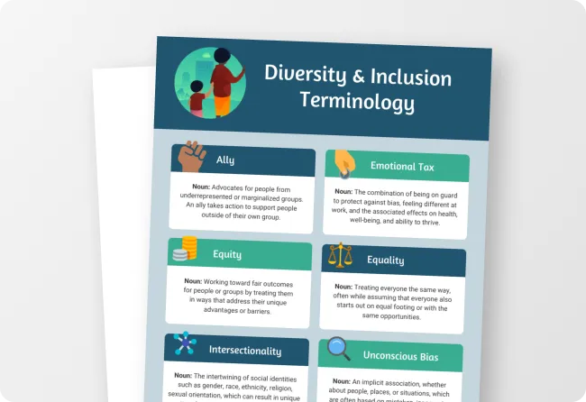
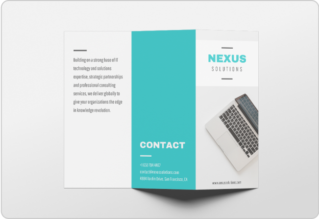
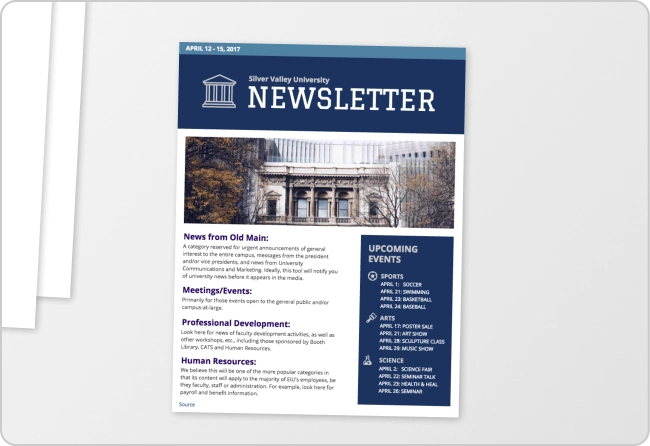
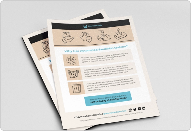
Here are the top infographic design trends for 2025 at a glance:

1. Bold typography
In 2024, we saw bold typography transform from a simple text element into a dynamic tool for storytelling and visual impact.
But bold typography doesn’t always mean size or weight. It’s a creative playground where text transforms into an artistic focal point. Over the last few years, the use of bold typography has emerged as a go-to design element that adds personality and impact to infographics and this trend shows no signs of fading.
From oversized styles and unconventional placements to dynamic spacing, bold typography demands attention. Imagine playful serifs mingling with sleek sans-serifs, infused with vibrant colors and textures that make the text leap off the screen.
A prime example is Visual Capitalist’s 2023 infographic on global currencies, where the headline uses supersized fonts to grab attention instantly.

Source: Visual Capitalist
To embrace this trend, choose fonts that reflect the tone of your message. Use fun handwritten fonts for lighthearted topics or sleek geometric ones for tech-centric themes. Create contrast with vivid colors and ensure that headlines guide readers through the content hierarchy.
For instance, this career infographic highlights keywords like “moving to NYC” with bold colors and font variations to make critical points stand out at first glance.

Typography also tells a story. Use a mix of styles, weights and sizes to create an information hierarchy. Highlight essential data points, emphasize headlines and use subheadings to provide direction. Infographics that balance clear icons, vibrant colors and strategic font use ensure your key messages are immediately understood.
2. Playful layouts
In 2024, the rigidity of traditional grid layouts gave way to playful, dynamic compositions and this creative shift continues to capture audiences in 2025. Adding an element of surprise with diagonal grids, unexpected angles or dynamic placements makes infographics more engaging and memorable.
Intentional disruption — not chaos — is the heart of playful layouts. Breaking the grid adds visual intrigue that keeps viewers exploring your design. For instance, this holiday-themed infographic with a layout shaped like a Christmas tree adds a whimsical touch while maintaining clarity.
Think of your infographic as a treasure hunt. By scattering data points throughout and guiding viewers with clear roadmaps, you transform passive consumption into an interactive experience.
MGL’s Sales Training Infographic is an excellent example, where icons and subheadings simplify complex data and keep readers engaged.

Unexpected layouts can also evoke humor or surprise. Jing Zhang’s recipe card designs showcase how creative structures can make content delightful and functional.

Spotify Wrapped graphics exemplify this trend beautifully. It combines animated infographics with playful layouts to create a highly shareable and personalized user experience. Recently, Google Photos followed suit with its Recap feature, offering users engaging animated memories that spark joy and nostalgia.
And by the way, talking about Wrapped, we at Venngage recently launched Travel Wrapped. It’s an AI tool that, when you sign up, will automatically turn your year of travel into a shareable infographic.

You just have to enter the names of the places you traveled to, your hometown and photos if you want to. The Traveled Wrapped will highlight destinations, total miles traveled and even fun stats like your most-visited cities. It’s a perfect way to turn your travel memories into visually stunning stories to share.
3. AI-generated infographics
AI tools made a significant impact in 2024, streamlining design processes and enhancing creativity and they continue to empower creators in 2025. However, AI isn’t here to replace your vision — it’s a collaborator that amplifies your creativity.
Experiment with AI-powered tools to generate infographic elements, customize charts and improve existing layouts. Venngage’s AI infographic maker, for instance, can turn raw data into engaging narratives. No design degree needed!
Here’s one I created using the generator:

Whether you are a design novice or a seasoned pro, these tools allow you to create visually stunning infographics without a design degree. Just remember to personalize and refine AI-generated elements to maintain consistency across all designs and keep your visual authentic.
While AI accelerates the design process, it’s crucial to maintain a human touch. Review all outputs for accuracy and clarity, ensuring they reflect your intended message. With AI as your assistant, the possibilities for creating captivating infographics are endless.
4. Accessibility for all
The push for inclusivity in 2024 brought accessibility to the forefront of infographic design and it remains a vital trend in 2025. Beyond just the look and feel of your infographics, it’s important to ensure your infographics are accessible to everyone — even those with vision impairments and disabilities.
Use high-contrast colors and easy-to-read typography to make content legible for everyone, like this visual here:

The CDC’s Flu Season infographic exemplifies these principles, combining vibrant colors, bold headings and large fonts to communicate critical information effectively.

Don’t forget to include alternative text for images and ensure interactive features work seamlessly for users with disabilities.
For added accessibility, make your infographics compatible with screen readers and provide downloadable formats. Use Venngage’s Accessibility Testing Tool to simplify this process. The tool offers features like built-in contrast checkers and WCAG compliance testing and lets you create designs that are inclusive for all readers.
Creating an accessible infographic? Here are some guidelines to help you pick accessible colors for your design:

The next section explores infographic and the latest AI and design trends to look out for in 2026 — ideas worth experimenting with to meet your marketing goals. Whether you are crafting an infographic for social media, paid ads or a data report, these ideas can help you stay ahead of the curve.
5. Interactive storytelling
Going by the infographic trends in recent years, infographics in 2025 are no longer going to be static visuals. We predict the infographics will offer a more immersive experience. For instance, they might incorporate clickable elements, embedded videos or dynamic data visualizations that transform the infographic into an interactive journey.
Imagine an infographic about the world’s biggest data breaches. You can click on the ones that you are interested in and it takes you to the news about when the breach happened, what were the consequences and so on.

This trend boosts engagement and increases dwell time on your website and helps your content stand out in a crowded digital landscape.
National Geographic frequently uses interactive infographics to break down complex topics and allows readers to interact with the story by scrolling, clicking or hovering. Like this one:

Creating such content might seem daunting, but Venngage makes it accessible with templates that support interactive elements. Investing in interactive storytelling not only captivates your audience but also reinforces your brand as a thought leader in your industry.
6. SEO-friendly designs
In an era dominated by search engines, SEO-friendly infographics are a must-have for marketers. These designs answer specific customer queries, such as “How do solar panels work?” or “What are the benefits of a vegan diet?” By focusing on relevant keywords and clear visuals, you can attract organic traffic and earn valuable backlinks.
According to Ahrefs, infographics remain a favorite content format for creating ‘linkable assets’ because they are great at attracting links. For instance, this infographic from NeoMam Studios has 21,7000 links from 1300 referring domains.

Search-friendly infographics are more likely to rank on Google’s image search or even appear in featured snippets, amplifying their reach.
HubSpot’s blog, for instance, extensively uses SEO-focused infographics to illustrate data reports and tutorials, driving consistent traffic to their site.

For best results, ensure your infographic includes optimized alt text, a descriptive file name and relevant metadata. By aligning infographic design with SEO best practices, you can turn visual content into a powerful traffic generator.
The rise of short-form content on platforms like Instagram, TikTok and LinkedIn has paved the way for micro-infographics. These are bite-sized visuals, often focusing on a single stat, tip or idea, designed to be consumed in seconds. They are perfect for grabbing attention in crowded feeds and encouraging shares.
Micro-infographics are particularly effective for reinforcing brand authority. For instance, an email delivery platform might share a single statistic about email open rates instead of a long infographic that includes data about email marketing in general.

These small but impactful pieces can build familiarity and trust over time. To ensure success, tailor your micro-infographics to each platform’s unique audience and aesthetic. Use bold colors, concise text and clear visuals that resonate with scrolling users. When done right, these small-scale infographics can deliver big results.
We recently ran a survey among 292 marketers to understand how they are using AI in design and content creation. And we used mini-infographics, like the one below, throughout the post to make it easy for readers to focus on a single intriguing data. And it made it easy for us to promote the post on social!

8. Subject matter visualizations
2025 will see a growing demand for infographics that dive deep into niche topics, offering granular, industry-specific insights. These hyper-detailed visualizations cater to professionals and enthusiasts looking for comprehensive information. Instead of broad overviews, these infographics break down intricate processes, technical data or specialized knowledge.
Fintech companies and personal brands on social media are leading this trend right now. Here’s an example of an infographic from Finshots — an India-based financial news site — about the cost of mobile data by countries:

The appeal of such infographics lies in their depth, which not only informs but also positions your brand as an authority in the field.
To create hyper-detailed visualizations, focus on accuracy and clarity. Use layered designs that guide the viewer from broad concepts to finer details and include annotations or legends for context. By delivering valuable insights, you can establish credibility and deepen audience trust in your expertise.

Put these infographic trends into practice in 2025 (and win!)
As we look toward 2025, infographic design continues to evolve, blending creativity, technology and inclusivity. Whether it’s bold typography, playful layouts or cutting-edge trends like interactive storytelling and SEO-friendly visuals, staying updated is key to captivating your audience. Don’t look at infographics as aesthetic content that only designers can create. Infographics have the power to make any data engaging, accessible and shareable — and it’s an essential tool in a marketer’s toolkit.
Ready to start creating your own infographics? Venngage offers over 10,000 templates and easy-to-use tools that can help you turn boring data to life, no matter your design experience.
Sign up for free and visualize your ideas into stunning infographics that stand out in a crowded digital world.


