


I’ve written brochure copy for trade shows, school projects and businesses. Most failed for the same reason. They tried to explain everything but failed to move anyone.
A brochure has one job: inform, persuade and push a clear next step. In this guide, you’ll get a practical tips on how to write a brochure, panel maps, copy-ready templates, real examples and a clean pre-print checklist.
Start with the 3 decisions that make writing easy
Most brochures fail before the first sentence gets written, mostly because the people behind it fail to decide what the brochure is for, who it’s for or what it’s supposed to do. If you skip these three decisions, every panel turns into filler.
Let’s break down the basics of brochure writing:
Purpose
Write one clear outcome. Remember, it’s not a mission statement, nor a positioning story. Just state the one result the brochure supports.
Examples:
- Book discovery calls with your sales team
- Drive traffic to your store launch
- Get QR scans for a virtual product demo
If you can’t write this in one sentence, you don’t have clarity about the brochure’s end goal. And it will be hard for you to convert eyeballs into traffic (or whatever your goal is).
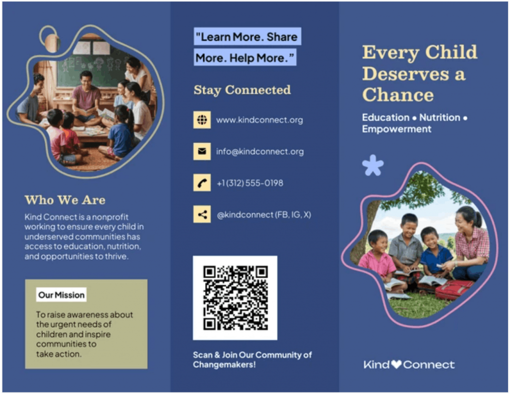
Here’s an example from a real-world brochure template. The purpose of this brochure can be summed up as:
To raise awareness about the urgent needs of children and inspire communities to take action.
Audience
Next, pick one real reader, one role, one situation, one mindset.
Saying your brochure is for “small businesses” is vague and too generic. So is “students” “decision-makers.” Instead, imagine the one person who will benefit the most after reading your brochure.
Examples:
- Operations managers at logistics companies
- Parents choosing a preschool
- First-time home buyers in urban apartments
You can also write down what they care about in plain language:
- Time
- Cost
- Safety
- Convenience
If you write for everyone, you persuade no one.
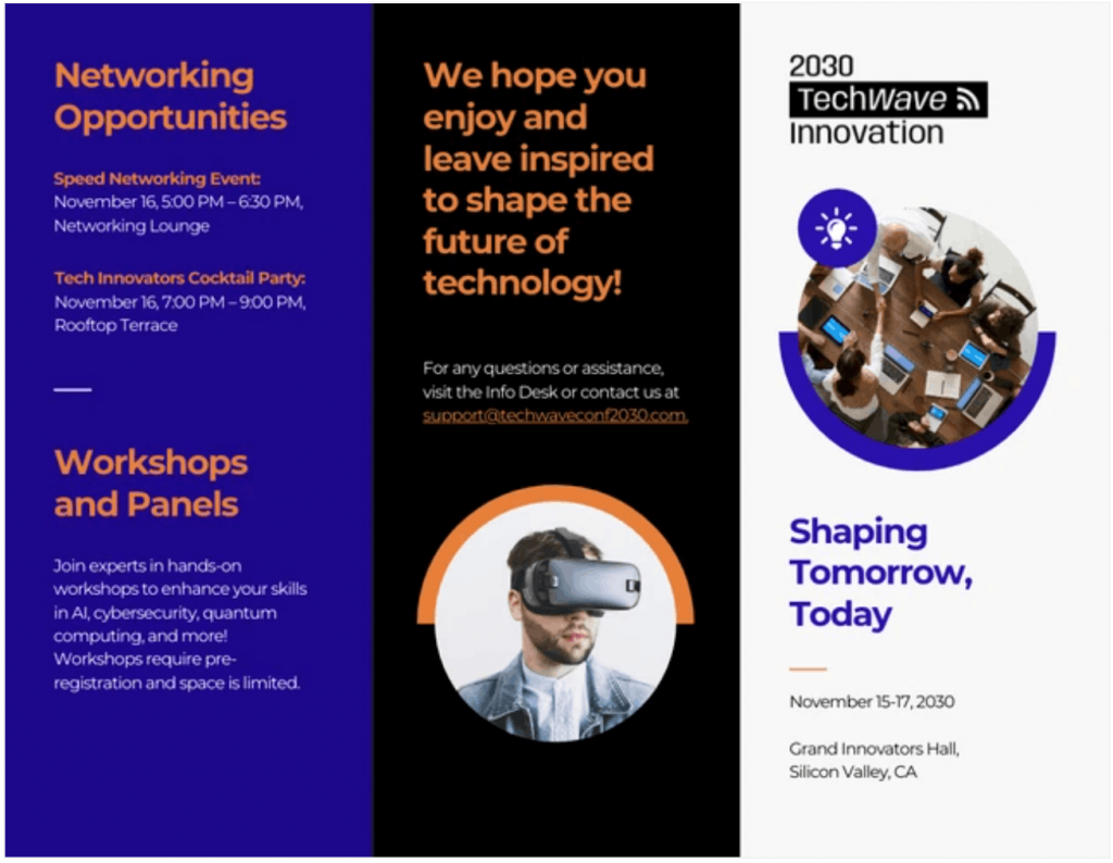
Sometimes, the brochures don’t spell out the obvious. For instance, this brochure makes it very clear that the event is aimed at attracting “tech professionals and innovators” without saying so.
Action
Your brochure should get your audience to perform one primary action, not two or three. The more choices you give them, the more you confuse them. A brochure is not a menu.
Pick one. Examples:
- Call Us For More
- Book An Appointment
- Scan The QR Code
- Visit Us Today
- Download
- Register
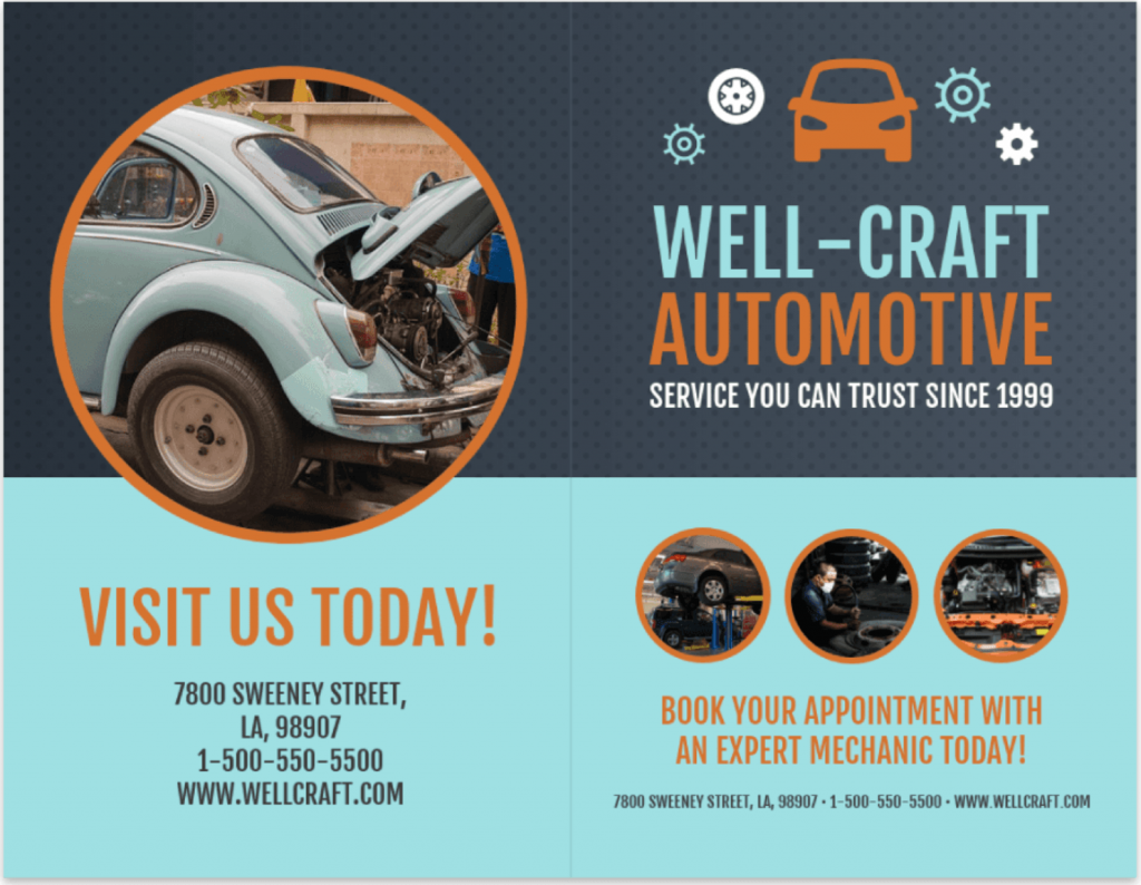
This bi-fold brochure template keeps it straight and simple with its “visit us today” CTA:
Brochure one-liner
Not every brochure will have this and that’s fine. But when it does, it gives your brochure a clear spine.
Think of it like a slogan or a mission for the entire piece. One line that keeps every panel focused and aligned.
Template: “This brochure helps [audience] do [action] by showing [main benefit].”
Examples:
- This brochure helps small retail owners book a POS demo by showing how they reduce checkout time.
- This brochure helps students understand climate change by showing causes, impacts and prevention steps.
- This brochure helps HR managers RSVP for campus hiring events by showing placement success and employer reach.
Choose the right brochure format
Your format decides how people read. Not your copy, not your design. The fold does the directing. Pick the wrong structure and even good writing feels scattered.
Here are some quick definitions of the most common types of brochure formats:
- Single-fold (Flyer format)A single-fold brochure is limited to just one sheet. It behaves like a flyer rather than a brochure. If you’re deciding between the two, read our breakdown on flyer vs brochure.
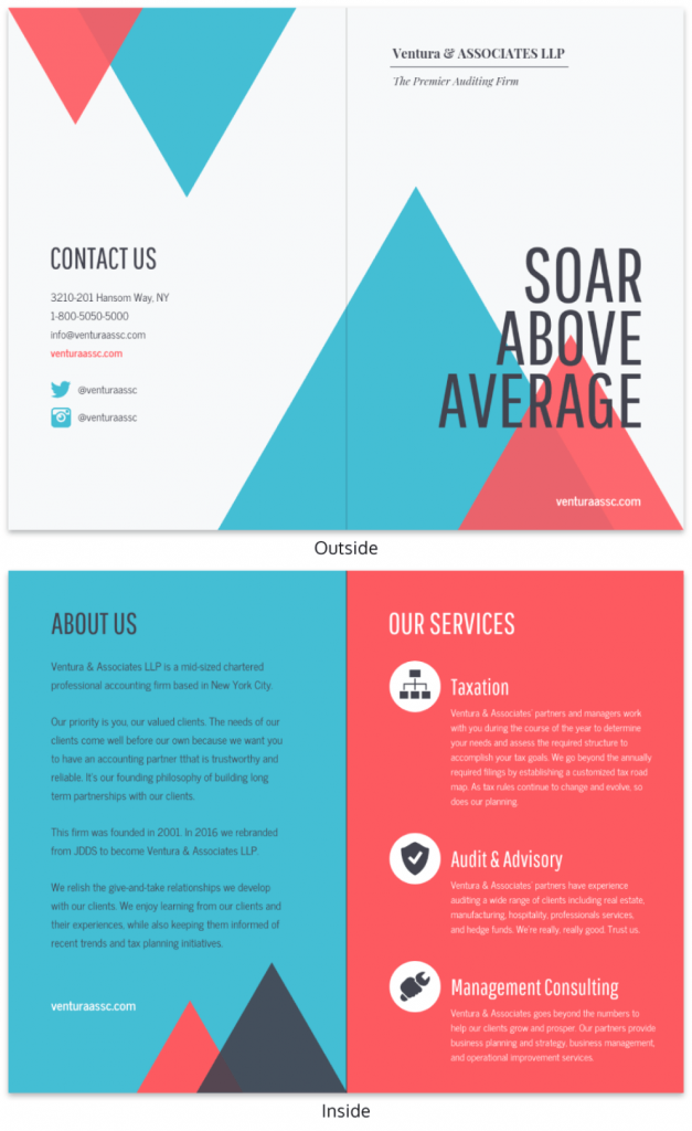
- Bi-fold (4 panels)
This type of brochure has two outside panels and two inside panels. Best for simple offers, school projects, event info, service summaries and short decision cycles. Think: introduction → explanation → proof → action. - Tri-fold (6 panels)
This has three panels per side. It’s best for persuasion-heavy use cases: trade shows, sales leave-behinds, local services, product education or multi-step decisions. This gives you room for sequencing without clutter. - Gate-fold
This brochure type has two outer panels that open to a center reveal. Best for premium experiences, high-end brands or controlled storytelling. It’s comparatively harder to print and distribute. But it’s great when you want to make a strong visual impact. - Z-fold or accordion
This brochure has a continuous flow layout. Best for timelines, processes or educational content. Weak for persuasion and CTAs.
If you need help choosing the right format or style, our guide to 30+ brochure ideas is a good place to start.
Rule of thumb: More panels on ≠ a better brochure
More panels and more text can make it easier to lose the point.
The takeaway is simple: if one message fits in four panels, don’t use six. Here’s a simple guide for you to decide which is better:
- One idea + one action → Bi-fold
- One story + one decision path → Tri-fold
- One visual reveal → Gate-fold
- One announcement → Flyer
Pick a structure based on message complexity, not design preference.
For basic layout and visual guidance, you can also read this guide on brochure design tips.
Understand the “write to the fold” principle
Each panel answers one question. Not two, three or five.
That’s how brochures stay readable.
Examples of panel questions:
- Why should I care?
- What problem does this solve?
- What’s the solution?
- Why trust you?
- What do I get?
- What do I do next?
When one panel tries to answer multiple questions, it messes up the context and hurts readability.
This is where structured templates help. Panel-based layouts force discipline because every space has a clear job.
Venngage’s brochure templates make that structure visible in the layout, so the format guides the writing. Respect the fold and your copy stays focused. Ignore it and you end up with a folded webpage.
The basic brochure structure
Structure matters more than style. If the order is wrong, people won’t read far enough to care about your message. A brochure is a guided sequence, not a canvas for random content blocks.
1. Bi-fold panel map (4 panels)
Note that the panel order can change based on the template and printer layout. Always confirm the reading order before you export.
Panel 1: Problem
Describe the real-world issue in plain language.
Panel 2: Solution
Show the offer and what changes for the reader.
Panel 3: Proof
Add credibility. Short testimonials, certifications, stats, process steps or trust signals.
Panel 4: Action
Close with a clear, specific action the reader can take next: contact, scan, book, visit or download. Make the value obvious and friction low (e.g., QR code, URL, contact info, incentive).
Here’s an example template from a marketing agency that does all of these well:
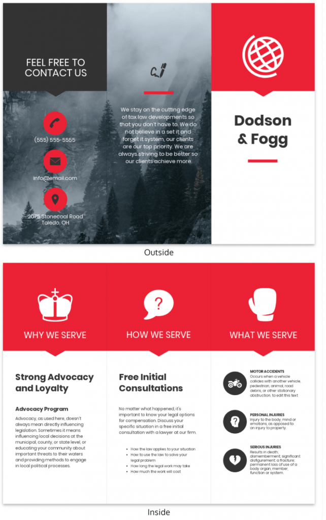
2. Tri-fold panel map (6 panels)
A tri-fold brochure template often includes:
Front cover
Purpose: Grab attention quickly.
This panel answers one question: Why should I open this?
Content: headline, short subhead, visual cue, brand signal.
Inside flap
Purpose: Set context.
This panel answers: What is this about?
Content: Short setup, preview of value, context framing.
Back panel
Purpose: Action.
This panel answers: What do I do next?
Content: CTA, contact info, QR code, location, hours, and/or social proof.
Here’s an example:
Panel word budgets
Here are the recommended brochure word count ranges to keep it readable and printable.
Front cover: 10–25 words
Headline + short subhead only.
Inside panels: 60–120 words each
Short paragraphs, bullets and clear hierarchy.
Back panel: 30–60 words
CTA, contact, QR and one trust signal.
One important callout: Use more whitespace than you think you need. Whitespace increases scanning. Scanning increases comprehension. Comprehension drives action.
How to write the brochure copy: Step-by-step method
Brochure writing is not “creative writing.” It’s business persuasion inside physical constraints. The space in the brochure is limited and your audience’s attention is shorter. Therefore, the structure matters more than style.
Here are seven effective steps to write your brochure for the best results:
Step 1: Write an attention-grabbing headline
A headline’s job isn’t to introduce your brand. It has to pique people’s curiosity and flip through the brochure. It must signal relevance in seconds.
Here are a few formulas/techniques you can use to come up with a powerful headline:
- Outcome-first:
“Get [result] without [pain].”
E.g., “Get more leads without cold calls.”
- Problem-first:
“Tired of [specific problem]?”
E.g., “Tired of chasing unqualified prospects?”
- Audience-first:
“For [specific audience] who need [result].”
E.g., “For founders who need faster customer onboarding.”
- Process-first:
“A simpler way to [task].”
E.g., “A simpler way to manage customer onboarding.”
- Comparison-first:
“A better way to [current method].”
E.g., “A better way to replace manual reporting.”
- Context-first:
“Built for [specific situation].”
E.g., “Built for fast-moving sales teams.”
- Time-first:
“Do [task] in [timeframe].”
E.g., “Launch your campaign in 10 minutes.”
Step 2: Define the problem in real terms
Don’t make the mistake of crafting catchy slogans. Instead, describe the real outcomes. Focus on results people actually care about:
- Save time
- Cut cost
- Minimize risks
- Reduce stress
- Avoid confusion
- Eliminate errors
Here’s an example on how to capture this in a copy:
Late deliveries slow operations, raise costs and create daily stress for logistics teams. Manual tracking causes errors and makes reporting unreliable.
Step 3: Introduce your solution as a clear offer
Say what it is, who it’s for, what they will get out of it.
Here’s a structure you can follow:
- What it is
- Who it’s for
- What changes for them
Example:
This is a route optimization platform for logistics teams. You get real-time tracking, delivery forecasting and automated reporting.
Avoid filler phrases, such as:
- “We are the leading…”
- “World-class solutions…”
- “Innovative platform…”
Step 4: Turn features into benefits
Features explain. Benefits persuade. Proof builds belief.
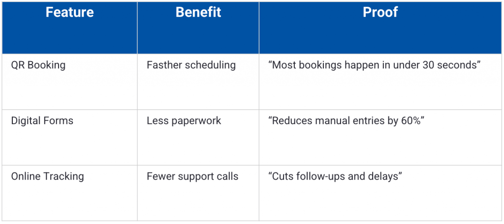
Rewrite examples:
- Feature: “Cloud-based system.”
Benefit: Access from anywhere.
Proof: Used across field teams and offices. - Feature: “Automated reports.”
Benefit: Saves time every week.
Proof: Weekly reports generated in minutes. - Feature: “Secure login.”
Benefit: Data protection.
Proof: Industry-standard encryption.
Step 5: Add proof that fits in a small space
Brochures don’t have room for long case studies. Use compact trust signals.
Best options:
- Short testimonial
Name, title and company, if applicable - One clear metric
- Certification badge
- Partner logos
- Rating summary
Examples:
- “Reduced response time by 40%.”
- “Used by 200+ local businesses.”
- “ISO-certified operations.”
- “Trusted by district schools.”
Step 6: Write a strong CTA
Different promotions need different actions.
For instance, a brochure aimed at being distributed in a trade show should focus on encouraging low-friction, fast action, such as:
- “Scan to book a demo.”
- “Scan to see pricing.”
In contrast, a direct mail should focus on building trust and clarity. For example:
- “Visit the site for full details.”
- “Call for a free estimate.”
If you are writing for a furniture business, your CTA should be location-driven:
- “Visit us today.”
- “Walk in for consultation.”
You get the drift. Just make sure your CTAs are specific, simple, actionable and easy to act on.
Step 7: Add only the details that help the decision
More details don’t make a brochure better. However, clear information does. This is where most brochures fail.
Make sure every detail answers one question: Does this reduce uncertainty for the reader?
If it doesn’t, cut it. Here are a few important details that can make your brochure valuable:
- Pricing ranges (if applicable)
Use ranges, not full rate cards. Ranges build trust without locking you in.
Examples:
- “Plans start from ₹1,500/month.”
- “Typical projects range from ₹50k–₹2L.”
- “Free for students.”
If pricing depends on scope, say that clearly.
- What’s included
Show scope, not features.
Examples:
- Installation + setup
- Training + support
- Materials + maintenance
- Access + updates
- FAQs (Micro-format)
Include one-line answers only.
Examples:
- “How long does setup take?”
“Usually 24–48 hours.” - “Is support included?”
“Yes, email and phone support.” - “Do I need a contract?”
“No long-term lock-in.”
- Hours and locationOnly what’s useful.
Examples:
- “Mon–Sat, 9 am–7 pm.”
- “Near City Center Metro Station.”
- “On-campus office, Block B.”
- Guarantee or risk reversal
This lowers hesitation.
Examples:
- “7-day refund policy.”
- “No-obligation consultation.”
- “Cancel anytime.”
Copy-and-paste brochure templates
Now that you know how to write a brochure, here are ready-to-use copy blocks you can paste directly into a doc, design file or brochure template and customize.
This is just a base for you to work on. You can edit the brackets and replace the placeholders to finish your brochure.
Tri-fold brochure copy template
Panel 1: Front cover (10–25 words)
Headline: Get [primary outcome] without [main pain]
Subhead: [What you offer] for [who it’s for] in [area/timeframe].
Brand cue: [Logo/name] • [Trust cue: “Licensed & insured” / “Since 2012” / “Certified ___”]
Panel 2: Inside flap
Intro line: In this brochure, you’ll learn how to:
- [Benefit #1]
- [Benefit #2]
- [Benefit #3]
Optional micro-CTA: Scan to see examples or pricing → [QR]
Panel 3: Problem
- If you’re dealing with [problem], you’re not alone.
- You might be seeing: [symptom/outcome]
- It often leads to: [cost/time/stress]
Bridge line: The good news: [simple hopeful statement].
Panel 4: Solution
What it is: [Service/product] designed for [audience].
What you get:
- [Deliverable/result #1]
- [Deliverable/result #2]
- [Deliverable/result #3]
How it works:
- [Step]
- [Step]
- [Step]
Panel 5: Proof / Trust
- “[1–2 sentence testimonial]” [“Name, title]
- [Stat or credential: “500+ installs” / “Certified ___”]
- [Mini case line: “Cut wait time from X to Y”]
Panel 6: Back panel
CTA headline: Ready to [desired action]?
Primary CTA: Call/Text: [phone]
Details: [Address] • [Hours] • [Email] • [Social]
Bi-fold brochure copy template
Front cover
Headline: Get [primary outcome] without [main pain]
Subhead: [What you offer] for [who it’s for].
Brand cue: [Logo/Company name] • [Trust cue]
Inside-left
- If you’re dealing with [problem], you’re not alone.
- [Symptom/outcome]
- [Cost/time/stress]
Who it’s for: Designed for [specific audience].
Inside-Right (Solution + Proof)
What it is: [Service/product] for [audience].
What you get:
- [Result #1]
- [Result #2]
- [Result #3]
Proof: “[Short testimonial]” — [Name] [Stat / credential / mini result]
Back panel
- CTA: Ready to [action]?
- Call: [phone]
- [Address] [Hours] [Email] [Social]
Good vs bad brochure examples
Here are two real brochure examples to show what works, what doesn’t and why the difference matters.
Example 1: Photography Tri-fold Brochure
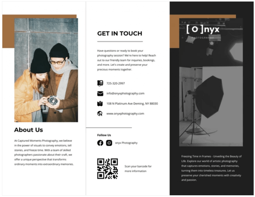
This brochure works because it balances clarity, visual appeal and accessibility. Bold headings and strong photography reinforce the brand’s focus on capturing moments.
The layout is clean, with well-spaced text and images, making it easy to read. The brochure makes its business contact info easy to find, encouraging action.
It also makes good use of consistent colors and typography to improve brand identity.
Best of all, the copy uses short paragraphs, clear fonts and icons to improve scanability.
Example 2: School project brochure
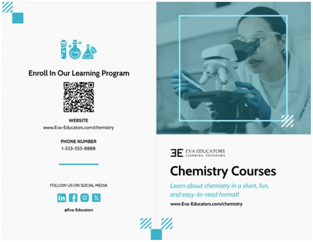
This chemistry brochure works because it’s clear, simple and easy to follow.
True to its scientific nature, it doesn’t waste your time beating around the bush. It gets straight to the point and separates information, visuals and contact details in a clean layout.
The lab-themed imagery instantly shows what the course is about, while the headline and short description explain the value quickly. It also makes it easy for readers to take action.
“Bad brochure” example
The Internet is filled with examples of great brochure designs. Unfortunately, there aren’t many examples of poorly-designed brochure layouts.
I used Venngage Free AI Brochure Maker to come up with this hypothetical brochure template to make a point about how a poorly designed brochure looks like.
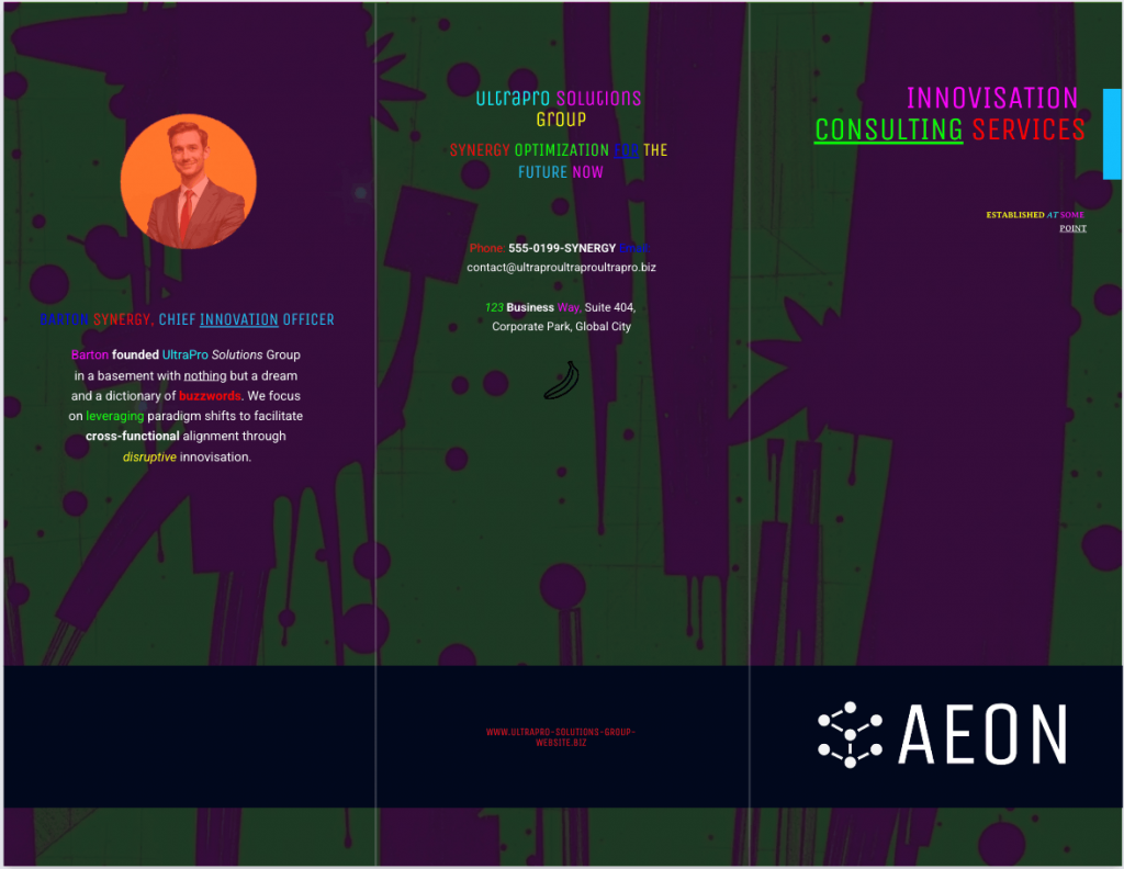
This brochure overwhelms instead of informing. Loud colors and busy textures fight for attention, while weak hierarchy makes headlines, body copy and contact details blur together. Inconsistent typography hurts readability and key info is scattered. Add buzzword-heavy copy with little real meaning and it forgets the brochure’s main job: clear communication and easy action.
Let’s change that. What if we can rewrite the brochure content and redesign it to make it better looking?
Once again, I prompted Venngage Free AI Brochure Maker to recreate the brochure with a better prompt this time and this is what I got in return:
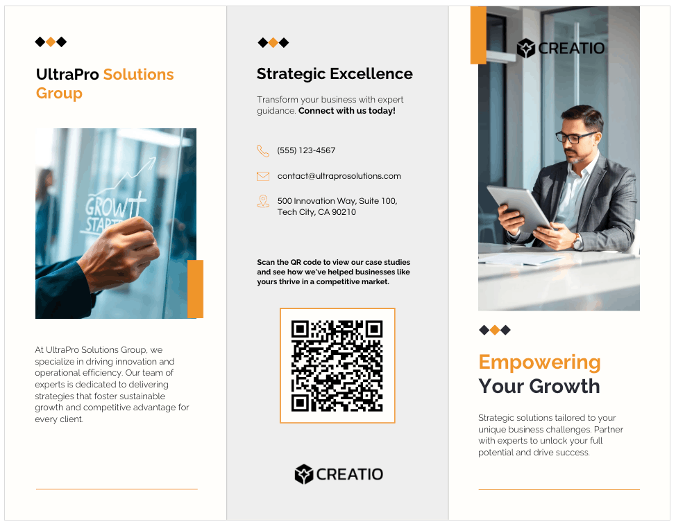
See the difference?
This brochure is cleaner, better structured and easier to scan. It guides the eyes naturally because it uses clear headings, consistent typography and strong visual hierarchy.
The imagery supports the message instead of overpowering it, while contact details and the CTA are grouped logically.
Brochure design and readability rules
Good copy fails when the layout blocks it. If people can’t scan, they won’t read. If they can’t read, they won’t act. Design exists to support comprehension, not decoration.
Layout hierarchy
Structure tells the eye where to go.
Make sure to use:
- Clear headings
- Short subheads
- Tight bullet lists
- Strong spacing
- Visual separation between sections
And avoid:
- Dense paragraphs
- Long sentences
- Equal-weight text blocks
- Competing visual elements
Every panel should have a clear entry point and a clear exit point.
Rule:If a panel can’t be understood in five seconds of scanning, it’s too dense.
Images
Use images as “anchors,” not fillers.
Use images that:
- Support the message
- Show the product or context
- Reflect the audience
- Guide attention
If you’re planning to print your brochure, remember these basics:
- 300 dpi minimum
- High contrast
- Clean edges
- No pixelation
Low-resolution images destroy credibility. Avoid stock photos that don’t align with your message. They add noise instead of building trust.
Fonts
Fonts control legibility, not style. Keep these rules in mind:
- Use 1–2 fonts only
- Clear contrast between headings and body text
- No decorative fonts for body copy
Practical size guidance (for print):
- Headings: 20–30 pt
- Subheads: 14–18 pt
- Body text: 10–12 pt
- Captions: 9–10 pt
To ensure better readability, use:
- High contrast between text and background
- No text over busy images
- Consistent alignment
- Enough spacing between lines
If someone has to lean in to read, you’ve lost them.
Front panel checklist
The front panel decides everything. It must answer four questions fast:
- What is this? → Headline
- Why should I care? → Value proposition
- Who is it for? → Visual cue
- What should I do next? → CTA
Front panel must also include:
- One clear headline
- One strong visual
- Brand identity
- One-line value signal
- Clear CTA
Common brochure mistakes (And fixes)
Most brochures fail because the execution ignores how people actually read, decide or act.
Here’s how to spot the problems and fix them without rewriting everything.
1. Too much text or no hierarchy
When everything looks important, nothing feels important. Long paragraphs, text blocks with the same weights and packed panels force readers to work too hard.
Here’s how to fix these issues:
- Break content into clear layers.
- Use headlines to anchor meaning.
- Use subheads to guide scanning.
- Use bullets for structure.
- Use whitespace to create breathing room.
2. Feature dumping
Most readers don’t care what your product has. They care about what changes for them. When a brochure reads like a list of specifications, it loses emotional relevance and decision value.
Here’s the fix:
- Convert features into outcomes.
- Tie every feature to a benefit and a result.
3. No CTA or too many CTAs
Some brochures forget to ask for action. Others ask for everything.
“Call us.”
“Visit the site.”
“Follow us.”
More options means giving your audience the choice paralysis.
How to fix this?Pick one primary action. Make everything else support it. Clarity creates movement while options create confusion.
4. No proof
Claims without evidence feel like noise. People don’t trust promises from brochures. They trust signals.
Fix them with the following tips:
- Add compact proof.
- Short testimonials.
- Clear metrics.
- Certifications.
- Logos.
- Ratings.
5. Generic Claims
Phrases like “best in class” or “world-class service” sound impressive, but don’t mean anything.
Here a specific tips to fix this:
- Replace claims with specifics.
- Say what you do.
- Say who it’s for.
- Say what changes.
- Say what happened.
6. Low-res images and inconsistent branding
Blurry images and mismatched colors signal carelessness. Even if the offer is good, the presentation creates doubt.
Tips to fix it:
- Use high-resolution images.
- Keep branding consistent.
- Match visuals to audience and context.
- Avoid filler visuals that don’t support the message.
7. Missing or incorrect contact info
It sounds basic. But you would be surprised how common it is for brochures to carry the wrong phone numbers, old addresses or missing business hours.
The fix:
- Proofread and verify everything before printing.
- Phone, email address, location, website address, social handles, etc.
Tools + printing checklist
Picking the right tool is often half the battle. Of course, writing comes first. But how you build and print it still matters.
1. Venngage
Venngage works well when you want structure without design complexity. It gives you panel-based brochure templates, layout discipline and visual consistency without needing layout training. The editor is visual and fast, which helps when you’re working in tight spaces like tri-folds and bi-folds.
You can also use the AI Brochure Generator to create a first draft layout and copy from a simple prompt, then refine it in the editor, which helps when you’re working in tight spaces like tri-folds and bi-folds.
The AI suggests layout structure, content blocks and visual elements automatically, which gives you a solid starting point for tri-folds and bi-folds before you refine anything.
With Venngage, you also get Brand Kit features that apply logos, colors and fonts across layouts, plus built-in accessibility checks that reduce contrast and readability mistakes.
That matters in print more than most people realize. Export options include PDF and high-resolution formats that are print-ready.
Pricing:
Free plan available; paid plans start at $10/user/month.
2. InDesign
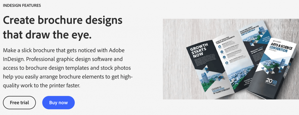
InDesign gives full layout control and professional print workflows. It’s powerful, flexible and industry-standard for print production.
It’s also slower, more complex and assumes design experience. If you’re working with printers regularly and managing multi-file brand systems, it makes sense. If you’re focused on speed and structure, it often becomes overhead.
Pricing:
No free plan available; paid plans start at $20.99/user/month for the single-app subscription.
Export basics
This is where most print mistakes happen.
- Use print-ready PDF formats.
- Confirm bleed settings if your design runs to the edge of the page.
- Embed fonts to avoid substitution errors.
- Check resolution before export, not after printing.
Always ask your printer for their preferred export settings. Never assume defaults are correct.
Paper basics
Paper affects perception more than most people expect.
Matte:
- Professional look, low glare, better readability, softer finish.
- Good for text-heavy brochures and business use.
Glossy:
- High visual contrast, strong color pop and more glare.
- Good for image-heavy brochures and promotional materials.
“Good enough” stock guidance
You don’t need premium paper for every use case. Choose a paper that fits the context. Trade shows, school projects and local distribution don’t need luxury finishes. High-end brand launches and premium offers might.
Measurement basics
If you’re printing brochures without tracking, you’re guessing.
Minimum setup:
- QR code
- Unique landing page
- UTM tracking parameters
- Dedicated phone number or call tracking where relevant
Simple flow:
Brochure → QR code → landing page → tracked action
FAQs
Here are answers to four of the most commonly asked questions people usually get stuck on when writing a brochure.
1. How do you start writing a brochure?
Start with three decisions: the purpose, one clear audience and one action. Write the one-liner first. Everything else flows from that.
2. How many words should a tri-fold brochure be?
Usually 300–500 words total, less if it’s visual. Use more words only if it’s educational or for school projects.
3. What goes on the front cover?
A clear headline, one strong visual, brand identity, a simple value signal and a light teaser CTA like “Scan to learn more.”
4. Can AI write brochure copy?
Yes, AI is a great tool for creating an initial draft. But you must always manually edit the AI result to remove fluff, fine-tune the generic claims and add your brand’s personal touch.
Make your brochure actually work
A good brochure doesn’t try to say everything. It makes one clear promise and leads someone forward with confidence. When structure, writing and layout work together, the brochure stops being a folded page and starts becoming a decision tool.
Choose the format that fits your message. Use a structure that respects attention. Write to the fold. Then let the layout do its job.
If you want a faster way to get there, start with free, ready-to-use brochure templates from Venngage.


