Bad presentations. We’ve all had to sit through them. Heck, we’ve probably all given one or two. I know I have.
You know the type: twice as long as they need to be, slides chock-full of text, no visuals in sight.
How can you ensure you don’t fall victim to these presentation faux-pas when designing your next presentation for your team, class, or clients?
In this blog, I’ll walk you through tips on how to design an impactful presentation along with presentation templates that can help you deliver it with style to leave a lasting impression.
Tips for designing and delivering an impactful presentation
What makes a presentation memorable?
It usually comes down to three things:
- The main idea.
- The presenter.
- The visuals.
All three elements work together to create a successful presentation. Just like how different presentation styles serve different purposes, having a good presentation idea will give the audience a purpose for listening.
To bring those ideas to life, it helps to follow a few timeless design principles:
The 5 golden rules of visual presentation design
- Keep it simple: Less text, more visuals.
- One message per slide: Avoid cramming multiple ideas together.
- Use consistent fonts and colors: This keeps your design cohesive.
- Prioritize readability: Make sure there’s enough contrast and use readable font sizes.
- Always design with your audience in mind: Tailor your content to what they need and care about.
Here are some top tips to consider to help you design and deliver an impactful presentation:
- Include less text and more visuals in your presentation design
- Identify one core message to center your presentation design around
- Eliminate any information that doesn’t immediately support the core message
- Create a strong presentation outline to keep you focused
- Use text to reinforce, not repeat, what you’re saying
- Design your presentation with one major takeaway per slide
- Use visuals to highlight the key message on each slide
- Use scaffolding slides to orient your audience and keep them engaged
- Use text size, weight, and color for emphasis
- Apply design choices consistently to avoid distraction
- Split a group presentation by topic
- Use a variety of page layouts to maintain your audience’s interest
- Use presentation templates to help you get started
- Include examples of inspiring people
- Dedicate slides to poignant questions
- Find quotes that will inspire your audience
- Emphasize key points with text and images
- Label your slides to prompt your memory
1. Include less text and more visuals in your presentation design
According to David Paradi’s annual presentation survey, the 3 things that annoy audiences most about presentations are:
- Speakers reading their slides
- Slides that include full sentences of text
- Text that is too small to read
The common thread that ties all of these presentation annoyances is text. Audiences are very picky about the text found in presentation slide decks.
In my experiences speaking at conferences and in webinars over the past few years, audiences respond much more positively to presentations that use visuals in place of text.
Audiences are more engaged, ask more questions, and find my talks more memorable when I include lots of visual examples in my slide decks.
I’m not the only one who has found this. We recently surveyed nearly 400 conference speakers about their presentation designs and found that 84.3% create presentations that are highly visual.
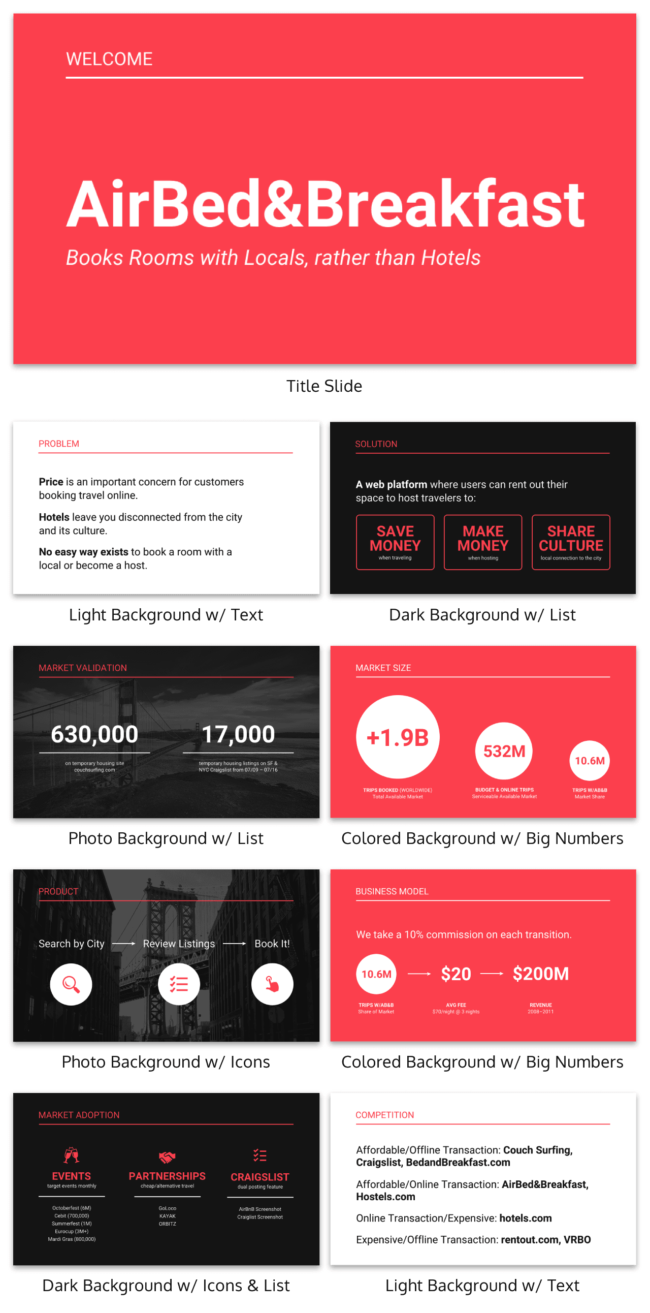
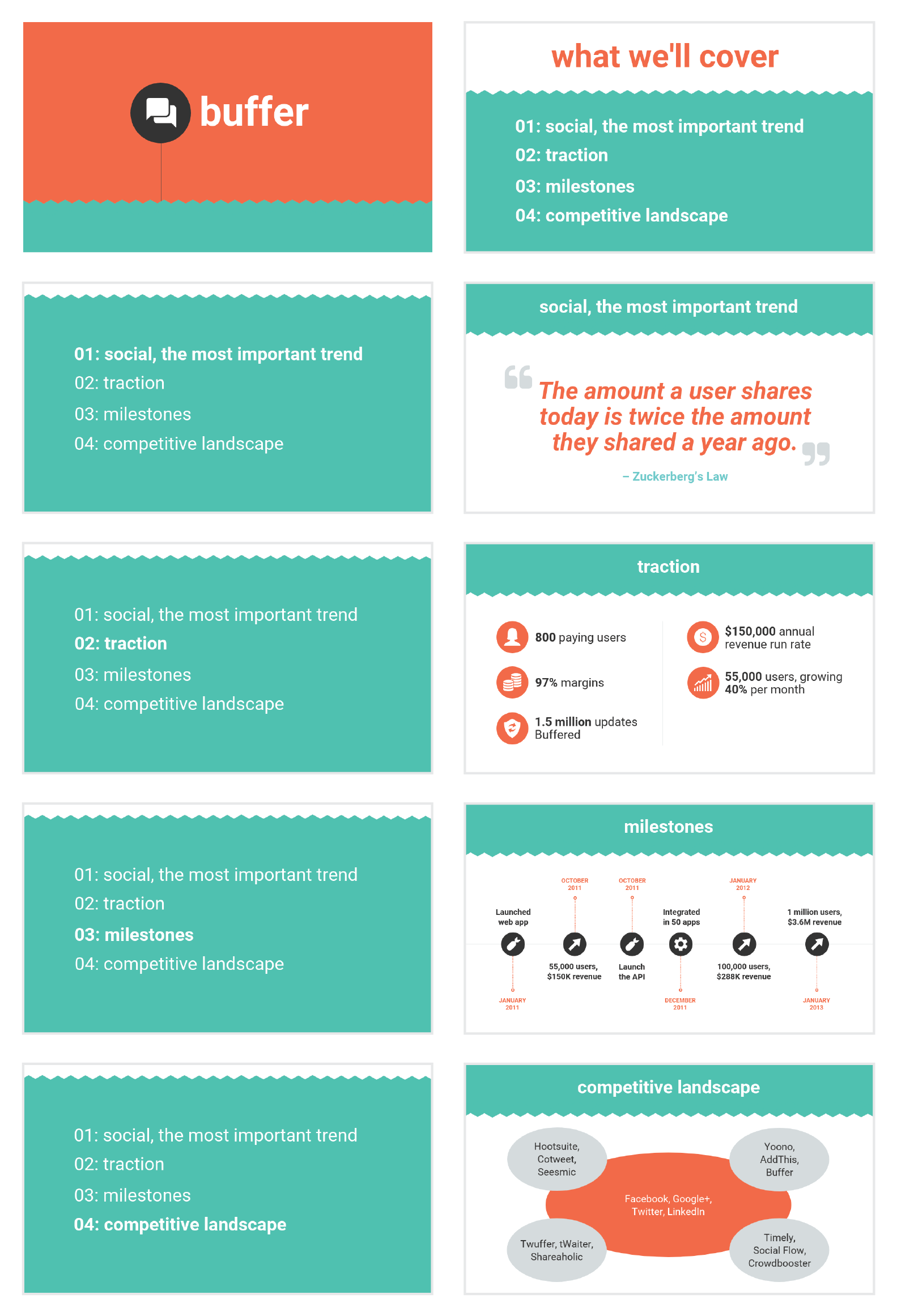
A great example of a high visual presentation is the iconic AirBnB pitch deck design, which includes no more than 40 words per slide. Instead of repeating the speaker’s script on the slides, it makes an impact with keywords, large numbers, and icons:
Learn how to customize this presentation template:
To help you take your presentations to the next level, I’d like to share my process for creating a visually-focused presentation like the one above. I’ll give you my top presentation design tips that I’ve learned over years of presenting:
- Webinars
- Class presentations
- Pitches
- Meetings
- Online courses
You can then apply this process to our professional presentation templates or pitch decks, creating unique presentation decks with ease! Our user-friendly editor tools make customizing these templates a breeze.
To leave a lasting impression on your audience, consider transforming your slides into an interactive presentation. Here are 15 interactive presentation ideas to enhance interactivity and engagement.
We’ll cover the most important steps for summarizing lengthy text into a presentation-friendly format. Then we’ll touch on some presentation design tips to help you get visual with your slide decks. Read on for the best creative presentation ideas.
2. Identify one core message to center your presentation design around
We know from David Paradi’s survey that audiences are easily overwhelmed with lots of text and data, especially when presentations are long.

(You when you see a presentation with lots of text and data and it’s long)
So unlike in a white paper, report, or essay, you can’t expect to tackle many complex ideas within a single presentation.
That would be a recipe for disaster.
Instead, identify a single central message that you would like to communicate to your audience. Then build your presentation around that core message.
By identifying that core message, you can ensure that everything you include in your presentation supports the goal of the presentation.
As seen below, a great presentation tells you exactly what you’re going to learn (the core message), then gets right to the facts (the supporting information).
To ensure you create an asset that’s clear, concise, impactful, and easy to follow, design your presentation around a single core message.
3. Create a strong presentation outline to keep you focused
Think of your outline as a roadmap for your presentation. The outline will shape the presentation structure and guide you through your content. Creating a strong presentation outline straight away helps make sure that you’re hitting all of the key points you need to cover to convey a persuasive presentation.
Take this presentation outline example:
- Introduction and hellos
- Vision and value proposition
- Financial profit
- Cash flow
- Your investment
- Thanks and questions
These are all things that we know we need to talk about within the presentation.
Creating a presentation outline makes it much easier to know what to say when it comes to creating the actual presentation slides.
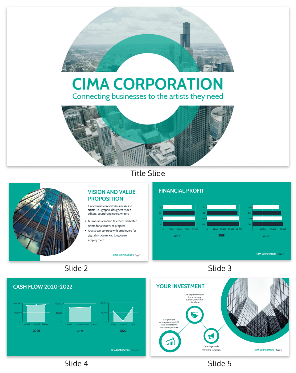
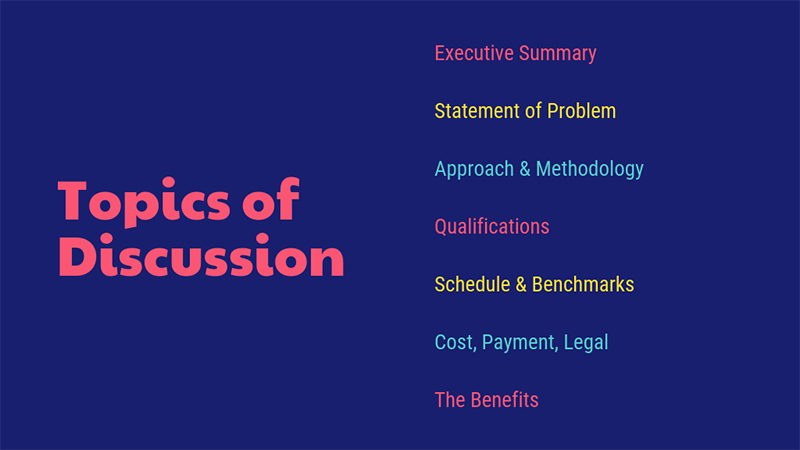
You could even include your presentation outline as a separate slide so that your audience knows what to expect:
The opening moments of your presentation hold immense power – check out these 15 ways to start a presentation to set the stage and captivate your audience.
4. Eliminate any information that doesn’t support the core message
Next, use that core message to identify everything that doesn’t belong in the presentation.
Aim to eliminate everything that isn’t immediately relevant to the topic at hand, and anything remotely redundant. Cut any information that isn’t absolutely essential to understanding the core message.
By cutting these extra details, you can transform forgettable text-heavy slides:
Into memorable slides with minimal text:
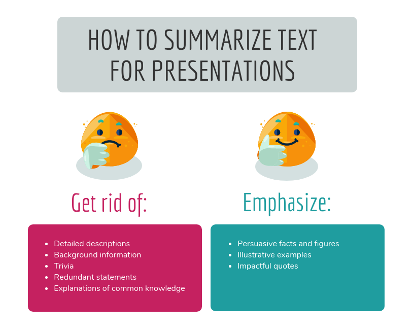
Here’s a quick checklist to help you cut out any extra detail:
Get rid of:
- Detailed descriptions
- Background information
- Trivia
- Redundant statements
- Explanations of common knowledge
Keep:
- Persuasive facts and figures
- Illustrative examples
- Impactful quotes
This step may seem obvious, but when you’re presenting on a topic that you’re passionate about, it’s easy to get carried away with extraneous detail. Use the recommendations above to keep your text in check.
Clarity is key, especially if you’re presenting virtually rather than in-person.
Watch: How to design a presentation [10 ESSENTIAL TIPS]
5. Use text to reinforce, not repeat, what you’re saying
According to presentation guru Nancy Duarte, your audience should be able to discern the meaning of your slides in 6 seconds or less.
Since your audience will tend to read every word you place on each slide, you must keep your text to an absolute minimum. The text on your slides should provide support for what you’re saying without being distracting.
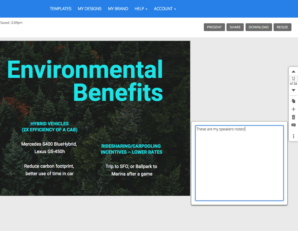
Never write out, word for word, what you’re going to be saying out loud. If you’re relying on text to remember certain points, resist the urge to cram them into your slides. Instead, use a tool like Venngage’s speaker notes to highlight particular talking points. These can be imported into PowerPoint — along with the rest of your presentation — and will only be viewable to you, not your audience.
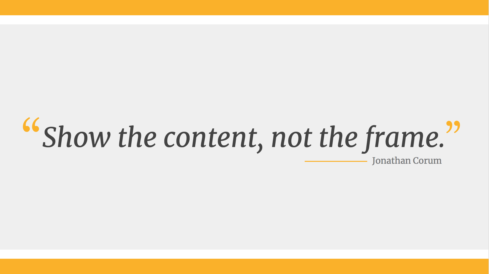
For the actual slides, text should only be used to reinforce what you’re saying. Like in the presentation design below, paraphrase long paragraphs into short bulleted lists or statements by eliminating adjectives and articles (like “the” and “a”).
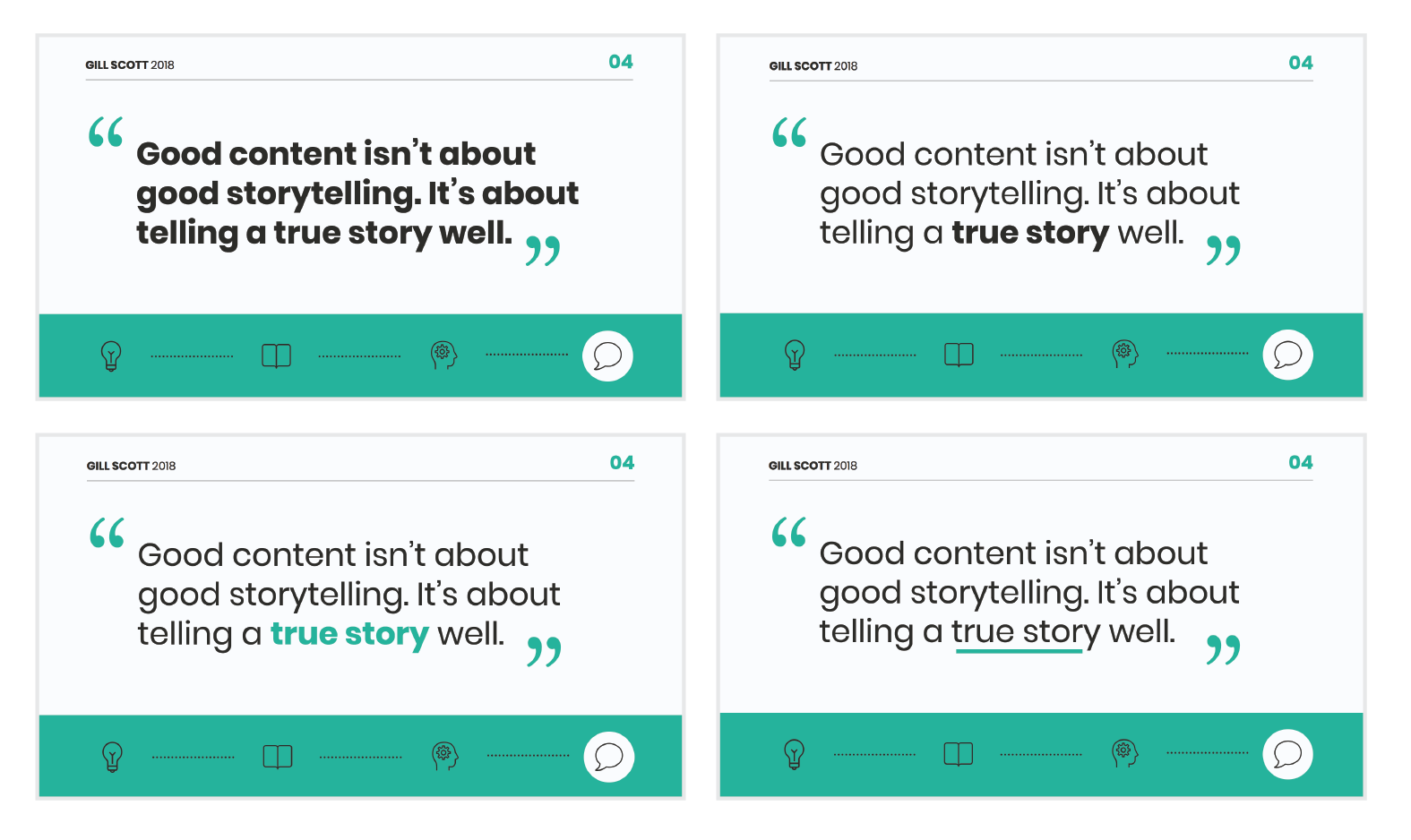
Pull out quotes and important numbers, and make them a focus of each slide.
6. Design your presentation with one major takeaway per slide
As I mentioned above, audiences struggle when too much information is presented on a single slide.
To make sure you don’t overwhelm your audiences with too much information, spread out your content to cover one major takeaway per slide.
By limiting each slide to a single simple statement, you focus your audience’s attention on the topic at hand.
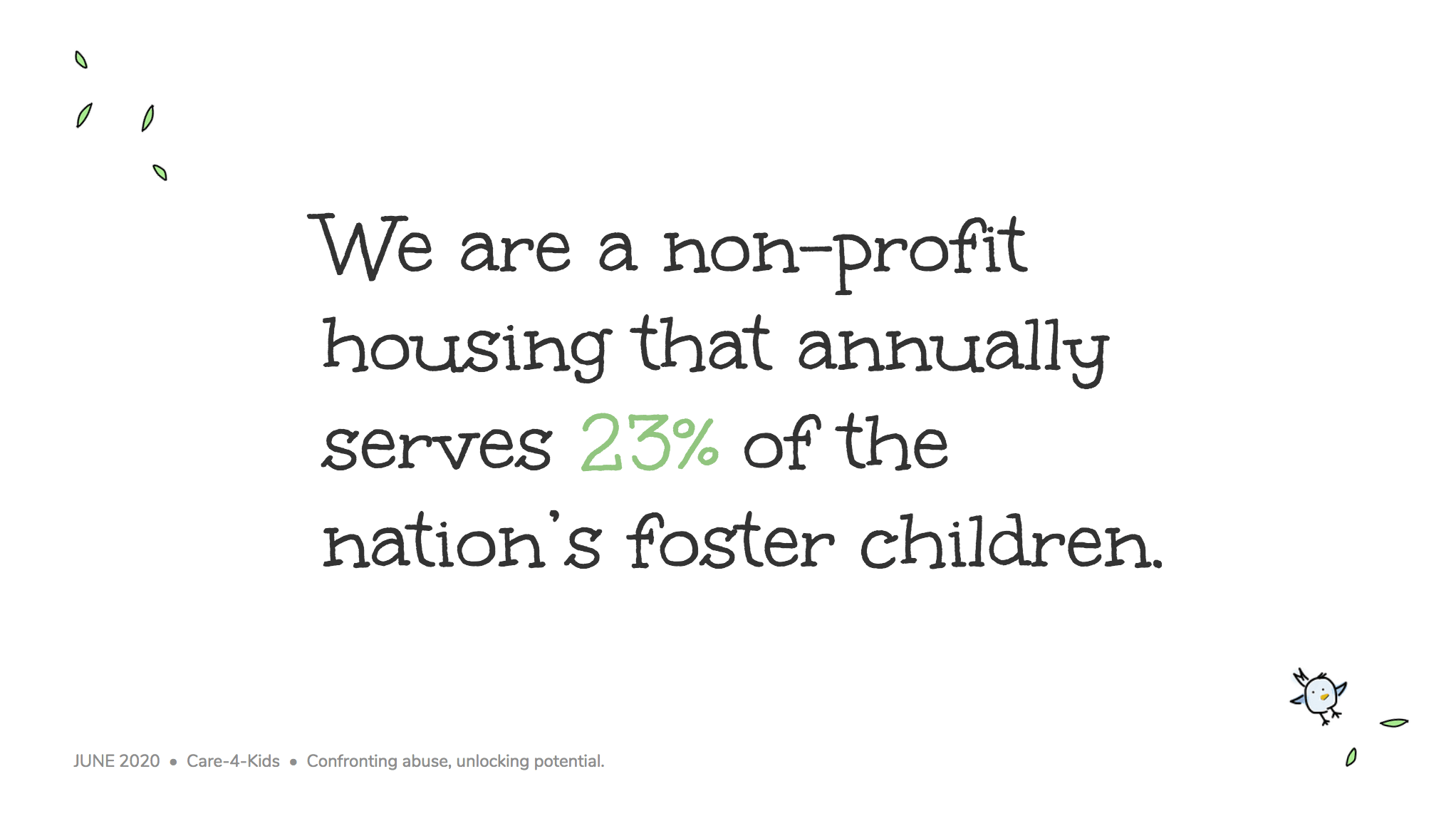
My favorite way to do this is to pick out the core message of whatever I’m talking about and express it in a few keywords, as seen in this presentation slide below.
This helps ensure that the visuals remain the focus of the slide.
Using the text in this way, to simply state a single fact per slide, is a sure-fire way to make an impact in your presentation.
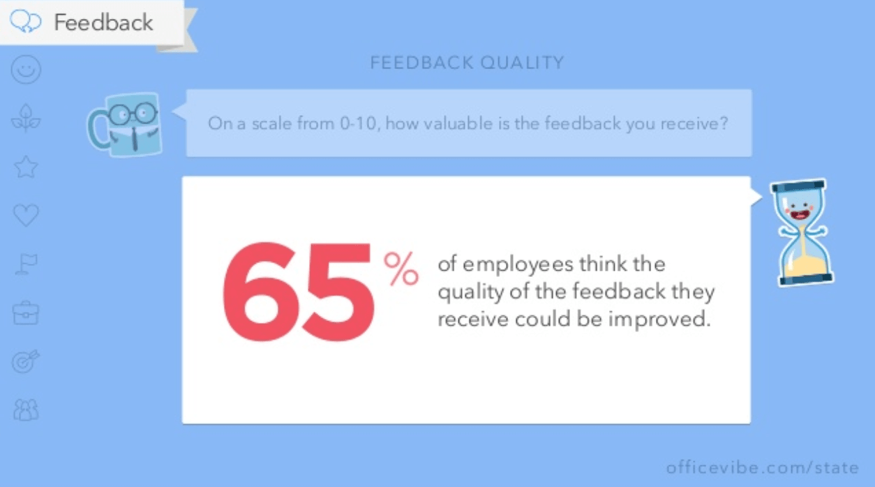
Alternatively, pull out a significant statistic that you want to stick in your audience’s minds and make it a visual focus of the slide, as seen in this popular presentation by Officevibe.
This might mean you end up with a slide deck with a ton of slides. But that’s totally ok!
I’ve talked to many professionals who are pressured by their management teams to create presentations with a specific number of slides (usually as few as 10 or 15 slides for a 30-minute presentation).
If you ask me, this approach is completely flawed. In my mind, the longer I spend sitting on a single slide, the more likely I am to lose the interest of my audience.
How many slides should I use for a 10 minute presentation?
A good rule of thumb is to have at least as many slides as minutes in your presentation. So for a 10 minute presentation you should have at least 10 slides.
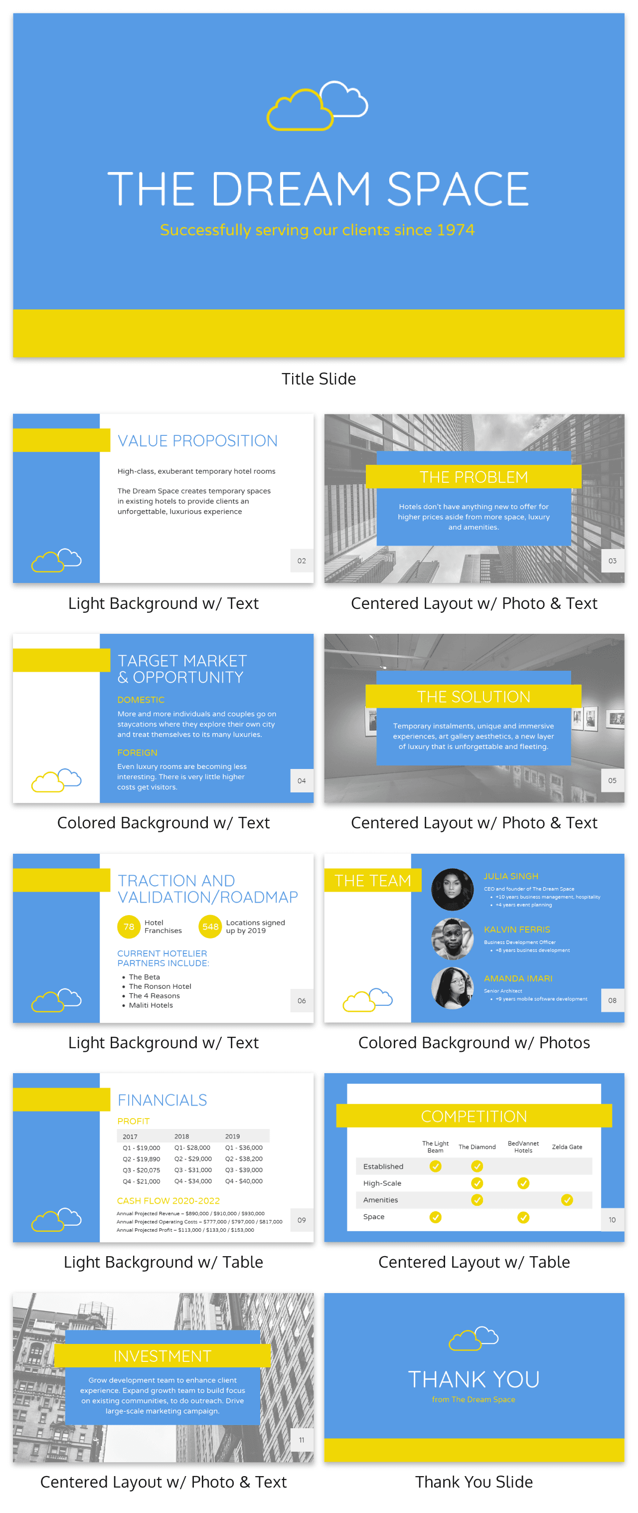
Use as many slides as you need, as long as you are presenting a single message on each slide, (as seen in the lengthy presentation template below). This is especially important if you’re presenting your business, or delivering a product presentation. You want to wow your audience, not bore them.
7. Use visuals to highlight the key message on each slide
As important as having one major takeaway per slide is having visuals that highlight the major takeaway on each slide.
Unique visuals will help make your message memorable.
Visuals are a great way to eliminate extra text, too.
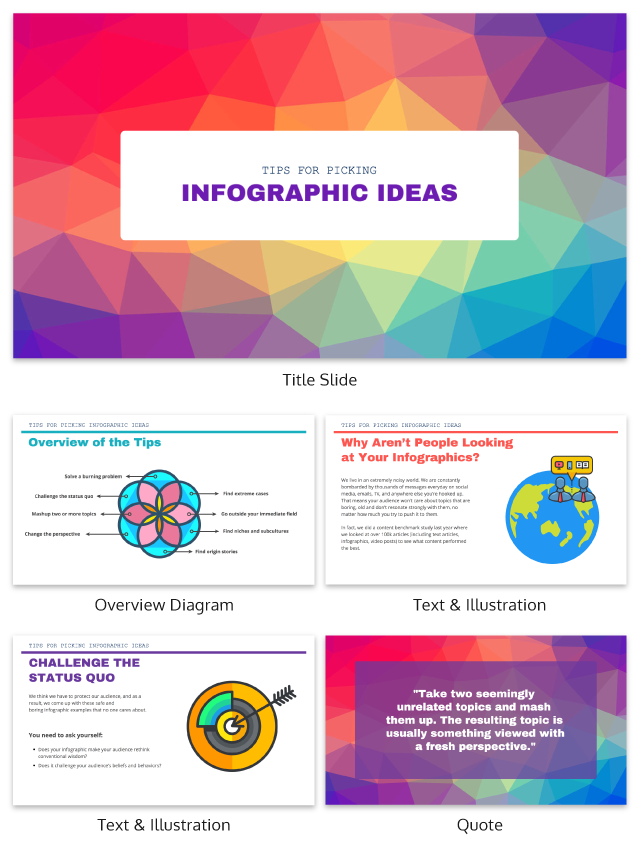
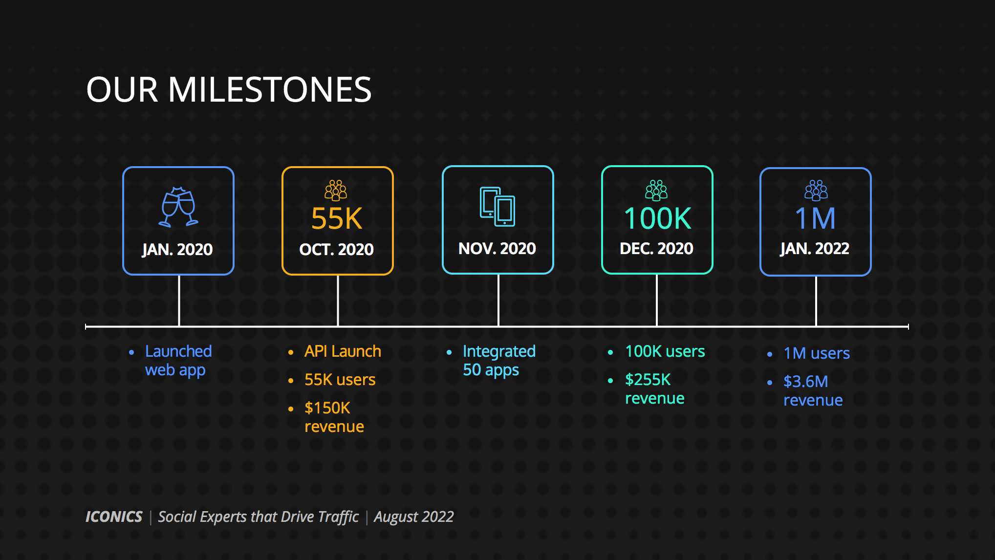
You can add visuals by creating a timeline infographic to group and integrate information into visual frameworks like this:
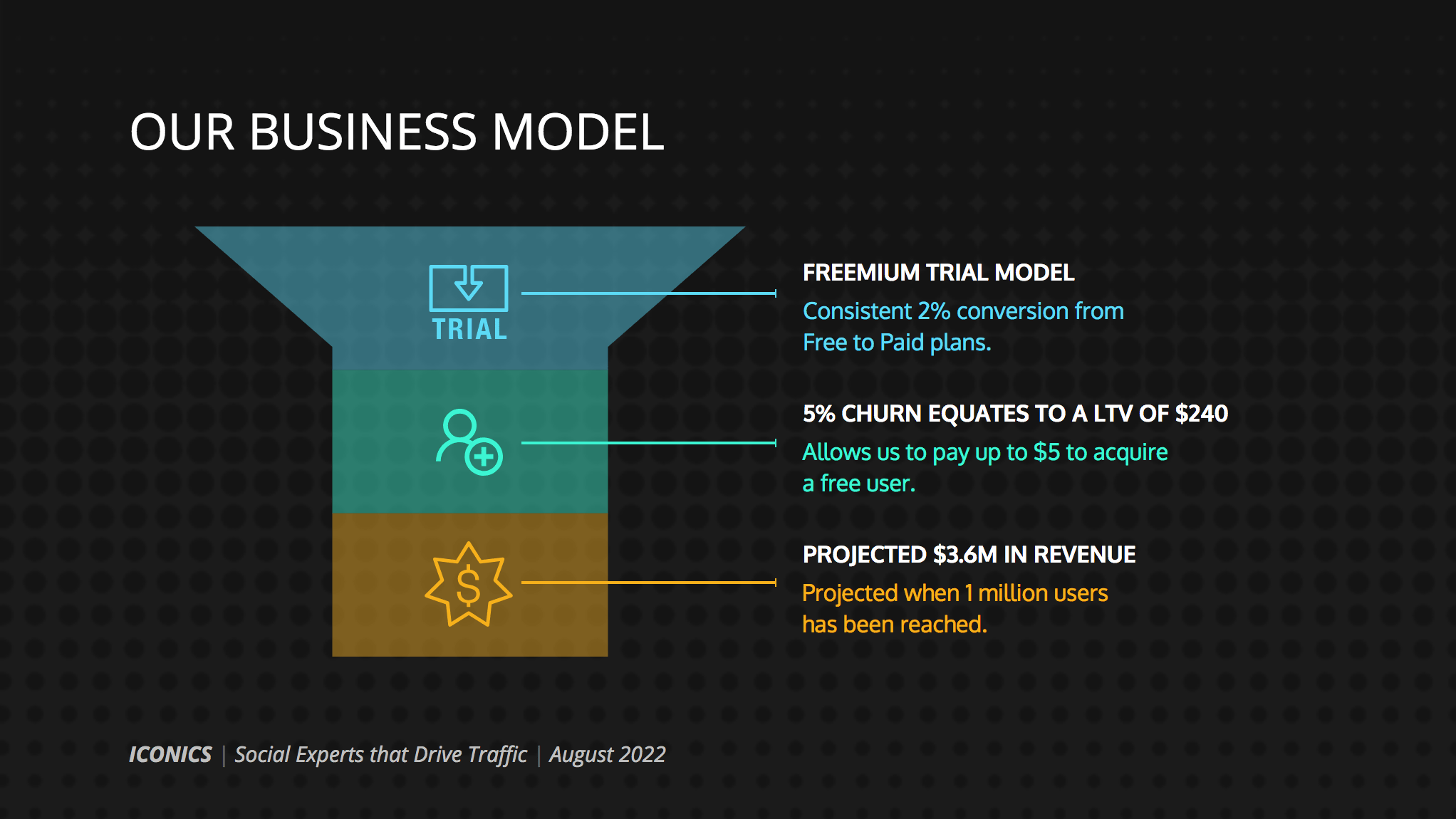
Or create a flowchart and funnels:
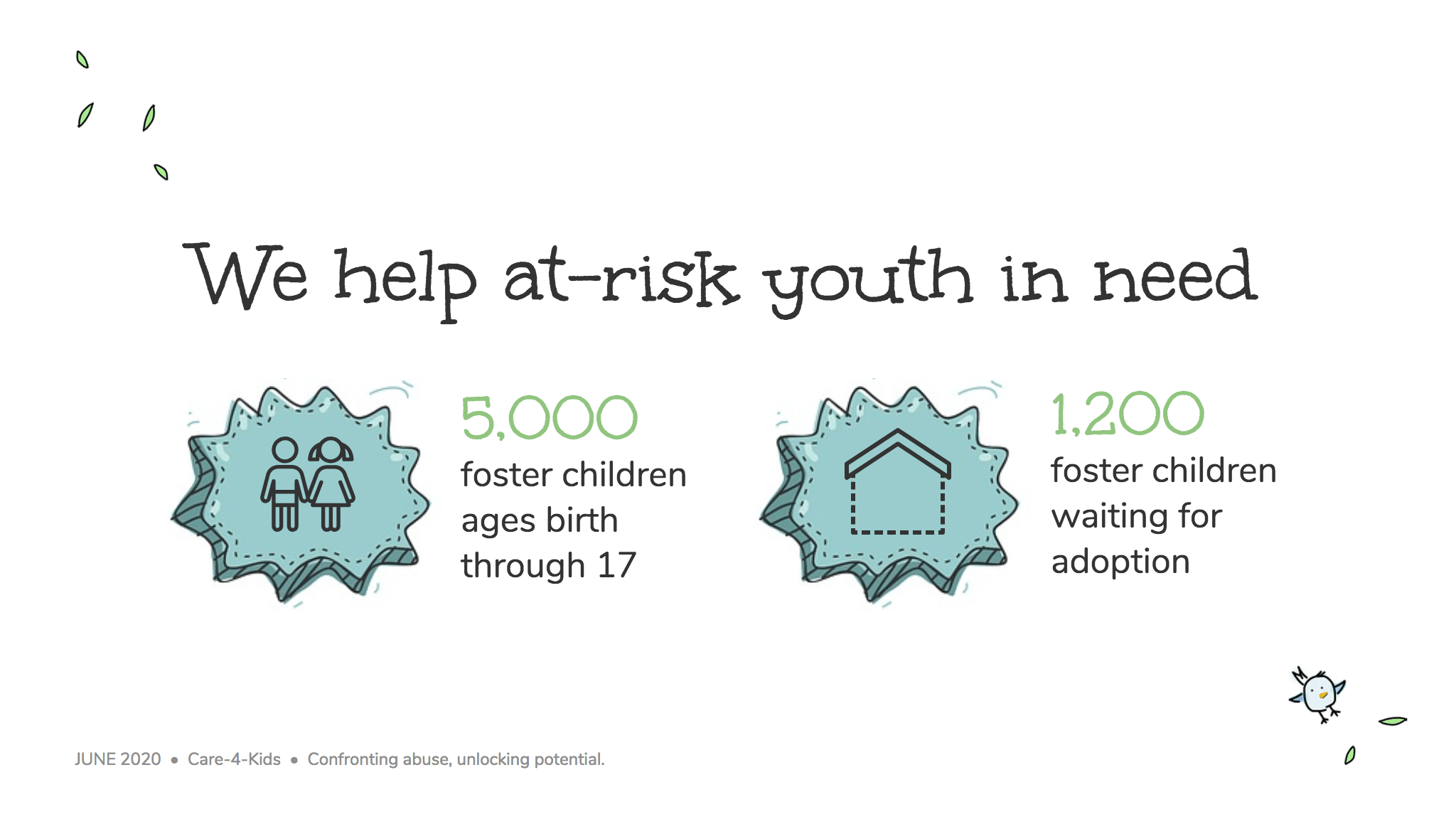
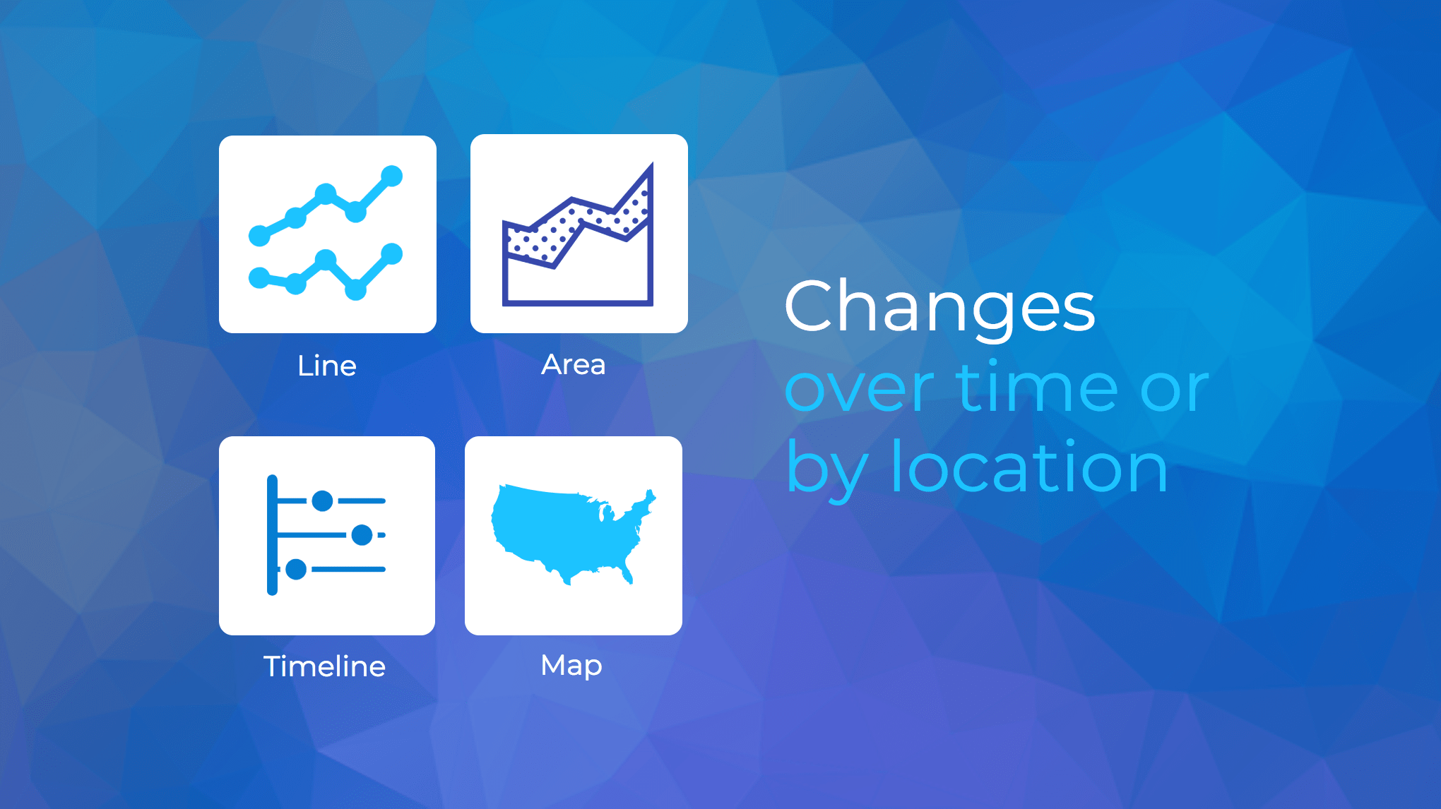
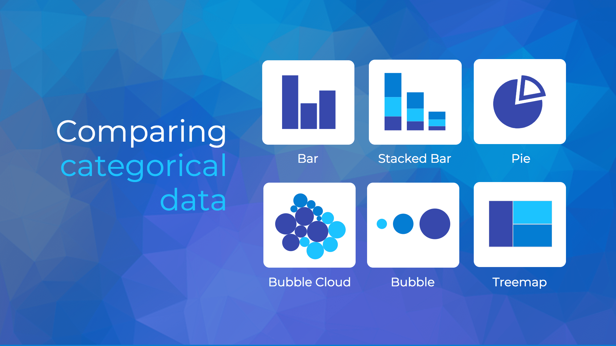
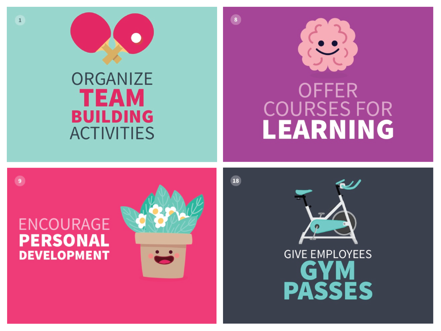
Or by representing simple concepts with icons, as seen in the modern presentation design below. Using the same color for every icon helps create a polished look.
Using visuals in this way is perfect for when you have to convey messages quickly to audiences that you aren’t familiar with – such as at conferences. This would also make the ideal interview presentation template.
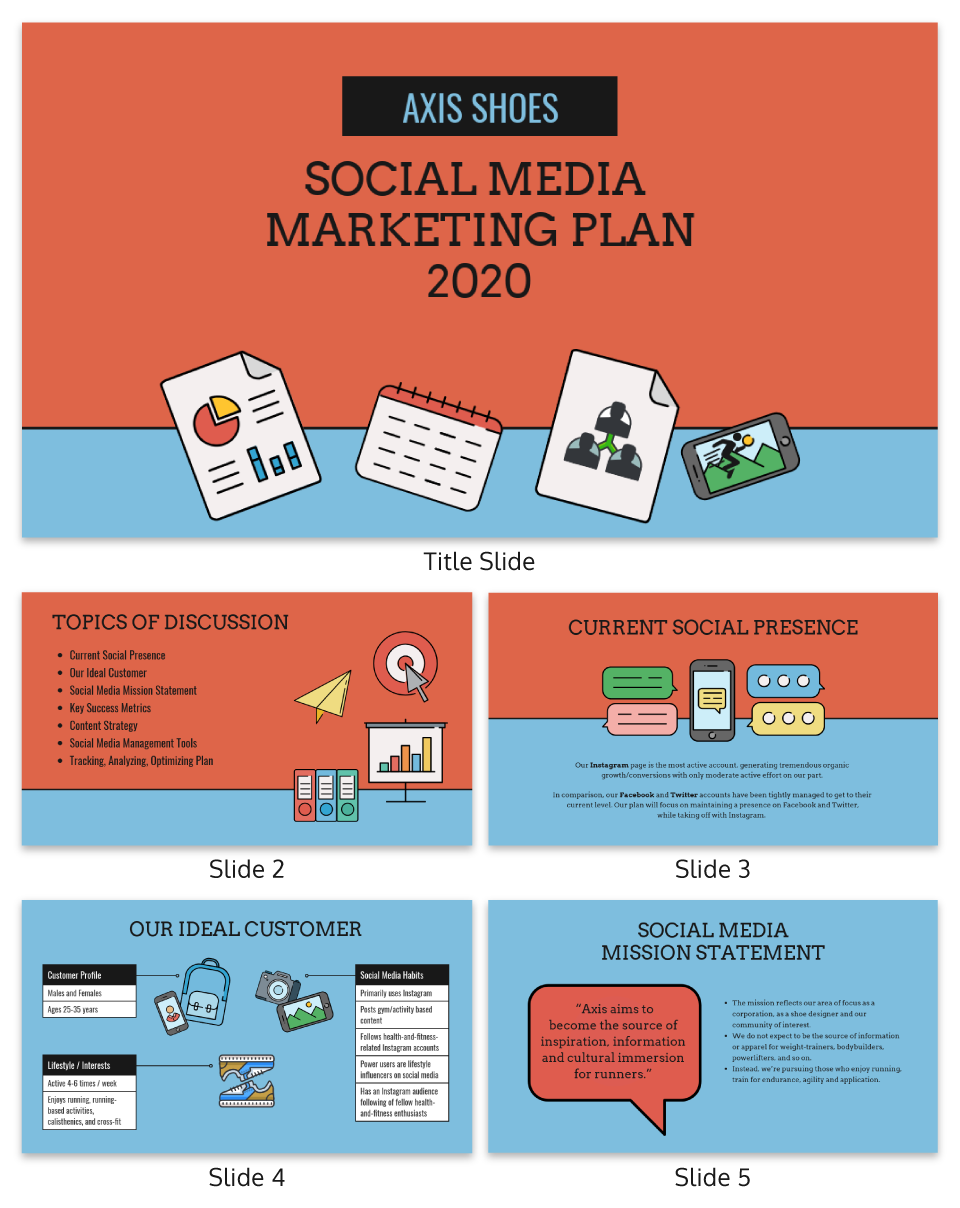
You can alternatively use icons in different colors, like in the presentation templates below. Just make sure the colors are complimentary, and style is consistent throughout the presentation (i.e. don’t use sleek, modern icons on one slide and whimsically illustrated icons on another). In this example, presentation clipart style icons have been used.
Any time you have important stats or trends you want your audience to remember, consider using a chart or data visualization to drive your point home. Confident public speaking combined with strong visualizations can really make an impact, encouraging your audience to act upon your message.
One of my personal favorite presentations (created by a professional designer) takes this “key message plus a visual” concept to the extreme, resulting in a slide deck that’s downright irresistible.
When applying this concept, don’t fall into the trap of using bad stock photos. Irrelevant or poorly chosen visuals can hurt you as much as they help you.
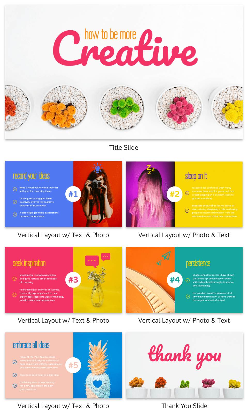
Below is an example of how to use stock photos effectively. They are more thematic than literal and are customized with fun, bright icons that set a playful tone.
The content and visual design of a presentation should be seamless.
It should never seem like your text and visuals are plopped onto a template. The format and design of the slides should contribute to and support the audience’s understanding of the content.

8. Use scaffolding slides to orient your audience and keep them engaged
It’s easy for audiences to get lost during long presentations, especially if you have lots of slides. And audiences zone out when they get lost.
To help reorient your audience every once in a while, you can use something I like to call scaffolding slides. Scaffolding slides appear throughout a presentation to denote the start and end of major sections.
The core scaffolding slide is the agenda slide, which should appear right after the introduction or title slide. It outlines the major sections of the presentation.
At the beginning of each section, you should show that agenda again but highlight the relevant section title, as seen below.
This gives audiences the sense that you’re making progress through the presentation and helps keep them anchored and engaged.
Alternatively, you can achieve a similar effect by numbering your sections and showing that number on every slide. Or use a progress bar at the bottom of each slide to indicate how far along you are in your presentation. Just make sure it doesn’t distract from the main content of the slides.
You can imagine using this “progress bar” idea for a research presentation, or any presentation where you have a lot of information to get through.
Leila Janah, founder of Sama Group, is great at this. Her Innovation and Inspire talk about Sama Group is an example of a presentation that is well organized and very easy to follow.
Her presentation follows a logical, steady stream of ideas. She seems comfortable talking in front of a crowd but doesn’t make any attempts to engage directly with them.
9. Use text size, weight and color for emphasis
Every slide should have a visual focal point. Something that immediately draws the eye at first glance.
That focal point should be whatever is most important on that slide, be it an important number, a keyword, or simply the slide title.

We can create visual focal points by varying the size, weight, and color of each element on the slide. Larger, brighter, bolder elements will command our audience’s attention, while smaller, lighter elements will tend to fade into the background.
As seen in the presentation template above, this technique can be especially useful for drawing attention to important words within a long passage of text. Consider using this technique whenever you have more than 5 words on a slide.
And if you really want your audience to pay attention, pick a high-contrast color scheme like the one below.

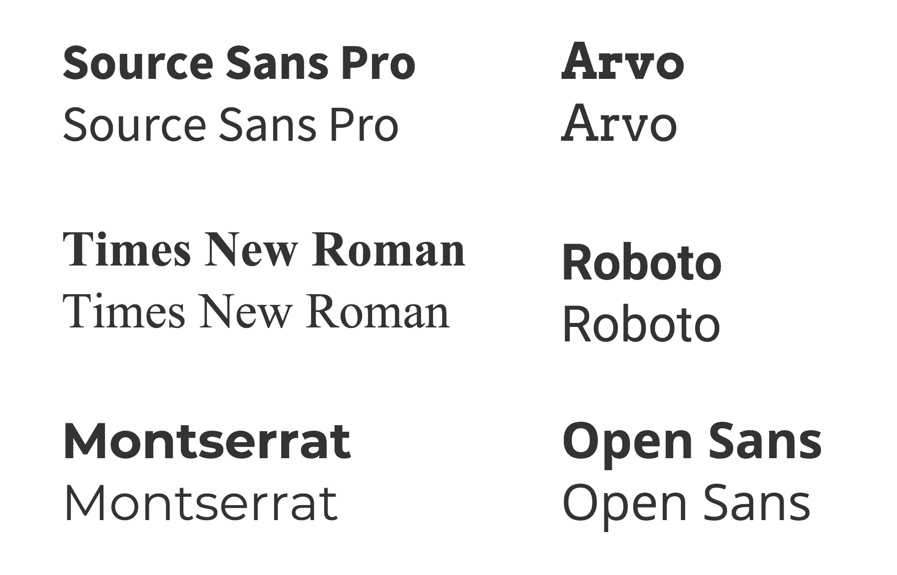
When picking fonts for your presentation, keep this technique in mind. Pick a font that has a noticeable difference between the “bold” font face and the “regular” font face.
Sans serif fonts (like Arial, Helvetica, Montserrat, Roboto) are usually best for presentations because they’re cleaner and easier to read on screens. Serif fonts (like Times New Roman) on the other hand can work for formal settings, but they often reduce readability at smaller sizes. For accessibility, always choose clear sans serif fonts.
The last thing to remember when using size, weight, and color to create emphasis on a slide: don’t try to emphasize too many things on one slide.
If everything is highlighted, nothing is highlighted.
10. Apply design choices consistently to avoid distraction
Audiences are quick to pick out, and focus on, any inconsistencies in your presentation design. As a result, messy, inconsistent slide decks lead to distracted, disengaged audiences.
Design choices (fonts and colors, especially), must be applied consistently across a slide deck. The last thing you want is for your audience to pay attention to your design choices before your content.
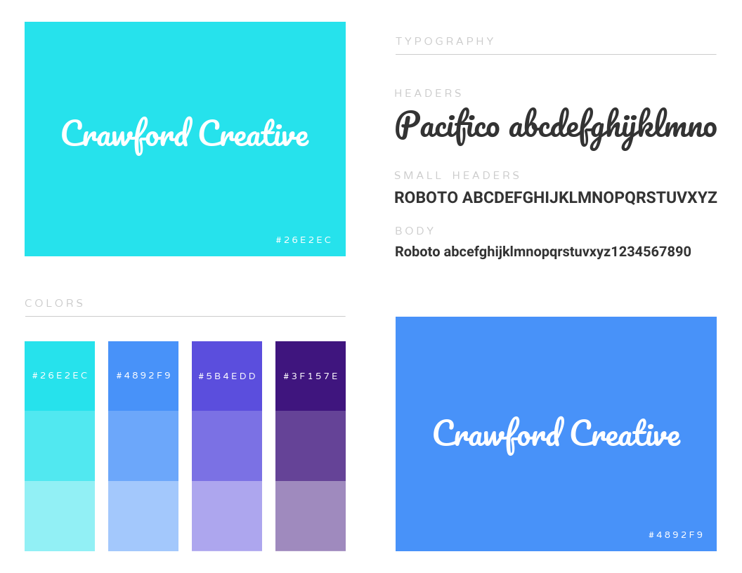
To keep your design in check, it can be helpful to create a color palette and type hierarchy before you start creating your deck, and outline it in a basic style guide like this one:
I know it can sometimes be tempting to fiddle around with text sizes to fit longer bits of text on a slide, but don’t do it! If the text is too long to fit on a slide, it should be split up onto multiple slides anyway.
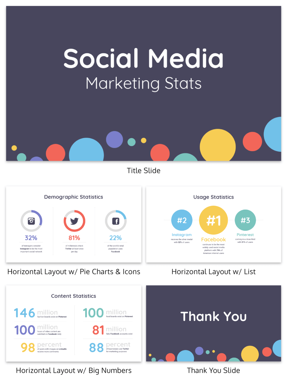
And remember, a consistent design isn’t necessarily a boring one. This social media marketing presentation applies a bright color scheme to a variety of 3-column and 2-column layouts, remaining consistent but still using creative presentation ideas.
11. Split a group presentation by topic
When giving a group presentation it’s always difficult to find the right balance of who should present which part.
Splitting a group presentation by topic is the most natural way to give everybody the chance to attempt without it seeming disjointed.
When presenting this slide deck to investors or potential clients, the team can easily take one topic each. One person can discuss the business model slide, and somebody else can talk about the marketing strategy.
Top tips for group presentations:
- Split your group presentation by topic
- Introduce the next speaker at the end of your slide
- Become an ‘expert’ in the slide that you are presenting
- Rehearse your presentation in advance so that everybody knows their cue to start speaking
12. Use a variety of page layouts to maintain your audience’s interest
Page after page of the same layout can become repetitive and boring. Mix up the layout of your slides to keep your audience interested.
In this example, the designer has used a variety of combinations of images, text, and icons to create an interesting and varied style.
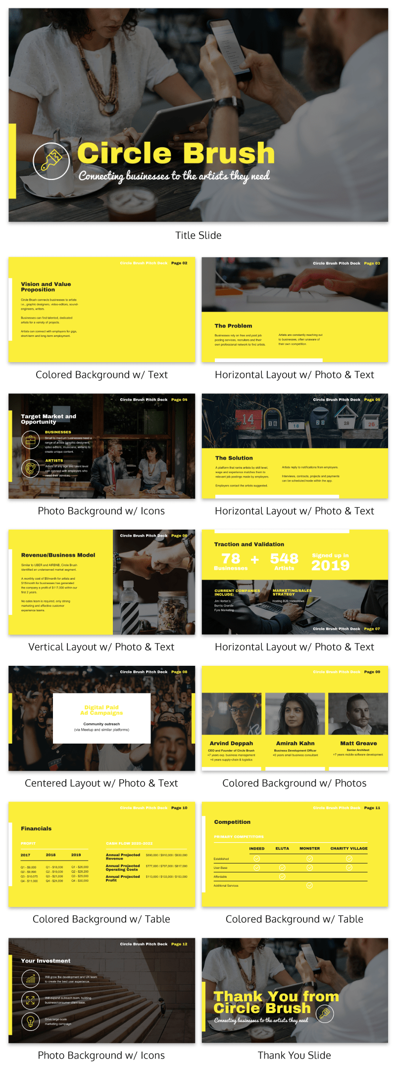
There are hundreds of different combinations of presentation layers and presentation styles that you can use to help create an engaging presentation. This style is great for when you need to present a variety of information and statistics, like if you were presenting to financial investors, or you were giving a research presentation.
Using a variety of layouts to keep an audience engaged is something that Elon Musk is an expert in. An engaged audience is a hyped audience. Check out this Elon Musk presentation revealing a new model Tesla for a masterclass on how to vary your slides in an interesting way:
13. Use presentation templates to help you get started
It can be overwhelming to build your own presentation from scratch. Fortunately, my team at Venngage has created hundreds of professional presentation templates, which make it easy to implement these design principles and ensure your audience isn’t deterred by text-heavy slides.
Using a presentation template is a quick and easy way to create professional-looking presentation skills, without any design experience. You can edit all of the text easily, as well as change the colors, fonts, or photos. Plus you can download your work in a PowerPoint or PDF Presentation format.
After your presentation, consider summarizing your presentation in an engaging manner to reach a wider audience through a LinkedIn presentation.
14. Include examples of inspiring people
People like having role models to look up to. If you want to motivate your audience, include examples of people who demonstrate the traits or achievements, or who have found success through the topic you are presenting.
15. Dedicate slides to poignant questions
While you might be tempted to fill your slides with decorative visuals and splashes of color, consider that sometimes simplicity is more effective than complexity. The simpler your slide is, the more you can focus on one thought-provoking idea.

16. Find quotes that will inspire your audience
A really good quote can stick in a person’s mind for weeks after your presentation. Ending your presentation with a quote can be a nice way to either begin or finish your presentation.
A great example of this is Tim Ferriss’ TED talk:
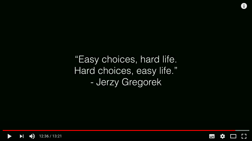
Check out the full talk below.
17. Emphasize key points with text and images
When you pair concise text with an image, you’re presenting the information to your audience in two simultaneous ways. This can make the information easier to remember, and more memorable.
Use your images and text on slides to reinforce what you’re saying out loud.
Doing this achieves two things:
- When the audience hears a point and simultaneously read it on the screen, it’s easier to retain.
- Audience members can photograph/ screencap the slide and share it with their networks.
Don’t believe us? See this tip in action with a presentation our Chief Marketing Officer Nadya gave recently at Unbounce’s CTA Conference. The combination of text and images on screen leads to a memorable presentation.

18. Label your slides to prompt your memory
Often, presenters will write out an entire script for their presentation and read it off a teleprompter. The problem is, that can often make your presentation seem too rehearsed and wooden.
But even if you don’t write a complete script, you can still put key phrases on your slides to prompt jog your memory. The one thing you have to be wary of is looking back at your slides too much.
A good presentation gets things moving! Check out the top qualities of awesome presentations and learn all about how to make a good presentation to help you nail that captivating delivery.
19. Use white space to let your content breathe
White space, also known as negative space, isn’t wasted space. It’s what gives your content structure, balance and breathing room.
Without it, even the best design can feel cluttered or overwhelming (think of it as giving your reader a mental pause between ideas).
By intentionally spacing out text blocks, images and design elements, you create a visual hierarchy that guides the eye.
This not only boosts readability and comprehension but also shows attention to detail, something both users and search engines notice. White space signals professionalism, care and clarity, all of which help build trust and authority in your content.
So next time if you’re thinking about filling up all the white space in your content, think twice.
20. Avoiding cognitive overload in your slides
Your audiences can only process so much information at once. When slides are packed with text or cluttered visuals, their working memory gets overwhelmed. This is called cognitive overload, which makes it harder for people to follow your message or remember key points.
Many of the strategies we’ve already covered—like focusing on one idea per slide, using visuals to support your points and scaffolding complex content—work because they reduce that overload. They help your audience absorb information step by step instead of all at once.
A few more ways to keep your slides clear and engaging:
- Reveal content gradually: Use simple animations so elements appear as you talk about them, guiding your audience’s attention.
- Simplify your charts: Skip 3D effects and avoid cramming in too many categories—clean, minimal visuals are easier to interpret.
When your slides are easier to process, your message lands more effectively and your audience walks away actually remembering what you said.
21. Designing for accessibility: Dyslexia and visual impairments
Great presentation design isn’t just about looking polished, it’s about making sure everyone in your audience can actually follow along.
Prioritizing accessibility helps people with dyslexia, color blindness, or other visual impairments fully engage with your content, which builds trust and shows you’ve considered diverse needs.
Here’s how to make your slides more accessible:
- Skip all caps: Text in all caps can be harder to read for dyslexic audiences. Use sentence or title case to improve readability.
- Avoid red/green color combinations: These can be challenging for people with color blindness. Stick with high-contrast color pairs that are easier to tell apart.
- Add alt-text to images: When sharing your deck digitally, include alt-text so screen readers can describe visuals for people with low vision or blindness.
And a few extra design tweaks that go a long way:
- Use generous line spacing: More space between lines reduces visual clutter and makes text easier to follow.
- Stick to left-aligned text: Centered or justified paragraphs can be hard to track visually, especially for those with reading difficulties.
By intentionally designing for accessibility, you make your presentations more inclusive, and that reflects both expertise and empathy in your work.
Conclusion
Audiences don’t want to watch presentations with slide decks jam-packed with text. Too much text only hurts audience engagement and understanding. Your presentation design is as important as your presentation style.
By summarizing our text and creating slides with a visual focus, we can give more exciting, memorable and impactful presentations.
Give it a try with one of our popular presentation templates: