What’s the point of creating documents if the intended audience can’t read them? Documents hold no value if they are inaccessible no matter if it’s an annual report, a contract or a research paper.
Most businesses treat accessibility like a box to check — something to do just to stay compliant. But accessibility is way bigger than that. It’s the difference between creating documents that inform everyone versus those that exclude some — like people with visual or cognitive disabilities.
To quote Martin Luther King Jr.:
Injustice anywhere is a threat to justice everywhere.
If your PDFs are unreadable to some, they are ineffective for all. And fixing that is not just morally right — it’s also “smart” from the business point of view.
In this blog, you will learn the best practices for designing and remediating PDFs to make them truly accessible.
From structuring content for screen readers to ensuring proper tagging and contrast, I’ll break down practical steps that improve compliance, usability and engagement.
Key principles of PDF remediation
I’ve lost count of the number of times when I download a PDF from the internet only to find it completely unreadable. In most cases, the text in the PDF is scattered all over the place, images are wrapped shoddily and links lead to 404 Error pages.
These experiences have made me realize how frustrating an inaccessible document must be for someone relying on assistive technology.
PDF remediation is the process of fixing these issues.
Remediation ensures that documents are structured, tagged and properly formatted so everyone — including those with disabilities — can access the content.
And it’s not an either-or situation. Making your PDFs accessible doesn’t take anything away from the experience of users without disabilities. It actually improves the doc’s usability for everyone.
But how do you ensure your PDFs meet accessibility standards? It starts with understanding the key principles of PDF remediation.
Here are eight key remediation principles you can follow to make your documents accessible for all if you use Adobe to create PDFs:
Run an accessibility check
Use Venngage’s free PDF Checker tool to check if your PDFs are accessible to everyone. It helps you identify elements that need attention, such as missing tags or alternative text.
Add tags for structure
Apply appropriate tags to define the document’s structure. Use headings (e.g. H1, H2 or H3) to have a logical flow that readers will find easy to navigate.
Write clear alternative text (alt text)
Provide descriptive alt text for images, charts and graphs. This ensures users with visual impairments can understand the content conveyed by visuals.
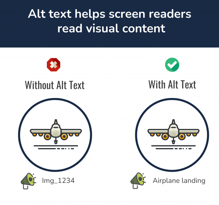
Here’s why an image alt text matters. Without it, a screen reader will simply announce “image,” giving zero context to users with low vision. But if the alt text says “airplane landing,” it gives the reader much better context about the image because now the screen reader describes it perfectly:
Set a logical reading order
Make sure the content follows a logical sequence for screen readers. Use the Reading Order tool to adjust the flow, preventing confusion for users relying on assistive technologies.
Use descriptive link text
Replace vague phrases like “Click here” with meaningful descriptions that convey the link’s purpose or destination.
Check color contrast
Make sure you have enough color contrast between text and background colors. This improves readability for users with visual impairments or color blindness.
You can use Venngage’s color contrast checker to adjust the ratio of your foreground and background colors:
Add metadata
Include essential information such as document title, author, subject and language settings. Metadata aids in document identification and accessibility.
Perform a final accessibility check
After making adjustments, run the Accessibility Check again to ensure all issues have been addressed and the document meets accessibility standards.
How can you do it? Use Venngage’s free PDF Accessibility Checker to make sure your PDFs are accessible to everyone.
Did you find these steps overwhelming to follow? Good news — you’re not alone.
Manual PDF remediation is often time-consuming and tedious. It also bears the risks of human errors and oversights especially when dealing with complex layouts.
On the other hand, automated accessibility checks offer pre-set processes that speed up the remediation processes. Of course, you can create a workflow to have a human review in place to ensure accuracy while making the process more efficient.
Want to skip the hassle of manual fixes and design accessible PDFs at scale?
In the next section, let’s go through some of the most common challenges — besides manual errors — that make PDF accessibility difficult to achieve.
Common challenges in PDF accessibility
Making PDFs accessible sounds simple — until you have to create one. From complex charts to messy layouts, small mistakes can turn a document into a frustrating experience for users with disabilities.
Let’s look at the biggest roadblocks standing in the way of true PDF accessibility.
Complex data visualization
Detailed charts and graphs are common in reports and research papers. But if your PDF doesn’t have descriptive alt text, these visuals are as good as non-existent to users with visual impairments.
For instance, screen readers don’t recognize visuals without alt text — or worse, they misinterpret them if you give them half-hearted descriptions.
Without clear descriptions, an important financial trend or research finding is as good as an incomplete PDF for people who use screen readers. They miss key insights that could shape their decisions. This leaves them at a grave disadvantage.
Information overload
PDFs packed with poorly structured paragraphs, haphazardly placed bullet points and walls of text are exhausting for anyone — with or without disabilities.
But it’s especially frustrating for people with vision or reading disabilities because they are at the mercy of screen readers.
And screen readers aren’t really great at navigating long documents. For instance, the lack of section breaks or headings in a text-heavy document forces assistive technologies like screen readers to read the content as one continuous block.
It’s like cramming the subtitles of multiple movie scenes onto one screen. Imagine the horror of reading a word salad with no punctuation, no line breaks or no clear order.
Inconsistent formatting
How would you feel if you saw someone walking down the street in a dinner jacket, a cowboy hat, swimming trunks and Converse shoes? You’d probably cross the street to avoid any kind of eye contact, right?
That’s how it feels to process a PDF document with mismatched fonts, irregular spacing and unpredictable layouts.
Bad formatting isn’t just an eyesore. From the accessibility standpoint, they create barriers that prevent people from accessing information correctly.
A document that looks visually okay can be completely unreadable to a screen reader if headings are styled manually instead of tagged correctly. Similarly, inconsistent use of bold, italics or color can make it hard for readers to process the intended meaning of the content.
Compliance risks
Think accessibility is a nice-to-have gesture for people with disabilities? You might be surprised to know that ignoring it can cost your business hefty fines and a big dent in your brand reputation.
For instance, ADA violations can cost up to $55,000 for a first offense and $110,000 for repeat offenses. Industries like healthcare, finance and education are under strict compliance. Yet, many organizations still assume a simple “Save as PDF” makes their documents accessible. It doesn’t.
How Venngage simplifies creating accessible content
It’s 2025 and creating accessible PDFs shouldn’t be a tedious, manual task. With stricter regulations and better technology, there is no excuse for creating inaccessible content.
Venngage makes creating accessible PDFs easy with intuitive features that help your business design visually engaging, fully accessible content.
Whether you need business reports, presentations, marketing materials or educational content, Venngage lets you create PDFs that meet accessibility standards without compromising on aesthetics.
Here are key accessibility features that even top design platforms like Adobe and Canva do not offer:
Ready-to-use accessible templates
Choose from professionally designed templates built with accessibility in mind — structured layouts, clear typography and logical reading order.
Venngage offers an entire library of professionally designed accessibility-friendly templates. They follow accessibility best practices with structured layouts, readable typography and a logical reading order.
Each template comes with easy navigation that aligns with key accessibility standards like ADA, WCAG 2.1 and Section 508.
Accessible color palette generator
Did you know that around 350 million people worldwide are colorblind? The world you see through the proverbial rose-colored glasses isn’t as rosy for people with color vision deficiency.
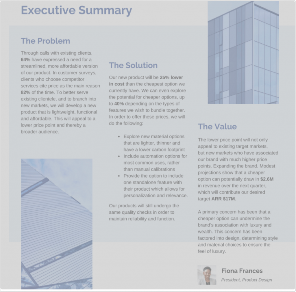
But Venngage’s Accessibility Testing Tools can help you ensure that you don’t exclude colorblind people in the dark. You can use the simulator tool to see exactly how your designs will appear to individuals with visual impairments.
Here is an example of how a document looks to someone with Cataracts, a condition that causes cloudy vision and reduces contrast:
Automatic alt text generator
For screen readers, images, charts and diagrams are meaningless without clear descriptions. A chart without context is just lines and bars. And a diagram without a description is just shapes on a page.
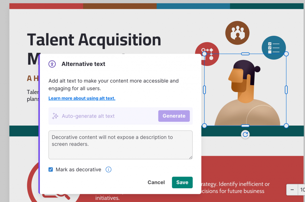
Venngage’s AI-powered alt text generator saves you time by automatically generating descriptive text for visuals.
All you have to do is select a non-text element in your PDF (such as an icon, shape or photo) and follow the instructions on the screen:
Smart design recommendations
Venngage has a host of tools that you can use to detect common accessibility issues like poor contrast, untagged images or unreadable text.
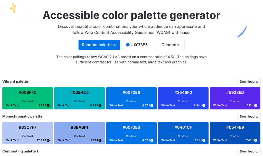
For instance, you can use the color palette generator to come up with color combinations that comply with Web Content Accessibility Guidelines (WCAG):
Collaboration tools
Accessibility is a team sport — and Venngage makes it easy to stay on the same page.
With Venngage, you can create branded templates and grant shared access to your team so that they can create consistent documents without having to worry about accessibility.
This is especially helpful for organizations who need to create accessibility-ready documents on a regular basis and at scale, or they need to share real-time feedback.
Whether you are a university team that requires its faculties to create accessible PDFs or a non-profit that needs the donors to review grant forms, Venngage’s collaboration-friendly features let everyone create and access PDFs in real time.
Best practices for creating accessible PDFs
Having the intention to create accessible PDFs is one thing. Actually doing it without missing key details? That’s where it gets tricky.
Here are some best practices to make sure your PDFs are accessibility-ready every time:
Prioritize key information
People don’t read PDFs like a novel — they scan. If your most important insights are buried under paragraphs of fluff, they are as good as invisible.
Put key takeaways, summaries and must-know details upfront so readers — especially those who use assistive technologies — get the message without having to go through dense content.
Use visual hierarchy
A wall of text is intimidating, inaccessible and frustrating for everyone. Structure matters more than you think — it defines the visual hierarchy and guides readers through your content with ease.
Properly formatting headings, bullet points and white space makes your content easier to process.
Screen readers rely on logical structure to help users process the content. Therefore, make sure your content is built for easy comprehension, not a long-winded rambling.
Keep language simple and clear
Using big words doesn’t make you sound smarter — just harder to understand. Use plain, direct wording so everyone, including non-native speakers and those with cognitive disabilities, can follow along.
If you can say it in five words instead of fifteen, do it.
Maintain consistent branding
Inconsistent fonts, colors and layouts create confusion. A clear, cohesive design reinforces brand identity while improving readability.
The choice of fonts, colors and layouts aren’t limited to aesthetics — they impact readability too. A PDF with five different fonts and a chaotic mix of colors is a headache to process — like the guy in a cowboy hat and boxer.
Keep things clean, legible and consistent with your brand personality. If you want to dive deeper into why cohesive visuals matter, read our guide on maintaining brand consistency.
Use strong calls to action
Every document should guide the reader toward the next step. Whether it’s subscribing, downloading or reaching out — make the CTAs clear, actionable and easy to find.
Accessible PDFs are not just about readability—they should drive action. But if your reader makes it to the end of the document and has no idea what to do next, you have failed.
Tell readers exactly what to do — subscribe, download or register. Make it obvious. Make it actionable. If they have to guess, they will likely move on to the next item on their schedule.
The accessibility gap you didn’t know you had
Most organizations assume that making PDFs accessible benefits only those with disabilities. But accessibility improves the reading experience for everyone.
Think about it. A report with proper headings, logical reading order and clear contrast isn’t just readable for someone using assistive tech. It’s also useful for busy professionals who are in the habit of skimming a document on their phone or non-native speakers that need to process complex information faster.
Sure, accessibility checks your compliance box — but it’s also a competitive advantage that can help you improve the user experience and search engine rankings. And let’s be real, the harder your content is, the easier it is for people to ignore.
Experience the difference accessibility makes. Schedule a demo with Venngage to learn more about how your organization can create accessible, compliant and user-friendly PDFs at scale.


