


Infographics help build brand trust and authority, engage your audience and explain complex concepts. But even the best infographic out there is still just words and images on a page. That’s why interactive and animated infographics are so appealing—they give you a chance to inject life and movement into your marketing campaigns.
Like with any type of visual communication, when it comes to creating interactive infographics or animated infographics, the only limit is your creativity. Of course, the nature of these types of infographics means most of them will take a bit more investment of time, but we think there are many reasons you’ll find the additional investment well worth it.
With Venngage for Business, you can make interactive infographics as searchable and SEO-friendly PDFs that let you embed clickable links, and you can create lead-qualifying content by embedding forms or Youtube videos into your infographics. These dynamic infographics can help round out your content strategy.
NEW! Introducing: Marketing Statistics Report 2022
It’s 2022 already. Marketers, are you still using data from pre-COVID times?
Don’t make decisions based on outdated data that no longer applies. It’s time you keep yourself informed of the latest marketing statistics and trends during the past two years, and learn how COVID-19 has affected marketing efforts in different industries — with this FREE marketing statistics report put together by Venngage and HubSpot.
The report uses data gathered from over 100,000 customers of HubSpot CRM. In addition to that, you’ll also know about the trends in using visuals in content marketing and the impacts of the pandemic on visual content, from 200+ marketers all over the world interviewed by Venngage.
Grab your copy now — it’s not like any other marketing reports out there, plus it’s 100% free!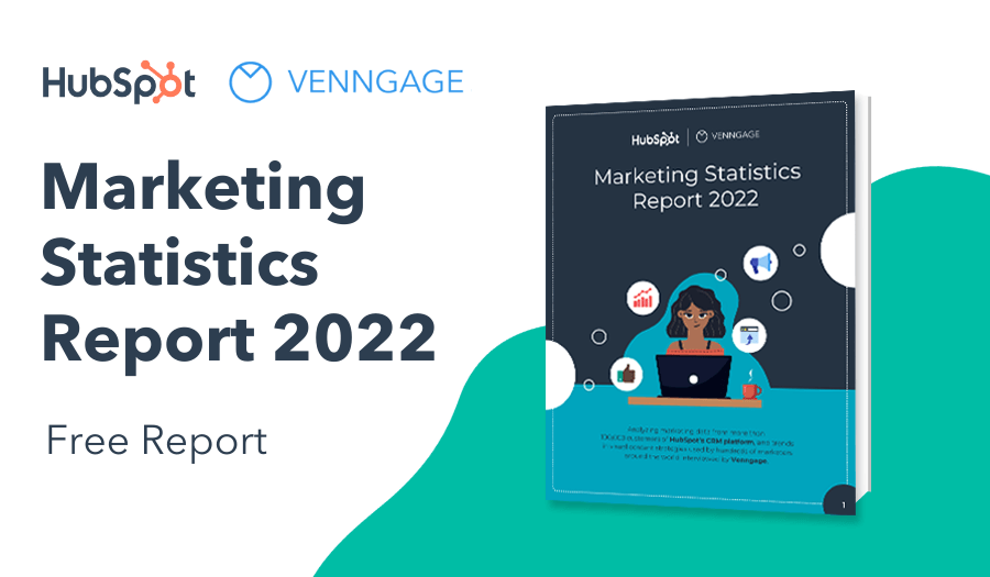
Let’s take a look at these 15 best interactive infographics for 2021: these are our favorite and most inspiring recent examples of interactive and animated infographics that should give you something to shoot for in your business communications.
Click to jump ahead:
- LGBTQ+ acronym explained interactive infographic
- Canine genealogy interactive infographic
- Family fun in Scottsdale interactive infographic
- Fashion footprint interactive infographic
- Gender identity animated infographic
- Law survey interactive infographic
- Lunar cycles & sleep patterns interactive infographic
- Main Street index interactive infographic
- Mask matters interactive infographic
- My home vs. Mahomes interactive infographic
- Negro League stars interactive infographic
- Wealth inequality interactive animated infographic
- What if the big one hit? Interactive animated infographic
- Where’s Wallace? Interactive infographic
- TCE contamination interactive infographic
Want to learn more about other types of infographics? Read our blog on the 9 main types of infographics or watch the video below:
LGBTQ+ acronym explained interactive infographic
This simple interactive infographic published by Northwestern University’s Medill School of Journalism consists entirely of an image accompanied by simple pop-ups that explore more information. In this case, the information is an explanation of the LGBT+ acronym, but this approach could apply to many other uses.

What we love about it: The design is a perfect match for the topic, and the instructions are detailed right upfront. One suggestion for enhancing the interactive infographic would be to include links to the information sources or advocacy organizations; interactives are an ideal way to push users to additional content.
Canine genealogy interactive infographic
You might know the breed or breeds your dog belongs to, but how much do you know about related dog breeds? The Guardian‘s interactive infographic lets users explore the origins of common breeds of man’s best friend. Users have the option of hovering over each picture surrounding the breed in question, or they can select the key to display the names rather than hovering. Interactive infographic examples like this are ideal for illustrating articles and other content.

What to watch out for: If you’re designing an interactive infographic that users will need to interact with to understand, be sure it’s obvious what they need to do. In this case, the “group key” information is followed by a button with a downward-facing arrow, and for some readers, this may be too subtle a clue.
Family fun in Scottsdale interactive infographic
Created to promote the Marriott hotel in Scottsdale, Arizona, this simple flow-chart interactive infographic uses an engaging style and offers a set of local Scottsdale activities. It’s intuitive and easy to use, and the retro style is entertaining.

What to watch out for: When creating something like this, be sure to think about adding real value. In this case, the McCormick-Stillman Railroad Park is a well-known attraction in Scottsdale, but they’ve also suggested the Native American Learning Center, which many people may not know about. One element that could elevate this is to add links where users could buy tickets to attractions.
Fashion footprint interactive infographic
Quiz- and calculator-style interactive infographics are extremely engaging. Informative, potentially challenging ones like this ThredUp carbon footprint calculator are useful for putting huge, complex issues into perspective or shining a light on a serious issue.

What we love about it: The style is distinctive, and it allows users to go back as well as forward, so they can change their answers if they sense their footprint is getting too big for their comfort. The subtle visual changes when the user moves the slider toward more usage are clever and provide another cue about the user’s carbon footprint based on their clothing purchase habits. And the quiz format is immediately recognizable, which makes it one of the best interactive infographic types to consider.
Gender identity animated infographic
This animated infographic by YouTube user Calvin Logan takes a whimsical, friendly and conversational approach to explain the basics of a topic that many people find mystifying: gender identity.
Why we love it: With a running time of just over 1 minute, this hits the sweet spot for the attention span of the average viewer. Plus, the animation is simple, which gives the cute characters a chance to shine.
Law survey interactive infographic
This interactive infographic produced by the Wisconsin Law Journal is as simple as it gets: It’s essentially a slideshow that takes users through the results of an American Bar Association survey about how attorneys perceive the state of gender equity in the legal profession.

What to watch out for: Some users will appreciate the slides that give them a chance to dig into the specifics of the survey data. However, even on a desktop computer, it’s a bit difficult to visualize the data without removing some of the categories. Assume your audience won’t take the added steps necessary to establish an ideal environment for fully understanding the information when you begin creating interactive infographics.
Lunar cycles & sleep patterns interactive infographic
A University of Washington study on how sleep quality is affected by lunar cycles generated a big headline: People sleep less and go to bed later on nights before a full moon. It also provided enough data to create this engrossing sleep patterns interactive infographic that lets users explore the average bedtime and duration of sleep at each point of the lunar cycle. And users can toggle between urban and rural settings to see how they differ.

What to watch out for: This piece is interesting even if you don’t know much about lunar cycles or sleep science, but some basic definitions might be helpful. However, since users are unlikely to encounter the interactive infographic outside of the context of a story about the study itself, the impact of undefined terms isn’t huge.
Main Street index interactive infographic
Companies and organizations across the world have been devastated by the COVID-19 pandemic, and few businesses are unscathed. Payroll services company CBIZ turned otherwise bland survey data about how businesses have been affected into a Main Street Index interactive infographic with simple animations. This type of infographic would be ideal for internal or external surveys you’ve conducted.

What we love about it: The format is intuitive, which means there’s no learning curve for users. The interactive infographic also looks the same on mobile as it does on a desktop, which is crucial in today’s mobile-first world.
Mask matters interactive infographic
Created by University of British Columbia researcher Timothy Sipkens, this engrossing and highly interactive Mask Matters infographic encourages users to explore data on the efficacy of masks and even allows them to build their own masks, seeing how effective it is at preventing the spread of particles.

What we love about it: The novel approach to data gives users a chance to do some hands-on learning, and when combined with the power of visuals, the audience is able to envision and create their ideal mask setup. The result is a dynamic infographic that gives readers seemingly endless options for creating their mask setup.
My home vs. Mahomes interactive infographic
Patrick Mahomes is a National Football League MVP quarterback and a Super Bowl champion. He’s also a rich young guy who got even richer after signing a contract worth up to $500 million to remain with the Kansas City Chiefs for at least a decade. This possibly infuriating infographic by betting site WSN lets people input their annual salary and see how long it would take them to purchase the homes of several professional athletes, including Mahomes.

What we love about it: The interactivity is limited to the user inputting their salary and scrolling down. While that means they might not spend a ton of time on the page, it also means the lean approach works for all platforms and browsers.
Negro League stars interactive infographic
FiveThirtyEight, made famous by its sometimes accurate projections of U.S. presidential elections, is a star in many data analytics circles. One big reason is its data-rich interactive infographics, like this one on Negro League stars who may finally get the recognition they deserve after Major League Baseball formally recognized the Negro Leagues to “major league” status.

What to watch out for: While the interactivity is immersive, it’s not immediately clear what the point is of the information. The more you dig, the more you see that exploration is the objective. And there’s certainly enough of that to be done, which brings up a second point: The extent of data required to put this together is daunting, so it’s not something you could create on a whim.
Wealth inequality interactive animated infographic
This isn’t exactly new or even a hidden gem, but its viral traction is the subject of envy. YouTube user Politizane’s “Wealth Inequality in America” has gotten nearly 24 million views since it was uploaded in 2012. The conversational tone is an ideal one for a dense topic like income inequality, and it’s an excellent example of encouraging viewers to think in a new way.
What to watch out for: If you’re taking a political stance, as this video does, be sure to do your homework and prepare for the backlash.
What if the big one hit? Interactive animated infographic
YouTube channel The Infographics Show posts a new animated infographic every day, so there’s no shortage of inspiration from them. But our favorite recent example takes a “what-if” approach to imagine a magnitude-10 earthquake along the Cascadia subduction zone in North America. Some geologists have predicted a major quake will strike the zone in the next half-century, and this “What if Richter 10 Scale Earthquake Hit?” animated infographic imagines the devastating repercussions.
What to watch out for: A just over 10 minutes, the running time is long, which is to be expected for a monetized YouTube channel. Best practices for generating revenue on YouTube recommend a length of at least 8 minutes; that said, for most content marketing purposes, this is far too long. Consider the attention span and time availability of your target audience.
Where’s Wallace? Interactive infographic
For fans of HBO’s “The Wire,” this interactive from the sports and culture site The Ringer is a surefire time-waster. The Where’s Waldo-style interactive follows a simple premise: The user must locate 47 characters in a vast landscape of the major and minor players in the show. (Warning: Strong language, so keep your speakers off if you’re at work.)

What we love about it: This simple idea capitalizes on the obsessive nature of the show’s devoted fanbase. While it’s not exactly an infographic since it’s not sharing any information about the characters, the game-style execution makes it endlessly compelling.
TCE contamination interactive infographic
Environmental contamination is a hot-button issue, for obvious reasons. Environmental Working Group (EWG), an advocacy organization, created an interactive map infographic of the U.S. that explores known sites where public water systems have been contaminated by the industrial solvent trichloroethylene (TCE). Circles denote both the location and the extent of the contamination.

What we love about it: Interactive infographics that rely on maps as their underlying structure are among the most intuitive, and this one is no exception. Thanks to the ubiquity of tools like Google Maps, the average user knows at a glance how to interact with this piece.
In summary: Interactive and animated infographics are popular, and demand for them is growing.
There’s no doubt they’re more complex than static infographics, but if you’ve got the right story to tell, interactivity and motion may be the best way to tell it.
According to Hubspot, about 85% of business-to-business marketers are using interactive infographics or plan to, while our research found that at least 15% of marketers use videos and presentations.
Given the additional time and effort involved in creating one, they’re not a perfect match for every infographic, but if your story fits within the tips we offered throughout this post, they may just be your best bet.
Start creating interactive infographics with Venngage for Business in the form of searchable and SEO-friendly infographic PDFs that let you embed clickable links. You can also create lead-qualifying content by embedding forms or Youtube videos into your infographics.


