


Remember those days when SEOs used to claim that you needed to write 5,000-word articles in order to drive any organic traffic to your website?
You’d spend hours upon hours trying to put together the best, most informative article and answer every single question possible on the internet?
Let me guess, the bounce rates on those posts were 80% or higher, and when you looked into the heatmaps, people stopped scrolling after the first sentence.
Well, Debra (may I call you Debra?) you’re not alone here.
The truth is, we live in a society of highly lazy people who read at a 6th-grade level. And that’s on the higher end of the spectrum.
The point is, people don’t actually want to read. They actually only want two simple things: to skim content, and to get an answer immediately.

Before you get bored of this article because I haven’t answered your question yet, let me answer your question: yes.
Yes, there is a way to write fewer words, to reduce your bounce rates, and to increase your rankings.
How?
By using mini infographics and structuring your content in an entirely different way, to appeal to those 6th graders that you’re writing for.
Related: Marketing Infographics: The Definitive Guide [Includes Infographic Templates]
But before you exit this page, don’t. Because in the following few skimmable sections of this article, I’m going to tell you the exact steps you can take to use infographics for SEO and achieve these goals, and all of the goals you have in life.
Actually, only the goals about ranking faster with fewer words. I don’t know the meaning of life… yet.
I’ll also show you easy-to-edit infographic templates you can customize now with Venngage’s Infographic Maker.
Click to jump ahead:
- Why mini infographics improve on-page SEO
- Types of mini infographics to use to maximize time on page
- Choose the right template for your mini infographics
- Optimize your blog SEO with mini infographics
- See the results for yourself
Part 1: How do I know that mini infographics are the solution to better on-page SEO?
A few years back, some of the people on the content team at Venngage asked ourselves a simple question: How can we increase our rankings without building any new backlinks, and only focusing on formatting updates to our content?
(But if you still want to build backlinks, read our guide on how to use guestographics to build links and increase your SEO rankings, fast.)
Back to the question above: in an attempt to answer it, we ran a focus group across some of our customers to see how they interacted with content.

The caveat was we only showed them two articles at a time, and scrolled through those articles very quickly.
In other words, people had 10 seconds to decide what they would read, and why.
Long story short, people indirectly told us 2 things:
- They were more likely to actually spend time on blog pages that were broken up by multiple headers, with a clear indication of what was to come.
- They were more likely to select articles that had a break in text and showcased a mini infographic or other forms of visual content, every 100 words or so.
These points are not surprising, of course, since even Google is starting to cut straight to the point and show people nice pictures.

In fact, more and more often, we are seeing image breaks or little question-and-answer boxes directly in the search engine results pages, since—as we now know—people are lazy and want lots of breaks in text and formatting.
You’ll notice this more frequently across many top-ranking sites and pages too. Particularly for content that contains the words examples or some variation of that word in it.
When you’re done reading this article, you should go Google that yourself to see, but only after this article since there’s a lot of really important information coming up, and you would likely be mad at yourself if you missed out on it.
Another thing you’ll notice later when you Google the above for yourself, is that these top-ranking posts are also structuring the headings and subheadings in a highly direct and simplified manner, like such:

Optimized headers that are followed by a relevant image or mini infographic which summarizes the little paragraph you wrote, will keep people engaged and as a result, on your page. And no, I did not intend for that last bit to rhyme, but I’m not upset about it.
Part 2: What is the right type of mini infographics to use in order to maximize time on page?
Now, when it comes to designing your mini infographics, it’s important to remember that these infographics are by definition, mini.
The intent is to summarize, in a quick visual, exactly what the main point is that you’re trying to express.
So try to remember these two things:
- Make sure you use text hierarchy to break up long passages of text, and to tell your audience what is most important for them to focus their attention on.
- Summarize those same key points into a simplified visual takeaway.
If you’ve ever heard the saying that practice makes perfect, well in the case of engagement and lower bounce rates, repetition enforces information retention. Using visual cues is yet another proven method for reinforcing learning, and infographics are the best visual cue there is.

Part 3: Choosing the right template to design your mini infographic
If you’re starting to freak out because you don’t have any sense of design, or if you’re just not sure where to start, I’m not suggesting you need to become a pro at infographic design.
In fact, I’d actually urge against it. That’s why data communication solutions like Venngage exist, so that you can make infographics in a matter of seconds, rather than figuring out how to use complicated professional software to make a simple mini infographic.
I’ve taken the liberty of outlining a few examples of mini infographic templates that you can start using right away, with the drag-and-drop editor we have built for you.
You don’t need to be a designer to build infographics. Choose from Venngage’s thousands of easy-to-edit templates and start creating your own infographic today.
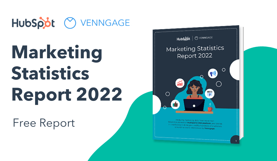
NEW! Introducing: Marketing Statistics Report 2022
It’s 2022 already. Marketers, are you still using data from pre-COVID times?
Don’t make decisions based on outdated data that no longer applies. It’s time you keep yourself informed of the latest marketing statistics and trends during the past two years, and learn how COVID-19 has affected marketing efforts in different industries — with this FREE marketing statistics report put together by Venngage and HubSpot.
The report uses data gathered from over 100,000 customers of HubSpot CRM. In addition to that, you’ll also know about the trends in using visuals in content marketing and the impacts of the pandemic on visual content, from 200+ marketers all over the world interviewed by Venngage.
Grab your copy now — it’s not like any other marketing reports out there, plus it’s 100% free!
In the meantime, if you want to first check out the mini infographic templates you can use for your SEO strategy, read on.
Use this comparative bar chart template
To summarize quick data points easily for your audience.

Use this timeline mini infographic template
To visual timelines for your projects, processes, presentations, employee onboarding, event planning and more.

Use this organizational chart template
To assist with your employee onboarding process or add visual cues to your company reports.

Use this simple editorial infographic template
To showcase a breakdown, or list of important points to remember by leveraging a scatterplot chart and engaging icons.

Use this word cloud template
To tell people what the most important message they should remember is after a long passage of text to further reinforce your message.

And if those still don’t seem like enough options, explore over 1000’s of these mini infographic and chart templates that real professional designers have made just for you. They’re not only great at improving your on-page SEO—they’re perfect for your social media infographics as well.
Related: 10 Tips to Make Eye-Catching Infographics for Social Media
Part 4: Go back and optimize your blog SEO with mini infographics
Now that you know what really matters in order to improve your on-page SEO, and how much more valuable it is to reformat your content for easy consumption, you should go into Google Analytics and take a look at the pages with a high bounce rate that might be ranking on the latter end of page one on Google.
Start by taking into account what the current rankings are, and what the bounce rates for those pages are.
Once you have those baselines tracked, start testing this method out by updating exceedingly text-heavy content with more descriptive headers, and summarized mini infographics.
For example, you can visualize statistics and summarize boring reports or large numbers using this mini infographic:

For every 100-150 words of text you have, try to break it up with a mini infographic, and see what the results look like after a few weeks.
Related: The Anatomy of the Perfect Blog Post: Proven Blogging Tips for 2020
Once you test this method out, let the data speak for itself.

See the results for yourself
Of course, I’m not one for making a claim and taking it as fact. So use these insights to test this method out for yourself.
Do you see a considerable difference in your rankings? Or maybe you’ll come back to this article and leave a comment telling me I’m wrong and I know nothing at all.
The point is, you need to try it out for yourself in order to see what works for your content and your industry. Every site is different, but I hope these tips help you improve your rankings by integrating mini infographics into your content.
In fact, one of our users actually incorporated infographics and blog visuals into their real estate blog and grew their blog traffic by 380%.
Interested in learning more? Read the full case study:

So test this method out and see if it works. Because if you can influence your on-page SEO and see a change in your traffic without building links, well you’ve just saved yourself a lot of time and energy!


