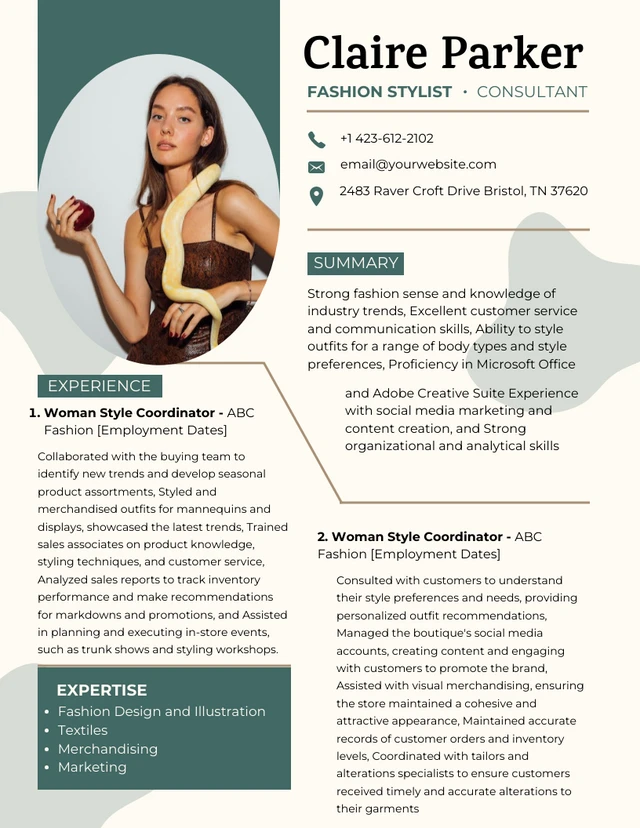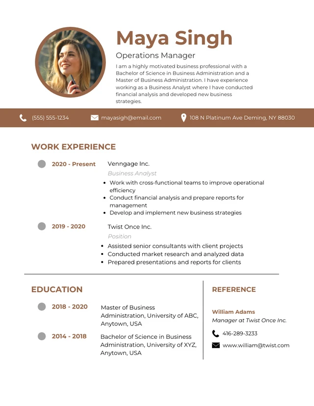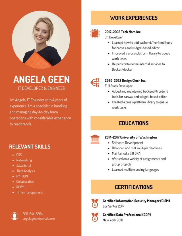
Are you hoping to land your dream job? Well, the first step to success is to create an effective resume.
Winning resumes are clear, showcase your skills effectively, and immediately grab the attention of a hiring manager or a recruiter.
One of the best ways to make a resume is still Microsoft Word since it has an interface people are familiar with. Word also offers resume templates and customization tools for quick turnaround.
If you don’t know how to make a resume in Microsoft Word, you’re in the right place to learn! (PS: You can also use our Free Resume Maker and resume templates for better results).
Click to jump ahead:
Creating a resume in Microsoft Word
Word is a popular resume-creation tool since it is installed on most computers, and .doc and .docx files can be read by most text-processing software.
Choose a resume template or start from scratch
In Word, you can create resumes from scratch (best for those wanting a unique layout) or use a template to jumpstart the process.
Select the Blank document on Word’s welcome screen to create a resume from a blank slate.
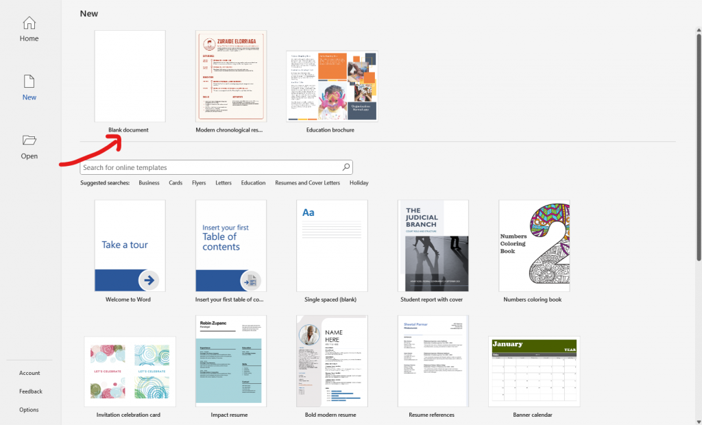
If you wish to edit a resume template in Word, type resume in the search bar instead.
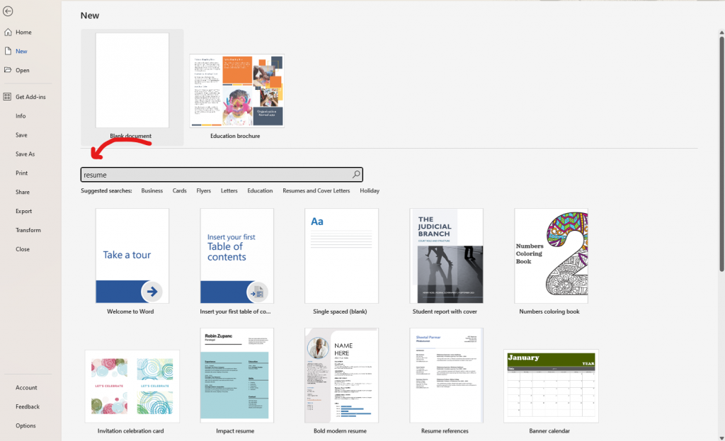
Word offers resume templates for various industries (hospitality, nursing, attorney, and more) and styles such as modern, minimalist, and playful.
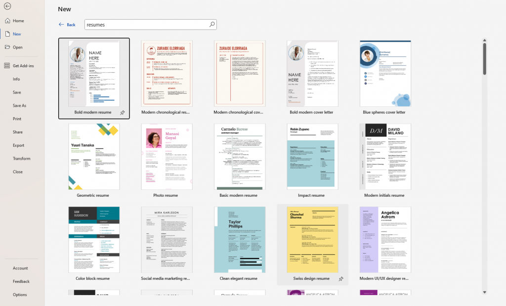
Pro-tip: If you don’t like Word templates, browse resume templates on Venngage. Business users can download these templates as a PDF and directly edit them in Word!
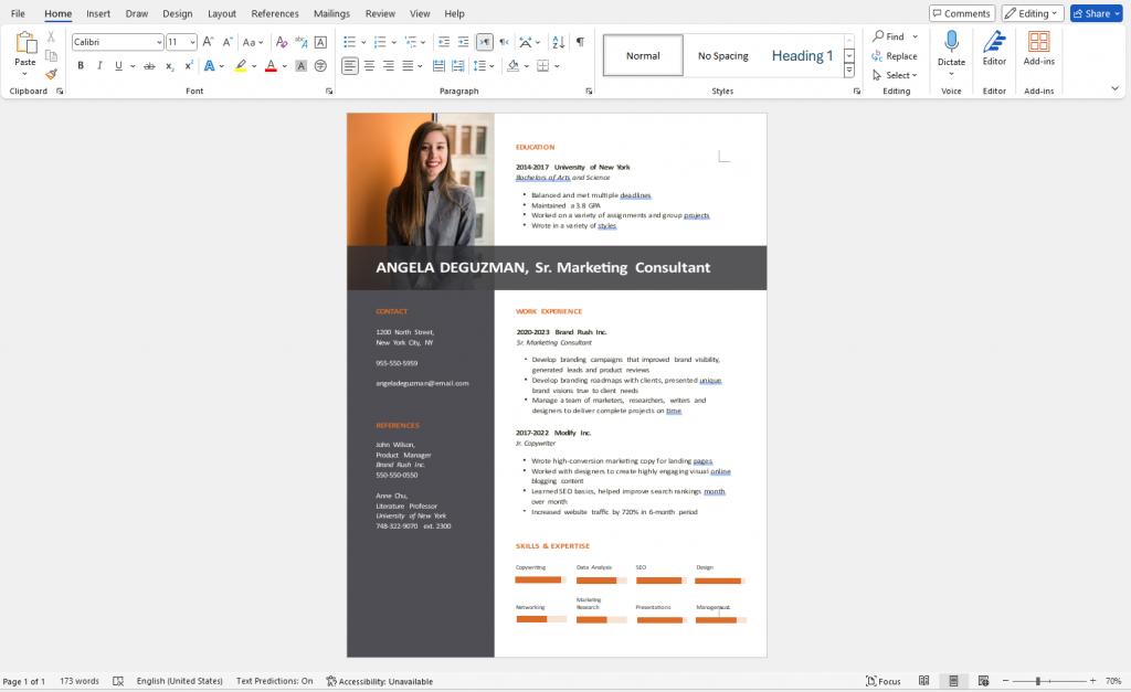
Structuring your resume
To make an effective resume, make sure you include sections that contain the following information.
- Contact details
- Professional summary
- Work experience
- Education
- Skills
Contact information
At the top of your resume, include all your essential details — name, phone number, email address, and LinkedIn profile (optional) or professional website.
Your name should always be in a larger font size to stand out.
Professional summary
Below your contact information, write a brief section summarizing your professional experience and skills or what you aim to achieve in your career.
Consider this your elevator pitch, as it will be one of the first items a recruiter or manager scans.
Work experience
The most common format for listing work experience on a resume is chronological (your most recent job comes first).
Here are details you should always include in the work experience section.
- Job title
- Company name
- Location
- Dates of employment
- Key responsibilities and achievements
Tip: When possible, use bullet points to list responsibilities and achievements to make resume content easier to scan.
Education history
Details about your academic history matter less as you accumulate work experience, so keep this section brief if this applies to you.
However, this section is important if you’re a new graduate or have little work experience. In such cases, here’s what you need to include.
- Degree
- Institution name
- Graduation year
- Any honors or distinctions, if applicable
You can even add information about extracurricular activities or coursework to stand out.
Skills
This section lets you communicate why you’re the best candidate for the job.
Mentioning specific skills in a job listing is a good way to make your resume stand out and get picked up by applicant tracking tools which screen resumes based on keywords.
Add text and content
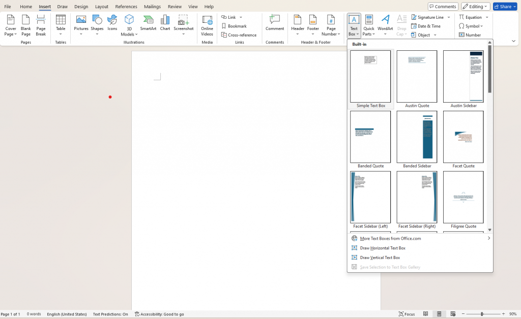
To add text to resumes in Word, go to Insert and click on Text Box.
You can use Word’s built-in designs or select Draw Text Box to make a custom size. You’ll need to create multiple text boxes for each section of your resume.
Formatting basics
A winning resume isn’t only visually appealing but also is designed to communicate effectively.
Use clear and professional fonts
Font styles like Arial and Calibri have clear letters, which guarantees your resume is easy to read.
Avoid decorative or hard-to-read fonts like Georgia. Remember, the focus is on your skills and experience, not the typeface.
Use consistent font sizes and style
Don’t let your resume become a hodgepodge of font sizes and styles (this leads to clutter).
Instead, maintain a consistent font size throughout your resume, typically around 12 points (exceptions include you name, job titles, and section headings).
Being consistent will make your resume easy to navigate and give it a professional look.
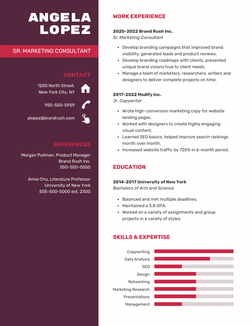
Maintain appropriate spacing between sections
Proper spacing between sections breaks up the text on your resume, making it easier to scan.
Make sure to apply appropriate spacing between each section on a resume so that information doesn’t get missed.
Generally, a 0.5 to 1-inch gap between sections like education, experience, and skills is adequate.
Set proper margins
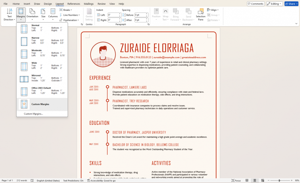
Setting proper margins in resumes prevents it from feeling cluttered. As part of good design principles, white space allows the reader’s eye to navigate easily.
Most resume templates offer pre-set margins (the standard is 1 inch on all sides).
To set margins, go to the Layout tab and then click Margins.
Use bullets and numbered lists
Hiring managers generally have limited time and too many resumes to review.
Instead of making their life difficult, use bullet points and numbered lists to present your skills and experience in an easy-to-digest format.
Utilize Word’s built-in design tools to your advantage
Want extra tips on how to make your resume more appealing?
- Apply emphasis to certain words or keywords on your resume using bold text, italics, or underlining to draw attention.
- Insert subtle borders or lines to separate sections on your resume visually.
Proofread and apply final touches
Once you’ve finished creating your resume, remember to proofread it for typos or grammatical errors.
Even a small mistake can create a negative first impression and cost you big.
One method to ensure your resume has no typos is to use Word’s built-in spellcheck. But to be safe, I recommend getting a third party to read your resume.
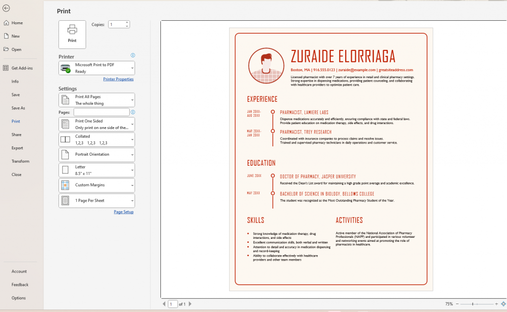
When you’re ready to print your resume, go to File > Print. Before you hit print, inspect the preview of how your resume will appear on paper. Ensure your text boxes, margins, and sections are positioned correctly and spaced evenly.
Want to make your resume more visually engaging? Check out these infographic resume templates to stand out from traditional text-based formats.
Conclusion: Create resumes that grab attention with Venngage
Word is a solid tool for creating resumes, but editing templates or applying changes without messing up the whole layout can get complicated and frustrating.
To save time and create better resumes, use Venngage — no design skills necessary. Check out our library of free resume templates today.


