


You probably have come across organizational charts before — they look like a big family tree for a company.
And you might have a fair idea about how useful they are. To an outsider or people new to the company, org charts show who is in charge and who does what, so everyone knows who to talk to when they need help.
But have you considered an org chart’s impact in helping companies communicate, innovate and outcompete the competition?
According to Mac Dougherty, entrepreneur and go-to-market (GTM) expert:
“Amateurs talk about products, but professionals study org charts.”
His logic? Studying an org chart reveals quite a lot about how a company operates. Dougherty believes that a well laid out org chart significantly improves every aspect of a company’s functioning by focusing on the most important aspect of every organization: its people.
In this blog, I’ll share what org charts are, why you need them and how you can create one for your business. You can also explore our free, ready-to-use organizational chart templates.
Click to jump ahead:
- What Are Organizational Charts?
- Great organizational charts drive results
- How organizational charts enhance communication
- 3 best practices for creating effective organizational charts
- How to make an organizational chart with Venngage
What are organizational charts?
An organizational chart is a visual representation of a company’s structure. It maps out business functions, teams, roles, responsibilities and reporting hierarchies.
An organizational chart helps everyone understand how tasks and communication flow within the organization. To put it in another way, it tells you how the business makes decisions.
Think of an organizational chart like an instruction manual for assembling a piece of furniture you recently bought. It shows how each part fits together and how it looks when the assembly is complete.
But if you don’t align the pieces correctly or leave out some of them, the furniture will not hold up properly for too long.
That said, there are different types of organizational charts and one size doesn’t fit all. Some are linear and hierarchy-based, while others look like complex nodes of a network.
Types of organizational charts
Here are 6 most common types of organizational charts and why they are popular:
1. Hierarchical Organizational Chart
This is the most traditional type of organizational chart that shows a clear chain of command with a top-down structure. In the hierarchical organizational setup, each level reports to the one above it.
Because of its rigid format, communication in a hierarchical setup is highly formal and usually flows from top to down. The levels also signify the amount of authority and responsibility associated with them. For instance, the higher-up teams have more decision-making power while the lower rungs are expected to execute tasks efficiently.
The U.S. Federal Government or military organizations across the world are some of the best examples of a hierarchical organizational structure.
These are highly efficient orgs because there’s a rigid chain of command and there’s no room for ambiguity. Imagine an army platoon at war. Without a strict hierarchy or an authority figure to mobilize them, soldiers will be left to fend for themselves and exposed to deadly risks.
2. Functional Organizational Chart
The functional organizational chart is likely the most common type of org chart that is in use. It organizes employees and teams by their specific functions within the organization, such as marketing, sales, finance, engineering and accounting.

You can use the functional organization chart to organize a business function into sub-groups, such as payroll, accounts payable and receivable, compliance and bookkeeping — all of which roll into accounting.
The functional organizational structure is best for companies that have highly specialized teams or employees. It also shows a linear but scalable path on how employees can climb to higher rungs within a function once they outgrow their current roles.
3. Divisional Organizational Chart
A divisional organizational chart is a structure where an organization is divided into smaller subdivisions — each responsible for a specific product line, geography, or market segment.
Multinational companies like Procter & Gamble, General Electric and Sony are best examples with a divisional organizational structure. These companies, while headquartered in a specific country, have semi-autonomous teams across the world with their own organizational setup.
In this setup, each subdivision runs like an autonomous entity with its own resources, such as marketing, finance and operations.
Divisional organizational structure allows businesses to expand rapidly across geographies, overcome bureaucratic hurdles and foster an environment to groom new leaders. It’s also a great way for global brands to appeal to cultural nuances when expanding to new geographies.
4. Matrix Organizational Chart
No, not that Matrix with Neo, Morpheus, red pills and blue pills.

This Matrix is all about an org chart where employees report to multiple managers. Usually, a team or employees in a matrix organizational structure have a functional reporting line and a product-based reporting line.
As a result, a matrix organizational chart looks like a grid in terms of their reporting relationships.

IBM uses the matrix org structure to manage its various product lines across multiple geographical regions. For instance, engineers at IBM report to both IT leads and project managers to facilitate smooth collaboration between functional areas and product lines.
Philips is another company that leverages the matrix org structure to smoothly manage products across different verticals, such as lighting, consumer lifestyle and healthcare. This allows Philips to coordinate between global and regional teams.
This organizational structure allows businesses to make the most out of their resources since two or more teams can share employees across multiple projects or departments. It also helps companies develop new business leaders with specialized expertise and broader skill sets.
5. Flat Organizational Chart
The spread of the Internet and the mushrooming of startups in the last couple of decades have led to the popularity of flat organizational structures. Flat org charts, also known as horizontal organizations, are polar opposites of hierarchy-based org charts.
That’s because flat organizations tend to do away with middle management. Flat orgs believe that the middle management — who have a lot on their plate — can slow down decision-making and create organizational friction.
Instead, flat orgs have “an open door policy” — a management approach where managers are always accessible to employees for direct discussions or feedback. That means employees, regardless of their seniority, can walk up to the leadership team and voice their opinions without having to jump through the hoops.
Most startups, or companies that like to maintain their startup DNA, prefer flat org charts. They are also the ones that have an open office setup that houses all employees in large halls without walls, doors, or cubicles.
Basecamp, for example, prefers direct communication and minimal layers of management to enhance better collaboration. Zappos has a culture that fosters open communication and employee empowerment.
6. Network Organizational Chart
Instead of formal reporting lines, a network org chart focuses on establishing communication channels and relationships between employees. It’s decentralized in structure, like flat organizations. And it’s multi-threaded in terms of communication practices — somewhat like matrix organizations.
So what makes network organizational charts unique? Two things:
- Decision-making in network orgs is distributed across various teams or units to improve the speed of execution.
- Teams or individuals are adaptive and amorphous, collaborating internally based on the nature of a project.
Non-profit organizations like The Gates Foundation and World Wildlife Fund (WWF) have a network organizational chart. It allows them to coordinate efforts across various programs and social initiatives, bringing experts and stakeholders together based on the project that they are pursuing.
Network-based organizations are more dynamic, innovative and democratic. That said, the success of this type of org chart heavily depends on effective communication and collaboration tools.
Key components of an organizational chart
For your organization to run smoothly, it’s important for all of its employees to have a good grip on how it’s structured. Here’s a quick look at the key parts of an org chart that you’ll need to create and understand them effectively.
- Job titles
- Departments
- Reporting relationships
- Hierarchical levels
- Functional areas
- Team structures
- Position relationships
- Lines of authority
- Decision-making nodes
- Physical offices
Great organizational charts drive results
Good communication is the lifeblood of any organization. It’s what keeps teams aligned, projects on track and goals within reach.
Lack of clear communication often causes even the most well-structured organizations to fail in achieving their business goals. Without it, friction builds up, leading to misunderstandings, missed opportunities and underperformance.
But achieving seamless communication is easier said than done. Common barriers such as information overload, cultural differences and a lack of clarity can create significant roadblocks. Let’s look at a few examples to understand these barriers better:
Information overload
An overwhelming amount of information can overburden employees, making it difficult for them to prioritize tasks.
Imagine a product manager who receives a ton of emails, Slack messages and meeting invitations every day — all while juggling between launching new features and PRDs. With so much information coming in from different channels, they struggle to distinguish what’s urgent and what’s just noise.
As a result, they might be late to turn in critical tasks, jeopardize priorities, or miss launch-related deadlines.
Cultural differences
A gap in understanding cross-cultural differences can often lead to misinterpretations, especially in global companies with divisional or matrix org charts.
An American team lead might take a casual “yes” from their Indian counterpart as an agreement. That’s because Americans value direct communication and prefer to call a spade a spade.
But an Indian colleague might say “yes” to show politeness — even if they have reservations on an issue. This difference in cultural behavior can lead to confusion about what was actually agreed upon.
Lack of clarity
When an organization lacks clear definitions of roles and responsibilities, employees might be unsure about who is responsible for what. And this happens more often than we realize.
Think of vague terms like “as soon as possible” or “sometime next week” that people throw around casually in email communication or office meetings without specifying exact deadlines. You might understand as soon as possible differently than your colleagues next to you, causing delays and misalignment in project timelines.
Consider a scenario where a marketing manager leaves a comment on a blog draft saying the copy “needs improvement” without going into the details. The person receiving the feedback won’t be able to apply the feedback effectively because the comment lacks clarity.
The point is: organizational charts can offer a framework for decision-making and task allocation. But it’s the effectiveness of communication that truly determines how well a company operates.
Smooth communication flow ensures that everyone knows what they need to do and how to do it well, often without any scope for misunderstanding.
How organizational charts enhance communication
Org charts do more than just map out hierarchy. They help in clearly visualizing the communication arteries within a company to ensure that everyone in the company is rowing the boat in the same direction.
Here are four specific ways how org charts can facilitate a smooth communication flow within a company:
Improved clarity and transparency
Organizational charts act as a clear visual guide to your company’s structure. They lay out the hierarchy and reporting lines in a way that’s easy to understand — even to an intern or an investor looking at it for the first time.
This transparency helps employees grasp who’s in charge of what and how different teams interact. It removes the guesswork and helps employees know who to talk to on specific issues and how the information is expected to flow.
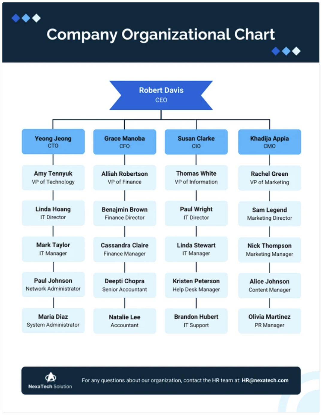
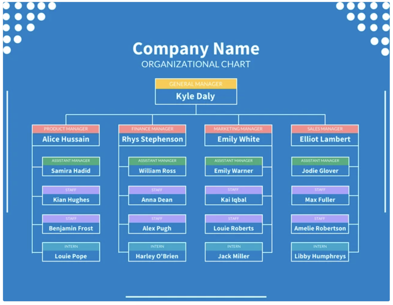
Here’s an example of an organizational chart that offers new employees clarity and full transparency about how their team is structured and who to reach out to:

Better understanding of roles and responsibilities
Some organizational charts go into great detail about each person’s role and responsibilities, helping employees understand where they fit in the larger structure. This reduces role ambiguity and helps individuals deliver on their expected jobs without stepping on each other’s toes.
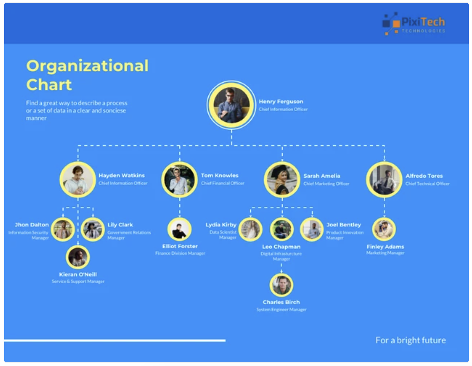
Here’s a template that you can edit to communicate people’s roles and responsibilities within your company:
Faster decision-making
Hierarchies exist because they establish clear authority and simplify decision-making. In a hierarchy-based organizational chart, there’s no confusion about who holds the reins for different aspects of the business.
This accelerates the decision-making process, allowing for quicker responses and better execution.
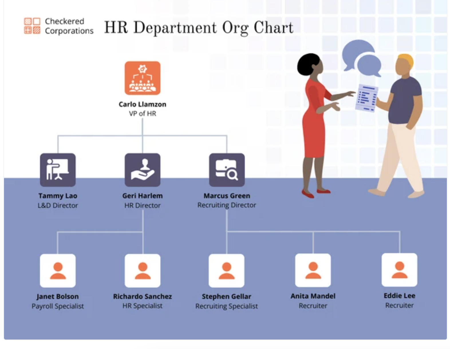
As an example, this template helps everyone within a company understand who makes what decisions within the HR department:
Stronger cross-team collaboration
Organizational charts are great at highlighting team interdependencies. They improve collaboration because they tell employees how their role connects with others and how they can make coordinated efforts when it’s needed.
This interconnectedness breaks down silos and fosters teamwork.
This is an example of an org chart that demonstrates clear lines of communication between different business functions within a company:
3 best practices for creating effective organizational charts
To make the most of an organizational chart, it’s important to follow some best practices that are both functional and effective. Here are three proven best practices and how to apply them in your organization:
Keep it simple and clear
Keep organizational charts straightforward and easy to understand. Avoid overcomplicating the design: a clear, simple chart ensures everyone can quickly grasp the structure and their place within it.
Update regularly
Ensure your organizational charts are regularly updated to reflect changes in the company’s structure. Outdated charts can cause confusion and create conflicts. So maintain accuracy to keep everyone aligned.
Involve the employees
Involving employees helps a company capture accurate role details and increases the buy-in. It makes the chart easy to implement and a more effective tool for cross-functional team collaboration.
How to make an organizational chart with Venngage
What are people — and businesses — without tools? Nothing.
Choosing a good tool is crucial for creating a good organizational chart since it simplifies and speeds up the design process.
Venngage is designed specifically to make this job easier because it comes with an easy drag-and-drop interface and 10,000+ customizable templates.
Creating an organizational chart with Venngage is straightforward and user-friendly. Here’s a step-by-step process to craft a clear and effective chart with Venngage:
Step #1: Log in to your account
Start by creating a Venngage account or logging into your existing one. To learn about Venngage’s free and paid subscription plans, visit the pricing page.
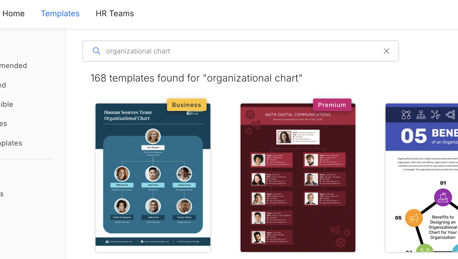
Step #2: Choose the right template
Click on the Templates tab at the top-left and search for “organization chart.” Select the one you like from Venngage’s library.
Many of our templates are free to use while others require a small monthly fee. However, you can create a free account and access Venngage’s online drag-and-drop editor before committing to a paid plan.
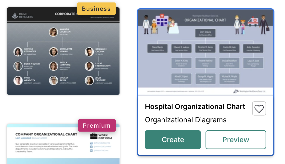
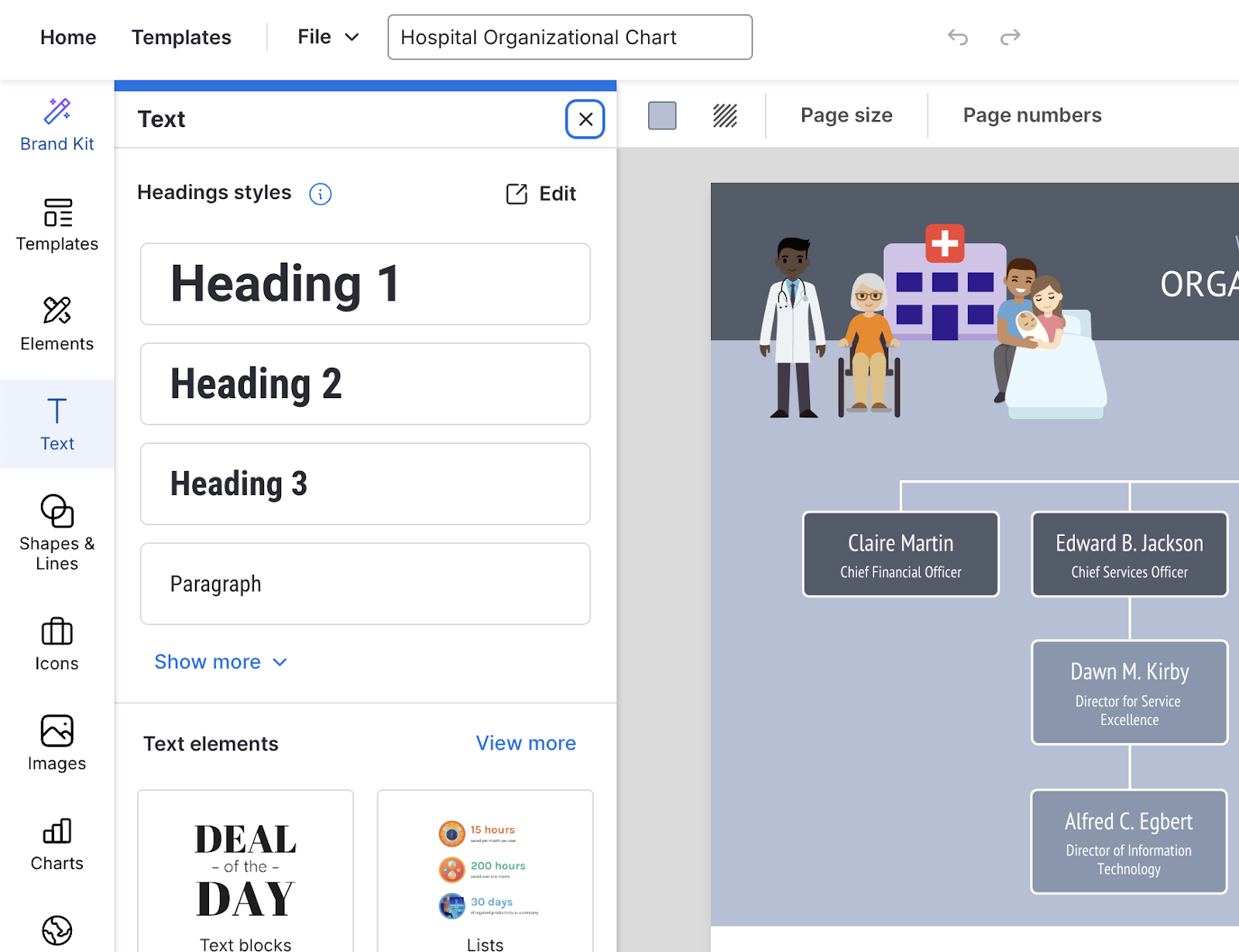
For this tutorial, I’ll go with the “hospital organizational chart” because it’s a simple hierarchical org chart. Click on the “create” button to get started with the template.
Step #3: Customize your design
Click on an element within the template to duplicate, ungroup, delete, or resize it.
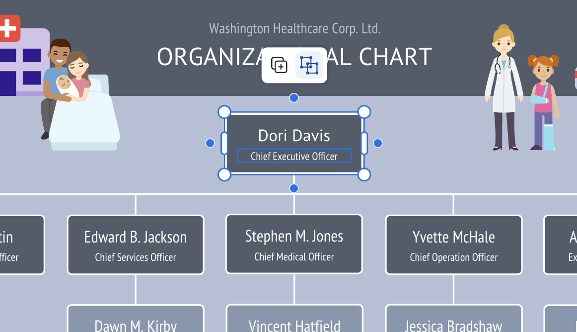
You can use Venngage’s drag-and-drop editor to easily adjust shapes, colors and text to fit your company’s branding and structure. Make use of the editor tools on the far-left menu panel to customize your organizational chart to your liking:
Here’s how the template looks after I made a few changes to the text, font and background color:
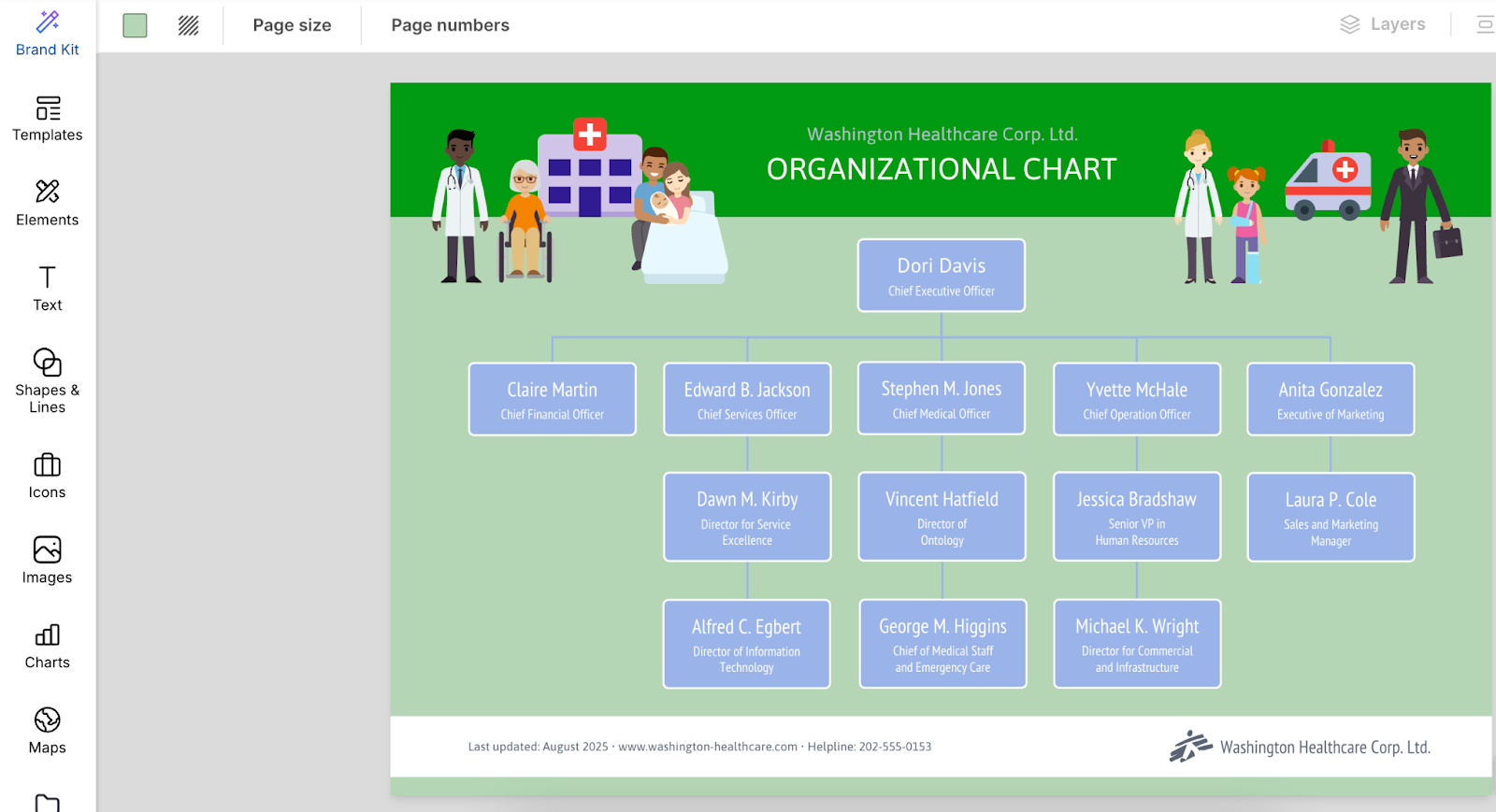
Step #4: Edit the necessary details
Change the people’s names, roles and reporting lines of your team members. Venngage allows you to easily adjust and align text boxes for a clear representation of your organizational structure.
Step #5: Save and download
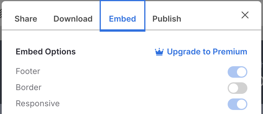
Once you’re happy with your chart, download it in PNG, PDF, or PPT formats or share it directly via a link. To download your design, click on the Download button on the top-right of your screen:

Venngage also lets you embed the chart into presentations or documents. To view the embed options, click on the share icon (with the upward-facing arrow) in the top menu panel:
Tying it all together: Put the power of org charts in action
Organizational charts aren’t just tools for outlining roles — they’re powerful instruments for streamlining communication and collaboration. If not for organizational charts, teams can end up cooped up in silos, unaware of how they can play a role in their company’s growth.
Now, it’s your turn to take action. If you are considering implementing an organizational chart in your workplace, roll up your sleeves and get to work! The key to a well-oiled organization is just a chart away!


