A business wouldn’t be anywhere without its customers.
You might not know everything about your customers but you do know that they’re people. And people like to feel appreciated. Part of fostering a loyal user base comes from showing your users that you’re thinking about them as people.
Sadly, you can’t give every single one of your customers a hug (or even a friendly handshake) but you can give them a small token of your appreciation in the form of a thoughtful ecard or a festive infographic.
Even if you’re not a designer, you can still create beautiful holiday images to include in your email campaigns and site content. All you have to do is start with a template and then customize the design to fit your brand and customer base.
It’s not hard, I promise!
And it’s worth it to take the time to do a little something for your customers. A small show of appreciation can go a long way.
Here are seven types of holiday images you can create to show your customers that you value them.
1. Personalized Holiday eCards
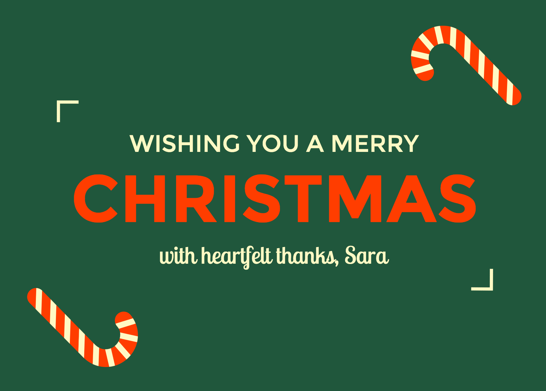
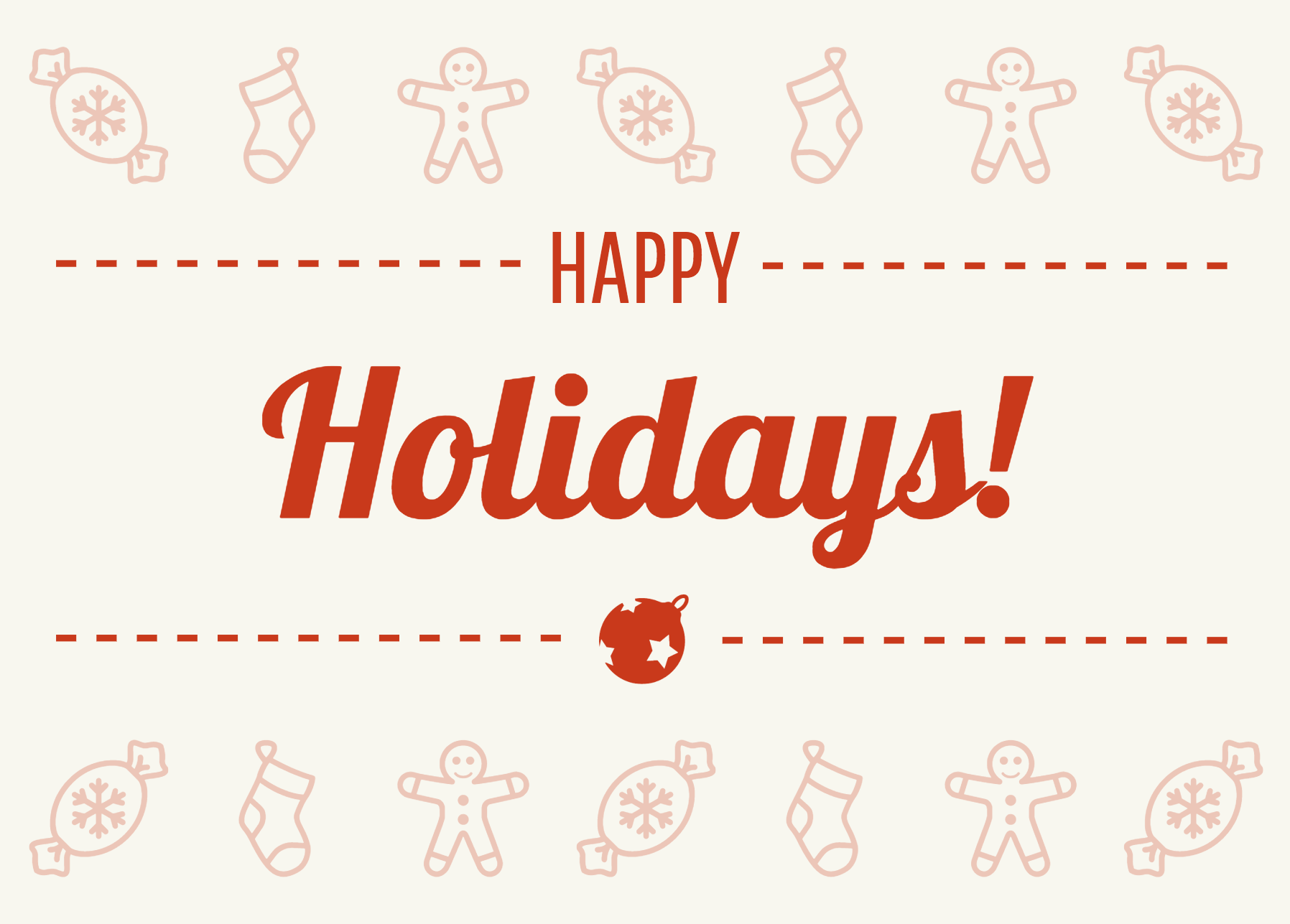
A festive ecard with a heartfelt message is a simple way to show your customers that you’re thinking of them. The more personal the ecard, the better.
Keep the text on your ecard brief. A concise, heartfelt message is enough. If you deal with clients personally, you could even send out a smaller batch of emails to those clients with a card signed with your own name.
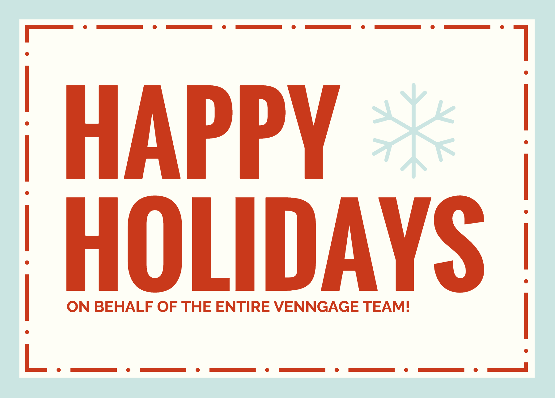
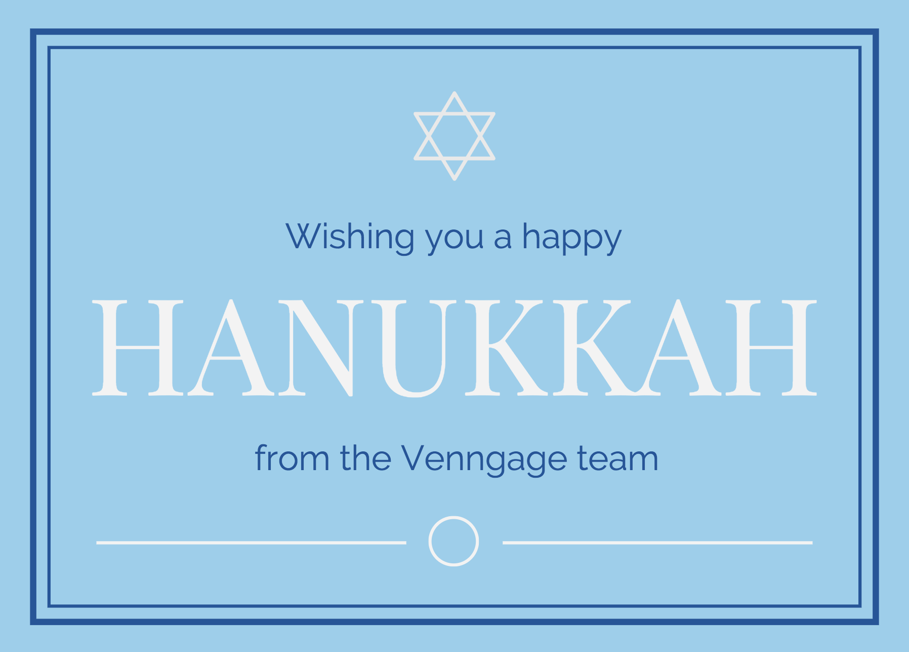
Borders can add a touch of elegance to your ecard design. Use dashed lines to give your ecard a stitched, DIY look. Or use an outer border with a thicker line and an inner border with a thinner line for a sleek, classy look.
When designing your ecard, it’s best to stick to only one or two fonts. Too many different fonts will make your design appear cluttered.
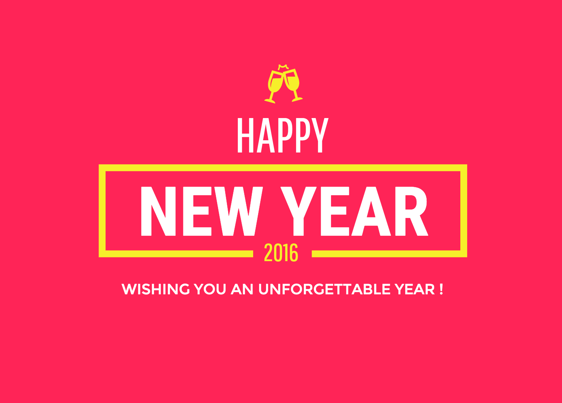
The same tip applies to using icons in your design. Embellish your ecard with festive icons, but use icons that have the same style and line width, and don’t use too many.
Generally, the ideal dimensions for email images are within 1080 x 1080 dpi.
2. Holiday Sales Flyers
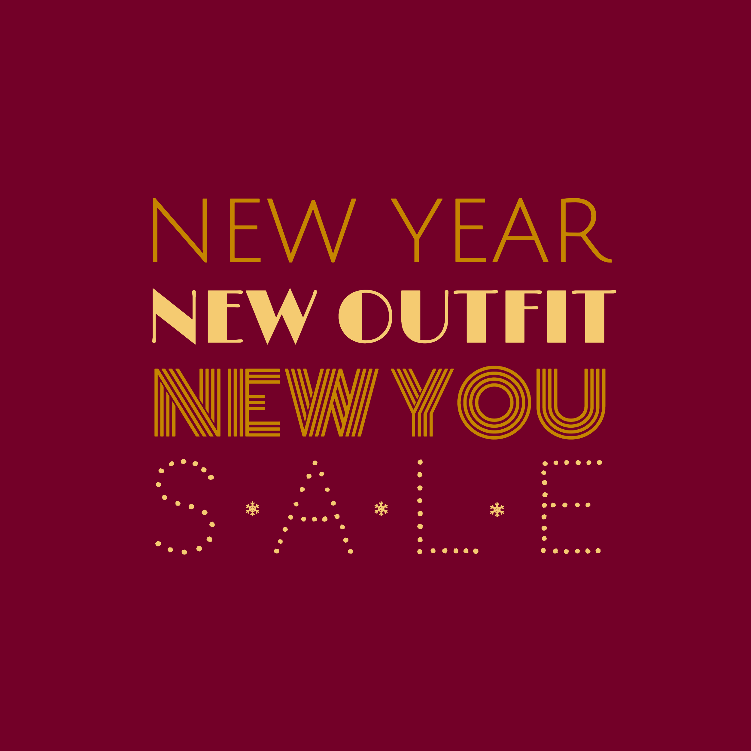
Businesses often like to give back to their customers by offering special holiday sales and promos. Just as you wouldn’t want to give someone a gift without a card, why not include pretty flyer?
Not to mention, a study by Vero found that email campaigns with images have a 42% higher click-through rate than campaigns without images. And you flyers can easily be shared on social media as well.
Keep the text in your flyer to a minimum. Just specify what the promo is (a promo code, a free gift, a preview of something new) and how long the promo is going on for.
Or, if your sale is site-wide, you could simply use a couple of keywords to amp up your customers.
If you want to make your flyer more exciting and dynamic than a simple static image, you can turn your flyer into a GIF. To do this, create several versions of your flyer image Then, use a GIF maker like Giphy to compile your images into a GIF.
Something to keep in mind, though: customers are inundated with holiday offers. So if you’re going to be sending out a promotion as a gift to your customers, write copy that isn’t too sales-y. Yes, you’re still getting something out of sending a promo out, but it don’t be a Scrooge McDuck about it.
3. Holiday Social Media Images
Similar to an e-card, you might want to post a holiday-themed social media images to your Twitter, Facebook or Instagram.
Make sure that your banner is branded by using company fonts. Venngage’s Business Plan has a branding kit that allows you to save your fonts, colors and logos.
One of the most important things to keep in mind when designing images for social media is to be mindful of the image dimensions for each site.
Instagram:
- Square images are 1080 x 1080 px
- Vertical images are 1080 x 1350 px
- Horizontal images are 1080 x 566 px
Facebook:
- Cover photos are 828 x 315 px
- Square images are 1024 x 512 px
- Portrait images are 800 x 1200 px
- Landscape images are 800 x 800 px
Twitter:
- Cover photos are 1500 x 1500 px
- Square images are 1024 x 1024 px and their
- Landscape images are 1024 x 512 px
- Expanded view images are 1024 x infinite px
The holiday season is the perfect time to play around with quirky designs, so have fun with it!
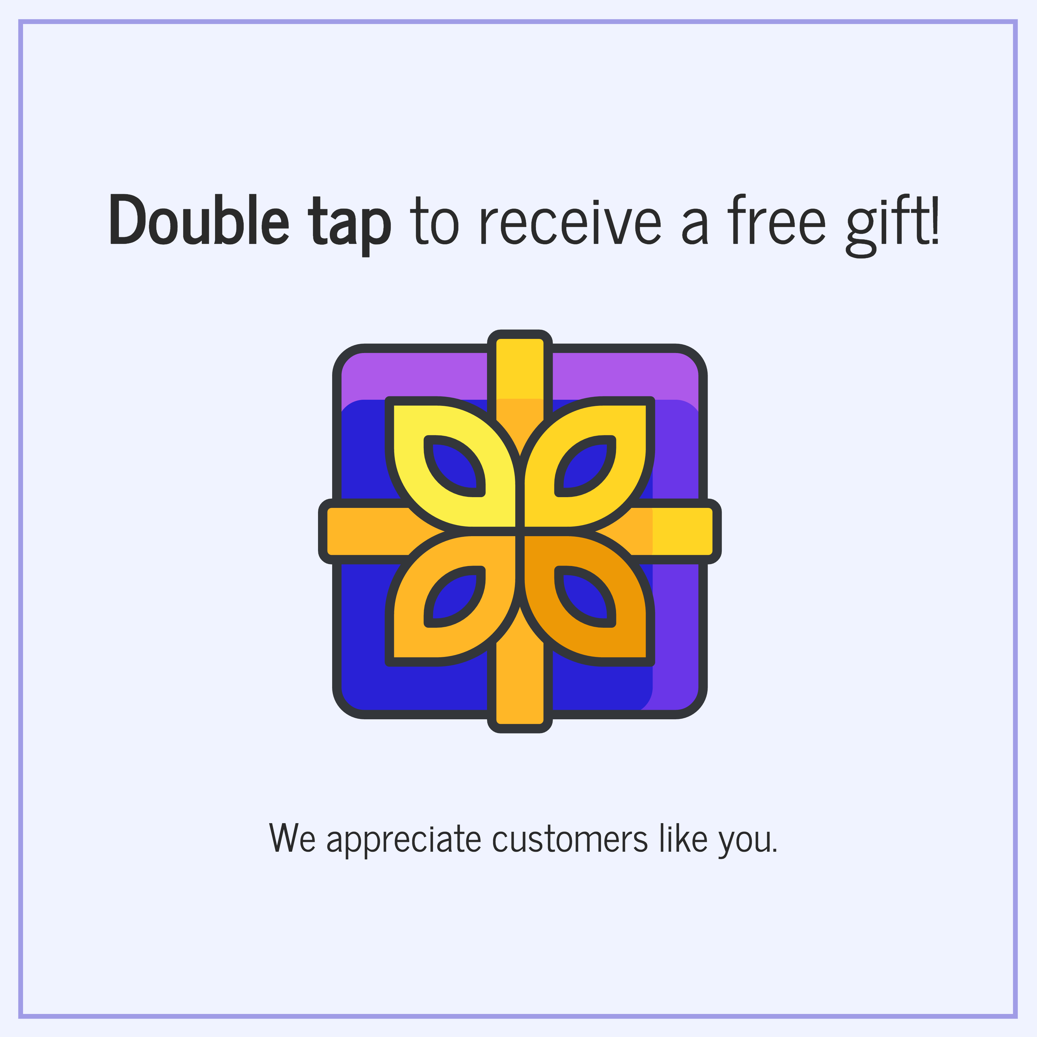
For example, you can incorporate the feature on Instagram into your design. You can use the image to both interact with your customers and to direct them to a special holiday promotion.
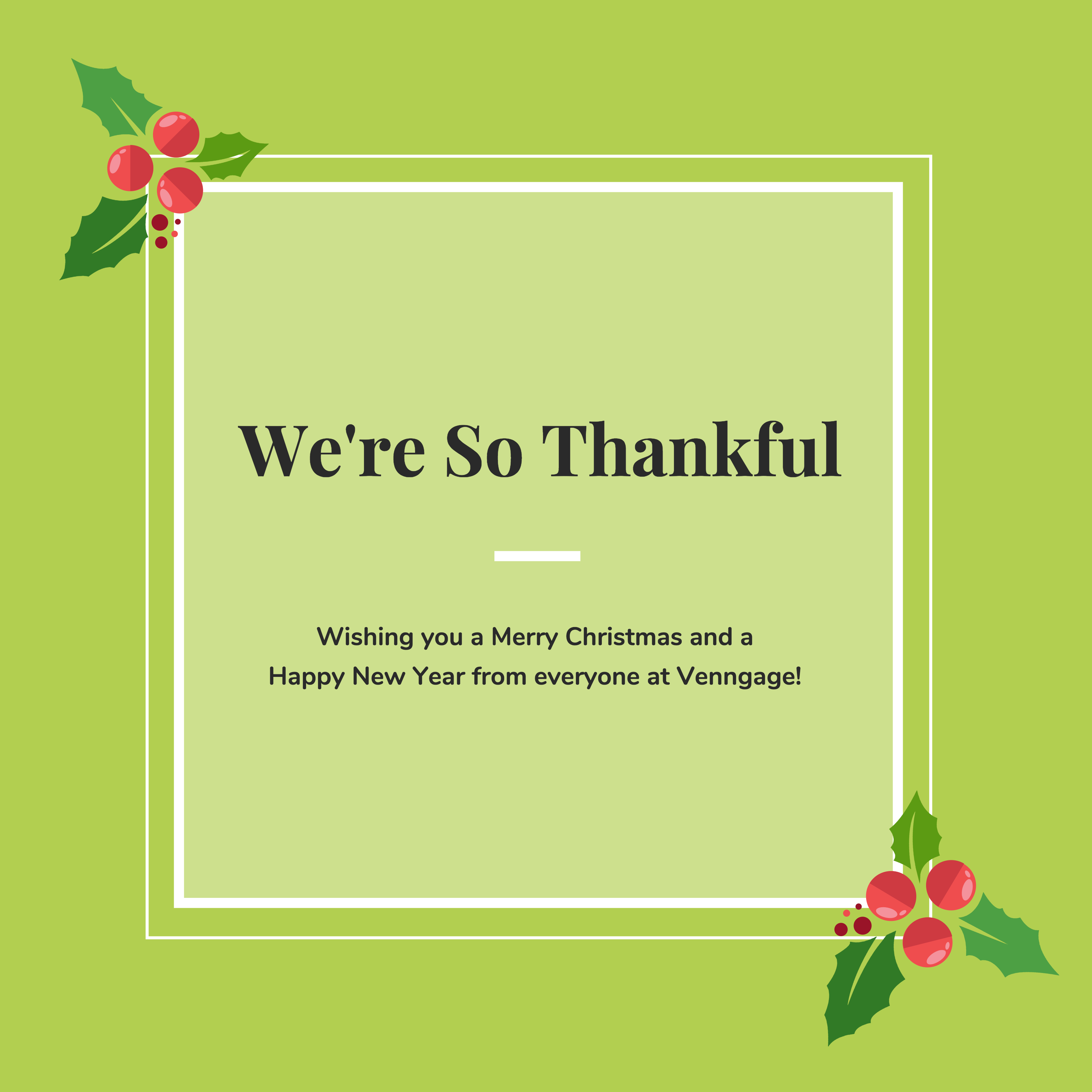
But your social media images don’t have to be promotional. It’s worth it to share a simple thank you with a thoughtful message. You can follow a similar design to an ecard.
4. Holiday Infographics
Infographics are fun and easy to share, so why not create a holiday-themed infographic to entertain you customers? Holiday-themed content can also give your customer engagement a little push, especially if your business tends to be a bit slower during the holidays (I know that’s the case for many SaaS companies).
Plus, it’s been shown that businesses that use infographics in their marketing grow traffic to their sites by 12%.
There are two ways you could go with a holiday infographic. To offer some themed content for your customers, create a fun and light-hearted infographic. In this case, keep the topic light and amusing; a collection of holiday-themed facts or a fun guide like how to get the perfect gifts for men or women.
This is also the perfect opportunity to make use of cute icons and a bright, bold color scheme. While the classic holiday combination of green, red and white would certainly be appropriate, you don’t have to be constrained to just use that. The colors you use in your infographic design should, first and foremost, reflect the content.
But if you want to take the opportunity to spread awareness about a cause your business or organization cares about, you could create an infographic to inform your customers about that cause. The tone of this kind of infographic will be more somber than a fun holiday-themed one.
Instead, let statistics and evocative images drive your design. Use icons and high quality photos to elicit an emotional response from the reader. After all, images are often more immediate than words.
5. Holiday Product Brochures
If you want to feature certain products for the holidays, you can create a festive brochure. To provide the best value for your customers, feature products that are not only great deals, but that will capture the interest of your customers.
If you have designate customer verticals, then segment your email campaign and offer a specific brochure to each vertical. For example, if one of your customer verticals are students, you could feature products that will make their studies easier.
Similar to when you create holiday sales flyers, try not to be overly sales-y with your copy. Yes, it’s a brochure promoting your products, but you can still key into why these products will present actual value to your customers.
6. Holiday Event Posters
If your business has a local customer base, as is often the case for retail and food businesses, you may want to throw a special holiday event for your customers. But for your event to be successful, you have to get the word out.
An eye-catching poster is perfect for this. You can pin it up around town and you can send it out in an email invite to your customers. While you don’t want your poster to have too much text, every event poster should include this information:
- The name of the event.
- A short description of the event.
- The date and time of the event.
- The location of event.
- If necessary, where guests can find more information (like a website or social media page).
Let the title of your event be the focus of your poster. Use a big, bold and easy to read font. As a rule of thumb, you should be able to read your title font from at least a meter away. Avoid fonts that are too elaborate and hard to read.

For posters, it’s best to choose one focus visual, rather than using a bunch of different smaller visuals. You want your poster to have impact, even if someone is standing a few meters away from it. You can also use icons to embellish your design, but use them sparingly.
To use an image as a background without creating too much clutter in your design, overlay a square of color and adjust the opacity so the square is semi-transparent.
But for a sleek, modern look, you could even forego images altogether and let typography drive your design.
If you’re planning on printing your poster, be sure to export your image in a 300 dpi resolution so that the image won’t come out blurry.
7. Holiday Email Campaign Buttons
Taking a little extra time to make your email messages and blog content more festive shows greater care. Holiday-themed email buttons are an easy way to make your email and blog post copy a bit more special than normal.
You can create one by simply taking a regular button shape and adding a holiday-themed icon. If you want to include text, keep it to just a couple of words in a clean, easy to read font.
You can find these email campaign buttons under the Text menu in the Venngage tool.
Repurpose Your Templates Throughout the Year
It might seem like a lot of effort to create these holiday images but remember that you can expedite the process considerably by starting with a template. And there’s no reason why you can’t repurpose your templates for different occasions throughout the year! Venngage’s Business Plan allows you to save custom templates you create yourself.
Once you have a layout that works, you can easily replace the color scheme, fonts and icons to fit a new occasion. And offering new and timely content to complement the season will help keep your customers engaged with your brand.
So what are you waiting for? Get creating!
Happy holidays from the Venngage team!


