Warning: this article contains spoilers for all previous seasons of Game of Thrones.
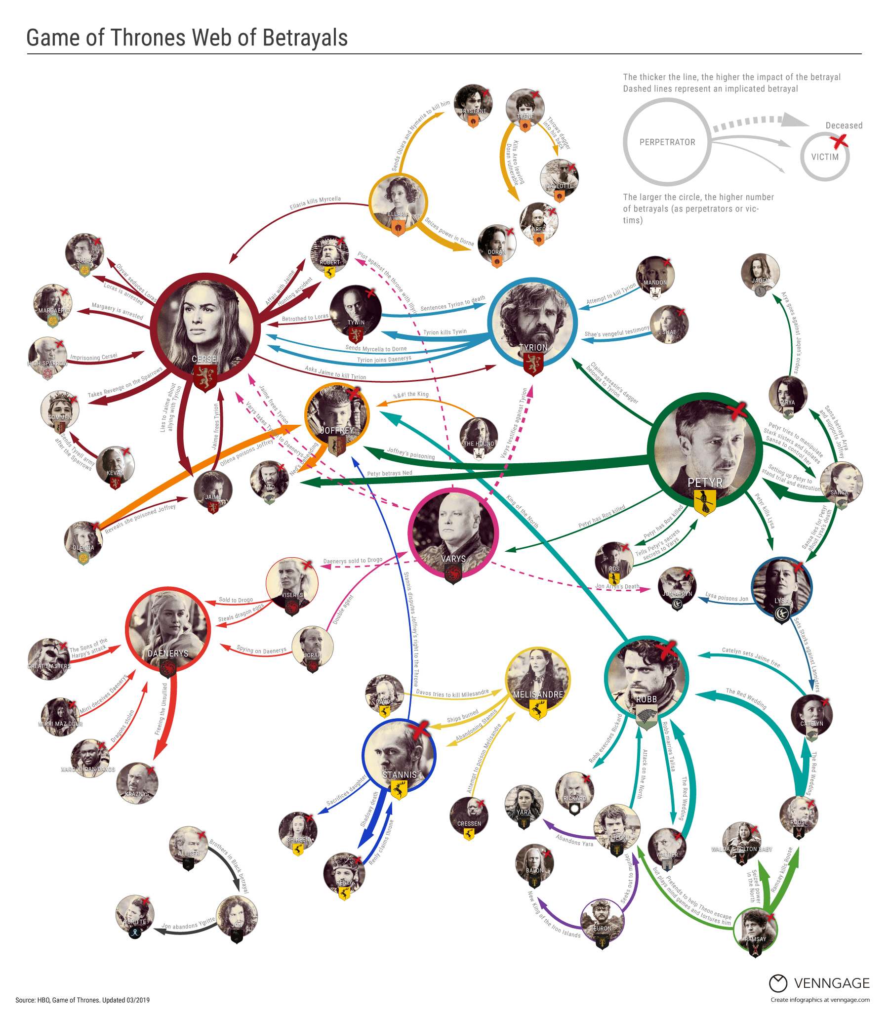
Click to enlarge. Scroll down for static version of infographic.
The final scene of the seventh season of Game of Thrones is a chilling one. Pardon the pun.
After seven seasons of steady build, the season concluded with the Army of the Dead finally approaching the wall. Tormund and Beric watch in horror as thousands of wights gather before them.
Then comes the Night King, riding the now undead Viserion. Without batting an eyelash (do dragons have eyelashes?), he burns right through the Wall. Members of the Night’s Watch tumble to their death, and the Army of the Dead casually stroll on in.
The scene is set for an epic climax to the story.
The latest season was the fastest-paced season so far. Many alliances have been made, broken, remade, and broken again. Characters have risen to power, only to plummet back out of it…and in many cases, have lost their life in the process. Notable characters to exit the stage are Ellaria Sand and the slippery Petyr Baelish.
Game of Thrones has a reputation for killing off fan favorite characters. It’s become a running joke and a warning that fans give to new viewers: don’t get too attached to any character, because they’ll probably get axed. Or poisoned. Or stabbed. Or pushed into an abyss. You get the idea.
We decided to take a closer look at these acts of betrayal. We wanted to see: who double-crosses who? Which characters gain the most from their acts of treachery? Who rises in power and who falls? What were the relationships between the betrayers and the betrayed? What were their motives? Was it for power, love, revenge?
Game of Thrones Infographic: Web of Betrayals
Power favors the treacherous. At least, that’s what Game of Thrones seems to suggest. The characters in Game of Thrones who have emerged by the most powerful by the end of the fifth season are, by and large, the most treacherous.

This infographic depicts every betrayal that has transpired in Game of Thrones from seasons 1-7. The characters who have died (to our knowledge) are indicated with an X. Click to enlarge.
We examined every act of betrayal in the last seven seasons (again, to our knowledge–there was a lot to keep track of) to see who betrayed who and what the outcomes of their betrayals were. What we found was that in the Game of Thrones, to deceive is, usually, to come out on top. The characters who by the end of the seventh season have the most power have also committed the most acts of betrayal. Most of their victims are dead and their houses decimated.
As the seasons have gone on, the number of characters who have double-crossed each other has increased. Characters who started off as meek and mild-mannered have changed their tune, driven by revenge or power. By the end of the seventh season, many characters had betrayed others at least as many times as they had been betrayed.
Who betrayed who and why?
With friends like these, who needs enemies?
This seems to be the case in Game of Thrones, where the majority of betrayers were allies (37%) and family members (28%) of the betrayed. Not to mention, 18% of betrayers were employees or bosses (someone call HR).
But why? What motives drive them to turn on their own people? The majority of characters who betray their allies do it to gain power, followed by revenge.
The infographic below shows the relationship between the betrayer and the betrayed, and their reason for treachery.
Who knows how many betrayals we can expect to get in the eight season of Game of Thrones? I know I’ll be watching with a bowl of popcorn and a box of tissues beside me. If you’re feeling creative, take a chance at creating your own infographic with Venngage’s infographic maker.
Our Method
To create our Game of Thrones infographic, we combed through the last seven seasons of the show to chart the acts of betrayal and the resulting shifts in power for each character involved. We recorded 83 different acts of betrayal–every betrayal in the show, to our knowledge.
We define betrayal as an act of going against one’s word, or an act of breaking the trust of a family member or ally. We then recorded the acts and categorized them by perpetrator (the one who committed the act of betrayal) and victim (the one who was betrayed), the relationship between both characters, and the motive behind the betrayal.
You can view the full spreadsheet of our findings here.
To be clear, we are looking strictly at the TV show. Any differences between the books and the show are not accounted for–we’re just looking at the events as they have unfolded on TV.
How to Make Your Own Mind Map Infographic
We had a blast geeking out and creating this Game of Thrones mind map infographic. So we wanted to give you a chance to make a mind map of your own!
Mind maps allow you to plot out ideas visually. They’re great for drawing connections between things that are not always obvious (like someone plotting behind your back…).
For most day-to-day purposes like brainstorming sessions, event planning, or presentation preparation, your mind maps doesn’t have to get as complicated as Game of Thrones.
In fact, with Venngage, making a mind map is easy!
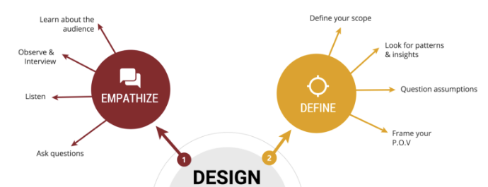
Here is a simplified mind map template you can use:
1. Use shapes to break information into hierarchical categories
Mind maps typically use a radial structure, meaning information branches outwards from one (or several) central topic into subtopics.
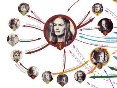
In the mind map we created for our Game of Thrones infographic, we organized characters by who they betrayed and also by the number of betrayals they’ve been involved in. Each character is represented by a circle and their betrayals are drawn using arrows.
The characters with bigger circles have been involved in more betrayals and the character with smaller circles have been involved in less betrayals.
The connecting arrows with thicker lines represent that the betrayals had a higher impact on the plot, while the dashed lines represent that a betrayal was implied.
In the template we created for you, the central topic is in the biggest circle, while the subtopics are in smaller circles.
Generally, when creating an information hierarchy, it’s best to use:
- Big circles for the central topic.
- Medium circles for the subtopics.
- And smaller circles for supporting ideas.
2. Use icons, numbers and colors to make information memorable
If you’re creating a mind map with a bunch of subtopics, it can be easy to lose track of each one.
An easy way to help distinguish between topics is by pairing each topic with an icon, by numbering each topic, or by assigning each topic a color.
In our Game of Thrones infographic, we color-coded each character so that it was easier to distinguish which betrayals were linked to them.
We used a similar approach in the mind map template we created for you:
- We numbered each subtopic to indicate which step in the design process it is.
- Each subtopic also has its own color.
- And an icon to make the topics more memorable.
3. Use simple, easy to read fonts
Mind maps are meant to make information easier to understand, not more complicated. That’s why they should be kept nice and organized.
This is a time to avoid gaudy decorative fonts (we’re looking at you, Comic Sans). Opt for simple, easy to read fonts instead.
In the mind map template, we used Roboto for the central topic title, Roboto Condensed for the subtopic titles, and Open Sans for the supporting ideas.
As a rule of thumb, use no more than three different fonts in one mind map.
Now you have the tools to create your own awesome mind map. Get started:
What Netflix’s Top 50 Shows Can Teach Us About Font Psychology [Infographic]
What Disney Villains Can Tell Us About Color Psychology [Infographic]
The infographics in this article designed by Joanna Lu, Michelle Lee and Steve Shearer. Data collected and analyzed with the help of Eugene Woo and Joanna Lu.
Infographic updated March 8, 2019 to include events from the seventh season of Game of Thrones.


