Your brand’s Facebook page introduces your brand to hundreds of people each day. So it’s crucial your page makes a great first impression.
After all, your target audience resides on Facebook. They’ll visit your page to learn more about you, start following you and engage with you. With integrations like Facebook Marketplace, it’s also a space where direct sales happen more frequently.
So why not take advantage of this growing trend of sales on social media? Make a solid first impression on your target audience by designing an outstanding Facebook banner image.

It’s okay, don’t panic!
Design seems like a scary word and finding banner images online kind of works, right? I used a Facebook banner image of raining donuts once. It was nice.
But no one knew I was a copywriter…
Or that I don’t like donuts.
Luckily, it’s pretty easy to create a Facebook banner image that’s professional and polished. Since it’s the first thing people see when they visit your page, it’s a great place to communicate a strong message.
Designing a facebook banner image and updating it periodically is essential to making a great impression.
Keep things simple, start with a Facebook banner template
If you’re not a professional designer, creating an eye-catching Facebook banner might seem a little daunting. So I’d recommend getting started with a Facebook banner template.

A Facebook banner template helps guide your design, sparks your creativity and saves you time. It’s also formatted for Facebook’s banner dimensions (which I’ll get into later), leaving you with less things to worry about.
Of course, there are a lot of ways to design a Facebook banner. Not sure where to start? No sweat, I’ve got you covered. Here are a number of Facebook banner templates and design tips to help you out.
1. Use high-quality stock photos as backgrounds
The easiest way to create a great Facebook banner image, is to use superb stock photos as backgrounds.
A high-quality stock photo is captivating for your audience. It gives them something to connect to. It’s also a way to amplify your message.
This Outdoor Adventure Facebook banner template, uses a relevant stock photo to capture the audience’s attention. This helps the message stand out. To choose a stock photo that helps get your message across, consider your brand, products and services,
When choosing your font and font colors, here’s a neat design trick. Think of stock photo’s color palette. By drawing from the image itself, your text and stock photo complement each other.
2. Use contrasting fonts to make bold statements
An empowering and motivating Facebook banner image speaks to your brand in positive ways. Using inspiration is a great way to present your brand to first-time visitors. All you need is the right, high-quality stock photo, a bold font and clear message.
This Inspirational Facebook banner template uses a stock photo and bold font to create an motivating image:
3. Use a transparent overlay to make your message pop
Sometimes we find the perfect stock photo, but there’s so much going on that our text won’t show up clearly. It clashes completely or disappears into the background. In those cases, you can use a transparent overlay to unify your visual.
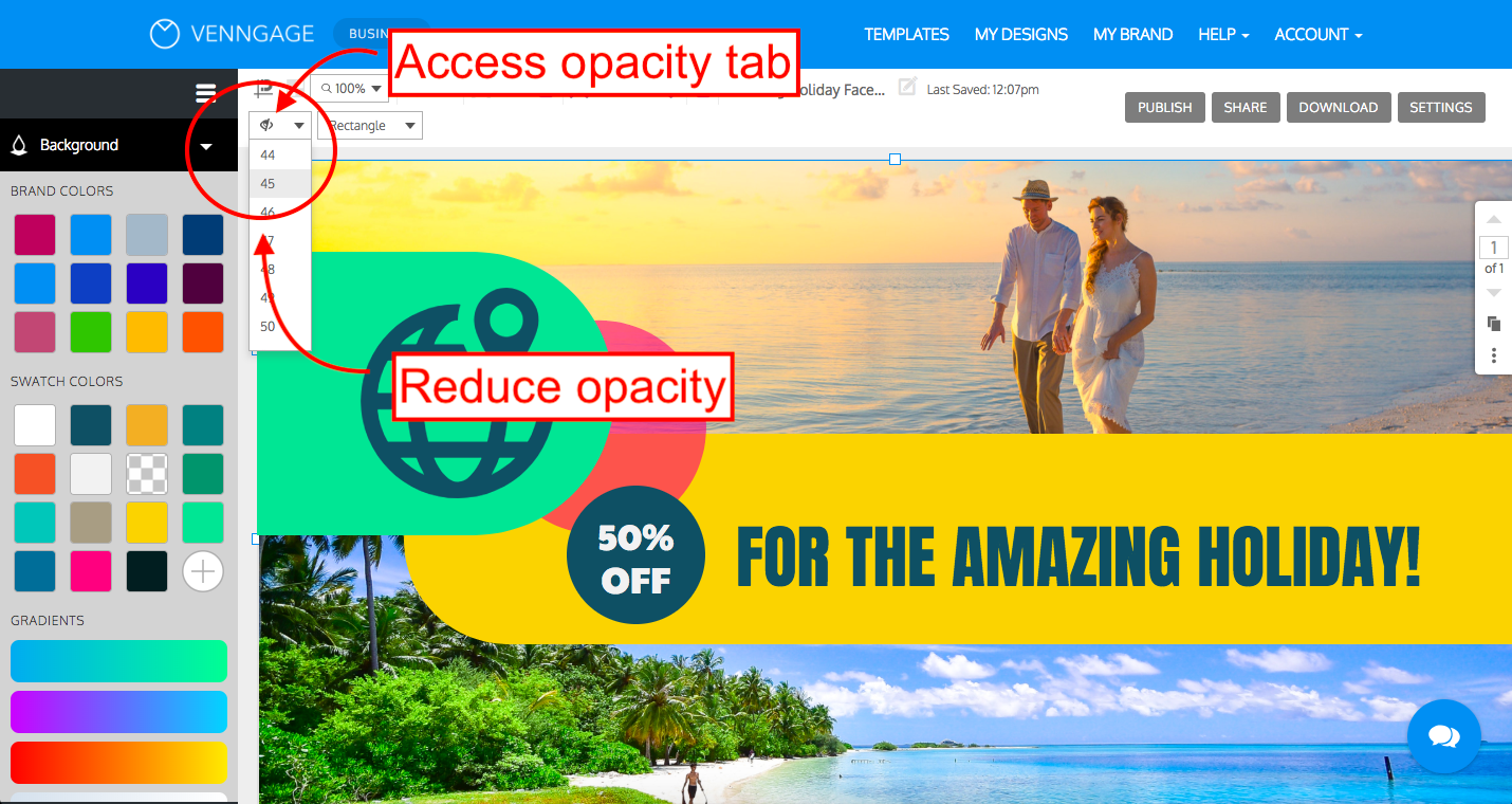
A transparent overlay is exactly what it sounds like. An image is laid over your canvas and then is made transparent, to subdue its bright colors. That way, when you add your text and graphics, they don’t clash or get lost in the stock photo.
The Facebook banner template below uses a color overlay to bring together the background images. It also allows the bright text and graphics to pop out at you.
To create a transparent overlay, first make sure your canvas background is dark:
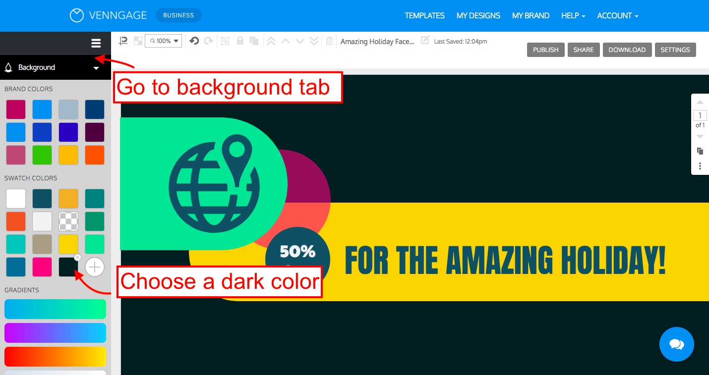
And then, when you place your image, click on the opacity tab and scroll to toggle the transparency:
4. Use illustrated icons instead of stock photos
The day may come (if it hasn’t already) that you just can’t seem to find the perfect stock photo.
Have no fear!
In those situations, you can use illustrated icons to design your own images. Venngage has thousands of icons for you to explore. They’ll give your banner the look of a professional graphic designer.
The Facebook banner template below does exactly that.
This Facebook banner template celebrates female industry leaders. It uses fun and detailed illustrated icons. The variety of icons conveys a sense of diversity and reflects multiple industries.
5. Introduce your brand with quotes from industry leaders
Designing your own Facebook banner image is a great opportunity to stand out. But that doesn’t mean you have to be completely original. When we borrow quotes from industry leaders, we demonstrate that our personal brand, or corporate brand, upholds those same values.
For instance, this Quote Facebook banner template features a quote from the late Steve Jobs:
Jobs emphasizes the value of teamwork. He minimizes his role as a visionary CEO and raises the work of his team.
When this is the first impression you leave visitors with, they picture a brand that’s governed by ideals, and not just profit.
6. Support social causes with the right color palettes
Today, brands with values attract and retain loyal customers. That’s because the most compelling reason for brand loyalty among consumers is a sense of “shared values”. So if there is a cause you wish to support, your Facebook page is a great platform to do that.
Just be sure to do it right. In the same way that certain industries have color palettes associated with them, different causes and organizations have colors specific to them.
For example, this Pride Facebook banner template incorporates the popular rainbow color scheme. It also includes icons that represent different cultures.
Plenty of other causes have color associations, too. Breast cancer is associated with the color pink, and AIDS with the color red. Organizations like the Salvation Army have a brand color palette of red and white, while the American Cancer Society uses red, white and blue.
7. Apply color palettes that fit your industry or brand to your Facebook banner
The concept of color psychology explores how different colors affect how we feel and think about something. As a result, different industries over the years have adopted specific colors to communicate with their audience.
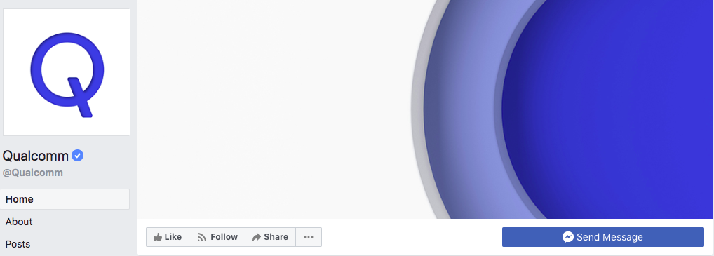
For example, the color blue is known to have a calming effect. Many tech companies use it in their branding. Consider the logos for Skype, Facebook, Linkedin, Twitter, Intel, AT&T, Cisco, General Electric, Samsung and Qualcomm (to name a few). With the amount of change new tech often represents, it helps to come off as less threatening.
Here’s Qualcomm’s Facebook page:
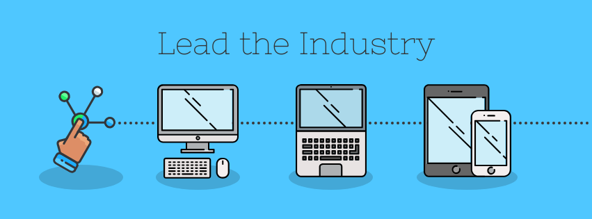
We’ve designed our Facebook banner templates with the concept of color psychology in mind. Below is our technology-themed, Industry Leader Facebook banner template. It uses a combination of soft blues and greys as a color palette you can use:
8. Provide a taste of the experiences your brand offers
Connect with your audience on an emotional level. Share something about the experiences your brand provides. The products and services your brand offers are great, but experiences are what people really want.
You can design a Facebook banner that appeals to your audience’s emotions. Think about what your brand promises. Is it a great night out with friends? A relaxing retirement? More time doing things they love? Or oodles and oodles of money? With that in mind, you can design something that touches on those experiences.
The Facebook banner template below provides a sense of adventure and exploration:
The wide shot of a city skyline, paired with the simple airplane icon, spark all sorts of emotions tied to travel, exploration, vacation and more.
9. Use calls-to-action to engage your audience
A call-to-action (CTA) encourages your audience to continue interacting with your brand. So if you’re speaking at a conference or offering an informative webinar, don’t keep it a secret. Share it with your Facebook-page visitors and make sure it’s the first thing they see.
Below is our Event Promotion Facebook Banner template, that promotes a conference. The template uses a few simple icons and graphics, a bold header, and a clear CTA. The CTA encourages visitors to act, by inviting them to attend the event.
10. Stand out with funky, high-contrast color palettes
When it comes to designing your own Facebook banner, professional doesn’t need to mean boring. Trying something different and out-of-the-box conveys confidence. Using high-contrast color palettes is one way to do that.
This Product Promo Facebook banner template uses abstract shapes and bright colors that grab your attention:
You can add your own shapes and designs easily by going through our icon library, resizing them and choosing your own colors.
11. Include your brand’s slogan or tagline
Your brand’s slogan can set you apart from the crowd. In fact, a well-liked slogan can positively impact revenue. The slogan you choose to share can also be part of a larger social media campaign you’re running.
The NBA’s Facebook banner displays a slogan which is straightforward. The design is simple, but the slogan speaks to the excitement, anticipation and other strong emotions that fans of the game all feel.

CoSchedule’s Facebook banner is also simple in design. Their slogan is informative but also conveyed with a playful font, which shares a lot about the brand’s personality.

12. Promote contests, giveaways, and more
A great way to build you online following is by hosting social media contests and giveaways. It’s one way to drive engagement, build your email list or even go viral. But you need to promote these events in ways that make them obvious and accessible.
Promoting contests, giveaways and other types of promotions using your Facebook banner image, is a great way to tell people what’s happening with you and your brand.
Take a look at this Facebook banner template:
It uses a captivating image that aligns with the theme of the contest, and states exactly what it’s about.
13. Save your design as a Facebook banner template
Since you’re already creating a Facebook banner that’s unique and eye-catching, save it as a template. This lets you design new banners all with a consistent tone and feel.
You can customize your new templates by using different stock photos or color palettes.
Apply new high-quality stock photos
Going back to the Inspirational Facebook banner template, here’s the original design:

And here are a few variations:


The spirit of the slogan is still the same, but the different images create whole new looks.
Apply new color palettes
Another approach to take is using new colors for the same design.
Take a look at this Facebook banner template:
Here are new versions of the same banner, using different color palettes:


The tone and feel of the design never changes, but the new color palettes have a renewed impact.
It’s also super simple to do! In the editor, just go to My Brand Kit and then shuffle through the different color palette suggestions. This feature is available to all premium users:

A few things to remember when designing a Facebook banner
Facebook banner dimensions and Facebook page layouts sometimes change. It’s essential to know how your images should be sized and formatted so that your Facebook banner looks perfect.
Image size and format
- For Desktop: 820 pixels wide by 312 pixels tall
- For Mobile: 640 pixels wide by 340 pixels tall
Facebook states that the image must be at least 400 pixels wide and 150 pixels tall. But of course, you run the risk of the image getting resized and stretched.
Optimize your banner for Facebook’s layouts
You may have noticed, a personal Facebook account has a different layout from a Facebook business page.
Here’s a personal page of a known brand evangelist:

You can see that the banner is obstructed by your profile picture, and several tabs at the bottom. Make sure the impact of your design and text isn’t lost or hidden behind something.
Here’s the layout for a business page:

You can see nothing obstructs the banner, allowing you to make full use of Facebook’s banner image size.
Now get out there and impress your audience!
Convince your target audience and your followers that your brand is top-notch. Make a great a impression on the visitors that land on your Facebook page and boost your lead generation. Design a custom Facebook banner image that reflects you and your brand.
Want some more tips for building your online following? Here are a few guides to help you out:


