What makes us see a character as good or evil? The character’s design probably has something to do with it.
Think about how color is used when talking about character: if someone is bad, they’re a “black hat”. If someone is jealous, they’re “green with envy”.
We see people bringing up color associations often in discussions about marketing and branding. There have been a ton of articles written about how colors affect our mood, or our decision to buy products. And for the most part, those articles should be taken with a grain of salt.
As HelpScout pointed out in their article about color psychology, our perception of color is largely influenced by factors like our personal experiences, cultural upbringing, and personal preference.
But there is something to be said about how color affects our perception of character and personality. After all, when you conjure up the image of a villain in your mind, they probably aren’t wearing pink, right?
We wanted to investigate the connection between color meanings and character. So we decided to analyze a group of characters that we, like so many, hold close to our hearts: Disney characters.
Many of us grew up with Disney characters. These characters inform our understanding of what makes the image of a “hero” and what makes the image of a “villain”. And after tallying up some numbers, we definitely were able to find some connections between the colors in their characters and their personalities.
WATCH: Everything you need to know about COLOR… in under 3 minutes!
Color meanings and how they affect our perception of characters
At Venngage, we love geeking out and making cool data visualizations.
That’s why we decided to see if we could find a correlation between the dominant color in Disney character designs and how “good” and “evil” they are.
Going into this, we knew that a lot of the Disney villains would have darker dominant colors like black and purple. But we were curious to see how the dominant colors for heroes would reflect their personalities and roles within the film, and what we could learn about color meanings from it.
And we also were curious to see how colors in the Disney villains’ designs might play into how likable of a character they are, despite being on the evil end of the spectrum.
To find out, we picked 40 Disney heroes and 40 Disney villains and pulled the most dominant color.
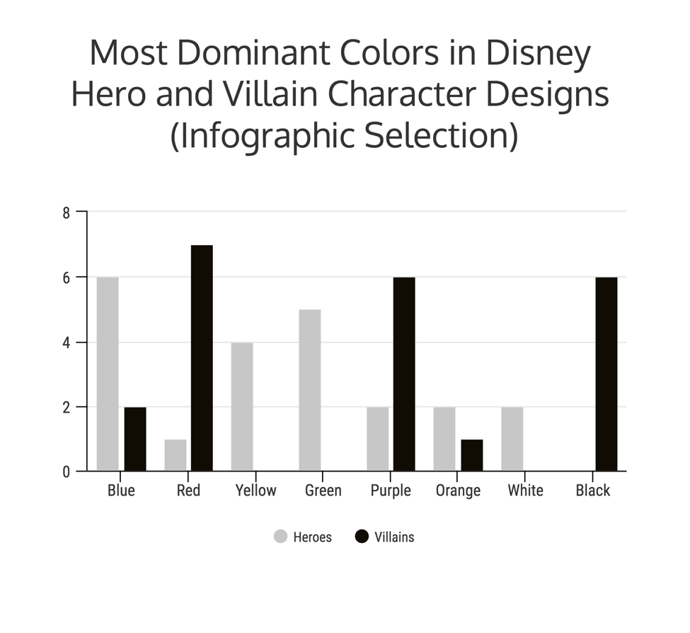
For the infographic, we picked 44 Disney characters at random (22 heroes and 22 villains). The color distribution for the smaller sample was very similar to the full sample.
We also ranked each character on a scale of good (+10) to evil (-10), with morally ambiguous characters ranging around the middle point (0). We ranked them based on their “heroic” qualities (like kindness, courageousness, and empathy) and their “villainous” qualities (like cruelty, greed and vengefulness).
That means that certain characters who are ultimately considered heroes still possessed some villainous qualities like greed or vengefulness. In those cases, they ranked lower than characters who had more heroic qualities.
Disclaimer: while we discussed each rating as a group, ultimately it’s based on our interpretations of the characters. We also might have gone a bit overboard in our discussions about some of the characters. But that’s part of the fun, right?
You can view the spreadsheet of character colors and good-to-evil ratings here.
Some of the results didn’t surprise us. As expected, mostly villains had designs that are primarily darker colors like purple and black. Meanwhile, brighter, sunnier colors like yellow and orange were primarily found in heroes.
But what was most interesting to us were how certain villains that are more likeable tended to have colors that were primarily attributed to heroes. Meanwhile, certain heroes who, despite being ultimately good, were a bit more morally ambiguous had either a “villainous” dominant color or were a darker shade of their more “heroic” color.
Purple
As we anticipated, purple was overwhelmingly one of the most villainous colors. When you consider that purple is often associated with power, nobility, luxury and ambition, it makes sense.
Those characteristics are certainly reflected in characters like Maleficent from Sleeping Beauty, Dr. Facilier from The Princess and the Frog, and the Evil Queen from Snow White and the Seven Dwarfs. They are all character who seek power in some form.
But it was interesting to consider how those characteristics are represented in heroic characters. Purple is a prominent color in Aladdin’s design, for example–and he certainly does have ambition.
Anna from Frozen also featured purple prominently in her design. Although she doesn’t embody any of the more villainous qualities attributed to purple, she does come from a noble background. It’s worth noting that blue features prominent in her character design as well, which we found to be a largely heroic color. It makes for an interesting conflict in her character, doesn’t it?
Blue
Blue was overwhelmingly a heroic color. The color certainly fits the bill, with characteristics like trust, loyalty, confidence and stability often attributed to it.
There are some undeniably good characters in the blue category. Characters like Judy Hopps from Zootopia, James P. “Sully” Sullivan from Monsters, Inc., and Cinderella. But there are also some villainous-turned-heroic characters, like Elsa from Frozen or Stitch from Lilo and Stitch.
We also found that the villain who featured blue prominently in their design were all likable characters. Hades from Hercules, for example, is undeniably villainous (he is the god of the underworld, after all) but he’s also a source of comic relief. And Darla Sherman from Finding Nemo is, well, a small child.
Red
Even though heroes are supposed to wear red capes, we were surprised to find that red was more commonly featured in character designs for villains.
But when you consider that red is often associated with determination and passion, you can see how those can both be heroic and villainous qualities. There’s no denying that a character like Captain Hook from Peter Pan or Jafar from Aladdin are determined. But red can also be associated with anger, so you can see how that may influence their characters designs as well.
On the heroic end of the spectrum, characters who feature a lot of red in their designs like Mr. Incredible from The Incredibles and Hiro Hamada from Big Hero 6 embody more of our traditional understanding of who a hero is.
Green
Green is a color often associated with growth, healing and safety. It makes sense, then, that green was found most often in hero designs.
The heroes who feature green most prominently in their designs also tended to be character who undergo a lot of growth in their movies. For example, Merida from Brave starts out as a stubborn young woman with a strained relationship with her mother. But by the end of the movie, she has learned to see things from from mother’s perspective and they are able to set aside their differences.
Or take Mulan, who grows from a daughter set to be married, to a fearless warrior. And Ariel, who literally learns how to walk on her own two feet and leave the ocean for the life she always dreamed of having.
Yellow
Characters who featured yellow were some of the most purely good characters from our sample. Pocahontas, Russel from Up, Snow White, and Belle from Beauty and the Beast all have a lot of yellow in their character designs.
The exception is Pinocchio, who despite being a naive and innocent character, also has a bad habit of lying. His design also features some red in it–maybe a slightly “evil” streak?
Orange
Like yellow, orange is a bright and “sunny” color. As you might expect, it did feature most prominently in Disney heroes.
The only Disney villain we sampled who was primarily orange was Shere Khan from The Jungle Book. But he’s a tiger so attributing too much meaning to his color scheme feels like a bit of a stretch. That being said, color psychology attributes orange to selfishness and opportunism, so make of it what you will.
Black
As you would expect, all of the characters in our sample who featured black prominently in their designs were villains. Some of the villains in this category were also scored the most evil, like Scar from The Lion King, Ursula from The Little Mermaid and Yokai from Big Hero 6.
But while Scar and Ursula have virtually no redeeming qualities, Yokai is a much more complex character. And a striking part of Yokai’s costume is his white mask. Maybe there’s some conflict at play in his character design?
White
Despite what we expected, white featured in as many villains as it did heroes. Sure, there were some undeniably good heroes whose designs were mostly like, like Duchess from The Aristocats and Pongo from One Hundred and One Dalmatians. The commonly attributed characteristics of “innocence” and goodness fit them.
But what was more interesting was the villains who featured white most prominently in their designs.
Take Bellwether from Zootopia, for example. We are led to believe she is a sweet, bumbling character, when in reality she is a wolf in sheep’s clothing. Or take AUTO from Wall-E who, despite being classified as a villain, doesn’t really possess any morality.
How do brands use color association to convey their “character”?
Through popular media, we develop ideas about specific colors. Brands are aware of this and that’s reflected in their marketing and design choices. Color psychology, like font psychology, plays a subtle but important role in influencing how people feel about a brand.
So let’s take a look at color psychology in marketing and branding. Taking color meanings into consideration, it’s interesting to look at which companies have chosen which colors for their branding. In many cases, the personality that the brand wants to convey definitely seems to play into the color they chose.
Blue, for example, is often found in financial brand logos. That’s probably because these brands want to communicate values like trust and loyalty to their clients.
What’s more, a study of the world’s top 100 brands found that most brands (33%) use blue. This makes sense, when you consider what other industries would want to ensure trust in their audience.
For example, blue also crops up a lot in tech company logos: IBM, Bell, GE, HP, and Intel. They’re all big “heroes” in the tech space. A lot of website logo designs also comprise of blue.
The second most popular color was red, which goes against the idea that red is a more “villainous color. But it probably makes sense that a lot of brands would choose red, when you consider red is associated with strength, energy and passion.
Those are all characteristics that apply to industries where you see a lot of red in logos, like fast food brands. McDonald’s, KFC, and Dairy Queen would want to evoke energy and excitement. But as this article points out, our tendency to choose fast food brands with red signage probably doesn’t have much scientific basis. It probably has more to do with the positive association we have with red from visiting those places as kids.
But the study also found that the third most popular color for brand logos were black or grayscale. Why might that be? These companies definitely weren’t setting out to look like bad guys.
According to other color psychology articles, black can also mean elegance, power, and balance.
Car companies will often use grays in their logos. This gives them a sleek, classy character.
Black is also used in a bunch of sportswears brand logos like the Puma, Nike and Adidas. They use black in a way that evokes power and speed. It’s also worth noting that white plays a big role in both their logos–there’s a stark contrast between black and white that makes their designs more impactful.
So like many people have critiqued already, our approach to color psychology should be taken with a grain of salt.
In many cases, how a brand’s logo comes across to their audience will depend on how the colors are used within the design to communicate a particular personality. And other marketing factors definitely contribute to our perception of the brand’s character as well, like their social media presence, ad content, and store designs.
If you want help picking a logo color for your brand, 99designs have put together a handy logo color calculator.
How can you pick your own heroic color scheme?
We wouldn’t be a good design blog if we didn’t give you something you could use.
When designing your own graphics, you should pick your color scheme deliberately. Think about the story you want to tell. What colors can you pick to get the mood and message of your story across?
What sort of “character” do you want to give your design?
Infographic created by Steve Shearer.


