Let me guess: you’re probably here because you know that while you could just send out a quick text with your event details, that won’t do much to get people hyped about your party.
No, what you need is a birthday invitation card design that reflects how lit the party will be.
I’m also guessing you probably don’t have the party budget to hire a freelance graphic designer solely for your birthday. Maybe you’ll get there one day! In the meantime, here are some tips for how you can design your own creative birthday invitation.
To make your own creative birthday invitation, follow these simple steps:
- Start with a birthday invitation template. You can access all of them using our invitation maker.
- Customize the template design to fit your party and personality.
- Export your invitation and send it to your friends!
Here are some tips to help you customize your birthday invitation card design:
- Use a bright color scheme in your birthday invitation card design
- Combine different font styles that complement each other
- Give your invitation an eye-catching header
- Use a color filter to make text pop from your card’s background image
- Make one image the focal point of your card design
- Organize the information on your invitation using a two-column layout
- Pick a thematic background image for your invitation card design
- Use image frames to incorporate photos into your invitation card design
- Think outside the box with your birthday invitation card design
- Give your invitation card a simple color border
1. Use a bright color scheme in your birthday invitation card design
Does anything scream BIRTHDAY more than rainbow sprinkles? Incorporate that simple joy into your invitation design with a bright, vibrant color scheme.
For a vibrant color scheme, use contrasting colors. Look for colors that are opposite each other on the color wheel, like blue/teal vs. orange/red.
For example, this birthday invitation card contrasts blue with green:
2. Combine different font styles that complement each other
To give your card design a bit of variety, try mixing and matching different font styles. A card is one of the few types of designs where you can get pretty crazy with your font styles and no one will bat an eyelash.
When in doubt, pick a decorative font for the main header, a second decorative font for the sub-header, and a plain font for the body text. The right font pairings can give your card design the touch of a professional.
This birthday invitation card uses three simple fonts, but the contrast still makes the design interesting to look at:
3. Give your invitation an eye-catching header
A simple way to achieve a striking card design is to use a big, eye-catching header. Try using a bold photo a funky pattern–something that will stand out.
For example, the birthday invitation card design below uses a simple but striking floral image for the header. The bold header contrasts against the neutral white background, achieving a clean and eye-catching design.
Note how the main text in the card is in a matching pink color. This helps give the design a sense of symmetry.

4. Use a color filter to make text pop from your card’s background image
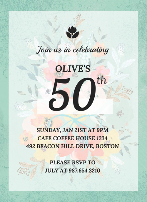
A busy background image can make it hard to read the text on your invitation card. That’s where using a color filter can help. A color filter will help your text stand out without completely obscuring the background image.
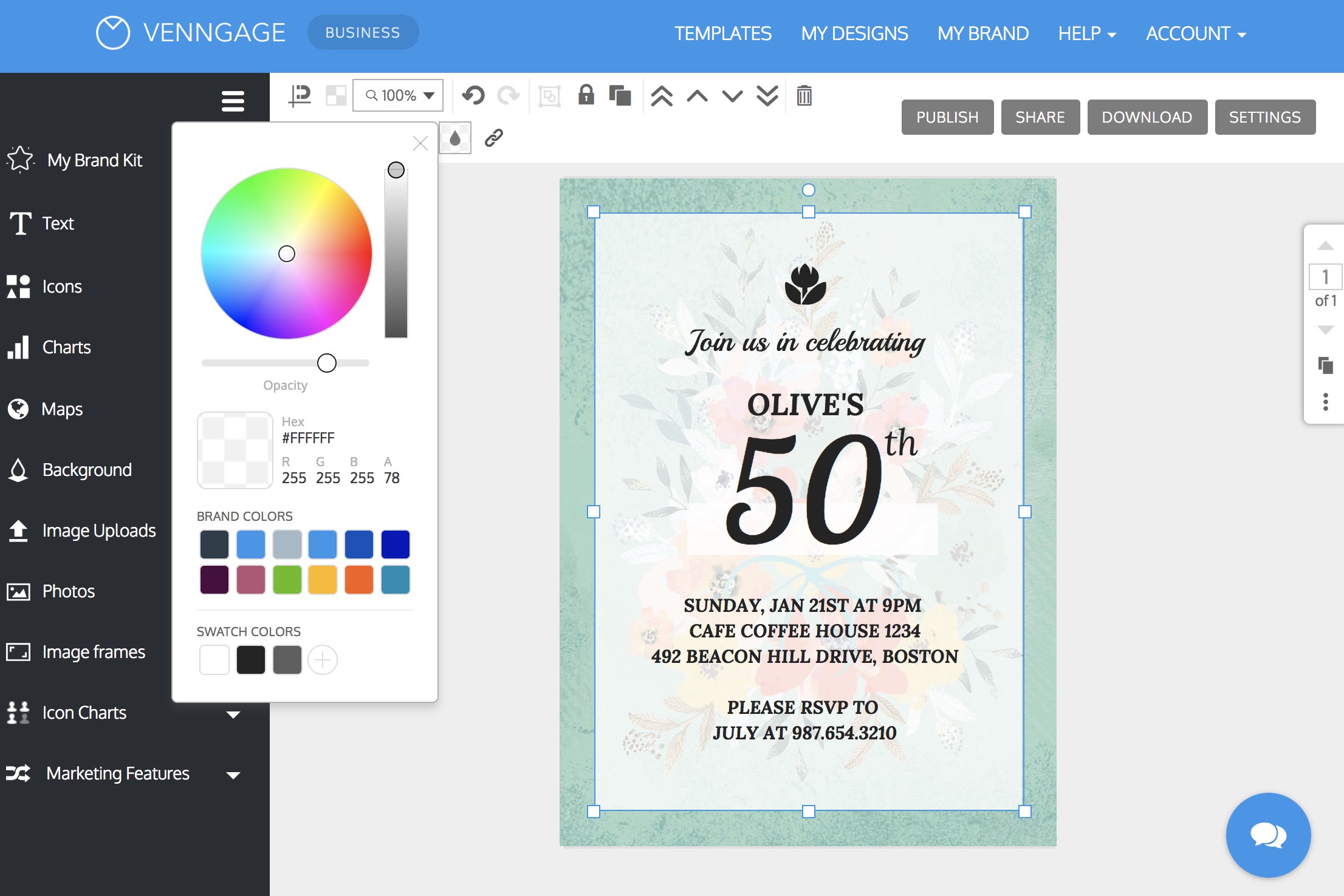
To give your card a color filter in Venngage, simply drag and drop a rectangle icon onto your card. Pick the color you want the filter to be, then adjust the opacity until you can see the background image rectangle.
The result is a card with a creative border and readable text:
5. Make one image the focal point of your card design
In the design world, a focal point is the part of your design that people’s eyes are drawn towards. Generally, the focal point is the part of your design that is the brightest, the most focused, the most contrasting, or where other parts converge.
You can create a focal point in your birthday invitation card design by picking one focus image. In this example, the cupcake image works as the focal point. The red cherry on top draws your eyes to the centre of the card:

6. Organize the information on your invitation using a two-column layout
For a balanced, easy-to-read invitation design, try splitting your card right down the middle. On one side, put a decorative image and on the other side, put a color block background with the party details. This type of layout works well for cards with a landscape orientation.
Note how this birthday invitation template uses the color filter technique as well:

7. Pick a thematic background image for your invitation card design
I you want to keep your effort to a minimum while still achieving a nice design, then opt for a background image that naturally frames your text. There are plenty of stock photos out there that are designed specifically for this purpose. Pick a photo that reflects the theme of your party, or that illustrates an activity that will happen at the party.
Be sure to use a font that contrasts with the background image. For light images, use a dark font, and vice-versa. Also, make sure your title font is in at least 40 pt font so that it’s easy to read.
8. Use image frames to incorporate photos into your invitation card design
Do you want to include photos of the birthday person in question? Use an image frame to seamlessly incorporate your photos into your birthday invitation card design.
In Venngage, you can do this by dragging the image frame onto your canvas, then dragging your photo on top of the image frame. The image will then take the shape of the frame.

This way, even if your images have different dimensions, they can all fit into the same cohesive card design.

9. Think outside the box with your birthday invitation card design
A classic card is always a hit. But if you want to make your party seem out of the ordinary, then brainstorm some creative concepts for your card design.
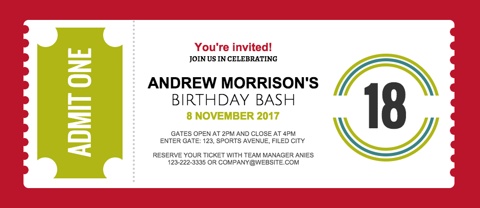
For example, you could make your invitation look like a ticket. Not only will this make your party seem cool and exclusive, it will also make for a nice keepsake for your invites.
For a ticket, use a 2:1 aspect ratio for the image. Look for simple ways to embellish your ticket design, like the red border in this ticket template:
10. Give your invitation card a simple color border
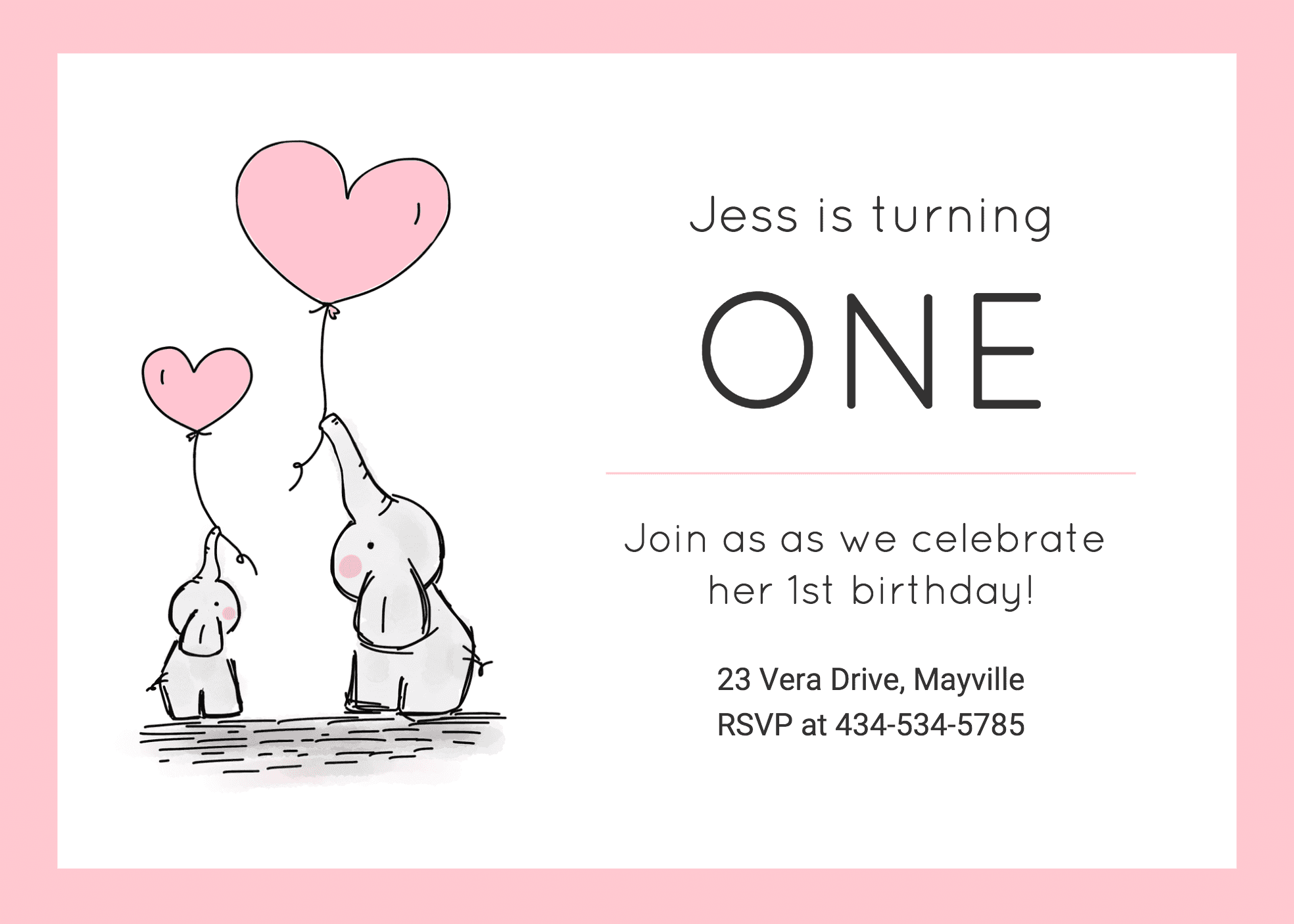
For a simple and clean design, use a solid color border. Pick a color that reflects the mood and theme of your party. If your birthday invitation card design features an image, then pick a border color that matches the image.
For example, this birthday invitation has a pink border that matches the hearts in the image:
How to export your birthday invitation card for print
If you want to print out your birthday invitation card, here are a couple of tips to make sure your final product is awesome!
Export your invitation in high resolution
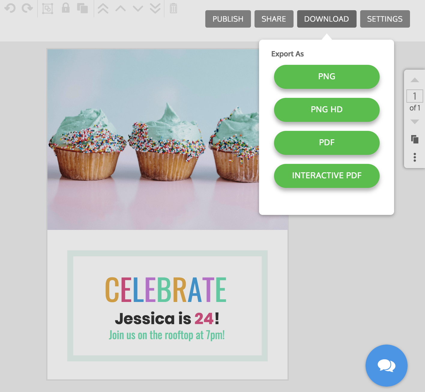
If your image quality is low, that will only become even more apparent once it’s printed. That’s why you should export your design as an HD PNG or PDF.
Set bleed marks for printing
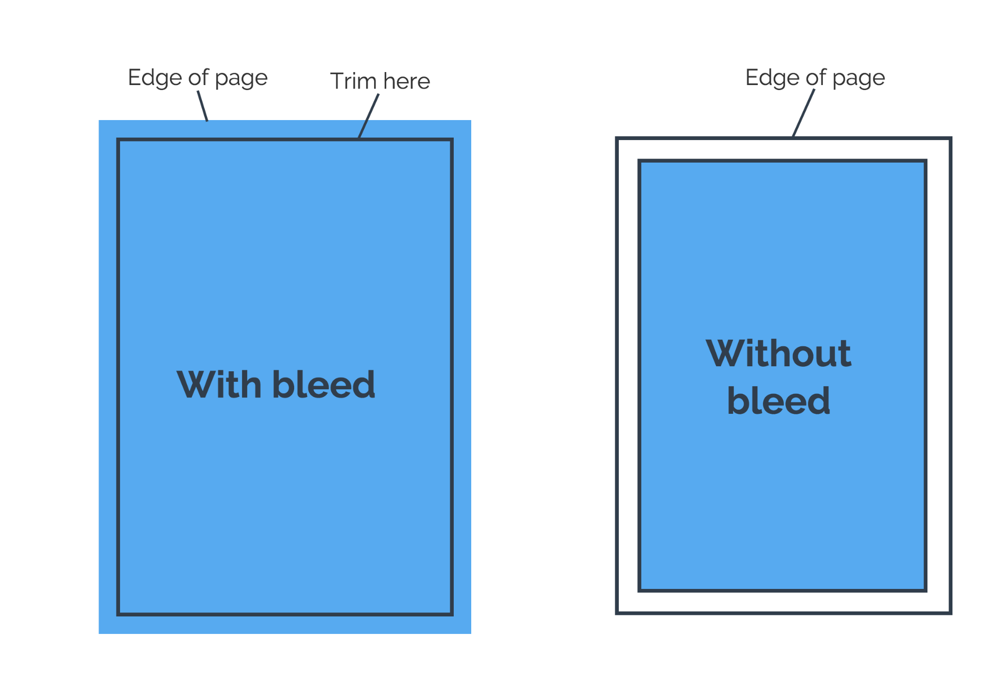
In the printing world, “bleed” means you have an image or object touching the edge of the page. When you design a card with an image that is flush with the edges of the page, your printer will automatically leave a thin white line around the edge of the paper.
When your design has bleed, it needs to be printed on a larger sheet of paper than the design, and then trimmed down to your intended dimensions.
To print your birthday invitation card so that there is no white margin around the edge, set crop marks. These will designate where the design ends on the page, so that you can crop the card after you print it.
You’re all set! For more invitation designs, check out our templates library.
Related articles:


