


Creating professional data visualizations used to require hours of manual formatting and design expertise. Today’s AI graph generators eliminate this friction by automatically analyzing your data, recommending optimal chart types, and applying professional styling in seconds.
This comprehensive guide examines the top 15 AI-powered visualization tools available in this year, covering free options for individual users to enterprise solutions for complex business intelligence needs.
Generative AI is the most powerful tool for creativity that has ever been created. It has the potential to unleash a new era of human innovation.
Elon Musk, founder of SpaceX, Tesla, xAI, Source
AI is likely to be either the best or worst thing to happen to humanity.
Stephen Hawking, Theoretical Physicist & Author, Source
Quick verdict: Best AI graph generators by use case
If you just want the short answer before diving into comparisons, here’s what actually works best for me:
Best AI graph generator for presentations: Venngage
In my testing, Venngage consistently produced polished, on-brand charts with minimal cleanup. The AI chart recommendations and design automation made it easy to create visuals ready for decks, reports, and client presentations.
Best free AI graph generator: Google Charts
Among free tools, Google Charts delivered the most reliable results. It handled clean CSVs accurately and produced accessible, embeddable charts, even though the AI features are fairly lightweight.
Best AI graph generator from text: Sigma Computing
Sigma performed best for text-to-chart workflows. I could ask questions in plain English and get meaningful visualizations with minimal setup, making it ideal for conversational data exploration.
Best AI graph generator for large or messy data: Tableau
Tableau handled large and imperfect datasets better than any other tool I tested. Its AI surfaced trends and outliers reliably, making it a strong choice for deeper analysis—if you’re okay with a learning curve.
Best AI graph generator for students & beginners: Lucidchart
Lucidchart was the most beginner-friendly option. The drag-and-drop interface and interactive guidance made it easy to create clear charts without prior data or design experience.
AI Graph Tools Comparison (17 Tools)
| Tool | Best for | Input types (text / CSV / Excel / API) | Output types | Free plan? | True AI vs template-based | Learning curve |
|---|---|---|---|---|---|---|
| Tableau | Large or messy datasets, enterprise analytics | Text, CSV, Excel, API | Bar, line, scatter, maps, dashboards | No | True AI | High |
| Microsoft Power BI | Business intelligence & reporting | Text, CSV, Excel, API | Bar, line, pie, KPI, dashboards | Limited | True AI | Medium |
| Venngage AI Graph Generator | Presentation-ready charts & branded visuals | CSV, Excel, Google Sheets | Bar, line, pie, area, infographic charts | Yes | AI + templates | Low |
| Google Charts | Free, embeddable web charts | CSV, API (and Sheets via integration) | Bar, line, pie, geo charts | Yes | Template/automation-based | Medium |
| Plotly (Dash) | Interactive dashboards & technical teams | CSV, API (JSON) | Interactive charts, dashboards | Limited | True AI (technical) | High |
| Canva AI Chart Maker | Students, beginners, visual content | CSV, manual input | Bar, line, pie | Yes | Template-based | Low |
| Infogram | Storytelling, infographics, shareable visuals | CSV, Excel | Charts, infographics, interactive visuals | Yes | AI-assisted templates | Low |
| QuickChart API | Automation + charts inside apps/workflows | API (JSON) | Bar, line, pie, radar | Limited | Automation-based (AI optimization) | High |
| Sigma Computing | Text-to-chart (conversational analytics) | Text, CSV, Excel, API | Charts, dashboards | No | True AI (LLM-driven) | Medium |
| Zoho Analytics | SMBs + NLP-driven insights | Text, CSV, Excel, API | Charts, reports, dashboards | Limited | True AI | Medium |
| Flourish Studio | Interactive storytelling & learning | CSV, Excel | Animated, interactive charts | Yes (public) | Template-based + AI guidance | Medium |
| Datawrapper | Publication-ready, accessible charts | CSV, Excel, API | Bar, line, maps, tables | Yes (public) | AI-assisted formatting | Low |
| Adobe Express (Chart Creator) | Branded, design-forward charts | CSV (Excel limited) | Basic charts + design visuals | Yes | Template-based + AI design | Low |
| FusionCharts | Enterprise dashboards & app embedding | CSV, Excel, API | Large chart library | No | AI-assisted recommendations | High |
| Chart.js (with AI plugins) | Custom charts with max dev control | API (via code) | Most standard chart types | Yes | Template-based (plugin-dependent) | High |
| Graphy | Quick, shareable charts for presentations | CSV, Excel | Bar, line, comparison charts | Yes | AI-assisted visuals | Low |
| Lucidchart | Students & beginners (interactive, drag-and-drop) | Manual input (CSV limited) | Basic charts + diagrams | Yes | Light AI assistance | Low |
How we evaluated these tools
To keep this guide practical and unbiased, we tested 17 AI graph generators using the same inputs and evaluation criteria. The goal wasn’t to crown a single “winner,” but to understand where each tool actually performs best.
How we tested
We ran each tool through three common real-world scenarios:
- Test 1: Text → Chart
We entered plain-language prompts (for tools that support it) to see how well they interpreted intent and generated relevant charts. - Test 2: Clean CSV → Chart
We uploaded well-structured CSV files with clear headers to test chart recommendations, formatting, and speed. - Test 3: Messy CSV → Chart
We used imperfect datasets (missing values, inconsistent labels) to evaluate how tools handled cleanup, errors, and edge cases.
Criteria we used
Each tool was evaluated using the same practical benchmarks:
- Setup speed – Time to first usable chart
- Accuracy – Whether values and labels matched the source data
- Chart choice quality – How appropriate the AI’s chart recommendations were
- Manual cleanup required – How much editing was needed after generation
- Export quality – Especially PPT and SVG support, which matters for presentations and publishing
- Cost-to-value – How useful the free tier or entry plan actually is
Limitations of our testing
Our testing focused on common business, education, and content workflows, not highly specialized scientific or real-time data pipelines. We also tested tools using sample datasets rather than proprietary or sensitive data. Performance may vary depending on dataset size, industry, and how advanced your use case is.
That said, every tool listed here was tested hands-on using the same process to ensure fair, consistent comparisons.
What are AI graph generators and how do they work?
AI graph generators help turn raw data or simple text prompts into charts by automating chart selection, labeling and formatting. Instead of manually choosing visualization types, the tool analyzes your input and applies established data visualization best practices to produce readable, different types of presentation-ready graphs.
True AI vs. automation marketed as AI
Not all tools labeled “AI” work the same way:
- True AI graph generators use machine learning or large language models (LLMs) to interpret data or text, recommend chart types, and surface patterns such as trends or outliers.
- Automation-based tools rely mainly on predefined templates and rules. They speed up chart creation but offer limited data understanding or insight generation.
Knowing the difference helps you choose the right tool based on data complexity and use case.
Where AI is genuinely useful
AI delivers the most value when handling repetitive, technical tasks:
- Data interpretation, including detecting trends and anomalies
- Chart selection based on data structure and relationships
- Labeling and formatting to improve clarity, accessibility, and consistency
These features reduce manual work and help non-experts create clear, accurate visuals more efficiently.
Where AI still needs human input
AI graph generators are assistive tools, not decision-makers:
- Data accuracy depends entirely on the quality of the source data
- Complex or high-stakes datasets often require expert review
- Context and intent—why the data matters—must still come from the user
The technology has evolved significantly from basic charting tools. Modern AI generators can handle complex multi-dimensional datasets, suggest interactive elements, and even provide narrative explanations of what the data reveals. In fact, 58% of enterprises have adopted interactive dashboards powered by AI.
AI is not about replacing people — it’s about augmenting human potential.
Fei-Fei Li, Stanford AI Lab, Source
Why use AI graph generators instead of traditional tools?
Traditional chart tools require manual chart selection, formatting and design tweaks. AI graph generators automate these steps using data visualization and design best practices.
Time efficiency advantages:
- Professional charts in minutes instead of hours — AI-powered tools can reduce chart creation time by 60-80% compared to traditional methods.
- Automatic formatting removes manual styling
- Supports batch uploads and real-time data updates
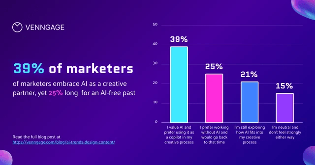
Try this customizable Venngage graph template I created to showcase data for AI Trends in Design and Content Creation. It saved me a ton of time, and Venngage’s AI Graph Generator can save even more.
Better quality, less effort
- Applies visualization best practices consistently
- Reduces chart selection errors
- Maintains accessibility and brand consistency
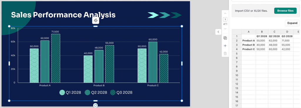
Just upload accurate data and let the AI handle the rest like in this sales performance analysis graph, where you can upload CSV/XLSX files or edit data directly in Venngage’s editor.
Accessibility made simple
- No design expertise required
- Easy for non-technical users
- Built-in templates and brand controls
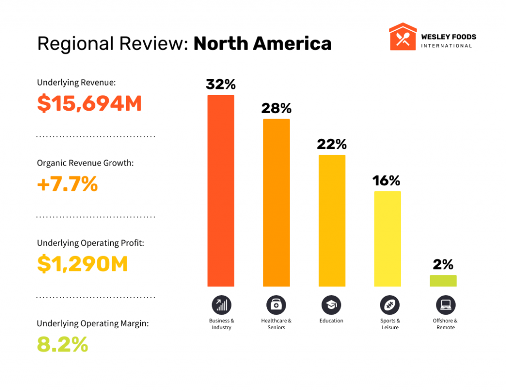
For instance, Venngage uses its accessibility tools to apply inclusive design standards to every project while giving you 100% control to customize your graphs with its “My Brand Kit” feature.
Companies that successfully implement AI-led processes will be able to reduce their workforces by 95%+ while maintaining or increasing output. We’ll see examples of $100M+ companies operating with just two or three people assisted by agentic AI systems.
Julia McCoy, founder of First Movers, Source
Best AI graph generator by use case
While most AI tools for graphic design offer broader creative features, specialized AI graph generators focus on turning data into charts to help you complement your visual storytelling.
Best AI graph generator for presentations
Tools that prioritize design polish, templates and visual storytelling:
1. Venngage’s AI Graph Generator
Venngage AI Graph Generator combines powerful AI automation with intuitive design tools, making professional data visualization accessible to users without technical or design backgrounds.
Key AI features:
- Smart chart recommendations – AI analyzes data patterns and suggests optimal visualization types
- Automatic brand styling – Applies consistent colors, fonts, and design elements across all charts
- One-click data import – Seamlessly connects with Excel, Google Sheets, and CSV files
- Intelligent formatting – Automatically adjusts layouts, legends, and labels for maximum clarity
- Template optimization – AI suggests the best templates based on data type and intended use
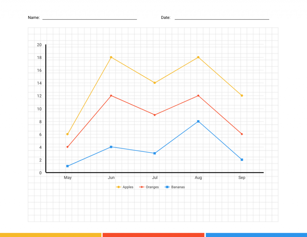
You can begin with a simple blank line graph template and let the AI graph generator populate it with your data.
Best for: Business professionals, marketers, content creators, and teams needing quick professional visualizations
Strengths: User-friendly interface, extensive template library, excellent design automation, affordable pricing
Limitations: Less suited for complex statistical analysis, fewer advanced customization options than enterprise tools
Pricing: Free plan available with basic features, paid plans start at $19/month
2. Canva’s AI Chart Maker
Canva’s approach to AI visualization emphasizes design aesthetics alongside data accuracy, making it ideal for content creators who need visually appealing charts for marketing and communication purposes.
Key AI features:
- Design-first recommendations – Suggests chart types that balance data clarity with visual appeal
- Automatic color coordination – AI selects colors that work well together and maintain brand consistency
- Template personalization – Adapts design templates based on data characteristics and intended use
- Social media optimization – Automatically formats charts for different social platforms
Best for: Content marketers, social media managers, small business owners, educators
Strengths: Intuitive drag-and-drop interface, extensive template library, strong design automation
Limitations: Less suitable for complex data analysis, limited statistical chart types
Pricing: Free plan with basic features, Canva Pro at $12.99/month
3. Infogram’s smart visualization assistant
Infogram specializes in infographic-style data visualizations, with AI capabilities focused on creating engaging, shareable content that communicates data insights effectively to broad audiences.
Key AI features:
- Content type recommendations – Suggests whether data works better as charts, infographics, or interactive content
- Audience-aware styling – Adjusts complexity and design based on intended audience
- Engagement optimization – AI suggests interactive elements that increase user engagement
- Multi-format output – Automatically optimizes visualizations for web, print, and social sharing
Best for: Content creators, journalists, marketing teams, non-profit organizations
Strengths: Strong focus on storytelling, excellent template variety, good social media integration
Limitations: Less suitable for detailed analytical work, limited statistical capabilities
Pricing: Free plan available, paid plans start at $25/month
4. Adobe Express chart creator with AI design
Adobe Express leverages Adobe’s design expertise and AI capabilities to create visually stunning charts that maintain data integrity while maximizing aesthetic impact and brand consistency.
Key AI features:
- Design principle automation – Applies professional design rules automatically
- Brand consistency enforcement – Ensures all visualizations align with established brand guidelines
- Creative enhancement suggestions – Recommends visual elements that improve engagement without compromising data clarity
- Multi-format optimization – Automatically adapts designs for different uses and platforms
Best for: Design teams, brand-focused organizations, creative professionals, marketing departments
Strengths: Superior design quality, excellent brand management, Creative Cloud integration
Limitations: Higher cost, may prioritize aesthetics over analytical depth
Pricing: Free plan available, paid plans start at $9.99/month
Best free AI graph generator
Tools that are free to use (good for basic charting and exploration):
6. Google Charts with Machine Learning integration
Google Charts leverages Google’s machine learning capabilities to provide intelligent visualization recommendations while maintaining the simplicity and accessibility the platform is known for.
Key AI features:
- Automatic chart type suggestions – Analyzes data structure to recommend optimal visualization approaches
- Smart defaults – AI applies appropriate scaling, formatting, and styling based on data characteristics
- Predictive visualizations – Uses historical data patterns to suggest trend projections
- Accessibility optimization – Automatically ensures charts meet web accessibility standards
Best for: Google Workspace users, web developers, teams needing embedded visualizations
Strengths: Free to use, excellent integration with Google services, lightweight and fast-loading
Limitations: Limited design customization, fewer chart types than specialized tools
Pricing: Completely free
7. QuickChart API for developers
QuickChart provides programmatic chart generation with AI optimization, making it valuable for developers who need to generate visualizations automatically within applications or workflows.
Key AI features:
- Automatic formatting optimization – AI ensures charts are readable across different sizes and contexts
- Performance tuning – Optimizes chart rendering for speed and resource efficiency
- Style consistency – Maintains visual consistency across automatically generated charts
- Error handling – AI detects and suggests corrections for common data visualization problems
Best for: Software developers, SaaS applications, automated reporting systems
Strengths: Simple API integration, handles high-volume generation, excellent performance
Limitations: Limited design customization, requires programming knowledge
Pricing: Free tier for basic usage, paid plans start at $40/month
Pricing: Free tier available, paid plans start at $420/year
8. Chart.js with AI enhancement plugins
Chart.js provides an open-source foundation that can be enhanced with various AI plugins and extensions, offering maximum flexibility for developers who want to incorporate intelligent visualization capabilities into custom applications.
Key AI features:
- Plugin ecosystem – Various AI extensions for automatic styling, optimization, and recommendations
- Custom algorithm integration – Ability to incorporate proprietary AI models and logic
- Performance AI – Plugins that optimize rendering and user experience automatically
- Community-driven enhancements – Continuously evolving AI capabilities through developer community
Best for: Developers wanting maximum control, custom application builders, organizations with specific AI requirements
Strengths: Complete customization freedom, no licensing costs, extensive community support
Limitations: Requires significant development expertise, no built-in business intelligence features
Pricing: Free open-source library, costs vary for commercial AI plugins
9. DataWrapper’s publication-ready AI
DataWrapper specializes in creating charts optimized for publication and web embedding, with AI features focused on readability, accessibility, and professional presentation standards.
Key AI features:
- Publication optimization – Automatically adjusts formatting for different publication contexts
- Accessibility compliance – AI ensures charts meet international accessibility standards
- Multi-format adaptation – Optimizes visualizations for web, print, and mobile viewing
- Style guide enforcement – Maintains consistent styling across all organizational charts
Best for: Journalists, publishers, news organizations, professional content creators
Strengths: Publication-quality output, excellent accessibility features, clean, professional design
Limitations: Limited design customization, fewer interactive features
Pricing: Free for public charts, paid plans from €599/month for organizations
Best AI graph generator from text
Tools that support natural language queries or text-to-chart workflows:
10. Sigma computing’s natural language analytics
Sigma Computing represents the next generation of business intelligence tools, where AI enables conversational interactions with data through natural language processing and automated insight generation.
Key AI features:
- Conversational data exploration – Ask business questions in plain English and receive relevant visualizations
- Automatic insight detection – AI continuously monitors data for significant changes and trends
- Smart drill-down suggestions – Recommends logical next steps for data exploration
- Business context awareness – Understands industry-specific metrics and KPIs
Best for: Enterprise business analysts, executive teams, organizations democratizing data access
Strengths: Intuitive natural language interface, powerful collaboration features, cloud-scale performance
Limitations: Higher cost, requires organizational data governance, learning curve for advanced features
Pricing: Custom enterprise pricing based on usage and features
11. Zoho Analytics with AI assistant
Zoho Analytics integrates AI capabilities across the entire business intelligence workflow, from data preparation through visualization and insight generation, making advanced analytics accessible to small and medium-sized businesses.
Key AI features:
- Zia AI assistant – Natural language interface for data queries and analysis
- Automated report generation – AI creates comprehensive reports based on data patterns
- Anomaly detection – Automatically identifies unusual patterns that require attention
- Predictive analytics – Uses historical data to forecast future trends
Best for: Small to medium businesses, teams using Zoho’s business suite, non-technical analysts
Strengths: Comprehensive business suite integration, affordable pricing, user-friendly interface
Limitations: Less powerful than enterprise BI tools, limited advanced statistical capabilities
Pricing: Starting at $22/month for 2 users, scales with additional users and features
12. Microsoft Power BI with AI insights
Power BI’s AI integration focuses on automated business intelligence, making advanced analytics accessible to everyday business users through natural language interfaces and smart insights.
Key AI features:
- Q&A visual – Natural language querying that understands business terminology
- Quick insights – Automatically scans data to identify interesting patterns and trends
- Key influencers visual – AI identifies factors driving specific business outcomes
- Decomposition tree – Automatically suggests drill-down paths for root cause analysis
Best for: Microsoft-centric organizations, business analysts, teams needing integrated BI solutions
Strengths: Seamless Office 365 integration, cost-effective licensing, strong mobile experience
Limitations: Less flexibility than specialized tools, limited advanced statistical capabilities
Pricing: Power BI Pro at $10/user/month, Premium at $20/user/month
Best AI graph generator for large or messy data
Tools built to handle complex datasets, enterprise BI, and deep analysis:
13. Plotly with Dash intelligence
Plotly combines interactive visualization capabilities with AI assistance, making it particularly valuable for data scientists and technical teams who need both automation and granular control.
Key AI features:
- Interactive element suggestions – AI recommends optimal user interactions based on data complexity
- Layout optimization – Automatically arranges multiple charts for maximum comprehension
- Performance recommendations – Suggests optimizations for large datasets and real-time applications
- Statistical insight generation – Identifies correlations and patterns worth highlighting
Best for: Data scientists, researchers, developers building interactive dashboards
Strengths: Highly interactive visualizations, supports multiple programming languages, excellent for real-time data
Limitations: Requires technical expertise, steeper learning curve for business users
14. Tableau with AI-powered analytics
Tableau remains the gold standard for professional data visualization, now enhanced with sophisticated AI capabilities that make complex analysis accessible to business users. Over 120,000 organizations use Tableau across the world, marking an 18% increase compared to 2023.
Key AI features:
- Ask data functionality – Type questions in plain English and receive instant visualizations
- Explain data feature – AI automatically identifies and explains statistical outliers and unexpected values
- Automatic dashboard creation – Suggests optimal dashboard layouts based on data relationships
- Smart recommendations – Proposes additional charts and analyses based on current visualizations
Best for: Enterprise teams, data analysts, and organizations with complex reporting requirements
Strengths: Handles large datasets efficiently, extensive customization options, robust collaboration features
Limitations: Steeper learning curve, higher cost, may be overpowered for simple charting needs
Pricing: Creator license starts at $70/month, Viewer licenses at $12/month
15. FusionCharts with intelligent recommendations
FusionCharts combines comprehensive charting capabilities with AI-powered recommendations, making it valuable for enterprise applications that require both breadth of chart types and intelligent automation.
Key AI features:
- Chart type intelligence – Analyzes data complexity to recommend optimal visualization approaches
- Performance optimization – AI tunes chart rendering for different data volumes and user scenarios
- Integration recommendations – Suggests best practices for embedding charts in applications
- User experience optimization – Recommends interactive features based on audience and use case
Best for: Enterprise software developers, dashboard creators, complex application builders
Strengths: Extensive chart library, robust API, enterprise-grade performance
Limitations: Requires technical implementation, higher cost for full feature set
Pricing: Developer licenses start at $497, enterprise pricing varies
Best AI graph generator for students & beginners
Tools with low learning curve and simple chart creation:
16. Flourish Studio’s storytelling AI
Flourish Studio is great for students and beginners who want to explore interactive and animated charts. Although it takes a bit more setup time, the AI-guided templates and built-in interactions make it easier to understand data and tell stories visually without needing advanced technical skills.
Key AI features:
- Animation sequence optimization – AI suggests the most effective order and timing for animated elements
- Interaction design recommendations – Proposes user interactions that enhance data comprehension
- Story flow assistance – Helps structure multiple visualizations into coherent narratives
- Accessibility automation – Ensures interactive elements work across devices and abilities
Best for: Data journalists, educators, presentation creators, storytellers
Strengths: Exceptional animation capabilities, strong storytelling focus, extensive template library
Limitations: Requires more setup time, less suitable for simple static charts
Pricing: Free for public projects, paid plans start at $69/month
How to create graphs with AI: Step-by-step process
Creating effective visualizations with AI graph generators follows a consistent workflow that maximizes the technology’s capabilities while ensuring accurate, meaningful results.
Step 1: Data preparation and upload
- Clean and organize your data in spreadsheet format
- Ensure column headers clearly describe the data they contain
- Remove or flag any missing values or outliers
- Consider the story you want your data to tell
Step 2: AI-powered analysis and recommendations
- Upload your dataset to your chosen AI graph generator
- Review the AI’s automatic analysis of data types and relationships
- Examine suggested chart types and visualization approaches
- Consider the AI’s insights about patterns and trends
Step 3: Customization and refinement
- Select from AI-recommended chart types or explore alternatives
- Apply AI-suggested styling and color schemes
- Adjust formatting based on your audience and context
- Add titles, labels, and annotations for clarity
Step 4: Validation and optimization
- Verify that the visualization accurately represents your data
- Test readability across different devices and formats
- Ensure the chart effectively communicates your intended message
- Make final adjustments to styling and formatting
In a few years, everyone will have their own personal AI — just like we all have smartphones today.
Emad Mostaque, founder of Stability AI, Source
How to choose the right AI graph generator for your needs
Selecting the optimal AI graph generator depends on your specific requirements, technical capabilities, and intended use cases. Consider these key factors when evaluating options:
For business reporting and analysis:
- Prioritize tools with strong AI insights and natural language capabilities
- Consider integration with existing business systems and data sources
- Evaluate collaboration features and sharing capabilities
- Look for platforms that understand business metrics and KPIs
For content creation and marketing:
- Focus on design quality and visual appeal automation
- Ensure templates and styling options align with brand requirements
- Consider social media optimization and multi-format output
- Evaluate ease of use for non-technical team members
For technical and scientific applications:
- Prioritize statistical accuracy and advanced chart types
- Look for programming language integration and API access
- Consider real-time data handling and performance optimization
- Evaluate customization options and extensibility
For enterprise and large-scale deployment:
- Assess security features and compliance capabilities
- Consider user management and administrative controls
- Evaluate scalability and performance under load
- Review integration options with existing enterprise systems
Getting maximum value from AI graph generators
Data preparation best practices:
- Clean and structure your data before uploading
- Use clear, descriptive column headers
- Remove or properly handle missing values
- Consider the story you want your data to tell
Working effectively with AI recommendations:
- Review multiple AI-suggested chart types before selecting
- Understand why the AI recommends specific visualizations
- Combine AI automation with human judgment about audience needs
- Test different approaches for complex datasets
Optimization strategies:
- Regularly review and update visualization templates
- Gather feedback from chart viewers to improve effectiveness
- Stay updated on new AI features and capabilities
- Integrate AI graph generation into broader workflow automation
The landscape of AI graph generators continues evolving rapidly, with new capabilities and improvements appearing regularly. The most successful users combine AI automation with human insight, using these tools to handle technical complexity while applying domain expertise to ensure visualizations communicate effectively and drive meaningful action.
By understanding the strengths and limitations of different AI graph generators, you can select tools that align with your specific needs and maximize the value of your data visualization efforts. Whether you need quick business charts, complex analytical visualizations, or engaging content graphics, the right AI-powered tool can dramatically improve both the efficiency and effectiveness of your data communication.


