Infographic Templates
Make your own infographics with our infographic maker and communicate in a catch your eye format. Explore our selection of 10,000+ infographic templates created by a team of professional information designers — ideal for showcasing your in-depth data, insightful research and business brilliance. Dive in with an idea and customize an infographic template to bring it to life.
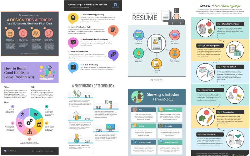
Get started with a free infographic template
Whether you’re creating a business model, statistical report or step-by-step guide, find the perfect starting point from our range of free infographic templates. All of our infographic templates come preloaded with relevant content, so you’re never stuck staring at a blank canvas. That means it’s easy to get started and modify a template until it’s just like that picture you had in your head.
Add custom charts, graphs and diagrams to visualize complex data, statistics or trends. Apply your brand colors and fonts with a quick click using My Brand Kit. Choose from over 40,000 icons with thousands of diverse options to reflect a range of skin tones and cultural backgrounds. Browse over three million high-quality, royalty-free photos and add an extra layer of professionalism to any design. There are countless ways to customize an infographic template in Venngage and do your ideas justice — no design skills necessary.
Create infographics, reports, maps and more
With Venngage’s selection of over 10,000 professionally designed templates, anyone can create an infographic in under an hour. Simply choose an infographic template that catches your eye and customize it to suit your needs with our user-friendly, drag-and-drop editor. Come back weekly to explore new templates and find what you need, every time.
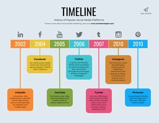
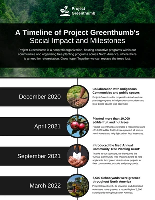
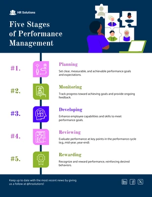
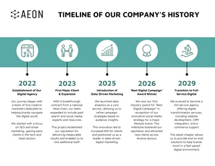
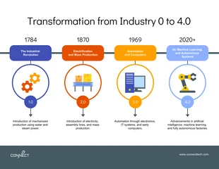
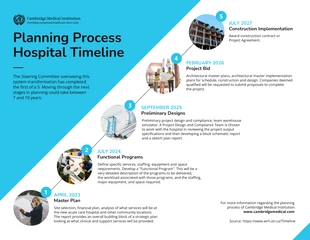
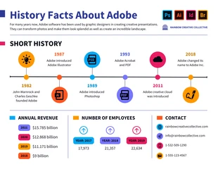
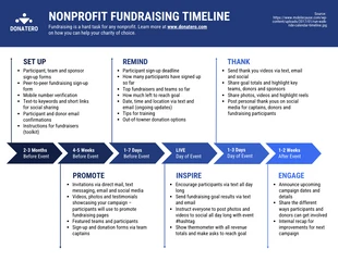
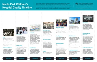
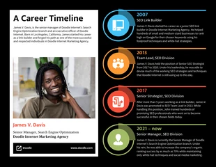
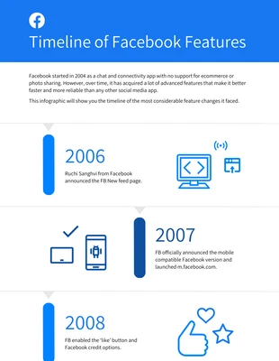
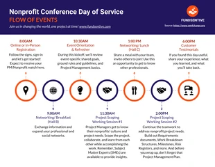
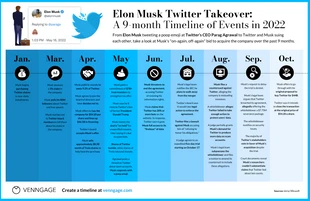
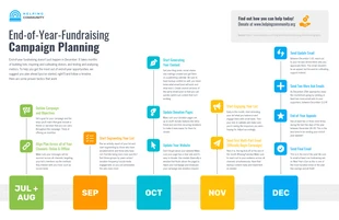
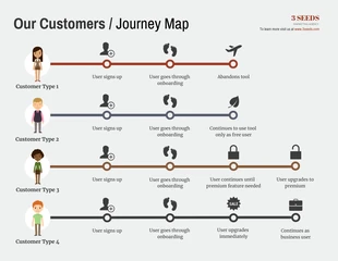
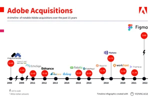
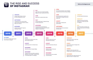
Though you can customize our infographic templates for any industry, they’re naturally suited to more sophisticated business communications. From timeline infographic templates to comparisons, processes and tutorials, tell an engaging story by creating your own infographics online. Do it all yourself with easily customizable, visually engaging infographic templates. And make sure the information you share is not only consumed, but retained.
Share your infographics, your way
Once you make an infographic, you have options. Collaborate with your team by sharing an editable link to your design. Get feedback through annotated comments, right in Venngage. Or, skip right to distribution! Once your infographic is ready to go, share it online or download it as a high-resolution PNG, PDF or interactive PDF.
Whatever format you’re looking for, Venngage is the best AI infographic generator to get the job done. With millions of daily users around the world and hundreds of new, research-backed infographic templates added to our collection monthly, Venngage is the perfect solution for busy professionals who need to create, without the headache.
Can you make an infographic for free with Venngage?
Venngage offers many free infographic templates, in addition to paid options. How can you tell which is which? Infographic templates labeled “Premium” or “Business” require a small subscription, while those without these labels are free to use. Many of our icons, images and data visualizations are also available for free.
Creating a Venngage account is always free, so you can jump right in, make an infographic or play around with a template. No matter what layout, style or format you’re looking for, you’ll find there’s no better selection when it comes to infographic templates — and no better choice when it comes to infographic makers.
