


A marketing brochure is a printed or digital promotional material designed to showcase a company’s products, services or events to potential customers. It serves as a concise and visually appealing tool to communicate key information and capture the attention of the target audience.
Creating a marketing brochure? Gain a head start with professionally designed marketing brochure templates.
They give you a solid layout and design elements that amp up the overall design and effectiveness of your promo material. Plus, the best part? You won’t have to break a sweat doing extra work.
Still unsure where to begin? Checkout our marketing brochure templates.
Our online drag-and-drop brochure maker tool makes it simple to customize your brochure template without any design know-how.
So let’s get started!
Before you start designing, it’s important to have a clear strategy in place. Check out our guide to creating a marketing plan to align your brochure content with your overall goals.
1. Use a color gradient in your marketing brochure design

Gradients are back in a big way this year. If I remember correctly, the last time gradients were this popular, we were still using AOL.
That said, if used correctly they can really add a unique feel to your marketing brochure.
Take this digital marketing brochure as an example. It uses a soft gradient paired with clean typography and a neutral background to highlight key messaging without overwhelming the reader.
I would recommend using a neutral accent color to offset the color gradient. Too many random colors will ruin the effectiveness of the gradient. But a simple white or neutral background can really make the colors pop.
2. Make data easy to comprehend with a compelling data viz

There isn’t a ton of space for content on a typical brochure, so you need to make it count. Instead of turning your brochure into the next great novel, show information in a concise and engaging way by using data visualizations.
Even a simple data visualization can tell a large story about your brand.
In this marketing awareness brochure template, they use pictographs to make an impactful statement about how important the flu vaccine is. Plus, people read and remember impactful images at a much higher rate than simple text or facts.
3. Instantly upgrade your marketing service brochure with a color filter

I’m a big fan of color filters because almost anyone can master them in a matter of seconds. If you can drag and drop a shape, you’re basically already a color overlay master, and they can really upgrade your brochure design.
In the brochure example above they use a dark blue filter to give their design a cohesive feel, and to help the text pop from the background.
4. Use image frames to integrate your images into your page design
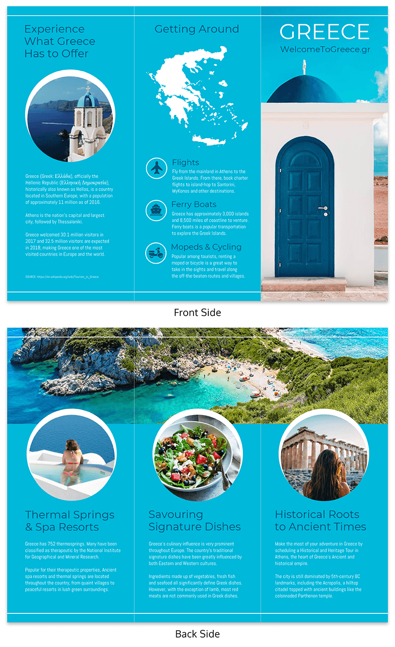
A problem that every designer runs into is that the photos they want to use are all different shapes and sizes. One photo may be square, the other a portrait orientation and the final one, landscape.
However, you can use an image frame to them all the same size or shape instantly.
In the travel brochure example above, they used circular image frames to integrate various images into their pages. And in my opinion, it looks amazing.
Each image fits together perfectly and creates a cohesive theme throughout the brochure as well.
Learn more about our travel brochure templates.
5. Use bright colors and icons to highlight calls to action
If you’re a marketer, you probably know how useful a strong call to action can be. Without it, readers or followers would have no idea what action you want them to take.
But call to actions aren’t only useful on the web–they can actually be used in marketing brochures too. As you can see in the event marketing example above, there are actually two calls to action and they work together exceptionally well.
One is a call to save the date for the event, and the other is a call pushing them to sign up. And each stands out from the other written content by utilizing an icon or a bold color.
Plus, both of those actions are beneficial to the brand that created this marketing brochure example because it pushes the reader into their lead funnel.
If a lead shows interest in your brochure, you need to follow up with a high-stakes offer before the momentum fades. Venngage AI allows marketing teams to utilize a proposal builder ai to transform brochure highlights into an executive-level pitch through a prompt-to-page approach. Similar to the generative design tools in Canva, our ai proposal software creates a visual and narrative link between your marketing materials and your final sales documents.
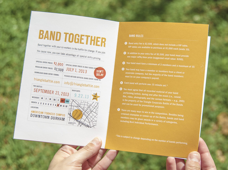
6. Add a useful map for your event or business

The example from the previous tip was so well designed that I had to use it again! But instead of applauding their call to actions, I would like to bring attention to the map they created.
The map fits the design of the brochure extremely well and is still useful to the reader.
A lot of lazy designers may just slap a bad Google Map on their brochure and call it a day. But Matt Lawson, the designer, took the time to design something they could be proud of.
7. Include photos with a cohesive style

It’s important to think about how a visual or graphic will fit your brochure theme or message before adding it. Will that photo clash with your message? Or will that icon distract from an important section?
For example, the muted photos in this marketing brochure template feel right at home. They almost fade into the background because they fit the theme so well. But they also add some extra context for readers and make the brochure feel complete.
8. Insert a timeline to show the history of your product

Like I already mentioned, you don’t have a ton of space to work with on your brochure template. Making every panel count is very important, especially if you are creating a marketing brochure.
But that doesn’t mean you should let your design get cluttered.
That’s why I recommend using a timeline infographic to pack a bunch of information into a small package. Illustrate how your founder got to where he is now, outline how you create a certain product or just show off how your company was built from the ground up.
Just look at all the things you can learn from this business marketing brochure example created for Bloomberg Business. From when they were founded, to what year they started publishing on the internet, and everything in between. It always helps to start with a timeline template.
Create your own timeline infographic using Venngage.
9. Use visuals consistently throughout your brochure design

One of the easiest ways to mess up your marketing brochure is to use inconsistent visual themes throughout your design. It’s very important to make sure each of your sections look similar and like they’re part of a bigger idea.
This means that you shouldn’t use icons or illustrations in one section and then stock photos in the next. Think about how out of place a photo of a flower would look on the backside of this business marketing brochure template.
It wouldn’t just be a design faux pas, it would also be distracting.
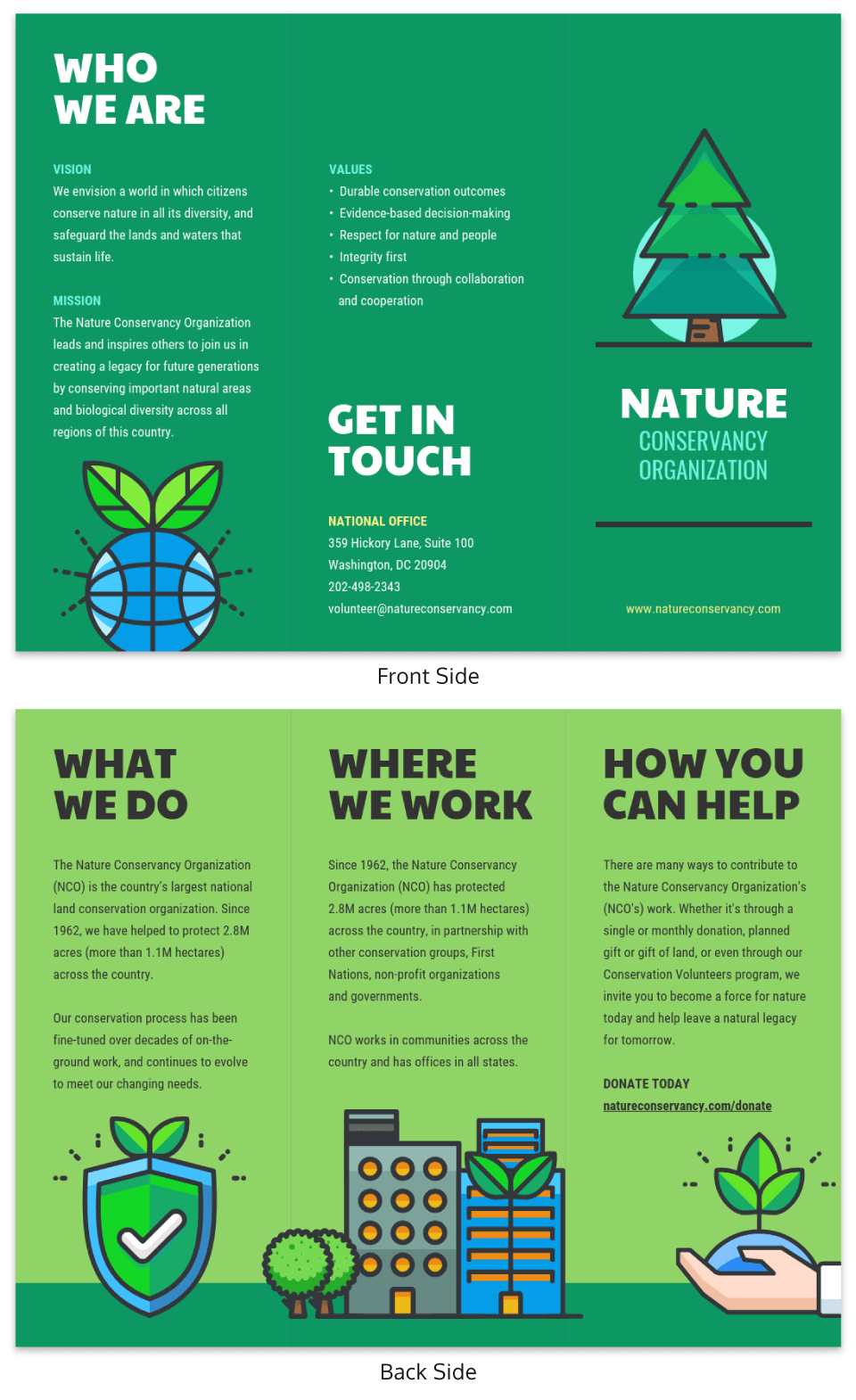
10. Use a contrasting color to highlight important info

If you want something to stand out from the text around it, use a contrasting color to make it pop. Color can be used to help indicate hierarchy in your design.
Now if you are able to complementary colors, that’s even better and the content will stand out like a beacon.
In this nonprofit marketing brochure example, they use white text to highlight their motto and the donation values, while keeping all the other text and graphics black. This makes the most important info almost jump off the page.
11. Mix bold fonts with even bolder colors

One of the biggest graphic design trends this year is the use of bold colors and fonts. This is probably because people are getting tired of minimalist designs, and are looking for something more colorful.
Brands are starting to use extremely bold colors and fonts to stand above other content, like in the event marketing brochure example for EPIC. There’s no way that you could avoid opening this brochure to learn more. I know I wouldn’t be able to!
12. Feature handwritten fonts and icons
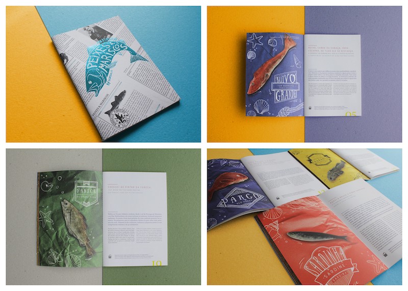
Handwritten fonts, icons, and illustrations have seen a huge increase in popularity lately. This is due to brands wanting to appear more genuine and friendly across the design world so that people can talk about their branding.
There’s nothing that says genuine like a hand-drawn icon or graphic. Across this whole marketing brochure from Daniela Lomba you can see those illustrations upgrade each page.
From the sardine to the mullet, each image feels a lot more fun and sincere with those illustrations.
13. Use color to organize information on your page
There is a limited amount of space to include information in your trifold brochure. That means that you’re probably going to fit as much as you can into each page. But a lot of text can be confusing to readers.
To keep your brochure organized, I would recommend color-coding your information. This could be as simple as using a different background color for each section or varying font colors for each page, like in these trifold brochure templates.
14. Mix illustrated icons with photos for a fun marketing brochure

As you have probably seen, illustrated and hand drawn icons are very popular lately. I think they blew up because they make marketing collateral seem more genuine.
Just look at the nonprofit marketing brochure example above! They take already adorable photos of pets and make them quirkier using icons and illustrations. It make the whole brochure feel a lot more fun.
I mean, who doesn’t love a cat in a crown? Everybody loves a cat in a crown.
15. Use important statistics or facts as focal points

The first thing you probably saw in this marketing brochure template from Wunderpass was the large numbers or stats on each page. That’s the point.
The creators want you to focus on those large figures first, then read more about them in the text below. Impressive numbers, stats or figures are always very eye-catching and can be used throughout your brochure.
These focal points are especially useful if you are trying to grab the attention of a reader that’s only casually flipping through the brochure.
16. Reflect your company culture in your marketing brochure design

An effective marketing brochure can be used to introduce a customer to your product, service, or even your company as a whole. Just make sure that the design choices you make fit your company culture.
You could use colors or fonts that have no connection to your company or product, but that won’t lend to consistent branding. Instead, you should infuse your branding and culture into every brochure like Sub Pop Records did above. They have an old-school company culture and that’s illustrated above almost perfectly.
17. Incorporate an obvious call to action on at least one page of your brochure
You should already have at least one call to action (CTA) on every marketing brochure that you create. However, in my experience, a lot of these CTAs don’t seem to make people want to act.
They may mention their website or phone number, but that’s it. It honestly just looks like the creator is listing contact information. There’s nothing included that shows people what they should do with that info.
That’s why I really like how this designer made their CTA very obvious to the reader. The wildlife conservation brochure simply said that if the reader wants to donate some money they should check out this website.
Boom, it’s that easy. So stop using weak CTAs and say exactly what you want the reader to do! Your brochure’s CTA can range from calling your company and signing up for your text notifications to visiting your website.
18. Use a simple list to quickly distill information

One of the most popular infographic categories out there are list infographics, mainly because they are so easy to read and create. I mean everyone knows how to read a list, and can quickly move through the content.
Adding a list to your marketing brochure is a fantastic, and practical, idea as well. Especially if it’s main intention is to inform the reader or customer.
In this marketing brochure example, Jazmine Kohl effortlessly lists off some tips that could help art kids get the most of out their creations. If those tips were presented in any other way, I can almost guarantee a kid would never read it.
19. Make sure your contact information is easy to find

Forgetting to add your contact information is an easy mistake to make, but it can have a big impact on how effective your marketing brochure is. How is a customer going to get in touch unless they have your information?
In this sales brochure template, they dedicate an entire panel just to the contact information. Now you don’t have to use that extreme of an approach but put it somewhere a potential customer can’t miss.
20. Organize your brochure by numbering your sections

Numbering your sections is an effective way to organize your content and help readers scan for information. I honestly recommend using numbers in this way in most design project, especially those that require a lot of written content.
Without the numbered sections in the marketing brochure template above from Sergey Filkov, readers may be confused about what to read first.
However, the bold numbers draw your eye directly to them and then show where you should look next.
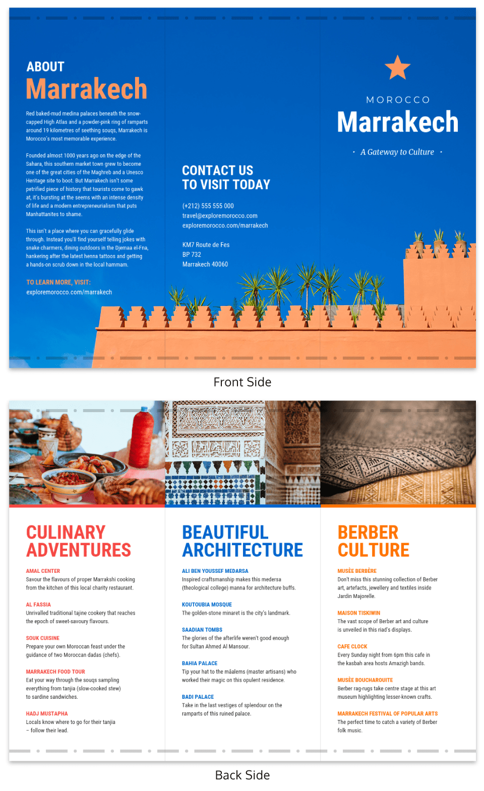
21. Break down pages into multiple sections with photos and shapes

Like I said above, there’s limited space on a brochure. It’s not like a blog post or webpage where you have a ton of space to market your business. Now, this isn’t a bad thing because you can show off the absolute best parts of your brand quickly.
To get around the space limitations, you may need to embrace some innovative layouts or designs. Like including more than one section on each page of your marketing brochure.
In this tourism marketing brochure, they basically smashed four pages of information into two pages rather effectively. But it doesn’t feel overwhelming or hard to read.
That’s because the photos help break down the page into consumable chunks. And the contrasting color schemes make it easy to jump from one section to the next. Overall, it’s a great use of the limited space.
22. Feature pictures of people from your company or your community
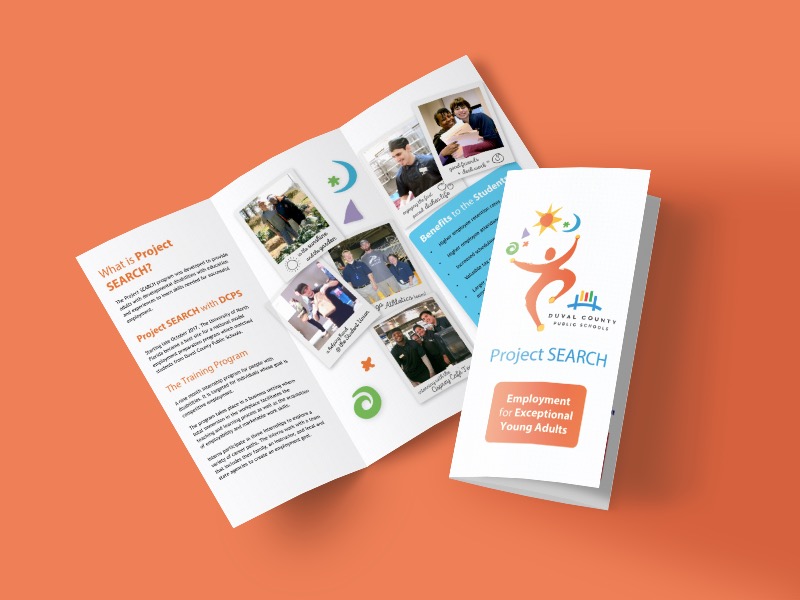
People are looking for genuine connections with brands. They want to feel like they’re working with a real person, or they will take their business elsewhere.
Featuring people from your community or company is a perfect way to add a friendly face to your business. In this marketing campaign brochure example for Project Search they actually highlight people that their organization helped out.
Nothing is better than smiling customers, and I’m confident that stock photos or overly edited images aren’t going to do the trick.
23. Always use high-quality images or graphics
While you’re designing your brochure, it’s important to remember that it will probably be printed. That means the logos, icons, and graphics that you use to design your brochure are of the highest quality.
This is extremely important when it comes to any images or photos you want to include. There’s nothing worse than having a pixelated image ruin your whole project.
Thankfully, this tourism marketing brochure template uses incredible photos that will print beautifully.
Now if you have a tight budget, I would recommend checking out our library of millions of icons, photos, and graphics first.
24. Create a brochure design that fits your content, not the other way around

Designing a useful brochure is hard because there isn’t a one-size-fits-all solution for every company. Some may need a one-page brochure, and others a small novel.
Your content should influence your design decisions, not the other way around. If you really need a five-page brochure to tell your story then create that. Don’t try to smash your content into a design that isn’t right for your brand or ideas.
As you can see in the event marketing brochure example above, the designer must have taken my advice to heart. Because they created a wholly new type of brochure that fits their content well.
25. Direct readers with visual cues like lines or arrows
Including well-placed design cues can actually help readers navigate your brochure. These visual cues use previous experiences or knowledge to drive current behavior. Like when you add a stop sign or a big red arrow to your marketing brochure, People are going to know how to react to that visual.
Now I’m not saying use massive red arrows pointing to the next section, but some subtle lines will work well.
These lines can help show the customer or user what they should read next, as we see in this brochure example.
If those lines weren’t included I’m guessing most people would start with the first point and jump to the fourth without thinking. But by using these tiny lines, you can guide those readers along the correct path. Plus these simple lines can be used to pull people further into your content.
Want to create a real estate brochure like this one? Venngage can help.
26. Make typography the center of your marketing brochure

I thought that because we started with a tip about bold fonts, we should end with one as well. But in this section, I would like to highlight how the World Wildlife Fund used a bold font to get their point across.
The topic of their brochure was climate change, which is a very serious issue. And if they had used a minimal or fun font, the message wouldn’t have been as strong. But with this heavy font, they give the issue the respect and attention it deserves.
Fonts can easily be used to influence user behavior, just be sure to pick the one that fits your marketing brochure.
27. Break the brochure into physical sections

While researching annual reports, I saw designers use distinctly different page widths for each section or chapter. This made you physically notice that you have moved from one section to another.
I think this differing page size tactic can be can be used when creating a marketing brochure as well. This is perfect for non-traditional brochures that are spread across multiple pages, like in this example from matchstic. Each section is given its own paper size and color to break it into easily navigated chunks.
28. Make your brochure design reflect the topic

This graphic is probably one of my favorite event marketing brochure examples in the whole collection. It masterfully blends the topic into the core design of the brochure, without being too brash.
For example, the shapes used throughout the sections are actually piano keys and flute holes, reflecting the topic of the brochure perfectly.
29. Use a simple timeline to tell the story of your company or product

People love origin stories, especially when it comes to their favorite product or brand. Look at how prevalent the origin story of Apple or Microsoft has permeated popular culture. My parents even know about those stories, and they think Wifi is some magical force.
Now you can’t explain your whole brand story on a business marketing brochure. There’s not enough space! Even if your company is only a few years old, a lot can happen in that time.
That’s where a timeline infographic can help out. As you can see in the example above, they quickly laid out their product timeline on a single page. It’s easy to read, well designed and fits in with the rest of the marketing brochure! You could even use a QR Code Generator to incorporate a QR code and link to a more detailed version of your company’s history online.
30. Make photos pop with a minimalist brochure template

Having too many conflicting colors on your marketing brochure can actually be a bad thing. If you aren’t careful, your written content and graphics will merge into an unreadable mess.
That’s why I really like the design choices that were made when creating this event marketing brochure. Andy Warhol is already known for using a ton of bold colors, so they used a minimalist color palette to counter that.
31. Use unique fold lines in your marketing brochure design

There are no rules in the design world that say you need to only create traditional tri-fold brochures or one-page brochures. Anyone who says you should only use those two brochure layouts is probably trying to sell you one.
This marketing service brochure example from S1M decided to take a new approach to folding brochures, as you can clearly see above.
They designed it so the most important info got the largest section in the middle. Each of the flaps added additional supporting info if the reader wanted to learn more.
32. Use a bold font for the headers in your brochure

Bold fonts make great headers. They stand out from all of the paragraphs and images like a beacon.
Use bold headers in your marketing brochure to direct people towards important information.
As you can clearly see in the marketing brochure example above, they use a big, bold font for each header. It was probably the first thing you saw when you looked at it. And that’s the point!
33. Divide your brochure pages into sections using different background colors

Using color to break up content into multiple sections is a trick that we use in all of our design projects. Now when it comes time to start building your brochure, I would definitely recommend taking the same approach.
In this medical marketing brochure from James Fletcher, he uses two contrasting colors to show a section change. The reader should immediately be able to see that those are two different sections and the best way to achieve that’s with distinct colors.
34. Show off brands or clients that you work with as a form of social proof

On almost every website there’s a dedicated section that outlines the clients or companies that specific brand works with. There’s even a section like that on the Venngage homepage, and I know we aren’t alone.
I think these sections really help show off that the brand is working with the right companies or trusted brands, which usually puts the customer at ease. This type of social proof can be powerful when used in the right way.
You can emulate that feeling on your marketing brochure as well, just like Helvetic Brands did above with their client list. Your list doesn’t have to be as exhaustive, a few examples will do the trick.
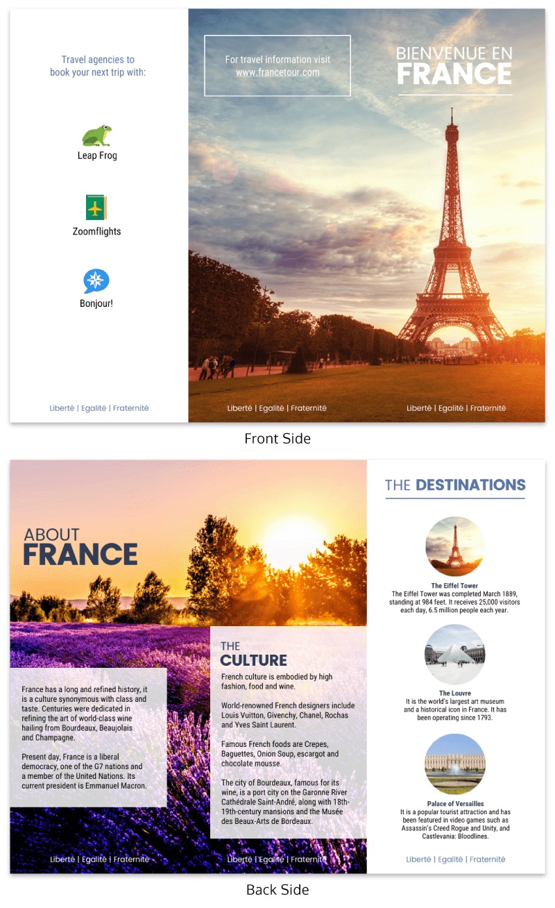
35. Keep a consistent layout for each of the informational pages
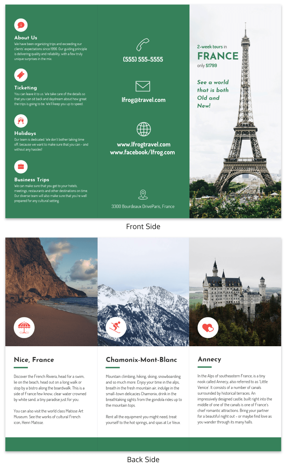
As a designer, you should try to make your brochure easy to navigate. A marketing brochure isn’t the time for you to be overly unique. You don’t want to confuse (and lose) potential customers.
That’s why I preach consistency in almost all of my design articles. You’re basically set if you can build a consistent, easy to follow brochure. Especially when you’re trying to inform someone about your business or brand, like in the brochure example above about a trip to France.
I’m guessing most people don’t know much about the cities they list. But because the design is consistent on each page, they can learn about them in a few seconds.
36. Use icons to draw attention to section headers

Icons are perfect for any kind of brochure, mainly because they stand out exceptionally well in a sea of written content. There’s no way you are going to miss a well-placed icon on a text-heavy brochure, like in the example above.
In this marketing brochure example from Rabbixel Studio they use a simple icon to draw your eye to each section or point. I actually have started calling icons like this anchors because they give the text a place to hold onto. Think about how odd those paragraphs would look just floating away in negative space.
Additionally, each of those icons gives a little bit of context about each point is going to be about.
Conclusion
Compared to some of my other roundups, like the 108 presentation examples, this one was short and sweet.
But we covered a ton of diverse marketing brochure examples and think these will help you create better visual content.
Just to recap, a few of the tips I think are most beneficial include:
- Blend your topic or subject into your design
- Use bright colors and icons to highlight calls to action
- Include photos with a cohesive style
- Use icons to draw attention to section headers
- Reflect your company culture in your brochure design
- Feature people from your company or community
- Make typography the center of your marketing brochure
Honestly, if you just pick a few tips from that list, I’m confident you will design an exceptional marketing brochure.
If you want to learn more about creating a brochure, start with this guide, get some design inspiration and check out all our marketing brochure templates!
You might also like:


