The font you use matters.
If you have any doubt about that, just consider the case of Cleveland Cavaliers owner, Dan Gilbert.
When Lebron James announced he’d be leaving the team for Miami in 2010, Gilbert posted an online missive criticizing the player’s decision. His “manifesto” blew up on the Internet–not due to its content, but rather Gilbert’s use of Comic Sans, a font that looks a bit like a child’s handwriting.
At Venngage, we help users all over the country create free infographics, and offer a wide range of fonts for people to choose from. Using anonymized data from users of our platform, we decided to see where in the US certain types of fonts are most commonly used.
We analyzed the 50+ fonts we offer through our platform, honing in on a few major font types–script, decorative, headline–as well as the use of serif vs. sans serif fonts.
Where do people favor using fonts that look like handwriting? How about fonts with fancy embellishments? Or plain fonts, like Arial? And what do these regional quirks tell us about America?
Summary of our findings:
- Script fonts: Just 4% of users use script fonts that look like handwriting–but folks in Nevada are far more likely to use them.
- Decorative fonts: Southerners tend to use decorative fonts more than the average US denizen–but the leading state when it comes to embellished typefaces is Hawaii.
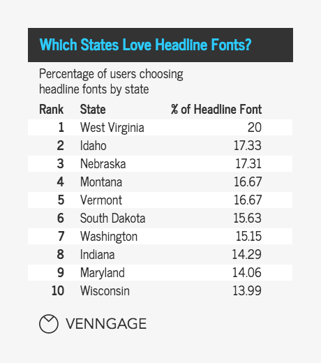
- Headline fonts: One out of five West Virginians favors emboldened headline fonts.
- Serifs: On the whole, Americans vastly prefer sans serif fonts (81%) to serif fonts–though 19% of Delaware residents are all about serif.
How does font type usage vary by location?
To start, we categorized all our fonts into several major classifications commonly used by typographers: script fonts, decorative fonts, headline fonts. We also distinguished between serif and sans serif fonts.
As background, script fonts are categorized as those derived from calligraphy or handwriting.
Decorative fonts typically have flamboyant embellishments.
Meanwhile, headline fonts are anything bold.
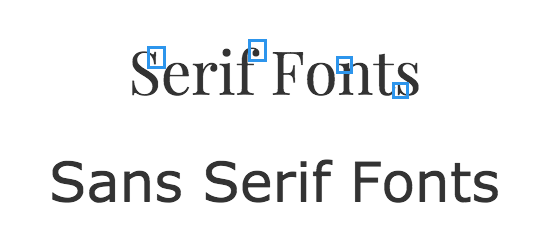
Serif fonts (ie. Times New Roman) have small brushstrokes at the end of certain characters, while sans serif fonts (Veranda) do not.
Script fonts by state
First, let’s take a look at script fonts by state.
These fonts, characterized by the loops, curves, and quirks of natural handwriting, are often employed for less serious content (comic strips), or when a personal touch is desired (invitations or greeting cards).
Included in this category: Comic Sans–the world’s “most hated font.” Originally released by Microsoft in 1994 for use in their (now-discontinued) “Bob” cartoons, it has since been applied to things it probably shouldn’t be associated with: door signs, term papers, and letters from NBA franchise owners.
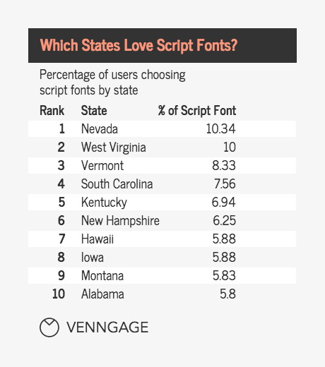
It makes sense then, that the most playful state in the US–Nevada, home of Las Vegas–tops the list of places where the highest percentage of people use script fonts. A surprisingly high 10.34% of all Nevadans who make posters, infographics and other visuals on Venngage choose fonts like Comic Sans.
Not far behind are a slew of Southern states: West Virginia (10%), South Carolina (7.56%), and Kentucky (6.94%).
Script fonts by city
Focusing specifically on the 25 largest cities in the US, let’s see where users favor these script fonts on a more granular level.
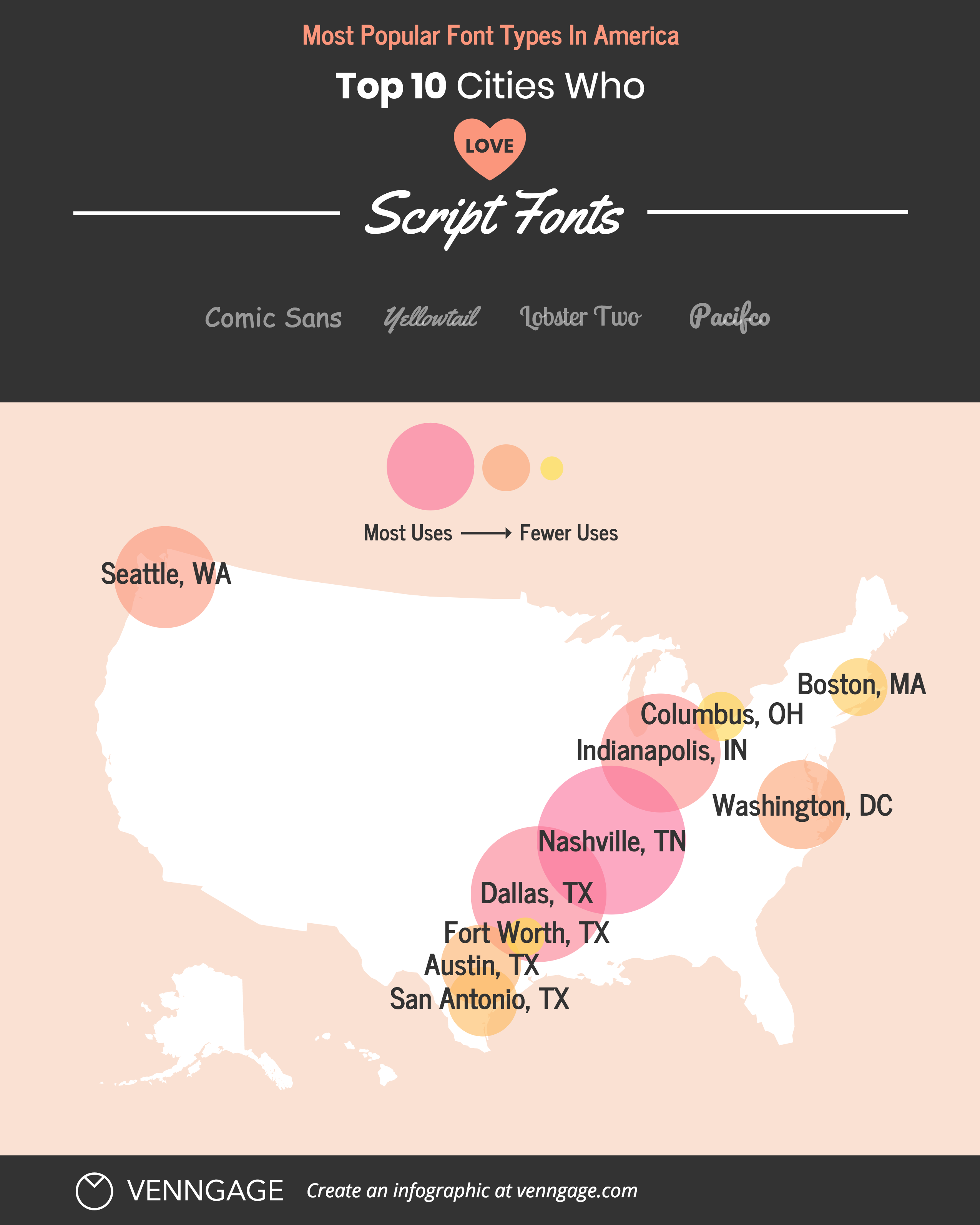
Interestingly, script fonts don’t seem to be heavily favored in any particular city (they are less popular in cities than in states as a whole). Nashville, TN tops the list with 3%, and is followed very closely by Dallas, TX (2.98%), Indianapolis, IN (2.97%), Seattle, WA (2.93%), and Washington, DC (2.92%).
Six of the top 10 here are in the South. It’s possible that this is partly due to the fact that Southern states are more religious. Gothic script fonts have been used in Biblical texts since the fifteenth century–and today, modern variations of the same fonts are favored in typing out religious quotes. The prolific use of these fonts may carry over more frequently when Southern users make infographics.
Decorative fonts by state
Next, let’s turn to decorative fonts, the semi-related, distant cousin of script fonts.
There is some overlap between decorative and script fonts (both are a bit over-the-top for most applications), but decorative fonts tend to have more embellishments and are often a bit blockier. They’re flashier than general-purpose fonts, and a whole lot less legible.
While script fonts have a storied history that dates back to the dawn of printing, decorative fonts only started getting popular in the early 19th century, when posters and advertisements became increasingly more common.
Overall, decorative fonts are more popular than script fonts across all states.
But they seem to be especially valued in Hawaii, where a whopping 23.5% of Venngage users favor them. This might be attributed to Hawaii’s massive $14B per year tourism industry, which makes up 21% of its entire economy. Oftentimes, tourism-related infographics are made with fancier decorative fonts to differentiate them from competing tours.
Decorative fonts by city
Decorative fonts seem to be much more popular on a city level than script fonts. In each of the top ten cities, about one in ten users chose a decorative font.
Texas dominates the list here, with four of the top 10 cities (and 3 of the top 4): El Paso (11.12%), Fort Worth (10.38%), San Antonio (10.22%), and Austin (9.67%). As Texas is one of the country’s most religious states, religion-based infographics (which commonly employ embellished fonts) may contribute to this–though cities like Boston (10.28%) and New York (10.09%) also rank high here.
Headline fonts by state
While script and decorative fonts are used to connote stylistic uniqueness, headlines fonts are used to get attention. They’re bold (literally) and favored by those looking to make a statement.
Overall, we see a bit more of a shift here from Southern states to Western/Midwestern states: the likes of Idaho (17.33%), Nebraska (17.31%), Montana (17.31%), and South Dakota (15.63%) populate the list.
But with 20% of all Venngage clients from West Virginia choosing a headline font for their infographics, the Southern state takes the cake.
Headline fonts by city
Looking at individual cities tells a slightly different story. Overall, headline fonts are about as popular in the big cities as decorative fonts–but the locales are dissimilar.
Once again, four of the top 10 cities are in Texas–but Philadelphia, PA (11.13%) tops the list.
Philly’s known for its in-your-face attitude. In fact, it’s been named both “America’s angriest city” and one of the country’s “rudest” cities. This culture could contribute to a higher usage of aggressive headline fonts in infographics.
The great debate: serif versus sans serif
In the font world, perhaps no debate is bigger than that between serif and sans serif fonts. These categories are more subtle than script, decorative, and headline fonts in their differences–but any typographer will tell you they are as different as night and day.
Both have practical applications. Generally, serif fonts are easier to read in larger, traditional text areas (ie. books, magazines, newspapers), and sans serif fonts are favored for web use.
Serif fonts by state
Let’s start with serif fonts on a wide scale. Which states most favor them?
Delaware tops the list, with 19.05% of users there favoring a serif font–nearly two percentage points higher than the next state.
It was the first state to ratify the Constitution of the United States (December 7, 1787), and enjoys a storied place in America’s history. Today, its residents seem to favor serif fonts, which have more of a storied past than sans serif fonts.
Serif fonts by city
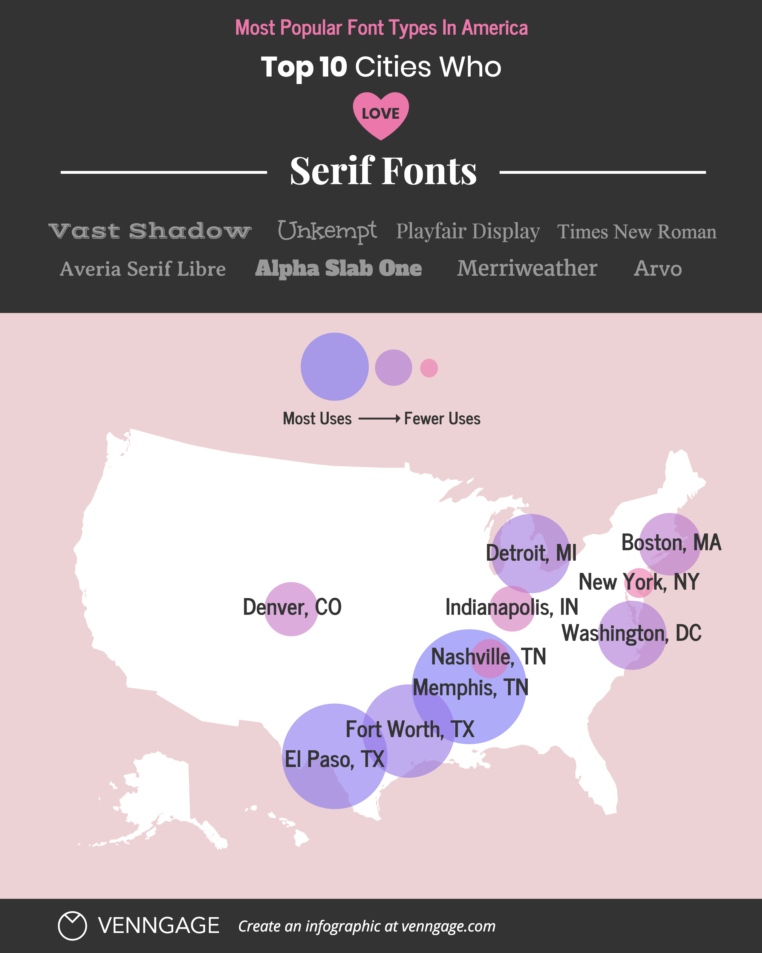
As we mentioned, serif fonts have subtle embellishments that sans serif fonts don’t have. And as was the case with other embellished fonts (script, decorative), Southern cities seem to love them.
Three of the top 4 serif-loving cities are in the South (going by the US Census Bureau’s definition), with 10.12% of infographic makers in Memphis, TN favoring them. Part of this may be attributed to the fact that Tennessee and Texas are both more conservative states than average–and serif fonts are more traditional and a bit fancier than sans serif fonts.
Sans serif fonts by state
On the flip side, it’s apparent that the US at large vastly favors sans serif fonts.
The top serif state (Delaware) only had 19% using the font group; here, a slew of states rank in at 80% use or more, with Arkansas leading the way at 85.29%.
Aside from Arkansas, none of these states are in the South–and we see more of a Western slant here (Utah, New Mexico, Oregon). Interestingly, the “newer” states seem to also favor the more modern sans serif fonts.
Sans serif fonts by city
With a few exceptions, we see the same trend play out on a city level.
Whereas the serif-favoring states were largely concentrated in the South, this list is spread all across the US. We also see San Francisco, CA (89.57%) listed for the first time on any of these lists–intriguing, given that it is the near-birthplace of the Internet, which gave rise to the popularity of sans serif fonts in digital media.
Unexpectedly popular fonts, by state and city
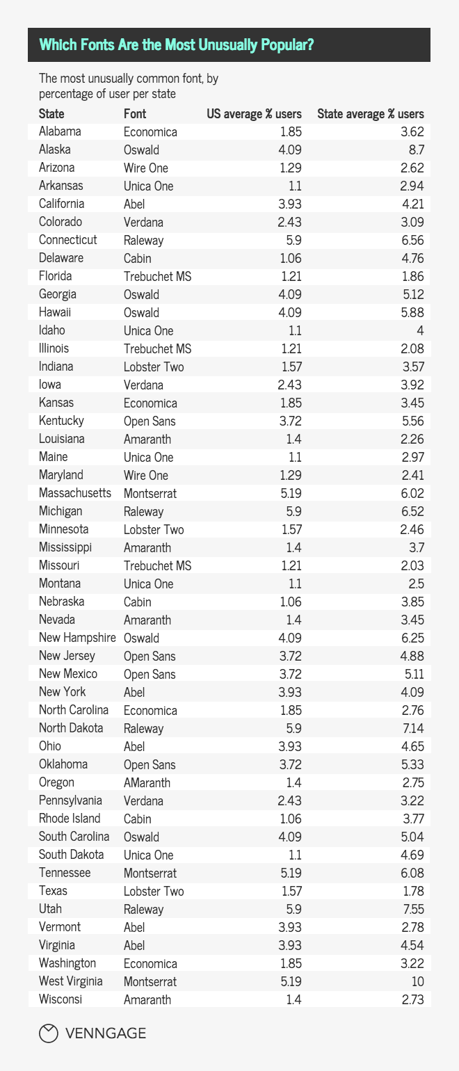
Finally, we wanted to know how which particular fonts on our platform are the most unusually popular in each state.
We looked at fonts that were used by at least 1% of users country-wide, then compared its average usage across the US to its usage in that state to determine how unusually popular it is.
Overall, the fonts above are all extremely uncommon in the United States, but each state has a peculiar stand-out favorite.
For example, 8.70% of users in Alaska chose to use Oswald in their infographics compared to a country average of 4.09%. This means that Alaskan users are 100% more likely to choose Oswald than the average US denizen. Similarly, West Virginians love to use the font Montserrat: they chose it 10% of the time, whereas the average user only chose Montserrat 5.19% of the time.
Abel seems to be a favorite (it is most unusually popular in 6 states), followed by Amaranth, Oswald, and Unica One (each 5 states).
For the city list, we focused on 25 key metropolises.
Most cities have even bigger differences over the US average than at the state level. This indicates that people in these large cities are more likely to choose rarer fonts compared to those not in these cities. For example, 13% of people in Jacksonville, Florida like the font Oxygen, compared to just 6.09% nationwide–a 113% increase over the average!
Conclusion
Font type varies greatly by location, and quite often seems to mimic the quirks of certain geographical regions. In the South–the land of manners and propriety–fancier decorative and script fonts reign supreme. Out West, folks prefer more modern sans serif fonts.
The font you choose has a tremendous impact on how people will perceive your work, the associations they’ll draw, and even their mood.
A recent study conducted by MIT psychologist Kevin Larson showed subjects two layouts (one that was poorly designed, and another that was well-designed) and found that the well-designed layout took less time to read, and led to increased cognitive focus and a “stronger sense of clarity.”
Fonts play a crucial role in layout and graphic design, regardless of where you live. Just something to keep that in mind next time you’re picking out one of our 50+ fonts to make your next infographic.


