


As marketers, we are obsessed with our audience, their pain points, what they search for, their patterns, trends and behaviors. Almost everything we do revolves around making the audience feel seen and visible. But many of us are missing out on one crucial aspect: making a large part of that audience feel included.
Go to Google and search for leadership or innovation. The results are almost always the same — a sea of ‘standard’ visuals featuring white, young, able-bodied professionals. Despite our talk of global reach, the majority of marketing assets and digital designs remain strikingly biased.
It’s almost as if we forget about the different ethnicities, cultures, and physical abilities of the people we are actually talking to.
And this isn’t necessarily a problem of values or a lack of awareness. Most marketers I know are deeply empathetic people. But when it comes to visuals or designs, the default has somehow become so ingrained that we don’t even notice it until it’s pointed out.
We are not deliberately excluding, but we are also not making a conscious effort to include, and that is the larger problem.
This article breaks down where inclusive designs fails inside real marketing workflows. More than just diversity, we need to think about how to embed better visual decisions into our campaigns, our templates and our AI-powered design processes.
In this article, we’ll cover:
- The meaning of inclusive visual design
- Inclusive visual examples
- Inclusive design best practices
- Inclusivity mistakes brands make and how to fix them
What inclusive imagery means for marketers
Inclusive imagery, in the simplest terms, means showing diversity in design. It involves showing people of different ages, genders, cultures, races, ethnicities, backgrounds, body types and disabilities, respectfully and contextually.
Inclusive representation in marketing requires giving people agency. The audience should see themselves as an active participant in the story you’re telling and not be shown as just a face in the crowd.
Here are a few examples of inclusive imagery:
- Showing a woman in a hijab leading a boardroom.
- A professional with a prosthetic limb solving a complex technical problem.
- An older professional (50+) at the center of an innovation-themed campaign, not just a retirement ad.
What inclusive imagery is NOT
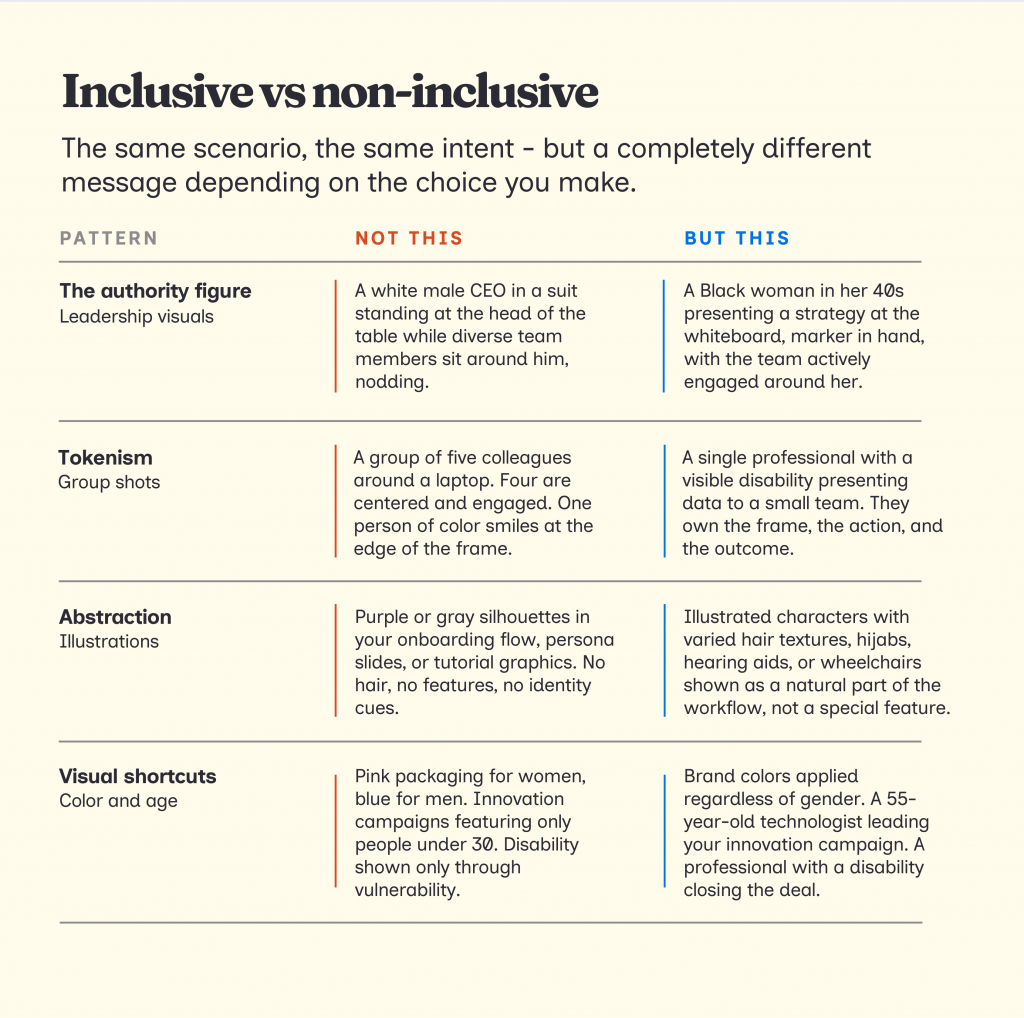
Inclusive design is not simply adding people of different backgrounds randomly together in an image without proper context. This is just being performative.
If your visuals have any of the following, they are not inclusive:
- Stereotyping by default: Like the subtle habit of showing men pointing at data while the women in the shot are holding the coffee or just listening.
- Tokenism: Placing one person of color at the very edge of a group shot just to satisfy a quota. If you can crop them out without changing the story of the image, your image is not inclusive.
- Sidelining certain characters: Using a person with a disability as an inspiring background character instead of showing them actually doing the work — typing, presenting, or leading.
One of the best examples of performative inclusivity is the Red Cross “Be Cool, Follow the Rules” Poster.
Despite trying to show a diverse group of kids, the designers labeled the white children as ‘cool’ while almost all the ‘not cool’ behaviors, like running or pushing, were assigned to children of color.
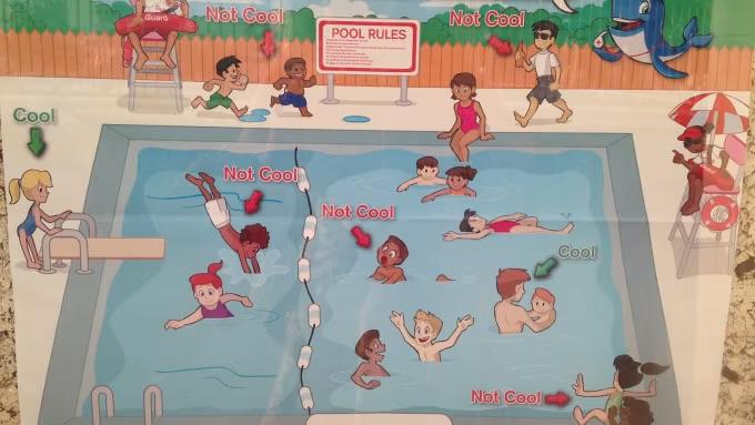
This is why it’s important to be intentional and avoid biases to create inclusive visuals.
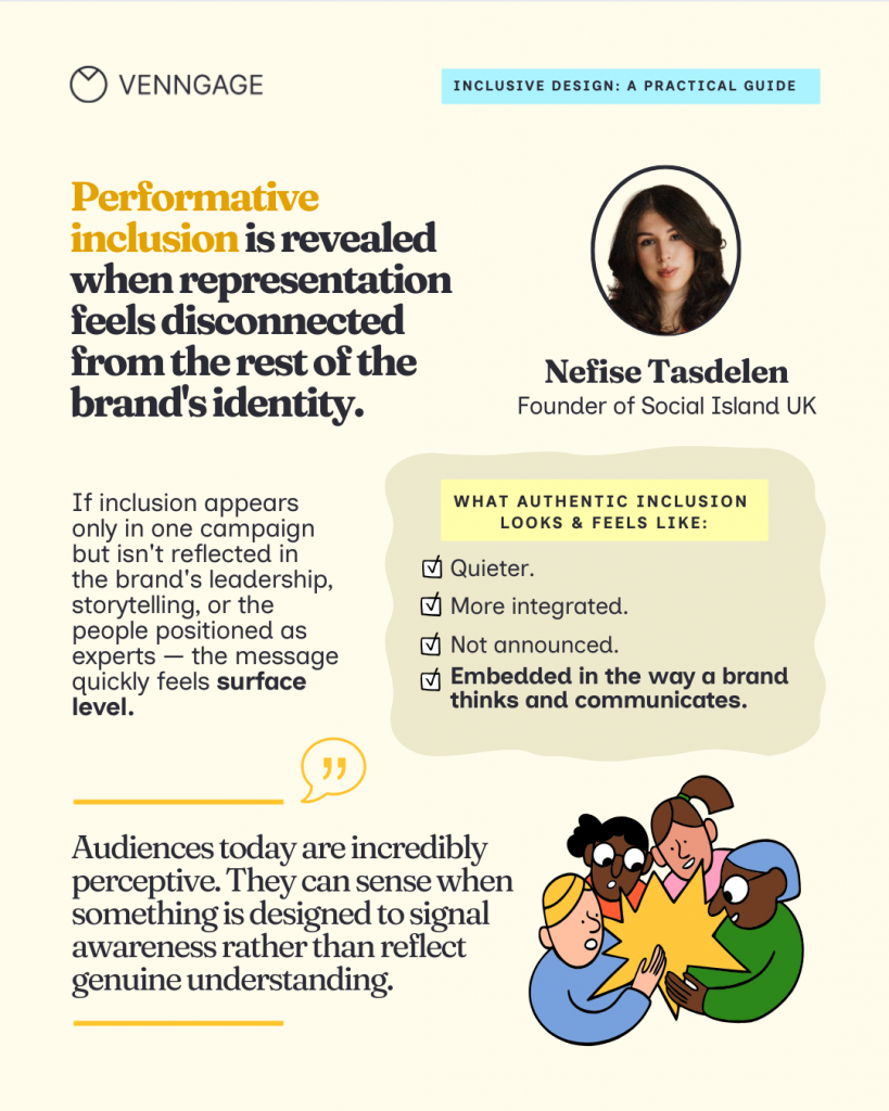
Nefise Tasdelen, a brand strategy and storytelling expert, says that the real difference between inclusive and non-inclusive imagery is intention and consistency. “When a company genuinely cares, representation becomes part of the narrative of the brand itself. Inclusion shows up not only in the visual storytelling but in the tone of the messaging, the people highlighted in leadership roles, and the types of stories being told.”
Inclusive design mistakes you might be making (and how to fix them)
Now let’s understand the common types of mistakes we see across the internet (and you might be making them, too).
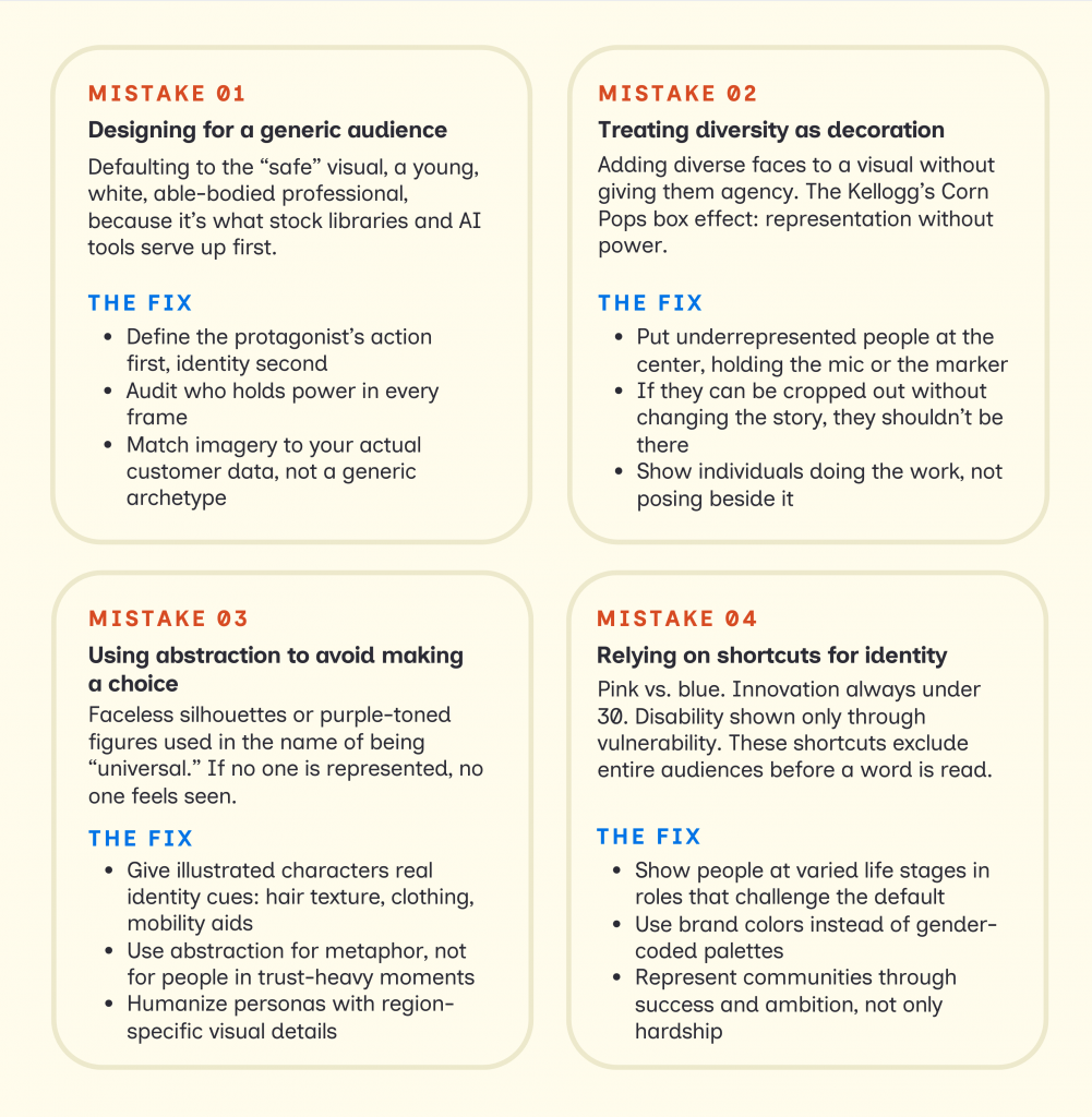
Mistake #1: Designing for a generic audience
The problem starts when we treat our audience as if they all look and act the same. Most stock photos and AI tools are trained on what is popular, and that usually defaults to a very narrow, historical average.
Exclusion persists because of how we work. We make visual decisions under speed and pressure. In the rush to hit a deadline, we reach for the safe choices that reinforce the same old defaults.
Look at this screenshot from iStock. When I searched for “chief executive officer,” the majority of images were of white males dressed in professional suits.
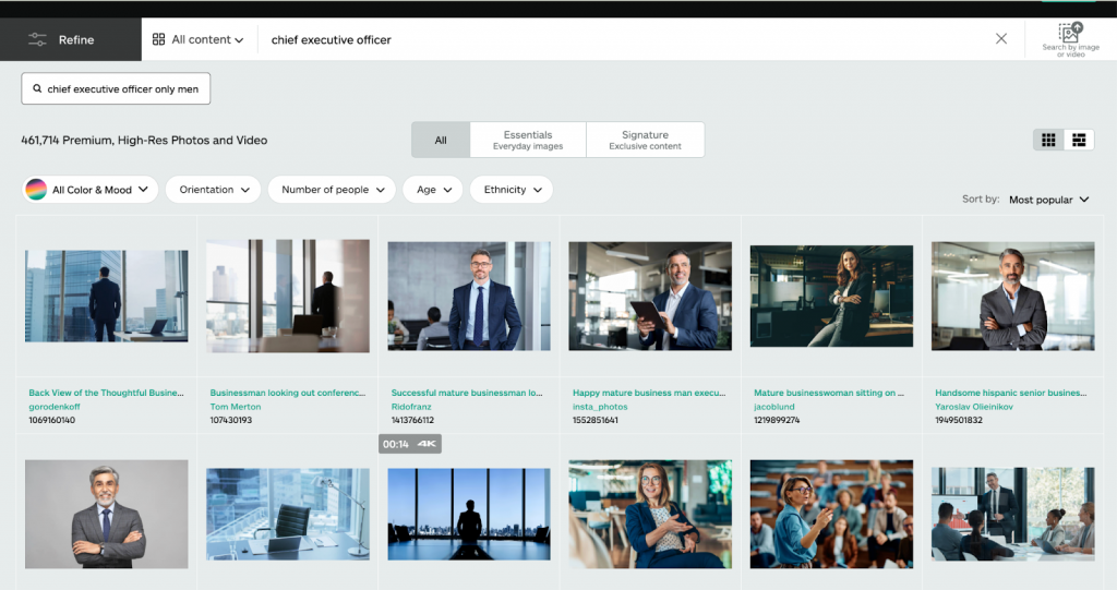
Source: iStock
If you use any of these images on your website or social media page, it might look fine. It’s high-res and professional. But if that same default, a white man as the authority figure, starts to appear across multiple pages, it becomes a problem.
We have to look at our visuals as a collective narrative. One image might be a choice, but ten of them are a pattern.
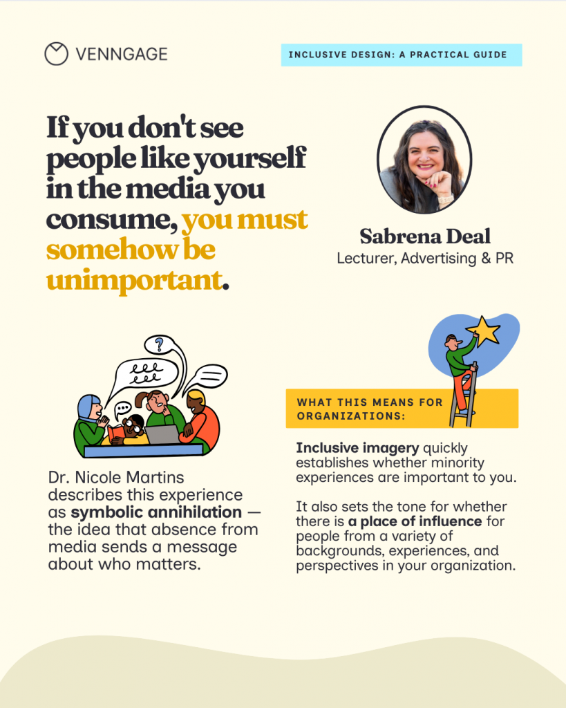
Sabrena Deal, an inclusivity advocate and consultant, explains that images are highly influential; they have the power to persuade, invite, entertain, and inspire.
“When we consistently exclude certain communities from those influential visuals, we contribute to Symbolic Annihilation. This is the psychological impact of being erased from the media one consumes. It sends the message that if you don’t see people like yourself in these roles, you must somehow be unimportant.”
Sabrena Deal
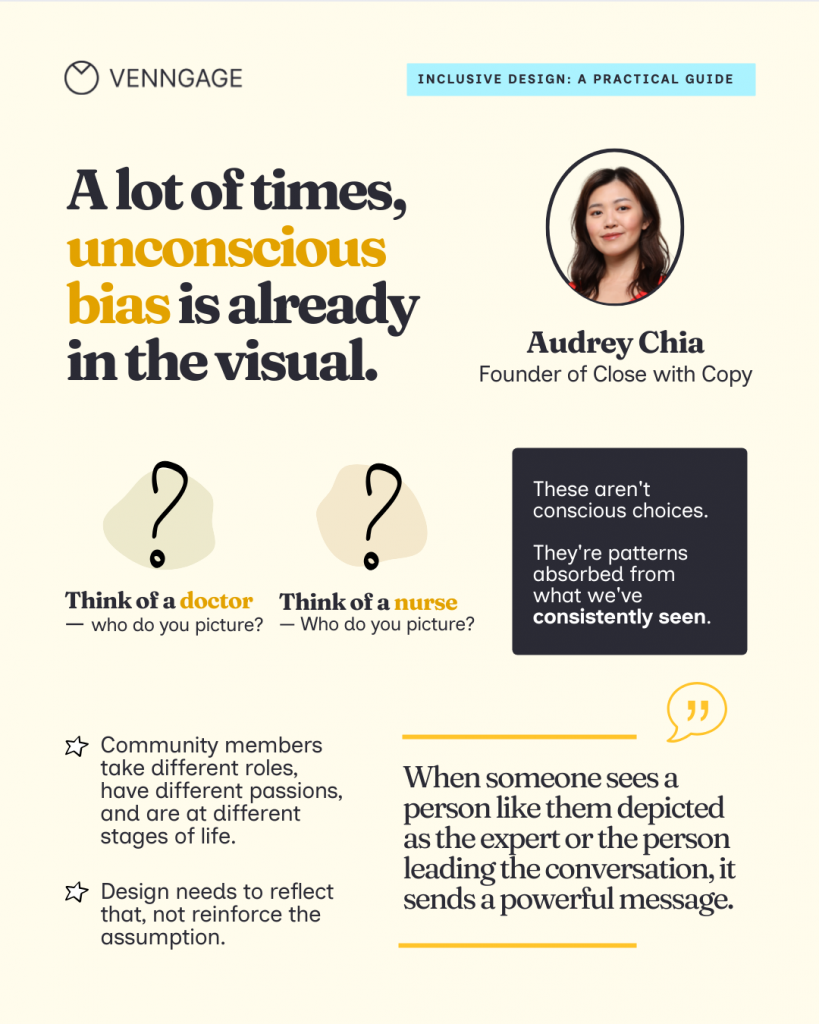
Audrey Chia, founder of Close With Copy and a brand positioning expert, explains that generic diversity usually happens when tools try to be neutral. But real inclusion is actually very specific.
Chia notes that “People experience the world through real identities: culture, age, profession, life stage, ability, and lived experience. Without those details, it’s easy for visual content to end up feeling very generic.”
Examples of generic designs:
- The global handshake: Two people in suits, shaking hands in front of a blurred city skyline. It’s the ultimate identity-less visual that indicates a lack of a specific audience.
- The collaboration huddle: A group of people leaning over a single laptop, smiling. It’s a staged setup that prioritizes a perfect look at how diverse teams solve problems.
- The success silhouette: Using shadows or backlighting to hide faces in an effort to be universal.
- The interchangeable hero: Using a model who looks like they could be in an ad for a bank, a software company, or a vitamin brand. If the person doesn’t look like they actually use your specific product, they are merely a placeholder.
How to create tailored and inclusive visuals for your target audience:
1. Focus on context: Instead of picking random professional images, pick one that shows the specific effort of the task. If you are creating a hiring flyer for a senior technical lead, instead of a ‘tech-bro’ in a hoodie, you could add a Black woman of mid-age.
2. Audit the power dynamics: Look at the agency in the frame. Who is driving the action? Who is the expert in the room? In your pitch decks or landing pages, show diverse leaders presenting ideas and owning the room. Instead of a man of color nodding along, show him holding the marker at the whiteboard
3. Choose imagery that reflects your actual customer base: Use imagery with relevant details. If your data shows your customers are remote founders, show a professional in a vibrant home office with a child’s drawing in the background or a visible identity cue like a hearing aid.
Mistake #2: Treating diversity as decoration
Sometimes we create diverse visuals, but all they do is reflect our subconscious biases. Kellogg’s “Corn Pops” box is a solid example of diversity for the sake of it.
Look at the image below, a sea of yellow characters playing, and the only brown character on the cover was depicted as a janitor.
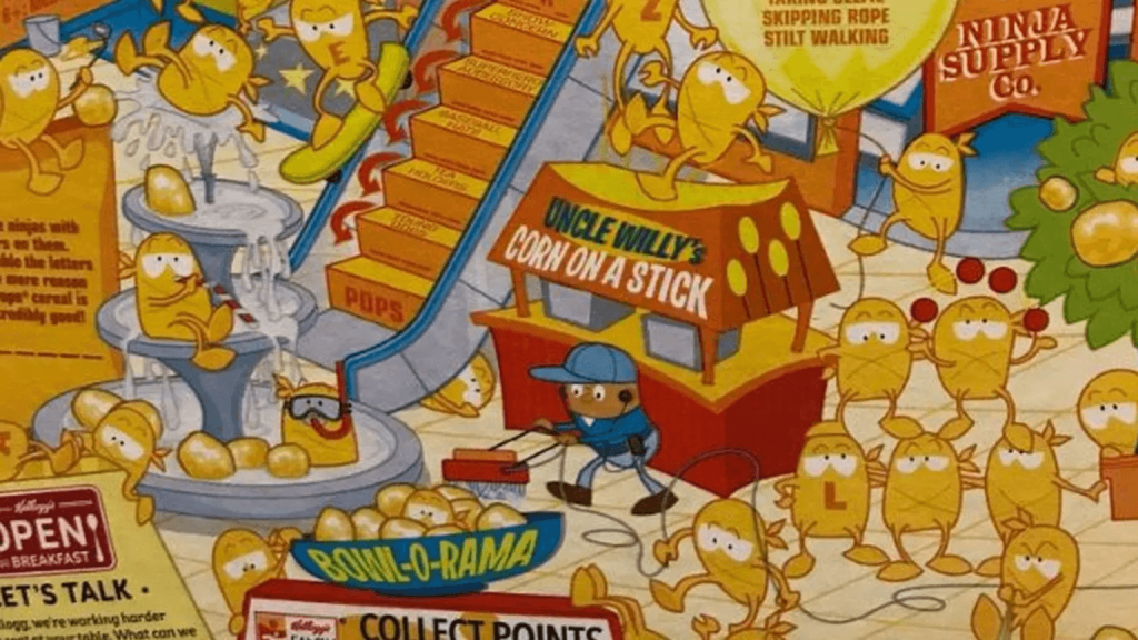
This is called token representation without real agency. In marketing, it shows up when:
- Diverse professionals are placed at the literal edges of a group shot.
- Underrepresented people are shown in passive roles while a default archetype leads.
- Diversity-focused slides look visually different from the rest of your brand deck, making them feel like an afterthought.
What agency looks like in practice
Agency means the person in the visual is the driver of the story, not just a decoration in the background. It’s about:
- Leading the conversation: Check your visuals and see who holds the microphone? Who is centered in the frame, explaining things? If your diverse characters are consistently off-center, you are sidelining them.
- Making decisions: Look at your data and strategy slides. Who is the person associated with the big win or the expert quote? Ensure those roles aren’t reserved for a single demographic.
- Owning outcomes: Avoid passive group shots. Instead, show a specific individual doing their job with expertise. A single photo of a professional with a disability presenting a strategy is more inclusive than a group shot where they are just a face in the crowd.
Mistake #3: Using abstraction to avoid making a choice
In the guise of inclusive imagery, we often see (and create) abstract illustrations or colorless silhouettes. This mistake is often born from a good intention: the desire to be universal. We worry that picking a specific person will alienate everyone else, so we use purple, blue, or gray skin tones, thinking that if no one is represented, then everyone is included.
A Medium article titled “You can’t just draw purple people and call it diversity” talks about how Shopify’s early faceless illustration was actually a blind spot. It had all purple silhouettes that looked like white people, just with dark skin.

Source: Shopify
Such featureless illustrations make it hard for a customer to see their specific professional identity reflected in the design.
There is a difference between using abstraction to be creative and using it to avoid a difficult conversation.
I recently came across SafetyWing’s website, where they use anthropomorphic birds (like their “Nomad” eagles) to represent their community. The imagery is fun and quirky, and at the same time inclusive. In their illustrations, you’ll see birds with different outfits, travel gear, and specific environmental cues that reflect a nomadic lifestyle. It feels like they are showing clear identities.
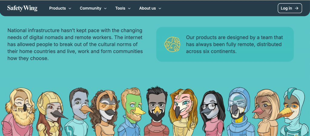
Source: SafetyWing
It’s a great example of how a brand strategy can be both creative and inclusive. The goal is to avoid using illustrations as shields.
Here’s how you can avoid creating abstract visuals
- Humanize your data: When creating infographics or personas, don’t just use a generic icon of a user. Give them a real identity. If your data shows your customers are in Lagos, your visuals should reflect the clothing, architecture, and physical traits of those regions.
- Be specific with attributes: If you’re using illustrations in a process explainer, give the characters real-world traits. Don’t just change the skin color; vary the hair textures, include hijabs or turbans, and show mobility aids like wheelchairs or hearing aids as a natural part of the workflow.
- Audit your Brand System: Look at your asset library. If the majority of your people are abstract shapes or symbols, you are missing a massive opportunity to build an emotional bridge. Abstraction is fine for metaphors, but for trust-heavy moments like tutorials or case studies, opt for human-centric visuals.
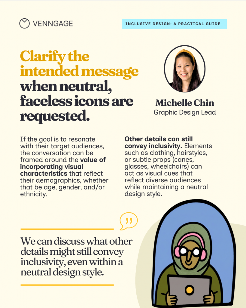
Michelle Chin, graphic design lead at Venngage, suggests a workaround for brands that prefer using faceless icons and illustrations.
“If you prefer neutral, faceless icons as a rationale for style preference, then we can discuss what other details might still convey inclusivity. Elements such as clothing, hairstyles, or subtle props (like canes, glasses, or wheelchairs, for example) can act as visual cues that reflect diverse audiences while maintaining a neutral design style.”
Michelle Chin
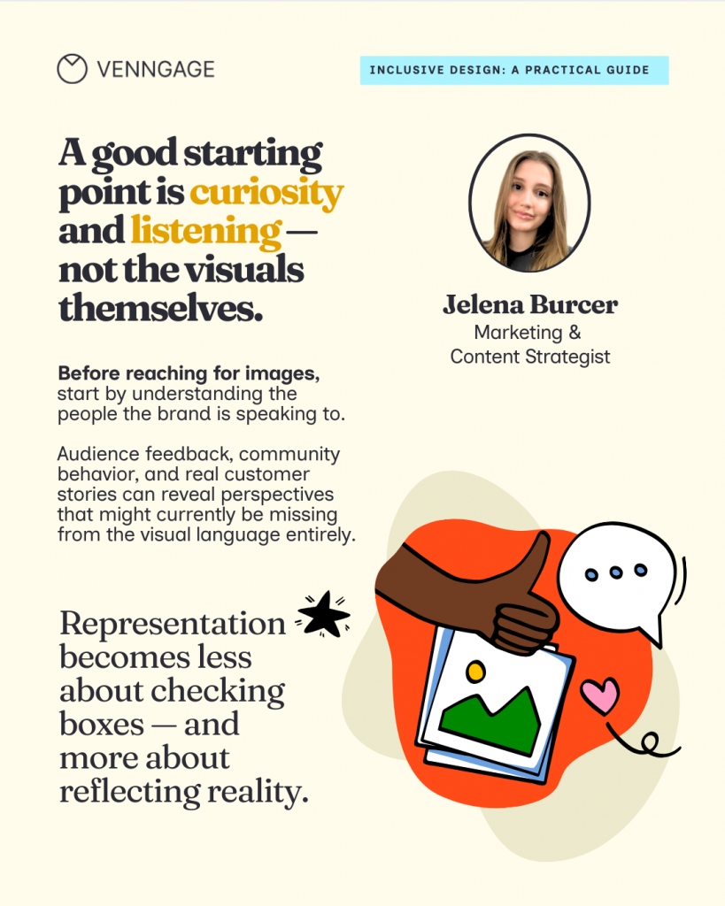
Jelena Burcer, a marketing consultant, suggests that a good starting point to create inclusive visuals is curiosity and learning. She recommends, “Looking closely at the community, audience feedback, and real customer stories to reveal perspectives that might currently be missing.”
Mistake #4: Relying on visual shortcuts for identity
Now this mistake is where societal bias meets lazy design. We’ve been conditioned to associate certain colors, ages and roles with specific identities for so long that we stop questioning them and end up reinforcing the very stereotypes that make our marketing feel dated.
I’m talking about the rigid pink vs. blue color coding, or the innovation visuals that only ever feature people under 30. When you rely on these notions, you tell a large part of our audience that this space isn’t for them.
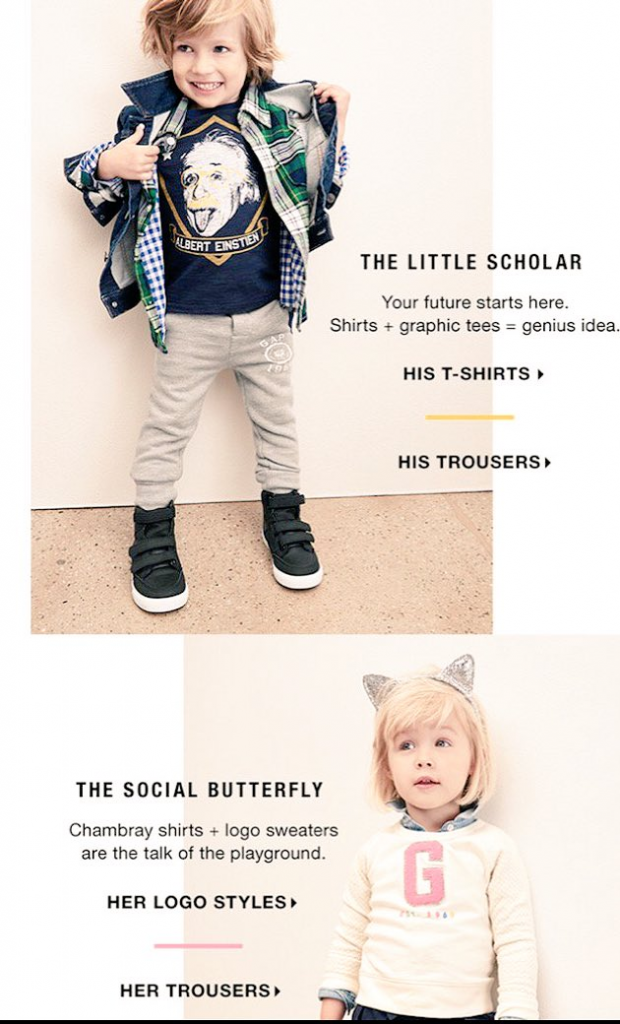
The Gap Little Scholar ad is the ultimate case study for this. By labeling the boy a scholar and the girl a social butterfly, the brand literally told the audience who is allowed to be the thinker and who is expected to be the supporter.
Source: The Guardian
But the bias goes deeper than just gendered colors; it’s about the narrow stories we allow certain people to tell.
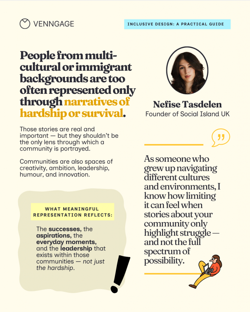
Nefise Tasdelen highlights a critical gap here. We often show people from multicultural or immigrant backgrounds only through narratives of hardship or survival. While those stories are important, they are stereotypical. Representation becomes meaningful only when it reflects the full spectrum of a community, including creativity, ambition and leadership.
“I know how limiting it can feel when stories about your community only highlight struggle and not the full spectrum of possibilities. Representation becomes more meaningful when it reflects the complexity of people’s lives: the successes, the aspirations, the everyday moments, and the leadership that exists within those communities.”
Nefise Tasdelen
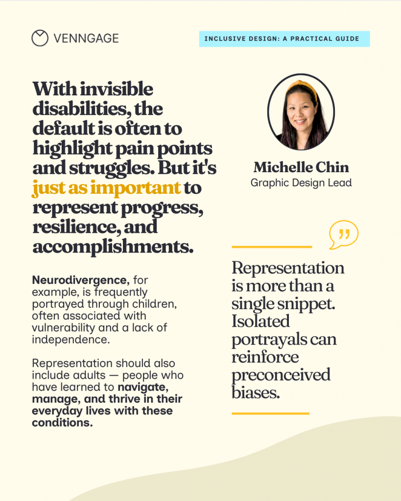
This also applies to how we visualize health and ability. Michelle Chin, graphic design lead at Venngage, notes that we often default to showing invisible disabilities through a lens of vulnerability. For instance, neurodivergence is frequently portrayed through children, implying a lack of independence.
“Representation should also include adults—people who have learned to navigate, manage, and thrive in their everyday lives. It’s just as important to represent progress, resilience, and accomplishments as it is to show the struggle.”
Michelle Chin
How to fix it: Replace stereotypes with context and action
To move past these shortcuts, focus on the action of the visual rather than just the identity of the person.
1. Show varied life stages
Represent people at different points in their career — like a mid-age career switcher or a senior technical lead—without leaning into the clueless or retirement tropes.
For example, in recruitment posters or page listings,instead of a cool office with 20-somethings at a ping-pong table, show a realistic workspace where people of all ages and abilities are doing deep, focused work.
2. Neutralize the palette
Avoid using gender-coded colors to segment your audience. Use your brand colors or a palette that reflects the mood of the task, not the gender of the user.
3. Focus on expertise
If you are talking about strategy, show an older professional at the center of the action. They should be leading the presentation or mentoring, not just sitting in the background.
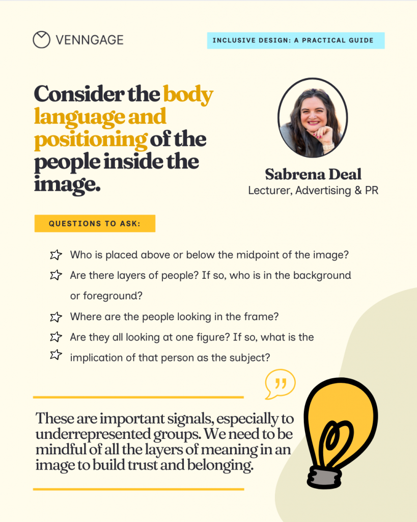
Sabrena Deal, an inclusivity advocate and consultant, takes this a step further by looking at the literal architecture of an image. For Deal, inclusive design isn’t about hitting a checklist, rather understanding the stereotypes that limit authentic experiences.
When selecting a visual, Deal pushes beyond race and gender to look for:
- Nuanced representation: This includes the use of assistive technology, limb differences, diversity of body shape and size, religious affiliation, and gender expression.
- Positioning: Deal considers the body language and positioning of the people inside the image. Who is placed above or below the midpoint? If there are layers of people, who is shoved into the background versus the foreground?
- The authority figure: Where are the people looking in the frame? Are they all looking at one figure? Deal asks: “What is the implication of that person as the subject?”
How to avoid AI bias in marketing visuals
As if our subconscious biases were not enough, people now have AI tools at their disposal that reinforce the bias I spoke about earlier in the article. And it’s obvious, AI is a mirror of the data it was trained on, and that data is heavily skewed.
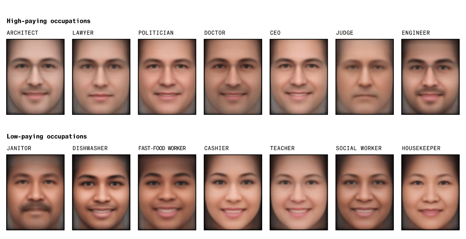
A study by Bloomberg analyzed 5,000 images generated by Stable Diffusion and found that the AI-generated visuals show “extreme racial and gender disparities”. For high-paying occupations, it generated images of men with lighter skin tones. And for low-paying occupations, it was mostly women and one black male.
The consequences are even more dangerous in specialized fields. A study published by The Lancet Digital Health showed that researchers tried to invert the “white savior” trope by prompting AI to create images of Black African doctors providing medicine or vaccines to suffering white children.
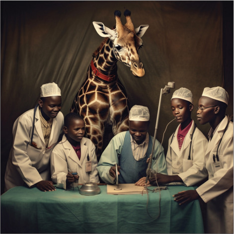
After 300+ attempts, AI showed patients with dark skin and a white doctor treating them. AI even generated culturally offensive or exaggerated elements like wildlife.
If you create visuals using AI, here’s a simple framework to avoid bias.
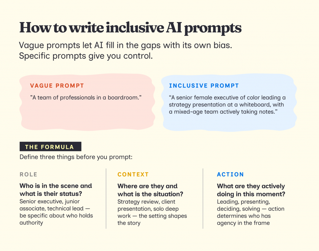
1. Write clear prompts
If you don’t give clear and specific instructions to an AI tool, it will automatically fill in the gaps with its own bias. So make sure to define the following details in your prompts
- Roles: Who is leading, presenting, deciding, supporting
- Context: What situation they’re in (campaign review, strategy discussion, presentation)
- Action: What is actively happening in the scene
Instead of: A team of professionals in a boardroom.
Try: A senior female executive of color leading a strategy presentation at a whiteboard, with a diverse team of junior associates actively taking notes.
2. Use tools and templates that support inclusivity
If AI isn’t giving you the nuance or the specific representation you need, you have to look outside the default search bar. There are specialized libraries that prioritize authentic, high-quality representation across diverse lived experiences.
- All Go: Body-size diversity
- Body Liberation Stock: Body-size diversity
- Centre for Ageing Better’s Library: Older people and age-positive icons
- CreateHER: Women of color
- DisabilityImages.com: People with disabilities
- Diversify.photo: Photos by people of color
- Gender Spectrum Collection: Gender diversity
- Getty Images, Disability Collection: People with disabilities
- Getty Images, Project #ShowUs: Female-identifying and nonbinary people
- If/Then Collection: Women in STEM
- Jopwell Collection: Black, Latino, and Native American professionals
- Nappy.co: Black and Brown people
- PhotoAbility: People with disabilities
- RawPixel.com: Diverse people
- Reclaimphoto.com: Photos by underrepresented photographers
- TONL: Cultural diversity
Source: Coalition for Diversity and Inclusion in Scholarly Communications
Having a list of resources is a great start, but the real bottleneck is often time. When you’re under a deadline, the extra step of finding and vetting inclusive imagery makes the whole process tedious.
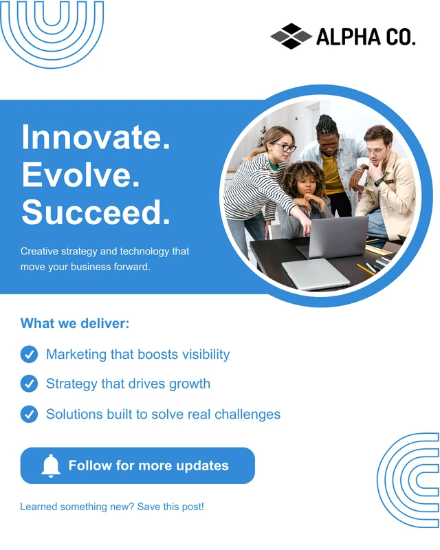
This is where a graphic design and visual communication tool like Venngage actually helps. It offers a variety of inclusive design templates for posters, flyers, infographics, social media posts, internal communication, etc., so you don’t need to spend time finding the ideal template.
For example, this Facebook social media template features a diverse group of professionals that signals an inclusive workplace culture without requiring you to hunt for the right stock photo.
This LinkedIn company introduction post template features a clean, professional layout designed to highlight your team and brand values at a glance. It includes a prominent team photo slot alongside a bold headline and brand colors, making it easy to showcase a diverse, people-first workplace.
This template is ideal for HR and employer branding teams introducing a new initiative, welcoming a new hire cohort, or announcing a DEI milestone.
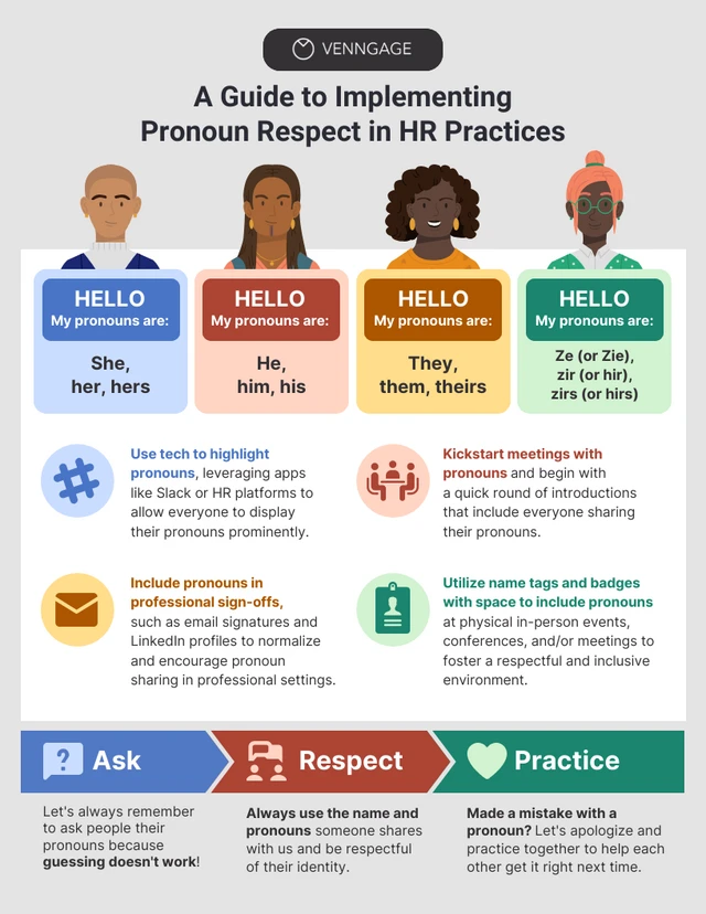
Even this HR infographic templates promotes inclusivity. The four illustrated figures at the top represent people of different skin tones, hair types, and styles, and each is paired with a pronoun set including she/her, he/him, they/them, and ze/zir, explicitly acknowledging non-binary and gender-expansive identities rather than defaulting to the binary.
The color-coded name badge design mirrors the kind of pronoun badges used at real inclusive events, making the concept immediately recognizable and practical.
Here’s how Venngage’s AI Design Generator supports inclusive design:
- Diverse Icon Libraries: Instead of a generic stick figure, you can access icons with various skin tones, hair textures, and mobility aids (like wheelchairs or hearing aids). It makes representing people in flowcharts or process diagrams much faster and more accurate.
- Accessible Color Palettes: Use built-in color contrast checkers to ensure your visuals are readable for everyone, including those with color blindness.
- Structured Templates: You can start with slide decks or infographics that already bake inclusive focal points into the design. It saves the time of having to “fix” a biased layout from scratch.
- AI Image Generator: Simply add a text prompt, and the AI tools will offer inclusive image options.
Here are a few examples of inclusive images created by Venngage’s AI Image Generator:
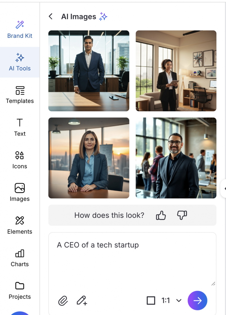
For example, I generated an image of a CEO using Venngage’s AI Image Generator. Instead of the default white male results you would typically get from stock photo sites like iStock, the tool returned a diverse mix of people across different genders and ethnicities for the exact same prompt.
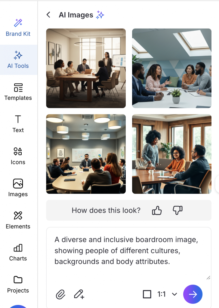
In this image, you can see meeting rooms where the people leading the conversation are not the usual stereotypes. These images have women of color presenting, people of different body types and ethnicities seated at the table as equals, and no single group dominating the room. It is a small but meaningful shift in what gets treated as a default.
3. Review
AI Visual Review Checklist
Generate & compare
- I generated at least 4–6 variations of the same visual
- I reviewed them side by side, not one at a time
Check the focal point
- One clear subject is visually centered
- The same type of person is not centered across all versions
Check roles and authority
- Someone is clearly leading, presenting, or deciding
- Leadership roles are not consistently assigned to the same demographic
Check passive roles
- No group appears only as observers or background figures
- Supporting roles vary across versions
Check for abstraction
- Humans are shown where trust or credibility is required
- Abstract figures are not replacing people unnecessarily
Separate representation from aesthetics
- Representation was reviewed before visual polish
- “Looks professional” didn’t override representation concerns
Assess reuse risk
- I asked: “What happens if this image is reused across 5–10 assets?”
- I’m comfortable with the pattern that repetition would create
Flag high-impact assets
- Extra scrutiny applied for:
- Landing page heroes
- Paid ads
- Pitch deck covers
- Thought leadership visuals
The Inclusive Design System (IDS)
Most of us review inclusivity right before we hit publish. We look at the image, ask ourselves if it looks diverse, make some fixes and move on.
For inclusivity to actually stick, it needs to be a part of your design workflow. Here’s how you can build an inclusive design system for your organization to make existing and future designs inclusive.
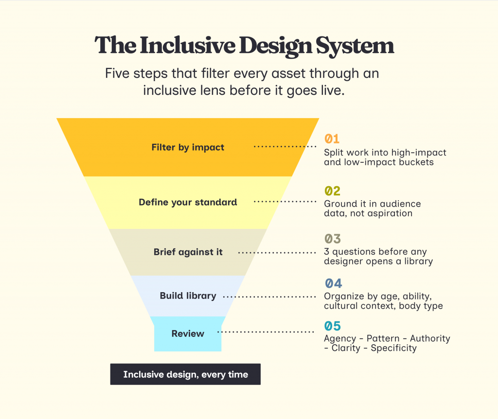
Step 1: Filter existing designs by Impact
Not every asset requires a deep audit. Divide your creative requests into two buckets to manage your team’s energy.
- High-Impact Assets: These require a full manual audit. Examples: Landing page heroes, paid ad creatives, pitch deck covers, and brand templates.
- Low-Impact Assets: These follow your pre-set brand guidelines. Examples: Internal memos, data charts, and secondary social graphics.
Use this matrix to decide where to spend your energy first.
Once you know where to focus, pull your last 30 high-impact assets and look at them as a body of work.
Ask these questions:
- Who is consistently centered, leading the action, or associated with the win?
- Who is consistently passive? Who is nodding, listening, or smiling at the edge of the group shot?
- What stories are absent entirely? Which life stages, abilities, or contexts never appear?
Step 2: Define your visual standard
After spotting the patterns, think of what they mean for your brand. Before you brief anything new, your team needs to agree on what the inclusivity standard will be going forward.
This requires a thorough understanding of your target audience. Look at your CRM, survey responses and customer interviews. Ask:
- Who is actually buying from you or engaging with your content?
- Which segments are underrepresented in your visuals relative to their presence in your audience?
- What do your customers look like in terms of age, background, ability, and life stage?
If that data does not exist yet, start small. Run a quick survey, look at your community comments, or talk to your sales team about who they are actually selling to. The goal is to ground your visual standard in reality, not aspiration.
Once you have that picture, write down three things your team will commit to consistently across all high-impact assets. For example: centering professionals over 45 in leadership contexts, including visible disability in at least one in four campaign visuals, or reflecting the cultural backgrounds your product actually serves.
This is your visual identity standard.
Step 3: Create a standard brief for your team
Now that you have a standard, every new brief should work toward it. For any high-impact asset, answer these three questions before a designer opens a single stock library:
- Who is the protagonist and what are they actively doing in this scene?
- Which default are we consciously breaking, based on our standard?
- What did we publish last time for a similar asset?
The third question is what connects individual briefs into a consistent narrative. If your last landing page hero was a young white male in a suit, that context should be sitting in front of your designer before they make a single decision.
Make these mandatory fields in your briefing template or project management tool.
Step 4: Build a curated asset library
The reason most designers fall back on biased defaults is not laziness. It is time. When you are under a deadline, you reach for the first polished result. That result is almost always the same person.
The fix is to build your inclusive asset library, so the right choice is also the easy one.
Organize it not just by topic, but by the variables that actually matter for inclusion: age range, visible disability, cultural context, body type, and gender expression. When a designer searches for “senior leadership,” every option in that folder should already reflect your standard.
A few places to start building that library:
- Nappy.co for Black and Brown professionals
- Jopwell Collection for Black, Latino, and Native American professionals
- Disability Images for people with disabilities
- Gender Spectrum Collection for gender diversity
- TONL for cultural diversity
If you are using a design tool like Venngage, you can skip part of this step entirely. Its icon and image library is already organized around inclusion variables like skin tone, hair texture, and mobility aids, so your designers are not starting from a biased default every time they open a new template.
Step 5: Create a checklist
Before any high-impact asset goes live, check these things:
- Agency: Is the underrepresented person the subject of the story, not just a background “token”?
- Specificity: Did I avoid “Purple People” or faceless abstractions for a real, specific identity?
- Authority: Does the visual challenge a stereotype (e.g., an older expert, a woman in tech)?
- Clarity: Is there enough white space and plain language for a neurodivergent or tired user?
- Pattern: Does this image look different from the last three images we published?
Think of design as an act of care
Every visual you publish is telling someone whether they belong in the story or not. That is just how representation works. We started this article talking about how marketers are obsessed with making audiences feel seen.
But feeling seen and feeling included are not the same thing. You can acknowledge someone exists and still design a world where they are always at the edge of the frame, always nodding, never leading.
The good news is that this is entirely fixable. You just need to lead with curiosity and intention and have a better system in place.
Want ideas and prompts to create inclusive visuals? We’ve created an Inclusive Design tool. Just select your audience and platform, and the tool will generate three inclusive visual ideas for you.
Find inclusive visual ideas
for your next campaign
Select your audience and placement — get 3 ready-to-use scene descriptions to hand to a designer or drop into any AI image tool.
Step 2 of 3


