


The fundamental purpose of an infographic is to simplify complex information and help make difficult concepts easier to understand.
We often use infographics to summarize data in order to send a message to our audiences. One of the best ways of visually representing this data is through the use of pictograms.
A pictogram is a visual representation of data. It’s not the same as your typical bar chart or pie chart. Instead, you use icons and illustrations to highlight the relevant statistics that you’re trying to get across.
They are typically a simplified representation of an idea, theme or concept, with a flat design. Pictograms are great for content creators because they give your audience a snapshot of quantity and volume in a visually impactful way.
But the most common use-case of pictograms is to represent a ratio. In this article, I’m going to cover some best practices for how you can effectively use pictograms in your content and in your infographics to help your audience better understand your data and statistics.
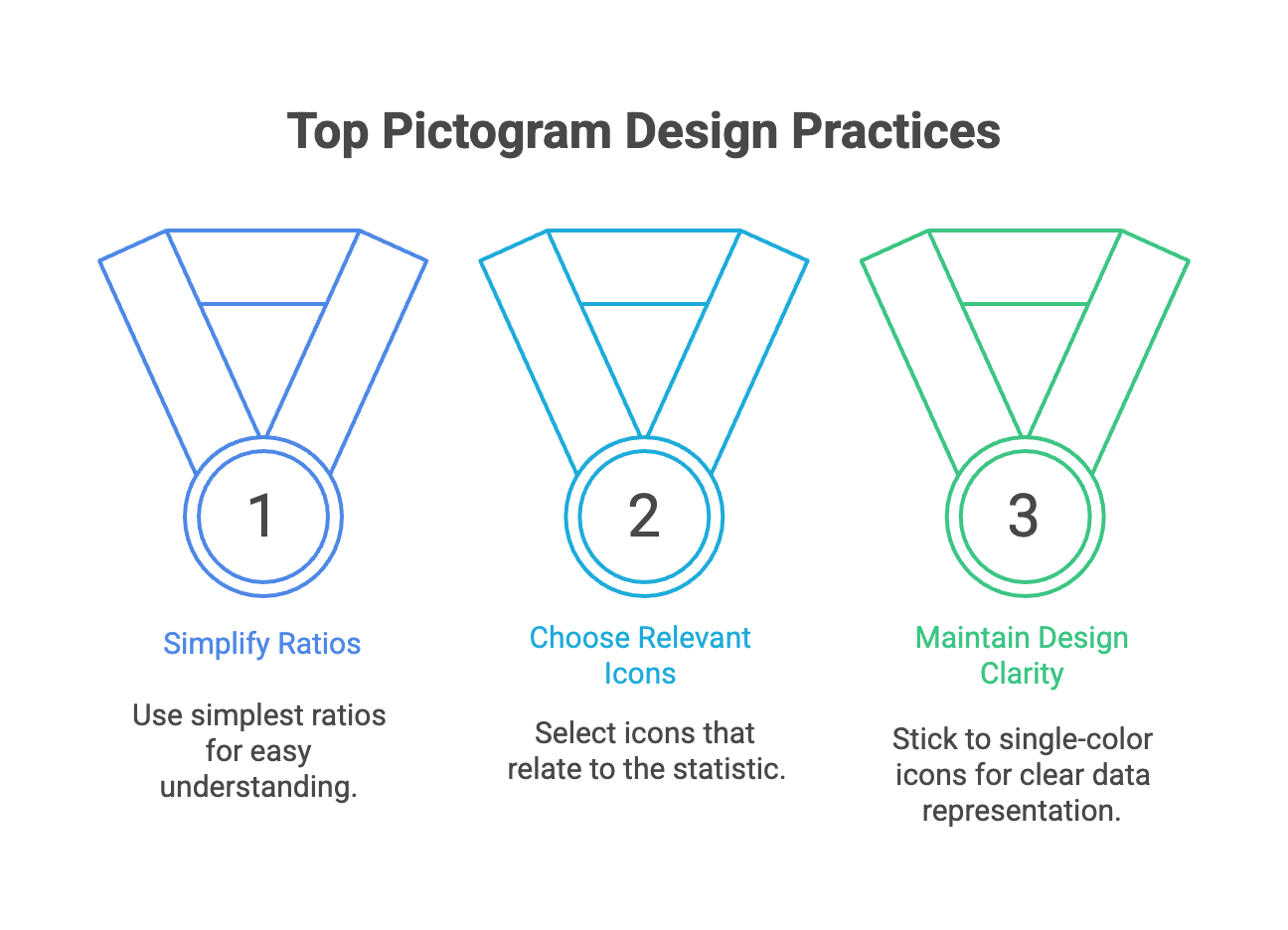
1) Use the simplest ratio
If you remember anything from your 5th grade math class, a ratio is essentially a fraction. You can convert most survey data into a ratio quite easily.
When converting your data, it’s important to make sure that your calculations are entirely accurate. For instance, if 25% of your users are marketers and you want to portray this in your content, you can easily depict the statistic as a ratio of 25/100, or even simplify it to 1/4.
Notice how there are 100 icons, with 25 of them highlighted in blue. Now it is relatively easy to comprehend just how many marketers make up your user-base. But it could also look like this if you simplified your pictogram by using the 1/4 ratio.
Notice now that there are far fewer icons to actually process. Immediately you have a visual understanding of the representation of marketers in your user-base.
So which one of the two pictograms makes the data more digestible and easier to interpret? You’d probably say the second option that includes fewer icons, and you’d be right.
It’s a lot easier for people to understand the concept of 1 in 4 when visually represented. Having to count 25 out of 100 icons still gets the message across, but the overall impact might not be as effective.
When possible, use the simplest ratio when choosing to include pictograms in your content. Trust me, your audience will thank you.
2) Select icons that relate to the statistic
Choosing relevant icons for your pictograms will make it a lot less excruciating for your audience to interpret your data. You wouldn’t want to represent how many Twitter followers you have by using a Facebook icon, would you?
Humans are visual people, and using symbols that are universally understood will make your work far more memorable.
Here’s an example of an infographic done well by using identifiable icons.
This particular infographic visualizes rainfall data with a variety of different charts. Notice how the icon choice perfectly pairs with the overall theme of the infographic, but that it’s not an exact depiction of “rainfall”.
Instead, we interpret the umbrella icons to signify rain, whereas an image of a cloud with a lightning bolt might better represent thunder, lightning or very heavy rainfall.
Now, this wasn’t just a quick decision. There was specific thought put into the pictogram selection. The designer knew that another icon might send a different message.
Don’t rush into your choices. Be as clear as possible and as specific as possible.
3) Don’t use pictograms for the sake of using them
Next, when it comes to including pictograms in your infographics, don’t just use them for the sake of using them.
The visual should be integral to the overall aesthetic and content of your infographic. Furthermore, pictograms are not ideal for the representation of large sets of data. If your goal is to share multiple statistics, you might be better off choosing charts like bar charts, or line graphs.
The best instances for using pictograms are to show a tally, or compare simple data.
Pictograms are very easy to repurpose on social media through carousels and slideshows. This amplifies your digital business card through compelling and diverse visuals.
4) Designing your pictograms
When it comes to designing your pictograms, it’s best to stick to a single color icon structure, rather than using full-fledged illustrations.
As you can see in the example on the right, it would be very difficult to depict partial data in an icon that is already multi-tonal. Instead, use a separate color to fill in a portion of specific single tone icons like this:
This also allows you to accurately depict data rather than making an assumption.
Lastly, make sure that you use labels to clearly communicate what you’re trying to say. Pictograms should be a means of clarifying results, but you still need accompanying text to educate your readers.
Conclusion
Whether you create a report, infographic or presentation, pictograms are a highly effective for infographic marketing. Keep the above tips in mind when incorporating them into your content, and your audience will always be ahead of the game.


