


A travel brochure only works if it moves someone through four steps: They pick it up. They read it. They remember it. They act on it.
That’s the outcome.
When we say a brochure should “stand out,” we don’t mean louder colors or more photos. We mean it captures attention, makes the experience instantly clear and gives someone an obvious next step.
In this guide, you’ll get a practical travel brochure layout templates, real production specs for print and digital, a self-grading rubric and examples tailored to different travel segments. Everything is tied to clarity and conversions and not just decoration.
What makes a travel brochure stand out? (the 3-second test)
If someone picks up your brochure in a hotel lobby, they give it three seconds.
In that time, they must instantly know:
- Where it is
- What experience they’ll get
- What to do next
If they hesitate, it goes back on the rack.
The 3 pillars of a brochure that stands out
A standout brochure has:
1. One Clear Promise (USP)
A USP (unique selling proposition) is your core benefit in one sentence.
Bad USP: “Explore our beautiful region.”
Better: “Three waterfalls. One easy 2-hour guided hike.”
Clear promise = faster understanding.
2. One visual story (hero + support)
The cover needs a dominant hero image. Not a collage. Not six equal-sized photos. One image that carries the emotional weight of the experience. Supporting images can appear inside, but the cover must be decisive.
In the real world, Brochures with cluttered image grids get ignored in hotel lobbies. Strong single-hero covers get picked up more often.
Choose:
- Emotion-first hero (adventure)
- Place-first hero (destination clarity)
- Experience-first hero (food tour, guided hike, spa day)
3. One obvious next step (CTA)
Your call to action cannot compete with itself. If you’re asking people to call, scan, and visit three different websites, you dilute momentum. Choose the primary action and design around it. Make it visible on the cover and repeat it inside.
Your CTA must be:
- High contrast
- Specific
- Repeated once inside
Mini checklist: the 3-second evaluation
Before printing, hold your draft at arm’s length and ask:
- Can someone name the destination in 2 seconds?
- Is the main benefit obvious?
- Is there only one primary CTA?
- Does the cover use one strong image?
- Is the headline benefit-driven (not generic)?
If you answer “no” to more than one, revise.
Start here: define your purpose + ideal traveler (so design gets easier)
Design becomes straightforward once strategy is defined. Most brochures feel messy because they’re trying to do too much.
Step 1: Define your purpose
Your brochure cannot do everything.
Choose one:
- Increase bookings
- Drive walk-ins
- Sell packages
- Raise awareness
- Support partner distribution (hotels, visitor centers)
A brochure designed for bookings needs pricing clarity and a strong QR pathway. A brochure meant for awareness leans more heavily on storytelling and brand positioning. A walk-in focused piece prioritizes maps, hours, and proximity cues.
When the purpose is clear, layout decisions follow naturally.
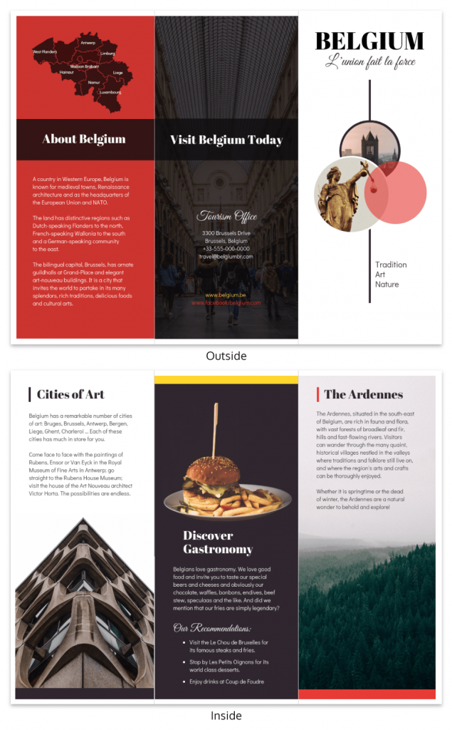
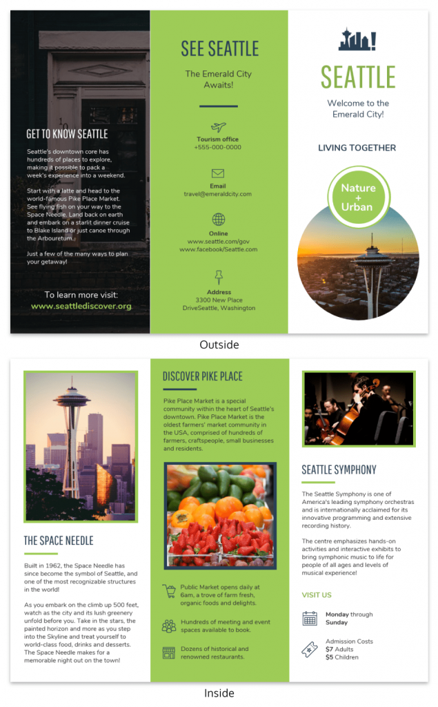
A good example is this Belgium Travel Tri Fold Brochure Template. The design focuses on showcasing the destination with strong imagery and clearly organized sections that highlight attractions and travel tips.
It also does a few things well that you can borrow:
- A strong cover image that immediately shows the destination
- Clear sections that make the content easy to scan
- A balanced layout that doesn’t feel crowded
Templates like this take care of the layout structure, so you can focus on adding the right content for your goal.
Step 2: Define your ideal traveler
Your ideal traveler shapes both tone and content.
Some quick profiles:
- Families: safety, pricing clarity, duration
- Luxury travelers: exclusivity, visuals, premium language
- Adventure seekers: intensity, challenge level, bold visuals
- Seniors: accessibility, comfort, clear schedules
- Budget travelers: value comparison, inclusions
- Business travelers: convenience, location, time efficiency
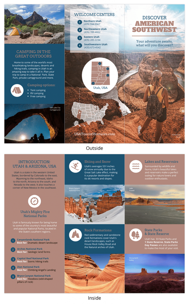
For instance, this Utah Travel Tri Fold Brochure Template clearly speaks to outdoor enthusiasts. The large landscape images and sections highlighting parks and outdoor attractions make it obvious that the brochure is designed for travelers interested in nature and adventure.
The key idea is simple: if your brochure tries to speak to everyone, it usually ends up resonating with no one. Focusing on one type of traveler helps the message feel more relevant and compelling.
Include vs cut rule
Here’s a practical filter: if a piece of information doesn’t help your specific traveler take the next step, remove it.
Example:
- Adventure brochure? Cut long historical paragraphs.
- Museum attraction? Include schedule + exhibit highlights.
Clarity improves pickup-to-action conversion.
Callout: school project fast track
If this is for a class assignment:
- Pick one destination and one traveler type.
- Use royalty-free image sources (Unsplash, Pexels).
- Keep copy under 250 words total.
- Cite image sources if required.
- Focus on clarity over decorative elements.
Professors tend to grade structure and communication more than decoration.
The 5 essential parts of a great travel brochure (travel-specific)
A great travel brochure isn’t just attractive, it removes doubt and makes saying “yes” easier. These five elements consistently separate brochures that convert from brochures that sit untouched.
1. A benefit-led message (not generic destination claims)
Travel decisions are emotional first, practical second. If your message sounds like every other destination — “beautiful views,” “rich culture,” “unforgettable experience” — it blends in instantly.
A benefit-led message answers: What will I actually get out of this?
Instead of: “Discover our stunning coastline.”
Try: “Walk three cliffside trails in one relaxed afternoon.”
Or: “See five must-visit landmarks in 90 minutes with no planning required.”
Do it fast tip:
Write your headline using this formula: Number + Specific Experience + Time Frame or Outcome
Example: “Two-Hour Guided Food Tour Through Old Town.”
If it feels concrete, you’re on the right track.
2. Strong visuals + clean layout
Visual hierarchy controls attention. If everything is loud, nothing stands out. A single dominant hero image communicates mood instantly, while clean spacing improves readability and perceived quality.
In hotel lobbies, brochures with one striking image consistently outperform crowded photo grids. That’s because people respond to clarity.
Do it fast tip:
Choose one hero image that captures the core experience. Then limit supporting visuals to three to five total inside panels. If you feel tempted to add “just one more,” remove one instead.
3. Clear CTA + easy contact
Travel is usually impulse-driven. If someone has to search for your phone number or website, friction increases and action drops.
Your brochure needs one primary action — book, reserve, scan, call — and it must be obvious.
Examples:
- “Scan to reserve your sunset cruise.”
“Call now to secure weekend availability.” - “Book your timed-entry ticket today.”
Do it fast tip:
Place your primary CTA in three locations: the front cover (as a teaser), inside near practical details, and prominently on the back cover.
4. Consistent branding (logo, colors, fonts)
Consistency builds trust. If the brochure feels disconnected from your website or signage, it creates subtle doubt.
Your logo placement, color palette and typography should match your broader brand presence. Especially in tourism, brand recognition drives repeat engagement.
Do it fast tip:
Limit yourself to:
- Two font families
- One primary brand color
- One accent color
Anything more usually weakens cohesion.
5. Audience focus (tone, activities, accessibility, budget cues)
A brochure written for everyone feels relevant to no one.
Families look for safety and clarity. Adventure travelers respond to energy and bold visuals. Luxury audiences expect refinement and premium language. Seniors often value accessibility details. Budget travelers scan for inclusions and value cues.
If the tone and details don’t match the traveler, trust drops.
Do it fast tip:
Write one sentence at the top of your draft:
“This brochure is for ______.”
If you can’t fill that in clearly, narrow your focus.
Layout that works: best brochure folds + when to use each
The fold you choose affects how your story unfolds (literally).
Different fold styles change how readers move through the brochure, so it helps to match the format to the amount of content you have and how the story should flow. If you want more inspiration before choosing a format, you can also explore these travel brochure examples to see how different layouts work in practice.
Match the fold style to your content volume and the way your story should progress.
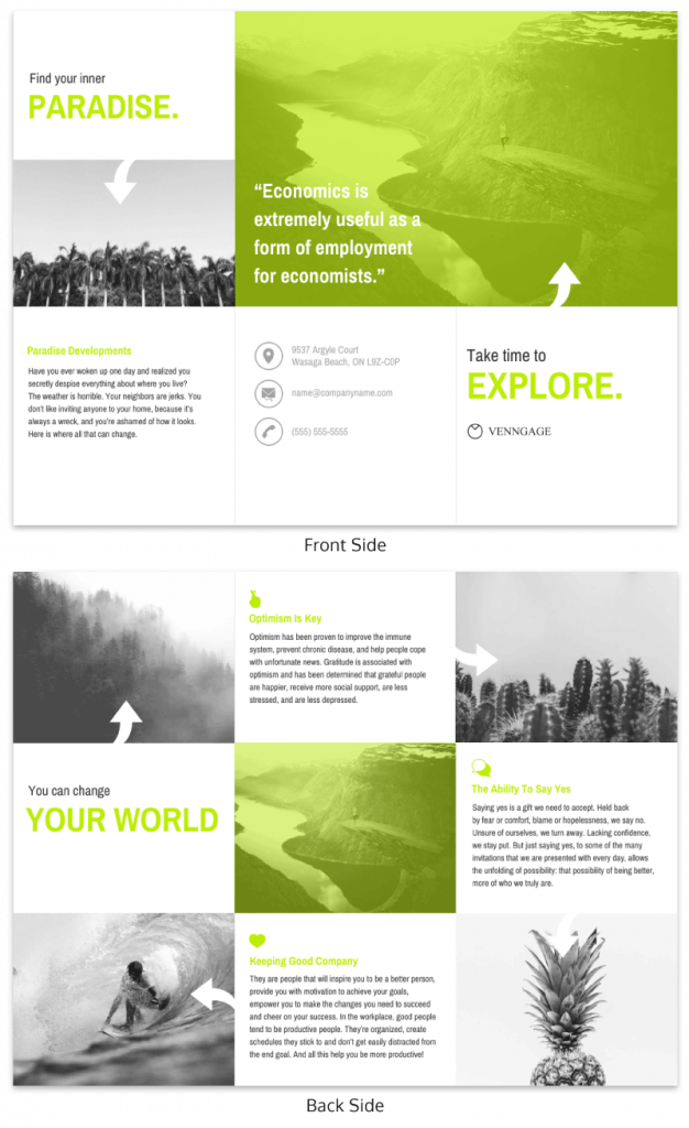
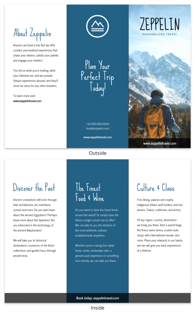
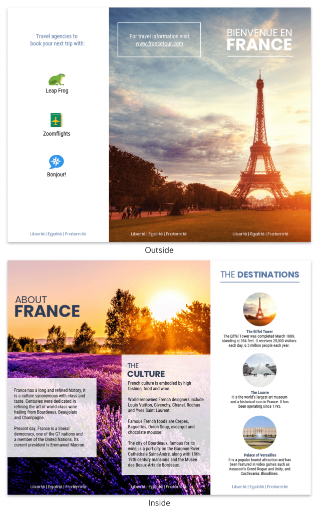
Tri-fold (the default)
Why it works:
The tri-fold is the most common format because it fits standard brochure racks and is easy to distribute at hotels and visitor centers.
It divides content into digestible panels and supports a logical flow from promise and highlights to practical info and action.
Best for:
- Tours
- Attractions
- General destination guides
- Rack distribution
Common mistake: Overloading each panel just because “there’s space.” Rule number one in designing – white space improves readability.
Bi-fold
Why it works:
A bi-fold (single center fold) feels cleaner and more premium because it has fewer panels. It’s ideal when you want strong visuals and controlled messaging.
Best for:
- Luxury experiences
- High-end resorts
- Curated tours
- Minimalist brands
Common mistake: Trying to cram tri-fold levels of content into fewer panels.
Z-fold
Why it works:
The Z-fold opens in a continuous sequence, making it ideal for timelines or step-by-step experiences.
Best for:
- Itineraries
- Walking tours
- Event programs
- Journey-style storytelling
Common mistake: Breaking the visual flow with inconsistent imagery or disconnected headlines.
Gatefold
Why it works:
A gatefold opens dramatically from the center, revealing a wide interior spread. It creates a high-impact reveal moment.
Best for:
- Major attractions
- Destination launches
- Premium campaigns
Common mistake: Using it for simple informational brochures. It increases cost and production complexity.
Quick Comparison
| Fold Type | Best For | Common Mistake |
|---|---|---|
| Tri-fold | Rack distribution, general tours | Overcrowded panels |
| Bi-fold | Luxury or premium offers | Too much text |
| Z-fold | Itineraries, timelines | Disrupted flow |
| Gatefold | High-impact reveals | Unnecessary complexity |
Decision rule: Choose your fold based on content volume and how the story unfolds — not just what looks interesting.
A proven panel-by-panel travel brochure outline (tri-fold template)
If you’ve ever stared at a blank tri-fold layout wondering, “Okay… what actually goes where?”, this is the part that makes everything easier.
Instead of guessing, think of your tri-fold as a guided conversation. Each panel has a job. When every panel does its job well, the whole brochure feels effortless to read.
Here’s how I approach it.
Front cover: make them pick it up
This panel has one responsibility: earn the flip.
When someone sees your brochure in a rack, they’re scanning, not reading. So the cover needs to answer two things instantly: Where is this? and Why does it matter to me?
Include:
- The destination name
- A clear, benefit-driven promise
- One strong hero image
- Your brand mark
- A small CTA teaser (“Scan to book today’s tour”)
If your cover feels busy, it’s probably doing too much. One powerful image and one clear promise almost always outperform a collage and a paragraph.
Inside panel 1: why this is worth their time
Once they open it, this is your moment to deepen interest.
Think of this panel as the “convince me” section. What makes this experience different? Why choose this over the other options nearby?
Lead with your core value proposition. Then reinforce it with a few tight, scannable highlights, things like duration, uniqueness or who it’s perfect for.
Keep it focused on benefits, not history lessons (unless history is the product).
Inside panel 2: the highlights people picture themselves in
Now you help them visualize the experience.
This panel works best when it’s concrete. Instead of saying “beautiful scenery,” show what that means:
- A 15-minute scenic overlook stop
- A guided tasting at a local winery
- A short forest trail suitable for beginners
Add small details like time commitment, distance or what’s included. These micro-details reduce uncertainty and uncertainty is what usually stops people from booking.
Inside panel 3: the practical details that remove doubt
This is where decisions actually get made.
People are silently asking:
- How much does it cost?
- When can I go?
- Is this available year-round?
- Is it accessible?
- What’s included?
Put those answers here clearly and confidently. No one wants to hunt for pricing or hours. The easier you make this section to scan, the more comfortable someone feels taking the next step.
Back inside panel: build trust before the ask
Before you go in for the final CTA, reinforce credibility.
This is where testimonials, star ratings, certifications or partner logos shine. Even one short quote can tip someone from “maybe” to “let’s do it.”
If you have a limited-time incentive like “Show this brochure for 10% off weekday tours,” this is a smart place to include it.
Back cover: close the loop
A lot of people flip straight to the back. So treat it like your closing argument.
This panel is about one thing: action.
Make your primary CTA big and impossible to miss. Pair your QR code with a short, readable URL (not everyone scans). Add your phone number and email. Keep the design clean so nothing competes with the next step.
If someone only sees your cover and back panel, they should still know exactly what to do.
Design principles that make it instantly more appealing
A travel brochure doesn’t need a complicated design to look good. In most cases, a few simple principles make the biggest difference. When the layout is clear and easy to scan, people are far more likely to keep reading.
Visual hierarchy: make the promise and CTA the focal point
When someone opens your brochure, their eyes should land on the most important message first.
That usually means the headline and main promise, followed by a short subhead, then highlights or bullets and finally the smaller details. Size, contrast and spacing help guide that flow.
If everything looks equally loud with big photos, big text, bright colors everywhere, the design feels chaotic. Pick one focal point and let the rest support it.
Keep it simple: white space beats clutter
One of the easiest improvements you can make is simply removing things.
When panels are packed with text and images, readers don’t know where to look. A bit of breathing room makes the whole brochure feel more polished and easier to scan.
Using one simple grid and consistent spacing across panels goes a long way. It’s a small change, but it instantly makes the design feel more intentional. Choosing the right layout and format can also help keep the design balanced, so it’s worth understanding common brochure sizes before you start designing.
Typography rules (that work in print and PDFs)
Typography doesn’t need to be fancy to work well.
Two fonts are usually enough, one for headlines and one for body text. Decorative scripts can look nice at first glance, but they’re hard to read in paragraphs.
For print, these sizes tend to work well:
- Headlines: around 24–36 pt
- Subheads: 16–20 pt
- Body text: 11–12 pt
This keeps everything readable in print and still clear if the brochure is shared as a PDF.
Color that supports the destination mood
Color helps set the mood of the destination, but it doesn’t need to be complicated.
A simple palette usually works best. Stick to:
- 1 primary color (often your brand color)
- 1 accent color to highlight key elements like CTAs
- Neutral tones for backgrounds and text balance
A few technical details also matter, especially if your brochure will be printed:
- CMYK for print – Printers use CMYK (Cyan, Magenta, Yellow, Black). Your file should be set to this color mode before printing.
- RGB for digital – Screen versions (PDFs, websites) use RGB (Red, Green, Blue). Colors may look brighter in RGB.
- Expect slight color shifts – Colors often appear slightly different when converting from RGB to CMYK, so preview your design before final export.
One rule I always follow: avoid placing text directly on busy photos unless there’s a color overlay or solid background behind it.
Captions that sell
Captions are easy to overlook, but they’re surprisingly powerful.
Instead of a generic label, add a little context. A quick formula that works well is: what it is + why it matters + a small detail.
For example: “Sunset Lookout — a five-minute walk from the trailhead and one of the best photo spots in the park.”
That extra detail helps readers picture themselves there.If all of this feels like a lot to juggle, using a tool can simplify things. Venngage’s Brochure Generator already includes layouts with built-in hierarchy, spacing, and typography rules, so you can focus more on the content and visuals instead of starting the design from scratch.
Images that sell the experience (what to use + what to avoid)
Photos do most of the emotional work in a travel brochure. The right images make people imagine the experience before they even read the copy.
What makes a strong hero image
Your cover image needs to show the experience clearly. The best ones are recognizable, aspirational, and easy to imagine yourself in.
For example, a photo of someone kayaking at sunset immediately communicates the activity and the mood. It tells a story in a second.
Inside the brochure, mix a few types of shots like a landmark view, people enjoying the experience, and a couple of small detail shots like food or local culture.
Print requirement: 300 DPI
For print, images should be 300 DPI. That just means the resolution is high enough to stay sharp when printed.
Many images found online are only 72 DPI. They look fine on screens but appear blurry once printed. Always check image resolution before finalizing your design.
Image rights: stock vs original
One thing to avoid: pulling images from Google because most of them are copyrighted.
Instead, use licensed stock photos or original images from your destination partners. Platforms like Unsplash, Pexels, or Shutterstock are common sources.
What to avoid
A few image issues can instantly make a brochure look less professional:
- Blurry or pixelated photos
- Generic stock images that don’t show the actual experience
- Heavy filters that make colors look unnatural
- Low-resolution screenshots pulled from websites or social media
A general rule: Fewer strong images always work better than filling the brochure with mediocre ones.
Write copy that sparks wanderlust (without sounding generic)
Travel copy works best when it’s specific.
Instead of phrases like “breathtaking views” or “unforgettable adventures,” try describing what someone will actually see or do. Concrete details make the experience feel real.
Short paragraphs also help. Most people skim brochures, so keeping sentences tight makes the content easier to absorb.
Headline formulas (swipe file)
If you’re stuck on the headline, these formulas are easy starting points:
- “Discover [Number] Must-See Spots in [Destination]”
- “Explore [Destination] in Just [Time Frame]”
- “A Perfect Day in [Destination]”
- “Your Guide to the Best of [Location]”
- “See [Destination] Like a Local”
- “The Ultimate [Activity] Experience in [Location]”
- “Hidden Gems of [Destination]”
- “Where to Go and What Not to Miss”
They help keep the message clear and benefit-focused.
“Insider” modules that make it feel unique
A small insider tip can make a brochure feel more helpful and local.
This could be a quick local tip, a hidden gem, the best time of day to visit a viewpoint, or even a simple what to pack suggestion.
Another idea is a tiny itinerary, something like “If you only have two hours, start here…”. It gives readers a quick plan without overcrowding the layout.
Calls to action that get bookings (plus QR code best practices)
A travel brochure only works if it leads to action. Once someone is interested, the next step needs to be obvious and easy.
Start with one clear action
The most effective brochures focus on one primary action. That action might be booking a tour, checking availability, calling a reservation line or scanning a QR code.
When multiple actions compete — “visit our website,” “follow us on Instagram,” “call for info,” “scan here” — the message gets diluted. Instead, decide what you want readers to do most and design around that.
Where your CTA should appear
Placement matters just as much as the wording.
The front cover works well for a small teaser like “Scan to reserve your spot.” This simply signals that there’s an easy next step inside the brochure.
The back cover is where the main CTA (call to action) should appear. The main CTA is the primary action you want readers to take, such as booking a tour, checking availability or scanning a QR code.
Many people flip straight to the back to look for booking details, so make the next step clear and easy. For example:
- “Scan to book your sunset tour”
- “Reserve your tickets today”
- “Check availability now”
This section usually includes the largest CTA text, a QR code and backup contact details like a URL or phone number.
QR code best practices
QR codes have become a standard bridge between print and digital, but they only work if they’re set up correctly.
- Label the QR clearly. Don’t assume people know what it’s for. Add a short line like “Scan to book your tour.”
- Link to a dedicated landing page. Sending people to a generic homepage creates extra friction.
- Track performance. Use UTM parameters or unique QR codes for different placements so you can see where scans are coming from.
- Test before printing. Try scanning with different phones and lighting conditions.
- Include a short URL as backup. Not everyone scans QR codes.
A little setup here turns a printed brochure into a measurable marketing channel.
CTA swipe file
If you’re stuck writing a call to action, these examples can help get you started:
- “Scan to reserve your sunset kayak tour.”
- “Check today’s tour availability.”
- “Book your spot for the 2pm walking tour.”
- “Reserve your room for this weekend.”
- “Unlock the full self-guided map.”
- “Buy timed-entry tickets here.”
- “Claim your rafting spot now.”
- “Plan your visit in under 60 seconds.”
- “Call now to secure weekend availability.”
- “Start your adventure today.”
Clear, direct language always performs better than vague phrases like “learn more.”
Common travel brochure mistakes (and fast fixes)
Even nicely designed brochures can fall short because of a few common mistakes. The good news is that most of these are easy to fix once you know what to look for.
- Too much text: It’s tempting to include everything, but long paragraphs make brochures harder to read.
Quick fix: Turn big blocks of text into short bullets and focus on the key “need-to-know” details. - No clear goal or audience: If the brochure tries to speak to everyone, the message ends up feeling vague.
Quick fix: Rewrite the cover message so it clearly speaks to one type of traveler or experience. - The CTA is hard to find: Sometimes the next step is buried in small text or tucked inside the brochure.
Quick fix: Put the main CTA clearly on the back panel and repeat it once inside. - Inconsistent branding: Using different fonts, colors, or logo styles across panels can make the brochure feel messy.
Quick fix: Stick to a simple brand setup—consistent fonts, colors, and logo placement. - Low-quality images: Blurry photos or generic stock images can make the brochure feel less professional.
Quick fix: Use fewer images, but make sure they’re high quality and at least 300 DPI for print. - Outdated details: Nothing frustrates travelers more than wrong hours, prices, or seasonal info.
Quick fix: Add a small “last updated” date so it’s easy to track when the brochure was reviewed. - Cluttered layout: When every panel is packed with text, images, and icons, readers don’t know where to look.
Quick fix: Use a simple grid, keep spacing consistent, and limit how many elements appear on each panel. - Missing travel-specific details: Some brochures forget the practical info travelers actually need. Common ones include:
- No simple map or directions
- Unclear seasonality (open year-round or only certain months)
- Missing accessibility information
Adding these small details makes it much easier for visitors to plan their trip. If fixing all these elements feels overwhelming, using a brochure design software can help. Venngage’s Brochure Maker includes ready-made layouts with structured sections, so it’s easier to organize content, keep branding consistent, and avoid common layout mistakes.
Most travel brochures exist in two formats: printed copies and digital PDFs. Each has slightly different requirements.
Print specifications
| Element | What to know |
|---|---|
| Color mode | Print files use CMYK (ink). Screen versions use RGB (light), so colors can look brighter on screen than in print. |
| Bleed, trim, safe margins | Add bleed for full-bleed backgrounds, and keep text/logos inside safe margins so nothing gets cut off when trimmed. |
| Fold tolerances | Folds can shift slightly. Avoid placing important text, faces, or QR codes too close to fold lines. |
| Paper stock + finish | Matte reduces glare and feels premium. Gloss makes photos pop and boosts color vibrancy (but can reflect light). |
| Test print + proofing | Always run a test print to check color, readability, alignment, and fold placement before a full print run. |
Digital / PDF considerations
| Element | What to know |
|---|---|
| Clickable links | Make URLs, phone numbers, and emails clickable. Use descriptive link text (e.g., “Book tickets” instead of “Click here”). |
| File size | Compress images so the PDF downloads quickly and is email-friendly, without making photos look blurry. |
| Mobile readability | Many people open PDFs on phones. Keep font sizes readable and avoid overly tiny multi-column text when possible. |
| Basic accessibility | Use strong contrast, clear headings, and add alt text where applicable (depending on how the PDF is created/exported). |
Self-grade your brochure: the “standout score” rubric
Once your brochure is drafted, it helps to step back and evaluate it the way a traveler would. One simple way to do that is with a quick “standout score.”
Score each item below from 0 to 2:
- 0 = missing or unclear
- 1 = decent but could be improved
- 2 = clear and effective
Self-Grade Your Brochure: The “Standout Score” Rubric (10 Points)
Score each item from 0 to 2 (0 = missing/unclear, 1 = okay, 2 = strong). Add up your total.
| Criteria | Score (0–2) |
|---|---|
| Clear promise / USP – Is the main benefit obvious right away? | |
| Cover impact – Would someone notice it and pick it up? | |
| Scan-ability – Is it easy to skim (short text, clear sections)? | |
| Design consistency – Fonts, colors, and branding feel consistent? | |
| Trust signals – Reviews, testimonials, awards, or partner logos included? | |
| CTA clarity – Is the main action (book/scan/call) obvious and easy to find? | |
| Practical info completeness – Hours, pricing, and key details included? | |
| Map / wayfinding – Is there a map, directions, or clear location context? | |
| Print + digital readiness – Sharp images, readable text, working links/QR? | |
| “Would I keep this?” test – Useful enough that someone would save it? |
Tip: Revise until you hit your target score (for example, 16+ for “ready to share”).
How to interpret your score
- 16–20 points: Strong brochure that’s clear, useful, and ready to share
- 12–15 points: Good start, but a few sections could be improved
- Below 12: Revise before printing or distributing
If your score feels lower than expected, that’s normal. Most brochures improve a lot after one or two rounds of revision. The goal isn’t perfection, it’s clarity.
Quick Start: make a standout brochure in 60 minutes (non-designers)
If you’re not a designer, don’t worry. You don’t need “creative genius,” you just need a simple plan. This 60-minute sprint uses the tri-fold template, headline/CTA swipe file, and the checklists you already have.
Step 1 (10 minutes): Pick the goal + the traveler
Decide the one thing you want people to do (book, scan, call, check availability). Then choose who this brochure is for (families, adventure travelers, luxury, budget, seniors, etc.). This keeps the rest of your choices easy.
Step 2 (10 minutes): Write the cover promise + CTA
Use a headline formula from the swipe file and make it specific. Then write one CTA that matches your goal.
Example:
Promise: “Two-Hour Guided Food Tour Through Old Town”
CTA: “Scan to reserve your seat”
Step 3 (10 minutes): Drop in your hero image + 3 supporting images
Pick one strong cover image that clearly shows the experience. Add a few supporting shots inside (people doing the activity + a detail shot like food/culture works well).
Step 4 (10 minutes): Fill the inside panels (highlights + practical info)
Use the template to fill in:
- Highlights (3–6) with tiny details (time, distance, what’s included)
- Practical info (hours, pricing, seasonality, accessibility)
If you’re tempted to add extra paragraphs, move that content to the website instead.
Step 5 (10 minutes): Add trust + make the back panel conversion-ready
Add one trust builder (testimonial, rating, award or partner logo). Then make the back cover very clear: big CTA, QR code and a short URL backup.
Step 6 (10 minutes): Run the final checklist + export
Do a quick scan for clutter, consistency, and missing details. Then export with the right settings:
- Print: CMYK, bleed, 300 DPI images
- Digital: RGB, clickable links, readable on mobile
If you can’t scan it and understand it in 3 seconds, revise before you share it.
FAQ (answering the top questions)
What makes a good travel brochure?
A good travel brochure makes things easy for the reader. It clearly explains where it is, what experience they’ll get and what to do next without making them work for the information. The best ones feel simple, confident and useful (not like an essay folded into thirds).
Are QR codes useful in brochures?
Yes, when they’re done well. A QR code works best when it’s clearly labeled (like “Scan to book”), links to a dedicated landing page, and has a short URL backup for people who don’t scan. Bonus points if you track it with UTM links or unique codes so you know what’s working.
Conclusion
If you remember nothing else, remember this trio: One clear promise. One visual story. One next step. That combo is what makes a brochure get picked up, read and acted on.


