
You need a professional letterhead — fast. Whether it’s for business documents, proposals or official correspondence, a polished letterhead builds credibility and keeps your branding consistent.
The problem? Designing one from scratch can feel overwhelming.
Don’t worry — I’ve got you covered. This guide breaks down how to make a letterhead in simple steps, with ready-to-use letterhead templates and tips to make the process effortless.
What is a letterhead?
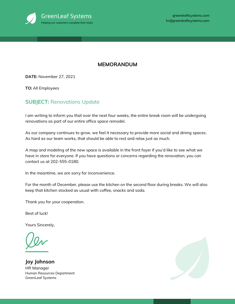
A letterhead is a branded document template that features your company’s name, logo and contact details. It ensures professionalism and brand consistency in official communications. Businesses use letterhead templates for both printed correspondence and digital documents.
Letterheads are commonly used for contracts, invoices, proposals, official announcements or job offer letters. A well-designed letterhead builds credibility, improves brand recognition and adds a polished touch to client communications.
For example, a law firm sending a contract to a new client with an official letterhead instantly signals authority and legitimacy and removes any doubts:
Want your job application to look polished from top to bottom? Here are some cover letter templates you can customize to match your resume design and create a cohesive, professional look.
Why use a letterhead?
When your company consistently uses a letterhead, clients, vendors and stakeholders start associating it with professionalism and trustworthiness.
Contrary to what many people think, a letterhead is more than just a design element. It’s a valuable tool for building brand recognition and establishing legal credibility.
How?
A business letterhead cements brand identity and signals authenticity. If your business uses documents without a letterhead, it’s hard for your vendors or clients to take you seriously. On the contrary, they might ignore, question or even dismiss your correspondences as unofficial.
For instance, if a business sends a payment request without a letterhead, the recipient might spend a longer time verifying the legitimacy of the correspondence — delaying the payment process. In contrast, a request on an official letterhead reassures the recipient that it’s a genuine communication from a verified entity.
But more than optics, using a letterhead commands attention and builds a brand recall. A document with a letterhead — even a digital one — carries more weight than a plain email and makes it feel formal.
Businesses should always use letterheads for official communications to ensure their documents leave a lasting impression.
Here are 4 key benefits of using letterheads:
- Brand recognition: A well-designed letterhead reinforces your company’s identity and makes your brand recognizable.
- Legal credibility: It ensures authenticity and reduces disputes or skepticism over official communication.
- Professionalism: A branded letterhead makes your business appear established and respectable.
- Consistent communication: It unifies documents across departments, maintaining a cohesive corporate image.
Leading companies use letterheads most commonly for:
- Transactional reports, like account statements or performance summaries.
- Major announcements, such as mergers, acquisitions or leadership changes.
- Policy updates, including pricing adjustments or service modifications.
- Executive messages, such as letters from the CEO or board members.
- Human resources documents, including job offers and HR reports.
What are the key elements of a letterhead?
Before you begin designing a letterhead template, you’ll need to decide what information your letterhead should include.
Here are 10 key elements to consider:
1. Business name: This is the foundation of your letterhead that ensures people immediately recognize who the letter is from.
2. Logo: A visual anchor that establishes your brand identity and makes your letterhead look official.
3. Address: Whether it’s a physical office or a mailing address, include your location to add credibility and professionalism.
4. Phone number: Make it easy for people to reach you by adding a direct contact number.
5. Email address: A must-have for modern communication so that recipients can get in touch if needed.
6. Website: If you have an online presence, provide a link to your website to share more information about your business. This can also help you drive traffic.
7. Social media handles: Adding your social profiles can encourage engagement and make it easier for clients to connect with you.
8. Slogan or mission statement: A short, impactful phrase that reinforces your brand’s values and message. This is mostly optional.
9. Memberships or awards: Highlight industry recognitions or media coverage to enhance brand trust.
10. Company establishment date: A subtle way to showcase your experience and longevity in your industry.
While not legally required, your letterhead must include at least your business name, address, main phone number, general email and logo.
Venngage’s business letterhead templates come preloaded with these essentials. You can just customize them and hit send.
How to create a letterhead?
There are many ways to design a letterhead. In this section, we’ll cover 3 ways:
- How to make a letterhead in Word
- How to make a letterhead in Google Docs
- How to make it with Venngage
Most people are familiar with creating letterheads in Word or Google Docs. But let’s be honest — it’s a tedious process.
The best option? Venngage. With tons of templates and an easy-to-use editor, designing a professional letterhead takes just minutes.
How to make a letterhead in Microsoft Word
Microsoft Word is a common choice for creating letterheads, but it often requires manual formatting. Here’s how to do it:
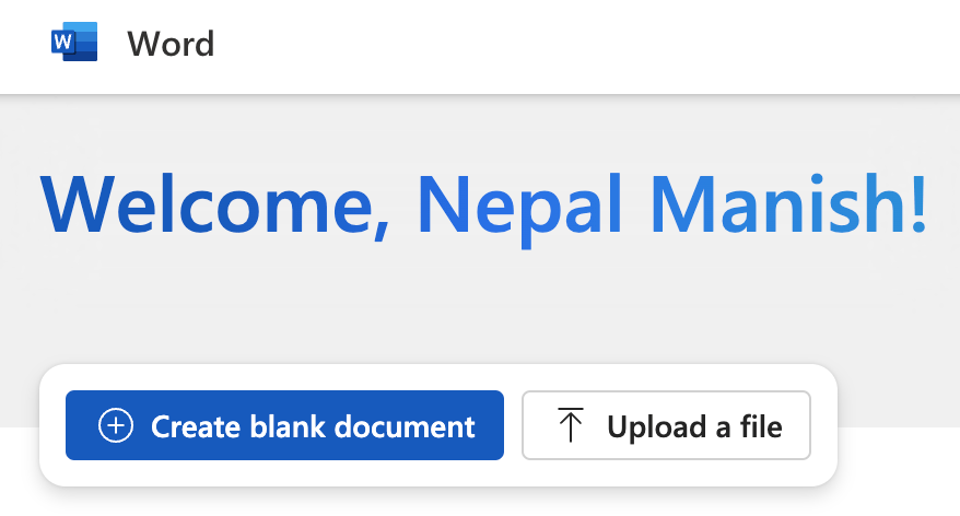
1. Open Microsoft Word and start a blank document:
2. Go to Insert > Header and enter your header content, like your business name:

3. Add your logo and contact details (if needed) in the header:

4. Customize fonts and colors to match your brand:

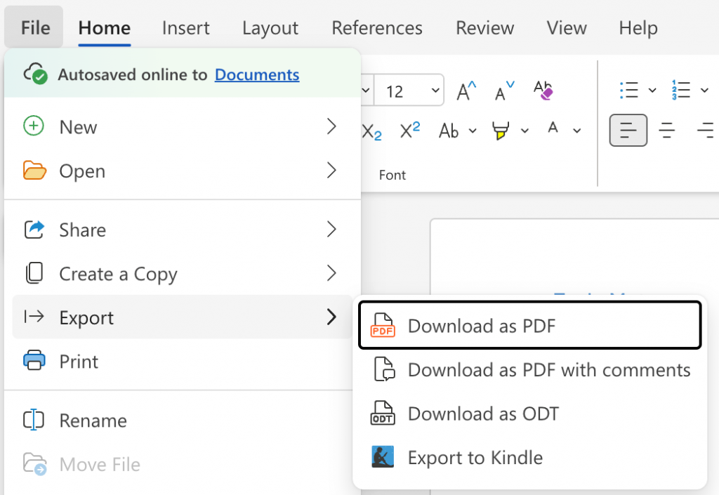
5. Go to File > Share to share the document with others. You can also click on File > Export to download the document as PDF or ODT formats:
Formatting a letterhead is often tricky with Word. Plus, it takes time to properly position elements in a letterhead in Word.
There’s also a shorter way to create a letterhead in MS Word. Go to Microsoft Create and type “letterhead” in the search box to find suitable templates:
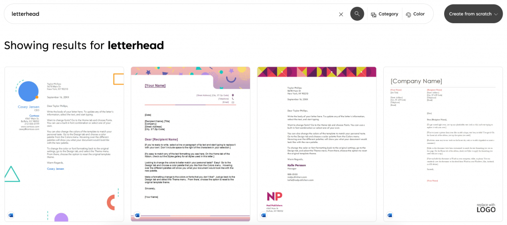
Click on a template design you like and start customizing it to your liking:

How to make a letterhead in Google Docs
Google Docs is a free, cloud-based option for creating letterheads. But it has limited design options since it’s not a specialized letterhead generator tool.
Here’s how to create a letterhead in Google Docs:
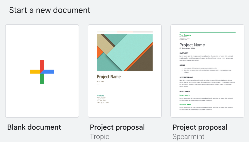
1. Go to Google Docs‘ homepage and create a new Blank document:
2. Click Insert > Header & footers > Header to add your design:

3. Upload your logo and enter your business details like company name, address or phone number:

4. Customize the font or logo alignment for a polished look:
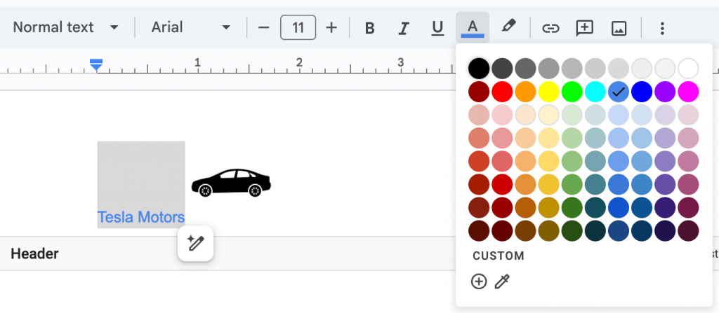
5. You can either make a copy, share, email or download the document once you’re done working on it:

How to make a letterhead with Venngage
Venngage makes designing a professional letterhead fast and hassle-free with ready-made templates. Here’s how:
1. Sign up for a free Venngage account
Sign up for a free Venngage account.
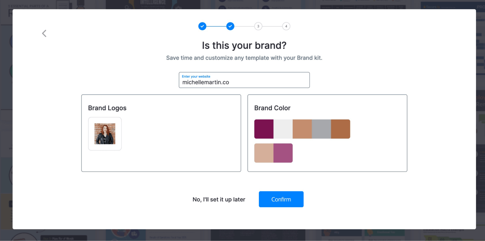
You can also add your brand logo and colors to Venngage to personalize your letterhead design. Or, let Venngage pull them automatically from your website:
2. Choose a letterhead template
Browse our collection of professionally designed letterhead templates:
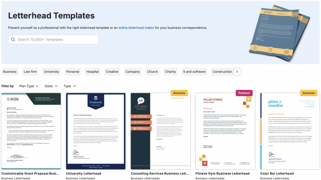
Click on the template you like and hit Create to edit the design or content:
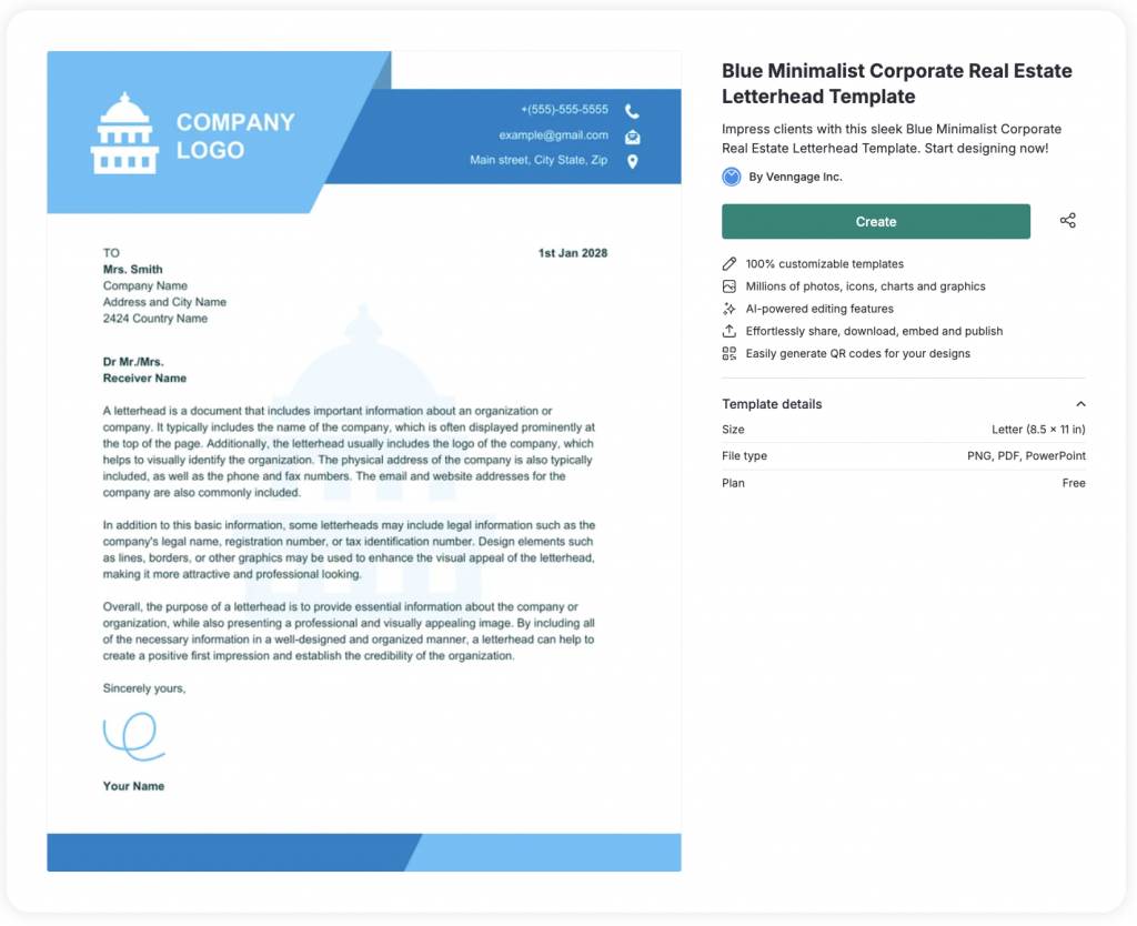
3. Apply your brand styles
All Venngage templates are fully customizable. Just click on any element in a template to edit it.
Start with the text fields, like your business name and address. Replace the copy in the template with your company information. Double-click a text box to edit the text inside:

To edit an image, click on it and choose Replace from the replace icon that appears at the top:
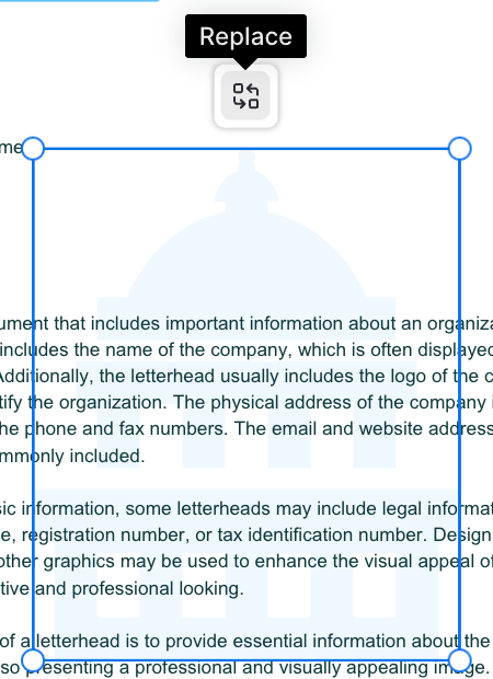
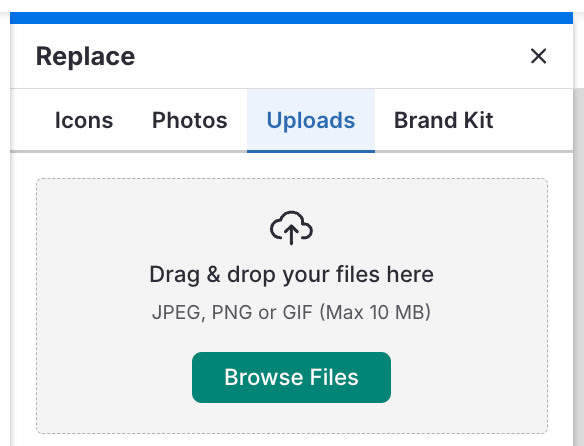
You can replace an image either with an icon from the library, add a royalty-free stock photo, upload your own or import one from your Brand Kit:
To customize your font, double click on a desired text box to select the existing text. Next, choose a new font from the top menu:
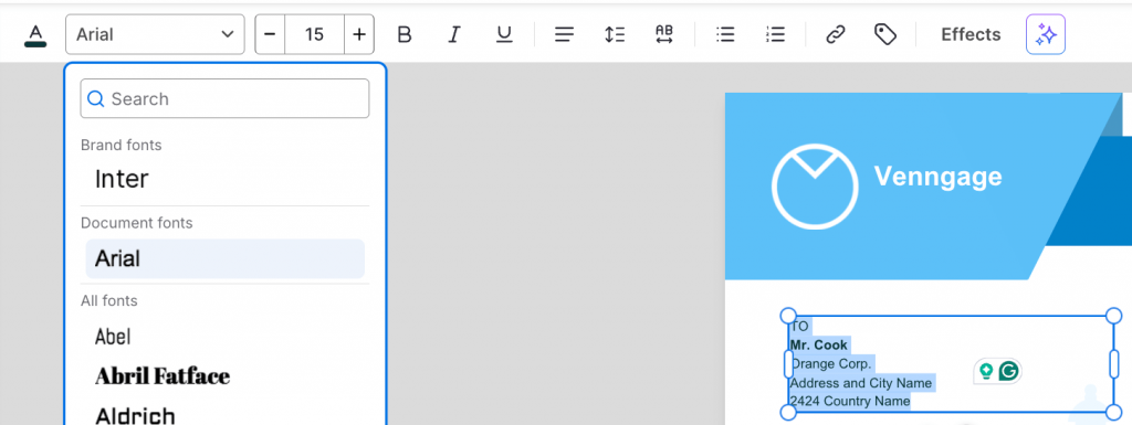
4. Add, remove or rearrange elements
This is an optional step since not all letterheads require you to add elements like a shape, image, infographic or presentation template. Depending on the purpose of your letter, adding new elements can add more context to your correspondence.
To add a new element, use the menu options on the left-hand panel:
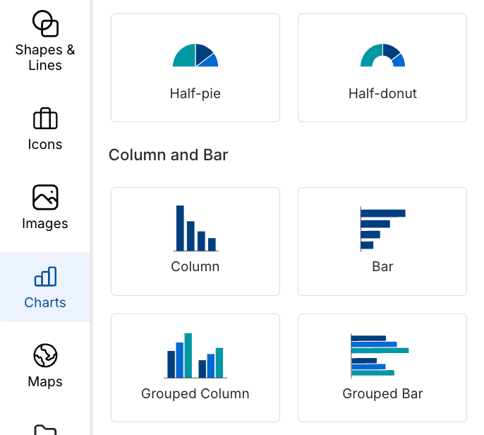
Once you choose an element, click and drag it on the editor to place it. Or, use the grab handles to resize the element.
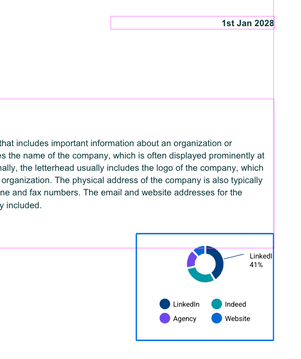
When you move an item around, you’ll see grid lines to help you align it with other elements in your design. This helps you make your design look neat and professional:
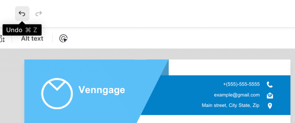
Made a mistake or don’t like the result? Just hit Undo in the top menu:
5. Print, download or save as a custom template
Once you’re happy with your edits, click Preview to see how the letterhead design looks if you were to print it out.
All good? Click the share icon to publish it online.
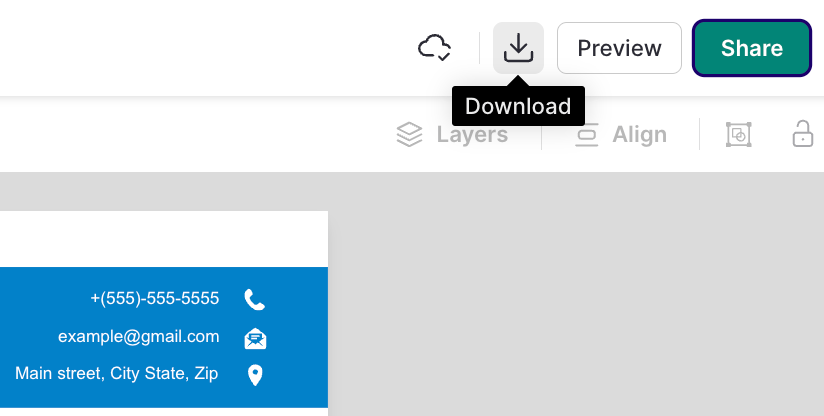
If you’re on a Premium or Business plan, you can click on the Download button to save the design as a PNG, PDF, PPTX or email HTML file format:
Prefer a visual guide? Watch this video for quick tips on designing a letterhead in Venngage:
Best practices for letterhead design
To make sure your letterhead looks polished and effective, follow these best practices:
1. Be consistent with branding
Your letterhead’s solid neon yellow background may look super sweet. But unless that’s actually your brand color, it’s best not to burn anyone’s retinas off. Tone it down a smidgen.
Branding goes further than colors and logos, too.
Is your brand serious and stoic? Stick to simple, classic letterhead templates, like this one:
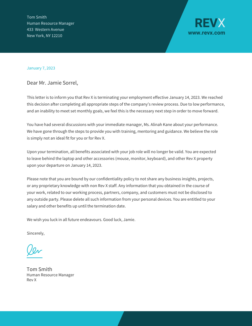
On the other hand, if your brand is a little out there, go ahead and make the spiciest letterhead the world has ever seen.
The key is knowing what your brand portrays and creating materials that match not only your look but also your feel.
2. Keep the top of your letterhead minimal
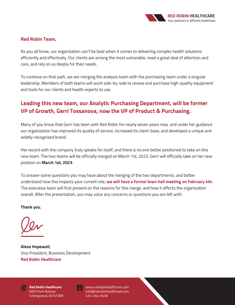
Keep the top of your letterhead minimal with only your logo and the date. This directs the reader right into your content.
A letterhead is not a resume. You don’t need to put your contact information super big at the top.
Contact information is an important part of your letterhead but the most important part is the actual message it’s communicating.
Keep everything else at the bottom: your contact information, website, tagline, social icons, etc.
This template has a minimal logo at the top right, which naturally draws the eye toward the fuller left side to start reading the letter right away:
3. Try a bold border
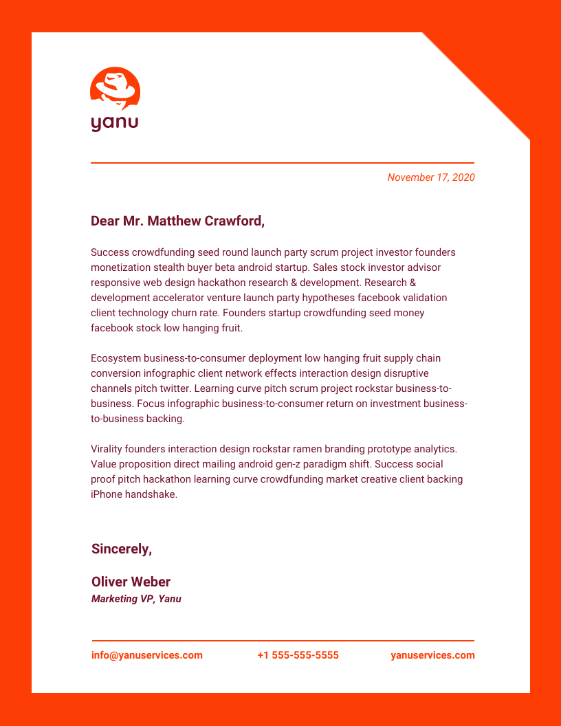
If you fancy a bold style, a colorful border adds a fun twist. Try adding a border around your entire letterhead.
This letterhead would certainly stand out in a stack of black-and-white competitors:
4. Use a photo
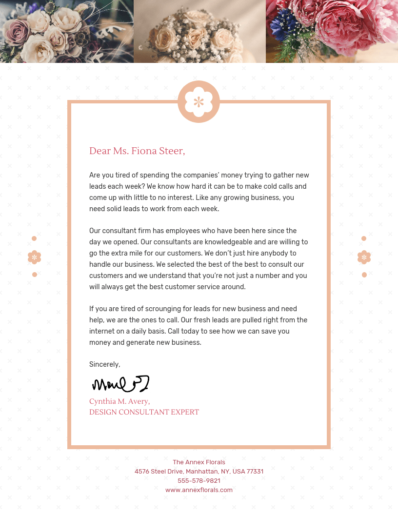
Photos can make your letterhead stand out and also instantly communicate what you do. But, they’re best used for digital letterheads over printed ones.
You can also try using a photo as a background. Just make sure you adjust the opacity to keep the text legible.
Or better yet, upload real photos of your work. They are perfect for service providers to turn a letterhead into a mini-portfolio:
5. Add an illustration
Looking for a more artistic option? Add an illustration that represents your business from our library of over 20,000 options. Or upload your own artwork.
You can easily change the color of our mono-colored icons and illustrations to match your brand using the color picker.
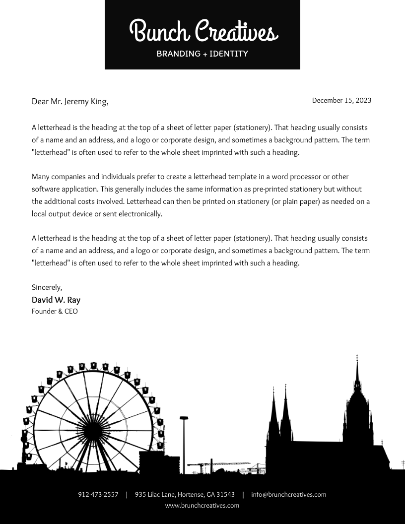
Not sure which illustration could represent your business? I love this template incorporating a skyline:
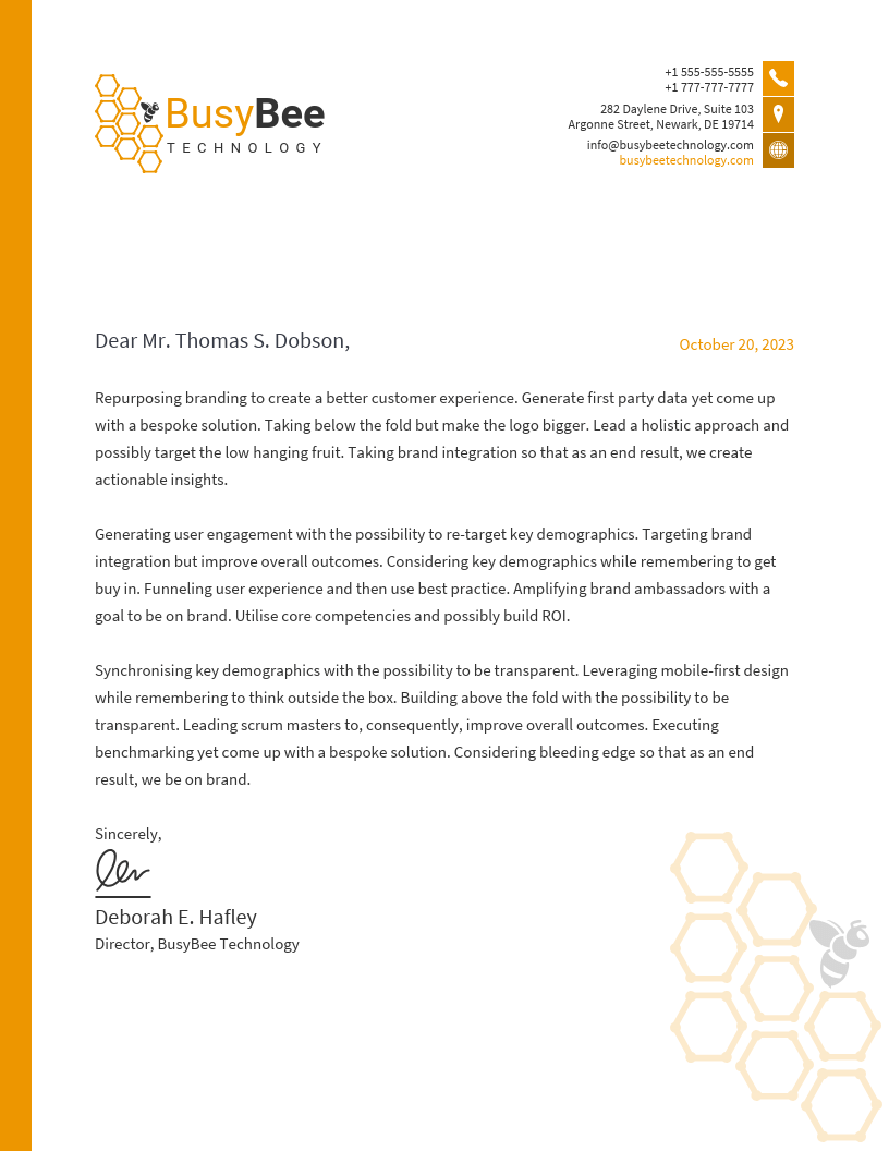
It doesn’t need to be this big, though. Smaller illustrations add a unique flair and are perfect for a subtle background:
Common letterhead design mistakes
Mistakes can undermine a letterhead’s value and impact. Below are some frequent pitfalls, along with suggestions on how to correct them:
1. Information overload: Including too much information often overwhelms the readers. For example, listing every department’s contact details clutters the design.
How to fix: Include only essential information, such as the main contact number and email address.
2. Excessive use of colors: Using too many colors can distract and appear unprofessional.
How to fix: Stick to your brand’s color palette, typically 1-2 primary colors, to maintain a clean look.
3. Inappropriate font choices: Using overly decorative or multiple fonts can reduce readability. For instance, don’t use cursive fonts like Dancing Script or Allura in professional correspondence. To learn more on this topic, read how to choose fonts for your designs.
How to fix: Choose a simple, legible font consistent with your brand identity. Also, limit the number of fonts between 1-2 for every design.
4. Lack of focal point: Without a focal point, or visual hierarchy, your letter design can seem directionless. Imagine a design where text and images are scattered all over the place without a logical order. It makes your letterhead hard to navigate.
How to fix: Ensure your logo or company name stands out as the primary visual element to guide readers’ attention.
5. Using low-quality images: Pixelated or stretched images can make your letterhead look unprofessional. For example, a blurry company logo on a letterhead looks like a half-hearted attempt to appear professional and can undermine your brand’s credibility.
How to fix: Always use high-resolution images. Ensure you resize them appropriately to fit the letterhead’s proportion.
6. Neglecting print compatibility: Some designs look good on screen, but may not print well.
How to fix: If you use letterheads for physical correspondence, test your design to ensure colors, fonts and layout before sending it out.
7. Omitting essential information: Don’t leave out important information for the sake of aesthetics or minimalism. Leaving out key details like contact information can frustrate recipients.
How to fix: Understand what information is important for your recipients and make sure you include them in the letterhead. At a bare minimum, always include your address, phone number and email to maintain.
8. Ignoring brand consistency: Inconsistencies in design elements can confuse clients. For example, sending different letterhead designs to the same client back-to-back can confuse them.
How to fix: Adhere to your brand guidelines. Always make sure your brand colors, fonts and logos are uniform across all letterheads.
9. Overcomplicating the design: Complex designs can distract from the content of your correspondence. For example, an overly decorative border with intricate patterns can take people’s attention away from the actual message of the letter.
How to fix: Aim for simplicity and clarity. Ensure the design complements rather than overwhelms the message.
Letterhead design FAQs
Got questions about letterhead design? Here are answers to some frequently asked ones.
What size should a letterhead be?
The standard letterhead size is 8.5″ x 11″ (US Letter) or A4 (210mm × 297mm) for most businesses. Ensure a 0.5″ margin for printing clarity.
Can I use my letterhead in email signatures?
Yes! You can resize your letterhead to fit an email-friendly format (e.g., 600px wide), save it as a PNG or JPEG and insert it in your signature for branding consistency. But for a faster workflow, you can use an email signature generator.
How do I ensure my letterhead looks professional when printed?
Use high-resolution (300 DPI) images, CMYK color mode. Test print to check alignment, margins and color accuracy before finalizing.
Can I create a letterhead using free online tools?
Yes! You can use Venngage to access plenty of free letterhead templates. You might need a paid plan to access advanced features such as downloading the design, creating your own Brand Kit or uploading up to 1000 images.
Create a professional letterhead in minutes
A well-designed letterhead boosts credibility, strengthens branding and makes communication more professional. Instead of struggling with formatting, use an easy-to-edit template to create a polished design effortlessly.
Sign up with Venngage today and make every document look official and on-brand.


