


We bet that when we say graph, the first thing that you would probably think of is: math.
Even if numbers and math aren’t your favorite, graphs can do much more than crunch data. They show how things relate, making choices clearer, especially since about 65% of people learn best through visuals.
As Henry D. Hubbard once put it, “There is a magic in graphs. The profile of a curve reveals in a flash a whole situation—the life history of an epidemic, a panic, or an era of prosperity. The curve informs the mind, awakens the imagination, convinces.”
Creating a graph doesn’t have to be intimidating either, as there are many ways for you to create one online. You can use a wide range of tools, for example, Google Slides, Microsoft PowerPoint, or a free online graph maker.
Let me walk you through on how to make a graph on Google Slides, and how you can use easy to use easy chart and graph templates to your advantage.
Click to jump ahead
- Step-by-step guide to creating a graph on Google Slides
- How to make a graph in Venngage?
- Final thoughts: creating a graph with Google Slides vs Venngage
Step-by-step guide to creating a graph on Google Slides
To create a Graph in Google Slides”, you can do the following steps:
- Step 1: Open Google Slides
- Step 2: Insert a Chart
- Step 3: Access Google Sheets
- Step 4: Enter Your Data in Google Sheets
- Step 5: Customize the Graph
- Step 6: Add Titles and Labels
- Step 7: Final Adjustments
- Step 8: Save and Present Your Slides
Let’s dive deeper with a step-by-step explanation to help you create a graph easily in Google Slides. After all, as Ben Shneiderman reminds us, “The purpose of visualization is insight, not pictures.”
Step 1: Open Google Slides
Google Slides is an online tool by Google that can help you create a graph, amongst other things. To start creating your graph on Google Slides, you will first need to access it.
1. Access Google Slides:
- On your web browser, go to Google Slides.
- Sign up for an account if prompted or needed.
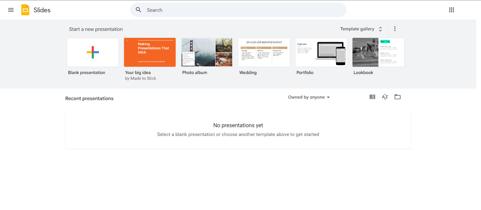
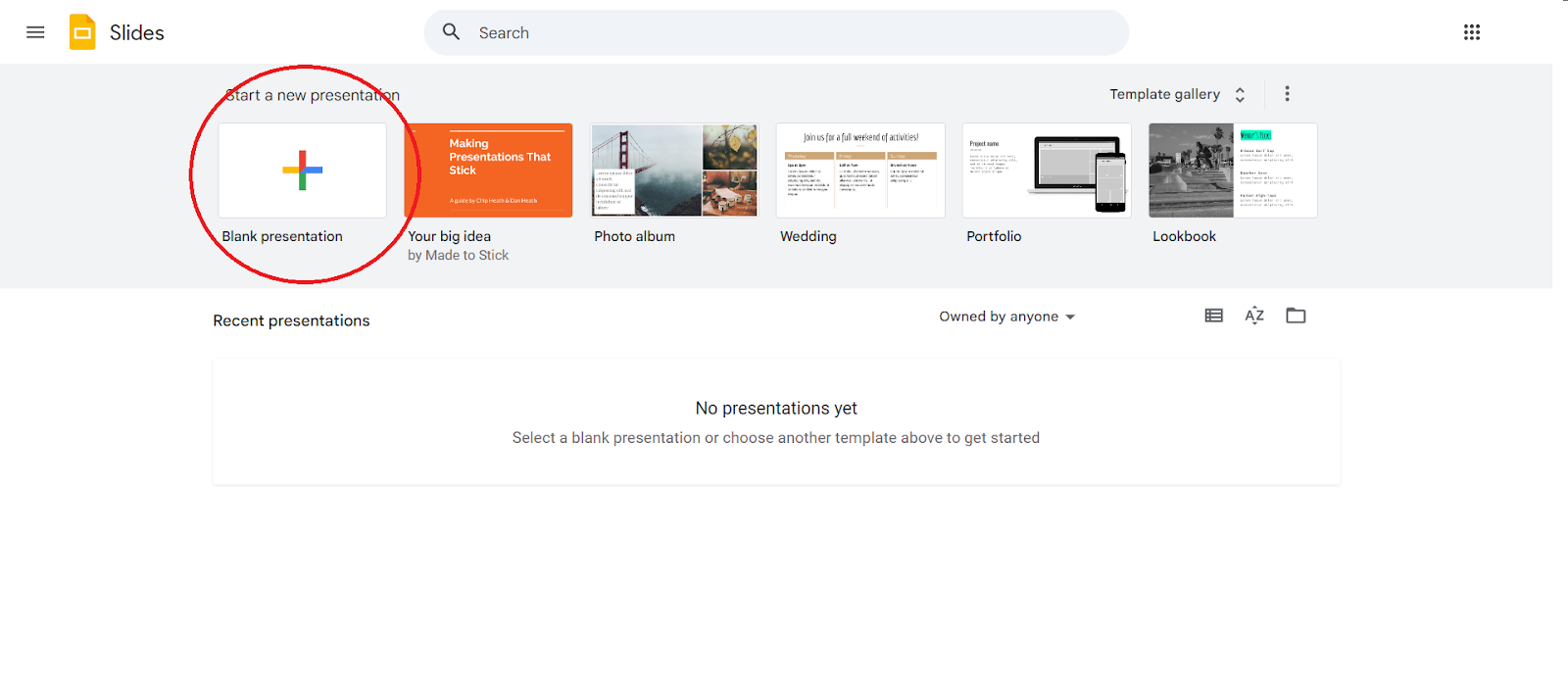
2. Create a new presentation:
- Click on ‘Blank Presentation’ with the “+” button to start a new presentation.
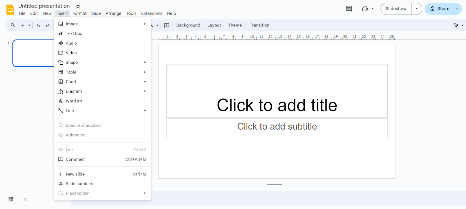
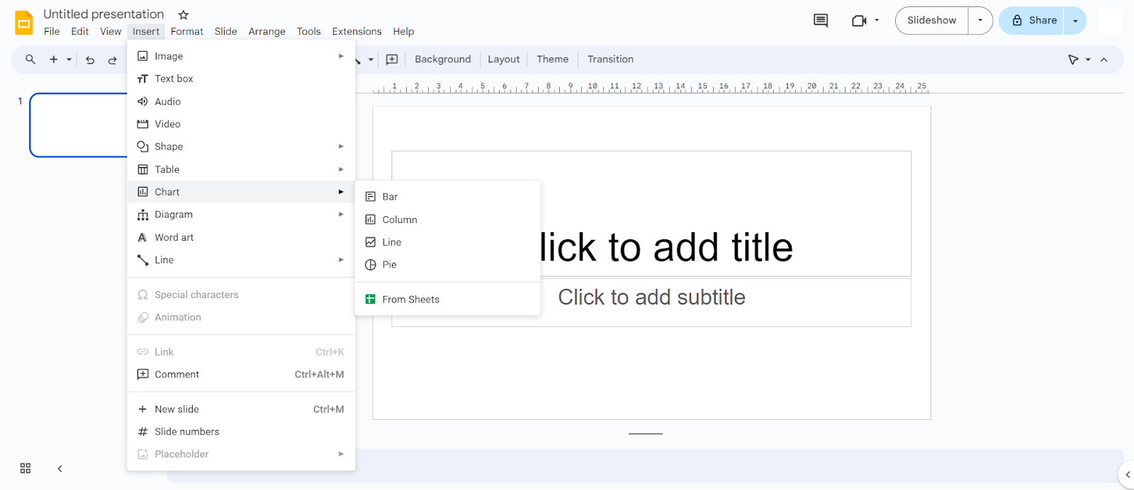
Step 2: Insert a chart
Once you have opened a new presentation, the next step is to dive into adding a new chart into your slide.
- At the top of your presentation, go to ‘Insert’.
- At ‘Insert’, you will see ‘Charts’ in the dropdown menu.
2. Select chart:
- Select ‘Charts’ from the dropdown menu.
- Choose between the different types of chart available
- You can choose a chart that suits you best
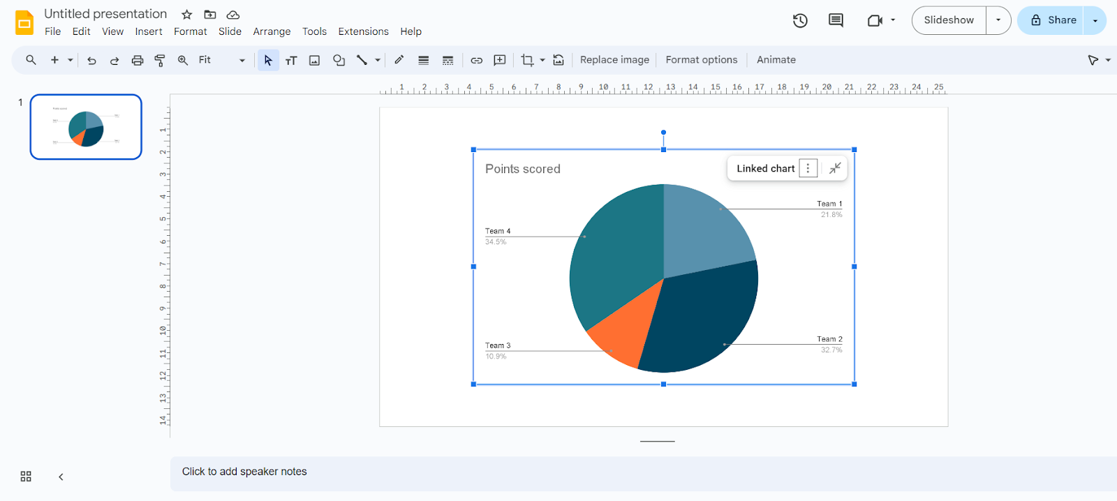
Step 3: Access the Google Sheets
Once you have chosen your desired chart, a Google Spreadsheets will be created.
1. Linked spreadsheet:
- When a Google Spreadsheets is created, it will be linked to your chart.
- This is to make inputting your data and having it reflected on the charts easier.
2. Open source:
- To edit your Google Spreadsheets, first click on your chart.
- You will then see ‘Linked chart’. Click on the menu icon next to it.
- Choose ‘Open Source’.
- This will lead you to your linked Google Sheets
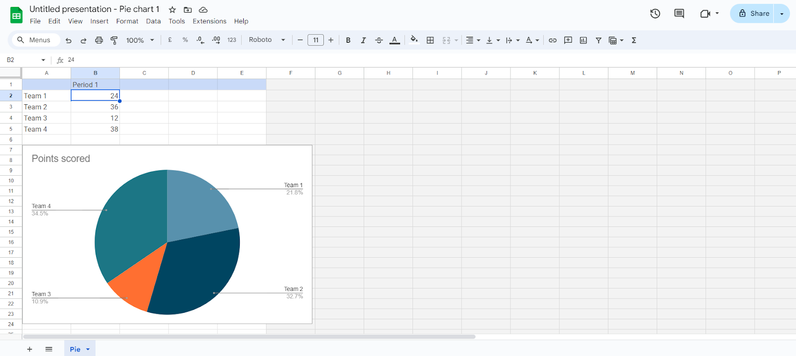
Step 4: Enter your data in Google Sheets
Now, it’s time to start inputting your data in order to build your graph or chart.
1. Input data:
- Above the chart, you will see a table.
- Use this table to input your data.
- Use appropriate column headers and ensure data is correctly formatted
- This is a crucial step in making sure that the data is accurately represented on your graph.
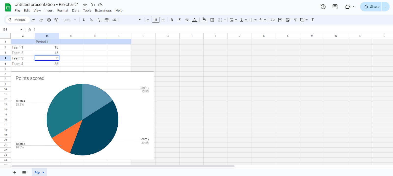
2. Automatic updates:
- Any changes or updates that you make within your spreadsheet will automatically reflect on your graph in Google Slides. Users can create documents up to 40% faster using Google Docs compared to traditional word processors.
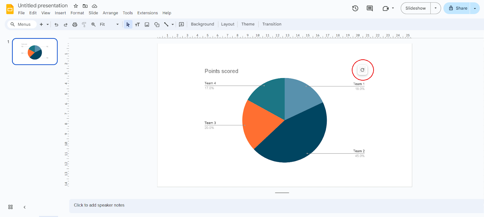
- If it is not automatically updated, click on the refresh button on your graph in Google Slides to apply the changes.
Step 5: Customize the graph
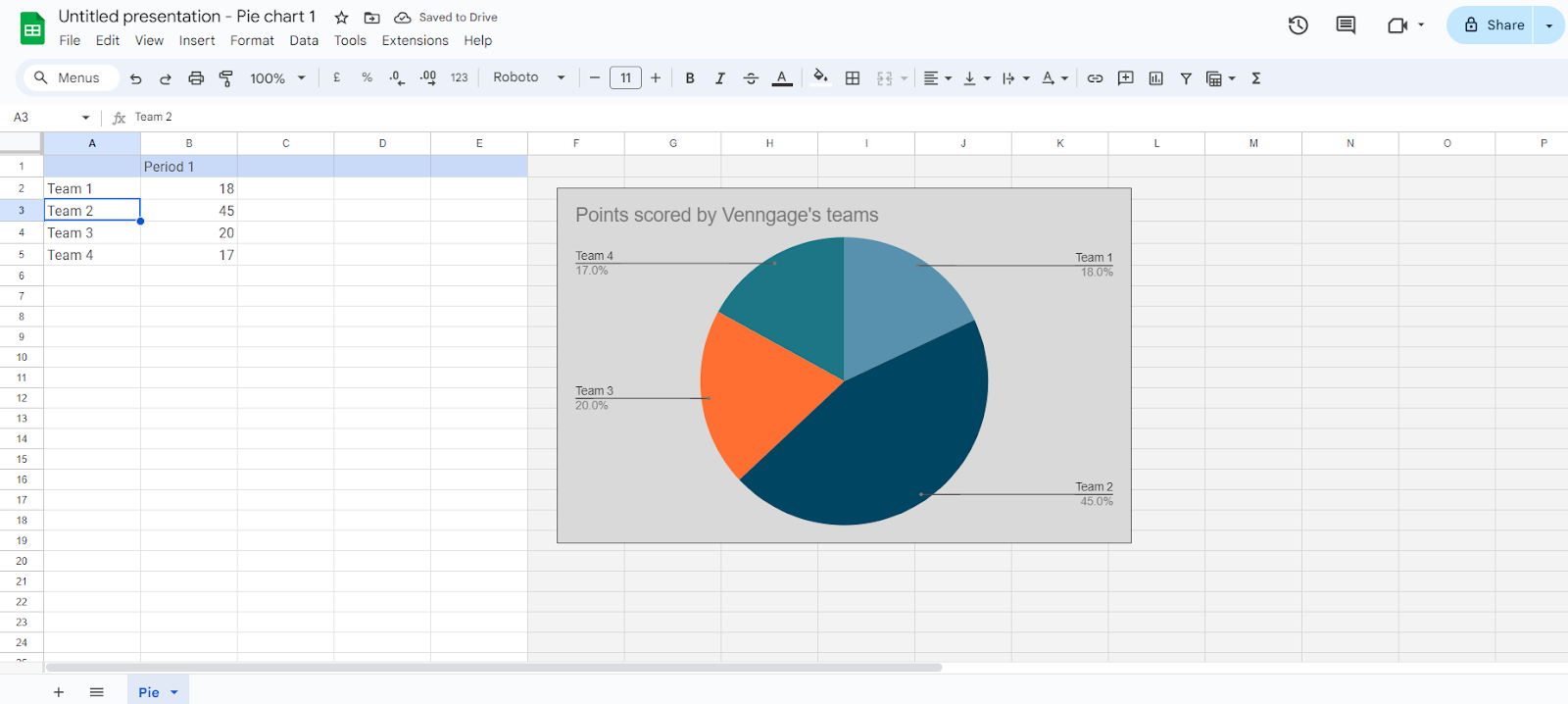
You’ve added the numbers for your chart, now it’s time to customize. Go to your spreadsheet to start.
1. Select the chart:
- Double click on your chart to select it.
- This will open your ‘Chart Editor’.
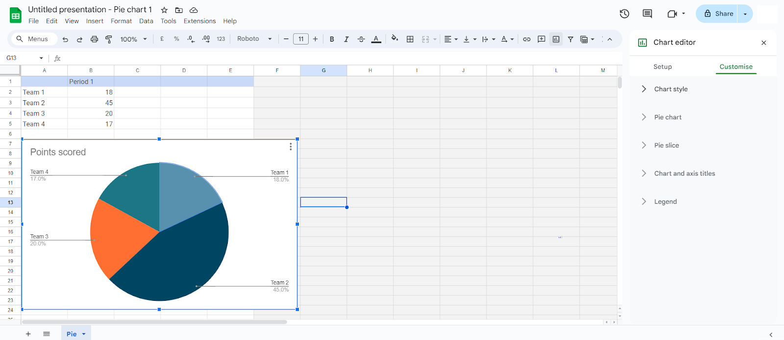
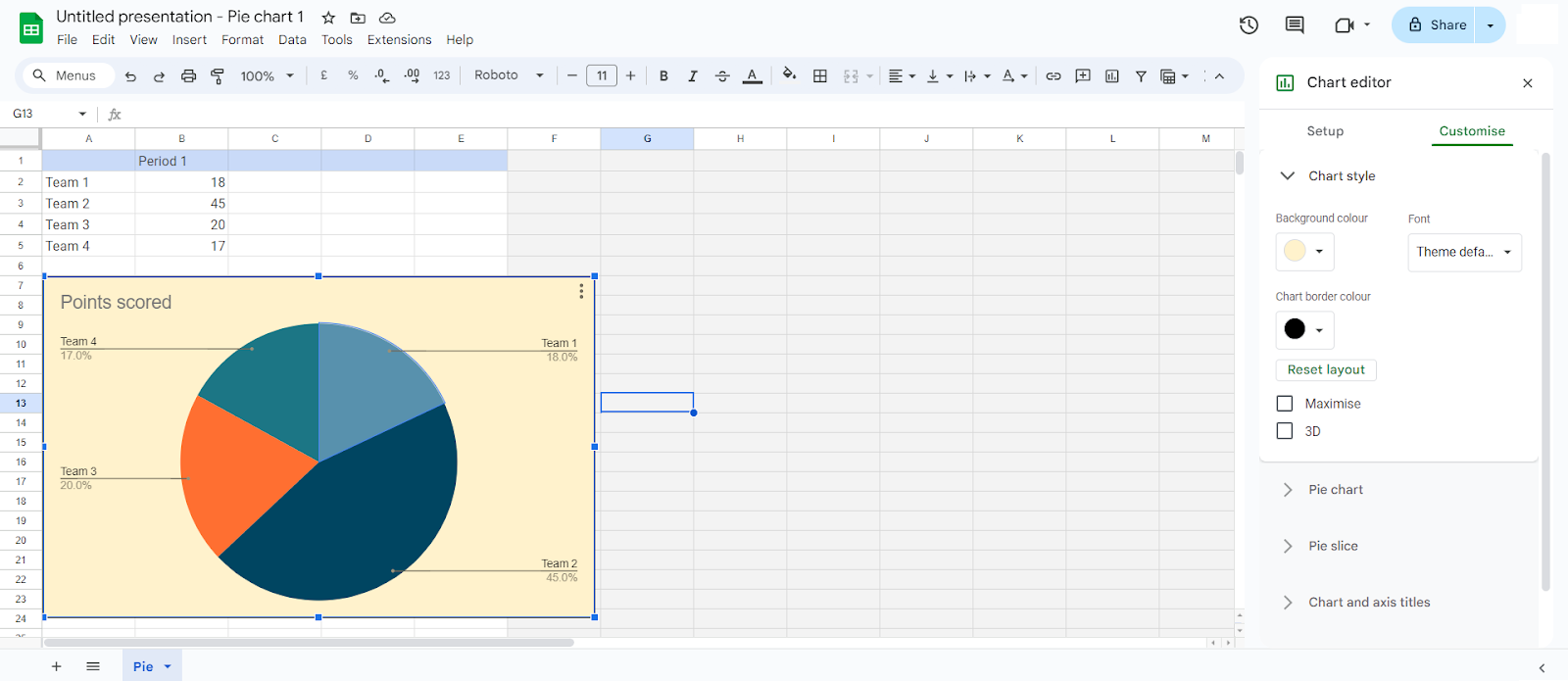
2. Chart editor:
- You can use the chart editor to edit and adjust chart type, style, and colors.
- For an example, you can choose ‘Chart Style’ to customize your overall chart look.
- You can do the same for each part of your graph at the ‘Chart Editor’.
3. Modify data ranges and titles:
- You can change data ranges for your chart to add, or remove some data.
- Double click on your chart, and go to ‘Setup’.
- Select and input your range.
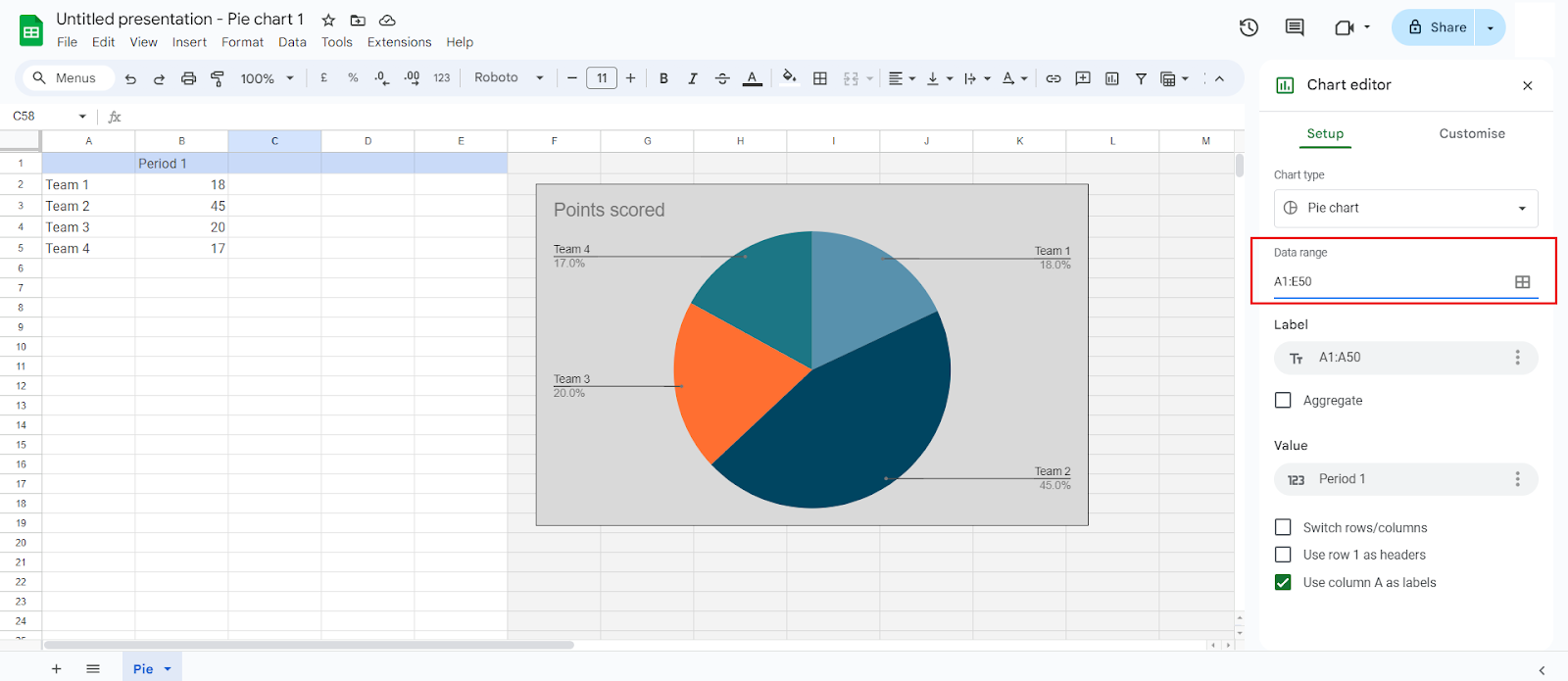
- Here, you can also add or edit your graph title for more clarity:
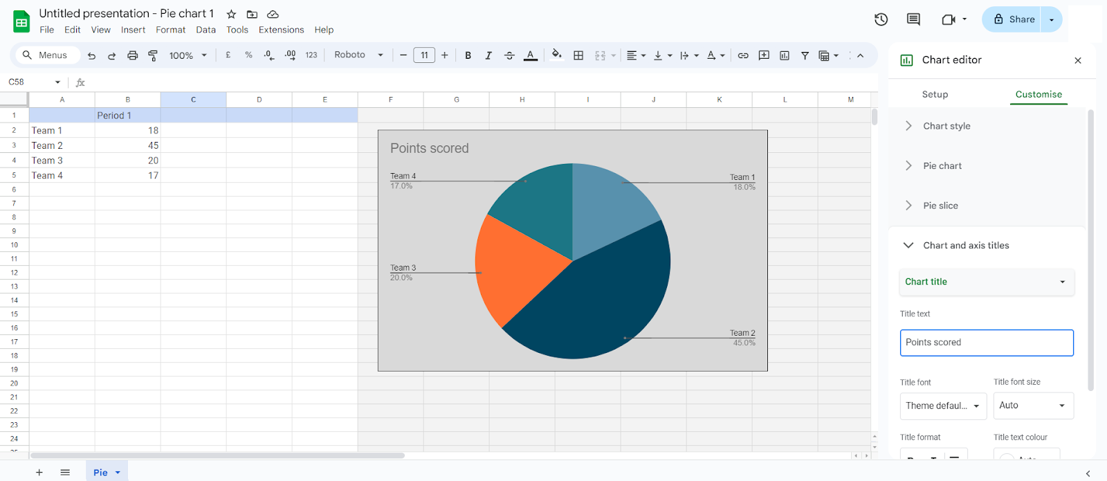
Step 6: Add titles and labels
To further customize your graph, you can choose to add titles and labels. Clear and descriptive titles and labels are crucial in making the chart more informative and easier to interpret.
Incorporating clear, descriptive titles for graphs can enhance understanding by up to 60% compared to unlabeled graphics. Here’s how you can edit or add titles and labels to your chart:
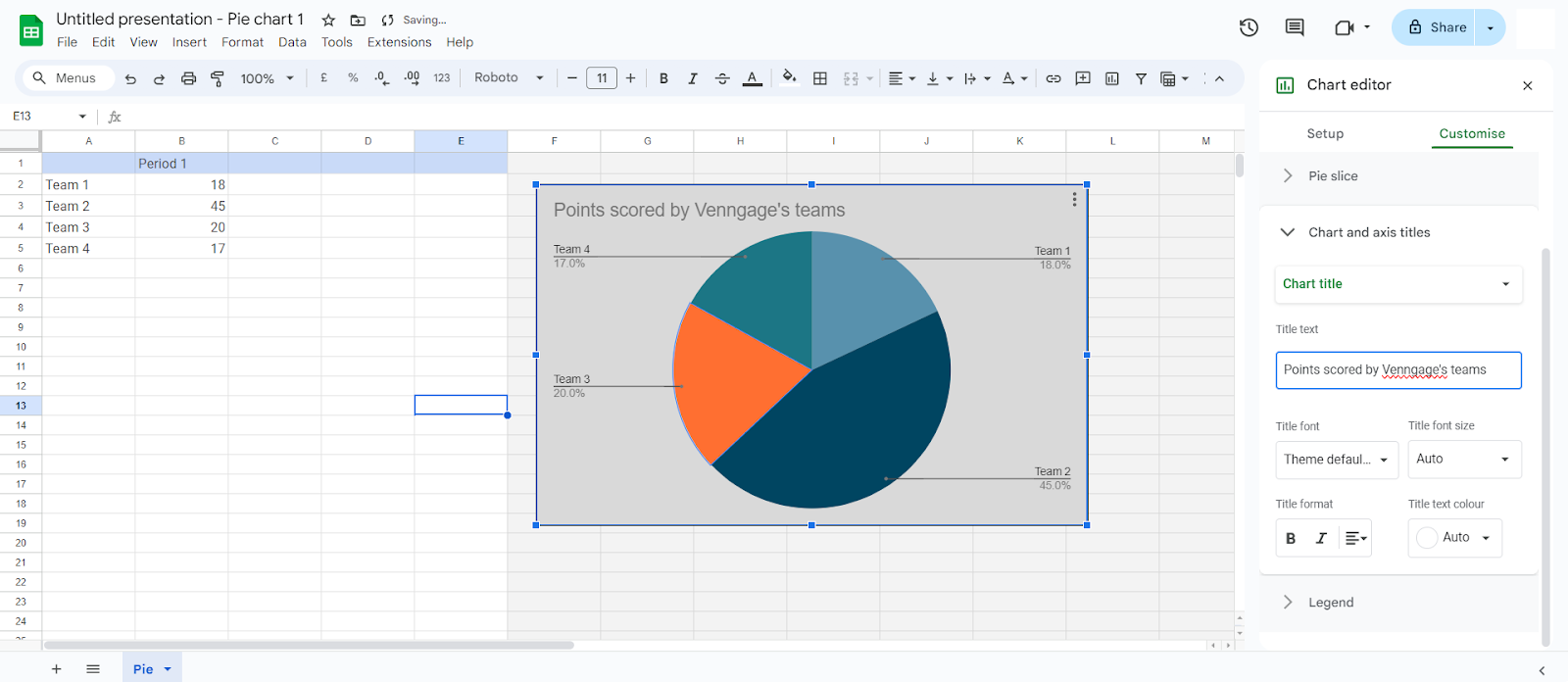
1. Chart title:
- Double click on your chart to access the ‘Chart Editor’ panel.
- Put in your new chart title.
- Make it clear and easy to understand.
2. Axis titles:
- To edit the chart’s Axis title, double click on the your data cell, and change your axis title accordingly:
Step 7: Final adjustments
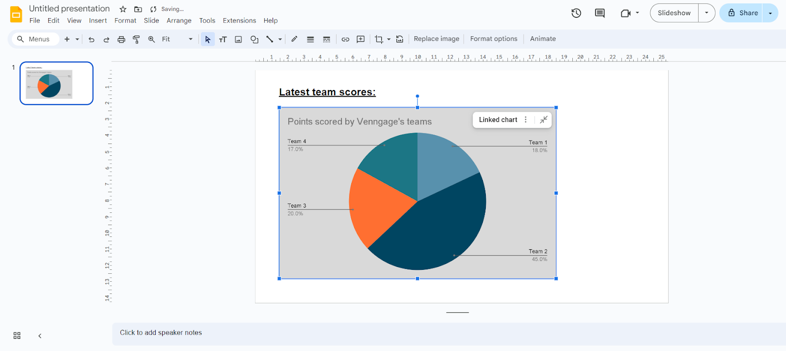
Your graph is almost complete. You’ve keyed in all the details, selected your colors, and renamed your chart. But you’re not done yet, make some final adjustments to your graph to ensure that everything is in order.
1. Resize and reposition:
- For a clean look, you can reposition and resize your chart in your slide.
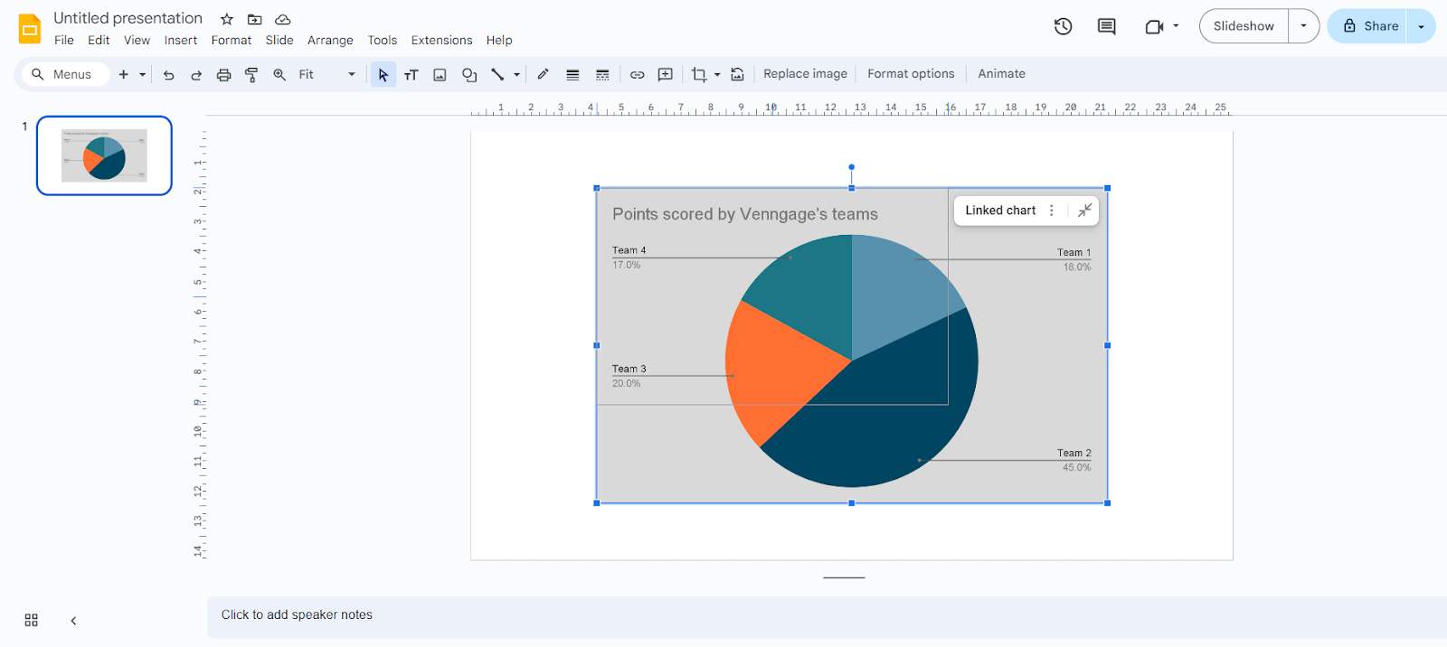
2. Align with slide elements:
- If you have other elements in your slide, align your chart properly in order to create a professional and clean look.
For a deeper look at how AI supports data visualization in the classroom, check out our full guide on AI graph tools for students and educators.
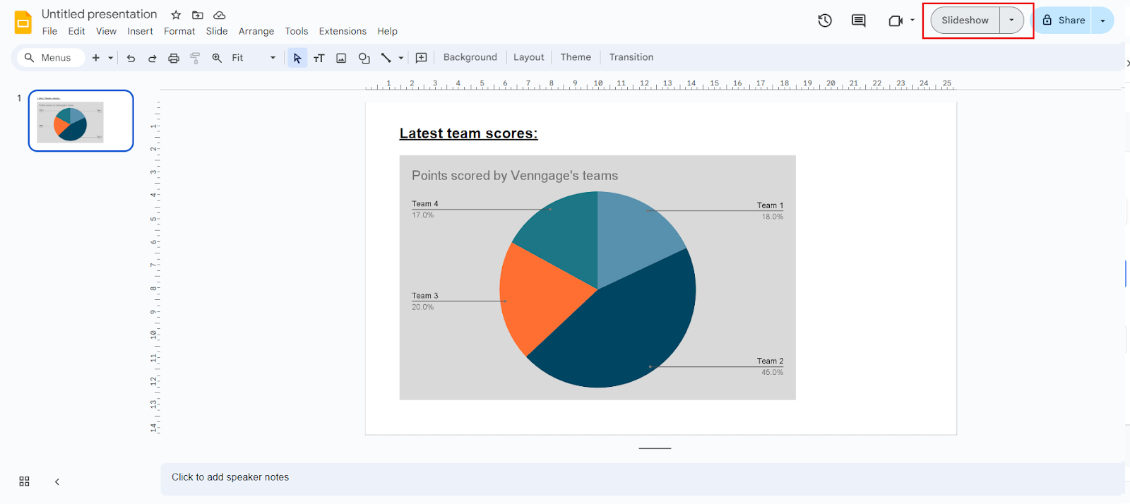
Step 8: Save and present your slides
Once you’ve finalized your graph, you can save and present your slides.
1. Automatic saving:
- Google Slides will automatically save your slides as you edit and make any changes in real-time.
- This feature ensures that no work is lost.
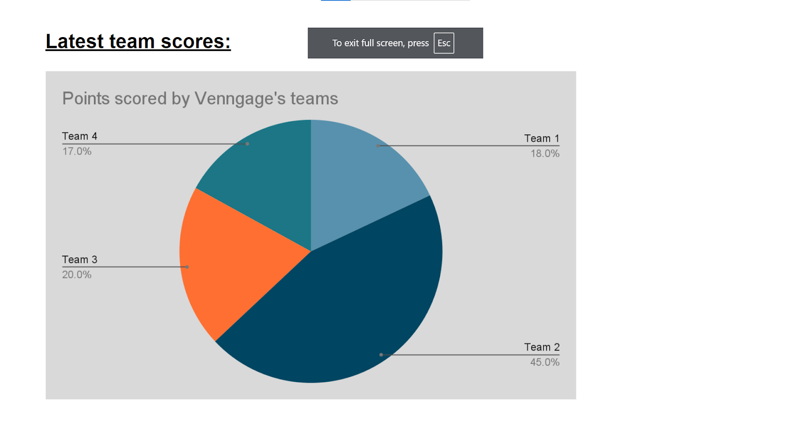
2. Presenting:
- To present your graph, click on ‘Slideshow’ to start.
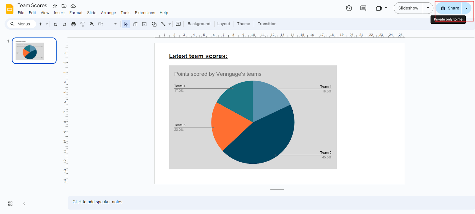
3. Sharing:
- You can also choose to share your graph with your friends, or colleagues.
- Click on ‘Share’, and insert their email addresses.
- Next set their permissions, and then proceed to share your slides.
- You can also choose to copy the link of your presentation and share it out.
And you’re done! You’ve made a graph on Google Slides and learned how to save, present, and share it.
Let’s take a look at how we can make this process smoother by using a free online graph maker.
Want even more options? Check out this roundup of the top free graph makers that actually make data visualization simple. Or if you want a deeper dive into free AI graph tools, check out this in-depth comparison.
How to make a graph in Venngage?
Venngage is a convenient online designing tool that helps you create brochures, posters, graphs, and more easily.
To start making a graph in Venngage, first head to Venggage on your browser to sign up for a free account. Signing up allows you to save your designing projects, and access them whenever you like to make changes or updates.
Then, you can use Venngage’s free online graph maker to start designing your graph, or you can pick a creative chart & graph template and start there.
All you have to do next is to pick a template that would fit your purpose best, and start editing! Once you’re done, you can save and export your project easily as well.
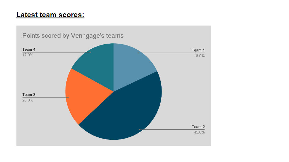
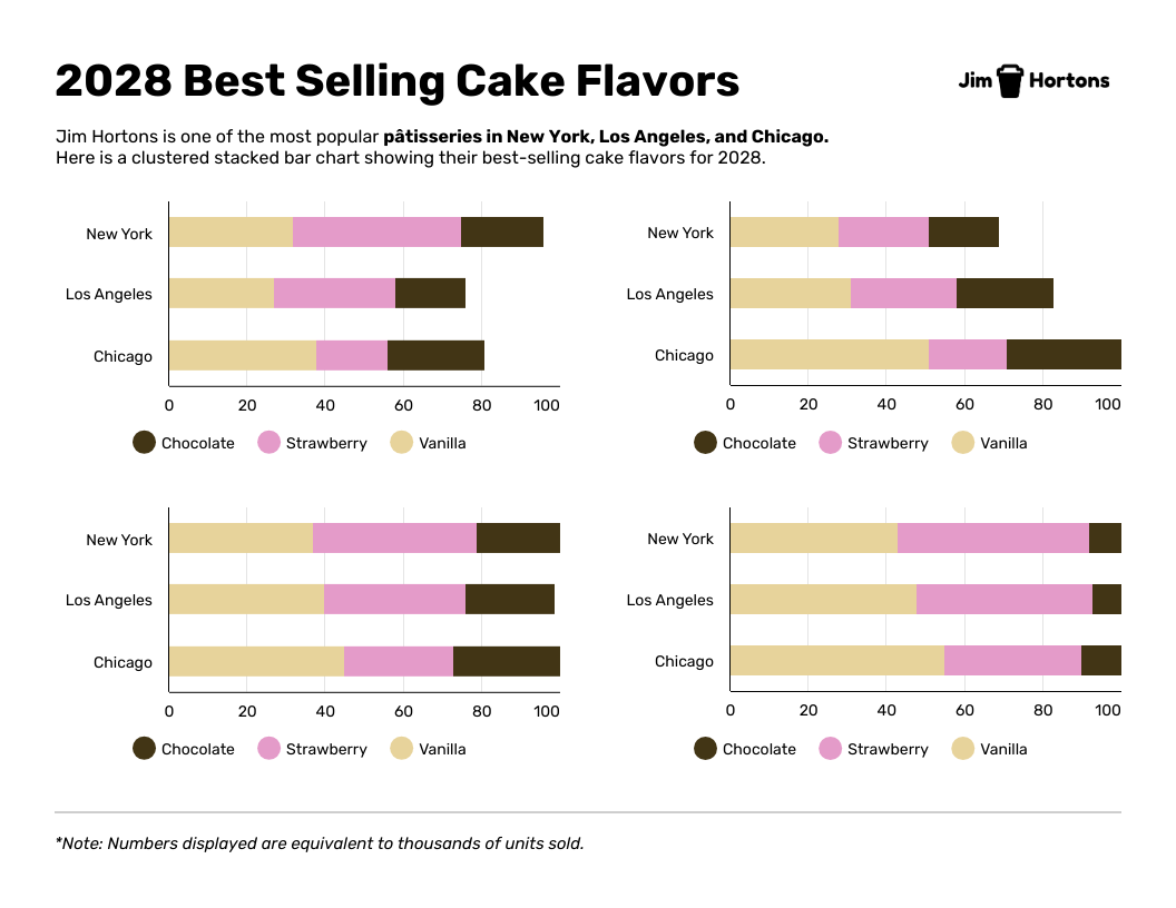
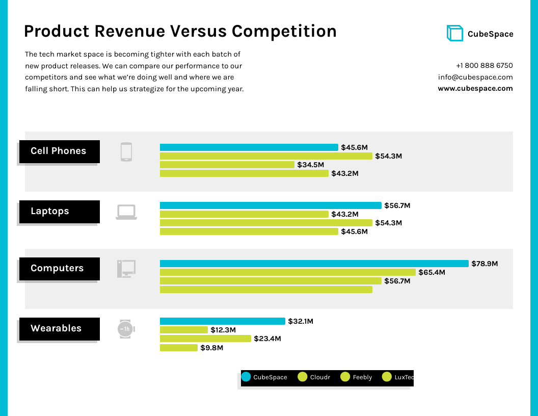
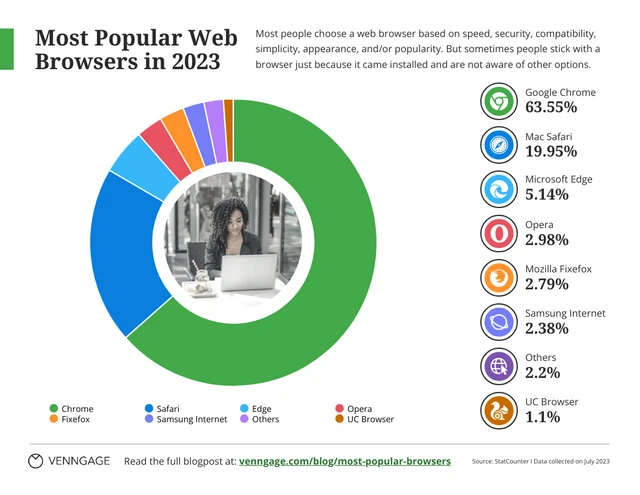
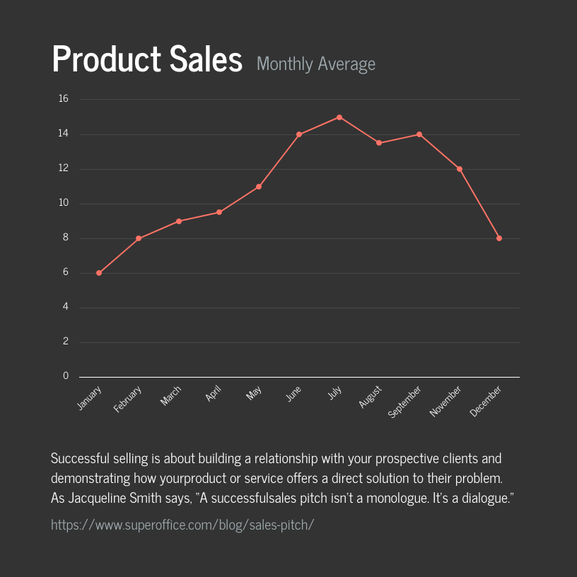
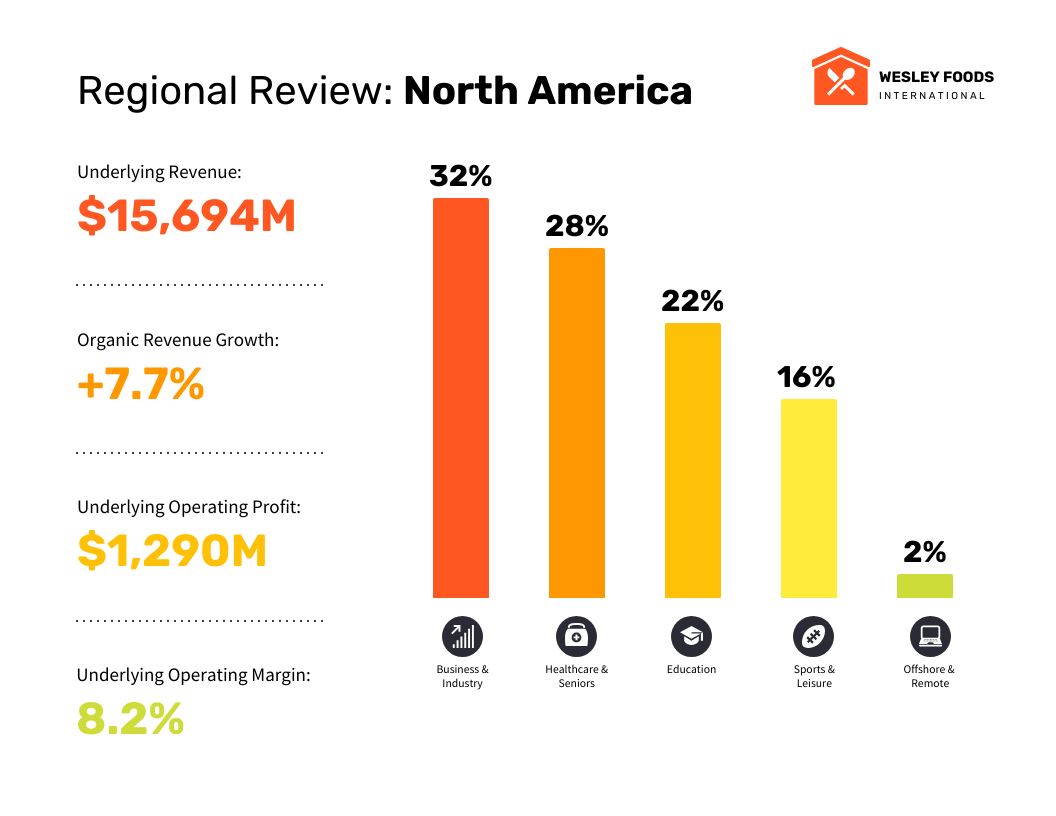
Here are some chart and graph templates that you can consider using for your graph design:

Learning how to build graphs is just the first step, making sure they accurately represent your data is just as important. To see common mistakes to avoid, check out our guide on misleading graphs.
Final thoughts: creating a graph with Google Slides vs Venngage
When presenting statistics, creating a report, or even tracking your favorite team’s scores, charts and graphs make relationships in data easier to see and understand. As Edward Tufte explains, “Graphical excellence consists of complex ideas communicated with clarity, precision, and efficiency.”
You can choose to use many different online tools to create your graph, for example; Google Slides, Microsoft PowerPoint, or by using a professional online graph maker.
When designing or creating your graph, it is important to make sure that your design is clean and has a professional look. This is to also ensure that your graph is easy to read and pleasant to look at.
You can achieve this by customizing your graph’s color, changing the name of your chart to make it easier to understand, rename your axis, resize and align your graph, picking the right font, and more.
Alternatively, you can choose from one of Venngage’s many convenient chart and graph templates to start designing your next graph.


