Raise your hand if you’ve ever worked with a designer and felt like they just weren’t getting your vision, or if you thought that it would’ve been better to design something by yourself.
Or if you’re a designer reading this, raise your hand if you’ve received feedback like “make it pop” or “can we try something different?” with nothing else to go on.
So you already know what this tension feels like.
- Marketers focus on campaign goals, spending, KPIs and stakeholder expectations.
- Designers look at clarity, brand integrity and the long-term cost of inconsistent decisions.
As a marketer who has worked with designers across several campaigns, I’ve lived this tension firsthand.
It usually comes down to three things: communication gaps, misaligned expectations and different priorities pulling people in opposite directions.
The result is almost always the same: the dreaded revision loop. It’s an exhausting cycle where nothing feels finished and both marketers and designers feel frustrated.
In this guide, I’ll show you how to fix the marketer-designer misalignment. You’ll get a simple decision-order framework, a 10-minute alignment checklist and practical ways to cut down revision rounds.
I’ll also cover how marketers can use AI in creative work the right way and speed up execution after a designer sets the direction.
Why marketing and design teams keep clashing
1. Different priorities
Let’s imagine two email inboxes on the same project.
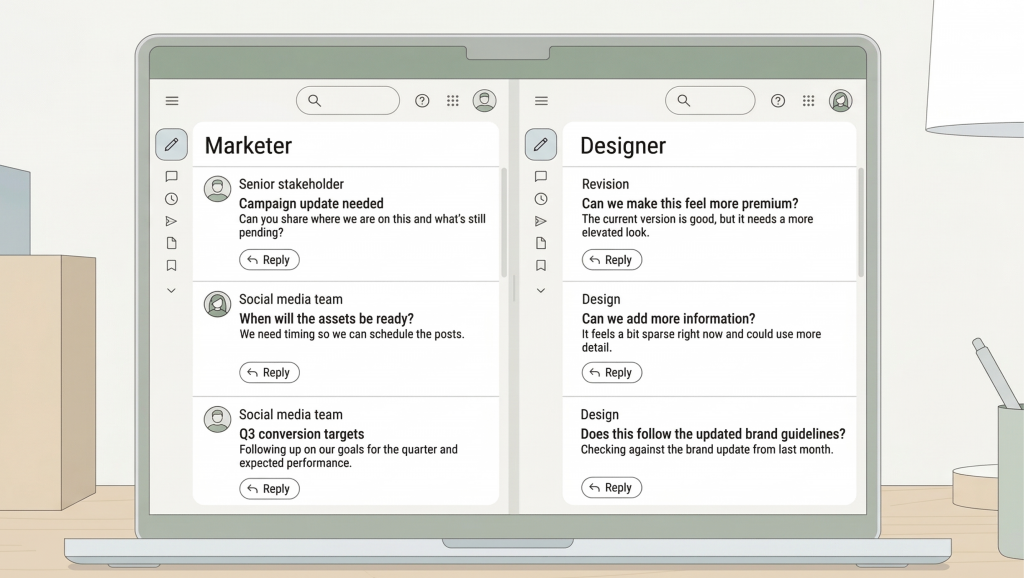
Same project. Same deadline. Two completely different views of what’s at stake.
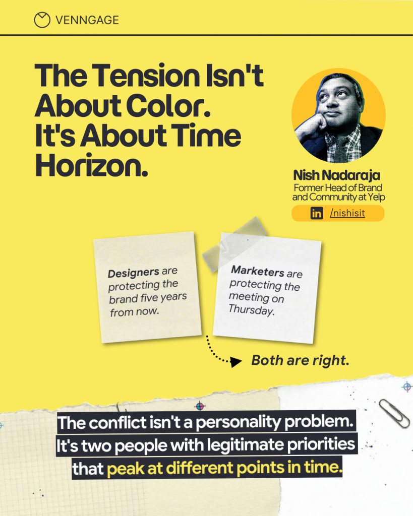
Nish Nadaraja, a marketer with deep experience in navigating stakeholder environments, describes the typical scene:
“Marketing often carries baggage from meetings you’re not in. There’s a quarterly number attached to this asset. There’s a board update. There’s a budget renewal. There’s someone above them who already thinks design slows things down. When a marketer asks for one more tweak, it’s more about risk than ego. Designers are protecting the brand five years from now. Marketers are protecting the meeting on Thursday. The tension isn’t about color. It’s about the time horizon. Both are right.”
Nish Nadaraja
Yes, both sides are right. However, without a shared framework for translating goals and intent into priority, visual hierarchy, and composition, teams end up wasting rounds of revisions trying to solve a clarity problem with too many styling tweaks.
2. Same brief, but different expectations
The brief says:
Both the marketer and the designer read it and agree on the details. Then they go off and have completely different expectations of the outcome.
The marketer pictures a banner that would stop people from scrolling, something that exuberates impact and authority. The designer imagines a layout with strong typographic hierarchy, a decent amount of whitespace and a composition that stays true to the brand guidelines.
Neither picture is wrong, but each side realizes it when the first draft is presented.
A marketer’s “make it pop” comment usually means “make it convert” but is often expressed as a feeling rather than a direction and a designer’s “this needs more white space” comment is misinterpreted as a visual preference rather than a calculated call to drive the audience’s focus.
While the shared goal is clear communication that drives action, the conflict starts when they move forward without agreeing on what must be decided first. And this ultimately impacts brand strategy.
Ham Maghazeh, a creative director who has worked across video, photography, motion, and digital, describes this as a structural problem, not a communication one:
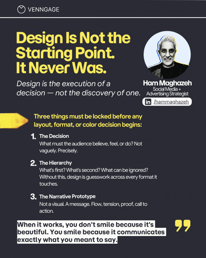
Marketers are usually under pressure to deliver campaigns on time, gather performance outcomes, and manage stakeholder confidence. Designers, on the other hand, are looking at design principles and brand consistency, making sure the creative can scale (and perform) across different formats and channels effectively.
Yesenia España, a designer who has seen this pattern play out across many projects, shares where projects actually get stuck:

Clarity, or the lack of, is the common root cause of a revision loop. By the time the first draft arrives in the inbox, both sides are already reacting to different versions of what the asset was supposed to be.
3. Intent gets lost in execution
Even when teams communicate well, creative work can still go sideways. There are five specific points where marketing intent gets lost before it reaches the final design.
- Gap 1: Strategy to brief. Brand strategy is often described in adjectives and deadlines. “We want this to feel enterprise-grade,” tells a designer nothing about hierarchy or composition. The actual intent — what the audience needs to believe and do — rarely makes it into the brief.
- Gap 2: Brief to priority. Goals are stated, but the ranking is missing. A brief with four equally important objectives forces the designer to make the ranking decision themselves, usually through composition, and that silent decision is what triggers the feedback in round two.
- Gap 3: Priority to composition. Teams agree on messaging goals, then jump straight into visuals without agreeing on what must win visually. Both sides end up negotiating through design tweaks instead of resolving the underlying priority.
- Gap 4: Composition to feedback. Marketers respond to a gut feeling, leaving designers to interpret vague direction.
- Gap 5: AI output to false certainty. AI-generated visuals look finished, but that polished look creates a false sense that the strategic decisions have already been made.

When a revision round feels like an endless loop, the fastest path forward is to ask: which gap are we in right now, and what decision did we skip?
The framework marketers and designers actually need
Here’s a comprehensive framework that helps marketers and designers work together.
The decision order that prevents revision loops
Revision loops happen because teams make decisions in the wrong order. Design is visible, so it feels like progress — color, typography, and layout get signed off before anyone has defined what the asset needs to do, who it’s for, or what action it should drive. By the time the first draft lands, those foundational questions are still open. Feedback then becomes the place where they get resolved, which means creative rounds are doing the job that strategy was supposed to do — and at greater cost.
You can attempt to stop this through a decision order sequence:
Step 1: Intent. What outcome are we driving, and for whom? This is different from campaign goals. It’s about the specific belief, feeling, or action the asset needs to produce in the person who sees it. If the intent is vague, the design will follow suit.
Step 2: Priority. What must the viewer understand first? What must they do? And just as importantly, what can be removed? Priority is not just about what to include. A remove list is equally important.
Nadia Fernández, a designer who has worked with teams across industries, identifies this as the single most important pre-design question:

Step 3: Composition. What intended feeling do we want to create from the full layout? This is where structure, density, spacing, and visual flow get decided – before all the final styling happens. Composition answers the question of what the eye should do as soon as it lands on the visual asset.
Step 4: Brand expression. Typography, color, imagery style, and brand tone reinforce what is already clear from the overall composition. Remember – this is the last step, not the first.
The reason teams slip into the wrong order is that brand expression is the most visible layer to judge. It’s what everyone reacts to in a review. However, when it’s treated as the starting point, everything beneath it remains unresolved and the revisions keep coming because they’re focusing on the wrong layer.
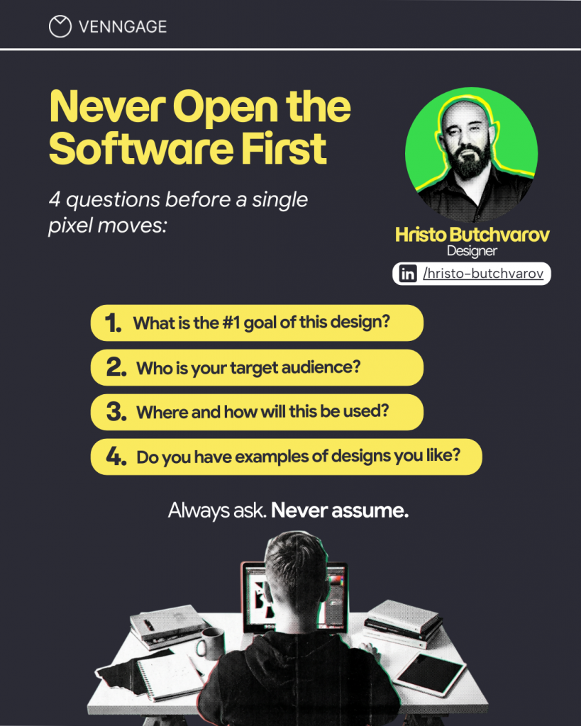
Hristo Butchvarov, a designer with over 17 years of experience, describes how he avoids this dilemma:
The 10-Minute Alignment Checklist that replaces hours of revisions
Most revision loops can be prevented with one upfront conversation. The problem is that neither side knows exactly what to address before work begins.
The checklist below takes no more than 10 minutes. It replaces the vague brief-to-design handoff with a set of shared decisions both sides sign off on before working on any brand asset.
- Primary message: One sentence. What must the viewer understand?
- Primary action: One action. What must the viewer do?
- Remove list: What can be cut without losing meaning? This is not optional.
- Feeling target: Choose one or two words that describe the intended emotion, then define what those words mean in practice. “Premium” can mean whitespace or a specific color combination. “Urgent” can mean contrast and a dominant CTA. Define it to avoid guesswork.
This doesn’t need to be a formal document. It can live in the brief, a kickoff note, a comment thread, or a single shared slide. What matters is making it the default before any design work begins.
Nish Nadaraja describes a similar habit as the single smallest process change that reduced his revision rounds the most:
“Force a ranked priority before design starts. No ties. It’s shockingly hard for adults to rank five things without cheating, but that’s the point. Then, in reviews, ask one question: does this draft serve the number one priority? If speed is first, stop asking for perfection. If brand is first, stop asking for shortcuts.”
Nish Nadaraja
Elena Hunt, a marketer who has worked on both sides of the brief as both creator and reviewer, reinforces why being specific matters:
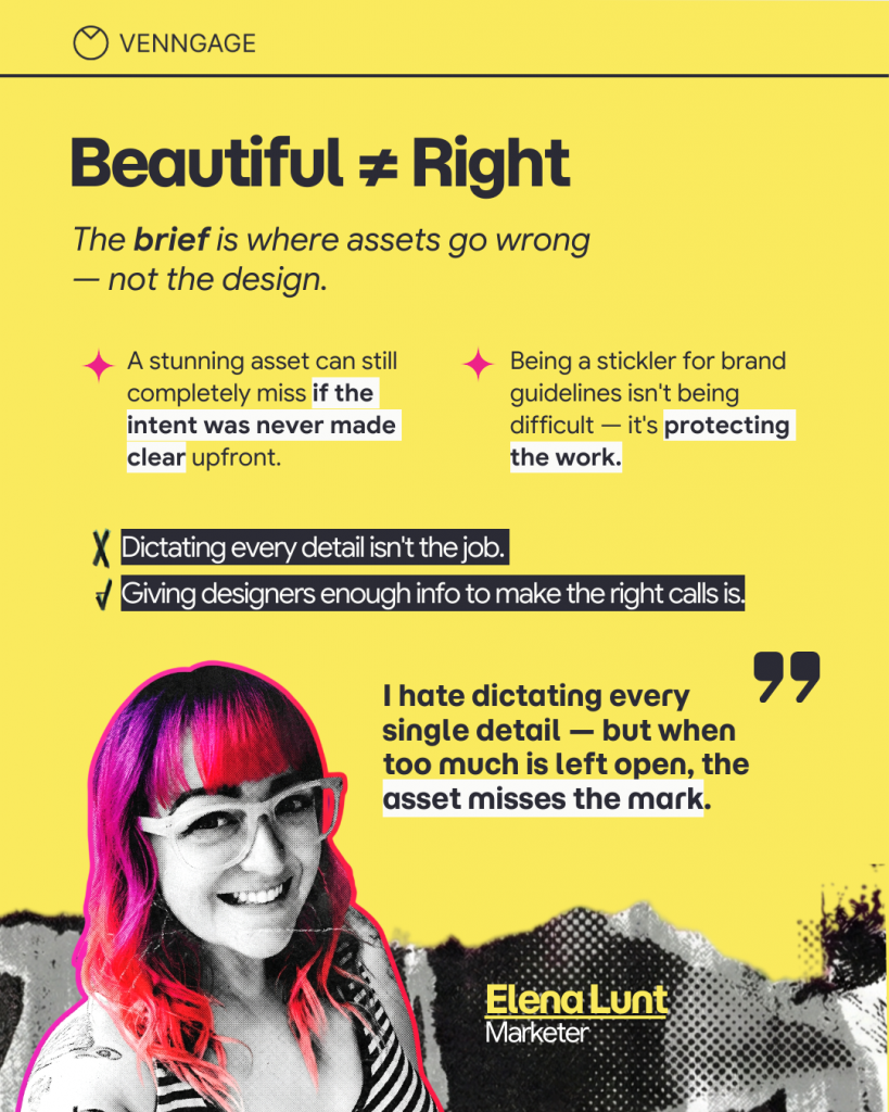
The checklist isn’t trying to remove creative freedom. It’s attempting to protect it. When the priorities are clear, designers can make creative decisions within a shared framework rather than guessing at what the marketer had in mind.
Before the checklist goes to the designer, stress-test it. Ask the marketer to explain the idea verbally, without slides or decks, in under three minutes.
Ham Maghazeh is direct about why this matters:
“If they cannot do it, design cannot rescue it. No amount of craft fixes unclear thinking upstream. Most revision cycles are not caused by bad design. They are caused by a brief that looked complete on paper but had never been stress tested out loud.”
Ham Maghazeh
Three things to add to any design brief alongside the checklist:
- One reference example the team wants to move toward and one they want to move away from
- One constraint that cannot be violated: a brand rule, a key message, a non-negotiable
- The checklist is discussed out loud before sign-off, not just attached as a formality
Related: How to Create a Marketing Plan That Actually Works
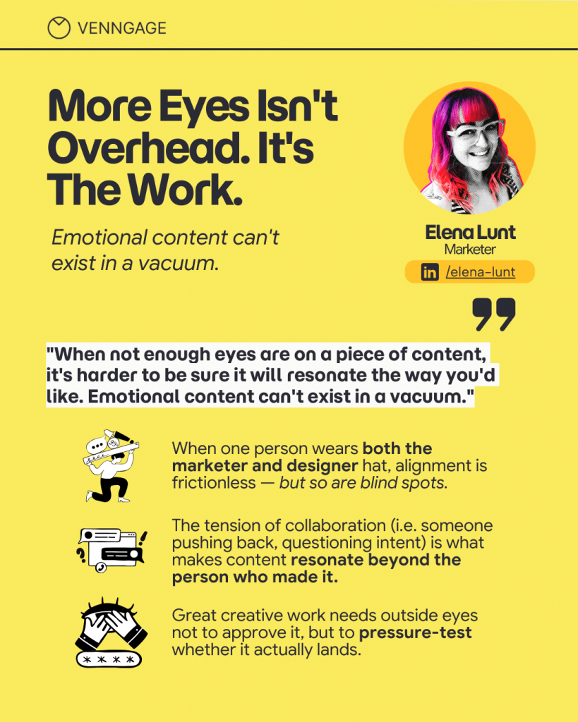
There’s a common assumption that more feedback results in better creative work. More rounds mean more refinement, and more review means fewer errors. However, the data from working teams tells a different story.
More rounds don’t fix the problem when the problem is an unresolved priority. Each round causes the styling to change, but the underlying composition stays the same. The hierarchy that triggered the feedback in the first place remains untouched. And the cycle continues.

The hours add up, but so does the doubt. Each revision round sends the same message to both sides: the other person doesn’t understand what this needs to be. The brand starts to drift in small ways and by the time something finally ships, it’s the result of unresolved decisions that were never really solved, just styled over.
The question is not how to give better feedback in round three. It’s how to avoid having three rounds all together.
The Marketer-Designer Feedback Translator (With real examples)
One of the most practical things a team can do is build a shared vocabulary for translating between what marketers feel and what designers need to hear. Most feedback breakdowns come from the choice of descriptions that seems clear to the person giving it but complete gibberish to the person receiving it.
Translating marketer feedback into design direction:
- “This feels off” = Something in the visual hierarchy is not guiding the eye where it needs to go. Check the rhythm, density, spacing, and the attention path.
- “It doesn’t feel premium” = Simplify. Increase whitespace, tighten the typography system, and reduce competing elements.
- “Too busy” = A signal to apply to the remove list. Reduce the number of proof points, simplify the layout, and ask what the asset should look like with 30% less content.
- “It won’t convert” = The message needs clarification. Ensure the CTA has more prominence.
- “Not clear enough” = Hierarchy problem. The primary message needs to be captured within two seconds of viewing.
Translating designer pushback into marketer language:
- “We need hierarchy” = The audience won’t know what to notice first, which directly impacts whether the asset performs.
- “We need to cut content” = Keeping everything reduces the impact. Each additional element takes attention away from the primary message.
- “This breaks the system” = It creates brand inconsistency across campaigns and slows future work because it introduces a new exception that has to be resolved every time.
Elena Hunt adds a practical note from the marketer’s side on what makes feedback actually useful:
“I’m most confident that an asset will convert if the messaging is extremely clear and it can tap into an emotion directly connected to the customer’s pain point. If we can’t make the viewer feel anything or believe their problem is going to be solved, they’re just going to keep scrolling.”
Elena Hunt
This is an example of a performance-based feedback, one that designers can work with because it highlights a specific outcome rather than a personal preference.
Two creative workflows every marketing team needs to know
Not all creative work is the same, and not all of it should follow the same process. One of the most useful shifts a marketing and design team can make is recognizing that two distinct types of creative work require two different approaches.
Lane 1: The System Lane (Template-First)
Best for: Proposals, pitch decks, repeatable campaign formats, social assets, and any work that needs to be produced at volume or by people who aren’t trained designers.
How it works: Designers build brand-compliant templates with pre-determined components such as typography sizing, color usage, spacing rules, approved imagery styles. Marketers (and anyone else who needs to create) can work within those templates, focusing on assembling rather than designing from scratch.
Outcome: Faster production, fewer revision rounds, consistent brand application across channels. The alignment work has already been done because it’s built into the template.
This is exactly what Venngage’s brand kit and template system is built for. It gives non-designers a starting point that’s already aligned with brand guidelines, so production doesn’t require a designer in the loop for every asset.
Lane 2: The Creative Lane (Priority-First, Then Custom Composition)
Best for: Event collateral, hero visuals, campaign launches, one-off pieces that need to do something specific and memorable.
How it works: The Priority Checklist is completed first, followed by a rough design layout (not polished drafts). Then styling is applied and the first draft is ready. Note: This sequence is non-negotiable.
Outcome: Fresh, distinctive work without the chaos or brand drift that comes from jumping straight to execution.
Ham Maghazeh describes why this sequencing matters especially now, when today’s designers are managing assets across far more formats than they were a decade ago:
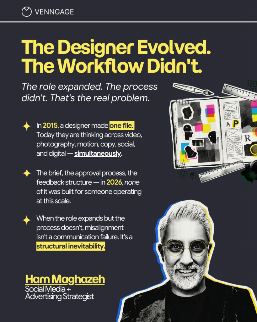
The most common mistake is treating all creative work as Lane 1 work i.e. using a template when the brief actually calls for original thinking, or jumping into Lane 2 without the Priority check. Knowing which lane you’re in before the project starts will save your team a lot of time.
Before and after: What marketer-designer alignment actually looks like
Let’s take a look at how aligned vs unaligned creative processes looks like in practice:
Scenario A: Event collateral
Without alignment: The marketer sends a flyer brief with keywords like “bold, exciting, premium”. The designer produces a first draft. The feedback comes back: “It’s good but something feels off – can we make it more exciting?” A second round begins. Someone else suggests changing the background color. Another round. The deadline finally arrives but what ends up shipping is a version everyone gave up on.
With alignment: The Priority Checklist is completed before the first draft. The primary message is clear, the remove list has cut three items that were competing for attention, the designer knows the dominating section of the asset. The first draft successfully serves the brief. The feedback round is only fine-tuning, not starting all the way from zero.
Scenario B: Campaign assets at scale
Without alignment: Icons, images, and copy blocks are created inconsistently across the campaign. Each asset was produced under a tight deadline with slightly different interpretations of the brief. Once the campaign launches, the visual language is inconsistent.
Yesenia España explains why this happens:

With alignment: A brand-compliant asset library and clear hierarchy rules are established right from the beginning. Approvals are faster because there’s nothing to argue about – the framework was agreed on before design work began.
Scenario C: AI-generated first draft
Without alignment: A marketer generates a polished-looking visual using an AI tool and sends it to the designer to “finish.” The draft looks complete yet the CTA is unclear and the primary message is competing for attention with three other elements. Rework is expected when something looks done before anyone’s actually agreed on what “done” means.
With alignment: AI is brought in after the Priority Checklist is complete. By the time AI enters the process, the hard decisions are already made. The composition is set, the brief is signed off, the constraints are clear. AI can help you create visuals and handle the execution e.g. variations, resizes, icon explorations, following which the designer reviews the output and decides what makes the cut. The work is faster, but the judgment is still human.
Where AI helps (And where it breaks) The marketer-designer workflow
AI has significantly changed the speed of creative production but it hasn’t changed what makes creative work effective.
Where AI genuinely helps
- Generating variations. Once priority and composition direction are agreed, AI can be used to produce multiple layout or styling variations quickly.
- Resizing across formats. Resizing a hero visual for multiple channels can become tedious, repetitive work, and this is exactly the kind of task AI handles well.
- Exploring options within constraints. When the brand and composition guidelines are clear, AI can generate icons, imagery, or copy variations that stay within these guardrails.
Where AI creates problems
Producing polished drafts before priorities are locked. This is the most common trap. A polished AI draft can make it feel like everyone’s aligned even when they’re not. The output looks clean, but can still be pointing in the wrong direction.
Elena Hunt highlights the limits to using AI:
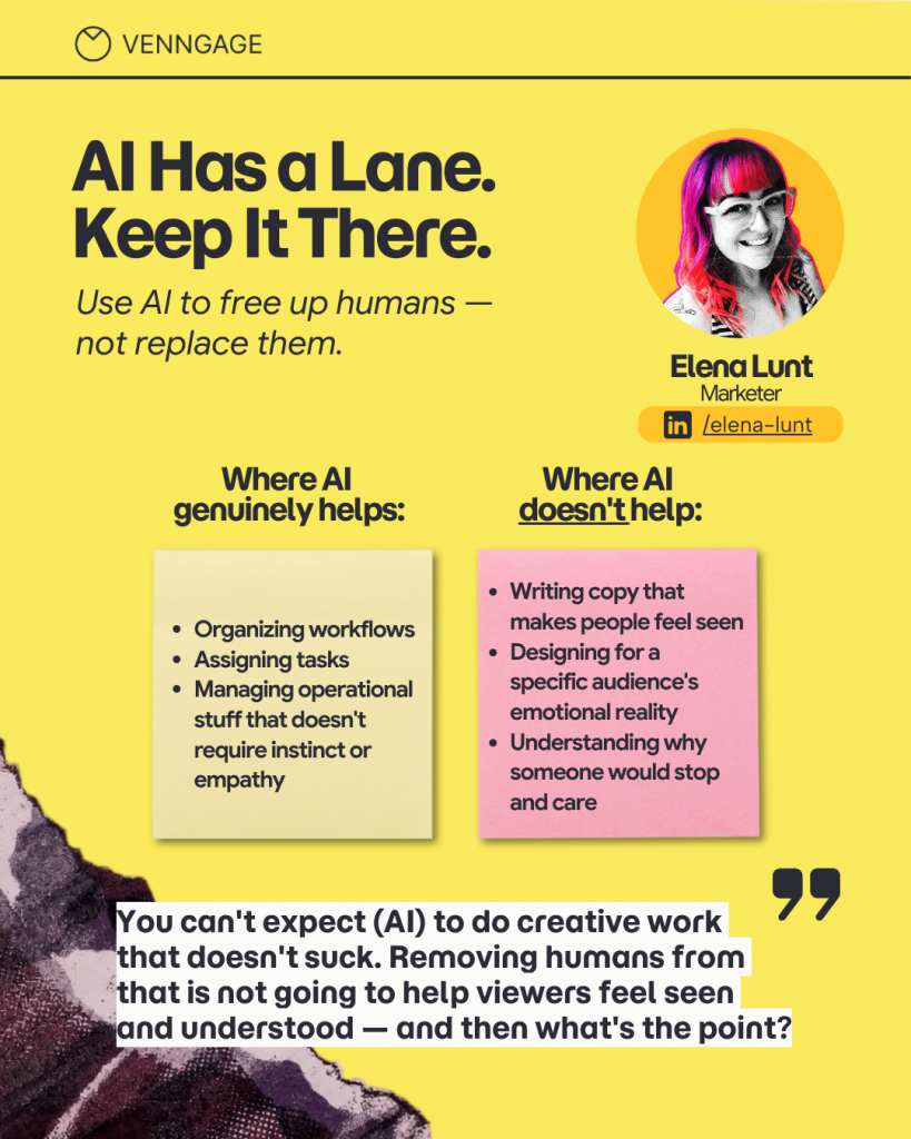
Introducing style drift. AI doesn’t inherently know your brand. Without a designer reviewing the output, you’ll start seeing inconsistencies that quietly multiply the longer the campaign runs.
Nadia Fernández describes this situation:
“AI can produce something that looks finished, clean, balanced, professional. But often everything has the same weight. The headline doesn’t lead anywhere. The CTA is probably pointless. Everything is visually polite. And polite doesn’t convert.”
Practical boundary rules for AI in a marketing-design workflow
- AI speeds up design execution (such as picking the best visual format), not decision-making. You still need a clear direction before you open a prompt.
- Brand rules apply regardless of how an asset was produced. AI-generated work must go through the same review as anything else.
- Someone with design judgment still needs to sign off at the end. A polished-looking output doesn’t mean the strategy behind it is sound.
How Venngage closes the Gap between marketers and designers
Part of the misalignment issue is just not having a shared starting point, and adopting good tools can help fix this problem. While it doesn’t replace the needed conversations, it allows both sides to share the same workspace for reviews and discussions.
Most alignment problems start before a single design decision is made. The brief exists in someone’s head. The assumptions are never written down or shared. They only become obvious when a draft comes back and doesn’t match what anyone pictured.
Venngage gives both sides a shared visual workspace to surface those decisions early. Rough layouts and structural sketches can be built before the polished work begins, so marketers and designers are working from the same reference point instead of filling in gaps on their own.
Brand guidelines as the first line of defense
The most common brand violations — font inconsistencies, off-palette color choices, hierarchy breakdowns — happen not because anyone is being careless, but because there’s no structural guardrail in place when production moves fast.
Venngage’s brand kit system embeds those guardrails directly into the production environment. Fonts, colors, spacing rules, and hierarchy logic are locked in from the start. Marketers working from templates can’t accidentally cause brand drift because the template itself enforces consistency.
Faster iteration within guardrails
The point of alignment isn’t to add steps. It’s to make each step count. When both sides are working from the same templates, the same brand rules, and the same composition logic, revision rounds stop being debates about direction and start being genuine refinements.
That’s where the real gains show up. Less back and forth, faster shipping, and creative work that lands because the thinking behind it was solid from the start.
How to start fixing creative misalignment before your next project
You don’t need a workshop or a new set of rules to change how a team creates. You just need one decision handled differently before the next project kicks off.
If you’re a marketer
- Provide Priority Checklist inputs before the first design conversation. The primary message, primary action, one proof point, a remove list, and a “feeling” definition with observable cues. This takes ten minutes and prevents multiple rounds of revisions.
- Define “feeling” with specificity. “Premium” needs to mean something. “Bold” should describe a composition choice, not just an attitude. The more you can describe the intended look in visual terms – what catches the eye first, what gets removed, what the hierarchy is communicating – the less a designer has to guess.
- Review drafts by emphasis, clarity, and outcome. Before reacting to color or font, ask whether the primary message is unmistakable within two seconds. Ask whether the CTA is prominent enough to drive the action. React to what the asset does before reacting to how it looks.
If you’re a designer
Ask what must dominate before you open any design tool. The question is not what should be included. It’s what must win. Everything else is secondary until that’s been answered.
Show composition direction early — before polish. A rough layout that makes the hierarchy visible is more valuable in alignment terms than a polished draft that looks finished. Nish Nadaraja identifies this as one of the most effective process changes available:
“Show direction before polish. Rough comps. Mood boards. Even ugly slides. A polished draft creates false certainty. It feels done, so people only critique what’s on the surface.”
Translate design rationale into outcome language. “We need to increase the whitespace” sounds more obscure than “reducing the visual noise here will make the CTA three times more visible.” Both say the same thing. The latter gives the marketer something to agree with.
For both sides
The brief is not a formality. Ham Maghazeh’s describes this well:
“The brief is not a document. It is the only reason collaboration works at all. A real brief translates action into design constraints. It says: this is the priority, this is the non-negotiable, this is what success looks like in this specific context. Without it, both sides are right and nothing gets resolved. With it, both sides are building the same thing — and they both know it before anyone opens a tool.”
When marketers and designers align first, everything else gets faster
The revision loop doesn’t have to be a given. It’s usually a sign that certain decisions were pushed past the point where they were easy to make. Priorities left unranked. Compositions no one signed off on. Briefs that set a mood but never touched hierarchy.
Make those decisions before the first draft and the whole process starts to feel different. Feedback lands as direction. Revisions move the work forward instead of circling back. Things ship on time because everyone was working from the same page.
The framework here is a starting point. The decision order, the alignment checklist, the two-lane workflow, the feedback translator. But the bigger change is in how the team thinks about alignment. Not as a hurdle before the creative work, but as part of it.
The argument for alignment isn’t about process efficiency. It’s about creative work that starts with a team who are building from the same understanding.
Start with your next brief. Add the Priority Checklist. Share the remove list. Define “feeling” in visual terms. See how much cleaner the first review becomes when both sides are already working from the same understanding. Try Venngage and build that into every project from here.